(616) 459-3539
Mailloux Dentistry: A New Location for Smiles to Begin 

Mailloux Dentistry: A New Location for Smiles to Begin 

At first glance, Mailloux Dentistry could be mistaken for a spa. It’s certainly a place where beauty is valued.

Dr. Brittany Mailloux and partner Dr. Caitlynn Haas are licensed general practitioners in dentistry and offer a full menu of dental services. What sets them apart is their attention to the beauty and aesthetics of the smile. They are a family dentistry where adult and child patients receive the same attention.

r.o.i. Design met Dr. Mailloux along with her husband, Dr. Kevin Kross, who owns Blueprint Dental. They are not partners in dentistry but did decide to purchase the building that they now share. This allowed them to have a state-of-the-art lab that they both use. And while they are married, the two practices look completely different.

We spent hours at Brittany and Kevin’s home where we met their children (as well as dogs, ponies, and horses) to make decisions. We were influenced by their hospitality and kindness in the design of Mailloux Dentistry.

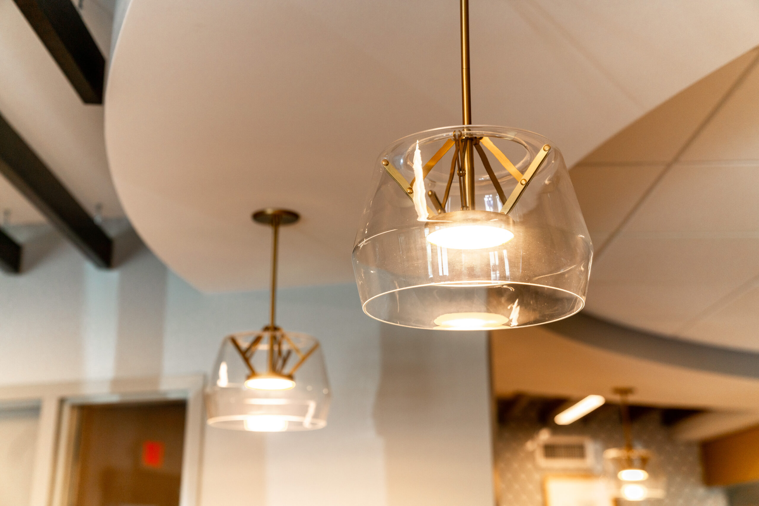
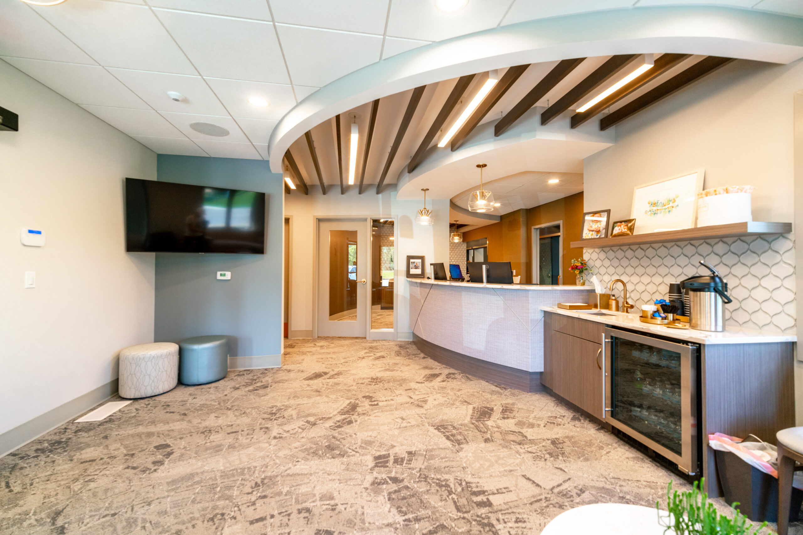
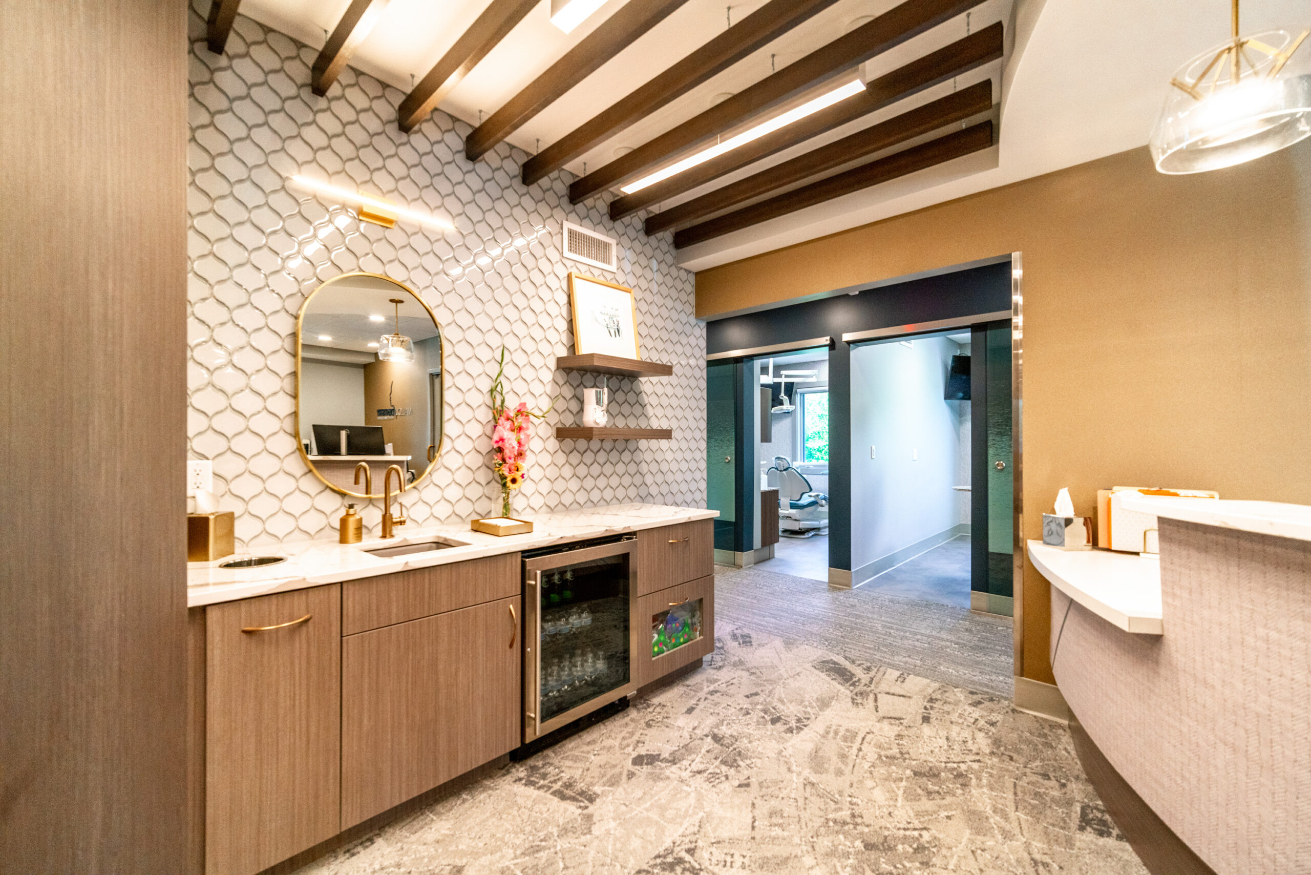
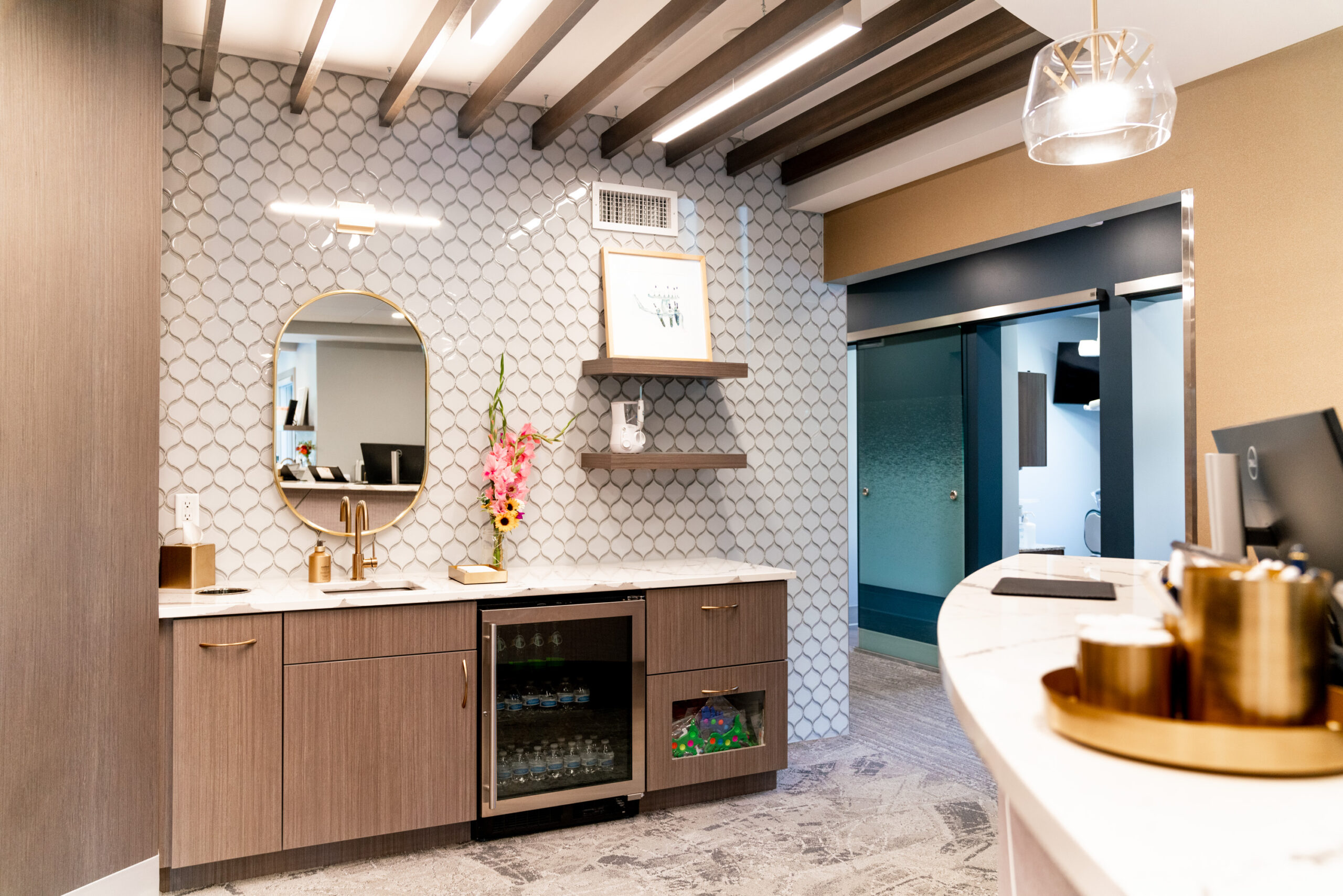
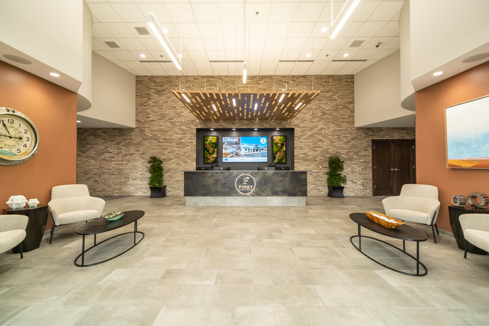
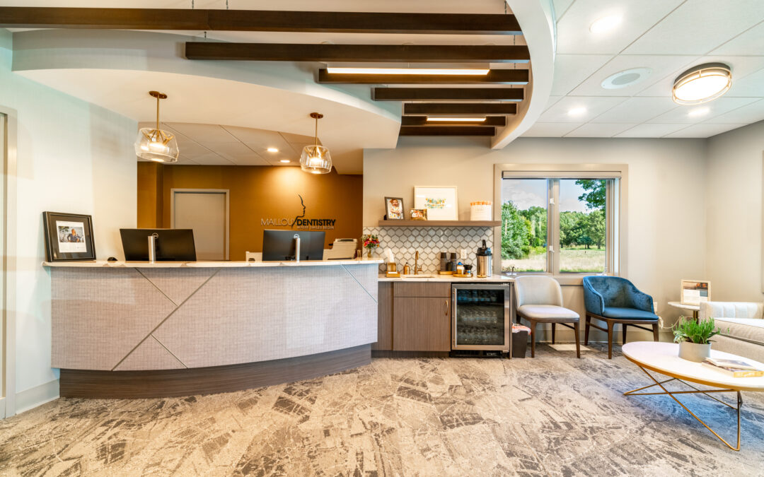
The lobby of the space has many curves. The reception desk, bulkheads, ceiling accents, accent tiles, and many more elements all incorporate curvilinear shapes. The intention was to make their patients feel welcome and relaxed. Inside the reception bulkhead are wood baffles that enhance the coziness of the space.

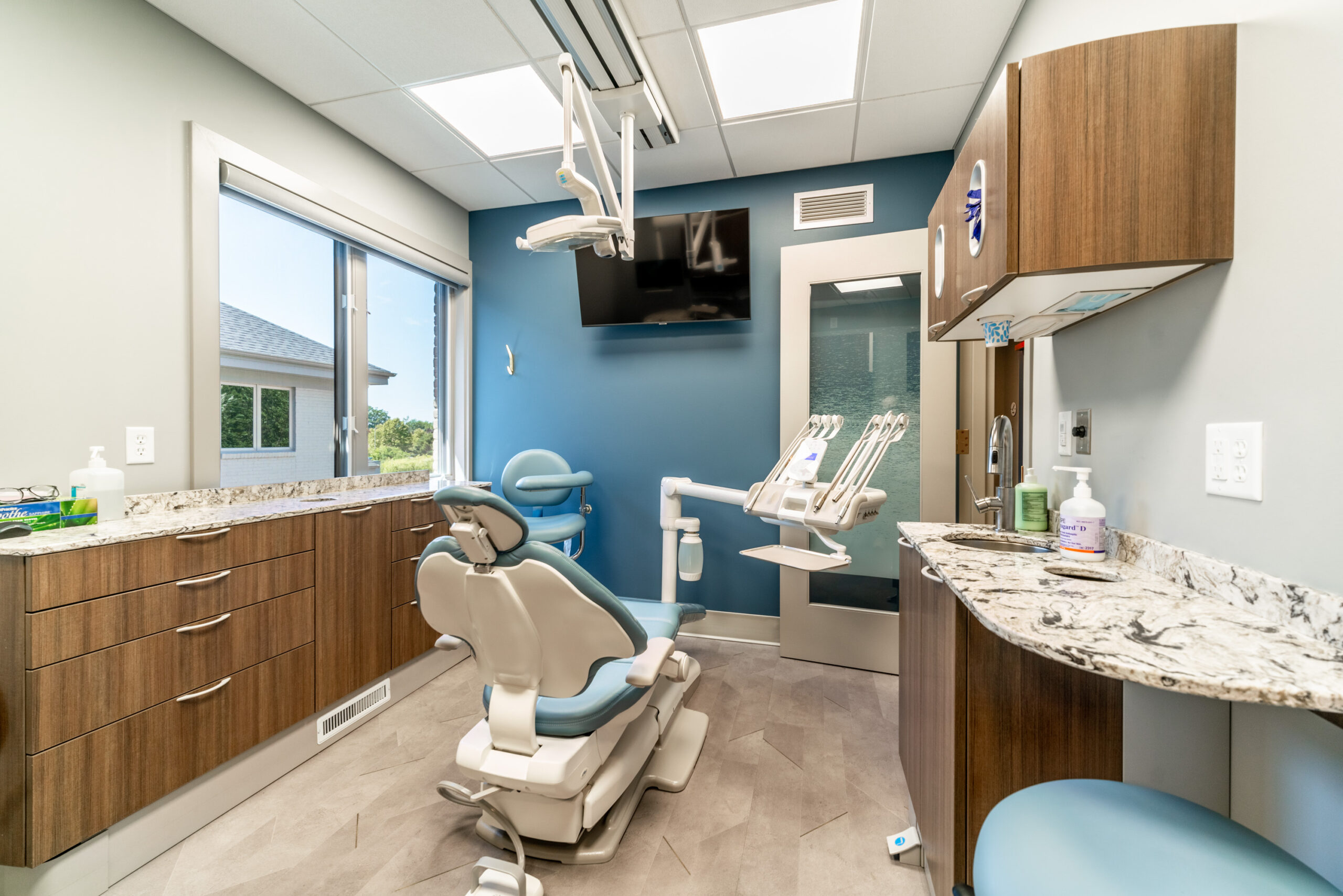
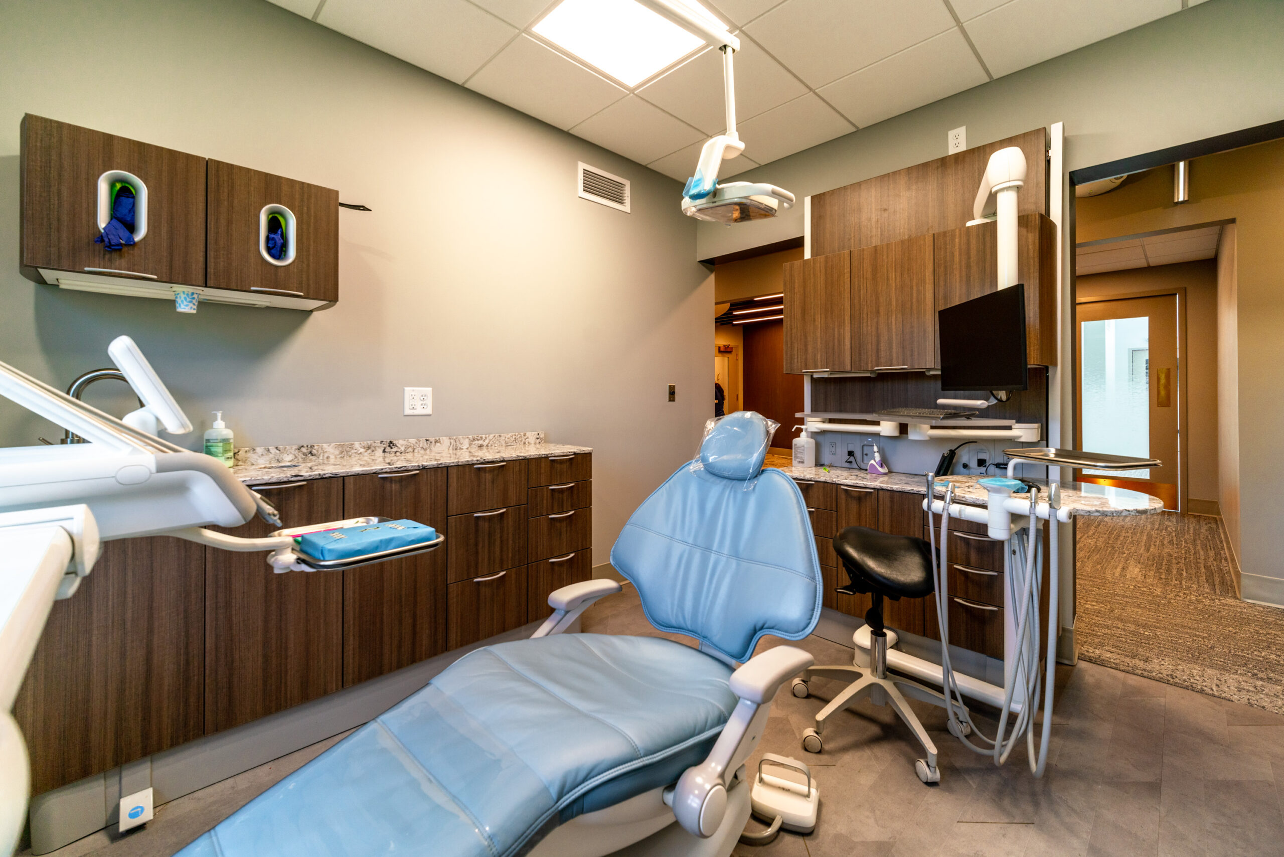
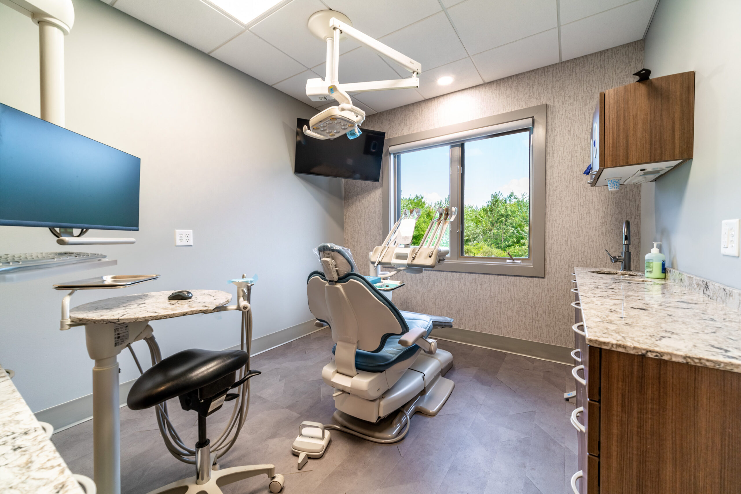
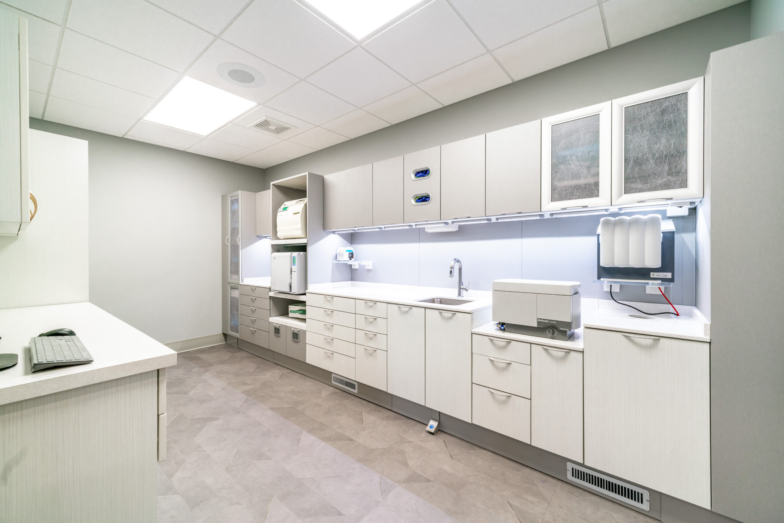
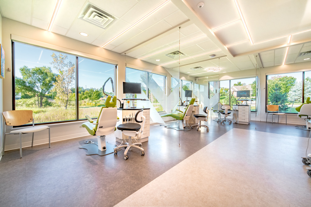
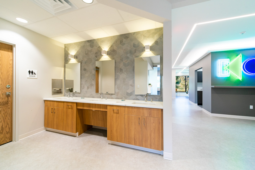
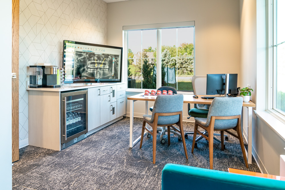
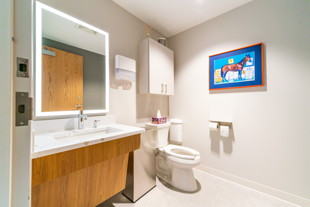
The overall color scheme includes gold, warm white, pink, and gray. The elegance of the lobby chandeliers and the waiting room furniture are paired with a carpet that looks handmade. The vinyl flooring (LVT) in the exam rooms has accents of gold in a light parquet wood floor look.

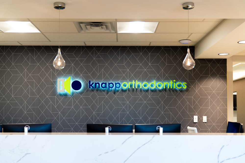
On this project, we were honored to also design their new logo. We came up with numerous concepts and refined them down to the final product. We also provided and branding standards document so they could use their new logo to its full potential.

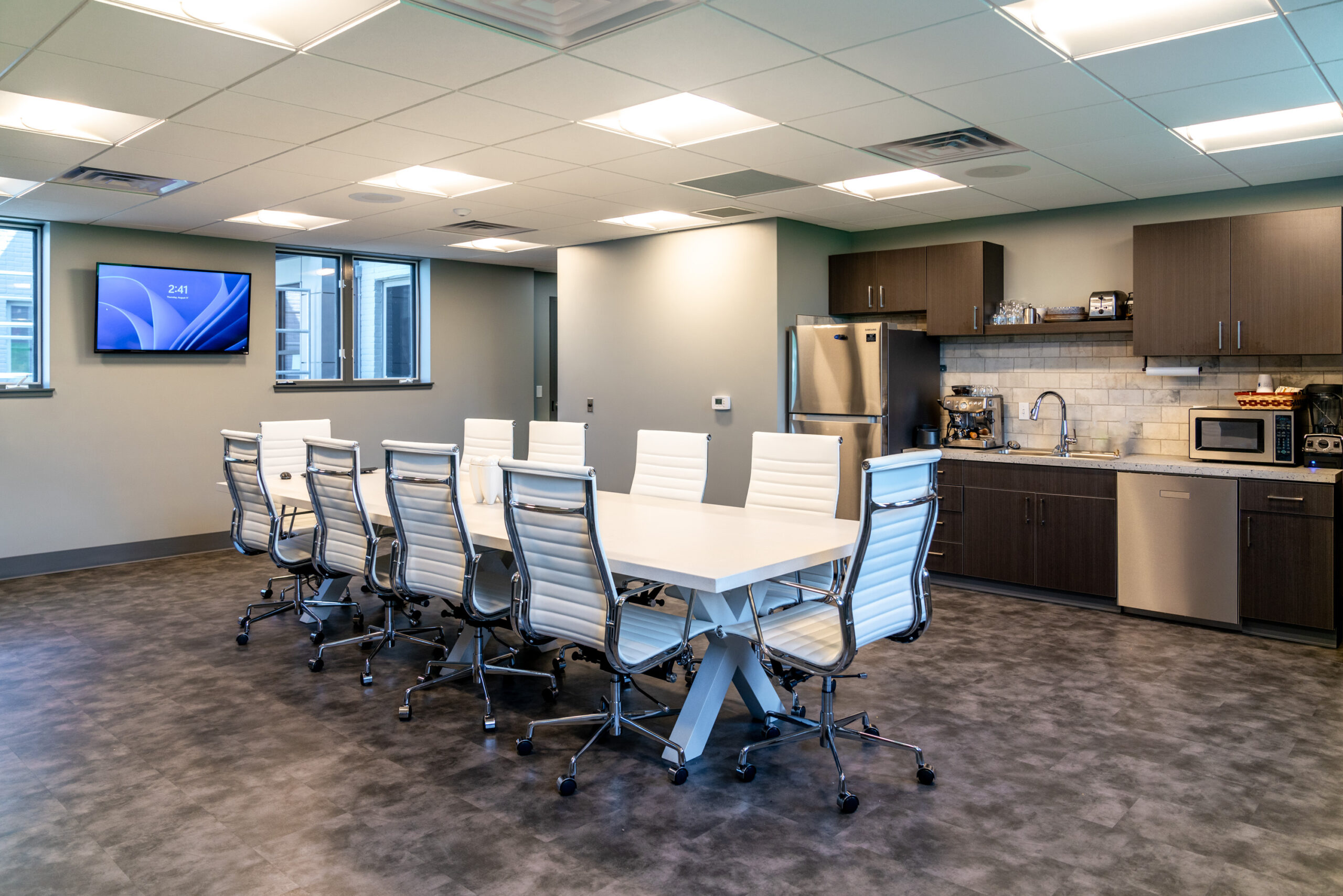
The lobby and reception furniture were also provided by r.o.i. Design. It is always wonderful to be able to finish a design we start down to these details.

© Photos Courtesy of First Companies, Inc.

 For more of our dental and medical projects click here


    Kraft Business Systems: New Office, New Look.

    Kraft Business Systems: New Office, New Look.

    When First Companies Inc. introduced r.o.i. Design to Jeff Cousins from Kraft Business Systems he said, “I don’t know design, I just want ‘cool’”. Jeff was very interested in every aspect of the new office. Dixon Architecture had been introduced a little earlier, and Ken Dixon had the space laid out and adjusted as needed to meet Jeff’s understanding of changing needs.

    Early in the interior design consultancy, we noticed and complimented Kraft Business Systems (KBS) on their logo. Not only is it good-looking, but it has been developed based on business values and images that support those values.

    KBS sells printers, but more importantly, printing solutions and technical innovations. The business is built on solving problems for their customers, and r.o.i. Design took that approach as they made interior design decisions.

    Each of the four key values were featured in their own areas:

    • “Honor our company heritage in the print and printer industry.” (Orange)

    • “Committed to continued innovation and I.T. for the paperless office.” (Green)
    • “Focused on our clients and committed to interpersonal communication.” (Light Blue)
    • “Look to the future with continued aspirations for creativity and growth.” (Dark Blue)

    The colors of the five values are very bold, but the overall palette is white, grey, and black, creating a neutral background for the reds, oranges, yellows, blues, and greens. Not only did r.o.i. Design color block some of the walls in logo colors, we also created custom graphics for large-scale wall covering whose imagery is very “techy”.

    As the design was coming to the finish line, Jeff commented, “This is cool, and I didn’t think I liked black, but I do!” The design was so well received that KBS borrowed finishes and accents for their other Michigan offices. That’s the best kind of compliment!

    © Photos Courtesy of First Companies, Inc.

     For more of our dental and medical projects click here


    The Colors of the Year for 2024

    The Colors of the Year for 2024

    It may not be the Super Bowl or The Oscars, but for designers, a “Color of the Year” reveal is always a big event. We memorialize them by painting a stripe on our office wall for each of Sherwin Williams’ yearly selections.  

    This year, it is likely that residential and commercial designers can find a “color of the year” they like since there are several to choose from.  Here are a few of this year’s colors from our favorite companies that we regularly reference.

    • Pantone: Peach Fuzz 

    • Benjamin Moore: Blue Nova

    • Sherwin Williams: Upward

    • Glidden: Limitless

    • Behr: Cracked Pepper

    • HGTV Home by Sherwin Williams: Persimmon

    Emily VanSchmus and Caitlin Sole from Better Homes and Gardens describe all the 2024 picks as “Earthy, nature-inspired tones will be especially big, according to the color experts that release their predictions each fall. This year’s trend forecast features earth tones like terra-cotta and moody forestcore-inspired picks that include a rich deep green. We’re also seeing an influx of coastal-inspired blues, from light pastels to bold teals.”

    In October of 2023, Martha Stewart writer Madeline Buiano published an article. “Here’s Every Color of the Year (So Far) To Inspire your Home Painting Projects in 2024” This article features 11 paint companies and their choice for “color of the year”.

    What influences those experts in paint colors? There are collaborations between paint companies with partners in yarns (carpet and fabrics), laminates, and chemicals (solid surfaces and quartz) months and years before an announcement. Each of these collaboration groups has manufacturers’ representatives and cultural analysts on their team to influence paint companies because color “sells”.

      First Companies Inc. – New Corporate Headquarters Bring the Whole Team Together. 

      First Companies Inc. – New Corporate Headquarters Bring the Whole Team Together. 

      Over the past few years, First Companies Inc. (FCI) has engaged r.o.i. Design to provide interior design services for their customers in the dental, medical, restaurant, and corporate sectors. In 2022, they asked us to help them design the remodel of a 10-year-old building to house their whole team. Previously they were spread over three separate locations, making it difficult to collaborate and communicate. For a company that has clear team values and goals, this was challenging. 

      Early in the design process, First Companies realized that illustrating their brand and values would take the lead in making choices. Part of their brand is to demonstrate innovation in interiors, and we were asked to make building materials an obvious but incorporated part of the design.  

      That resulted in the creative use of Baltic Birch plywood, veneer brick, burnished steel, concrete, and integrated LED lighting. We also employed acoustic treatments that look like wood and softened the ceilings. The overall envelope of finishes also needed to incorporate the existing wood trim, doors, and laminate cabinetry. 

      All new carpets, porcelain tile, and luxury vinyl were added. We used several distinctive styles and patterns to create interesting looks, differentiating departments and functional uses.  

      The design was not limited to finishes; First Companies saw the importance of continuing a consistent message with décor and graphics. We developed custom icons for their company’s values, and we embodied those icons as artwork. In addition, we created five value boards that are prominent in the décor.  

      We created large-scale prints using their own project photos and drawings and mounted them on the walls. On a more personal level, photos of hard hats, lunch boxes, plumbing pipes, laying bricks, sawing wood, etc. were researched that complimented their values and aligned with a contractor’s aesthetic. In the conference rooms, we featured some of their projects completed over the last year. 

      The décor has created landmarks for a directed tour through the new facilities, looking at photos and icons and being able to tell the First Companies story. 

      A special thank you to the First Companies team that walked alongside us to make sure we got it right: Crissy and Matt Sink. We also appreciate the trust from Craig and Jeff Baker to make the space everything First Companies. Kudos to our team who designed the space, graphics, and furnishings: Marianne Martz, Ryan Bright, and Ronda Geyer. 

        © All Photos Courtesy of First Companies, Inc.

         For more of our projects click here

          Knapp Orthodontics Creates an Innovative Office for an Innovative Practice. 

          Knapp Orthodontics Creates an Innovative Office for an Innovative Practice. 

          Orthodontics is a very personal business. Practitioners meet and grow with their families to create lifelong relationships. Knapp Orthodontics takes this to the next level. Dr. Kevin Knapp is design-sensitive and connects all the dots between his practice operations, patient experience, and office design. 

          We were introduced to this practice through First Companies, who were working with them to develop the property. We are grateful that they recommended us to assist in the interior design of their new office and have learned a lot through the process.  

          As a team, we learned that not all clients are colorphobic. Knapp Orthodontics welcomed the use of color in their design, especially when it complemented their brand colors of blue, green and grey. We used those colors to accent the walls. We also introduced an acid yellow to the spectrum and used it in carpet and upholstery accents. 

          We also learned that some clients are more forward-thinking about lighting and technology. Knapp Orthodontics embraced our design that incorporated recessed linear LED lighting in the lobby and the exam areas. While the overall light level was great, the effect of the smooth surface lighting was refreshing, clean and takes a step away from traditional lighting. 

          Knapp Orthodontics invested in wall-mounted digital games for patients and their siblings to use while waiting which creates a positive experience for the kids. We responded to this detail by creating acoustic wall panels that incorporated the brand logo behind the games and providing kid-friendly ottomans that can be used while families play games or wait for treatment. 

          Dr. Knapp and the team inspired us with their vision for booth seating in the waiting area, a combination of quartz and wood-faced materials on the reception desk, and full glass partitions between exam areas. 

          Thanks to Dr. Kevin Knapp, his wife Jenny and Tara for all your help and inspiration. We look forward to hearing about all their growth and success!

            © All Photos Courtesy of First Companies, Inc.

             For more of our dental and medical projects click here

              Creating Renderings for Exterior Building Improvements 

              Creating Renderings for Exterior Building Improvements 

              For the most part, r.o.i. Design is known as a commercial interior design firm, but we also do exterior design as well. Many of the projects that we work on require design and consulting on the materials and colors for a building’s exterior. For some projects, that is all we do.  

              For instance, a longtime customer, DTN Management in Grand Rapids, owns several multi-family residential complexes throughout the state. One of the local properties, Alpine Slopes Apartments, needed improvements to the buildings’ exteriors to update the look and provide less maintenance.  

              We worked with their team to provide options for new siding and paint options. We created renderings from photos we took to show how the new finishes would look when installed. This proved to be a valuable tool for DTN. Replacing the siding on all the buildings of a large complex was a major undertaking, so making sure it would look right was important.  

              The new siding has gone up on most of the buildings, including the clubhouse and pool building. It looks great and is a real improvement. We are happy to have been able to help DTN and look forward to more collaborations like this in the future.  

              Click on thumbnails below to view larger images.