(616) 459-3539
Kent County Office of the Defender Makes an Important Move
Kent County Office of the Defender Makes an Important Move

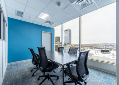
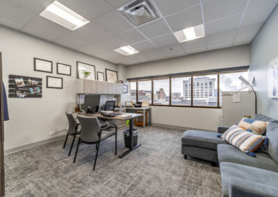
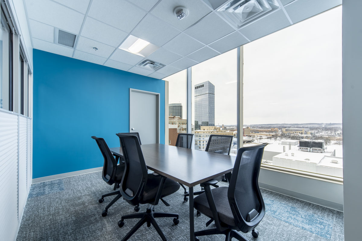
Kent County Office of the Defender (KCOD) has been working with r.o.i. Design for over five years.  KCOD was funded and mandated by the State of Michigan to increase its capacity to serve more people.  Initially, we were trying to squeeze more people and efficiency into their small office. But the demand for space was growing, and it was clear a new and larger office was needed. The new office had to accommodate an increasing staff, be walkable to the courthouses downtown, and be connected to public transportation.  They also needed to maintain as much of the integrity of the space as possible (historical building, loyal realtors, and use type). 

When KCOD leased the 8th floor at 850 Monroe, it had previously housed a law firm but was vacant for 10 years. 

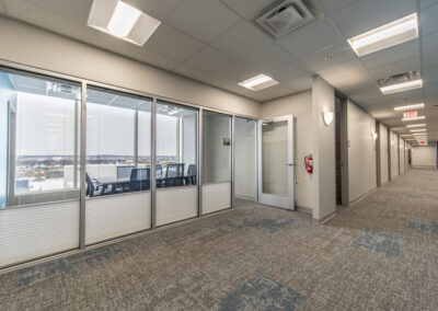
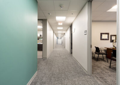
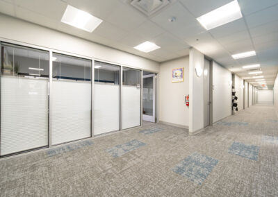
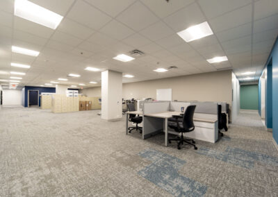
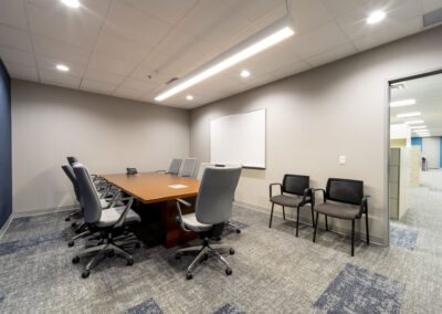
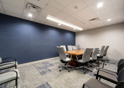
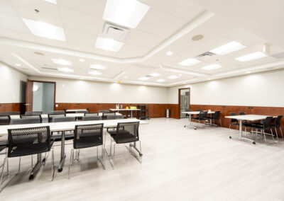
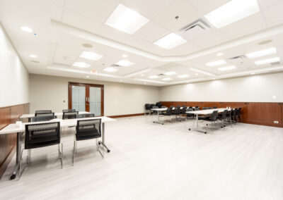
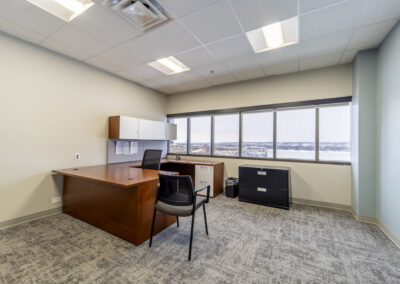
The entry, lobby, reception, and training room needed minor updates and the office layouts were appropriate but too few. Generous corridors were narrowed so 12 offices and a conference room could be added. At their move-in in 2023, they had every office filled. To expand more, they would look to add space one floor down in the same building. 

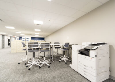
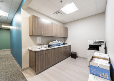
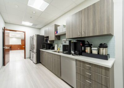
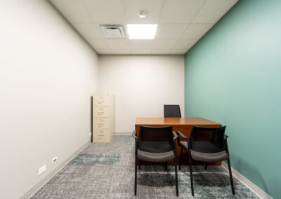
The suite’s previous design was quite dated and needed major finish updates to the lighting, paint, and flooring. r.o.i. Design added color-coordinated accents in quadrants: navy, green, and teal. The lunchroom, copy room, and client check-in received new case goods, and all received new laminates.  

It was decided to keep the original cherry paneling and marble floor in the Lobby. 

The base paint color of the suite remained neutral, removing much of the wallcovering, and adding a lighter paint. All carpets were replaced with a mid-toned product which was better at hiding stains. Accent carpet tiles interrupt the pattern to enhance the color of the quadrant. 

The lighting was inspected and converted to LED throughout. Very few decorative lights were added or needed. 

The restrooms had been updated just before the previous tenants left and worked very well for the group with just a few lighting tweaks. 

It is becoming more common for us to work with our clients in searching for new spaces, helping them imagine their operations in a space before they commit to a lease. In the case of KCOD, this search was organized by realtor CWD. We laid out multiple spaces before the group decided. We engaged with many commercial realtors and found CWD to be very accommodating. McGraw Construction took on the challenge of remodeling this old building, where nuances were discovered every day and handled professionally. 

    The Colors of the Year for 2024

    The Colors of the Year for 2024

    It may not be the Super Bowl or The Oscars, but for designers, a “Color of the Year” reveal is always a big event. We memorialize them by painting a stripe on our office wall for each of Sherwin Williams’ yearly selections.  
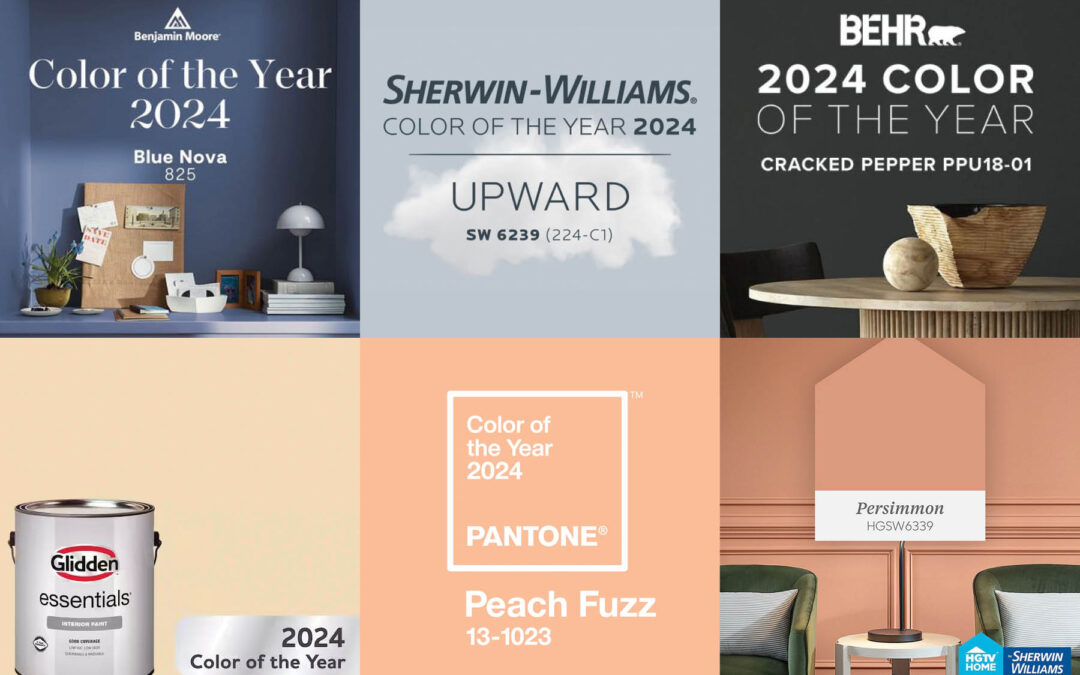
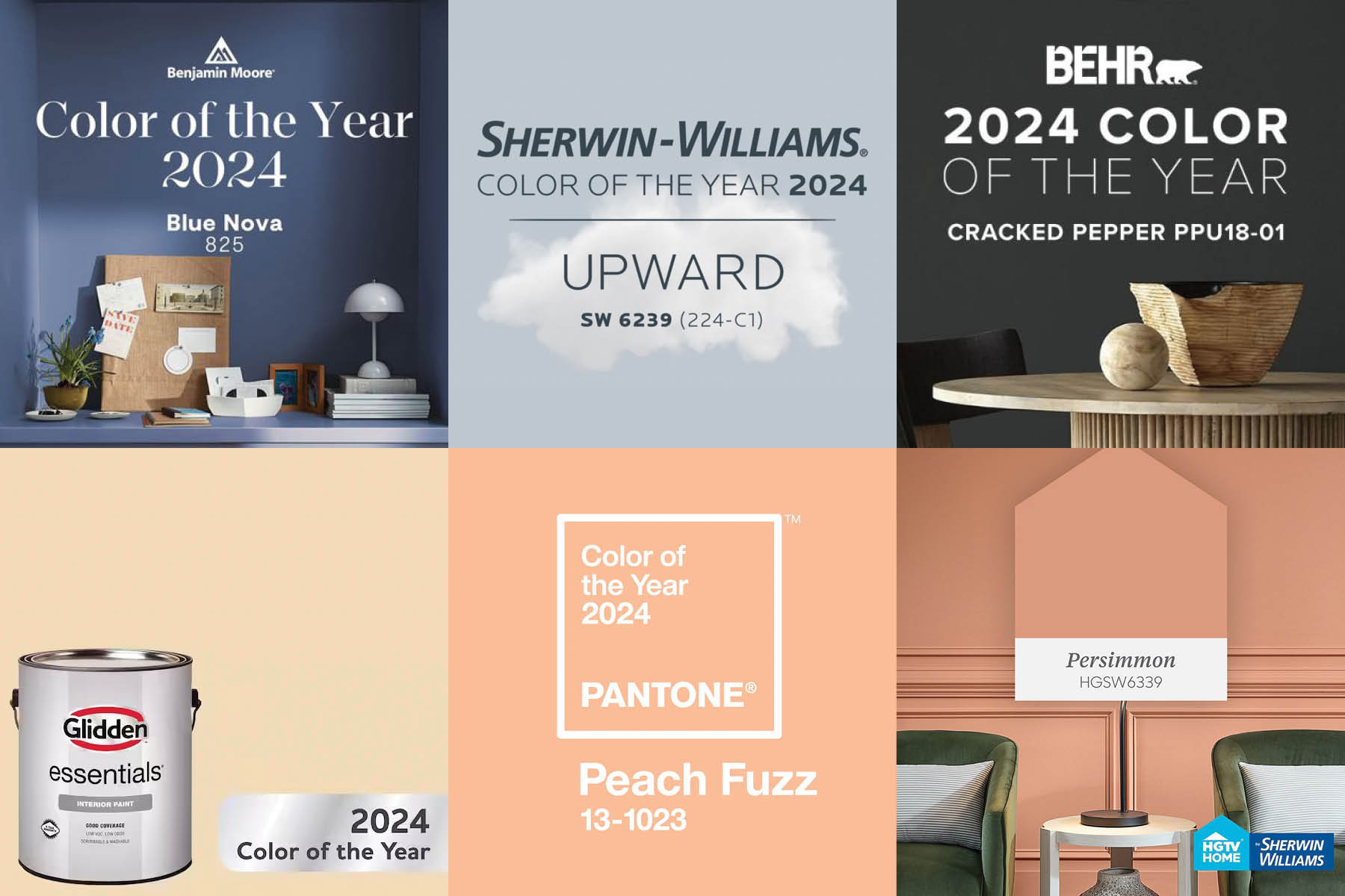
    This year, it is likely that residential and commercial designers can find a “color of the year” they like since there are several to choose from.  Here are a few of this year’s colors from our favorite companies that we regularly reference.

    • Pantone: Peach Fuzz 

    • Benjamin Moore: Blue Nova

    • Sherwin Williams: Upward

    • Glidden: Limitless

    • Behr: Cracked Pepper

    • HGTV Home by Sherwin Williams: Persimmon

    Emily VanSchmus and Caitlin Sole from Better Homes and Gardens describe all the 2024 picks as “Earthy, nature-inspired tones will be especially big, according to the color experts that release their predictions each fall. This year’s trend forecast features earth tones like terra-cotta and moody forestcore-inspired picks that include a rich deep green. We’re also seeing an influx of coastal-inspired blues, from light pastels to bold teals.”

    In October of 2023, Martha Stewart writer Madeline Buiano published an article. “Here’s Every Color of the Year (So Far) To Inspire your Home Painting Projects in 2024” This article features 11 paint companies and their choice for “color of the year”.

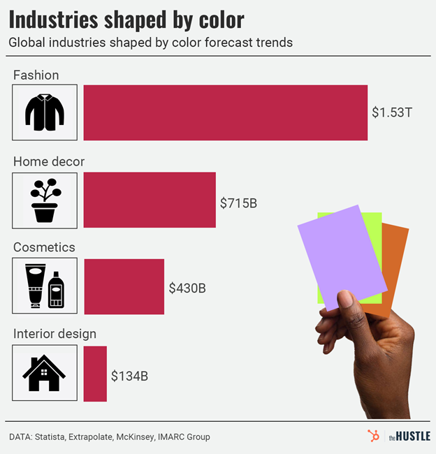
    What influences those experts in paint colors? There are collaborations between paint companies with partners in yarns (carpet and fabrics), laminates, and chemicals (solid surfaces and quartz) months and years before an announcement. Each of these collaboration groups has manufacturers’ representatives and cultural analysts on their team to influence paint companies because color “sells”.

      Royal View Senior Living Remodel Gains Developer’s & Residents’ Approval

      Royal View Senior Living Remodel Gains Developer’s & Residents’ Approval

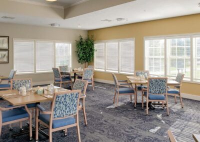
      Returning customer, Denis Johnson of Johnson Newhof & Associates, was so pleased with r.o.i. Design’s work at previous projects, they were confident that we could provide exceptional interior design and affordable public space furnishings for Royal View Assisted Living.

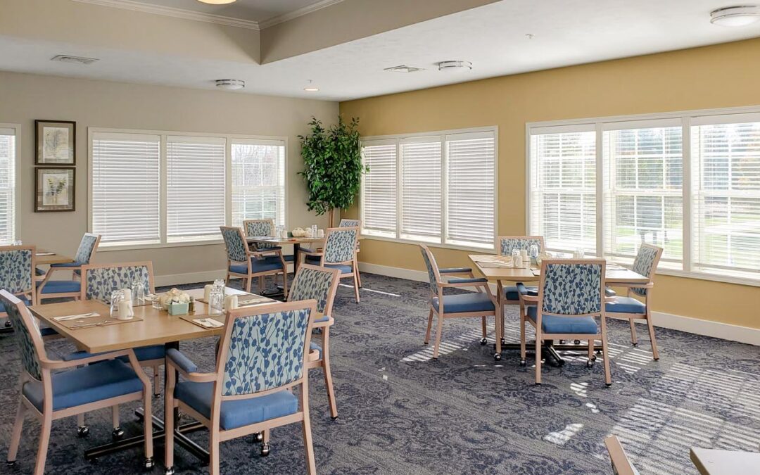
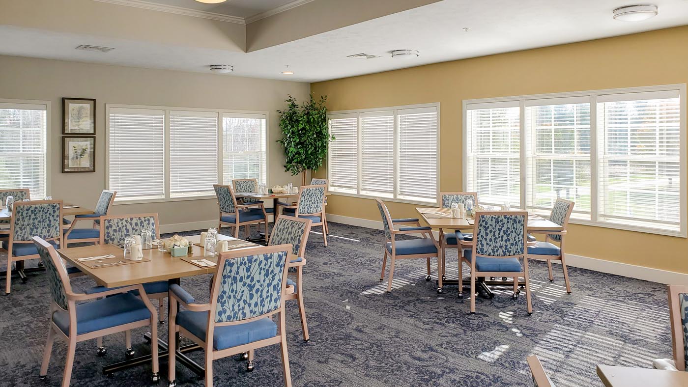
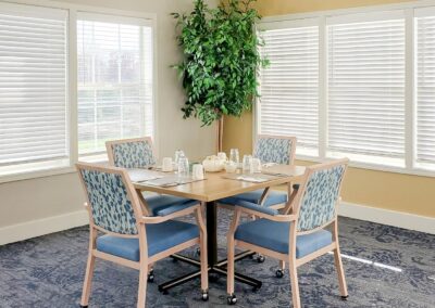
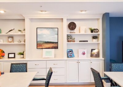
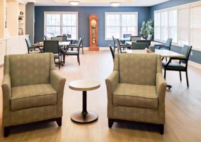
      Royal View is located just East of Canadian Lakes. This is an intimate property with a caring staff and sensitive amenities. The property had many features and finishes that remained. The remodel was focused on relocating medical equipment, improving staff spaces, and refreshing the residents’ dining room, beauty salon and common areas.

      For r.o.i. Design this meant furniture plans, lighting plans, finish and furniture selections, as well as selecting wall art and décor. We also provided light construction and carpentry services supporting the owner’s facility staff.

      Paying attention to our mantra: Budget, Brand and Beauty, we designed with budget in mind, kept the beach front theme of the property and the outcome was beautiful.

         For more of our Multifamily & Senior Living projects click here

        Stellar Smiles creates an “Out of this World” Pediatric Dental Office

        Stellar Smiles creates an “Out of this World” Pediatric Dental Office

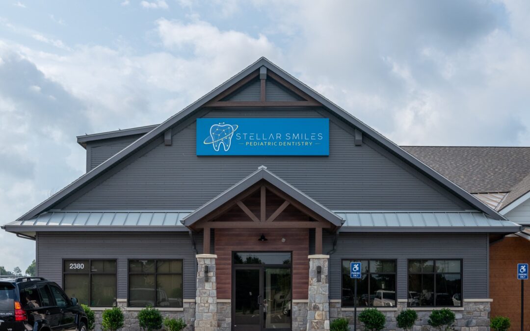
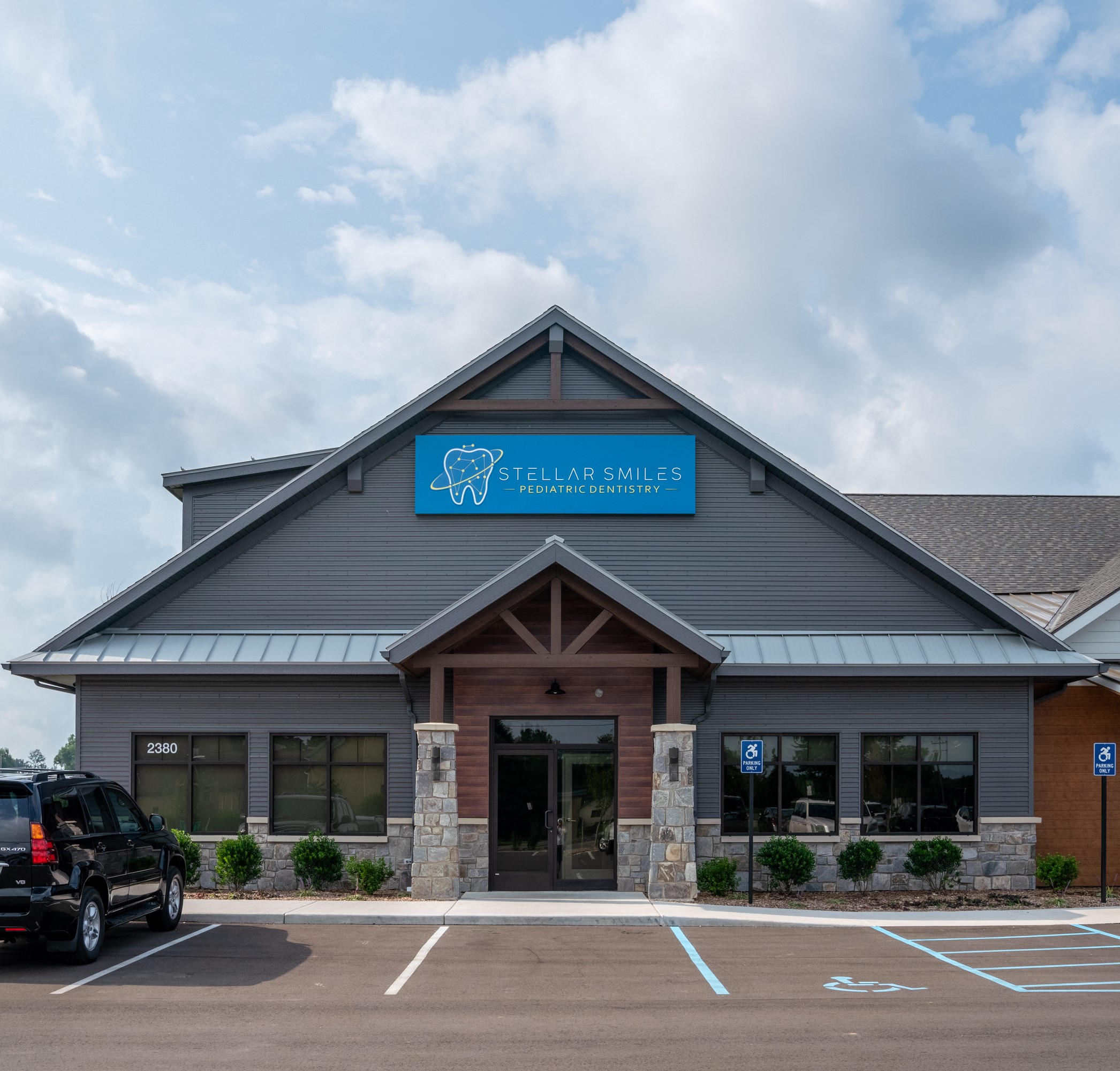
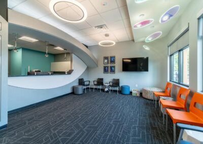
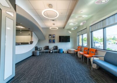
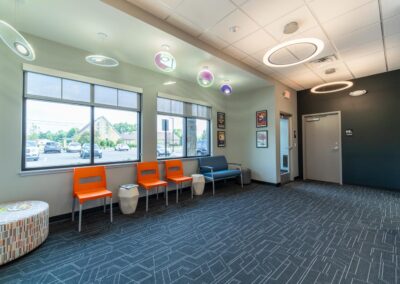
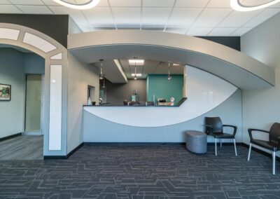
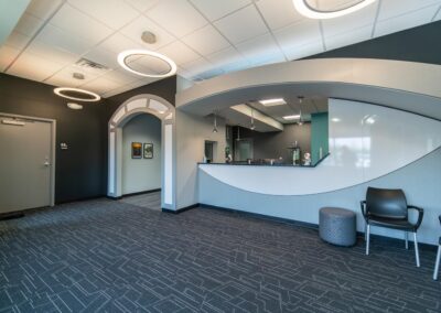
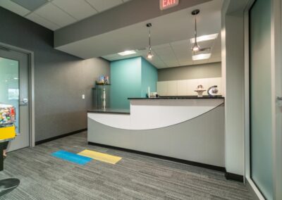
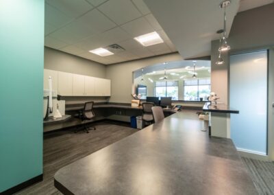
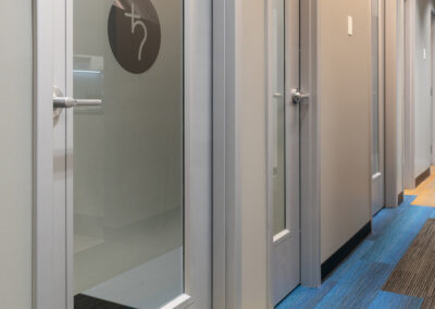
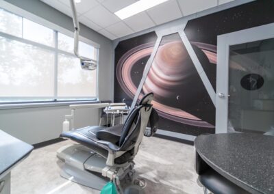
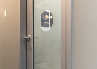
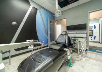
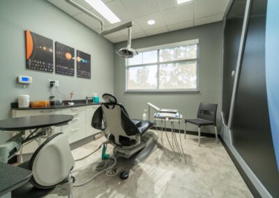
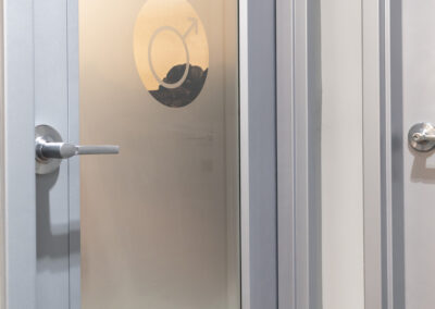
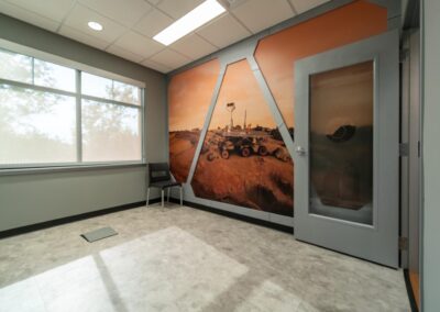
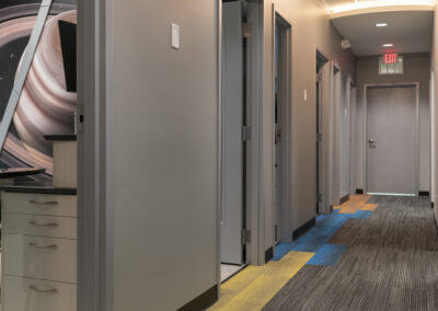
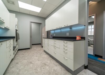
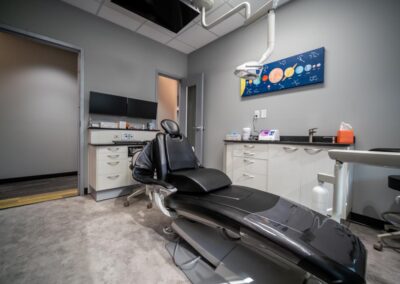
        Committed to the finest in dental care, Dr. Chris Powell married that with his passion for outer space to create a family-friendly office with surprising details. The front desk resembles a spaceship, the lobby features Saturn-inspired floating light fixtures, and the exam rooms could be space pods looking out into the galaxy with life-like murals of outer space. The walk to the exam rooms features color-coded carpet accents and entry signs using the symbols of planets.

        Dr. Chris worked with First Companies Inc. to lease space from Knapp Orthodontics and found an affordable way to open their doors to a welcoming neighborhood of families without compromising on design. As of November 2023, the second phase of the space is already in planning which will add open an exam bay and more space for staff.

        r.o.i. Design is grateful to be the designer for this unique dental office. We appreciate First Companies’ trust in our ability to work with Stellar Smilies and Knapp Orthodontics. Both offices are in the same building with entirely different looks.

          © Photos Courtesy of First Companies, Inc.

           For more of our dental and medical projects click here

            The Final Step of Design: Décor

            The Final Step of Design: Décor

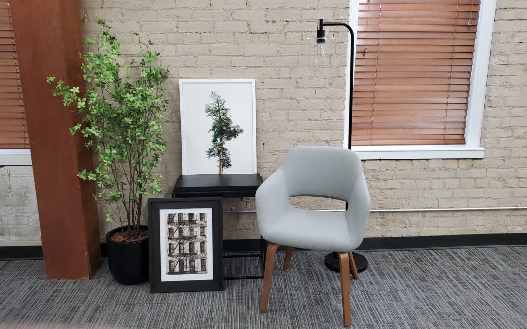
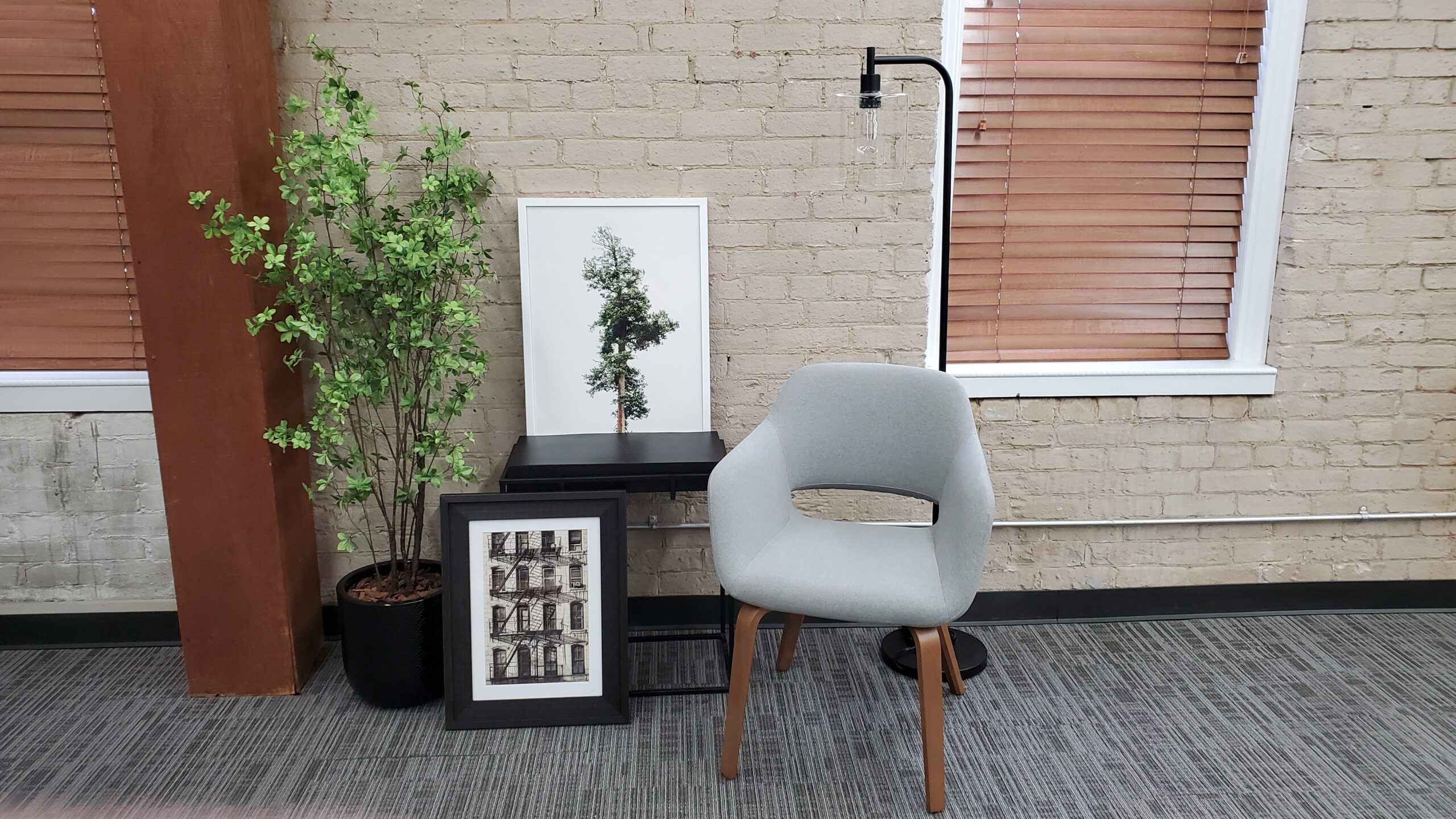
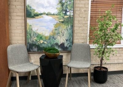
            The contractor is gone, the furniture is in place, and everyone has moved in, but the space doesn’t feel complete. r.o.i. Design is on hand to assist our clients in selecting wall décor, accessories, and window coverings – an important part of making a space feel complete.

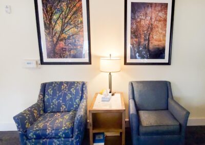
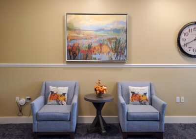
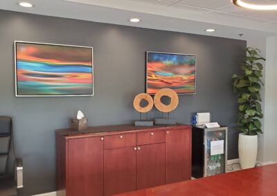
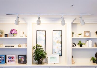
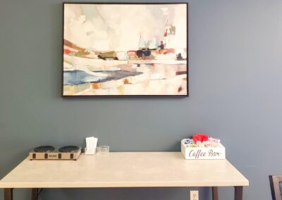
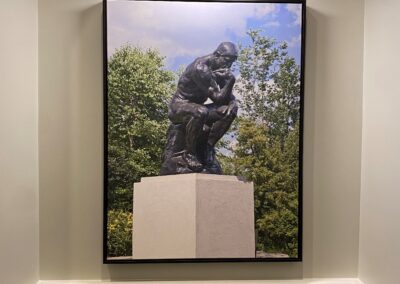
            Wall décor may be framed images that complement the design. That could mean realistic to abstract art, or company-related graphics. Other wall décor would include 3D sculptures, clocks, wall-mounted greenery, and more.

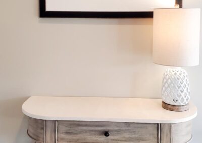
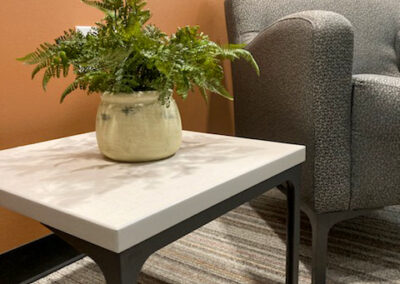
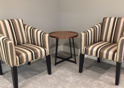
            Accessories may be occasional tables, tabletop silks and greenery, glass or ceramic vases and trays, floor lamps, baskets, books, sculptures, or decorative bowls.

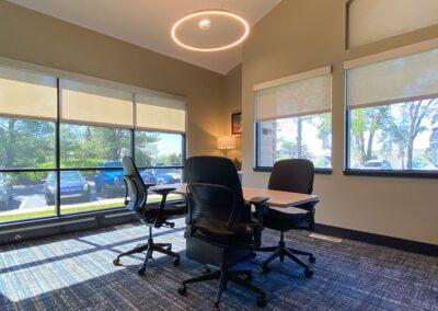
            Window coverings in commercial spaces are typically solar shades. If a more residential look is desired, we can also design decorative fabric side panels.

            Our process in supplying these items includes site visits, décor selections and presentations, budgets and proposals, and installation. Typically a short turnaround, we can upgrade your space in 4 to 8 weeks.

            We can also make suggestions for seasonal decorations that you can purchase and reuse for seasons to come.

            For more information, reach out to Ronda Geyer at r.o.i. Design, rondageyer@roidesign, or 616-272-5302.

              UFCW 951 Makes a Move.

              UFCW 951 Makes a Move.

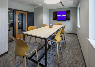
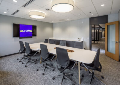
              Projects are significant for many reasons. For r.o.i. Design the United Food and Commercial Workers Local 951 (UFCW) project is very important to us because it spanned more than three years in a customer relationship that persevered through COVID-19 and ended in great success because of their focus, clarity, and determination. We appreciate being brought along to help. 

              Our relationship started with UFCW searching Google. Our website portfolio shows a variety of office looks, but more importantly, our client base resonated with them. We are business-focused not just design-focused. When we met with them, they were early in the process of selling their existing building and finding a new building that would meet the current needs of the union. We toured several buildings with them and landed on the former Steelcase Credit Union on 60th SE, which had been vacant for approximately 10 years. The site is prominent and visible, and the spaces could accommodate their staff. They needed to expand the space to allow for members’ space and the site allowed for that.  

              We invited our friends Dwayne Masselink and Trevor Howard from InterActive Studio  to join the team as architects. Along with r.o.i. Design, they developed space plans and layouts for the remodeling of the credit union. Because UFCW needed to use union contractors, we called on partners, KASCO Inc. They were able to check all boxes for union labor but more importantly, could protect UFCW from political issues in West Michigan by managing trades and the site. And while r.o.i. Design had many hands in the project, Marianne Martz, Ryan Bright, and Mary Witte “brought it home”. 

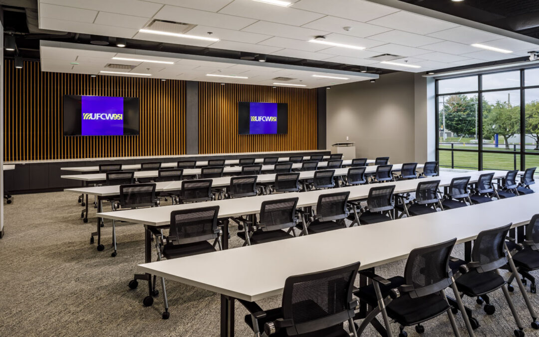
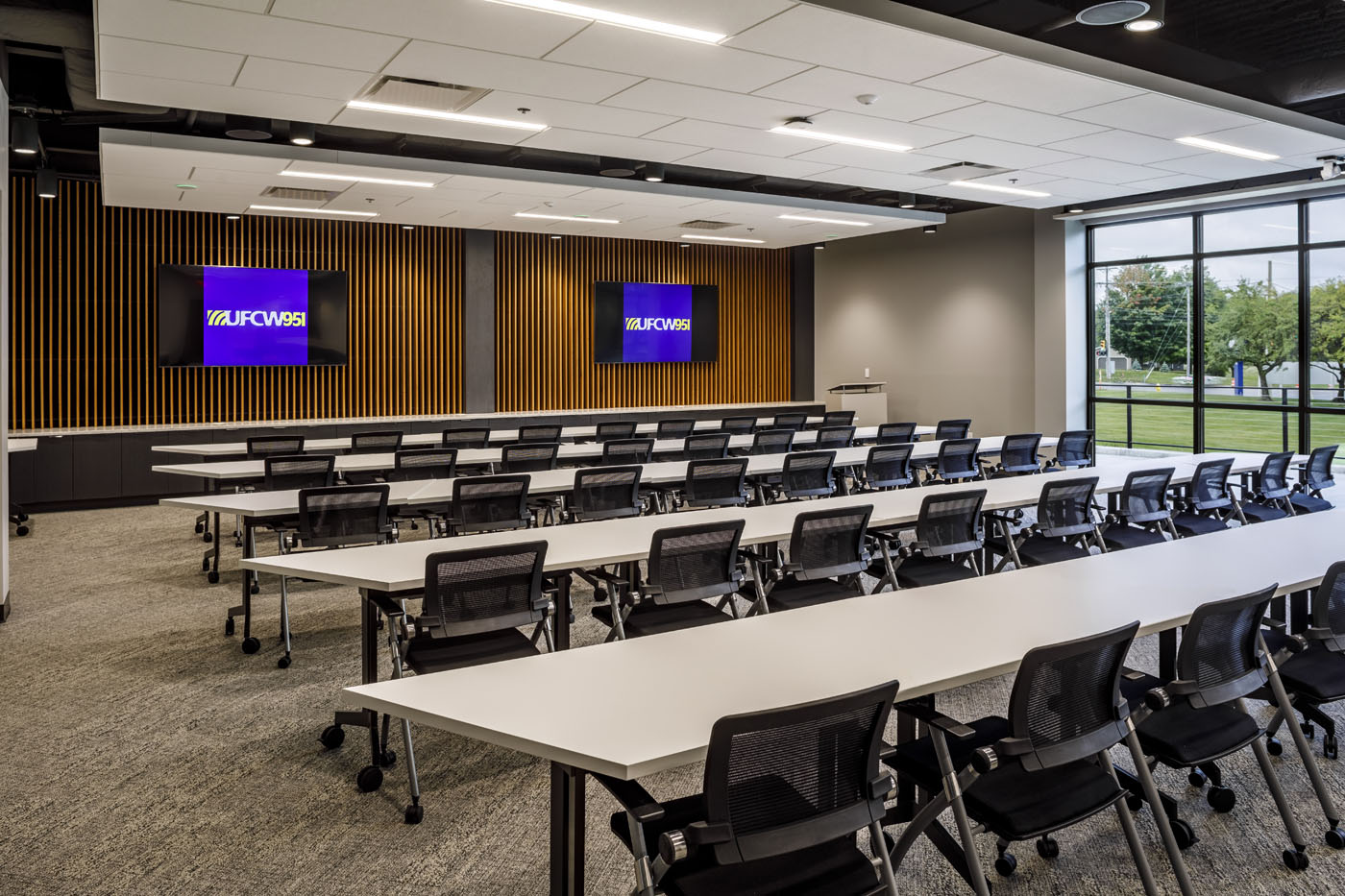
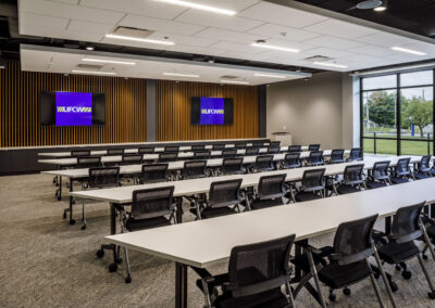
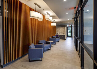
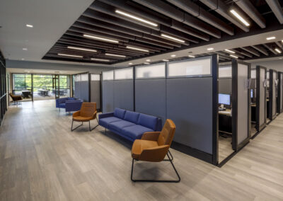
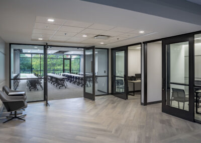
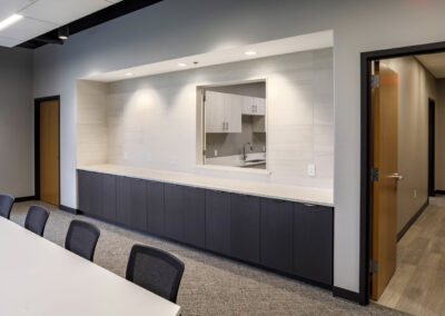
              UFCW shared with us the “looks” they liked. They researched our project history and gave us clear directions on details from our portfolio. These included wood slat millwork walls, storefront glass offices, private cubicles with tall walls and doors, simple lighting, and non-fussy details. The property brought some challenges, including converting a barrel ceiling to an open office ceiling. Opening the ceiling revealed mechanical ductwork that required bulkheads and some non-traditional acoustic solutions. 

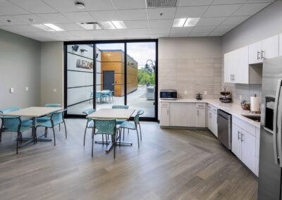
              The overall design theme is contemporary and architectural but not “over the top”. Color comes through furnishings provided by Interphase Interiors and West Michigan Office Interiors. Otherwise, the space is warmly neutral. 

              Congratulations to our friends at UFCW. Thank you, Marisa, Steve, and Ashley! 

              © All Photos Courtesy of InterActive Studio.

               For more of our corporate office projects click here