(616) 459-3539
How Design Impacts Hiring and Retention

How Design Impacts Hiring and Retention

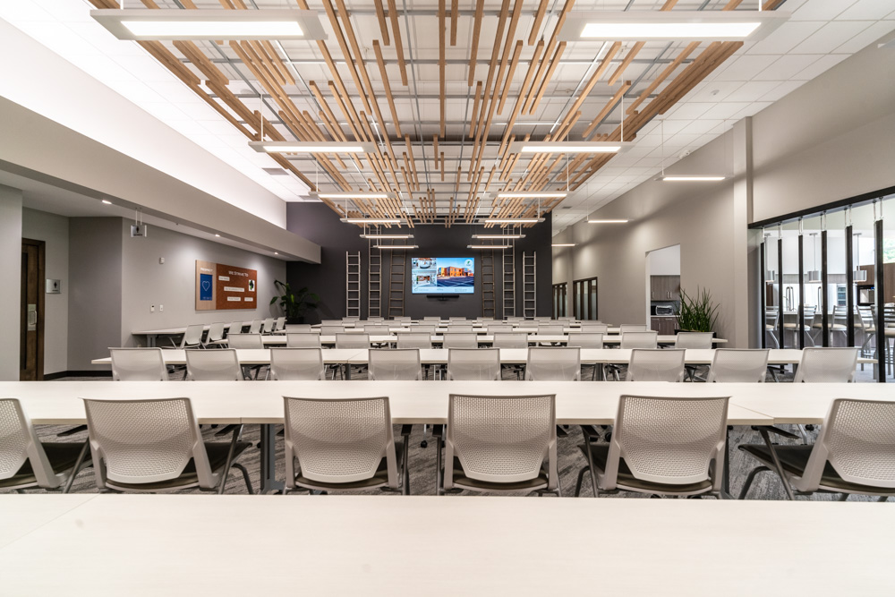
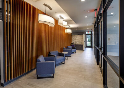
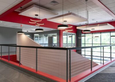
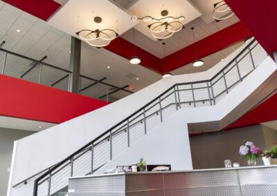
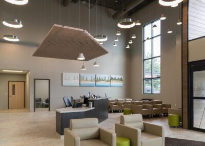
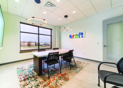
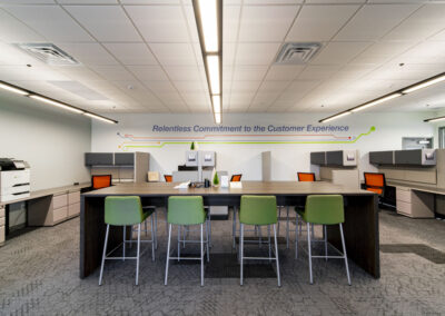
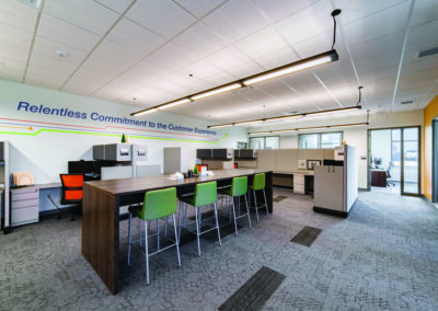
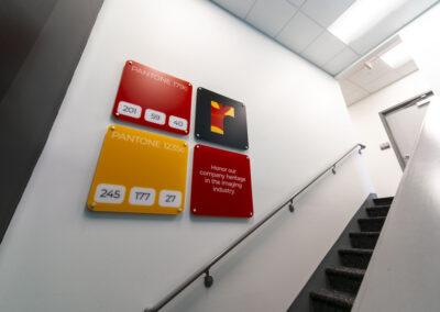
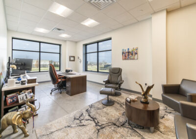
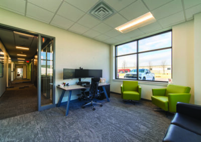
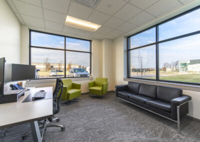
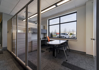
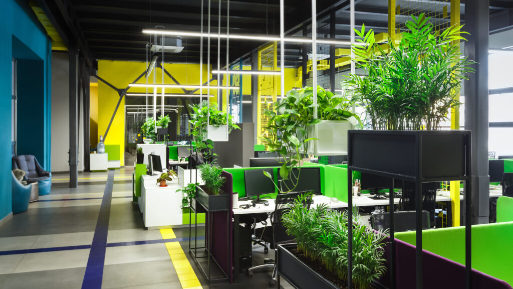
r.o.i. Design responded to a call from a mid-size manufacturer who asked, “Can you help us make our Core Values more prominent in our facility?” They thought it would help them during their interview process as well as engaging existing employees.

This group had just undergone an office remodel and while things were “fresh”, they felt they weren’t communicating their purpose to employees, future employees, and customers. “We want employees to know they are coming to work not just to make parts, but their actions and leadership’s actions are part of a larger mission. They are impacting the lives of our customers and creating positive change.”

This group wants everything about their space to reflect who they are, and they realize that it is more than words and posters. Making their “brand” important impacts more than the hiring and retaining of employees.

This notion is supported by business leaders, as cited in the article Importance of Interior Design to Grow your Business” written by Ideagram for LinkedIn.

“Design creates culture. Culture shapes values. Values determine the future.”  — Robert L. Peters. Interior design is an opportunity to reflect your brand identity. Your physical space should align with your company’s values and vision. (1.)

“Design is the last great competitive advantage.” — Seth Godin. A thoughtfully designed interior has the potential to enhance the overall customer experience and set you apart from the competition.

 “Design is not just what it looks like and feels like. Design is how it works.” — Steve Jobs. A well-designed interior can enhance the functionality of your space. Through thoughtful layout planning and efficient use of space, you can optimize workflow and improve productivity.

A master plan for branding design can be created thoughtfully and rolled out over time as budget and buy-in allow. For our mid-size manufacturer, the process had to start with leadership, making sure they were all on board to make communicating the brand a high priority. A priority worth the investment in design.

    © Photos Credit: Stewart Signs.

      Open Offices Bring Acoustic Issues

      Open Offices Bring Acoustic Issues

      With the onset of the open office and shared spaces comes great efficiency and improved collaboration, but also brings acoustic issues. 

      Acoustics are the science of sound control, addressing the reflection of noise between and around spaces. Very rudimentary sound waves act like a ping pong ball in a space, rebounding off hard surfaces. Ideal reverberation time, referred to as T60, signifies the time it takes for sound to fade by 60dB (decibels) within an enclosed space. The faster the fade, the better it is. r.o.i. Design approaches the issues of acoustics in most jobs where we consider absorbing, blocking, covering or diffusing sound.

      Absorb

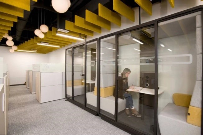
      The absorption coefficient of materials controls how much sound reverberates when they hit those materials—a higher coefficient means they absorb more sound. Therefore, absorptive objects reduce ambient noise. A favorite solution is one that also adds design are decorative baffles made from felt, wood, or fabric.  


      Block

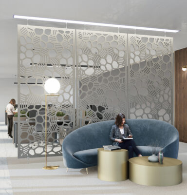
      The amount of sound blocked by a wall or other obstacle is called sound transmission loss—or attenuation. For example, screens, panels, and doors also help block sound from traveling between spaces. r.o.i. Design often adds partitions and window coverings to block sound. 

      Cover

      If you can’t absorb or block sound, you might have to cover it. Carpets and acoustical ceilings, as well as efficient HVAC systems, can conceal sound and lower background noise levels. A popular solution is sound masking technology, much like a sound system that is designed to create a consistent pitch to cover other sounds. 

      Diffuse

      In some environments, proper acoustics involve scattering sound uniformly throughout the space, in other words, diffusion. Too much absorption makes it difficult to transmit noise properly— for example, people may need to hear others talking over a long distance.  Back to the ping pong ball, imagine it trying to bound off a textured wood wall; the bound is diffused.  

      While r.o.i. Design is not acousticians, we are very capable of specifying products that absorb, cover, block, and diffuse. For projects that we added acoustic solutions, click on the links below: 

      Mailoux Dentistry

      Cedar Animal Hospital

      Notions Marketing

      Funky Buddah 

      Lifestream Church

        The Role of LED Lighting in Interior Design

        The Role of LED Lighting in Interior Design

        With the introduction of LED* lighting over ten years ago, the world of lighting and lighting design has exploded. Now, more than 80% of all lighting is LED. This is mostly because of their high efficiency and low power consumption as compared to traditional incandescent bulbs. LED doesn’t just allow for creative light fixtures but also expands the possibilities in lighting solutions and environmental control.

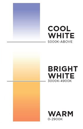
        One outcome is the ability to control the light’s color, imitating a variety of experiences. That color temperature is measured by Kelvins. Low numbers are warmer, and high numbers are cooler. To make something feel “homey” we use lower numbers. When we need a clinical effect, we use higher numbers. Have you ever heard someone say, “It feels like a hospital in here!”. That is likely because the space has a high Kelvin measurement when it needs to be lower. Interior designers can match the environment to the Kelvin for the most comfortable experience.

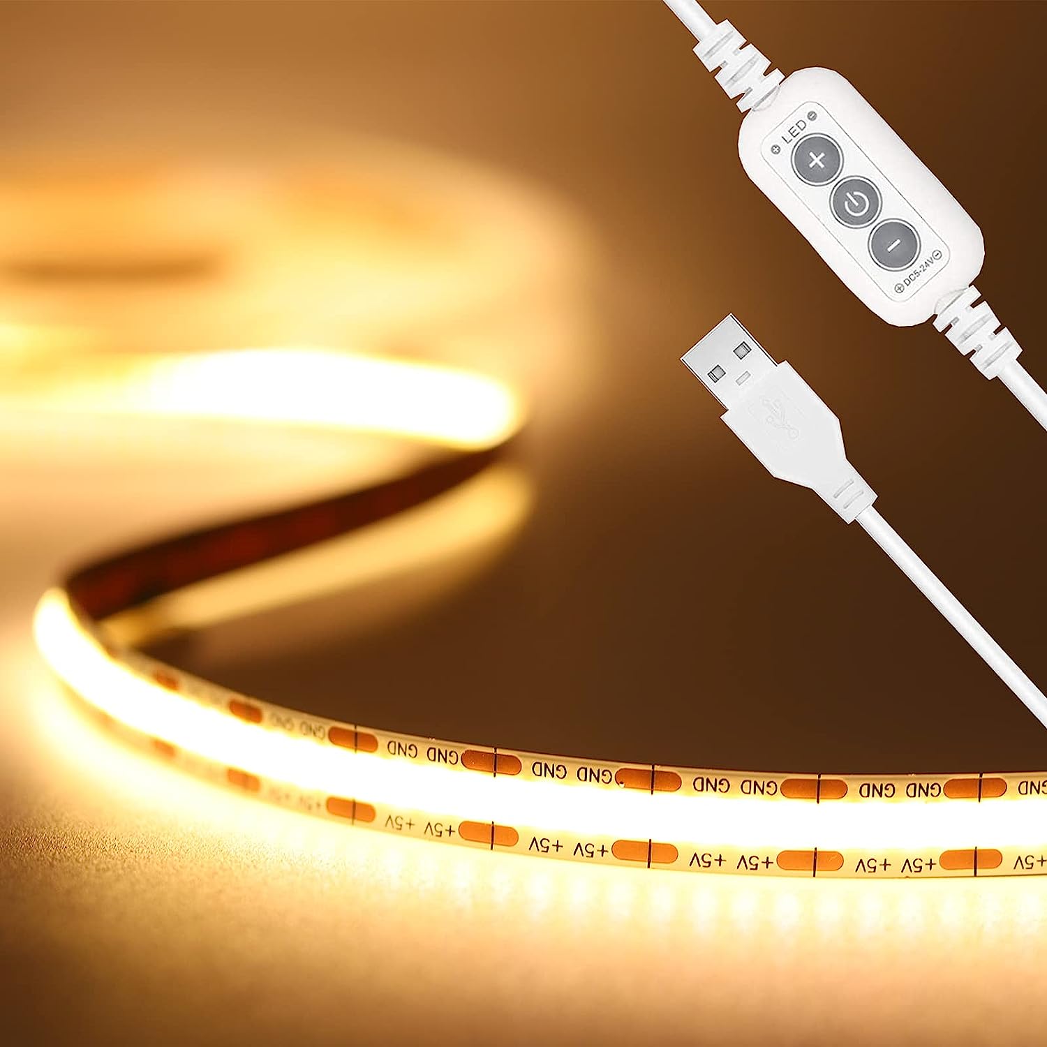
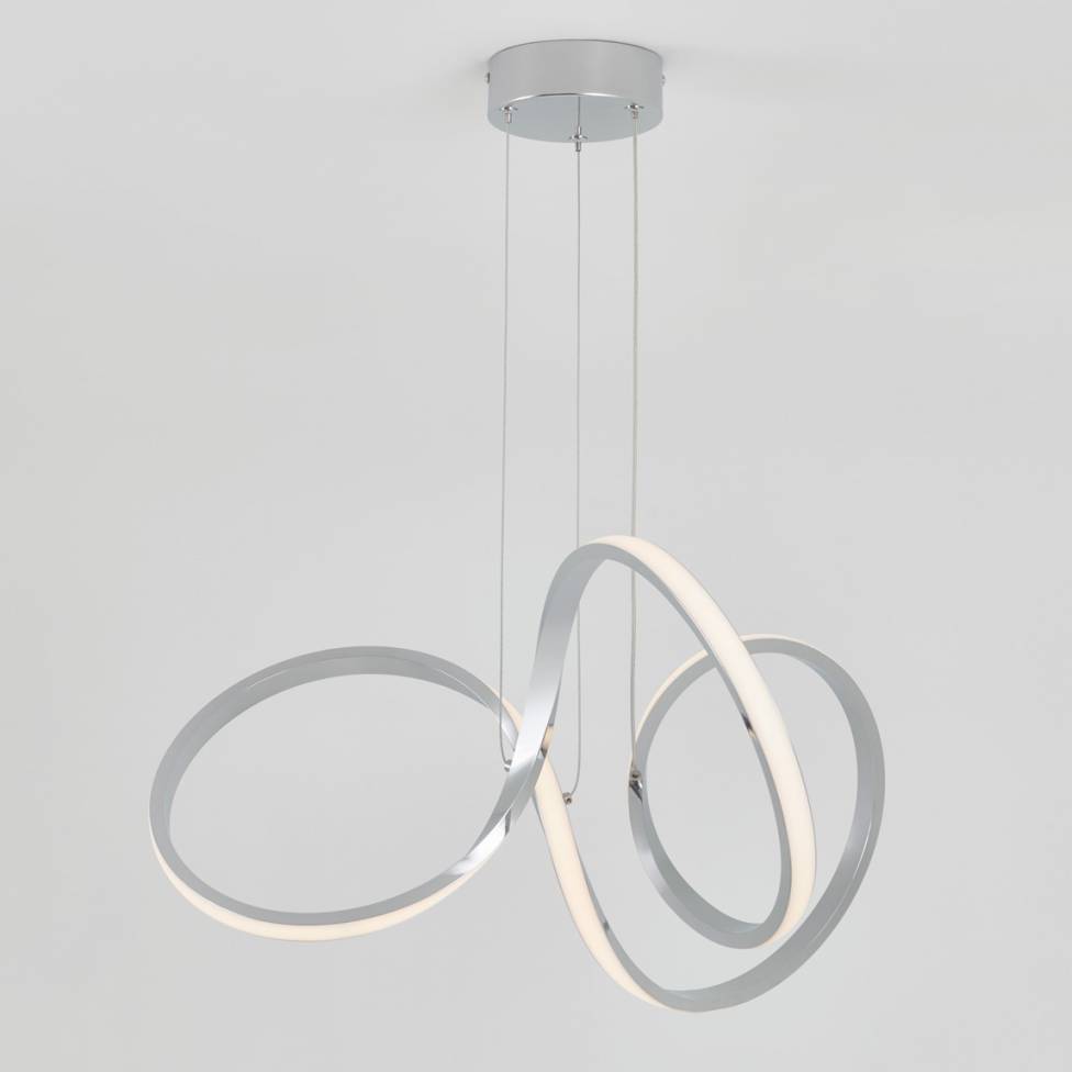
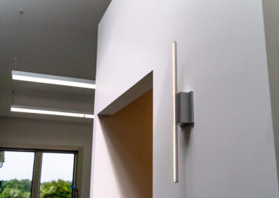
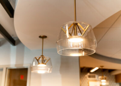
        Another aspect of LED lighting is size and flexibility. Since the lumens come from a chip, that small chip can be put into a variety of housings, making it easier to find lighting for every situation; whether its architectural, theatrical, or practical (see photos of examples).

        At r.o.i. Design, we work with lighting engineers to assist in specifying fixtures along with their colors and lumens. We used to use a measurement called foot-candles to describe the amount of light in a room. Now the industry uses lumens, specifically lux, which is one lumen per square meter. Not only is the color of light important, but its brightness is critical in creating comfort for the user.  

        Interior design is highly affected by light. All finishes look very different depending on the color of the light. We can be leaders in interior design by providing expertise in lighting design. 

        (*) LED stands for light emitting diode. LED lighting products produce light up to 90% more efficiently than incandescent light bulbs. How do they work?  An electrical current passes through a microchip, which illuminates the tiny light sources we call LED, and the result is visible light.

        Below are some examples of interesting LED lighting we have used on recent jobs. Click on the thumbnails to enlarge.

          Current Trends in Senior Living

          Current Trends in Senior Living

          There has been a change in how we think about senior living over the past 10 years. The aging baby boomer generation is influencing this change. It’s predicted that in the next several years there will be more people over 65 than children. As the baby boomers age, more and more are looking to make the move to a senior living community. This group of people is more active than in past generations and holds greater expectations of their living experience.  Because they are planning ahead, the process of selecting their retirement community is more well thought out and thorough. Research has shown that up to 5 communities will be visited before making the final decision. Their new home must check all the boxes. Updated furniture and finishes can ensure a good first impression is made and boost the marketability of any community, whether it’s a new construction or an established facility.

          The following should be considered when designing a senior living community:  

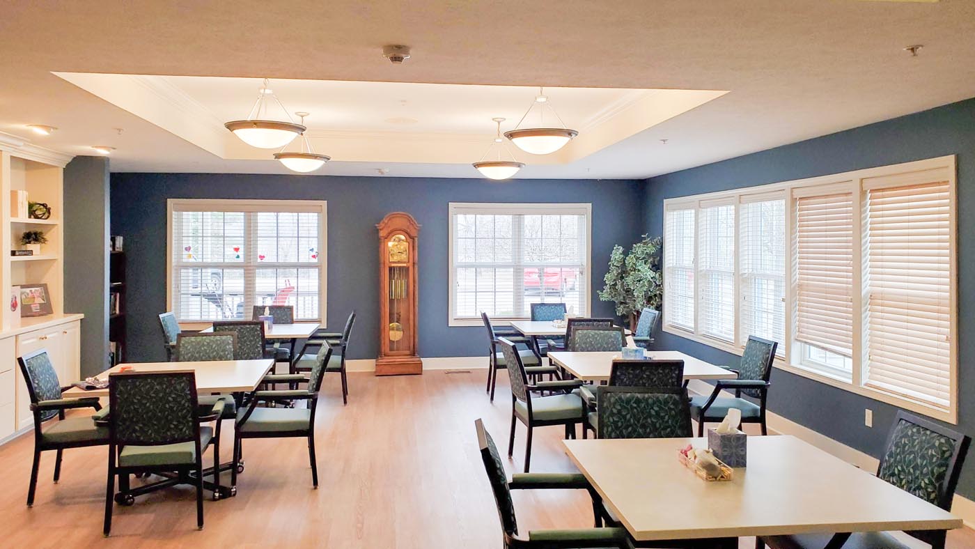
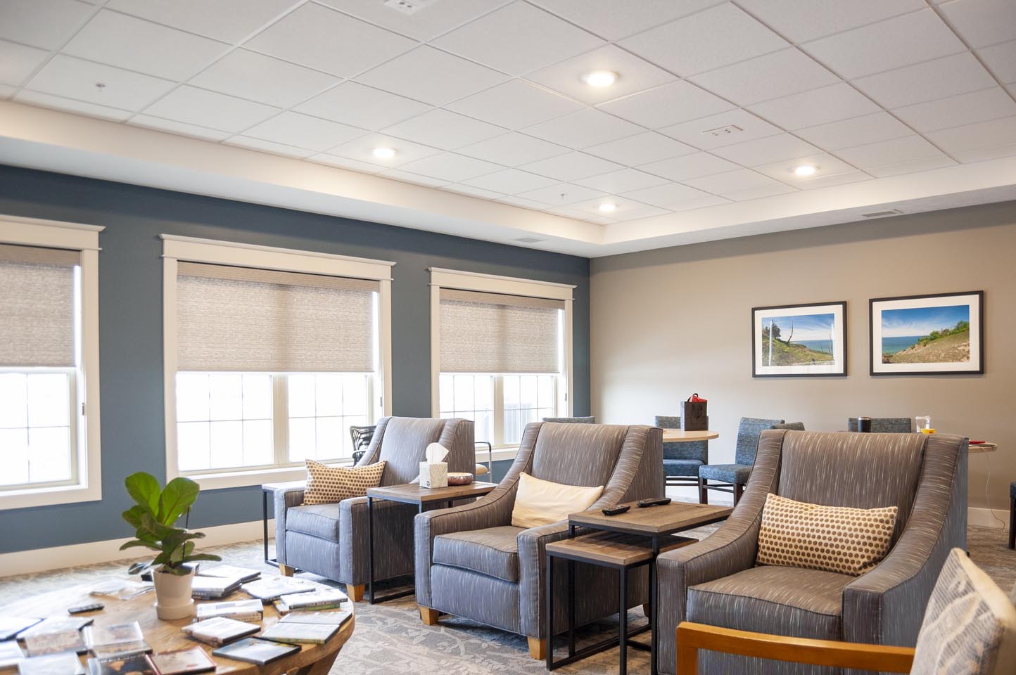
          • Finishes should look like home, incorporating residential-type finishes with senior living durability. Vibrant, fresh, approachable spaces that bring people together and foster a sense of community. 
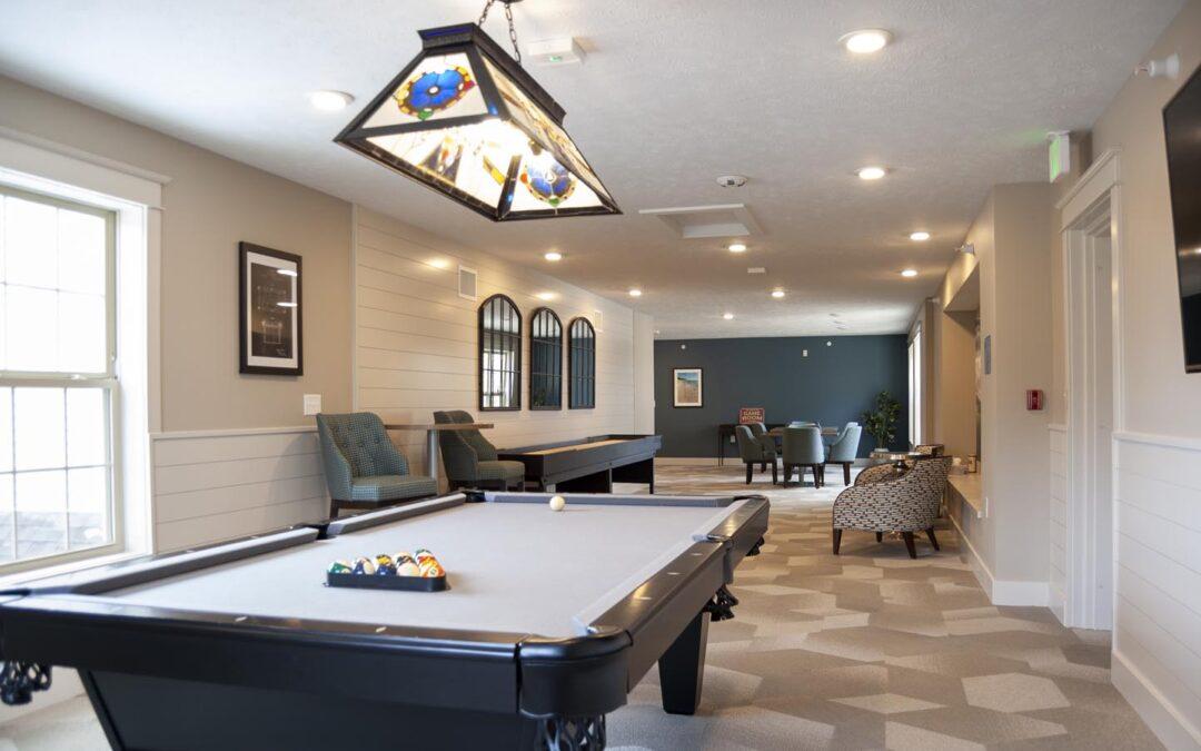
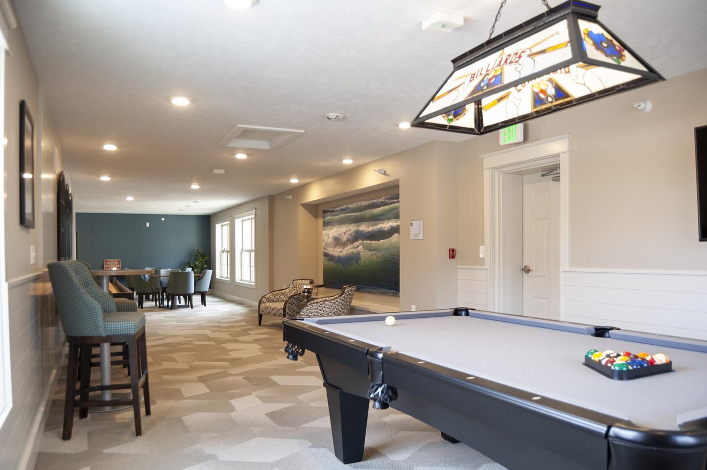
          • Flexible gathering areas that draw residents from their rooms and can accommodate larger groups when necessary. Spots for crafts, games, and other activities that promote socialization are amenities today’s seniors are looking for. A sense of community ranks highly with today’s seniors. Chairs that can stack and tables for crafts and puzzles that fold for storage enhance the flexibility and function.  
          • Connection to the outdoors. Natural light, plants, and large-scale artwork that depicts views of nature foster that important connection with nature for residents who aren’t able to get out as easily. 
          • Wellness-focused spaces promoting engagement and activity.   
          • The formal dining room is being revamped to add flexibility, better serving the needs of the residents. A more modern dining space provides a place to gather with friends for a cup of coffee or a casual chat. This area has become the social hub, and those social connections are crucial to maintaining cognitive function and overall well-being.  
          • Staff attraction and retention is an important consideration as well. Providing a comfortable place for staff to work, and as a recharge, should be planned for. 

          Have a project in mind? We would love to hear about it! r.o.i. Design provides full-service design and FF&E services. We have access to numerous resources that can provide beautiful and functional furnishings for all budgets. Additionally, we will consult with you on space planning and allocation to meet the changing needs of today’s senior living residents. We will also help balance input from ownership, management, and staff when designing the space and furnishings.

          Contact us to discuss ways we can help.  

          Mailloux Dentistry: A New Location for Smiles to Begin 

          Mailloux Dentistry: A New Location for Smiles to Begin 

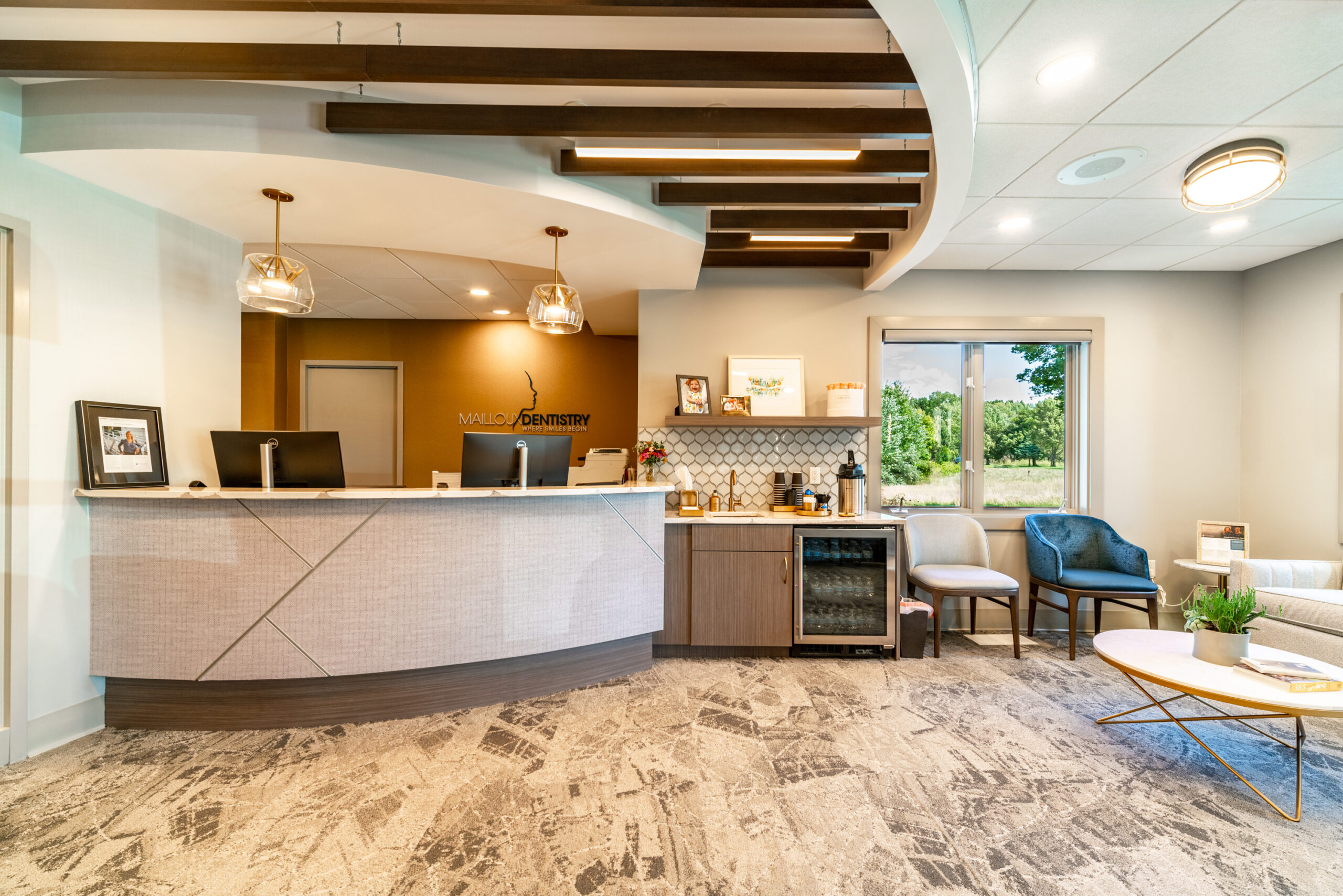
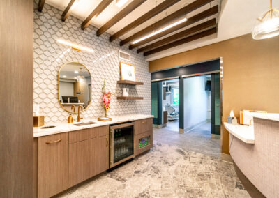
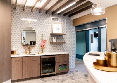
          At first glance, Mailloux Dentistry could be mistaken for a spa. It’s certainly a place where beauty is valued.

          Dr. Brittany Mailloux and partner Dr. Caitlynn Haas are licensed general practitioners in dentistry and offer a full menu of dental services. What sets them apart is their attention to the beauty and aesthetics of the smile. They are a family dentistry where adult and child patients receive the same attention.

          r.o.i. Design met Dr. Mailloux along with her husband, Dr. Kevin Kross, who owns Blueprint Dental. They are not partners in dentistry but did decide to purchase the building that they now share. This allowed them to have a state-of-the-art lab that they both use. And while they are married, the two practices look completely different.

          We spent hours at Brittany and Kevin’s home where we met their children (as well as dogs, ponies, and horses) to make decisions. We were influenced by their hospitality and kindness in the design of Mailloux Dentistry.

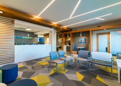
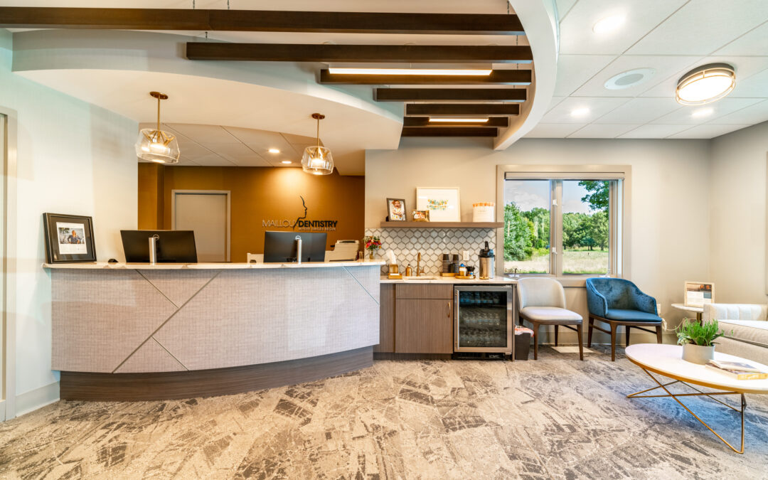
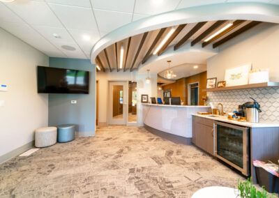
          The lobby of the space has many curves. The reception desk, bulkheads, ceiling accents, accent tiles, and many more elements all incorporate curvilinear shapes. The intention was to make their patients feel welcome and relaxed. Inside the reception bulkhead are wood baffles that enhance the coziness of the space.

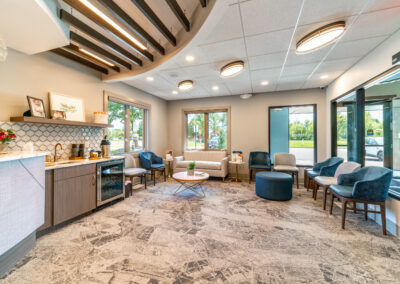
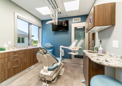
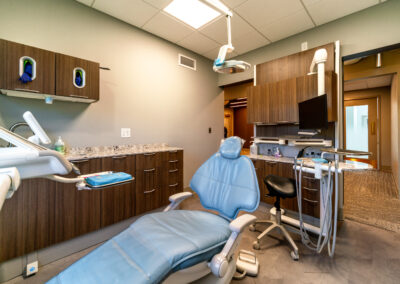
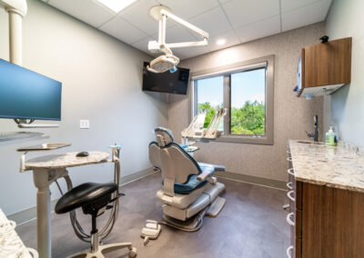
          The overall color scheme includes gold, warm white, pink, and gray. The elegance of the lobby chandeliers and the waiting room furniture are paired with a carpet that looks handmade. The vinyl flooring (LVT) in the exam rooms has accents of gold in a light parquet wood floor look.

          On this project, we were honored to also design their new logo. We came up with numerous concepts and refined them down to the final product. We also provided and branding standards document so they could use their new logo to its full potential.

          The lobby and reception furniture were also provided by r.o.i. Design. It is always wonderful to be able to finish a design we start down to these details.

          © Photos Courtesy of First Companies, Inc.

           For more of our dental and medical projects click here


            Kraft Business Systems: New Office, New Look.

            Kraft Business Systems: New Office, New Look.

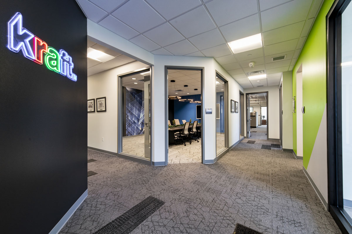
            When First Companies Inc. introduced r.o.i. Design to Jeff Cousins from Kraft Business Systems he said, “I don’t know design, I just want ‘cool’”. Jeff was very interested in every aspect of the new office. Dixon Architecture had been introduced a little earlier, and Ken Dixon had the space laid out and adjusted as needed to meet Jeff’s understanding of changing needs.

            Early in the interior design consultancy, we noticed and complimented Kraft Business Systems (KBS) on their logo. Not only is it good-looking, but it has been developed based on business values and images that support those values.

            KBS sells printers, but more importantly, printing solutions and technical innovations. The business is built on solving problems for their customers, and r.o.i. Design took that approach as they made interior design decisions.

            Each of the four key values were featured in their own areas:

            • “Honor our company heritage in the print and printer industry.” (Orange)

            • “Committed to continued innovation and I.T. for the paperless office.” (Green)
            • “Focused on our clients and committed to interpersonal communication.” (Light Blue)
            • “Look to the future with continued aspirations for creativity and growth.” (Dark Blue)

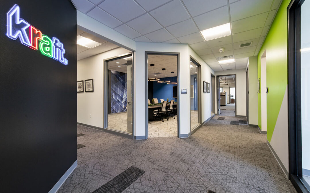
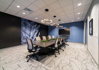
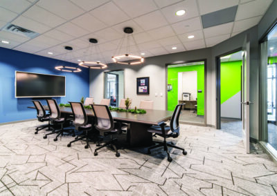
            The colors of the five values are very bold, but the overall palette is white, grey, and black, creating a neutral background for the reds, oranges, yellows, blues, and greens. Not only did r.o.i. Design color block some of the walls in logo colors, we also created custom graphics for large-scale wall covering whose imagery is very “techy”.

            As the design was coming to the finish line, Jeff commented, “This is cool, and I didn’t think I liked black, but I do!” The design was so well received that KBS borrowed finishes and accents for their other Michigan offices. That’s the best kind of compliment!

            © Photos Courtesy of First Companies, Inc.

             For more of our dental and medical projects click here