(616) 459-3539
Current Trends in Senior Living
Current Trends in Senior Living

There has been a change in how we think about senior living over the past 10 years. The aging baby boomer generation is influencing this change. It’s predicted that in the next several years there will be more people over 65 than children. As the baby boomers age, more and more are looking to make the move to a senior living community. This group of people is more active than in past generations and holds greater expectations of their living experience.  Because they are planning ahead, the process of selecting their retirement community is more well thought out and thorough. Research has shown that up to 5 communities will be visited before making the final decision. Their new home must check all the boxes. Updated furniture and finishes can ensure a good first impression is made and boost the marketability of any community, whether it’s a new construction or an established facility.
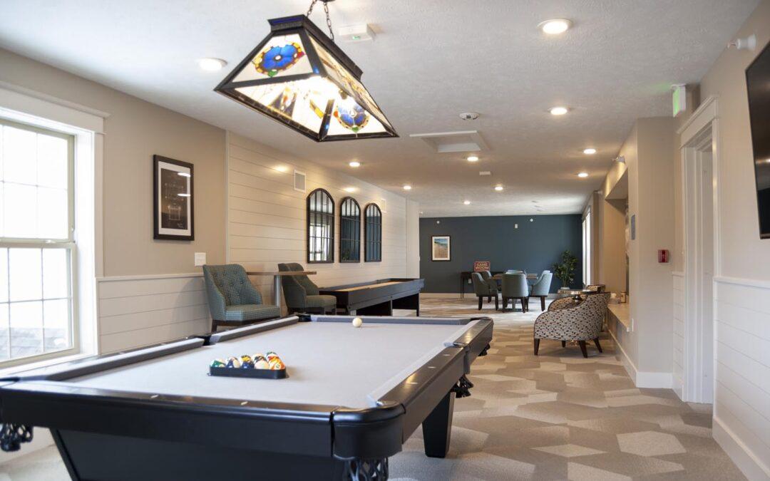
The following should be considered when designing a senior living community:  

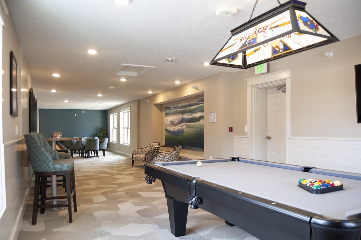
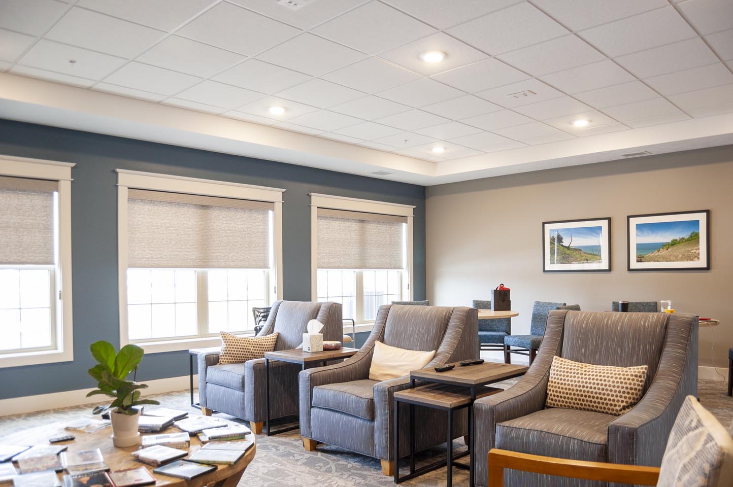
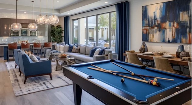
  • Finishes should look like home, incorporating residential-type finishes with senior living durability. Vibrant, fresh, approachable spaces that bring people together and foster a sense of community. 
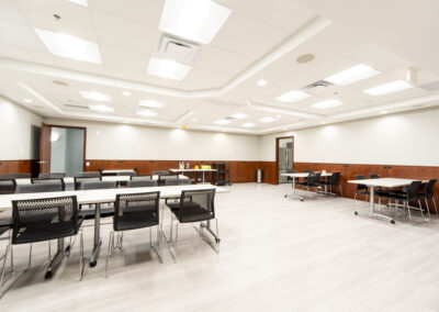
  • Flexible gathering areas that draw residents from their rooms and can accommodate larger groups when necessary. Spots for crafts, games, and other activities that promote socialization are amenities today’s seniors are looking for. A sense of community ranks highly with today’s seniors. Chairs that can stack and tables for crafts and puzzles that fold for storage enhance the flexibility and function.  
  • Connection to the outdoors. Natural light, plants, and large-scale artwork that depicts views of nature foster that important connection with nature for residents who aren’t able to get out as easily. 
  • Wellness-focused spaces promoting engagement and activity.   
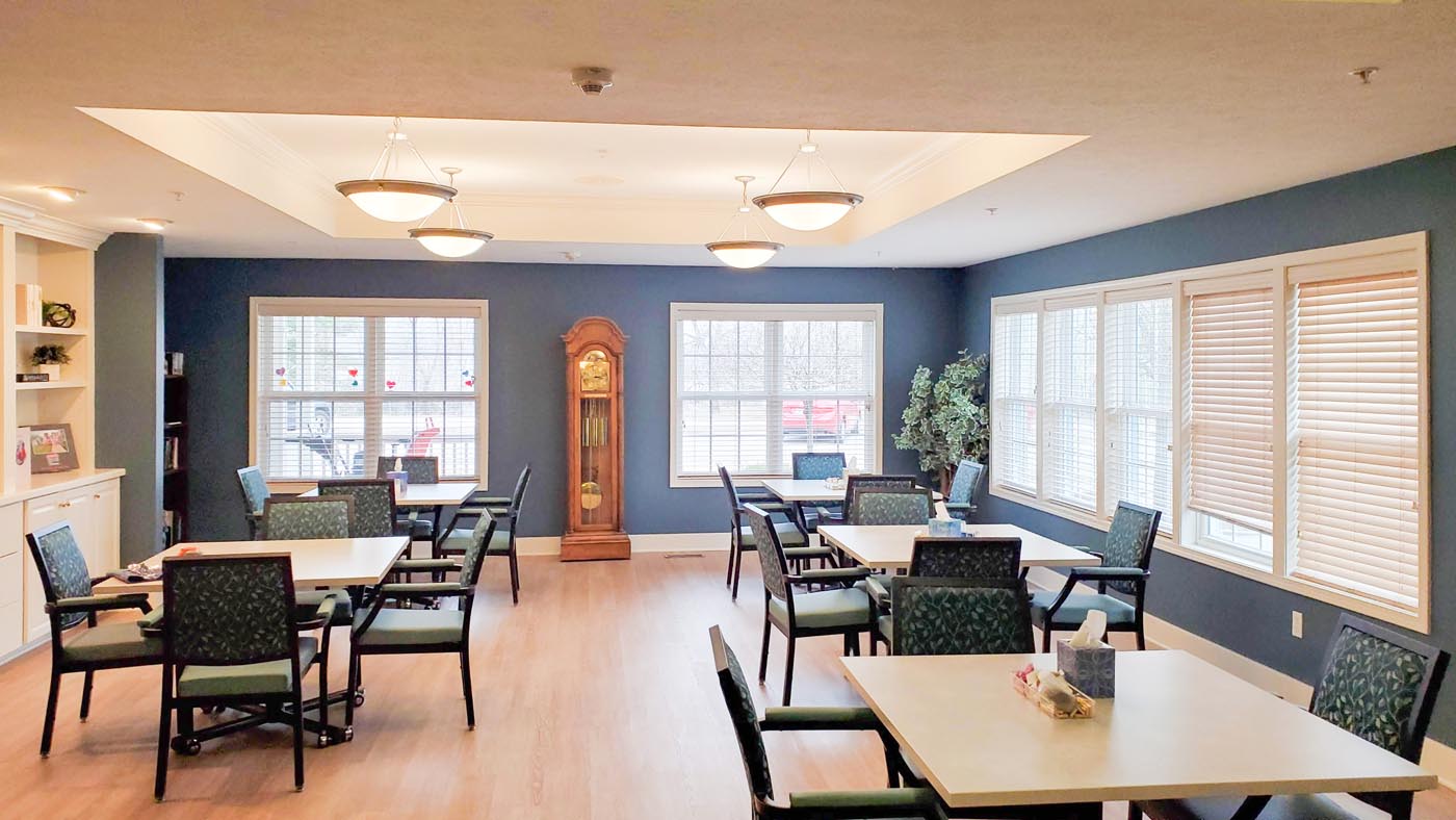
  • The formal dining room is being revamped to add flexibility, better serving the needs of the residents. A more modern dining space provides a place to gather with friends for a cup of coffee or a casual chat. This area has become the social hub, and those social connections are crucial to maintaining cognitive function and overall well-being.  
  • Staff attraction and retention is an important consideration as well. Providing a comfortable place for staff to work, and as a recharge, should be planned for. 

Have a project in mind? We would love to hear about it! r.o.i. Design provides full-service design and FF&E services. We have access to numerous resources that can provide beautiful and functional furnishings for all budgets. Additionally, we will consult with you on space planning and allocation to meet the changing needs of today’s senior living residents. We will also help balance input from ownership, management, and staff when designing the space and furnishings.

Contact us to discuss ways we can help.  
Mailloux Dentistry: A New Location for Smiles to Begin 

Mailloux Dentistry: A New Location for Smiles to Begin 

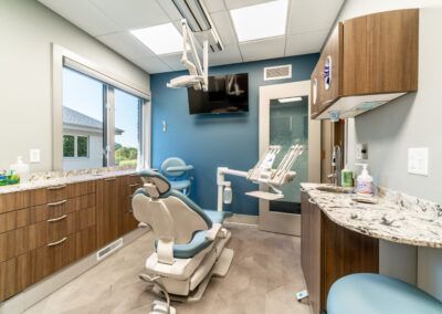
At first glance, Mailloux Dentistry could be mistaken for a spa. It’s certainly a place where beauty is valued.
Dr. Brittany Mailloux and partner Dr. Caitlynn Haas are licensed general practitioners in dentistry and offer a full menu of dental services. What sets them apart is their attention to the beauty and aesthetics of the smile. They are a family dentistry where adult and child patients receive the same attention.

r.o.i. Design met Dr. Mailloux along with her husband, Dr. Kevin Kross, who owns Blueprint Dental. They are not partners in dentistry but did decide to purchase the building that they now share. This allowed them to have a state-of-the-art lab that they both use. And while they are married, the two practices look completely different.

We spent hours at Brittany and Kevin’s home where we met their children (as well as dogs, ponies, and horses) to make decisions. We were influenced by their hospitality and kindness in the design of Mailloux Dentistry.

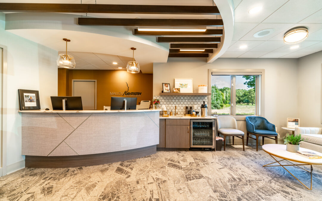
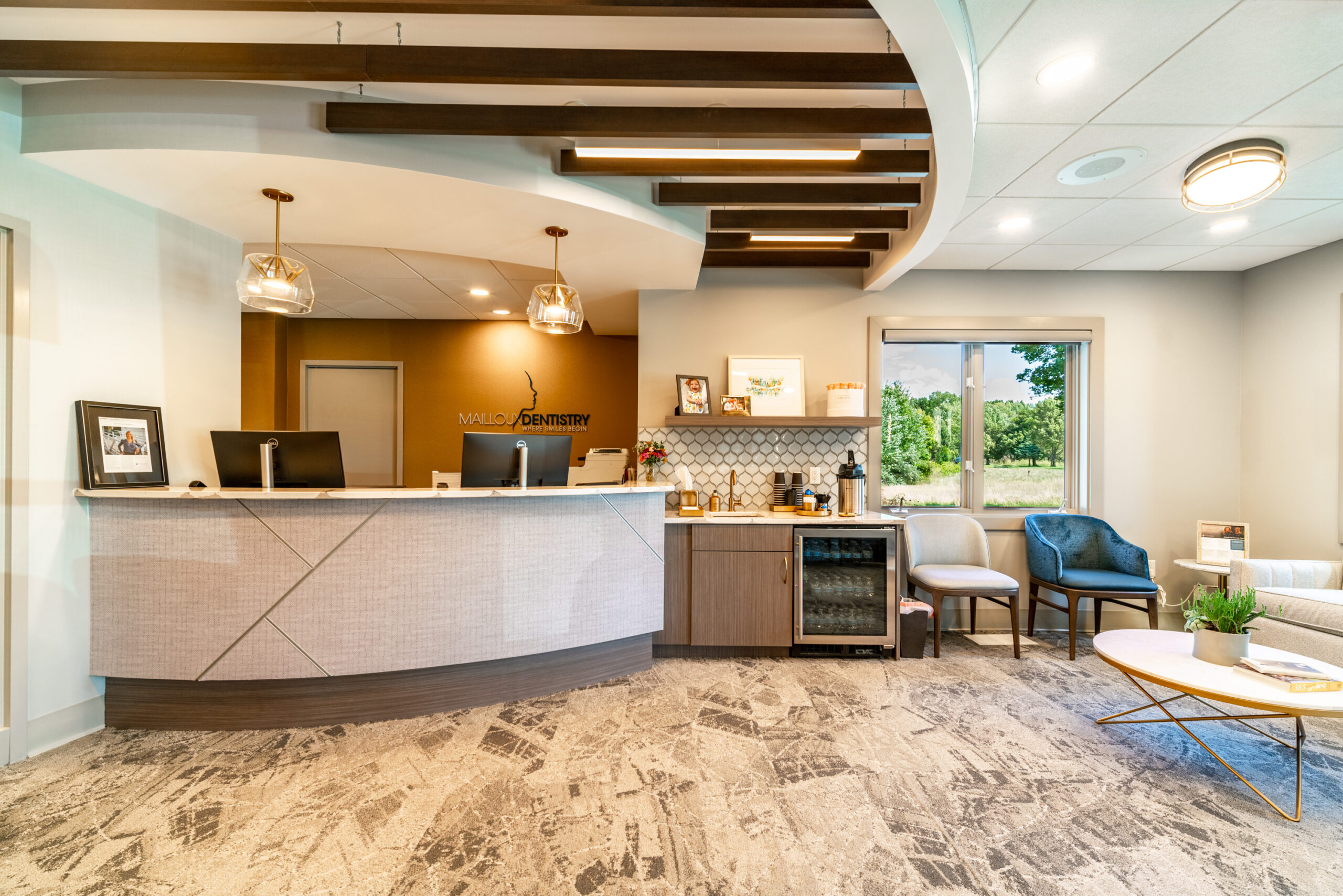
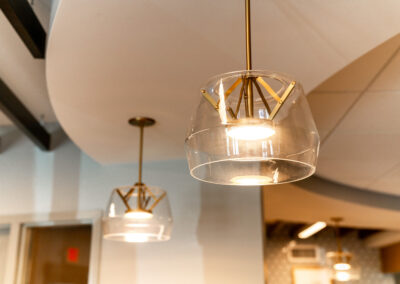
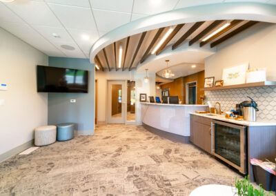
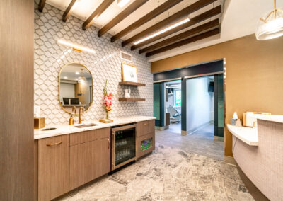
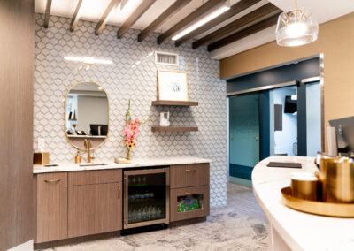
The lobby of the space has many curves. The reception desk, bulkheads, ceiling accents, accent tiles, and many more elements all incorporate curvilinear shapes. The intention was to make their patients feel welcome and relaxed. Inside the reception bulkhead are wood baffles that enhance the coziness of the space.

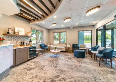
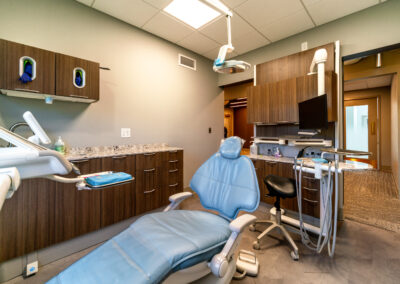
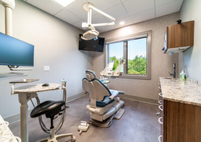
The overall color scheme includes gold, warm white, pink, and gray. The elegance of the lobby chandeliers and the waiting room furniture are paired with a carpet that looks handmade. The vinyl flooring (LVT) in the exam rooms has accents of gold in a light parquet wood floor look.

On this project, we were honored to also design their new logo. We came up with numerous concepts and refined them down to the final product. We also provided and branding standards document so they could use their new logo to its full potential.

The lobby and reception furniture were also provided by r.o.i. Design. It is always wonderful to be able to finish a design we start down to these details.

© Photos Courtesy of First Companies, Inc.

 For more of our dental and medical projects click here


    Kent County Office of the Defender Makes an Important Move

    Kent County Office of the Defender Makes an Important Move

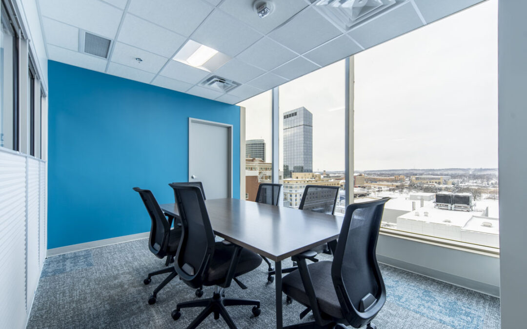
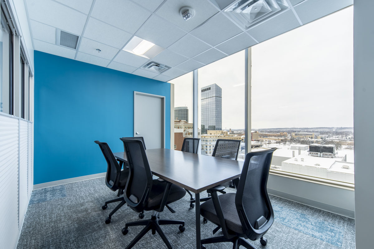
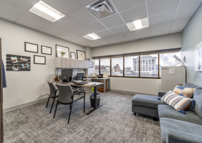
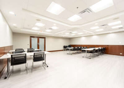
    Kent County Office of the Defender (KCOD) has been working with r.o.i. Design for over five years.  KCOD was funded and mandated by the State of Michigan to increase its capacity to serve more people.  Initially, we were trying to squeeze more people and efficiency into their small office. But the demand for space was growing, and it was clear a new and larger office was needed. The new office had to accommodate an increasing staff, be walkable to the courthouses downtown, and be connected to public transportation.  They also needed to maintain as much of the integrity of the space as possible (historical building, loyal realtors, and use type). 

    When KCOD leased the 8th floor at 850 Monroe, it had previously housed a law firm but was vacant for 10 years. 

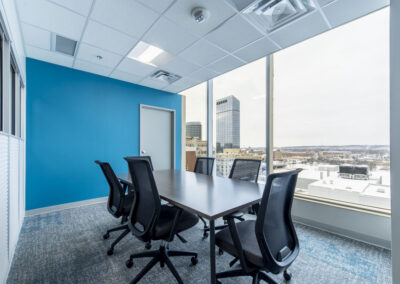
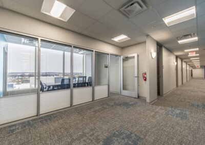
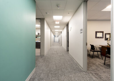
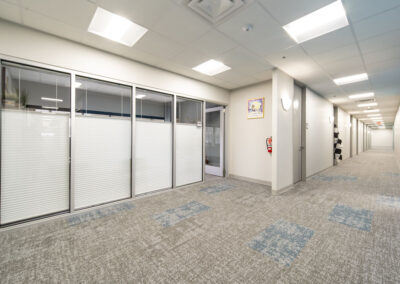
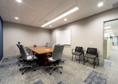
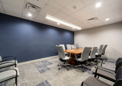
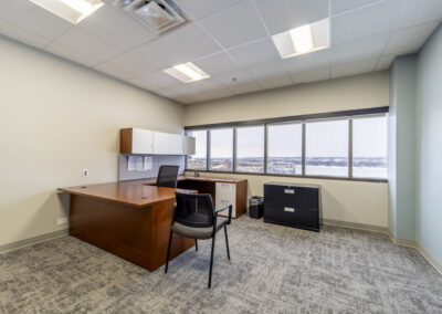
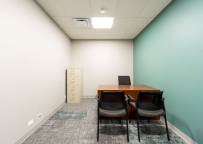
    The entry, lobby, reception, and training room needed minor updates and the office layouts were appropriate but too few. Generous corridors were narrowed so 12 offices and a conference room could be added. At their move-in in 2023, they had every office filled. To expand more, they would look to add space one floor down in the same building. 

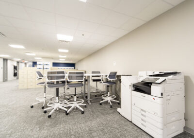
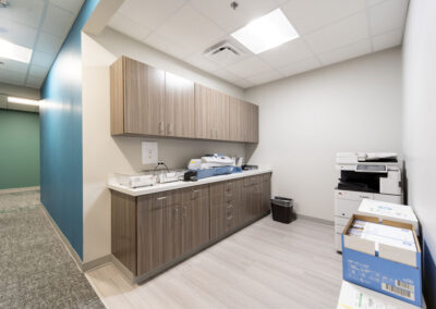
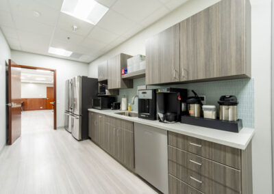
    The suite’s previous design was quite dated and needed major finish updates to the lighting, paint, and flooring. r.o.i. Design added color-coordinated accents in quadrants: navy, green, and teal. The lunchroom, copy room, and client check-in received new case goods, and all received new laminates.  

    It was decided to keep the original cherry paneling and marble floor in the Lobby. 

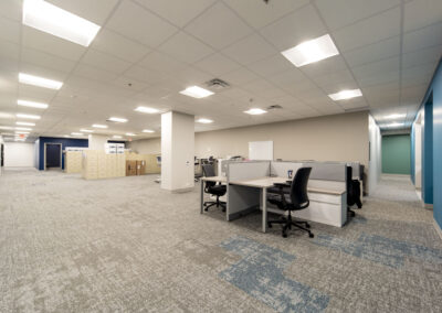
    The base paint color of the suite remained neutral, removing much of the wallcovering, and adding a lighter paint. All carpets were replaced with a mid-toned product which was better at hiding stains. Accent carpet tiles interrupt the pattern to enhance the color of the quadrant. 

    The lighting was inspected and converted to LED throughout. Very few decorative lights were added or needed. 

    The restrooms had been updated just before the previous tenants left and worked very well for the group with just a few lighting tweaks. 

    It is becoming more common for us to work with our clients in searching for new spaces, helping them imagine their operations in a space before they commit to a lease. In the case of KCOD, this search was organized by realtor CWD. We laid out multiple spaces before the group decided. We engaged with many commercial realtors and found CWD to be very accommodating. McGraw Construction took on the challenge of remodeling this old building, where nuances were discovered every day and handled professionally. 

      The Colors of the Year for 2024

      The Colors of the Year for 2024

      It may not be the Super Bowl or The Oscars, but for designers, a “Color of the Year” reveal is always a big event. We memorialize them by painting a stripe on our office wall for each of Sherwin Williams’ yearly selections.  

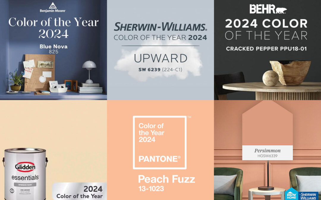
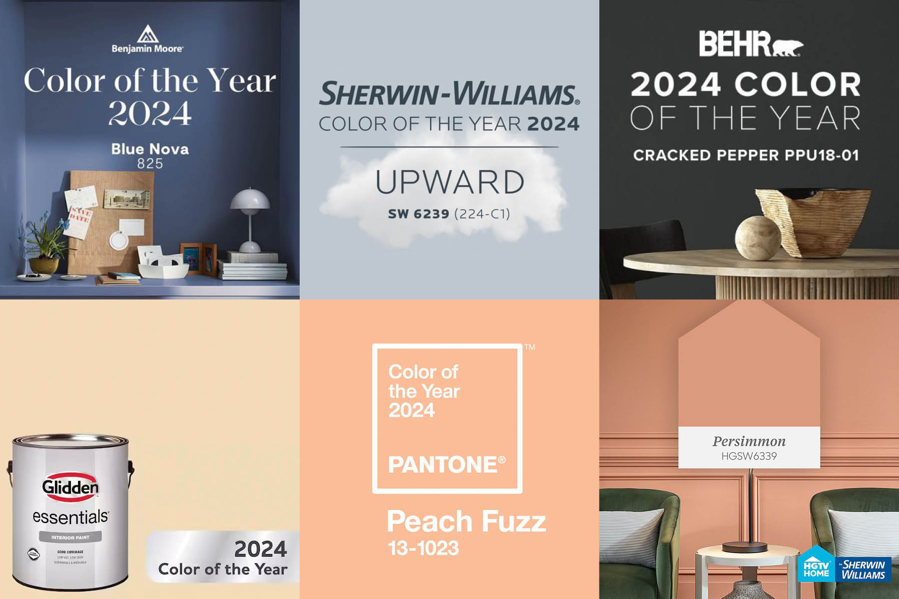
      This year, it is likely that residential and commercial designers can find a “color of the year” they like since there are several to choose from.  Here are a few of this year’s colors from our favorite companies that we regularly reference.

      • Pantone: Peach Fuzz 

      • Benjamin Moore: Blue Nova

      • Sherwin Williams: Upward

      • Glidden: Limitless

      • Behr: Cracked Pepper

      • HGTV Home by Sherwin Williams: Persimmon

      Emily VanSchmus and Caitlin Sole from Better Homes and Gardens describe all the 2024 picks as “Earthy, nature-inspired tones will be especially big, according to the color experts that release their predictions each fall. This year’s trend forecast features earth tones like terra-cotta and moody forestcore-inspired picks that include a rich deep green. We’re also seeing an influx of coastal-inspired blues, from light pastels to bold teals.”

      In October of 2023, Martha Stewart writer Madeline Buiano published an article. “Here’s Every Color of the Year (So Far) To Inspire your Home Painting Projects in 2024” This article features 11 paint companies and their choice for “color of the year”.

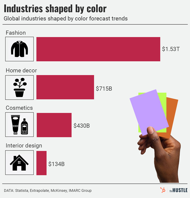
      What influences those experts in paint colors? There are collaborations between paint companies with partners in yarns (carpet and fabrics), laminates, and chemicals (solid surfaces and quartz) months and years before an announcement. Each of these collaboration groups has manufacturers’ representatives and cultural analysts on their team to influence paint companies because color “sells”.

        Pantone Color of the Year 2023

        Pantone Color of the Year 2023

        When it comes to the color of the year, there are a lot of experts and a variety of opinions. In September, we reported on Sherwin Williams’ Color of the Year, Redend Point SW9081. Benjamin Moore announced its choice for Color of the Year,  Raspberry Blush 2008-30 on October 12.  

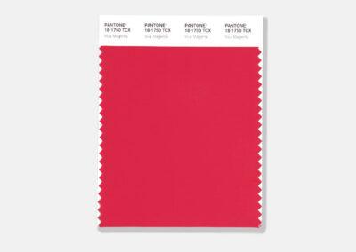
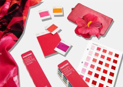
        Pantone, widely recognized as one of the authorities on color and color trends, recently announced its Color of the Year. For 2023, Pantone has chosen Viva Magenta 18-750, which it describes as “a shade rooted in nature descending from the red family and expressive of a new signal of strength.”

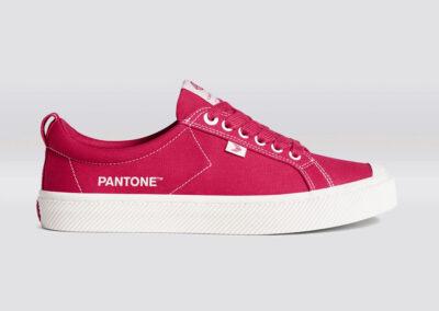
        As interior designers, we recognize color trends and how they affect many industries, including fashion, industrial design, packaging, and interior design. These color trends announced by Pantone usually are seen first in the fashion industry. Each project we work on is unique, and color selections are based on many factors. We try not to let color trends dictate our design choices, but are aware of their influence on the entire industry. 

        Click on the thumbnails below to view larger images.

        © All photos courtesy of Pantone USA