by Ryan | Sep 27, 2017 | Design News, Interior Design, Workplace Design
This perfectly located, generously sized and well-appointed office building is going through a face lift.

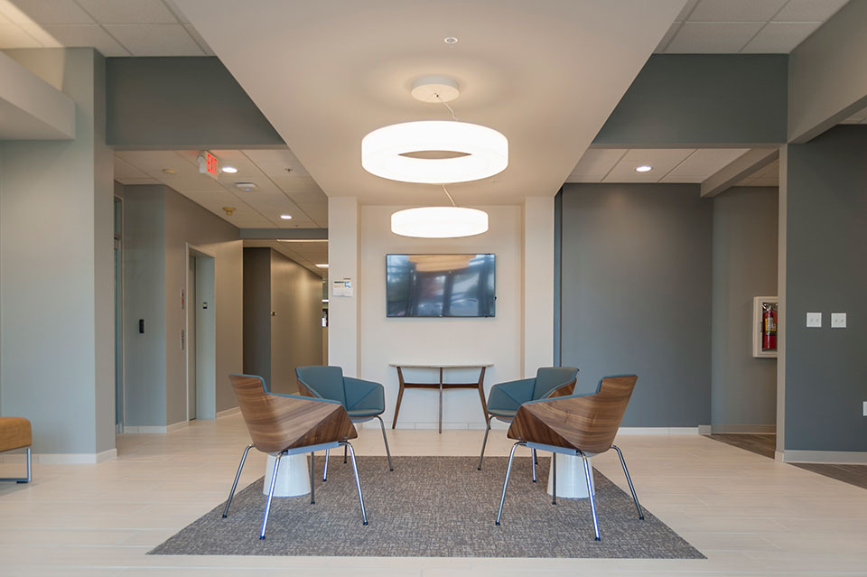
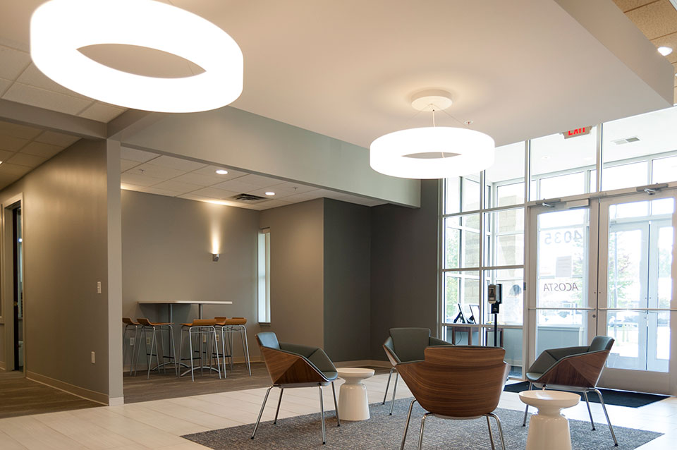
Hillary Taatjes-Woznick and Doug Taatjes of NAI Wisinski contacted us, asking us to compete to win the opportunity to provide a design for the lobby of Park East Court, off of East Paris in Grand Rapids, Michigan. This “first impressions” area was key in providing future tenants a glimpse into the aesthetics and financial commitment of ownership.

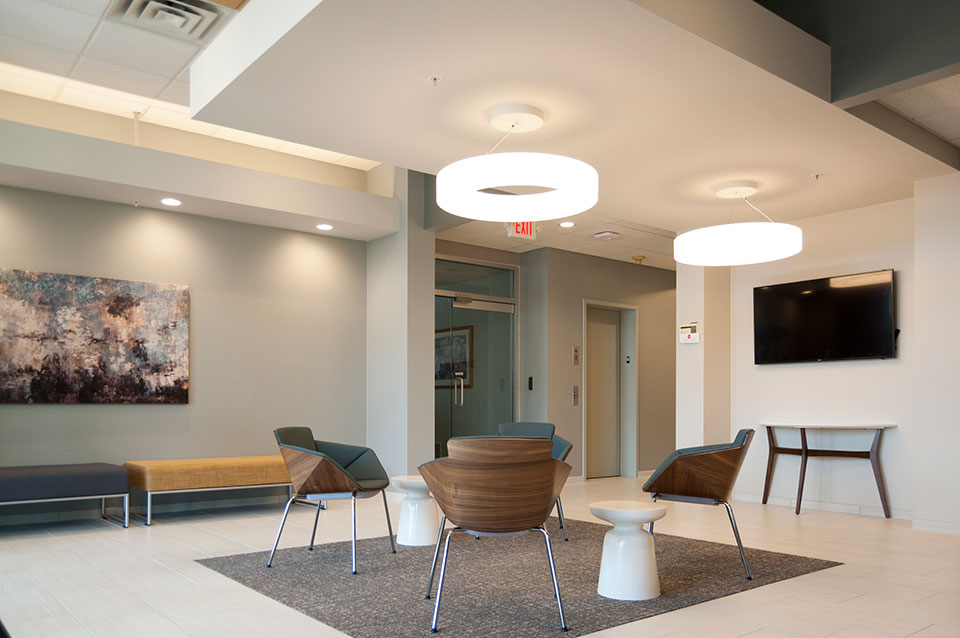
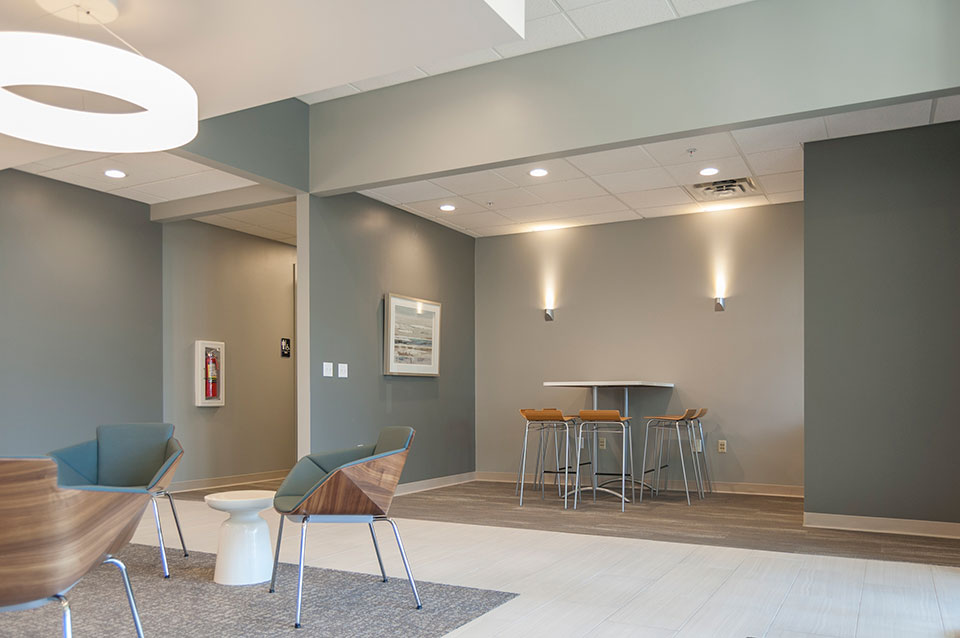
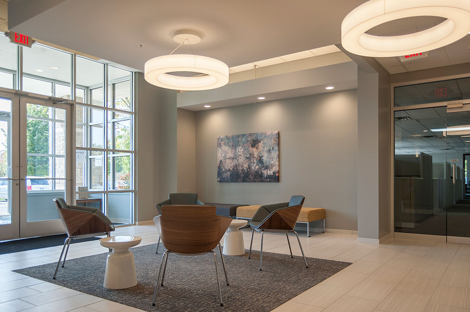
Our design included expanding the lobby into a hallway and a copy/storage room and floating a drywall lid in the center of the space. We replaced a reception desk with seating, and added focal points to the space. The popular gray color scheme of today was used, but with an accent of yellow on the ceiling and blue in the furnishings. The dated mahogany trim was painted. Decorative lighting was strategically placed to create a contemporary appeal.
We partnered with longtime friends and collaborators, Pinnacle Construction, to create budgets that directed the final design scope. Pinnacle Construction completed the lobby remodel in spring of 2017.

While we pride ourselves on our values of Budget (first), Brand and Beauty, we were told we won the opportunity to provide the design because they liked our design, which they thought best captured the owner’s preferences and gave them a look that they thought would best appeal to their tenants. Our idea wasn’t the least expensive but they thought offered the best ROI.

For more information about Park East Court, visit naiwwm.com and search for 4035 Park East Court

by Ryan | Sep 27, 2017 | Design News
Business growth demanded Dooge Veneers to plan for hiring over the next five years. Already their recent growth had new staff using conference rooms for offices and doubling up in offices.
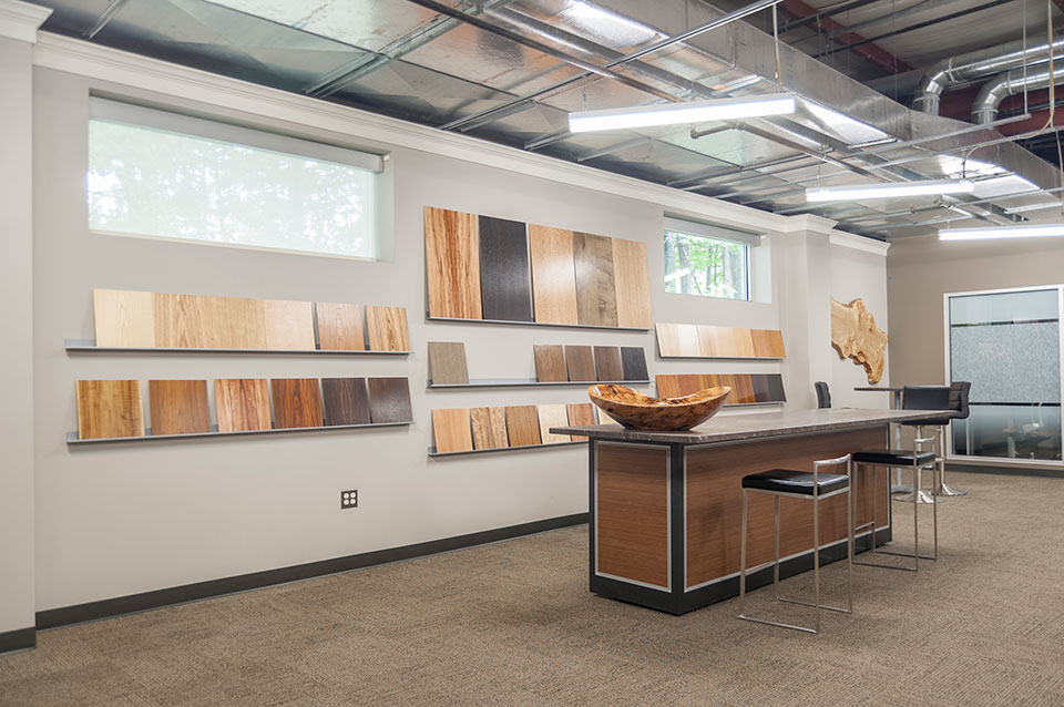
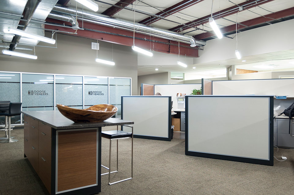
They had a large warehouse area that they used to inspect veneers as well as serve as a veneer sample library for their sales staff and their customers. Their goal was to convert that space to open office with a larger conference room.

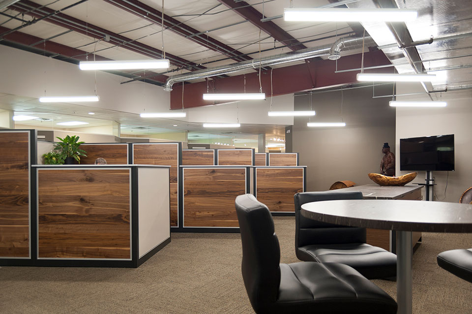
Like their current offices, they wanted to use some of their veneers as architectural finishes. They were also hoping they could avoid putting a ceiling into the “warehouse” space, but rather find a way to create a more urban loft appearance exposing the ceiling structure and mechanical.
“Dooge Veneers is a wonderful customer because they are very design sensitive and aware of trends because they provide veneers for interiors and work with architects and designers all the time,” says Mary Witte, owner, r.o.i. Design. “Not only do they understand design, they challenge us and collaborate with us, so whenever we work with them the result is world-class”.

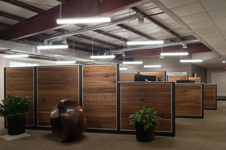
In 2009, the office was remodeled and many of the finishes still looked fresh, so r.o.i. Design identified the criteria for the new expanded open office based on elements that existed as well as taking advantage of today’s design style. Key to the design was the creation of custom “office cubicles”. Previously, Dooge had free standing desks with full height wood panel dividers that lined a wall in a much smaller open office. In order to maximize the space, r.o.i. Design opened up the warehouse to the existing offices, added spots for six people and the expanded sales space. While this meant offices had to be a little smaller, the new “cubicles”, using matched “rustic random” walnut veneer, recut walnut veneer and stainless steel trim, were more than enough for staff to accomplish their work. Their ability to work more collaboratively in the open office has proved to be very efficient and promotes the sharing of information. The new conference room allows for larger meetings while also creating a beautiful back drop to the open office with their new logo on a glass wall. Inside the conference room, r.o.i. designed inset panels in the drywall with FC Sapele wood and stainless steel trim.

This project, like so many recently, we also assist in the actual execution of the remodel, offering select project management services.
Dooge Veneers, whose offices are located in southeast Grand Rapids, has been in business for over 50 years. r.o.i. Design has had the extreme honor of helping this group design and remodel their corporate office and showroom three times over 20 years.


by Ryan | Apr 26, 2017 | Branding, Design News, Interior Design
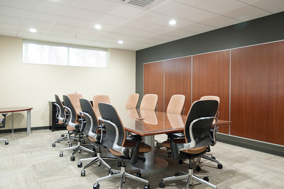
We pride ourselves on being a commercial interior design group that has experience in a variety of environments. In the last few years our work has created office environments (from manufacturers to a variety of service providers), retail environments (from stores to neighborhood dental/orthodontic practices), schools (charter schools and higher education spaces), hospitality and multi-family spaces (hotels and apartments), and religious spaces (worship and educational related).

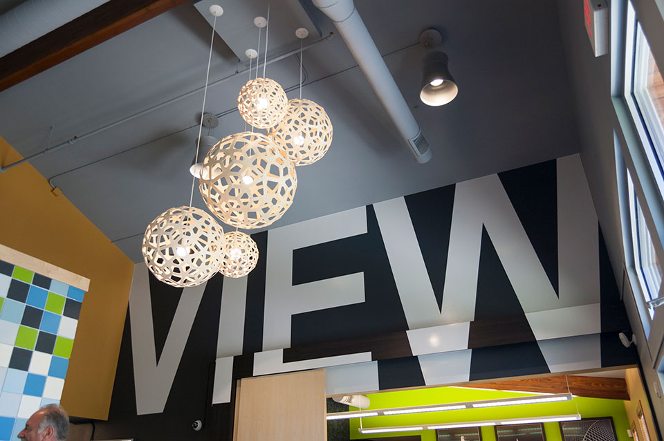
Campus View Apartments, Clubhouse – Allendale, MI
While there is variety in the types of spaces, our customers have some key attributes in common:
- They have a budget
- They have a company story, a brand. Sometimes it is more developed than others.
- They want their space to appeal and attract customers as well as please current and future employees.

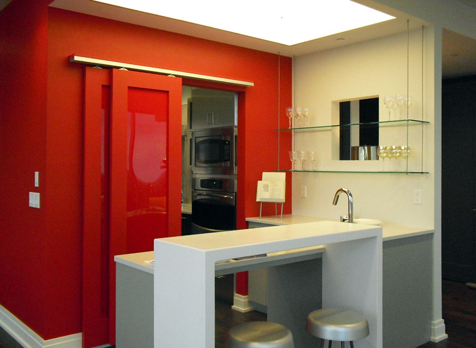
River House Condo – Grand Rapids, MI
Our design process, early in concept design, includes budget development. Our experience working with contractors and owners has given us perspective and knowledge that can identify budget issues early on, before all the design fees are spent.
Concept and developed design needs to reflect who the company is. We interview our clients, we listen as well as we can, and then summarize back to our customers what we heard.

Wolverine Power Cooperative, Conference Room – Cadillac, MI
Everyone wants their space to be beautiful. But even more importantly, it needs to attract the target customer and maintain and inspire the ideal customer. This is a focused aesthetic, delivered with restraint.
For more information, see our current company brochure:


by Ryan | Apr 24, 2017 | Branding, Design News, Designing for Kids, Medical Design
So much more than runny noses, vaccinations, bumps and scrapes, a pediatric practice is a sophisticated business that manages the physical, behavioral and mental health issues for newborns through teenagers. There are lots of challenges, so the office design needs to create an environment that offers some efficiency and some fun.
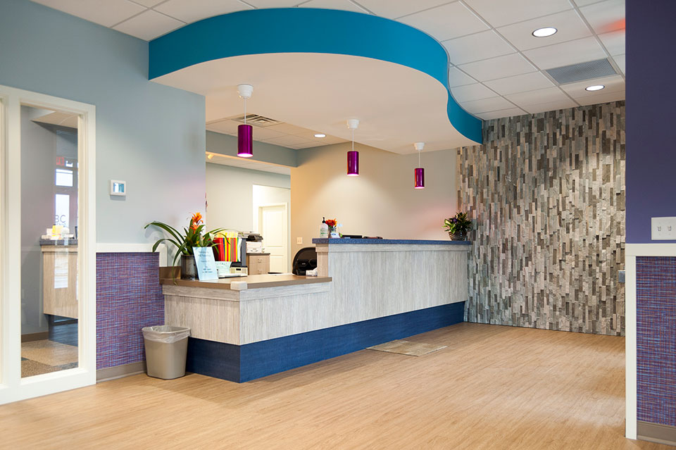
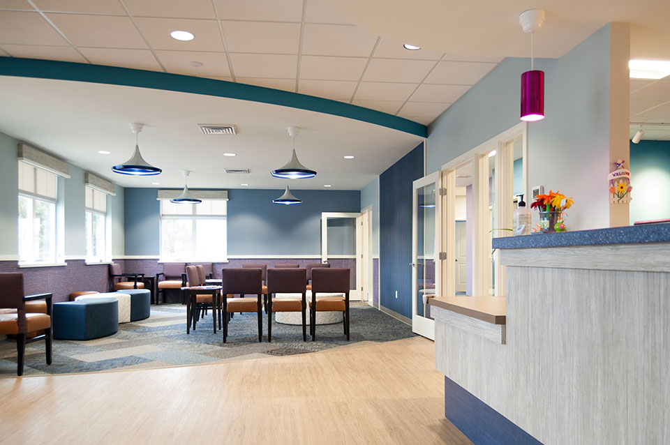
r.o.i. Design learned so much working with ABC Pediatrics as we helped them with the interior design of their new offices in Wyoming, MI. We learned how they wanted to engage families with their interiors, but not be just “kid-like”. They wanted their space to look professional and simple, but very welcoming and comfortable. They needed it to be user friendly for staff and family which meant maintainable surfaces and easily identifiable areas. And there was a budget.

ABC Pediatrics Lobby
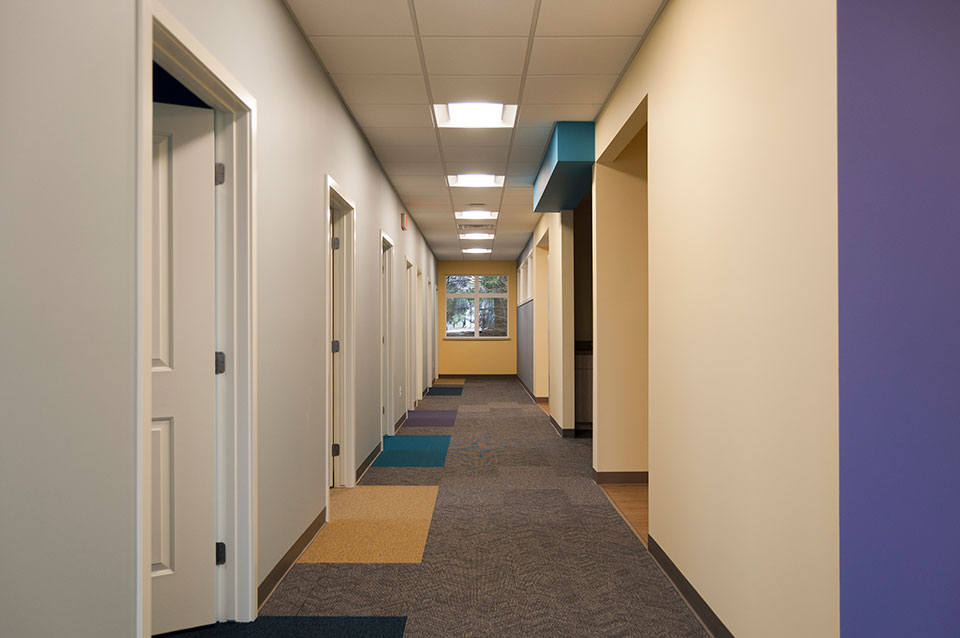
Starting with a color scheme that they currently use in their Walker location, r.o.i. Design “upped the ante” by intensifying some of the colors, adding pattern and interest, in thoughtful ways. Some of our favorite elements are the carpet accents, the color accents, the decorative lighting and the lobby furniture. Wall art will soon be added to the interior and we like those selections as well.

Interior corridor at ABC Pediatrics.
ABC Pediatrics also asked us to create a new logo for their practice. They wanted a logo that was as updated as their offices were, but more importantly, a representation of their brand. Interviewing them about how they viewed their distinctive difference, we came away with “Caring”, “Diverse” (ages and specialties), and “Child Centered”. They were very pleased with their new business logo designed by Ryan Bright, Creative Executive at r.o.i. Design.

ABC Pediatrics’ new logo.
More about designing for kids
r.o.i. Design has designed for younger audiences before so we had some clues on how this audience reacts to spaces. We know they see color differently than adults and appreciate any tactile detail. For more on our recent work for younger people please visit our page on Black River Schools and Northern Michigan Pediatric Dentistry.
More about ABC Pediatrics
Having outgrown their offices in Grandville, ABC decided to build a building that would be large enough to accommodate their expected growth of families from the south west side of Grand Rapids. Architect-at-Large created the footprint, and Pinnacle Construction was engaged to build the building, and when ABC inquired about interior design, Pinnacle recommended us for the assignment.
Learn more about ABC Pediatrics:

by Ryan | Feb 28, 2017 | Design News
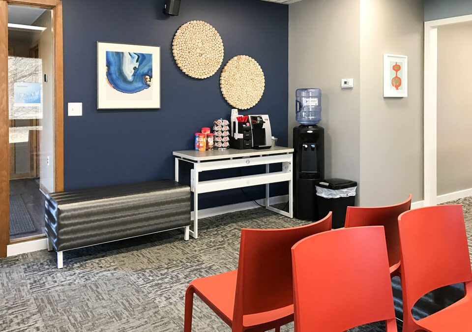
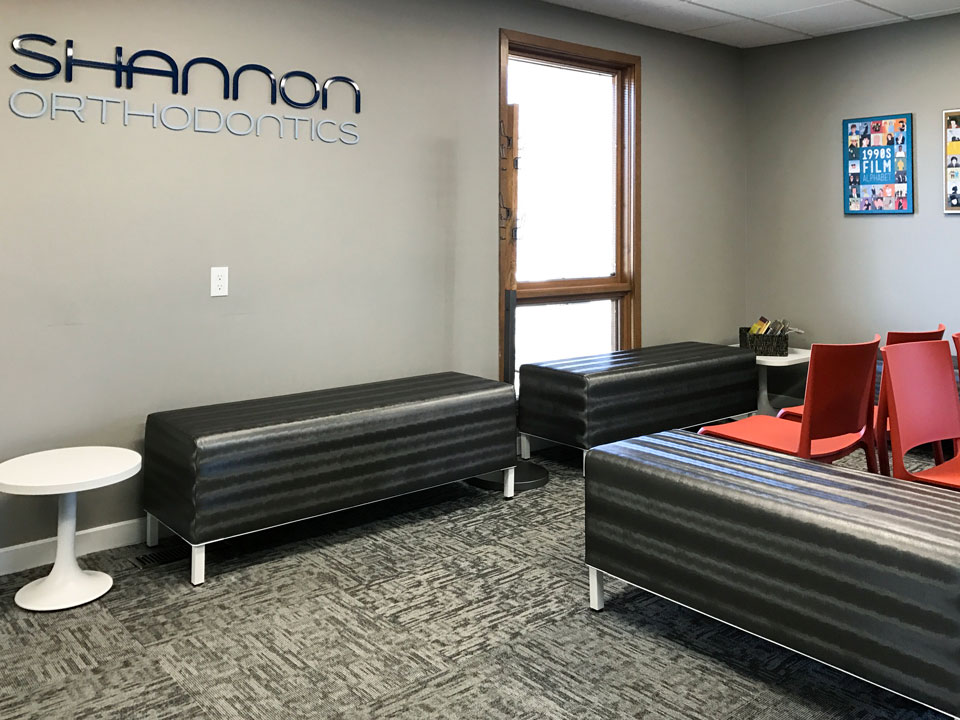
Shannon Orthodontics has three offices. Last year we designed their Grandville, MI space and last month we finished their office in Plainwell, MI. Thanks again to Rockford Construction for making it all happen for this busy practice.
Shannon understands the importance of brand and marketing.
They want all their offices to provide a uniform feel so they could use their interiors in their advertising. They used their new spaces to create a video to promote their business.
Some of the interior elements that help carry the brand include the color scheme, the use of logo and signage, iconic furniture and wall art pieces.

We recognize that Shannon Ortho customers have many choices when it comes to orthodontics, and we want our customer to look as great as they make their patients feel!
For more about Shannon Orthodontics:
