(616) 459-3539
New Landmark Office Building for Coach Road Capital and EQI
New Landmark Office Building for Coach Road Capital and EQI

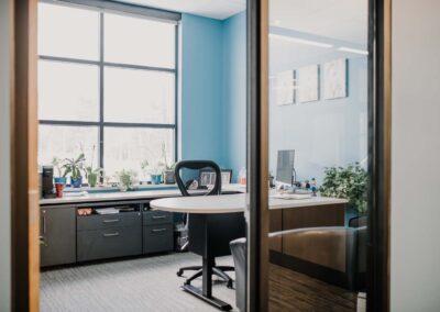
Relationships and innovation create great designs. Dixon Architecture and Coach Road Capital gave us a level of trust that allowed us to push the envelope on the design for this four-suite, state-of-the-art office building. We thank Jim Reyers of Copper Rock Construction for the willingness to listen to design needs and help us execute our customers’ visions.

Building owner Coach Road Capital has a variety of businesses including, but not limited to, US Retail, which manages over 40 locations of Pet Supplies Plus. As Coach Road Capital, they are real estate developers and business investors.

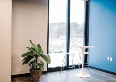
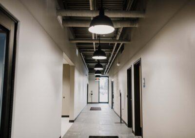
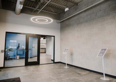
Our work with Coach Road established building standards for all suites, as well as created a design for communal areas. We worked with the first two tenants to customize their space to meet their business and brand needs.

Coach Road Capital

Not only had they outgrown their offices, but they were also looking to create a more collaborative and open environment for their team.
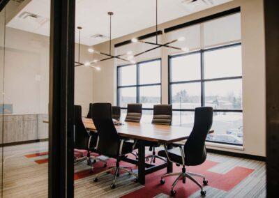
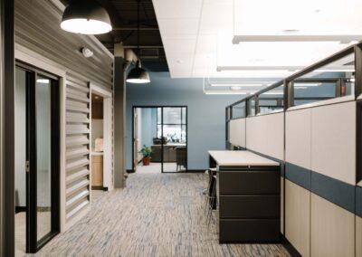
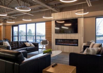
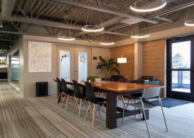
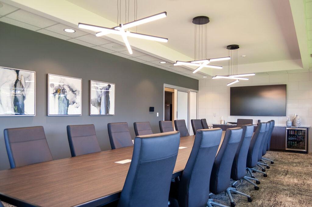
Their new office offers a spacious feel with interesting details. Our favorite features are the ceiling clouds and lighting, the metal siding on the interior of the space, the wood walls in the conference room, and the natural color scheme.

We appreciated the leadership of Val and Aaron Young and Terry Nash who gave us the direction and encouragement to help them make this a wonderful space for their team. They were tireless in their efforts and we appreciate their trust.

EQI

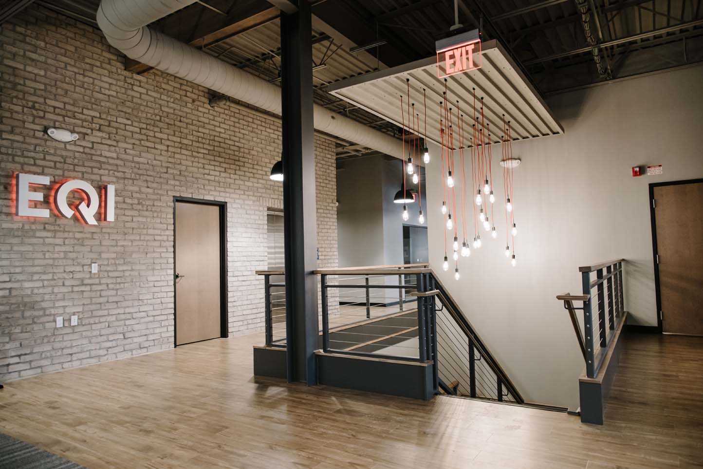
EQI provides tailored design, engineering, procurement, and logistics services for metal castings across diverse end markets at a global scale. The Spring Lake corporate office provides design and project management as they work with their offices in China, Vietnam, and India for the manufacturing and fulfillment of customized products.

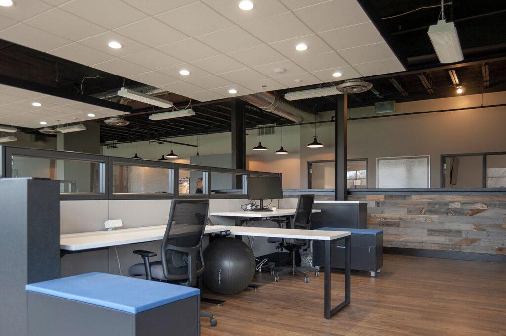
Again, this company had outgrown its space but also wanted to change how they work. They needed their team to be more exposed to all department activities and to understand how their work fits into the entire project and business outcomes.

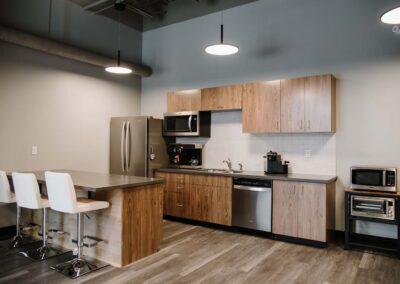
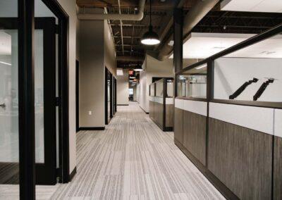
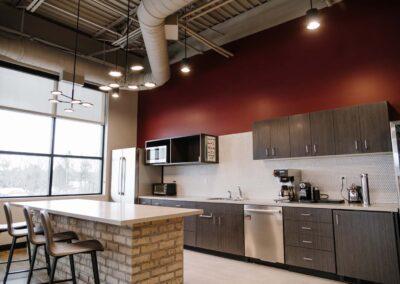
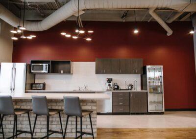
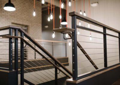
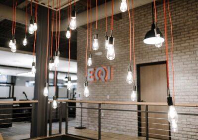
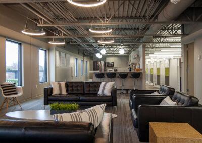
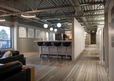
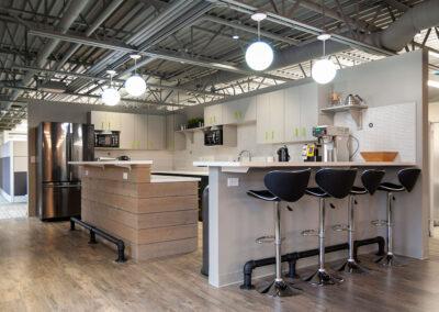
The new space offices a variety of meeting and break out areas which were lacking before. All offices have glass walls to the open areas, connecting everyone visually. A large break room/kitchen is an inviting “other” space that hopes to bring people together for a variety of social and work activities.

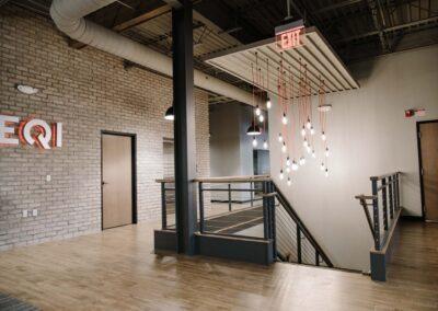
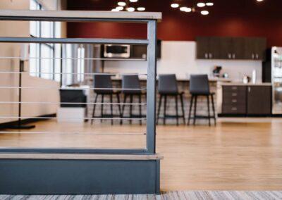
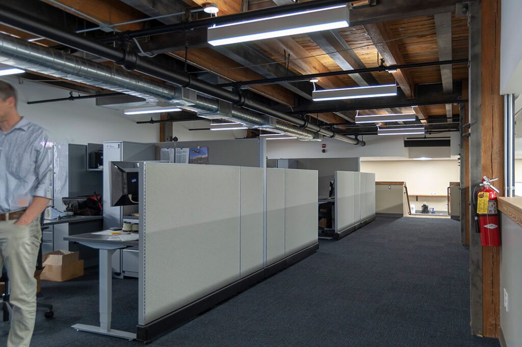
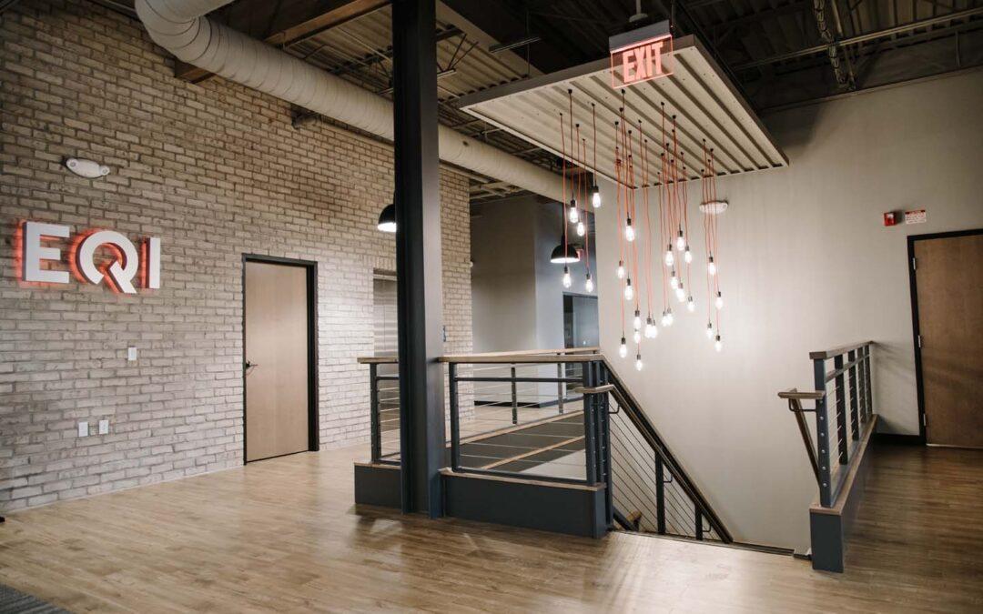
We are especially excited about the interior brick wall, the interesting light fixtures, the open staircase the warm color scheme, and the subtle placement of brand-friendly finishes.

President and CEO of EQI, Blake Phillips, was attentive and patient as we designed the space through the time of COVID, and he inspired us as a strong believer in the importance of design.

Click on thumbnails to view larger images.

© All Photos Courtesy of Coach Road Capital

Wolverine Building Group Updates Their Conference Room

Wolverine Building Group Updates Their Conference Room

r.o.i. Design has a 25-year relationship with Wolverine Building Group, and we are grateful for the work they give us in the industrial and retail builds. 

When Aaron Jonker and Curt Mulder purchased the company and became the new presidents and co-owners of Wolverine, they looked to redesign their office spaces. While Wolverine does have designers on staff, they wanted outside help with their first-floor main conference room which is highly visible and used frequently. 

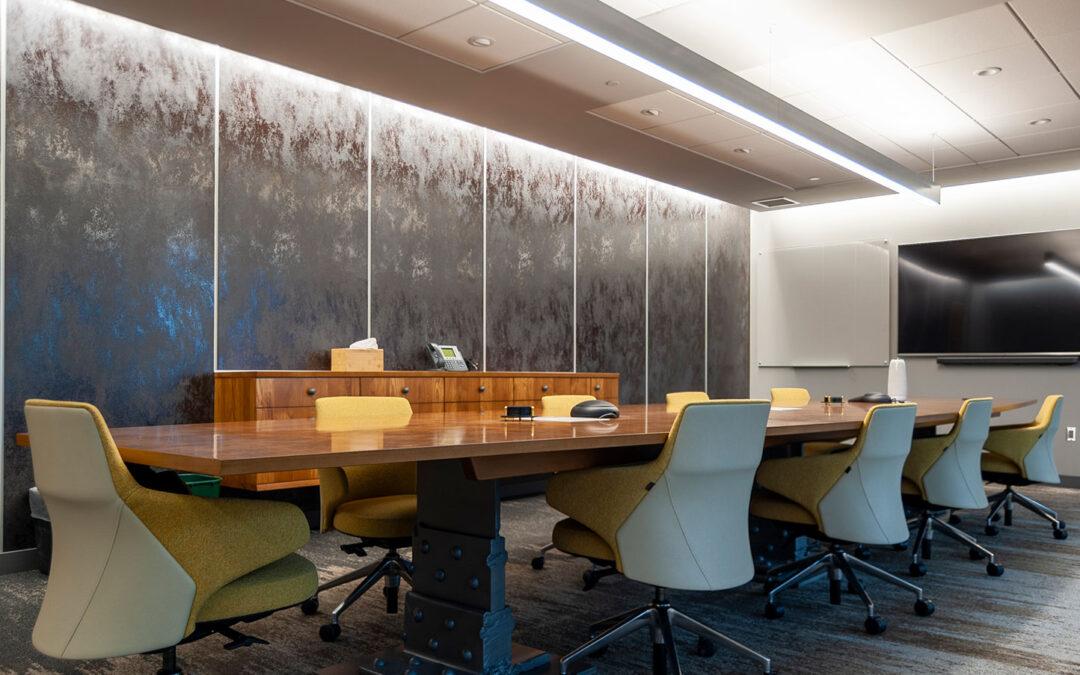
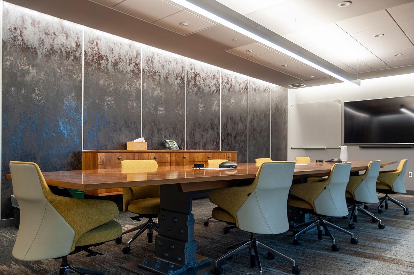
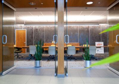
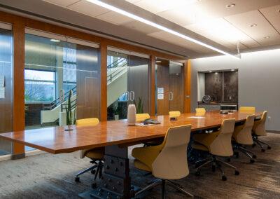
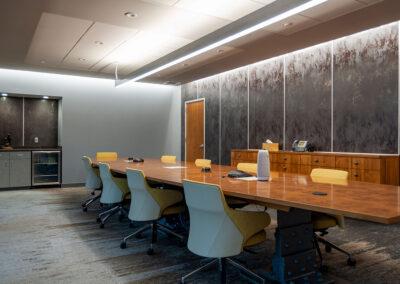
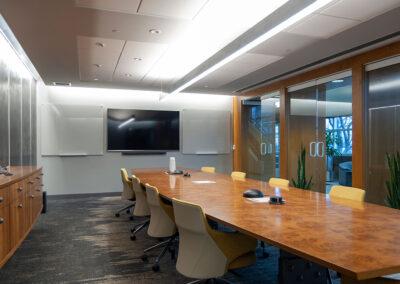
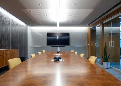
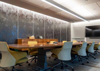
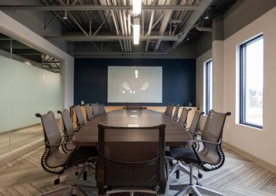
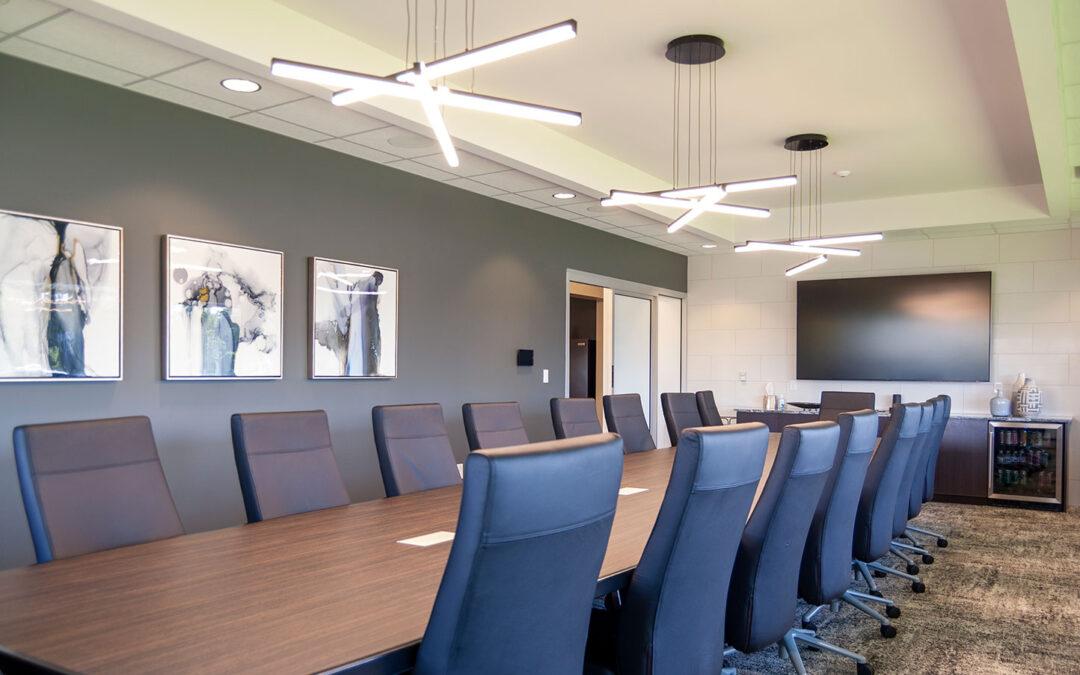
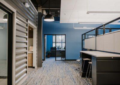
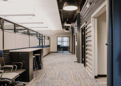
Our design included updating the lighting and finishes. The back accent wall of the room is clad in large monolithic ceramic tiles with a metallic finish. The carpet tiles create a unique gradient pattern along the length of the room. Wolverine replaced their old conference table with a new custom table using an ash burl top and a base of reclaimed steel girders designed by Robert Mulder. r.o.i. Design also provided custom glass white boards.

The room was transformed and will stand the test of time for the next generation of leadership at Wolverine Building Group.

Click on thumbnails to view larger images.
Mars Hill Bible Church Reduces Its Footprint and Remodels Its Space

Mars Hill Bible Church Reduces Its Footprint and Remodels Its Space

Mars Hill and r.o.i. Design have a 15-year relationship and we have worked on a variety of remodels as their building needs have changed. 

In 2019, Mars Hill sold half of their building’s footprint to Grandville Public Schools, who were looking for space for their Early Education and After School Programs.  

r.o.i. Design engaged Dwayne Masselink and Matt Shoffner of InterActive Studio, who have also previously worked with Mars Hill, to partner on the design and architecture of the remodel. r.o.i. Design led the design team and supported Mars Hill in the process. Mars Hill interviewed four contractors and decided on Erhardt Construction to complete the remodel. 

Because of the challenges imposed by the COVID-19 pandemic, the Mars Hill project morphed many times. Budgets also impacted the phasing and scope of the work. Essentially, the scope of the project had to be divided into two phases.

The Phase 1 remodel included remodeling a mezzanine space for the church’s new offices, reconfiguring the middle school classrooms for preschool, reconfiguring preschool spaces for babies (nursery), and creating a complete separation from the Grandville Public School side of the building. 

The old offices were separated by a mall corridor and the updated design has all staff in the same space for the first time in many years. While there was not enough room to give everyone private offices, they agreed to all have cubicle offices with private hotel offices being available for project-based needs and studies.  

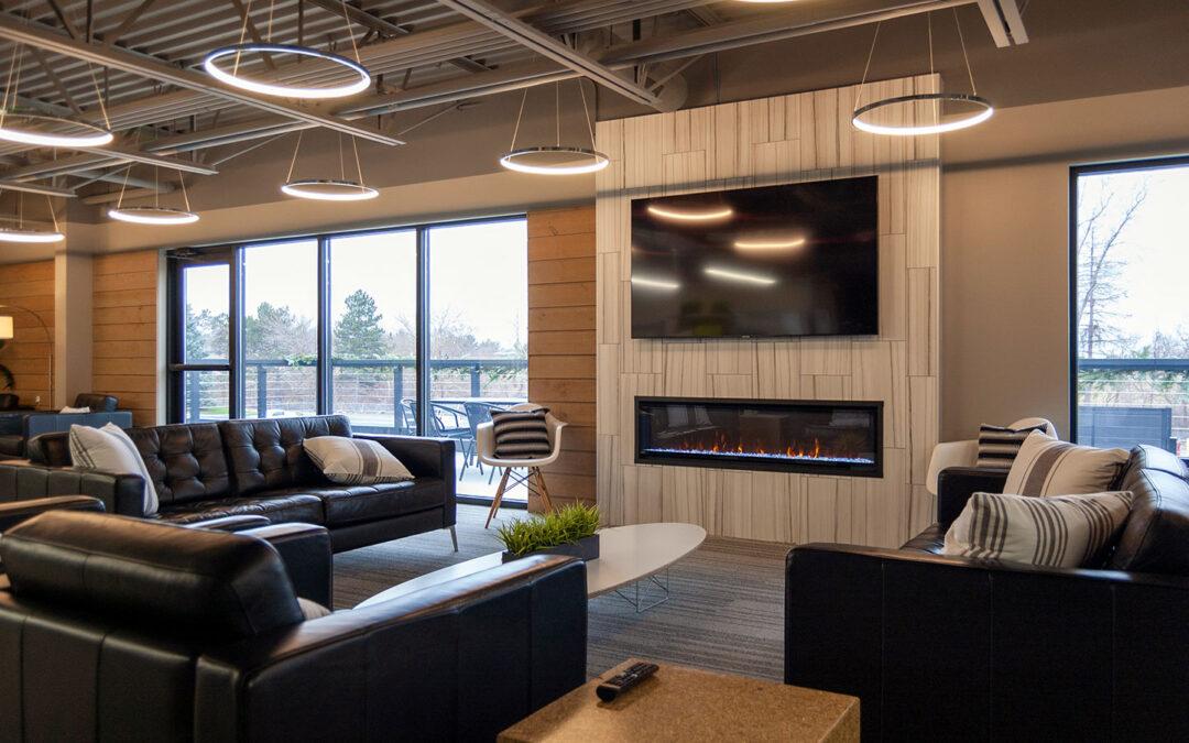
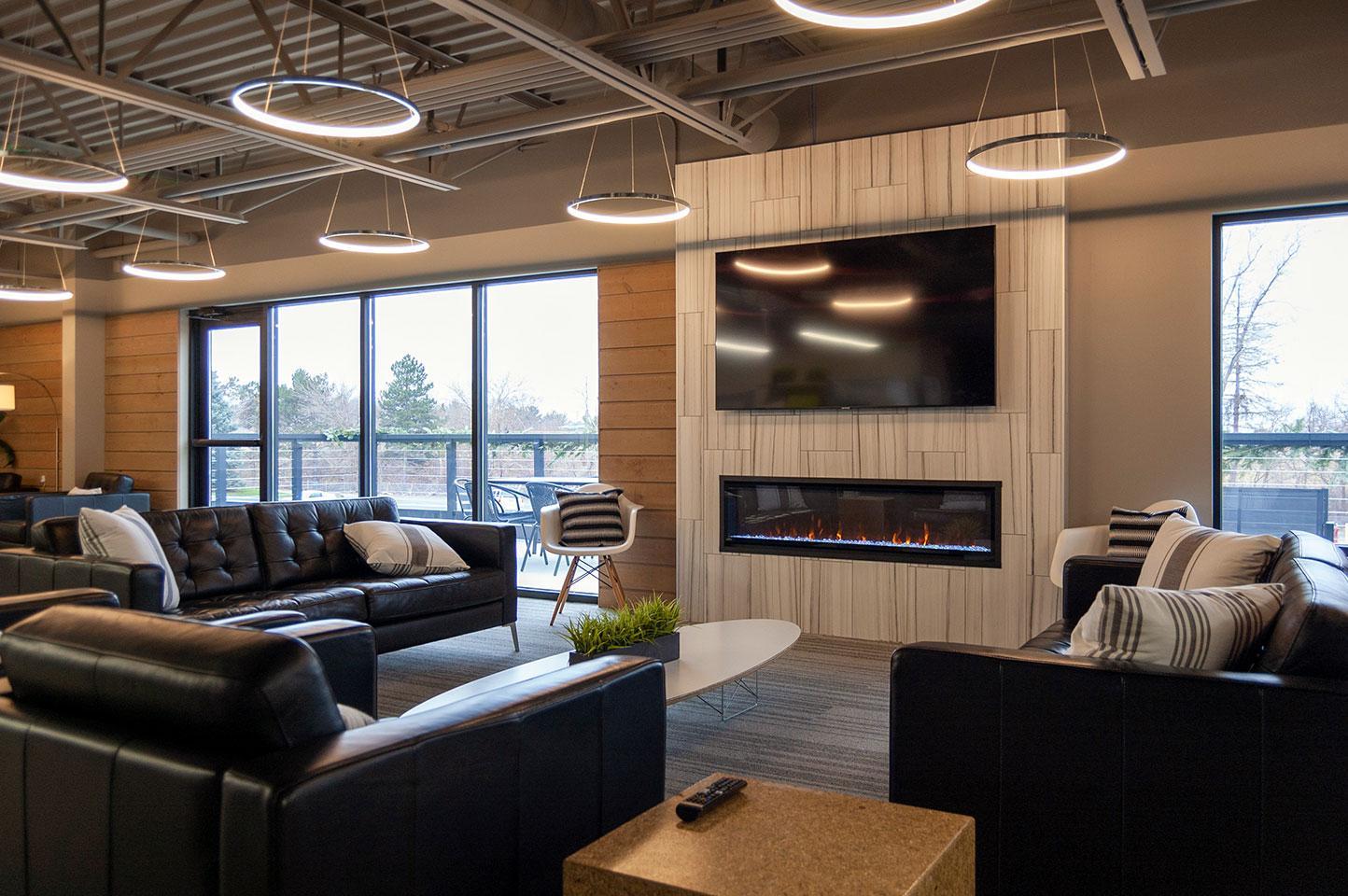
The mezzanine office remodel included new windows and views to the outside. They also created a large outdoor deck right off the lounge and break room area. The office includes a fireplace, several meeting spaces, a kitchen breakroom, and new restrooms.  

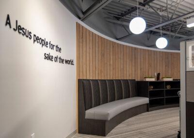
Details that we really appreciate in the new mezzanine office include the reuse of the cedar siding reclaimed from the first floor demolition, the fireplace, the lighting plan and light fixtures, the curved wall and benches outside of the reception area, and the thoughtful furnishings provided by West Michigan Office Interiors. 

Phase 1 also included adapting the buidling’s exterior to create a more appealing entrance for office staff and visitors. Phase 2 will include remodeling the elementary and preschool classrooms and the hallway areas.  

A huge shout-out to Ken Sanders at Mars Hill for his care and patience during the project and to Erhardt Construction for their flexibility. 

Click on thumbnails to view larger images.
Funky Buddha Arrives at Studio Park

Funky Buddha Arrives at Studio Park

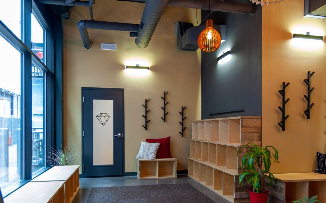
In January, Funky Buddha Yoga Hothouse opened its fourth location in the exciting new Studio Park development in downtown Grand Rapids. Anna Baeten, Executive Director, and Michele Bookie, Operations Manager, see this new location as the opportunity to align the look of their facility with their updated clean brand that’s on their website and marketing.
“It was time to become clear with our brand; we are intentional and simple in our approach. We believe in Growth through Practice. We want our spaces to reflect our values: Respect, Integrity, Intentionality, Caring, Honesty, and Humility,” says Baeten.

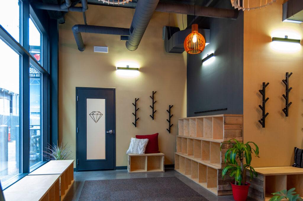
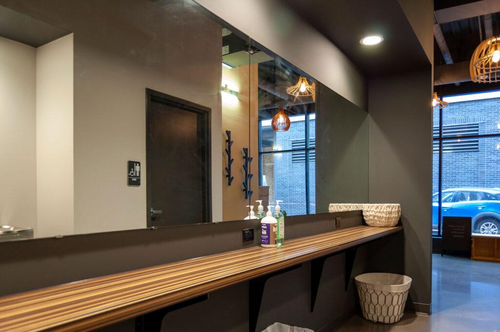
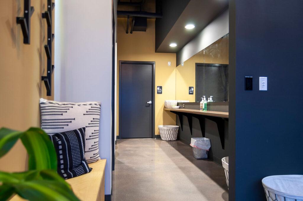
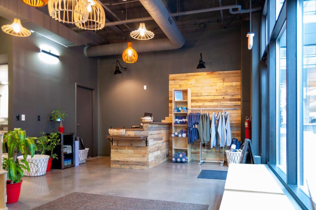
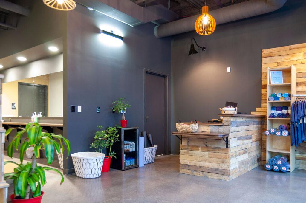
With that direction in mind, r.o.i. Design assisted in developing an interior that minimized their previous scheme of tropical fruit colors to a neutral palette of black, white, gray, cork, and wood. With touches of greenery and a focus on cleanability, there was still room for some “funk”.

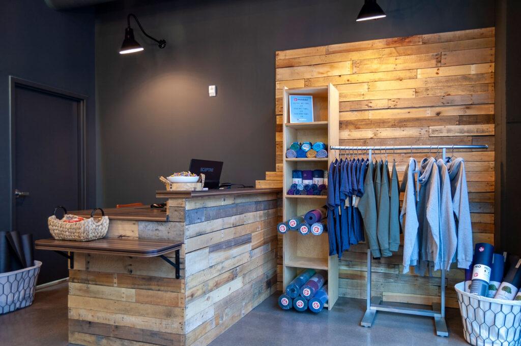
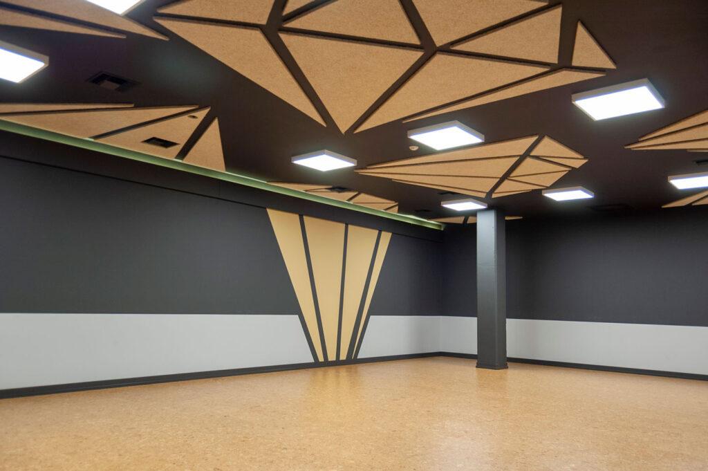
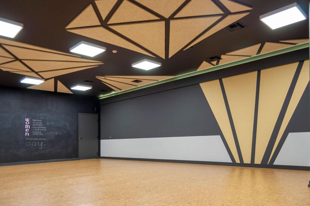
A variety of shapes of wood shade lamps hang in the lobby. The desk and retail area are built from reclaimed pallet wood from Grand Rapids Pallets. Their diamond logo is featured in the tectum acoustical panels applied to the yoga studio’s ceiling. Indirect lighting was added to the waiting area as well as the studio.

We thank our collaborators Jon Blair from r2Design for architecture, First Companies for construction, and Ken Kearney for specialty millwork build-out.

For more about Funky Buddha please visit their website.

Click on photos to enlarge

Variety and Diversity of Lighting in the Workplace

Variety and Diversity of Lighting in the Workplace

So many things support a healthy culture at work. It is about the variety of types of spaces offered to employees, the acceptance of broad diversity in staff perspectives and skills, as well as management’s desire to build a community that makes an office culture-rich and productive. One component in making all that work is the lighting.

Office lighting levels and colors determine how we see and feel the office environment.

While lighting engineers are striving for an overall “well lit, bright” and “evenly lit” environment, it may be that creating different lighting levels within the corporate office provides some relief or at least some options for the office worker. There is a lighting design theory prevalent now that says when light levels change within an environment, workers note the change and it reduces comfort. We at r.o.i. Design wonder if changes in office light levels create an opportunity for more comfort, not less.

We are conditioned by light in nature. Our relationship with the sun makes us aware of how the light feels different in the spring than in the fall. We walk through the woods and experience direct and bright light in clearings, indirect and dappled light in the forest, and the reflective light while by water.

So how do you bring natural lighting design to your office?

Consider indirect lighting.

Most light we experience is reflected off of other things. Today there are a variety of fixtures that push light to ceilings, and walls that redirect light into the environment. At least 50% of office light needs to use this technique.

Consider changeable lighting.

Giving office dwellers the ability to dim lighting is crucial. Projections and computer screens require less ambient light. And it has been proven that at 3 pm, most offices need a boost of light to energize the office, while earlier in the day people are more productive with less direct light.

Consider multiple sources and points of light within a space.

If an interior space requires a certain level of lumens, make sure that requirement comes from not just one source. Many successfully lit spaces use direct downlight from the highest point, pendant lighting from 8 to 9 feet off the floor, and wall lighting that is 7 feet off the floor. This technique also allows decorative lighting to provide a function, and not just to be pretty.

Consider direct lighting to focus attention.

Much like lighting a billboard, signage, corporate messaging and images, create a “hot spot” of focused light to emphasize what’s important.

While this all sounds expensive, lighting needs can be accomplished on a budget.  We are seeing an increased practice of knowledgeable lighting designers working in collaboration with us to create these superiorly lit environments at an affordable price point. Together, lighting design and interior design create spaces that work.

The Open Office: A Love/Hate Relationship

The Open Office: A Love/Hate Relationship

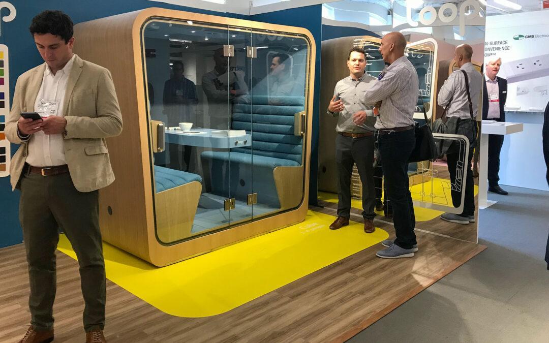
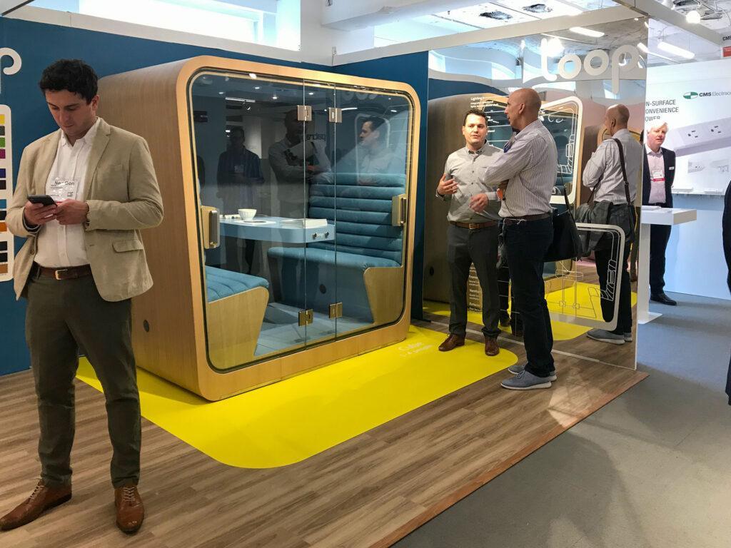
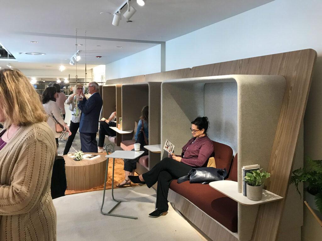
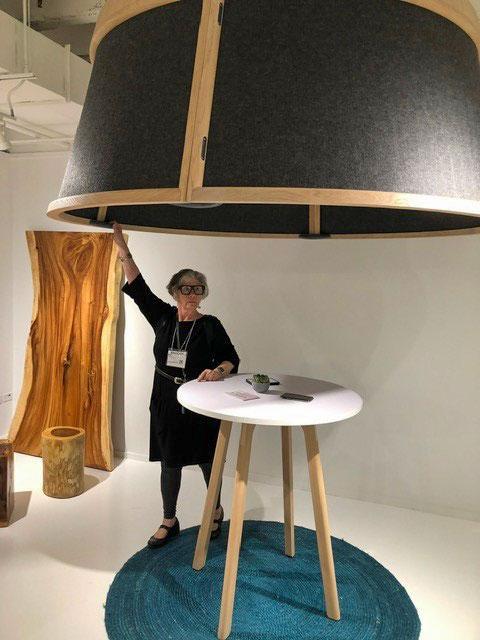
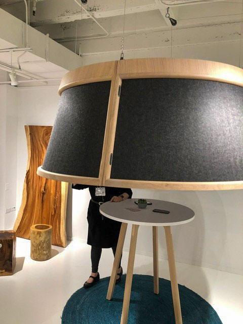
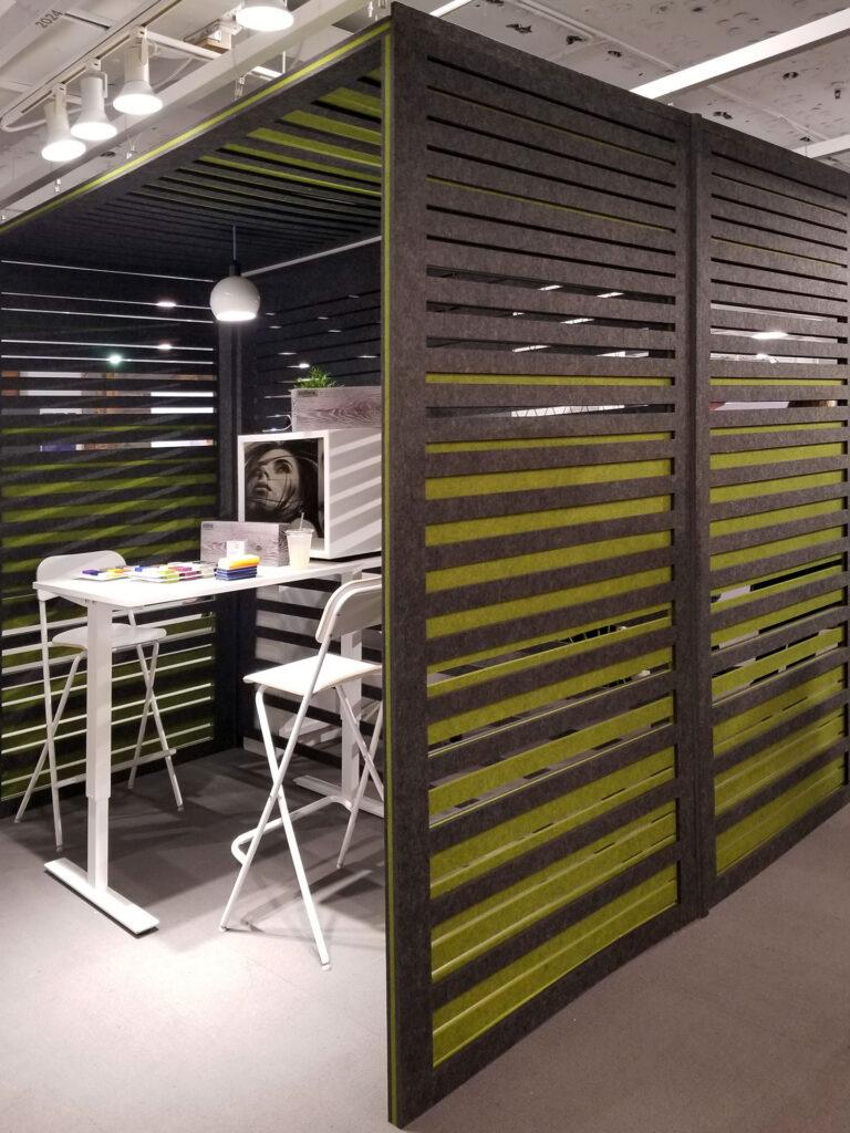
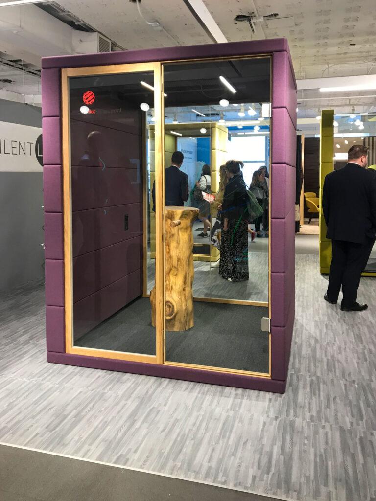
Lots of “Pods” at NeoCon 2019

Do you love the open office environment, but sometimes struggle with the need for a quiet spot to get a project done, have a private conversation, or just have a moment by yourself?

While trends in office space planning are moving towards no walls and open spaces, the reality is that most people sometimes need an area which is peaceful and private, where they aren’t interrupted.

The open office isn’t going away because it has proven to be great for managing by overhearing, training the new hire, and collaboration. It also helps the growing company be flexible as they need to add or move employees without calling a contractor and building more walls.

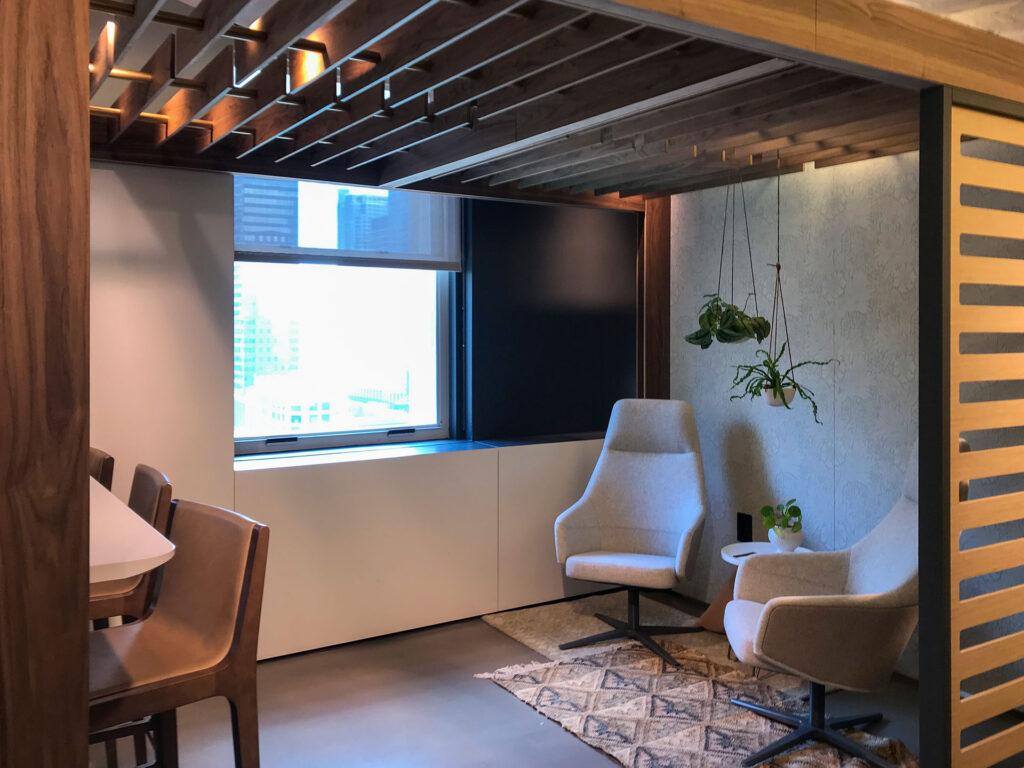
So, how are offices balancing the need to be together but “apart”? Our annual trip to NeoCon proved that manufactures are paying attention to their customers’ open office needs. We saw lots of creative ways to get a moment of isolation, while still being “available”.

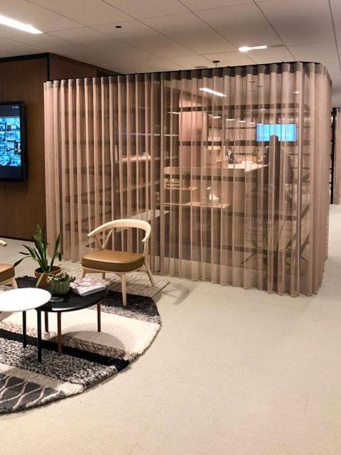
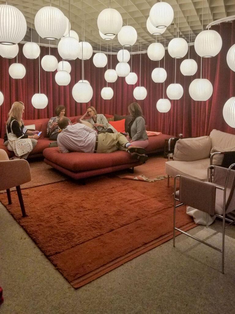
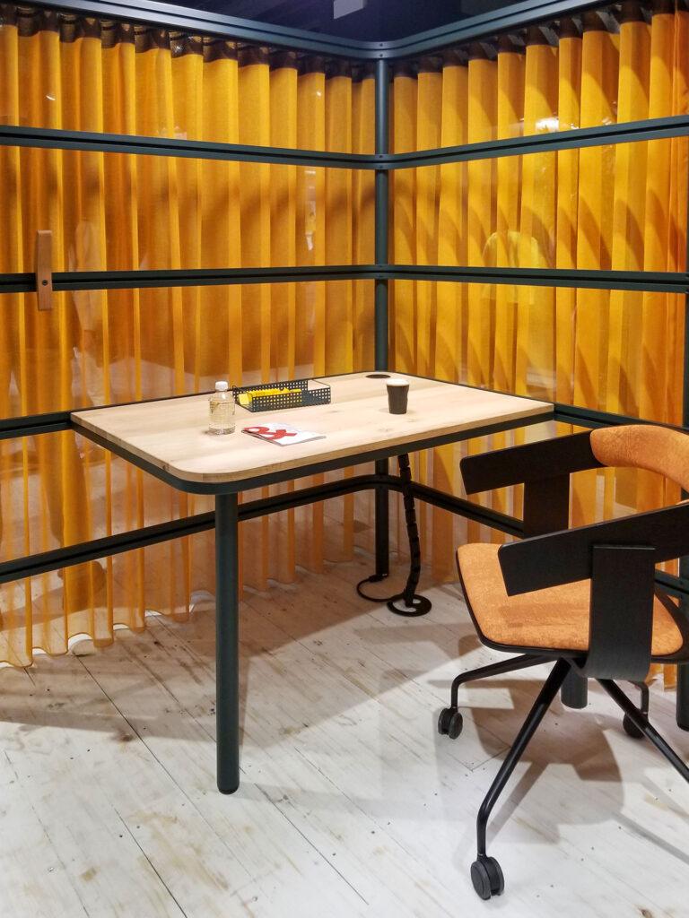
This year the drapery curtain showed up in several showrooms, turning the cubicle walls into a framework that allows for a curtain to be drawn for full separation, or just some. Herman Miller created a lounge in their open office using a giant red velvet curtain and globe lights. Groovy!

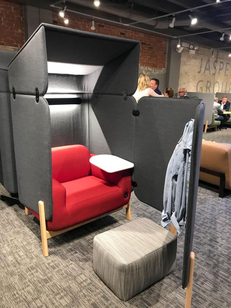
There were also a lot of “pods”, little rooms that manufacturers are now offering as part of the line of furniture. You buy this tiny room and place it within the open office and plug it in for power and ventilation.

There were canopies, lids and cones of all shapes and sizes that aim to keep your voice from traveling to the next. There was one we called “the cone of silence” that you can pull down around a meeting table.

So, don’t hate the open office, it doesn’t have to make you frustrated. You just need to get creative with some relief spaces!