by Ryan | Sep 26, 2018 | Branding, Design News, Graphic Design, Interior Design, Workplace Design
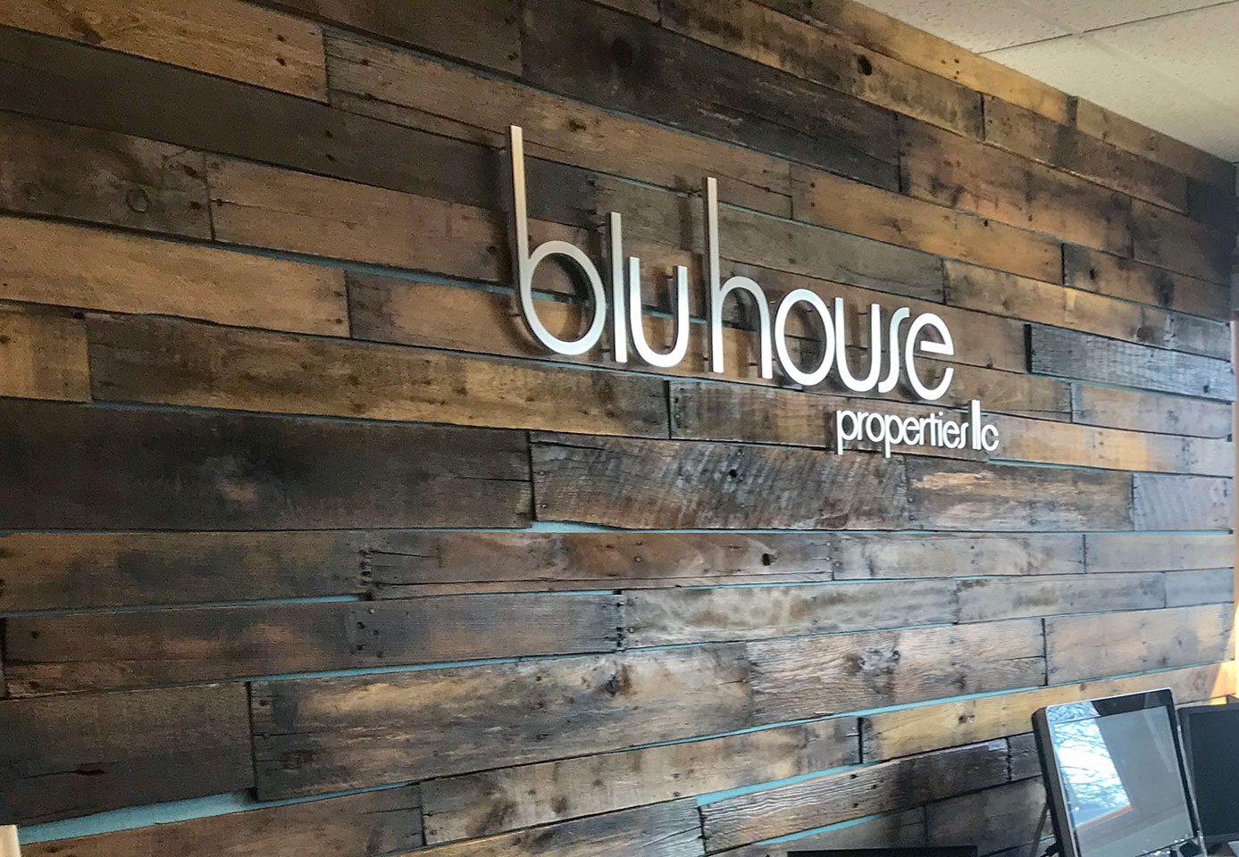
r.o.i. Design has been supporting Ryan Ogle and BluHouse with interior design for many years, and we were part of the team for their recent expansion. Along with interior design, we provided graphic design and product procurement to assist in getting their space operational in time for the busy 2018 real estate season.
We worked with architect Tim Allspach, builder Kevin Cook, and BluHouse’s own team of builders, Mariani Construction, to complete the project. The complete remodel included almost 4,000 square feet of office space.
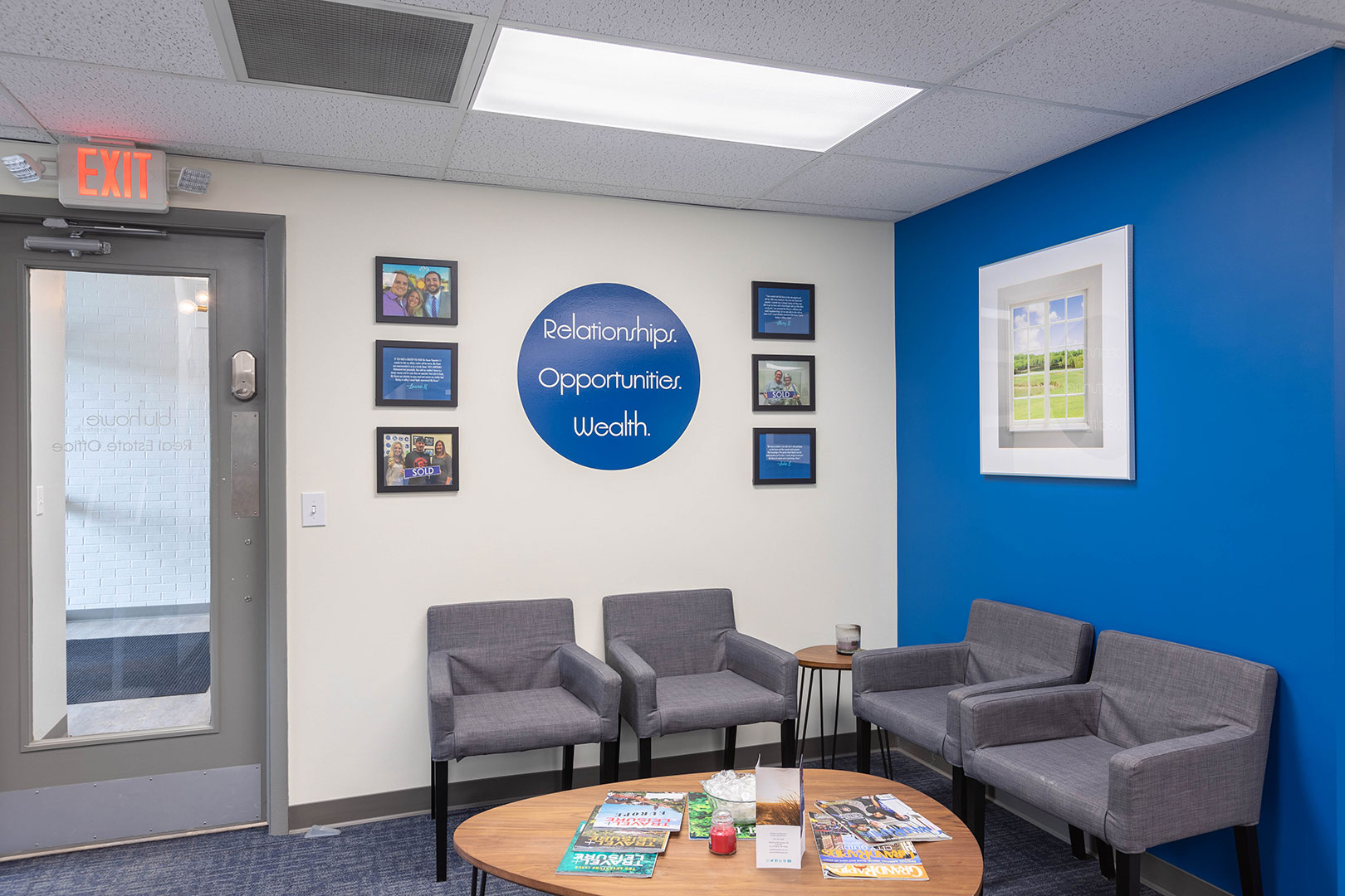
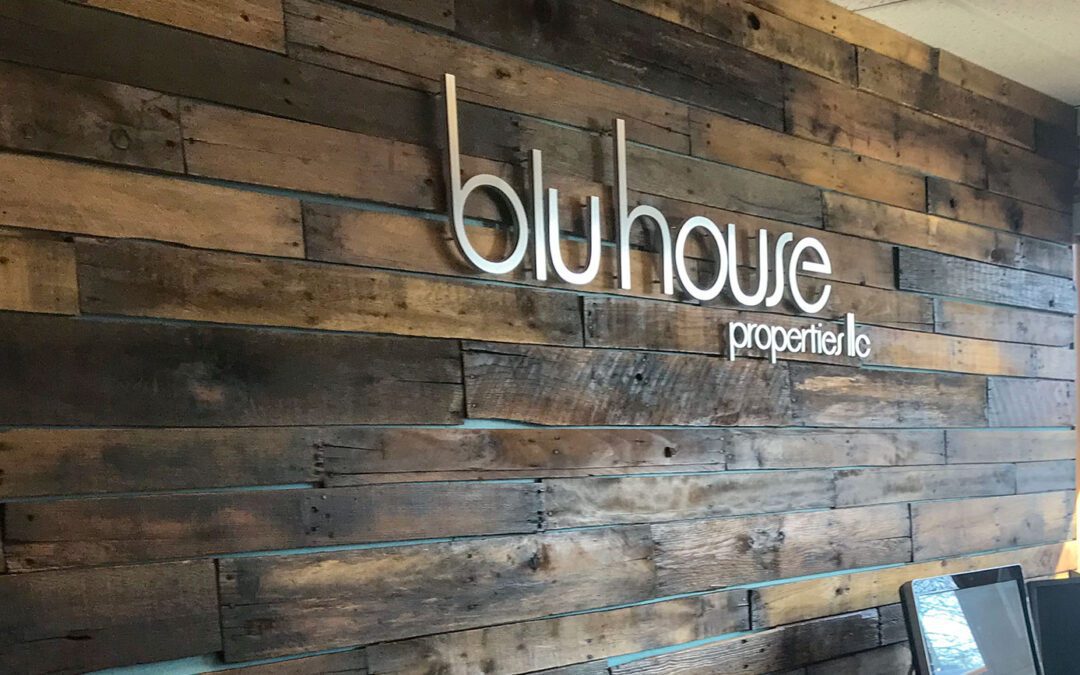
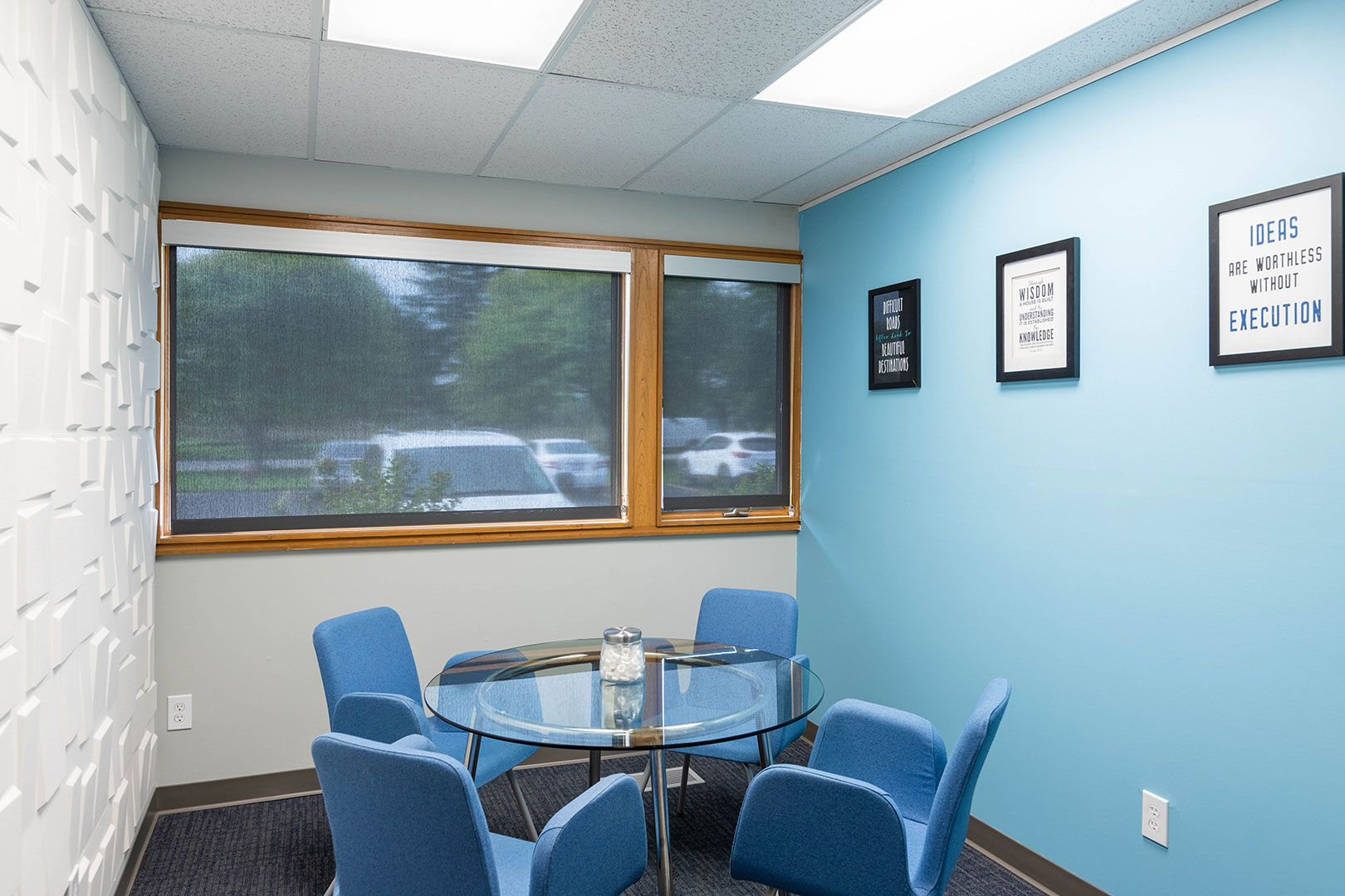
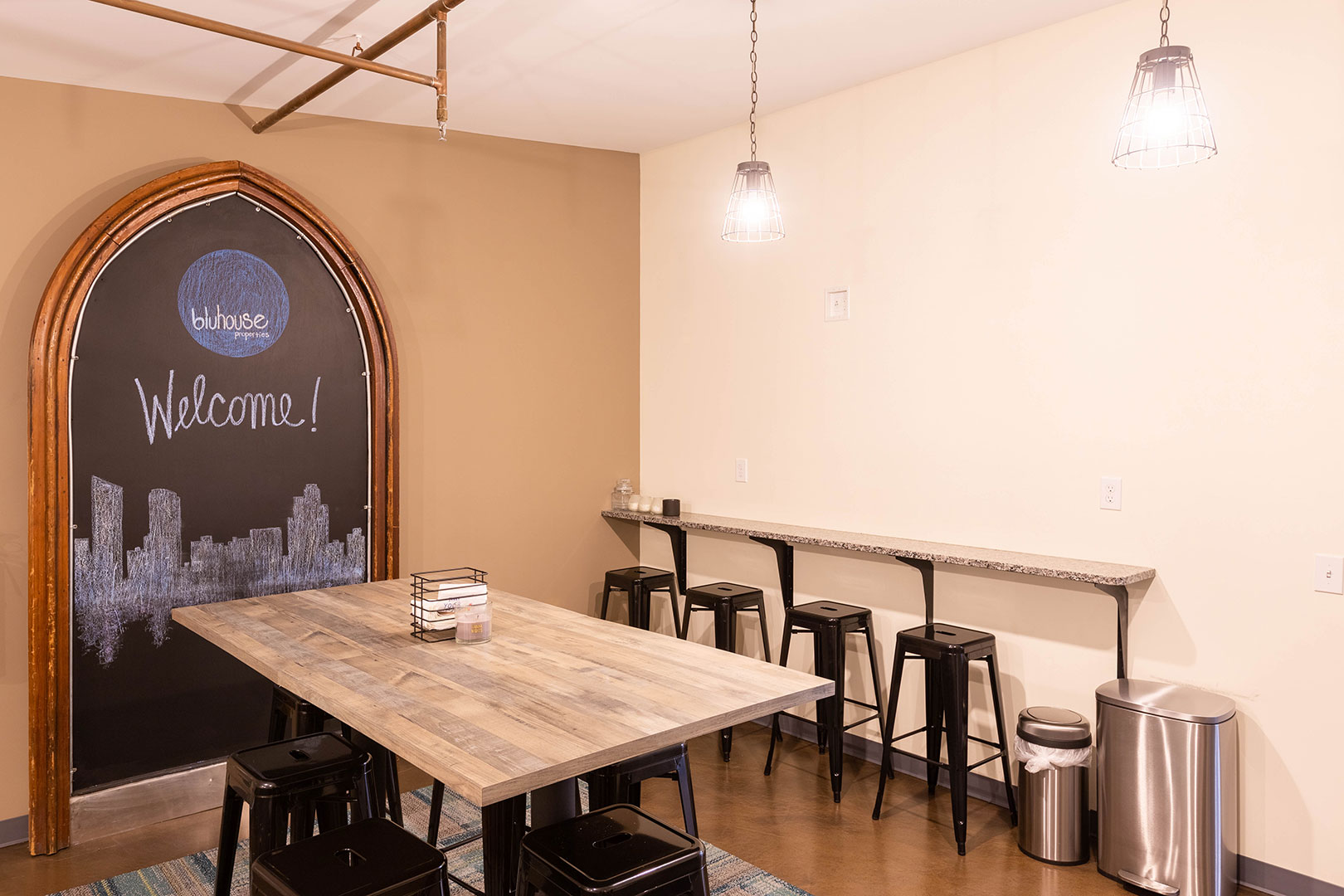
The office includes a combination of private offices and open office space supported by tiny private areas for team members to use for calls and focused work. The reception wall makes use of reclaimed wood, which was locally sourced from Grand Rapids Pallets. Throughout the space are accents of “BluHouse Blue” and the inclusion of some of Ryan’s key “finds and treasures”. A dynamic team photo wall makes a bold statement at one end of the space.
Ryan Ogle started BluHouse in 2007. He has grown the company to include an active team of realtors, property managers and remodelers, and marketing consultants through a variety of privately held and related businesses.
Their first offices on Wealthy Street in Eastown became cramped and impractical, so over a few years, business segments were relocated to other facilities. BluHouse Properties, the real estate business, moved to East Paris in 2016 but expanded their presence there in 2018.
For more about BluHouse Properties, Rent Blu, and 7thRow Creative go to thinkbluhouse.com, rentblu.com, and think7th.com.
by Ryan | Jul 12, 2018 | Design News, Exhibit Design, Interior Design, Lighting Design, Workplace Design
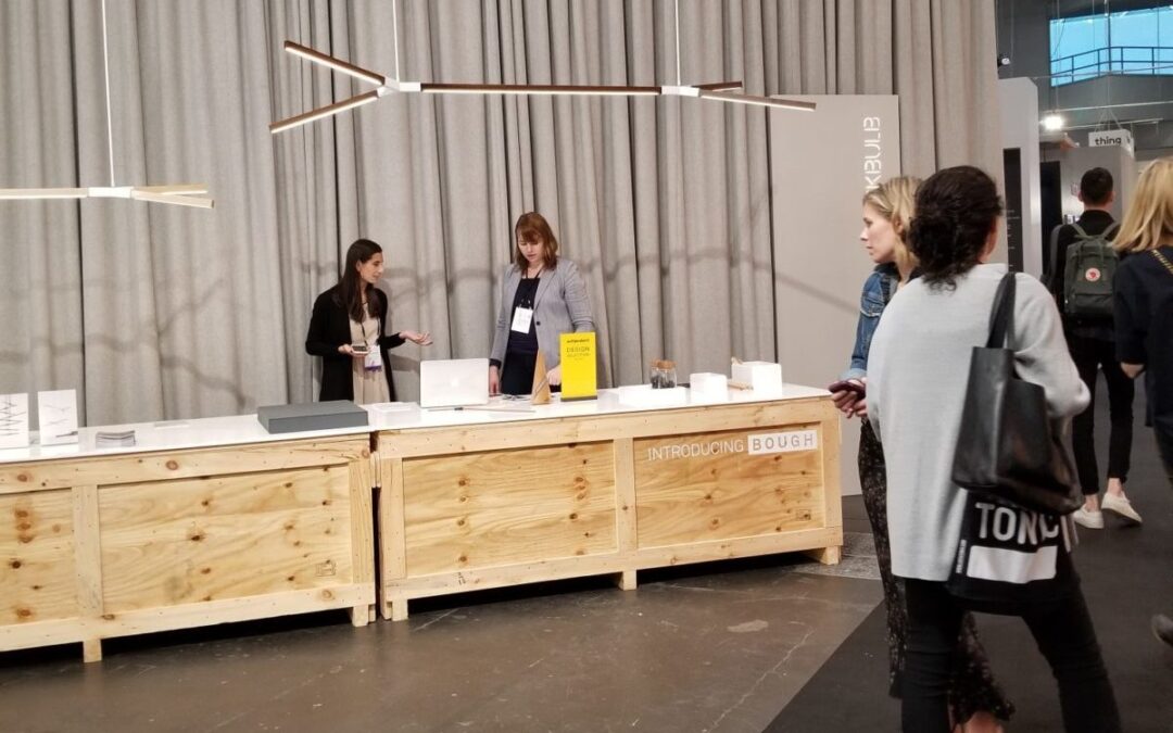
At r.o.i. Design, we like to stay on top of new products and current trends in the design world. One important way that we do this is by attending design shows to see these new products and trends firsthand. This spring, we attended two major design shows, International Contemporary Furniture Fair (ICFF) in New York City and NeoCon in Chicago. Read on to learn more about we saw and discovered.
ICFF, New York City
Thirty years ago this show started as an international furniture show, introducing new ideas and new materials for furniture. But today it is not limited to furniture. They describe themselves as North American’s platform for global design, showcasing the newest frontier of what’s best and what’s next. ICFF NYC hosts more than 800 exhibitors from more than 40 countries in 11 categories from furniture to materials to kitchen and bath to fabricators.
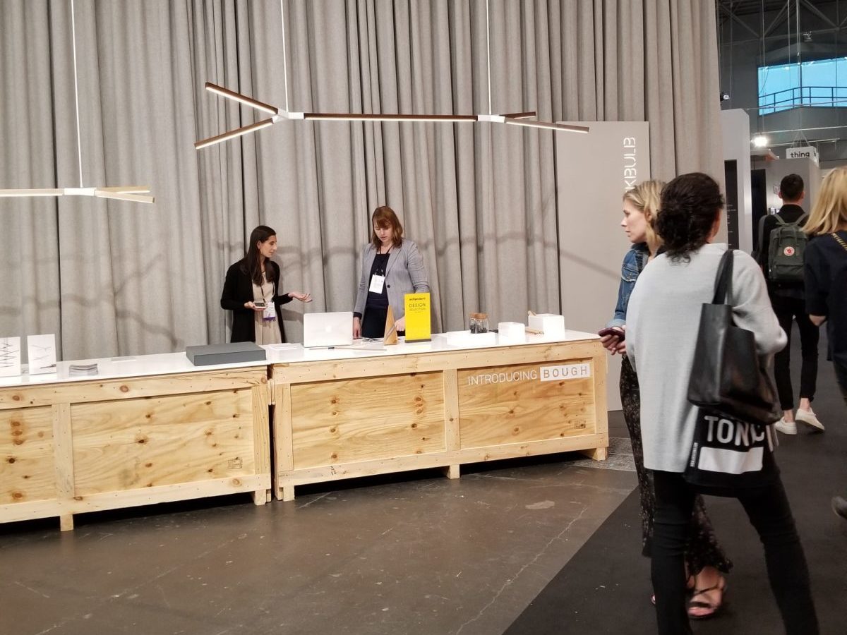
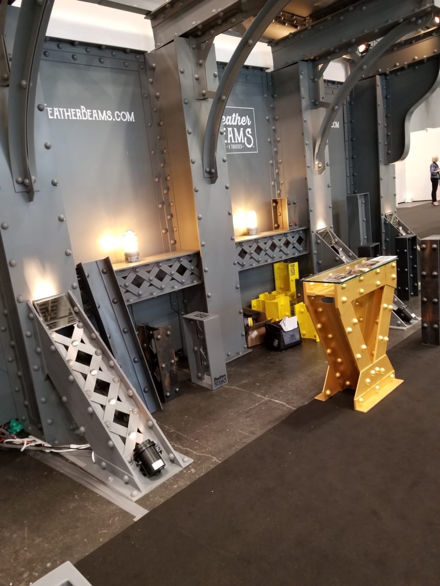
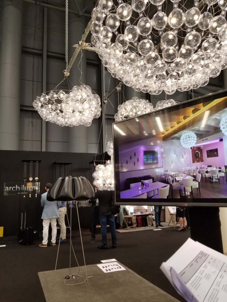
r.o.i. Design spent a day at the show and came away with a couple of observations. LED lighting promotes creativity in all product design, but the decorative lighting designs were breathtaking. A couple of memorable showcases were Featherbeams decorative faux trusses and metalwork, Puff Buff Design, LED lights in vinyl bubbles that are shipped unassembled from Poland, and Knuckles and Other Good Joints, beautiful metal joinery that promotes custom table designs.

ICFF is part of Design Week in NYC and the Cooper Hewitt Design Museum was part of the Design Week agenda. They were featuring two major exhibits, “Access+Ability” and “Saturated: The Allure and Science of Color”.
“Access+Ability” is an exposition of product designs that enable humans to freely engage with their environment. There has been a surge of design with and by people with a wide range of physical, cognitive, and sensory abilities. Fueled by advances in research, technology, and fabrication, this proliferation of functional, life-enhancing products is creating unprecedented access in homes, schools, workplaces, and the world at large. “Access+Ability” features over 70 innovative designs developed in the last decade.

The second exhibit, “Saturated: The Allure and Science of Color” explores the elusive, complex phenomenon of color perception and how it has captivated artists, designers, scientists, and sages. Featuring over 190 objects spanning antiquity to the present from the extraordinary collections of Smithsonian Libraries and Cooper Hewitt, the exhibition reveals how designers apply the theories of the world’s greatest color thinkers to bring order and excitement to the visual world.
NeoCon 2018, Chicago
We took a day trip to Chicago again this year to attend NeoCon. This year marked the 50th annual Neocon! While the six-plus hours on the road (round-trip) made for a long, hurried day, we still enjoyed the opportunity to see what is new in the world of commercial furnishings.
As usual, NeoCon was crowded with industry professionals on six floors of the Merchandise Mart. Some floors are occupied by the permanent showrooms of larger established manufacturers of furniture, textiles, carpet, and wallcovering. Other floors are full of booths represented by smaller groups and some newcomers. Large or small, many of these exhibitors have something unique, exciting, or just plain beautiful to introduce each year. This year was no exception, as we saw many items to whet our designer appetite.
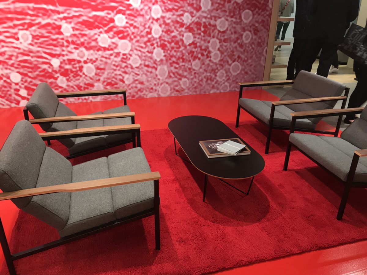
Here are some of the trends and cool stuff we saw at NeoCon this year.
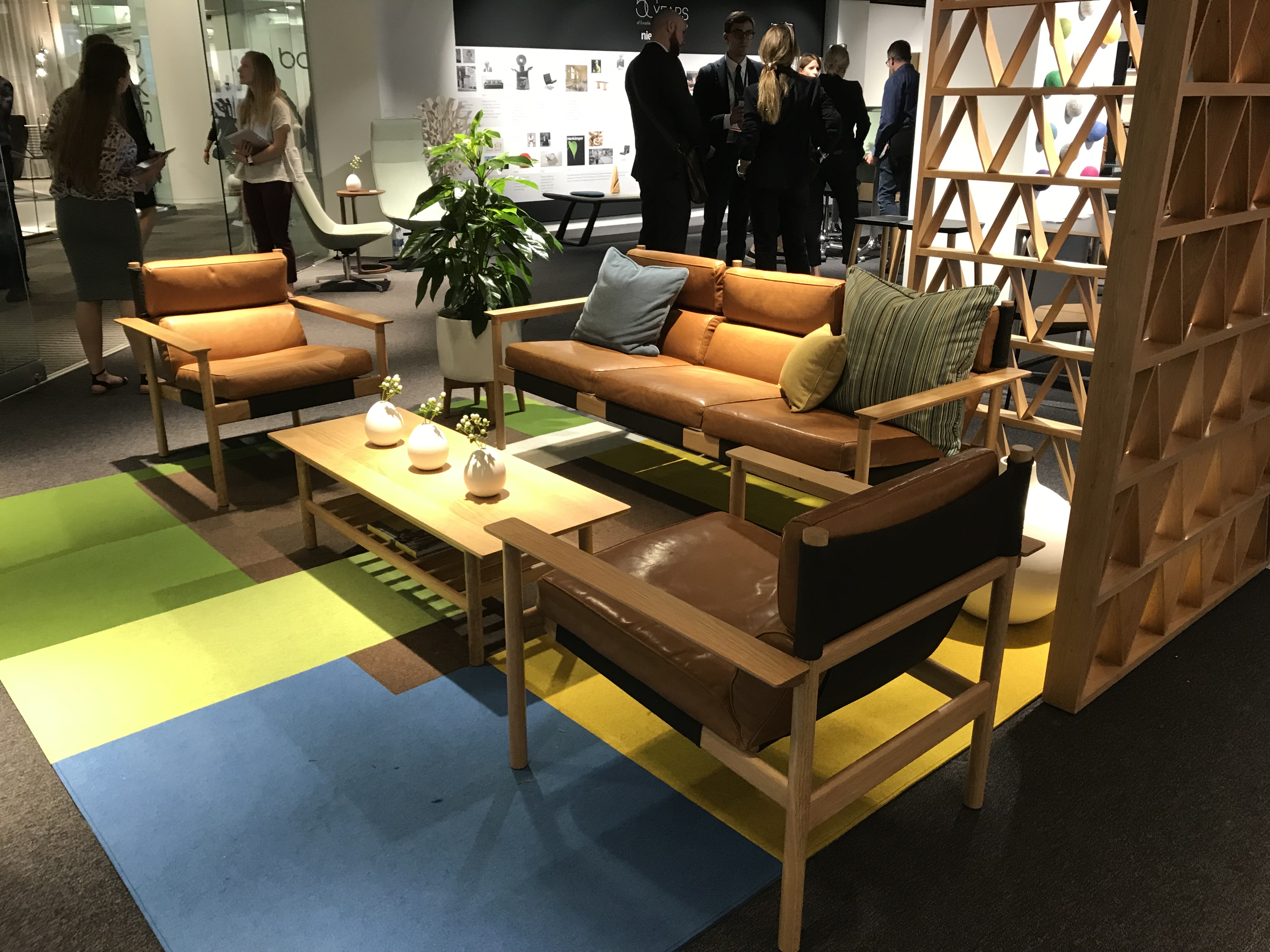
The styles and colors of the late-midcentury modern style are coming back in retro full-force. This style is super-chic right now in the commercial office industry. Of course, these styles are updated to today’s standards of technology, sustainability, and environmental quality.
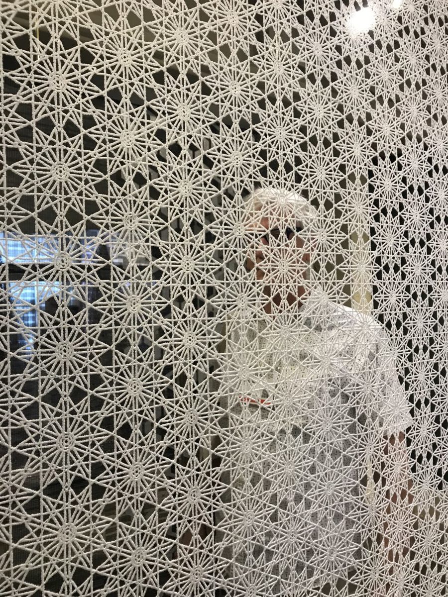
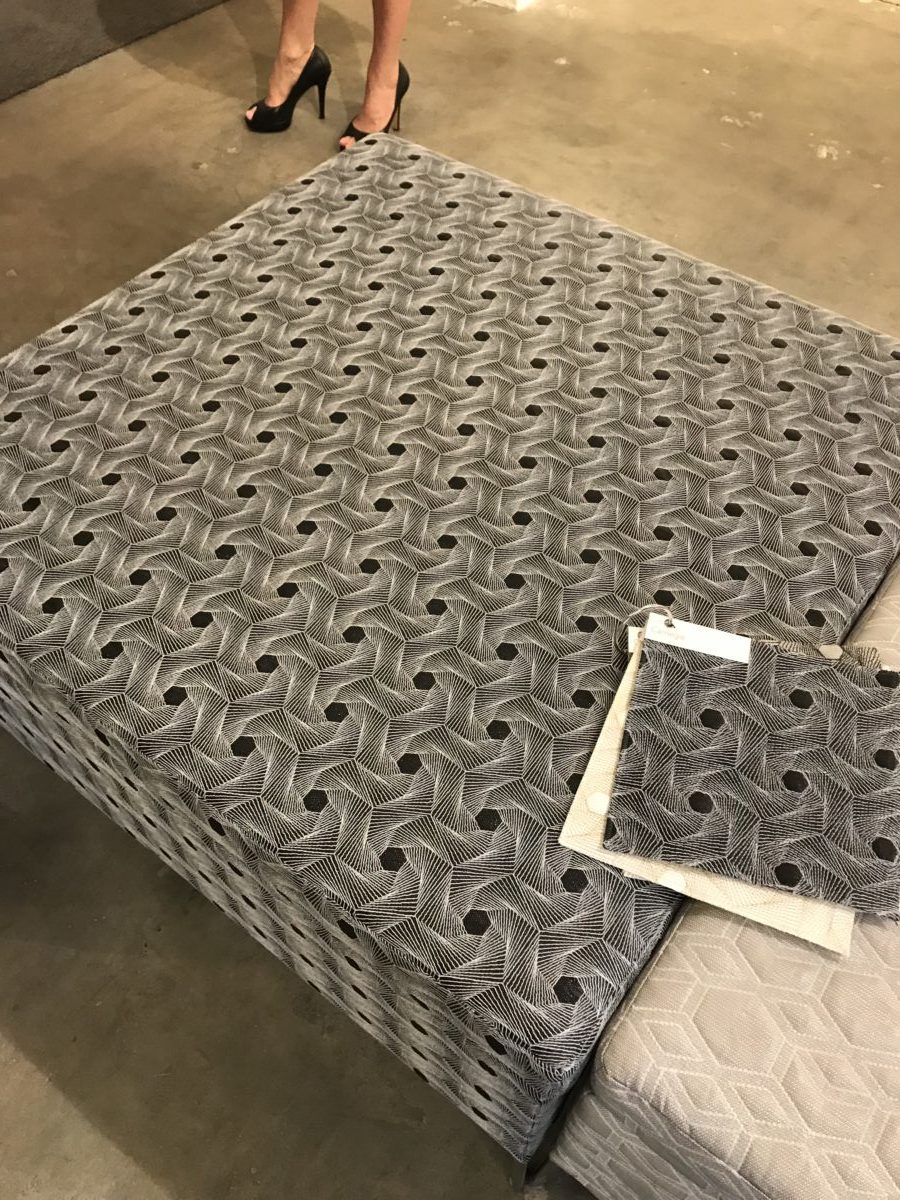
Intricate and complex geometric patterns are trending. We saw a lot of these tessellations in fabrics, wall panels, and even light fixtures at this year’s NeoCon.
Adjustable Desks – This trend actually took off a few years ago, but it was interesting to see how almost everyone has adjustable height workstations now. There are some great designs out there. Heck, even r.o.i. Design created custom adjustable desks recently for one of our clients!
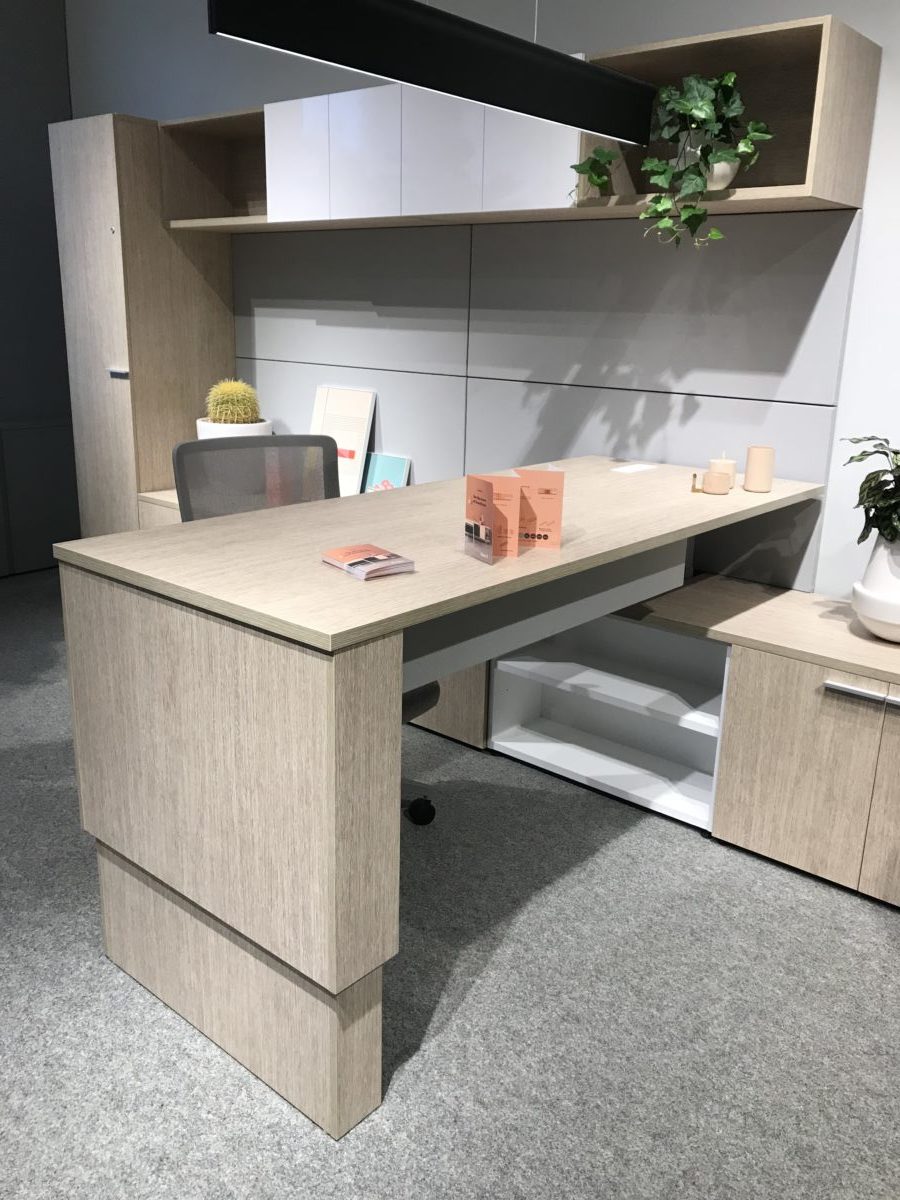
We noticed a lot of furniture now features natural wood paired up with powder-coated metals. When past trends in furniture were all wood or no wood at all, these new designs seem to strike a balance between the two.
by Ryan | Feb 20, 2018 | Design News, Interior Design
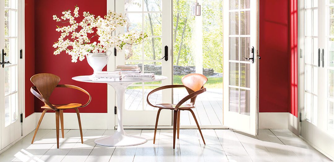
As we all know, trends come and trends go. Just like the changing seasons, things that were fashionable just a short while ago are now passé. As interior designers, we at r.o.i. Design try to stay ahead of the trends or at least keep up with them. Some people make it their profession and area of expertise to predict the trends. The color experts at Pantone, Benjamin Moore, and Sherwin Williams report on their color trends each year, including their “Color of the Year”.
Below are links to the 2018 color trends from Pantone, Benjamin Moore, and Sherwin Williams.
Pantone
Color of the Year – Ultra Violet 18-3838
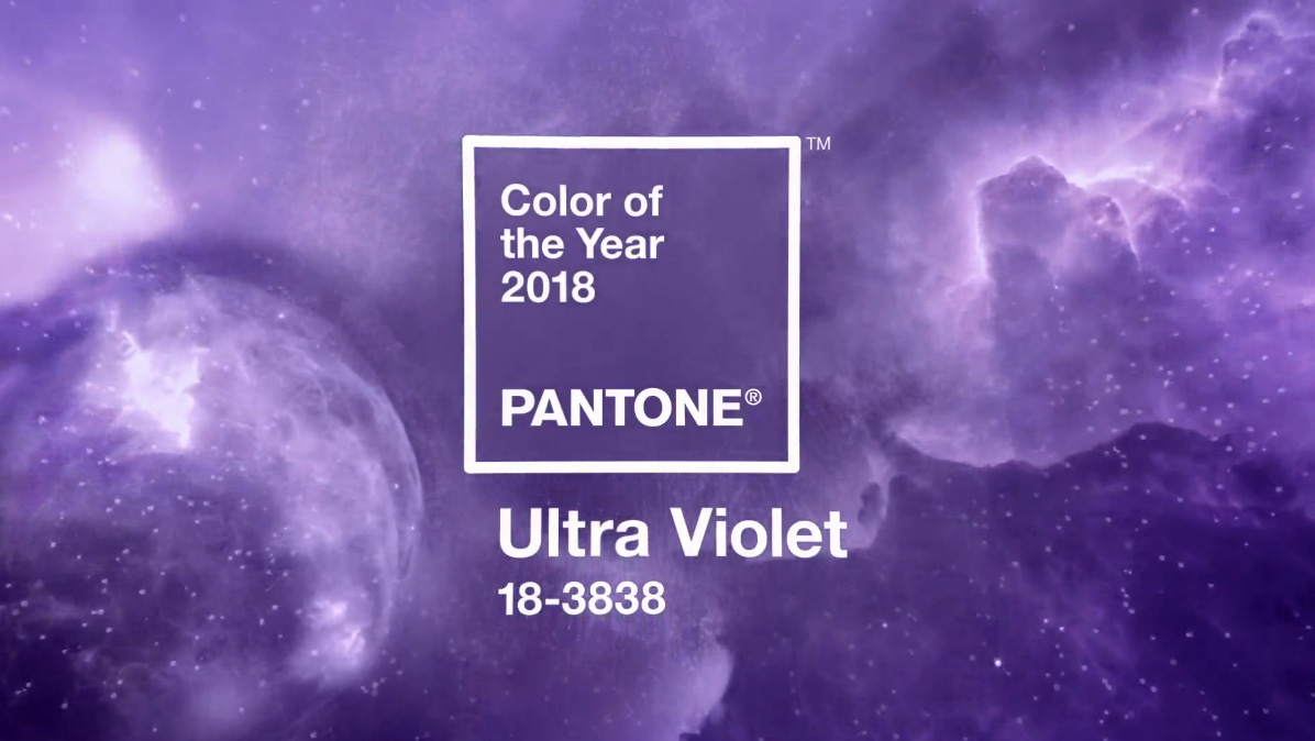
Complex and contemplative, Ultra Violet suggests the mysteries of the cosmos, the intrigue of what lies ahead, and the discoveries beyond where we are now. The vast and limitless night sky is symbolic of what is possible and continues to inspire the desire to pursue a world beyond our own.
Benjamin Moore
2018 Color Trends – Caliente AF-290
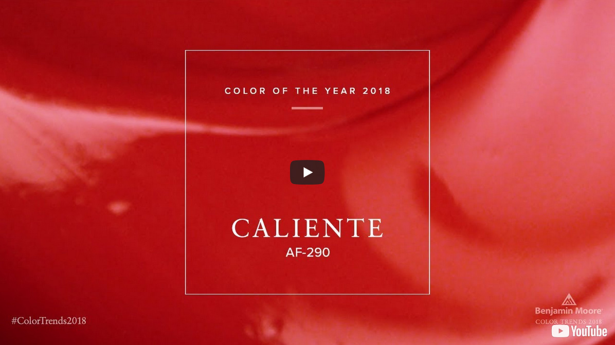
“Caliente is the signature color of a modern architectural masterpiece; a lush carpet rolled out for a grand arrival; the assured backdrop for a book-lined library; a powerful first impression on a glossy front door. The eye can’t help but follow its bold strokes. Harness the vitality.”
—Ellen O’Neill, Benjamin Moore & Co.
Sherwin Williams
2018 Color of the Year – Oceanside SW 6496
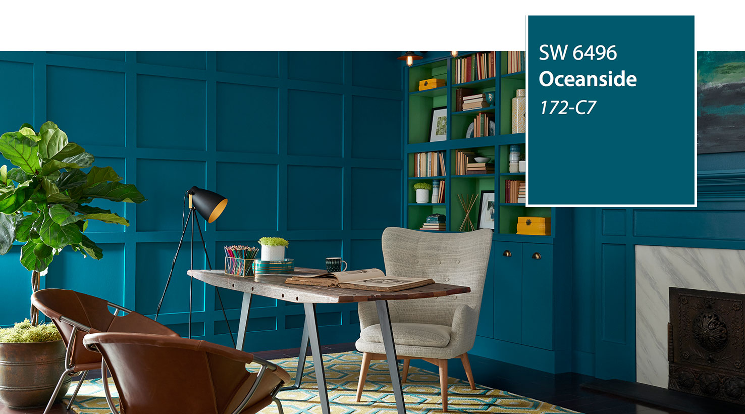
A collision of rich blue with jewel-toned green, a color that is both accessible and elusive, Oceanside SW 6496, is our 2018 Color of the Year. A complex, deep color that offers a sense of the familiar with a hint of the unknown, Oceanside, bridges together a harmonious balance of blues and greens that can be found in what’s old and new.
by Ryan | Dec 18, 2017 | Church Design, Design News, Graphic Design, Interior Design
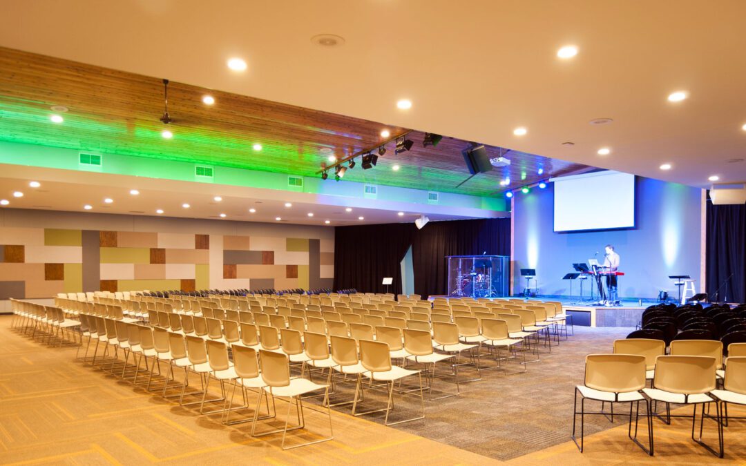
Sun Rise Ministries now has its own facility after 14 years. They purchased the former Freedom Chapel in Jenison, MI. They engaged BCI Construction and TJA Architecture to remodel the facility. Having worked with both Doug Kooistra of BCI and Tim Allspach of TJA on other projects, it was great to join the team as the Interior Designers.
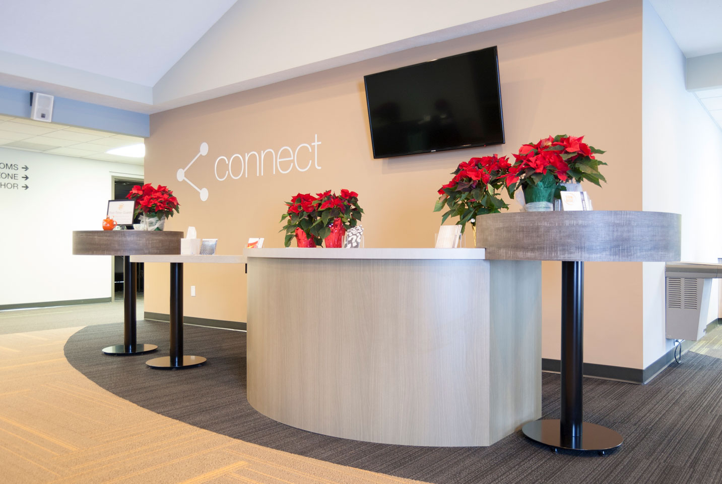
For Sun Rise, their commitment to help people Connect and Serve meant their new church home needed to be immediately “engaging”, welcoming visitors to participate.
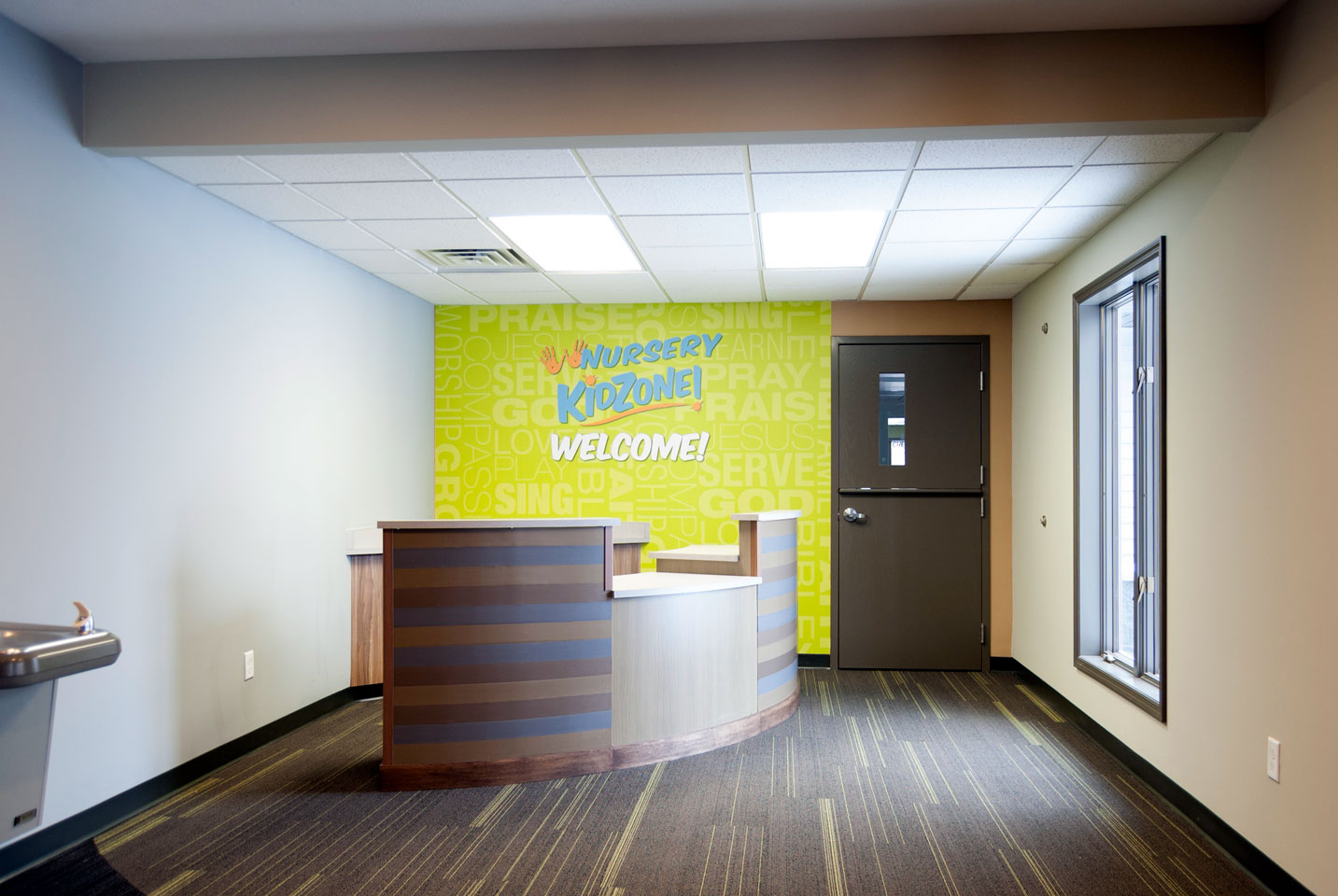
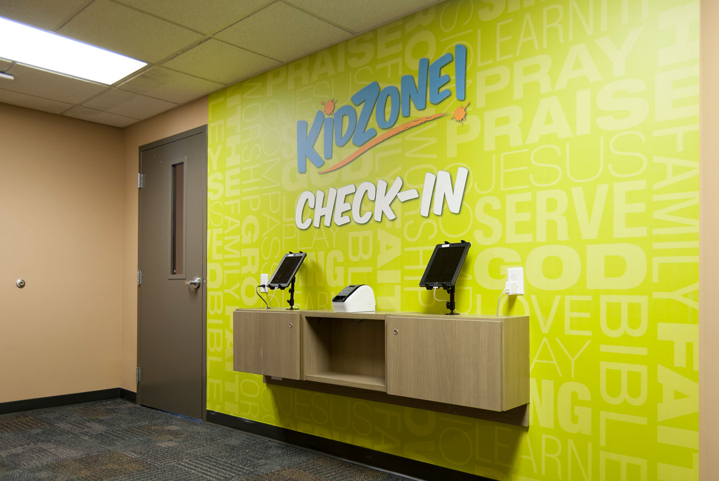
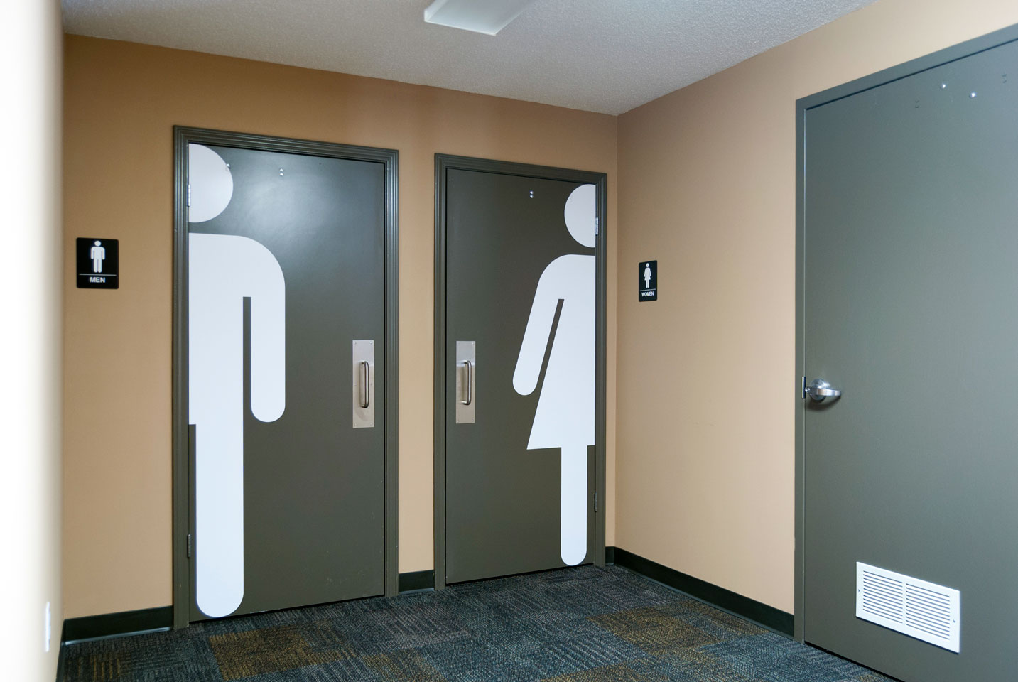
It is amazing what some well-placed paint, carpet and graphics can do to a space. We integrated the acoustical panels in the worship area to create a wall design. We were also able to offer graphic design services, creating wall graphics and signage in the corridors. (A “shout-out” to our own Ryan Bright, graphic designer.)
Thank you to church leaders Bob and Penny for your direction and leadership. Blessings on your ministry’s new home!
by Ryan | Dec 18, 2017 | Branding, Design News, Hospitality Design, Interior Design, Procurement and Purchasing
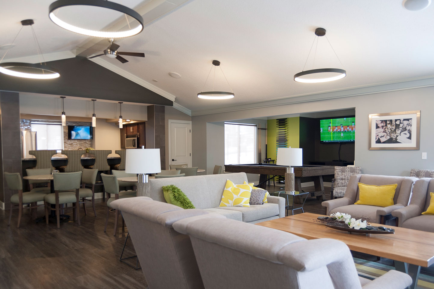
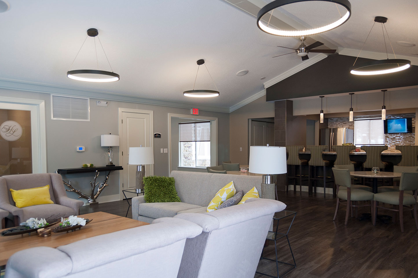
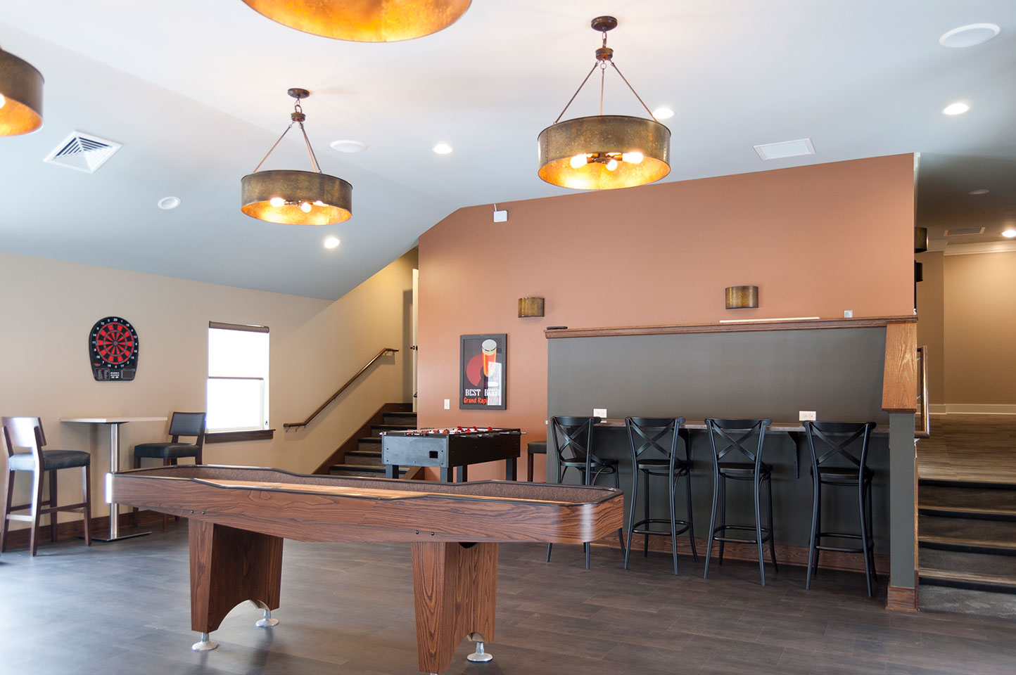
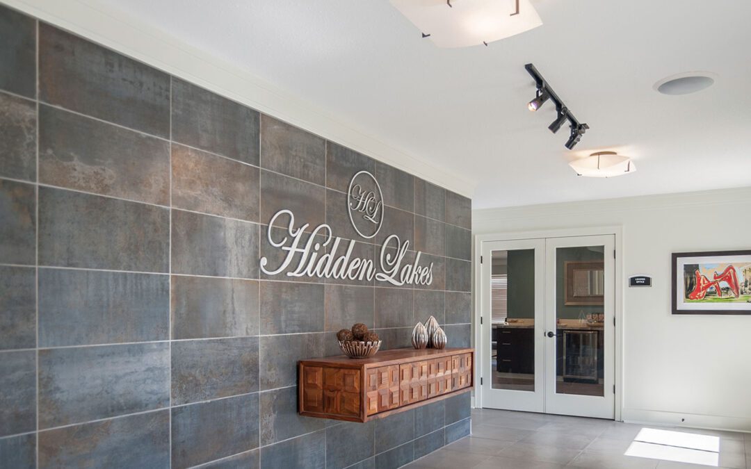
 Apartment complex developments depend on their leasing office and shared amenities to give their customers a sense of their brand and values. Those spaces also say something about the company’s aesthetic. Hidden Lakes Apartments in Kentwood, Michigan initiated a two-year remodeling of their clubhouse, game room, leasing office and outdoor pool in 2015.

Wolverine Building Group project manager, Landon Jones, contacted r.o.i. Design to design the interiors. The project celebrated its grand reopening in November 2017.

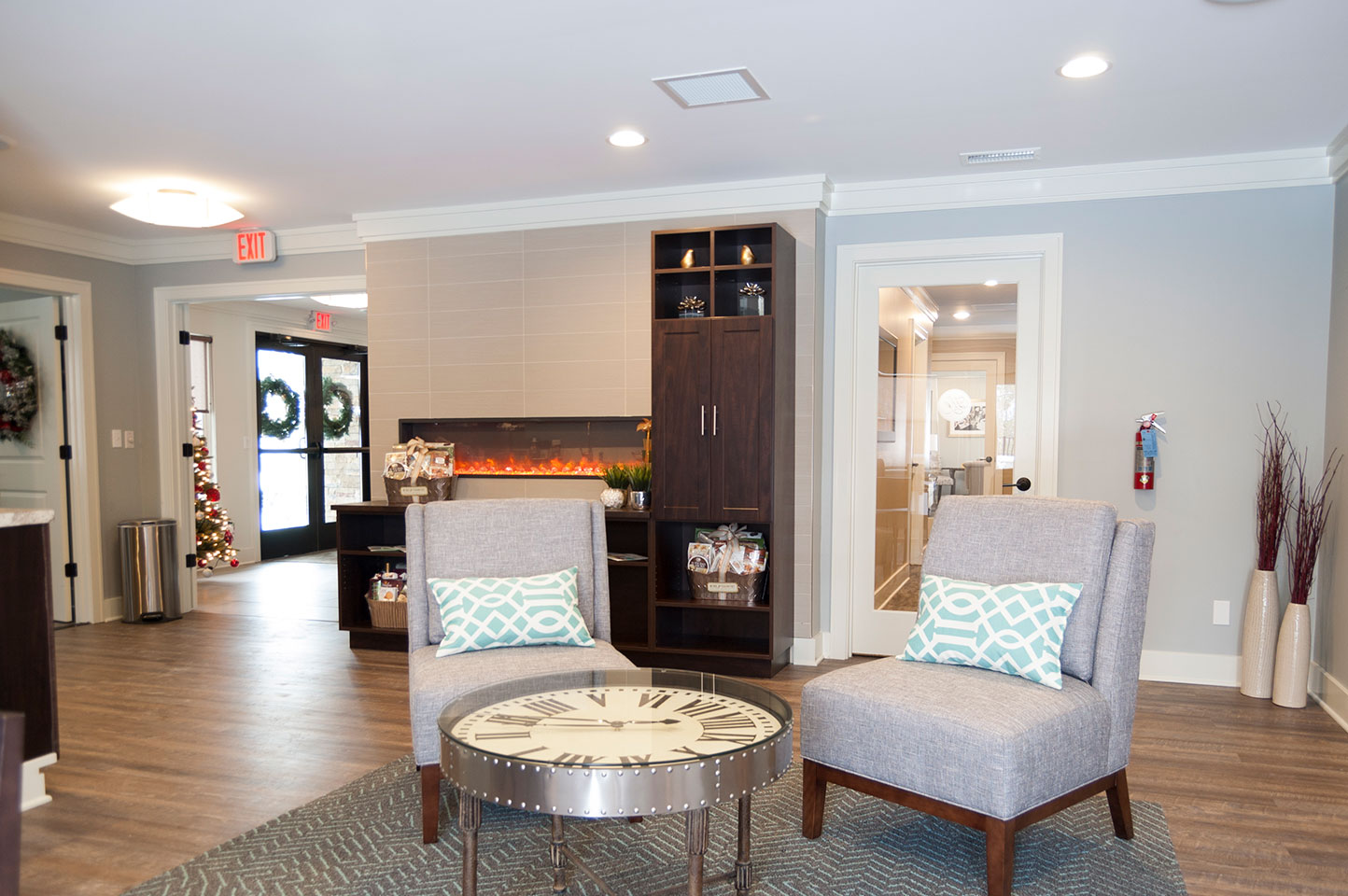
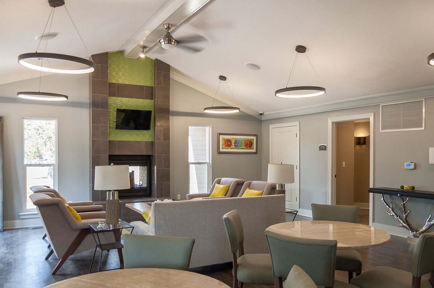
In addition to selecting all finishes, r.o.i. Design selected all art and furnishings, supplying many of them. The clubhouse lounge furnishings look amazing! Great job, thanks to Ronda Geyer, our Procurement and Purchasing Manager.

Some other favorite elements of the remodeled space include:
- Large format wall tile and a wall hung credenza in the Lobby
- New LED chandeliers in the Clubhouse Lounge
- Recessed wall fireplace and built-ins in the Leasing Office
- Wall finishes in the Restrooms


by Ryan | Nov 15, 2017 | Design News, Interior Design, Medical Design
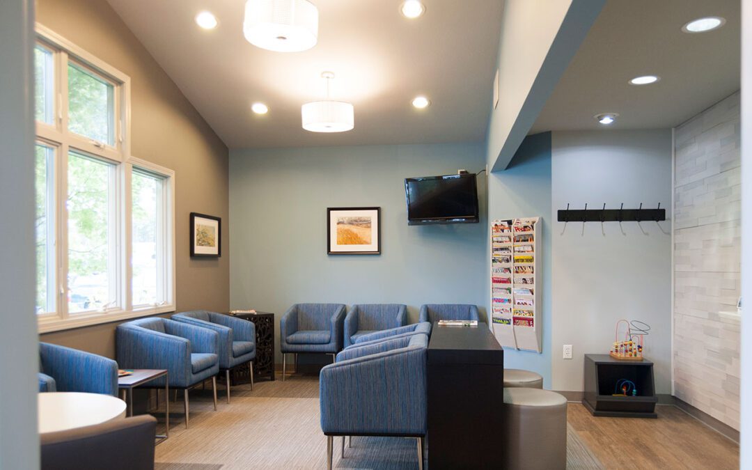
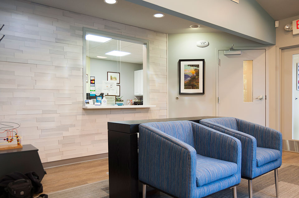
Dr. Drew Scholtz contacted r.o.i. Design looking for finish ideas to update his office. The challenge for any business is to understand what to invest in. What changes will have the largest impact on customer and employee satisfaction?

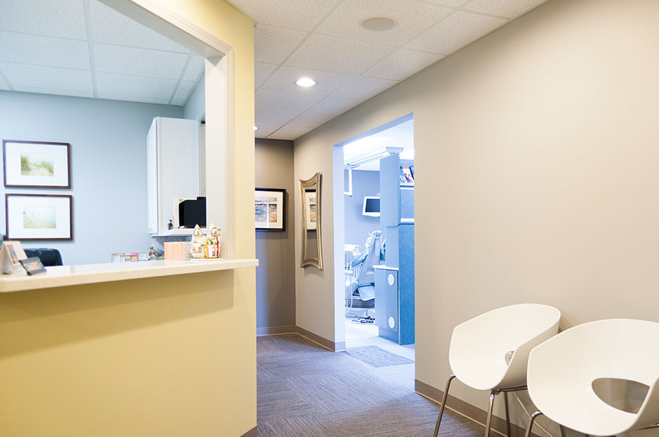
For Scholtz Dental, upgrading the lighting, updating the floor and wall finishes and replacing the lobby furnishings was the answer. Equipment and casegoods were able to remain until the next remodel. The lobby upgrade was the most noticeable improvement. We created a feature wall at the reception, added decorative lighting, installed an interesting carpet and added new stylish furnishings.

r.o.i. Design has a select group of manufacturers whose furniture we can distribute at competitive prices. Thank you Dr. Scholtz for selecting r.o.i. Design not only to provide you with interior finish ideas, but to supply you with new furnishings. It looks great!


 Apartment complex developments depend on their leasing office and shared amenities to give their customers a sense of their brand and values. Those spaces also say something about the company’s aesthetic. Hidden Lakes Apartments in Kentwood, Michigan initiated a two-year remodeling of their clubhouse, game room, leasing office and outdoor pool in 2015.