by Ryan | Apr 26, 2017 | Branding, Design News, Interior Design
We pride ourselves on being a commercial interior design group that has experience in a variety of environments. In the last few years our work has created office environments (from manufacturers to a variety of service providers), retail environments (from stores to neighborhood dental/orthodontic practices), schools (charter schools and higher education spaces), hospitality and multi-family spaces (hotels and apartments), and religious spaces (worship and educational related).

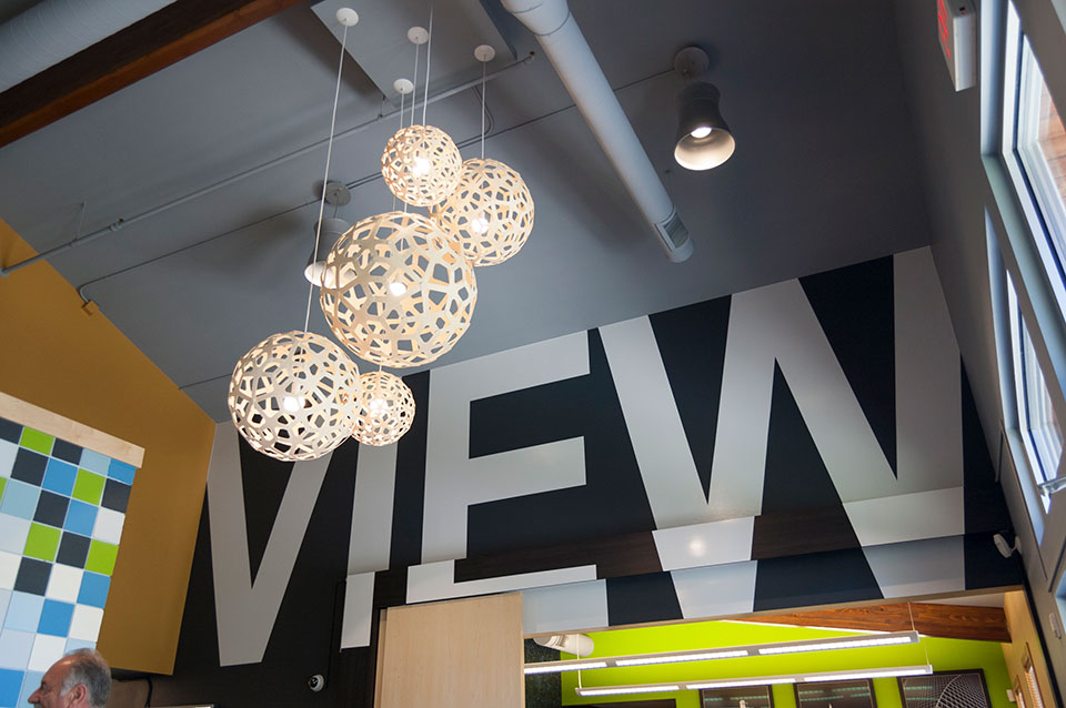
Campus View Apartments, Clubhouse – Allendale, MI
While there is variety in the types of spaces, our customers have some key attributes in common:
- They have a budget
- They have a company story, a brand. Sometimes it is more developed than others.
- They want their space to appeal and attract customers as well as please current and future employees.

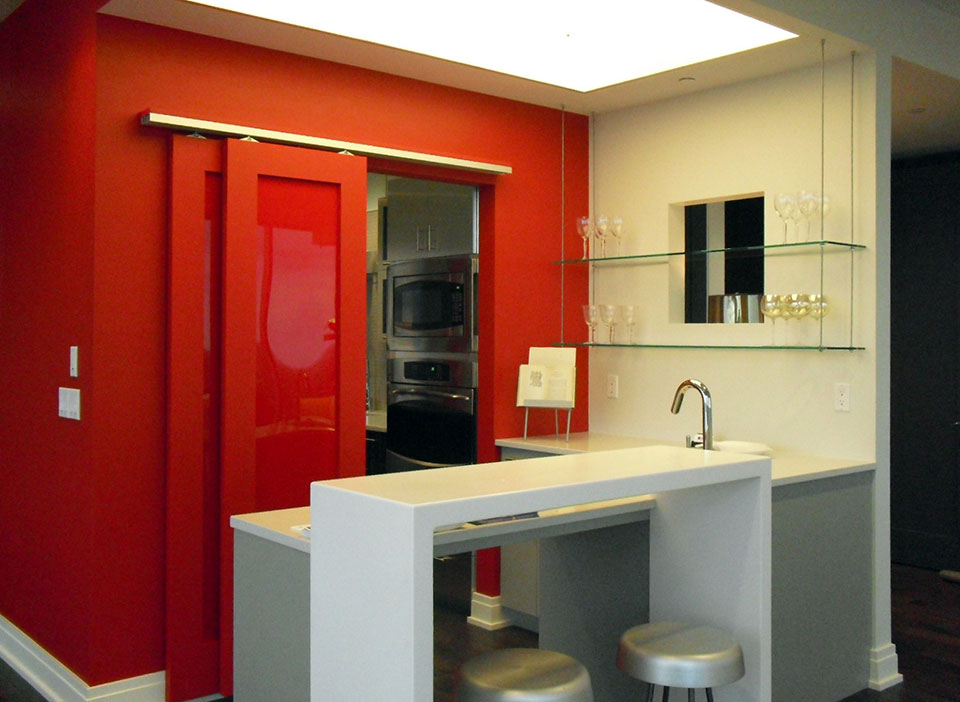
River House Condo – Grand Rapids, MI
Our design process, early in concept design, includes budget development. Our experience working with contractors and owners has given us perspective and knowledge that can identify budget issues early on, before all the design fees are spent.
Concept and developed design needs to reflect who the company is. We interview our clients, we listen as well as we can, and then summarize back to our customers what we heard.

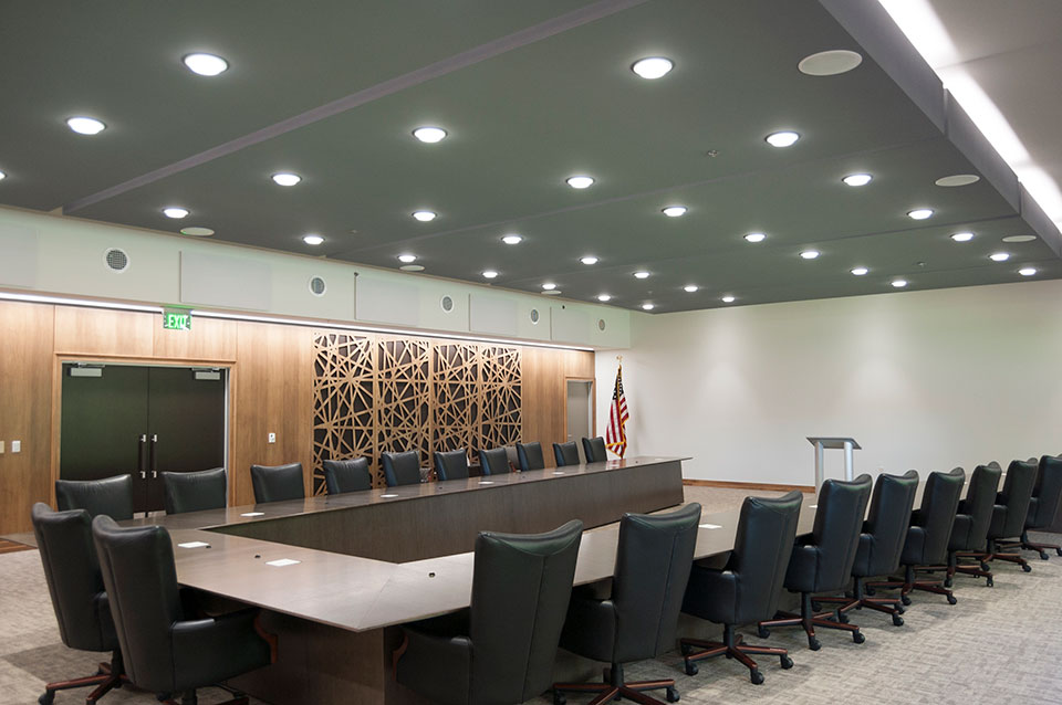
Wolverine Power Cooperative, Conference Room – Cadillac, MI
Everyone wants their space to be beautiful. But even more importantly, it needs to attract the target customer and maintain and inspire the ideal customer. This is a focused aesthetic, delivered with restraint.
For more information, see our current company brochure:


by Ryan | Apr 24, 2017 | Branding, Design News, Designing for Kids, Medical Design
So much more than runny noses, vaccinations, bumps and scrapes, a pediatric practice is a sophisticated business that manages the physical, behavioral and mental health issues for newborns through teenagers. There are lots of challenges, so the office design needs to create an environment that offers some efficiency and some fun.
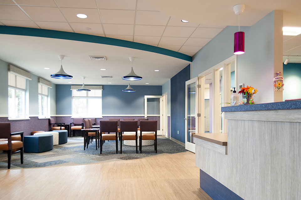
r.o.i. Design learned so much working with ABC Pediatrics as we helped them with the interior design of their new offices in Wyoming, MI. We learned how they wanted to engage families with their interiors, but not be just “kid-like”. They wanted their space to look professional and simple, but very welcoming and comfortable. They needed it to be user friendly for staff and family which meant maintainable surfaces and easily identifiable areas. And there was a budget.

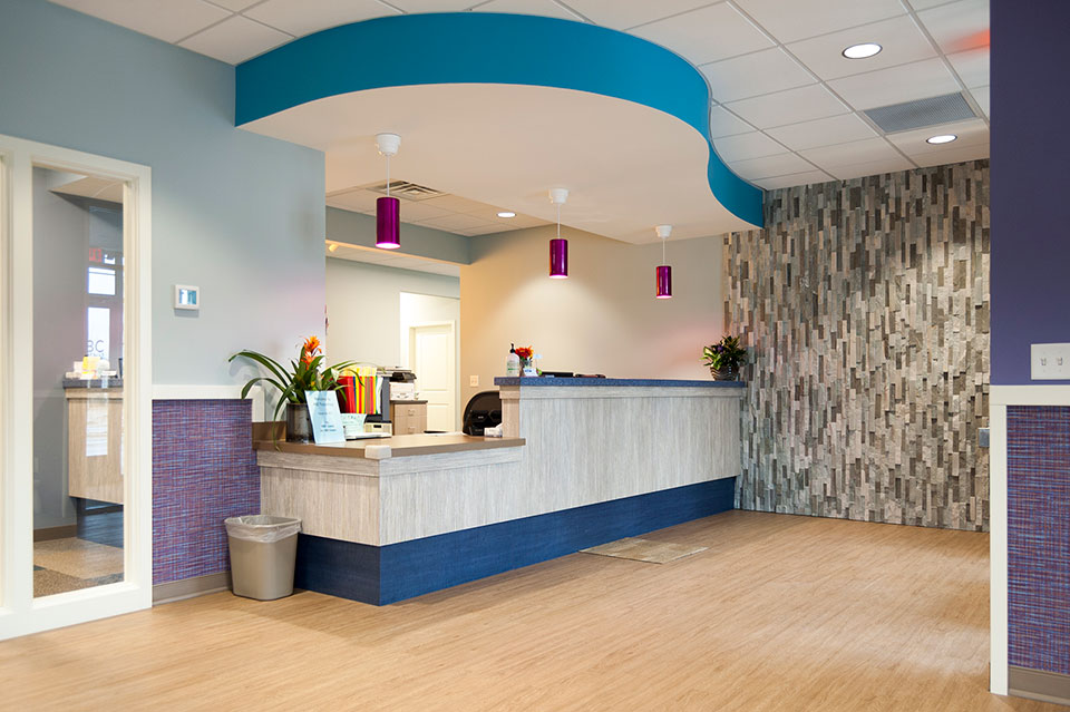
ABC Pediatrics Lobby
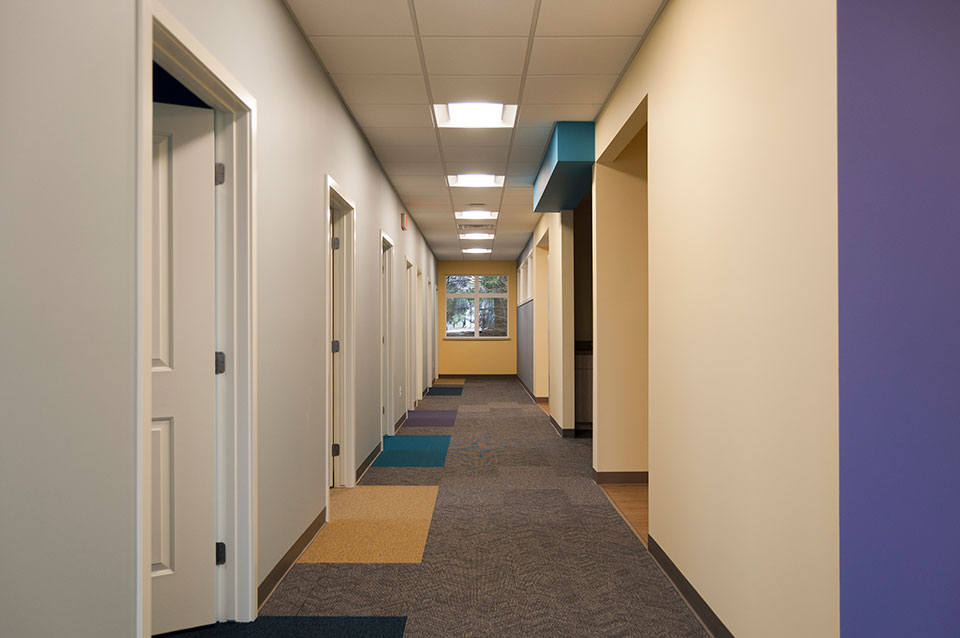
Starting with a color scheme that they currently use in their Walker location, r.o.i. Design “upped the ante” by intensifying some of the colors, adding pattern and interest, in thoughtful ways. Some of our favorite elements are the carpet accents, the color accents, the decorative lighting and the lobby furniture. Wall art will soon be added to the interior and we like those selections as well.

Interior corridor at ABC Pediatrics.
ABC Pediatrics also asked us to create a new logo for their practice. They wanted a logo that was as updated as their offices were, but more importantly, a representation of their brand. Interviewing them about how they viewed their distinctive difference, we came away with “Caring”, “Diverse” (ages and specialties), and “Child Centered”. They were very pleased with their new business logo designed by Ryan Bright, Creative Executive at r.o.i. Design.

ABC Pediatrics’ new logo.
More about designing for kids
r.o.i. Design has designed for younger audiences before so we had some clues on how this audience reacts to spaces. We know they see color differently than adults and appreciate any tactile detail. For more on our recent work for younger people please visit our page on Black River Schools and Northern Michigan Pediatric Dentistry.
More about ABC Pediatrics
Having outgrown their offices in Grandville, ABC decided to build a building that would be large enough to accommodate their expected growth of families from the south west side of Grand Rapids. Architect-at-Large created the footprint, and Pinnacle Construction was engaged to build the building, and when ABC inquired about interior design, Pinnacle recommended us for the assignment.
Learn more about ABC Pediatrics:

by Ryan | Feb 28, 2017 | Design News
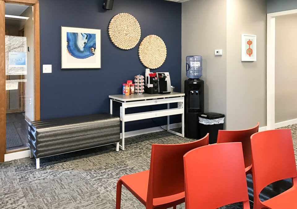
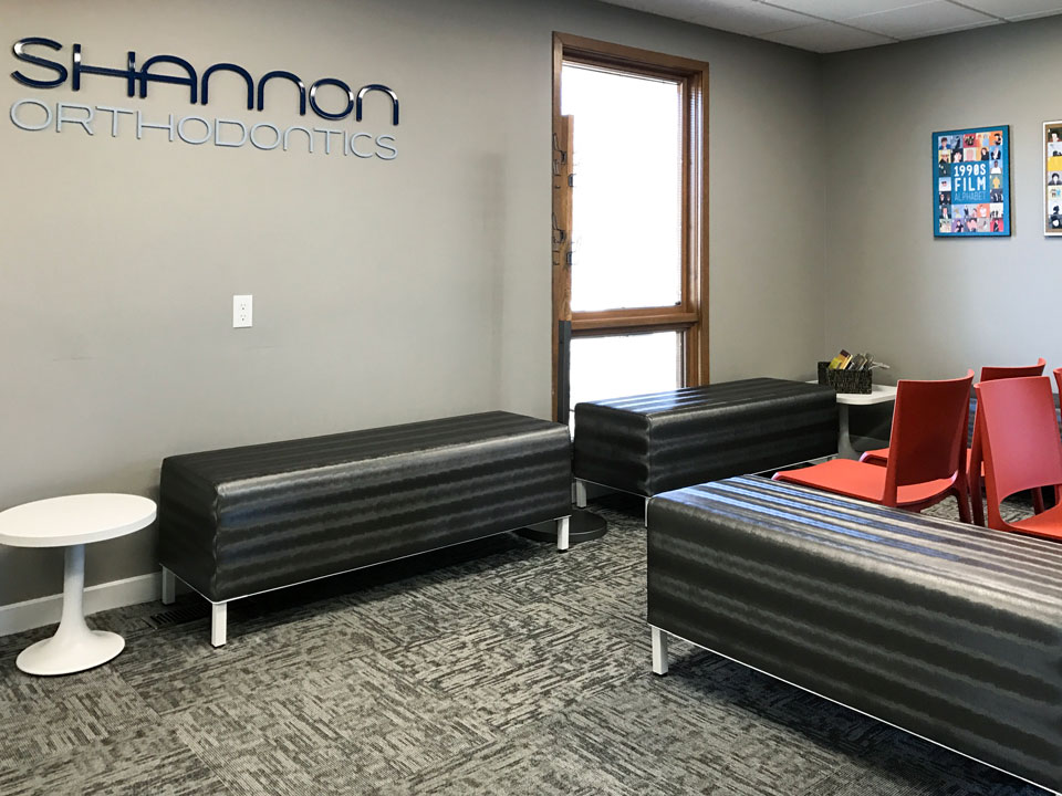
Shannon Orthodontics has three offices. Last year we designed their Grandville, MI space and last month we finished their office in Plainwell, MI. Thanks again to Rockford Construction for making it all happen for this busy practice.
Shannon understands the importance of brand and marketing.
They want all their offices to provide a uniform feel so they could use their interiors in their advertising. They used their new spaces to create a video to promote their business.
Some of the interior elements that help carry the brand include the color scheme, the use of logo and signage, iconic furniture and wall art pieces.

We recognize that Shannon Ortho customers have many choices when it comes to orthodontics, and we want our customer to look as great as they make their patients feel!
For more about Shannon Orthodontics:

by Ryan | Dec 7, 2016 | Design News
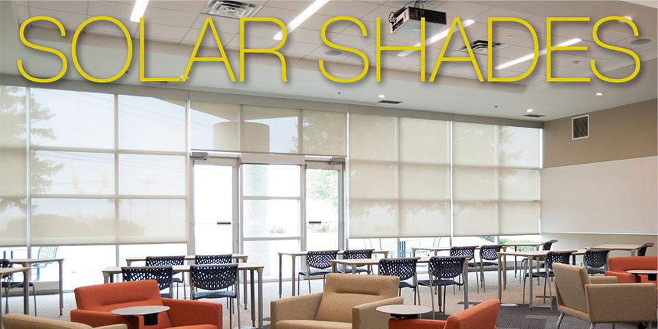
r.o.i. Design Now Offers and Installs SWF Contract Window Coverings!
Give us a call for a free estimate on SWF Contract Solar Shades. We would be pleased to show you product samples and discuss your window covering needs. r.o.i. Design will visit you, take measurements and provide installation.
Solar Shades Are Our Most Popular Window Covering!
- Great alternative to mini-blinds
- Manages light and privacy with minimal decoration
- Easy to clean woven vinyl panels in a variety of colors and transparencies
- Manual or electronic operation with superior clutch systems
Call Us: 616.459.3539 x105
or email Ronda Geyer: rondageyer@roidesign.com

by Ryan | Dec 7, 2016 | Design News
While r.o.i. Design helps design projects that are “ground up” new construction, we are often engaged to assist in the refreshing of existing properties and interiors. More than maintenance and less than easy, property owners review upgrades annually and typically have budgets every three to five years for improvements.
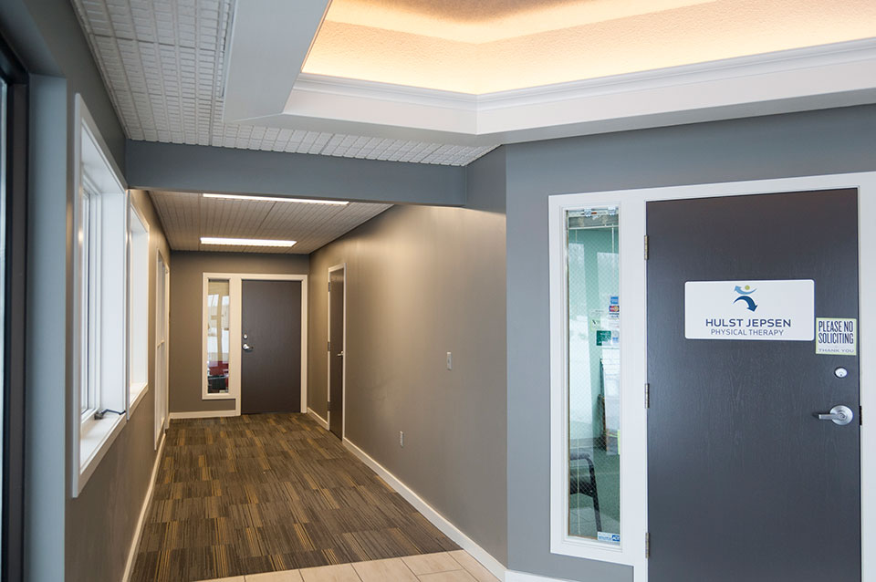
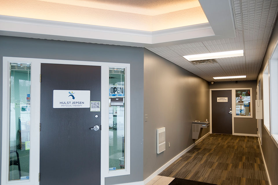
While sometimes these projects may be considered “tiny”, we think of them as “mighty”. Two of those projects for us recently included the upgrading of a public space corridor for a multi-tenant office building on 44th Street in Grand Rapids, MI, owned in part by Mike Stoddard of Basic Online and the atrium of Beechwood Church in Holland MI.
1535 44th Street Office Corridor

New corridor finishes in the Office Suites at 1535 44th St. Wyoming, MI.
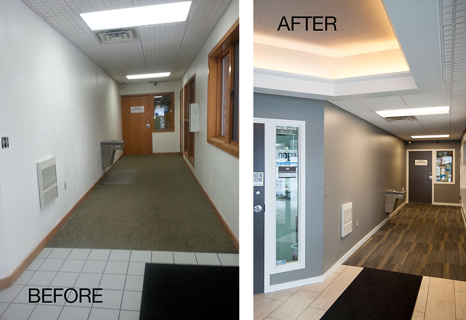
Mike Stoddard recognized the caliber of his tenants and wanted to make sure their customers enjoyed their experience of the building. His realtor, Hillary Taatjes Woznick of NAI Wisinski of West Michigan referred us to Mike and we made paint, flooring and lighting selections that brought his space to today’s standards. We were also happy to solicit bids and provide the project management of the remodeling. Plus, we topped if off with new suite signage!

Photos showing the “before” and “after” results at 1535 44th Street corridors.
Beechwood Church

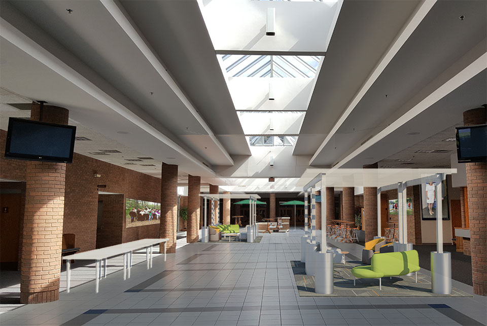
r.o.i. Design’s rendering for the atrium at Beechwood Church, Holland, MI.
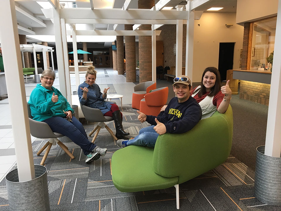
r.o.i. Design engages in church design on a regular basis, but when Barb Ellis (Black River Schools, Spin Dance, and Infinite Key) contacted us for help on her church, the assignment was focused. With the arrival of a new pastor, and a commitment to “start new”, the design committee was looking for ideas to make an impact on the large atrium that connected the worship, education and office space of the church operation. Taking on the perspective that the atrium was the outdoor “mall”, we suggested adding some pergolas with seating, and relocating welcome desks and hospitality areas to be more prominent within the space. With the help of products from Home Depot, IKEA and CB2, a conversion was possible. There was also a generous gift made by Haworth to provide furniture for the pergola areas. Great job, Beechwood! It’s always tough to take a risk in design.

Happy customers at Beechwood Church. Left to right: Jean Lemmenes, Co-director of Music, Emily Bodkins, Children’s Ministry, Leah Vondracek, Administration.

by Ryan | Dec 6, 2016 | Design News
There is glory in planning a great project and being able to guide the design criteria. There is great satisfaction in selecting architectural finishes that meet the budget and still provide a stunning look. While r.o.i. Design continually has those opportunities, we also appreciate the projects when we are asked to put on the “finishing touches”.
Finishing touches could include wall art, accessory furnishings or signage.
Recently we have had this opportunity with Rylee’s Ace Hardware and Wolverine Power Cooperative.

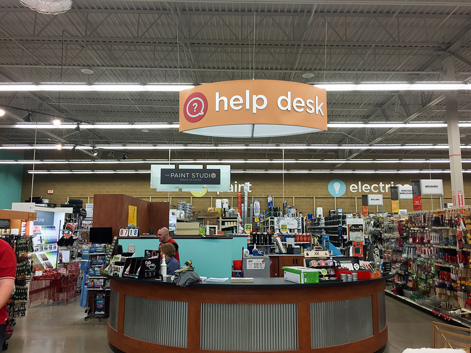
Signage installation at Rylee’s Ace Hardware, Grand Rapids, MI.
Lori Terpstra, owner and CEO of Rylee’s Ace Hardware in Grand Rapids, MI contacted us this fall reminding us that it has been seven years since we designed their store and wanted the colors and signage to be updated. Taking into consideration the Ace Hardware national brand direction, but more importantly Lori’s store and customer, we created a bold solution. When we first designed the space, colors were more muted and neutral, today color is brighter-more celebrated and we brought that to the store. In 2009 retail department signage typically was based on lifestyle images and text; today it’s all about symbols. We took today’s graphic preferences and brought them to the design. www.ryleesace.com

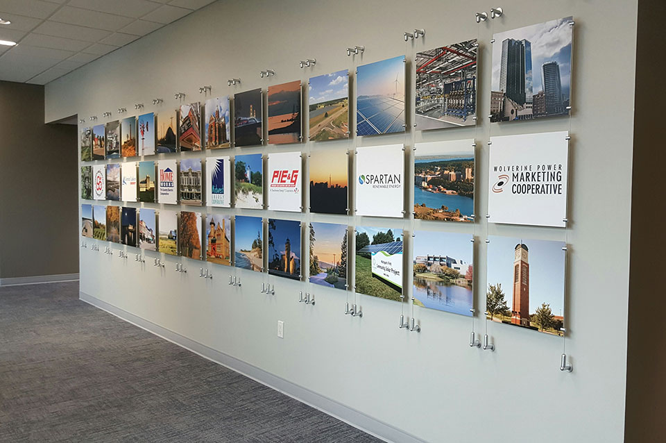
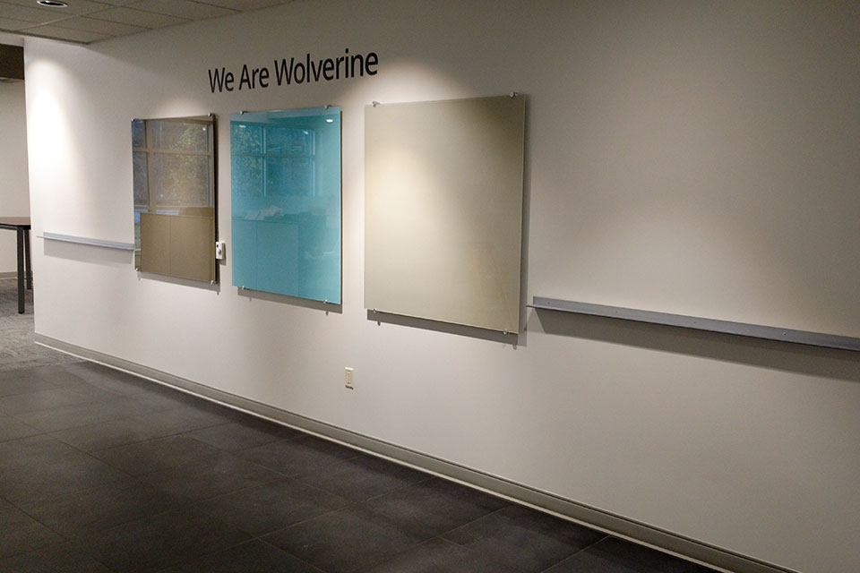
Community Wall at Wolverine Power Cooperative, Cadillac, MI.
Wolverine Power Cooperative, Cadillac, MI, moved into their new corporate offices less than a year ago. Our work as designers on the project gave us some insights into their brand and messaging. Dawn Coon, Executive Director of Administration, appreciated our perspective and engaged us to create custom wall décor for several of their walls in this large facility.
Making the wall décor personal and relevant to our customer’s business assists in creating the ROI we have built our business on.
In addition to corporate inspired art, Wolverine has purchased art produced by Michigan artists and will continue to support locally created art. www.wolverinepowercooperative.com

42 image panels installation at Wolverine Power Cooperative, Cadillac, MI.

Custom Service Map Wood Print, Wolverine Power Cooperative, Cadillac, MI.
