by Ryan | Oct 30, 2018 | Design News, Graphic Design, Interior Design, Retail Design
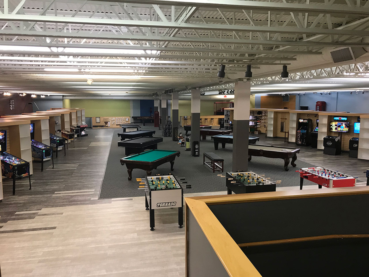 Doug Wildey has been thinking about expanding Game Room Guys, headquartered in Comstock Park, MI, into other cities for several years. He has been talking to r.o.i. Design about what satellite stores could look like, and how those stores need to be designed to attract their customers. While they have a showroom at their headquarters, most of their sales are generated online. They have been delivering to major metropolitan areas in the midwest, east, and south already which gave them valuable data on where physical stores could benefit their growth.
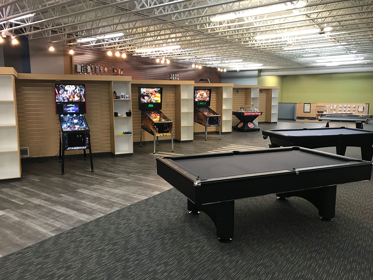
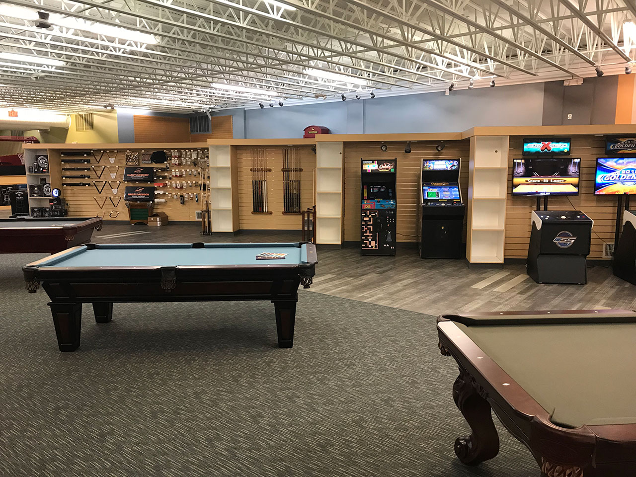
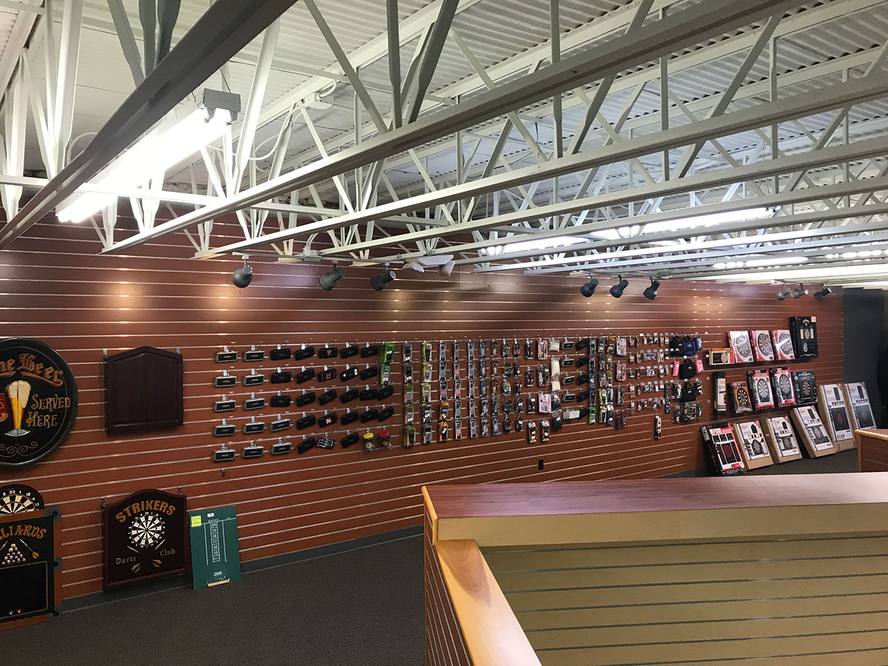
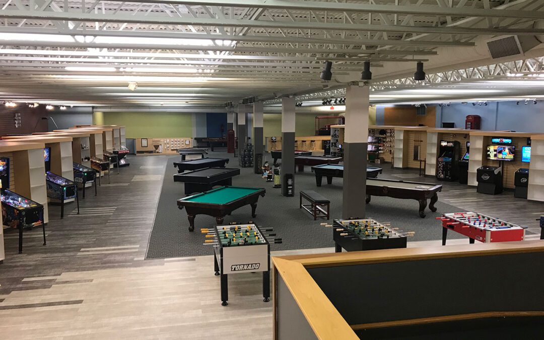
This year they found a former golf pro-shop in Livonia, near Detroit. This great location already had a lot of “retail friendly” details in place. Their space, while larger than what they required, does allow for an impressive display of merchandise in all their different categories.
Wildey engaged r.o.i. Design to help Game Room Guys create merchandise layouts, select finishes, and create signage. As the store continues to see sales, we will finish up with all the little merchandising touches that will make the retail space an attractive and interesting place to spend time and money. One of the greatest challenges was the flooring, staying within budget while still creating a retail “look”. With the help of our Shaw Flooring Contract Representative, Patrick Coulsen, we were able to deliver both.
Kudos to Game Room Guys for their methodical process, their commitment, and investment into the project. They opened their doors in the summer of 2018 and are experiencing continual sales growth and increased traffic.

As a teen, Doug Wildey plunked coin after coin into the Captain Fantastic and Eight Ball pinball machines at his favorite arcade.
Decades later, Wildey turned his love of arcade games into a growing retail business, Game Room Guys, where he sells pinball machines, pool tables, foosball games, golf simulators, dartboards, poker tables, air hockey — even jukeboxes, record turntables, vending machines, and Jack Daniels memorabilia.
What started as a business out of his garage in 2001 has grown into a 26,000-square-foot national headquarters in Comstock Park, near Grand Rapids, with customers across the nation.
And now, Wildey has entered the metro Detroit market with a new store in Livonia, southeast of Eight Mile and Newburgh roads.
Wildey described Game Room Guys as “one of the largest pinball dealers in the world.” He said the majority of customers are homeowners who want to create or add a game room atmosphere to part of their home.
But he also supplies corporate break rooms, college dormitories, bars, youth centers and, of course, arcades.
Wildey said two of his three sons are involved in the business, which has 26 employees. He said his company is the go-to place for people who need to find replacement parts for pinball machines and other products dating back to the 1940s and 1950s.


by Ryan | Oct 30, 2018 | Design News, Interior Design, Procurement and Purchasing, Workplace Design

Architectural Concepts has been a friend of r.o.i. Design since 2000. We have collaborated on many projects with conceptual planning and interior design, while they delivered the architecture and managed the construction. Hutchinson Antivibration Systems is one example of our shared projects, where we designed their innovation center, the 616 Fab House.
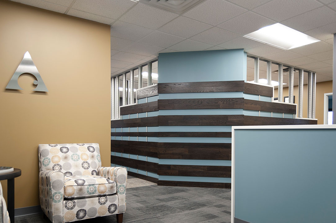
While that relationship is a long lasting one, their original office interior was not. Like many 20-year-old interiors, it was tired and presented a dated color scheme. Ken Watkins, principle and owner, decided his team deserved to work in the kind of space they create for others.
We were engaged for interior design. Our process was transparent because we have worked comfortably with them for a while. We felt like we could take some risks. We brought in two to three possible schemes, some hand sketches, and photos. The staff at Architectural Concepts (Jackie, Dave, Matt, and Ken) sorted through what they liked, and we discussed how finishes could be applied.
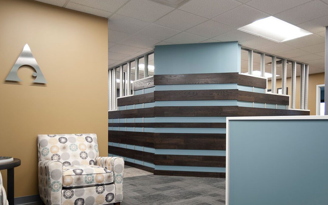
Like all good collaborations, the end product was a mixture of finishes from all three schemes. Even though the office is relatively small, four carpets were used (3 as accents), and six paint colors were selected.

It was with great satisfaction that r.o.i. Design was hired to assist them to update their space with selections for new flooring, new paint, and new details. We provided new window coverings, new furniture, and overall support for their continued success.
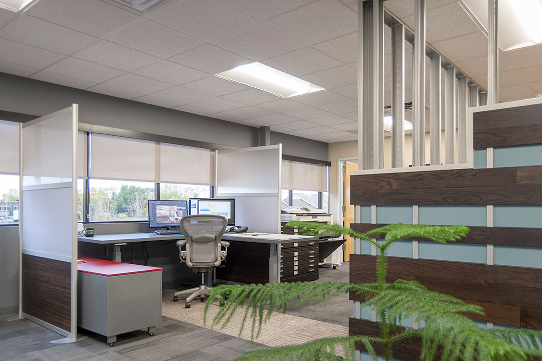
- r.o.i. Design is a distributor of SWF Contract Solar Shades. Updating to solar shades for this office was a huge improvement. Not only are they visually calming, but within a few moments, the temperature in the office was more comfortable.
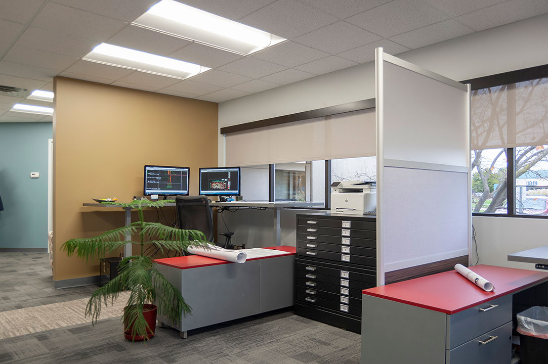
- We also provided the new open office furniture which included custom-built “L-shaped” desks that are easily adjusted from seated to standing height. These huge surfaces provided more than enough room for staff to lay out large-scale drawings while working.
The most noticeable change to the office was the wall that surrounds the new meeting room. Exposed metal studs were incorporated into the design as a finished element as a celebration of architecture as well as Ken’s honest and “exposed” style.
Ken, while a passionate architect for their commercial and industrial client, is also earnestly involved with a second business alongside his wife, Shelly. They run a non-profit called Genesis Waters which is dedicated to bringing clean water to communities around the world. They travel quarterly to locations to work with teams to create clean water systems and related infrastructure. Photos of the people they serve are featured in the office, which is beautiful décor but also an inspirational reminder of the meaning of “work”.
Many congratulations to Ken and his team for their great work and big hearts.
For more information about Architectural Concepts contact Ken at archconcepts@sbcglobal.net or for Genesis Waters Shelly’s email address is shelly@genesiswaters.org.


by Ryan | Sep 26, 2018 | Branding, Design News

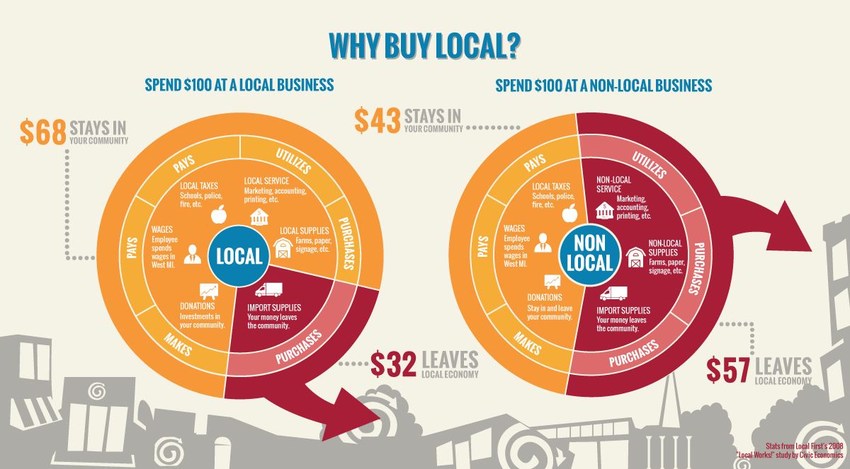
We are always looking for new ways to get involved with the community and make a positive difference in West Michigan. Local First had been on our radar for a couple of years. We felt now was a good time to learn more about them and get signed up.
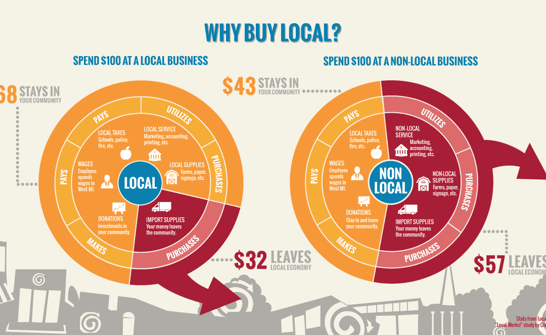
Local First is a nonprofit organization founded in 2003 by a group of seven business owners dedicated to promoting local businesses in Grand Rapids, Michigan. Today, Local First represents more than 800 businesses throughout West Michigan and is the largest organization supporting and advocating for locally owned businesses in the Midwest.
Today, Local First represents more than 800 businesses throughout West Michigan…

Membership in Local First comes with many benefits. First, it is a great networking platform to meet, interact, and conduct business with other companies in the local community. We love the idea of encouraging the creation of a sustainable local economy through community education and relationship building. Local First provides numerous marketing outlets as well, whether through social media, their online directory, or the Local First “Guide to Local Living”
r.o.i. Design is proud to be a part of the local West Michigan business community. We look forward to learning more about Local First and the opportunities it can bring to r.o.i. Design and the community at large.
To learn more about Local First, go to localfirst.com.

by Ryan | Sep 26, 2018 | Design News

We welcome Stacey Udell as r.o.i. Design’s Office Administrator. This is a new position and supports all aspects of our business. She will be working in the areas of design contract administration, accounts receivable, accounts payable, and operational vendor relationship management. Stacey will support Ronda Geyer, Products and Procurement Manager, as she continues to manage the purchasing and receipt of furnishings we provide for customers. Julie Kleinjans, in Finance and Marketing, will continue to coordinate any financial reporting to accountants and municipalities but plans to shift a good part of her time to marketing efforts.
Stacey comes to us with more than 20 years’ experience in office administration and small team management. Her methodical, persistent and organized style is adding business support for our creative team. The hope is that with her arrival, others at r.o.i. Design can spend more time with customers and developing new opportunities. We also love that she knows a great deal about Facebook and is already a raving fan of all things r.o.i. Design!
Stacey left a very busy office before deciding to make a change to work with “small but mighty” r.o.i. Design, where she hopes to have more time for family and personal interests.
By the time Stacey shows up to work every day, she has already been to the gym. She is an avid cyclist, both on solo and tandem bikes with her encouraging husband, Chris. Her love for her Golden Retrievers, Nellie and Bru, is surpassed only by her love of family, including her new grandbaby, Leland.

by Ryan | Sep 26, 2018 | Branding, Design News, Graphic Design, Interior Design, Medical Design, Procurement and Purchasing

© Image Courtesy of First Companies
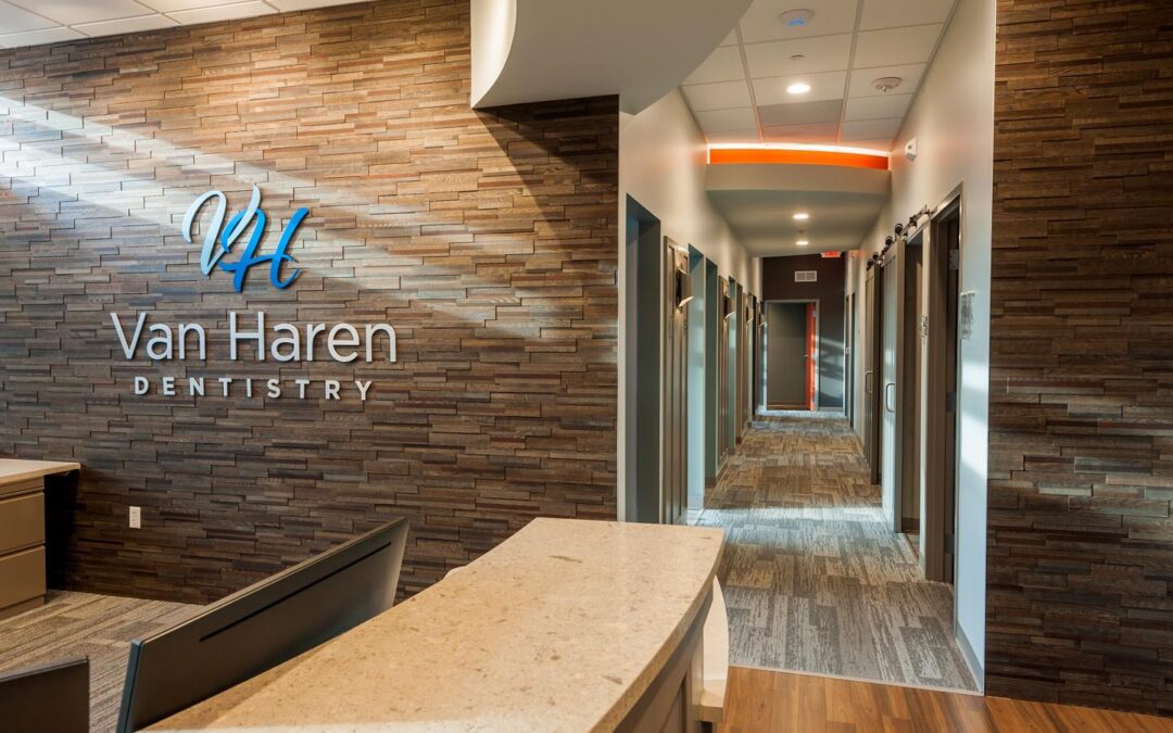
Van Haren Dentistry needed a new home, outgrowing their office after 10 years of dental practice, and reached out to First Companies’ Craig Baker for help. First Companies put together the team of r.o.i. Design and r2Design Group, architect Jon Blair to create a space to meet Ryan Van Haren’s needs.
r.o.i. Design was eager to provide a warm and friendly space for this team who uses the word “kind” to describe their practice. We found Dr. Van Haren to be a very caring professional with a love of family and desire to serve his patients and wanted him to feel at home in his new space.

© Image Courtesy of First Companies
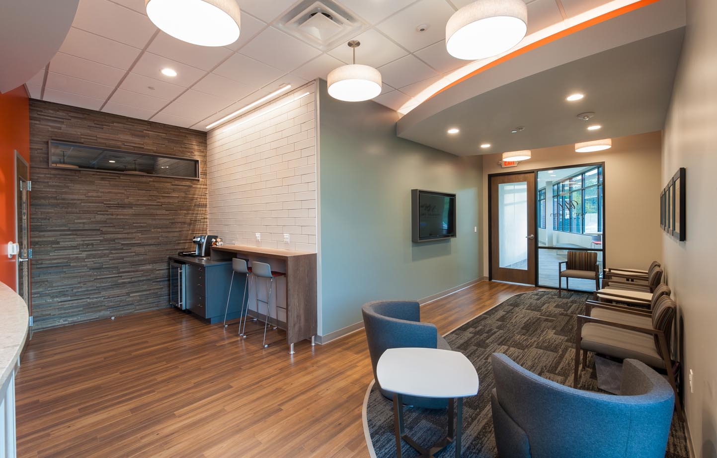
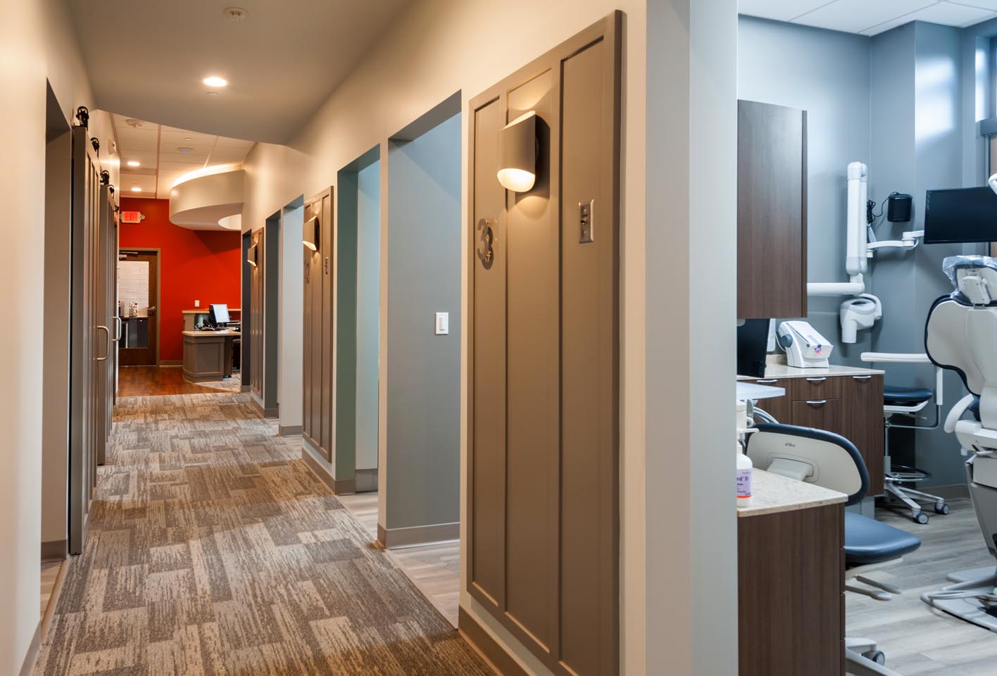
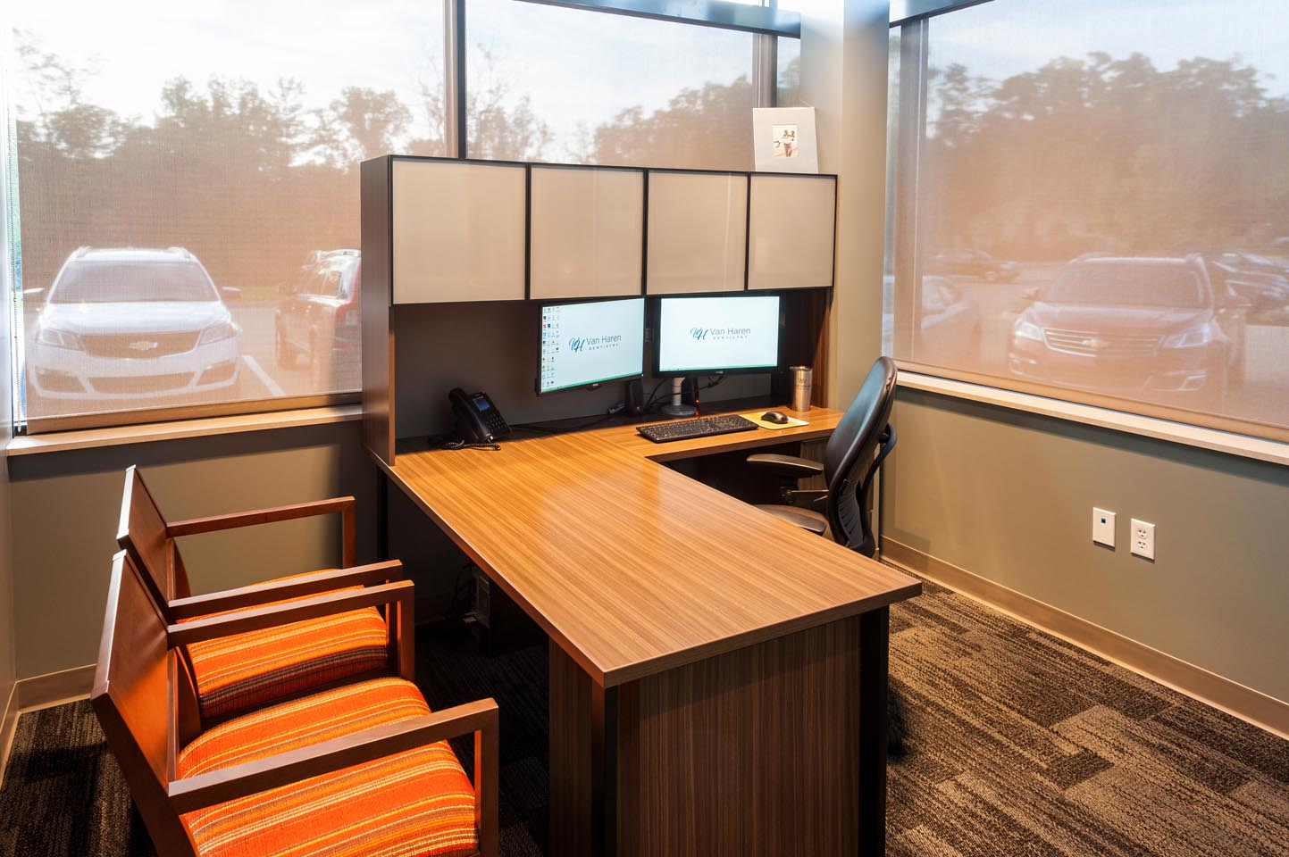
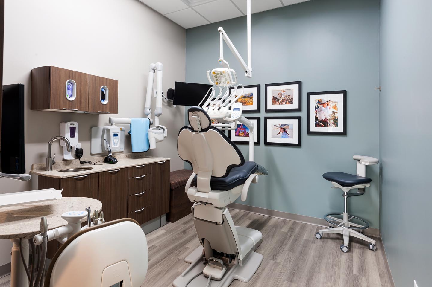
The new office has improved patient spaces, including waiting, consult, and hygiene/operatory. It also has more efficient space for staff, including reception, lab, sterilization, and break room.
One element from the old office was brought along: photos of Grand Rapids’ sister cities are displayed in the lobby, consult room and hygiene/operatory rooms. These colorful photos of people from around the world are a bright and refreshing accent throughout the space.

© Image Courtesy of First Companies
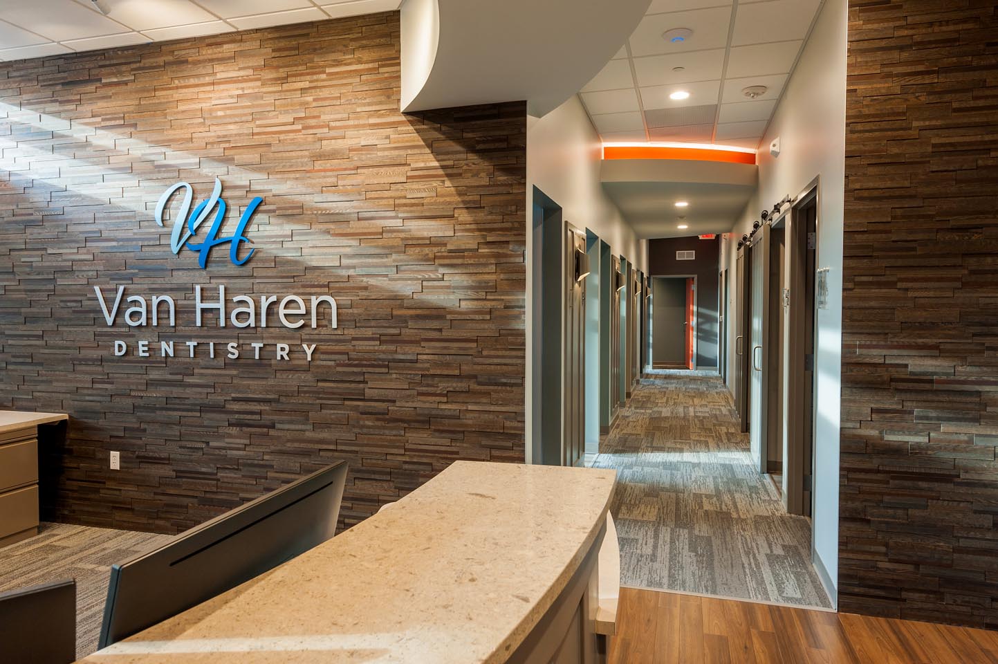
Our favorite features in this design include the pop of the color orange, use of a panelized wood tile, lobby and corridor ceiling details with edge lighting, as well as a friendly hospitality area with full height tile walls.

© Image Courtesy of First Companies
Not only did r.o.i. Design provide complete interior design services, we designed their new logo and designed the signage for the outside of the building. Again, a friendly and welcoming use of the “V H” hopes to reflect the nature of the practice. We also supported their process of procuring furniture, working with Custer Office.

© Image Courtesy of First Companies
First Companies delivered the space by the 4th of July. Congratulations to Josh Reynolds and the whole team from First Companies.
For more information about Van Haren Dentistry go to vanharendentistry.com.

 Doug Wildey has been thinking about expanding Game Room Guys, headquartered in Comstock Park, MI, into other cities for several years. He has been talking to r.o.i. Design about what satellite stores could look like, and how those stores need to be designed to attract their customers. While they have a showroom at their headquarters, most of their sales are generated online. They have been delivering to major metropolitan areas in the midwest, east, and south already which gave them valuable data on where physical stores could benefit their growth.