by Ryan | Nov 28, 2018 | Branding, Design News, Interior Design, Restaurant Design

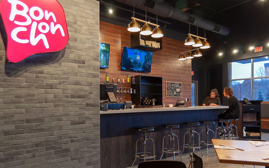
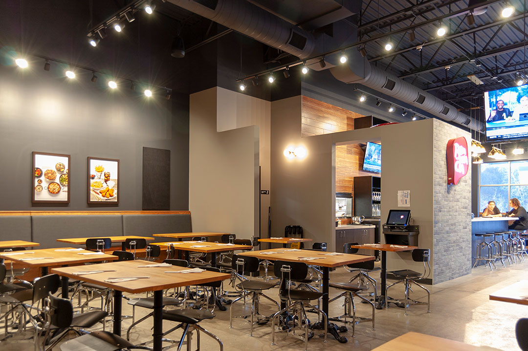
Bonchon Chicken, Korean Fried Chicken & Wings, is an established restaurant franchise in many metropolitan cities around the U.S. Now West Michigan has one right here in Grand Rapids!
Pinnacle Construction, in their retail development of Knapp’s North on the East Beltline, attracted Michigan franchise owner, Randell Ganchua. Randell was looking to open his first of many Bonchon restaurants on the Northeast side of Grand Rapids.
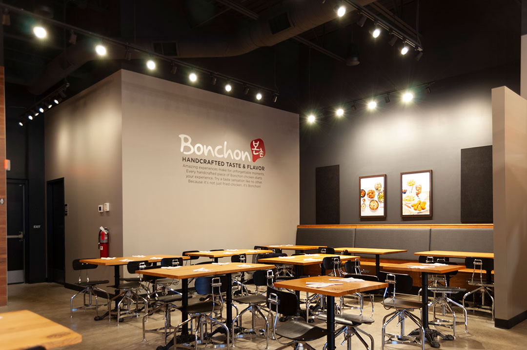
Pinnacle Construction engaged r.o.i. Design to help design the exterior façade of the retail development as well as coordinate the interiors for Bonchon. Using established standards, r.o.i. Design created furniture plans, lighting design, finish selections, construction documents, coordination with kitchen designers and advocacy for the owner.
Bonchon had their soft opening in mid-November, and the reviews are great. We look forward to their continued success and expansion.
For more about Bonchon, go to bonchon.com/grand-rapids-mi.

by Ryan | Nov 28, 2018 | Design News, Designing Public Areas, Hospitality Design, Interior Design
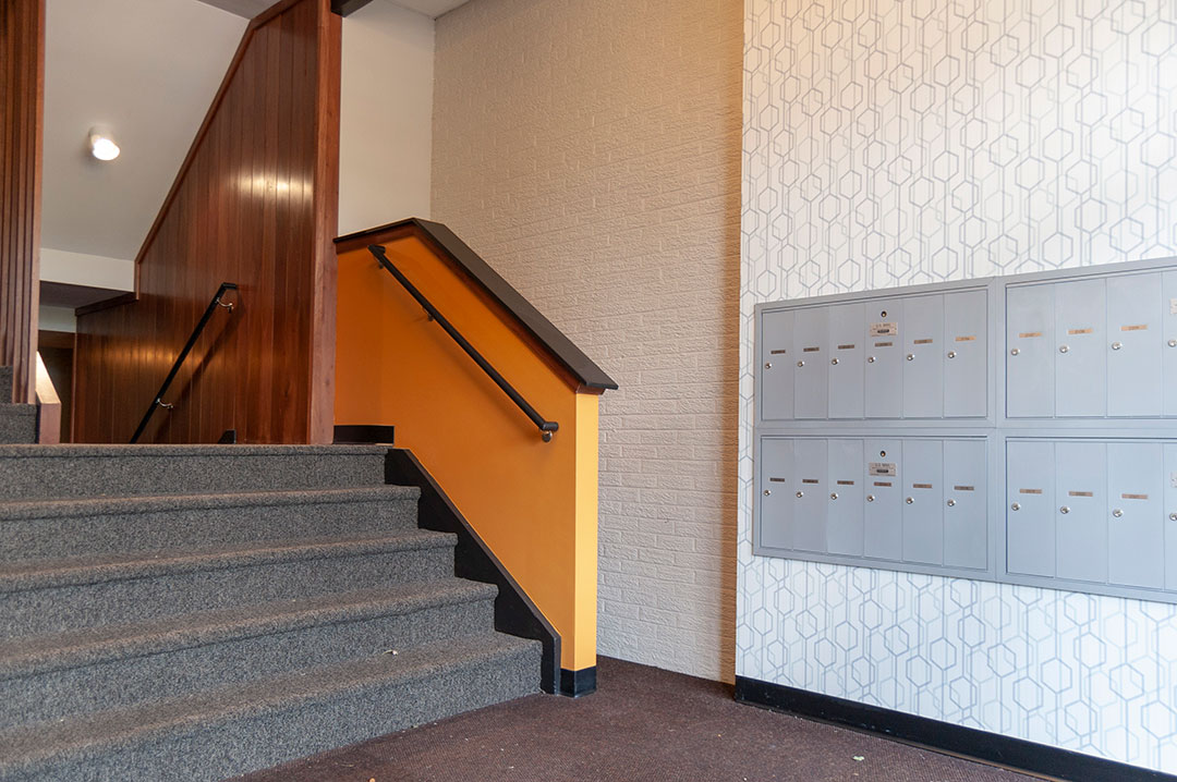
Campus View Apartments are located directly adjacent to the campus of Grand Valley State University. Campus View had the vision 50 years ago to purchase and develop property near GVSU to provide apartments for students. Today they have more than 400 units and continue to expand to serve the off-campus student housing needs.
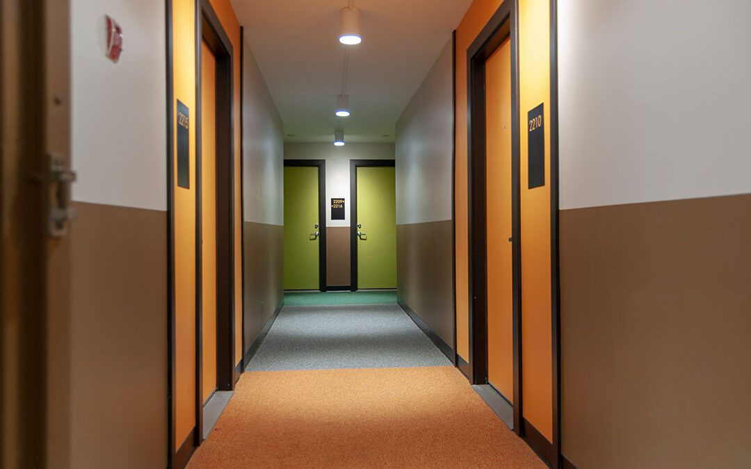
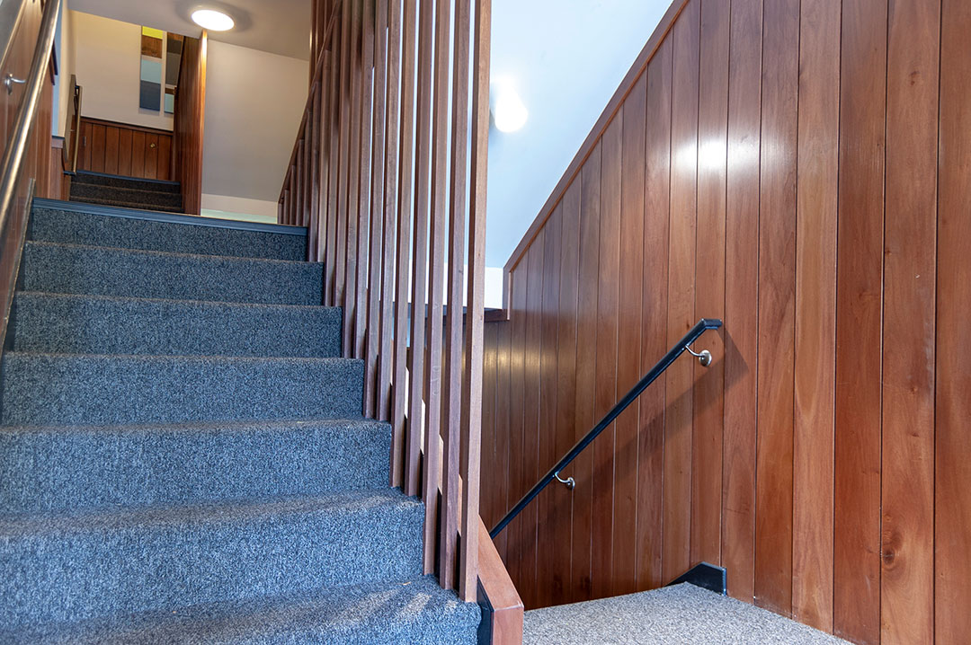
r.o.i. Design had the privilege to work with them in 2016 to update their main lobby and leasing offices. This year we were asked to help them refresh the look of the four original apartment buildings. Those original apartment buildings were built in the 1960’s, featuring shag carpet and paneled wood walls. While the apartments have been updated, r.o.i. Design recommended a retro look for the common areas and corridors.
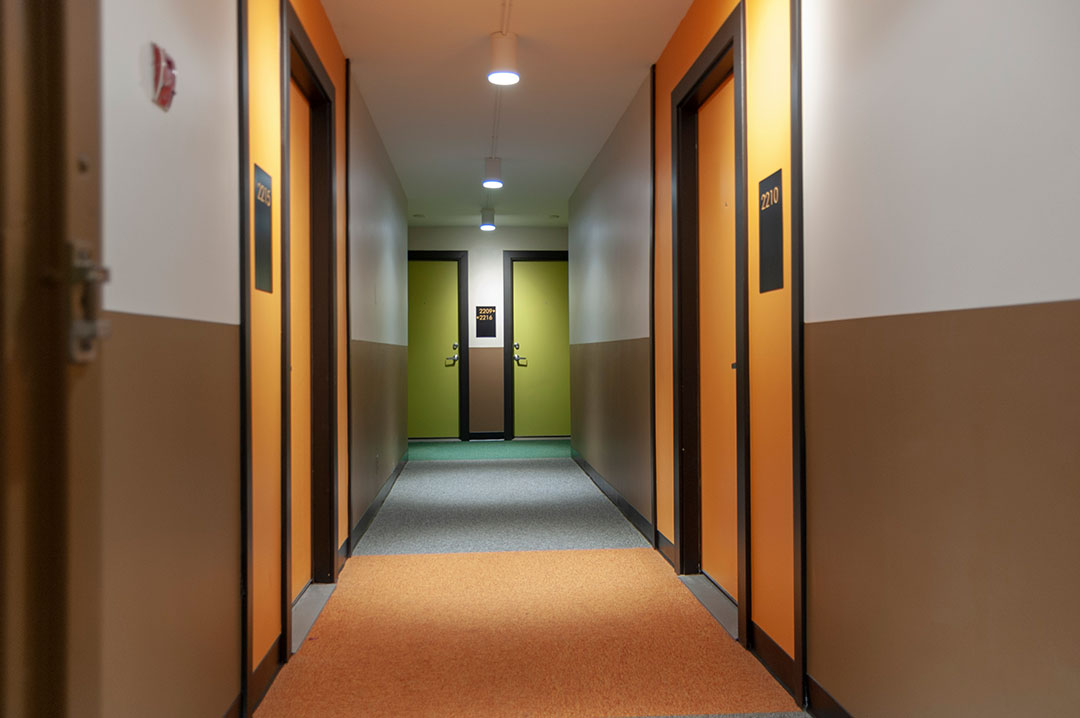
Our design included a mid-century modern use of patterns, colors, and light fixtures. The apartment hallways leave little doubt where the entries are with a bold accent of color at each door.
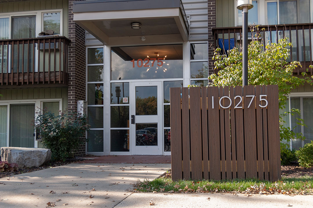
In addition to the corridors, r.o.i. Design designed building signage for the site that blends with the architecture but again, has a bold retro look.
The reports are that students are loving the upgrades, and Campus View is realizing new leases.
r.o.i. Design continues to work with Campus View in new projects that will open in 2019. From more information on Campus View go to campusviewhousing.com.
by Ryan | Nov 28, 2018 | Design News, Designing for Kids, Designing Public Areas, Interior Design

r.o.i. Design has a heart for the community, education, and kids. Every year we dedicate some of our time to non-profits whose goals match our own vision as we strive to make a difference in the lives of those we touch.
We have been investing in Living Stones Academy since 2016, when our friend Aaron Winkle, Head of School, reached out for support. Aaron’s request was coupled by the endorsement of Marlin Feyen, founding partner of Feyen Zylstra Electric. He showed us their vision to be radically inclusive and absolutely accessible, which struck a chord with us.
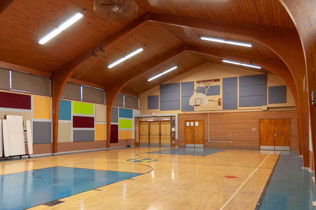
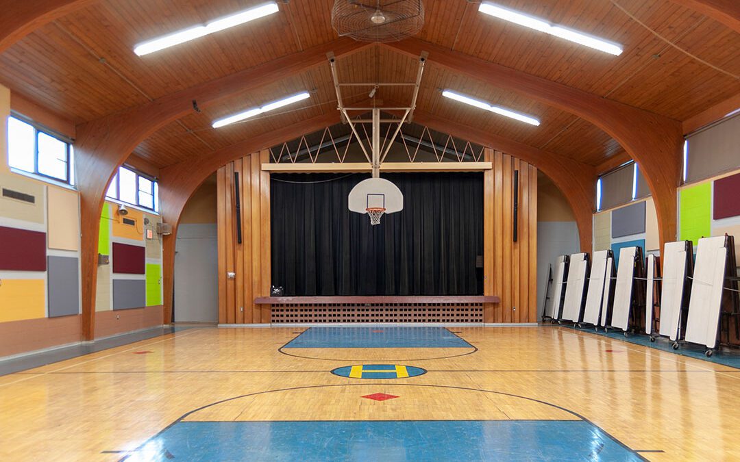
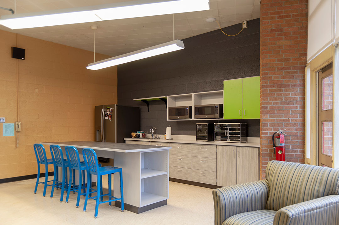
Since our involvement, we have provided design and direction for finishes in their new lunch program kitchen and related corridor, their gymnasium, and the teachers’ lounge. In each case, we took into consideration the 70’s style of the architecture that boasted a modern style and blocks of colors.
The largest of those projects was the gym. We created a design that included acoustic panels so it could be more effective as a presentation space, allowing the audience to hear more clearly. Perhaps the most rewarding was the redesign of the teacher’s lounge. Old fixtures were retired and a new friendly space was delivered that the teachers can use as a retreat from their classrooms.

We look forward to Living Stones continued success as they serve their families, of which 56% receive tuition assistance, 52% are minorities, and 15% are English language learners.
For more information about Living Stones Academy, go to livingstonesgr.org.
by Ryan | Oct 30, 2018 | Design News, Interior Design, Workplace Design
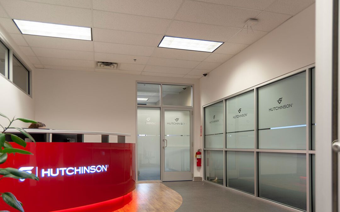
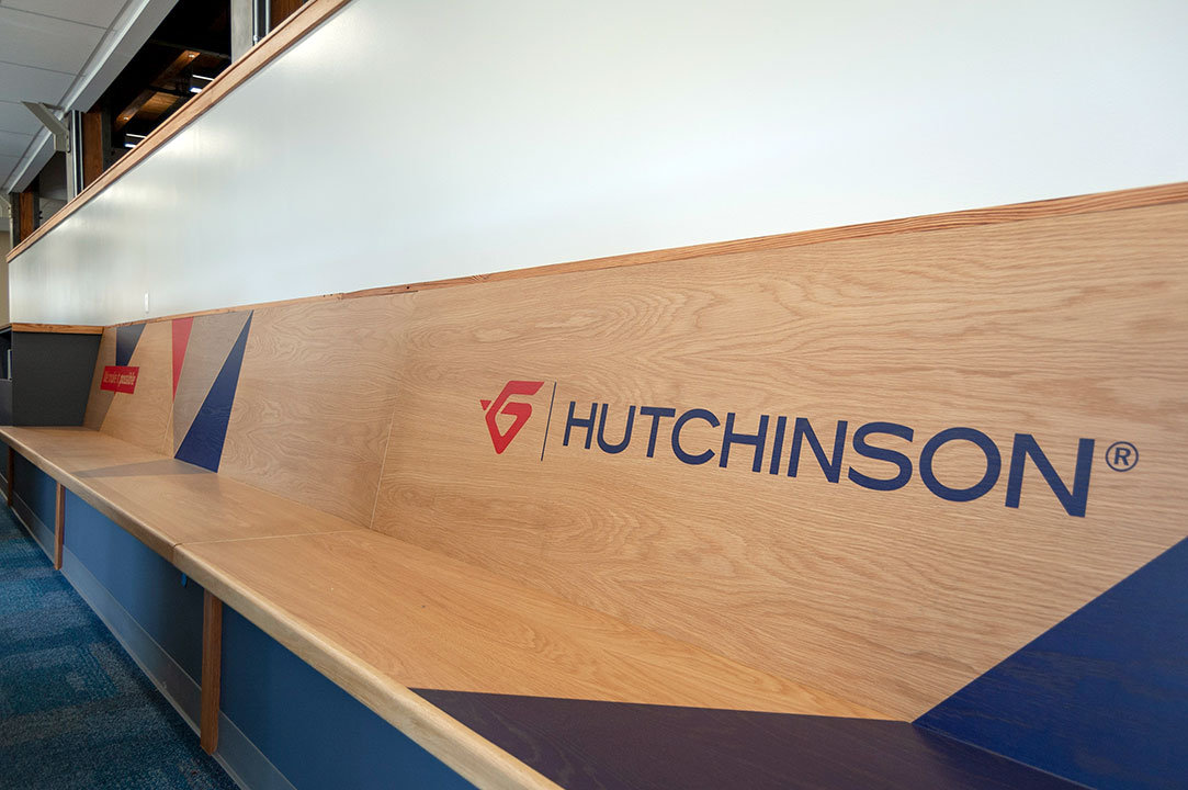
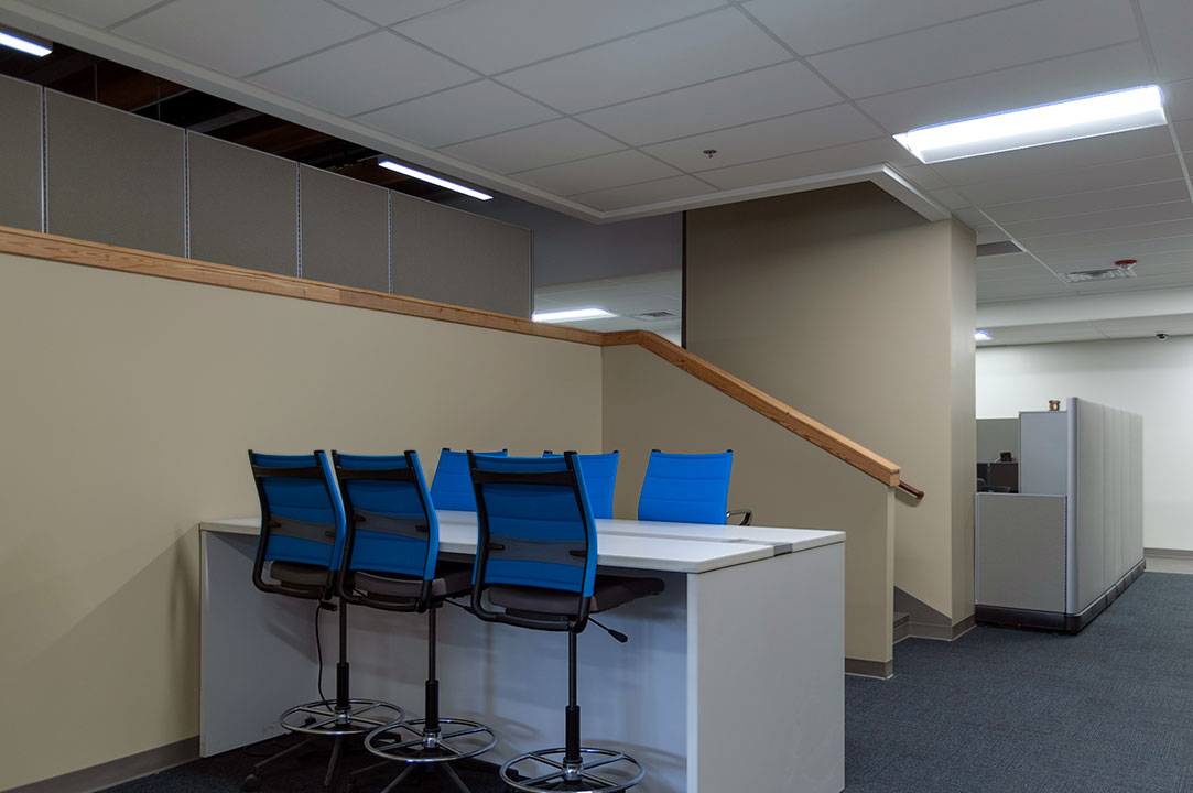
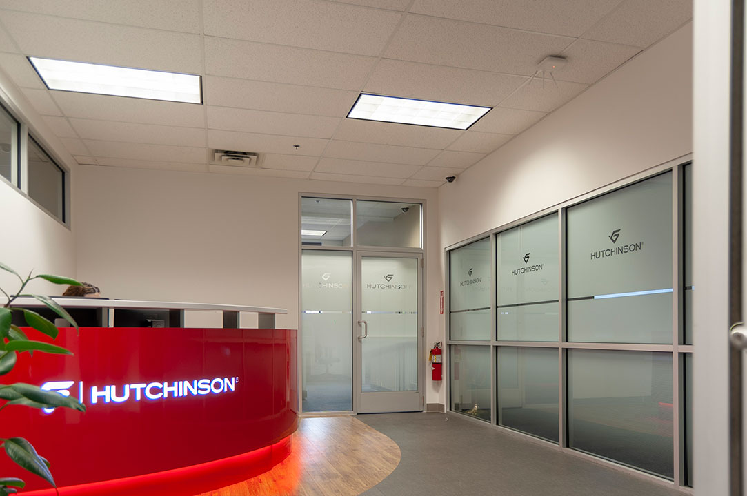 Building on the success of the 616 Fab House where r.o.i. Design created an innovation center that met international acceptance, Hutchinson Antivibration Systems engaged us to design the expansion of their engineering, plant operations and purchasing offices at their Grand Rapids location. They trusted that we understood their business goals and criteria.
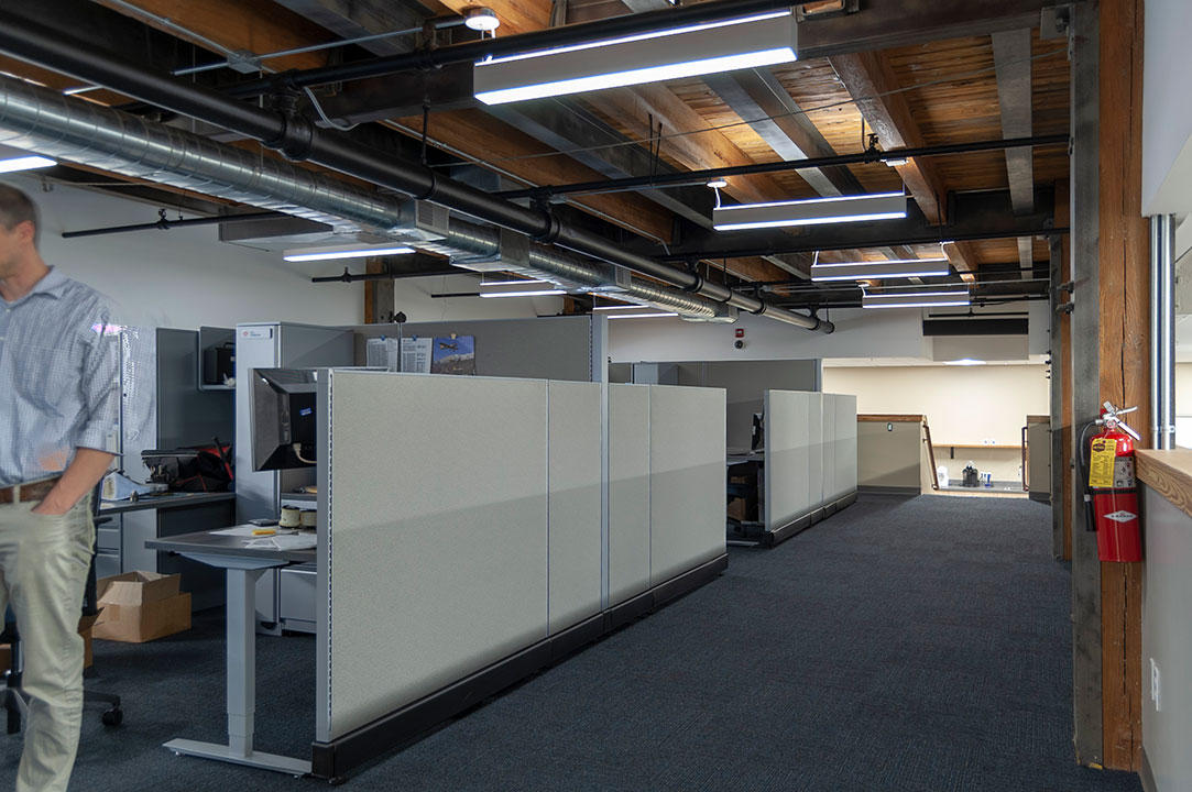
Hutchinson’s growing success as an OEM provider of parts and solutions for transportation brands meant that they needed to create competitive working environments to attract and maintain talent. The total renovation was around 16,000 square feet. This project converted 6,500 square feet of existing warehouse space to office space.
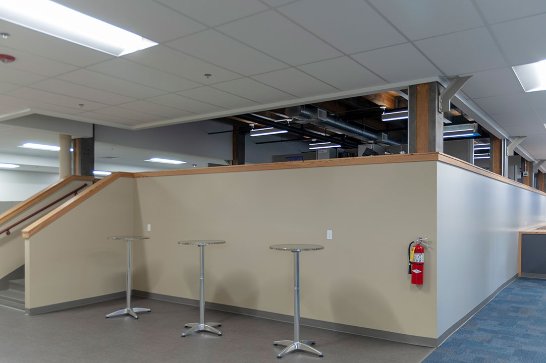
While historic building conversions are not new to r.o.i. Design, every old building introduces challenges. This conversion included creating a space with a raised platform over an industrial space. What may have seemed like a problem actually created a very desirable working space.
We would like to acknowledge the efforts and partnering by everyone involved at Pinnacle Construction and Kentwood Office Furniture, especially Aaron Byler, Project Manager and Greg DeVries, Account Executive.
For more information about Hutchinson Antivibration Systems, visit hutchinsonna-antivibration-purchasing.com.
by Ryan | Oct 30, 2018 | Design News, Interior Design, Medical Design, Procurement and Purchasing
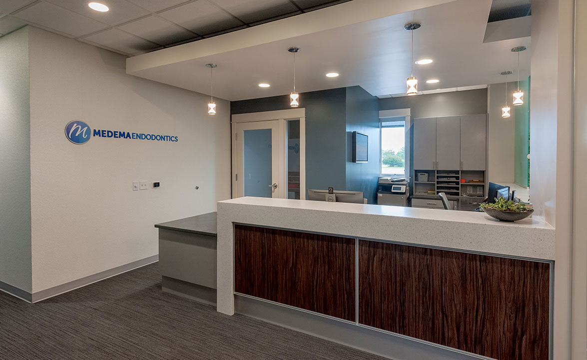
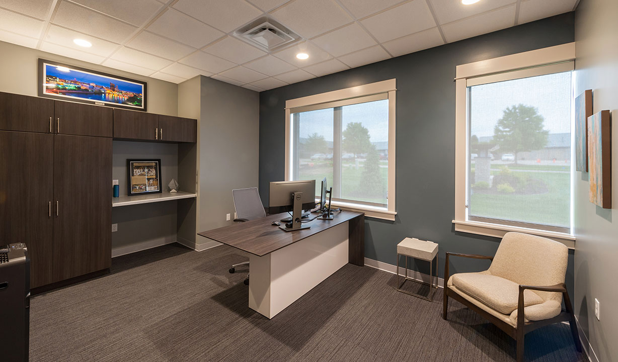
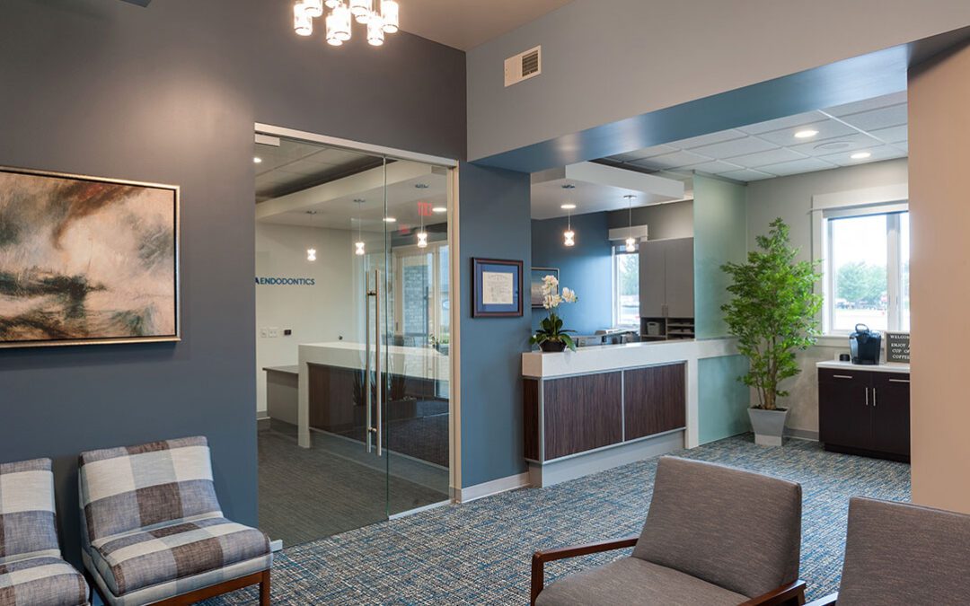
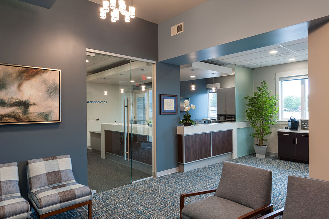 Dr. Brent Medema’s attention to detail isn’t only focused on his patients’ teeth. He appreciates design, and as an owner of a downtown condo, wanted his new dental office to reflect his urban modern style.
r.o.i. Design was introduced to Medema Endodontics through First Companies. They engaged us to design the interior of this space, which they then built-out and delivered in 2018. From that introduction we found a client who was interested in every aspect of the design, scrutinizing finishes and decisions, resulting in a wonderful product. We’d like to recognize Jordan Irish, First Companies Project Manager who was attentive to design details and customer requests.
The clean look supports the surgical nature of the practice but isn’t so clinical that it ignores patient comforts. Dr. Brent made sure there were wall art and furnishings that appealed to his patients and helped create a welcoming feeling.
Our favorite details of the design include the lobby and reception ceiling and lighting details, the exam room corridor wall, ceiling accent insets, as well as the overall color scheme.
- We provided the lobby furnishings whose style hinted at a mid-century modern feel while using contemporary fabrics and finishes.
- We provided wall art based on Medema’s criteria and managed the professional installation based on project needs and timelines.
Medema Endodontics is an expert practice with a focus on patient care, medical technology and continuous learning and practice improvements. For more about Medema Endodontics, medemaendo.com.


 Building on the success of the


 Dr. Brent Medema’s attention to detail isn’t only focused on his patients’ teeth. He appreciates design, and as an owner of a downtown condo, wanted his new dental office to reflect his urban modern style.
