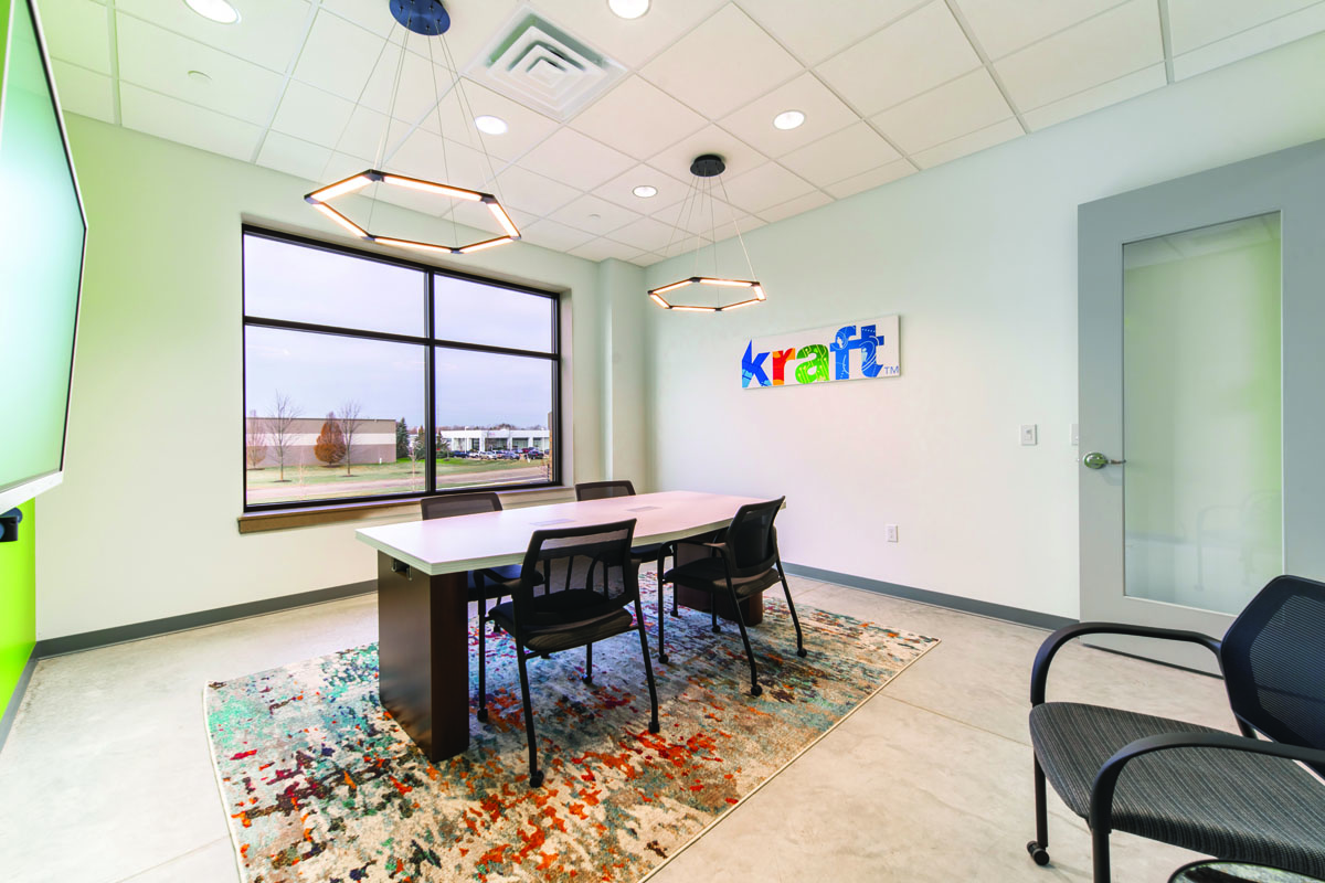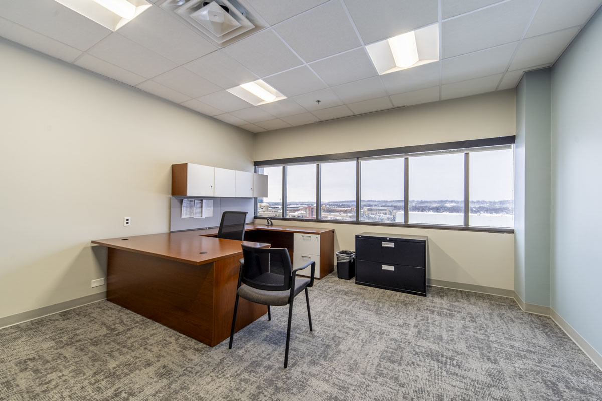
Kraft Business Systems: New Office, New Look.

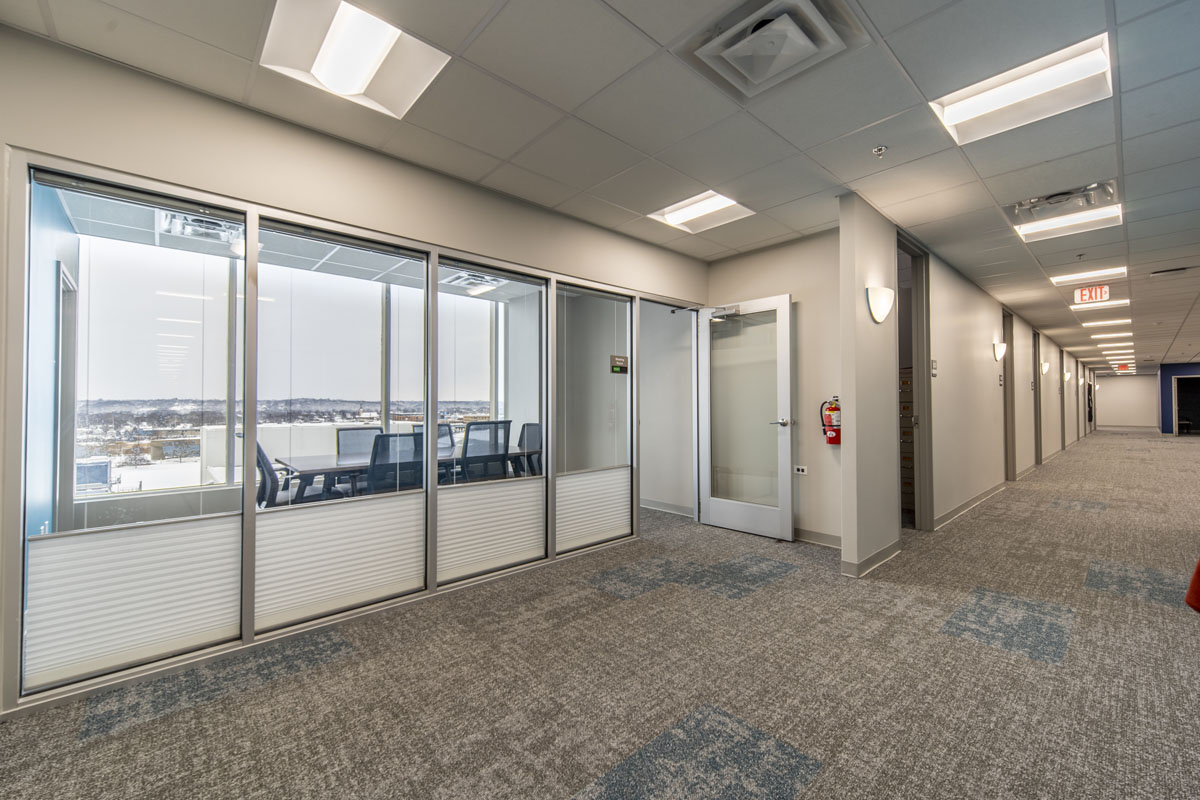
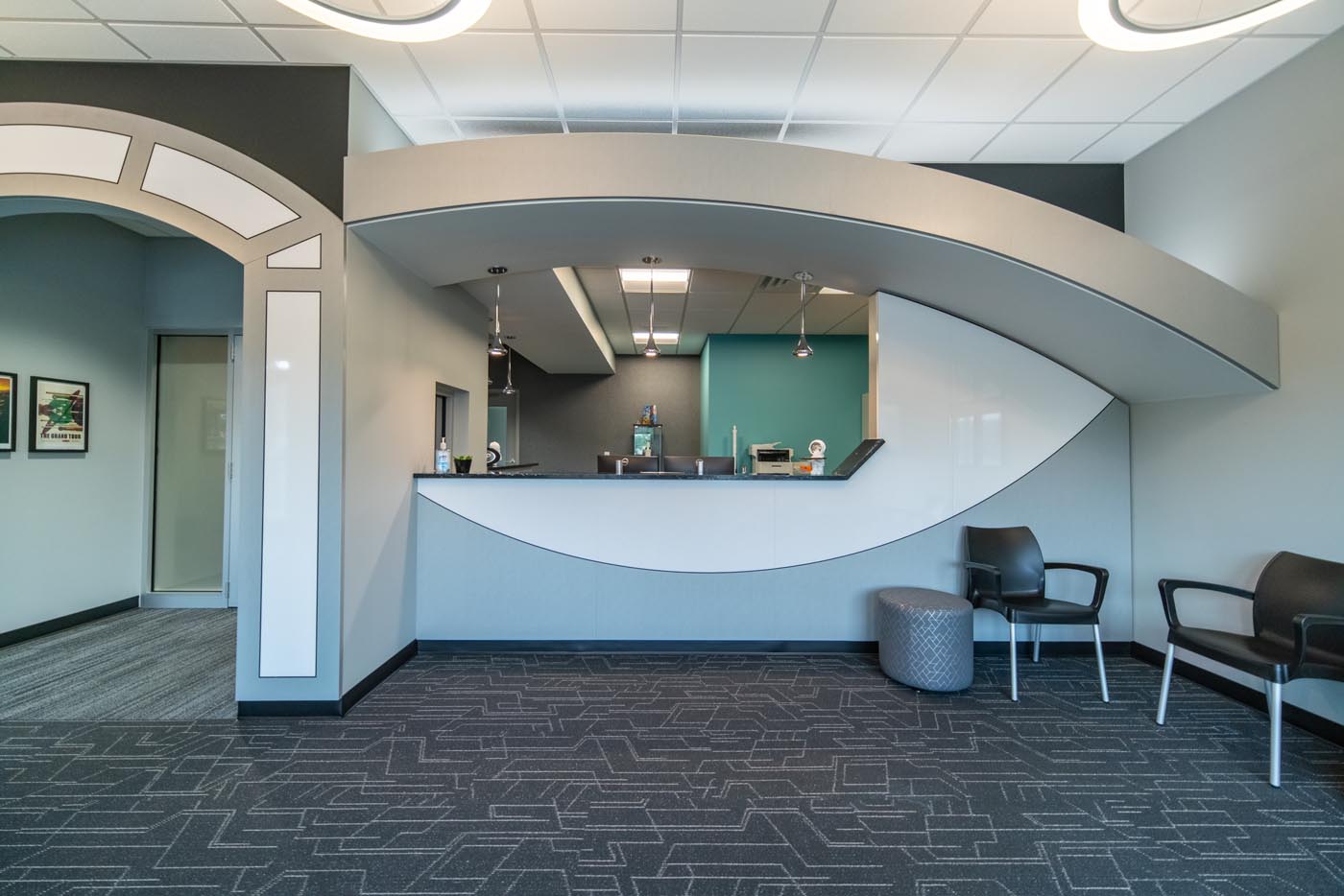
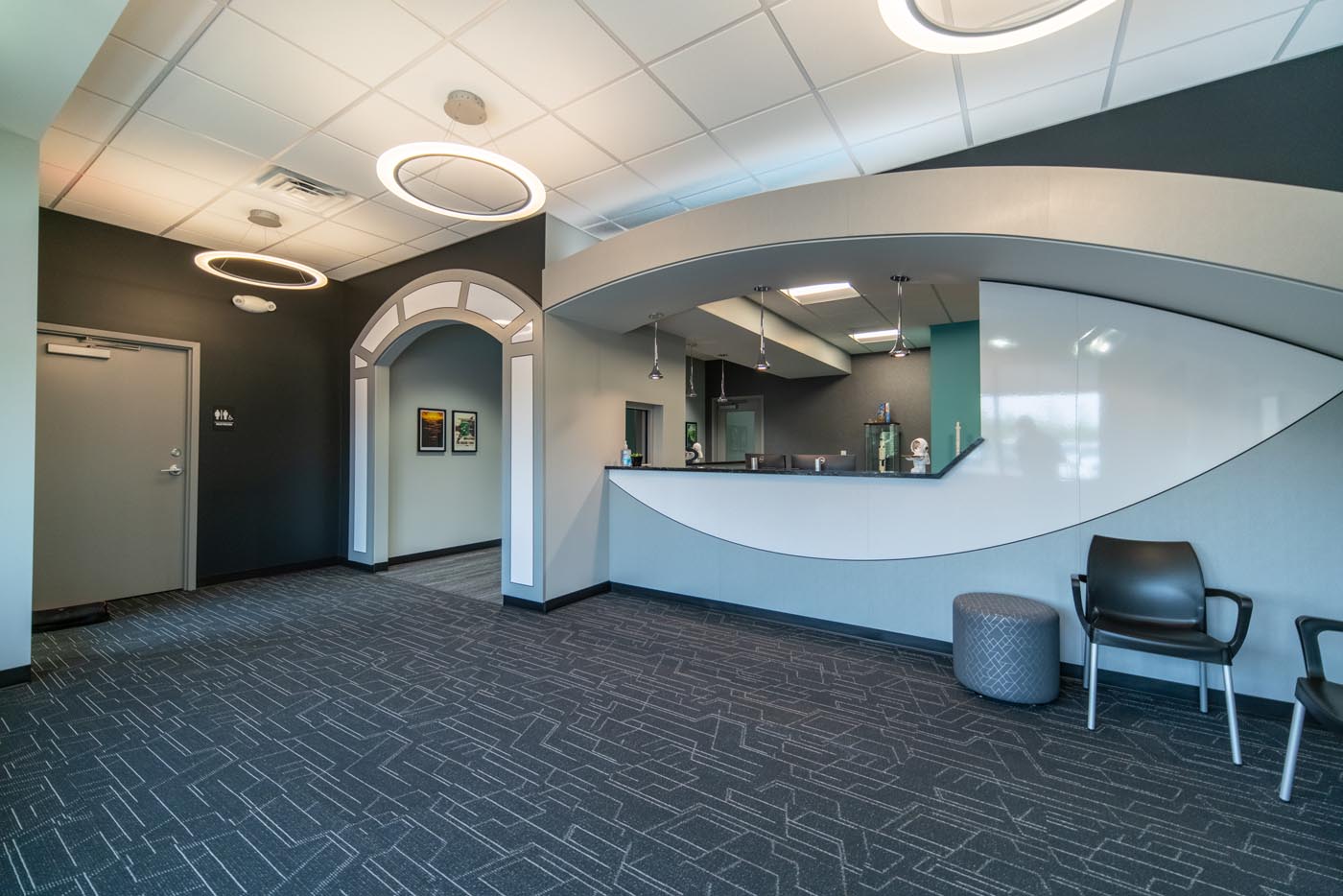
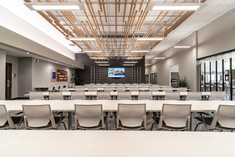
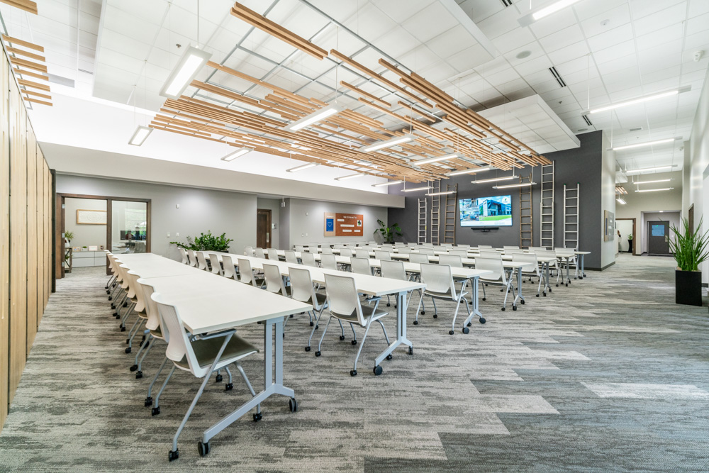
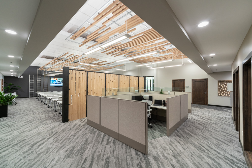
When First Companies Inc. introduced r.o.i. Design to Jeff Cousins from Kraft Business Systems he said, “I don’t know design, I just want ‘cool’”. Jeff was very interested in every aspect of the new office. Dixon Architecture had been introduced a little earlier, and Ken Dixon had the space laid out and adjusted as needed to meet Jeff’s understanding of changing needs.
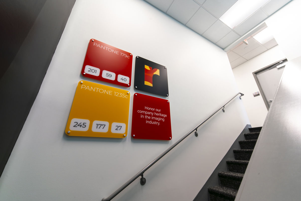
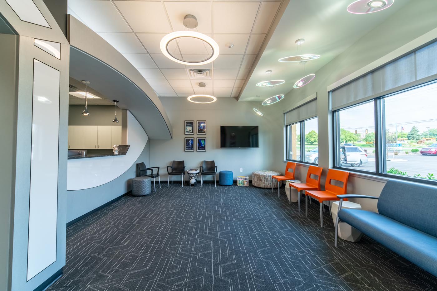
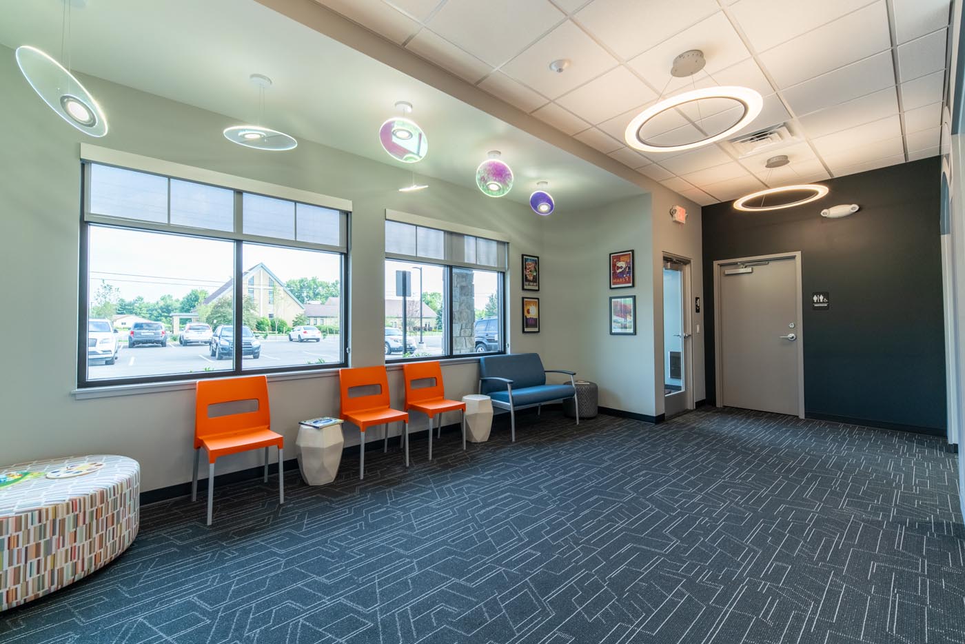
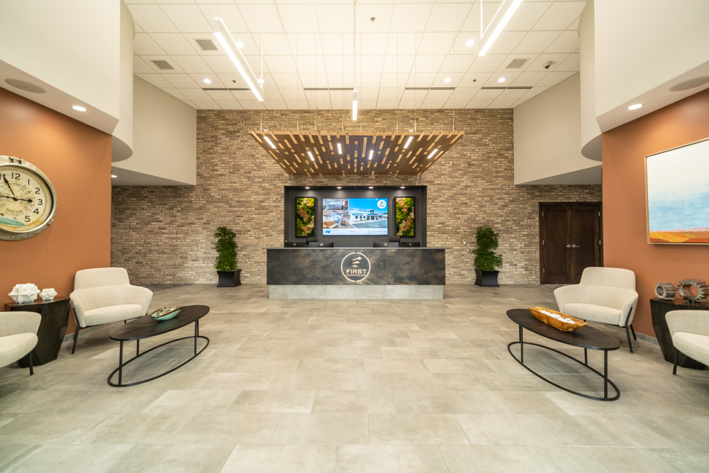
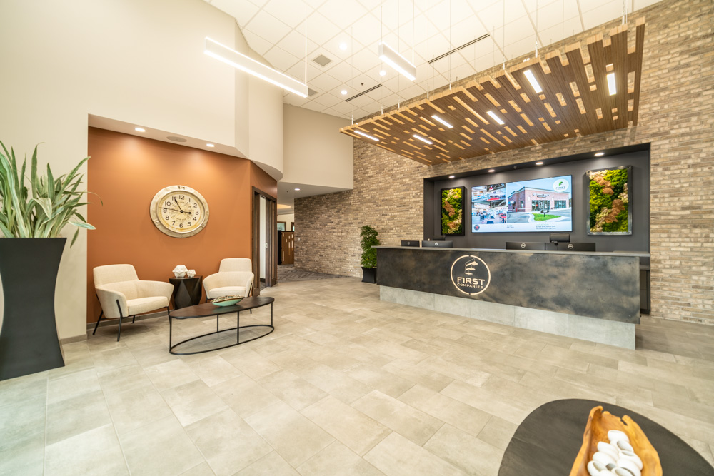
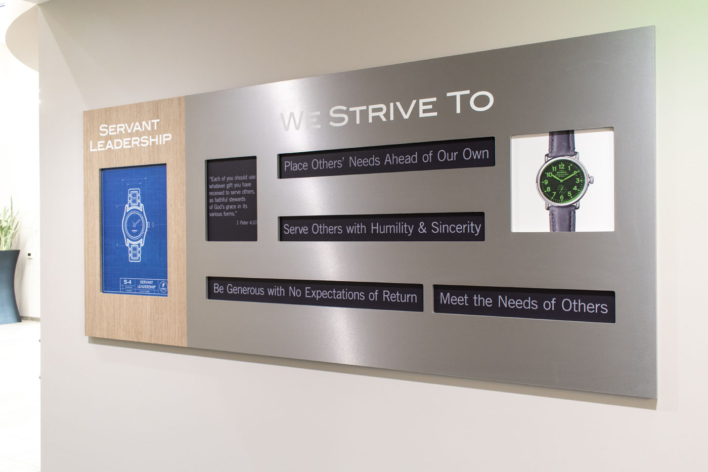
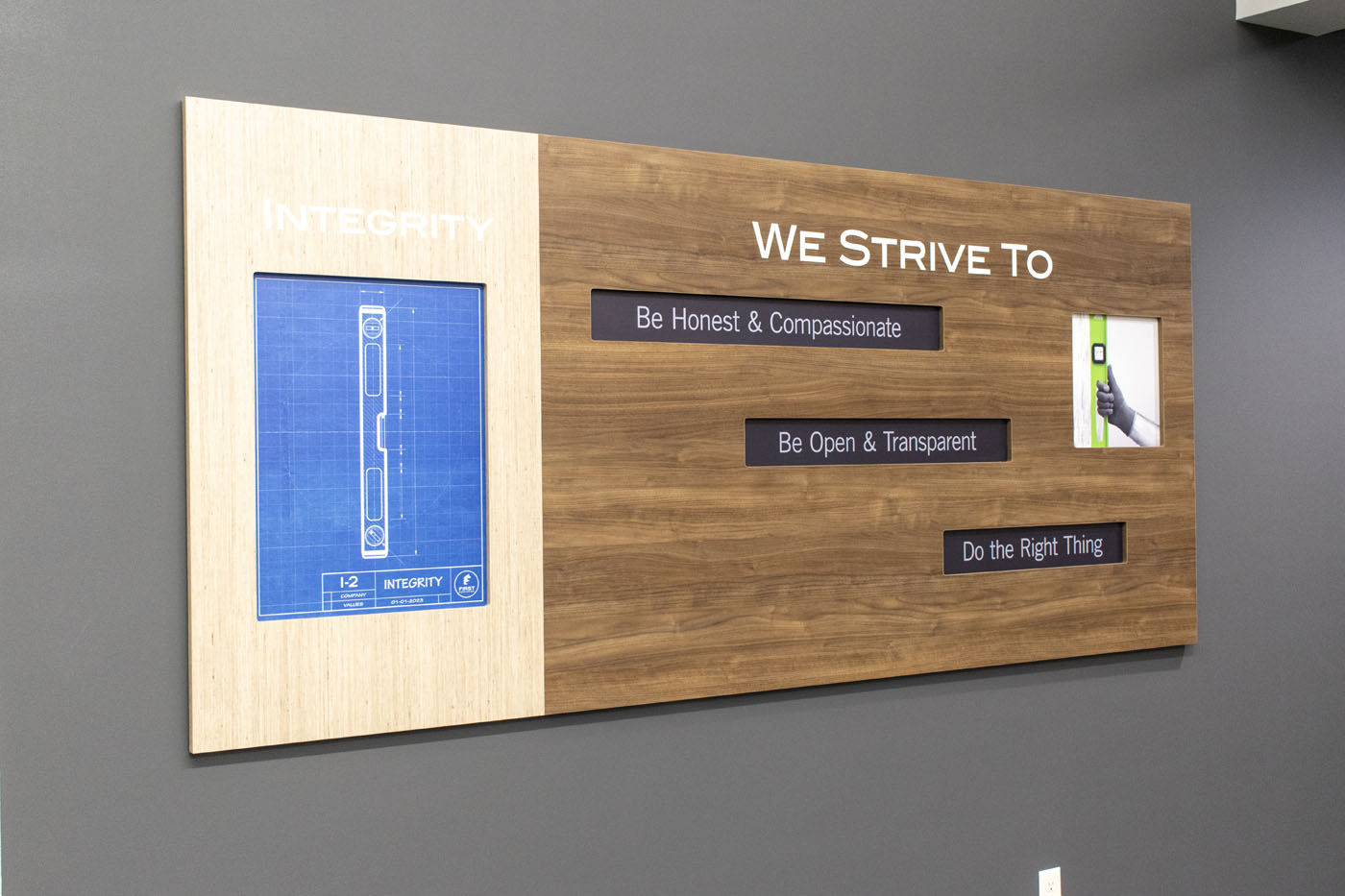
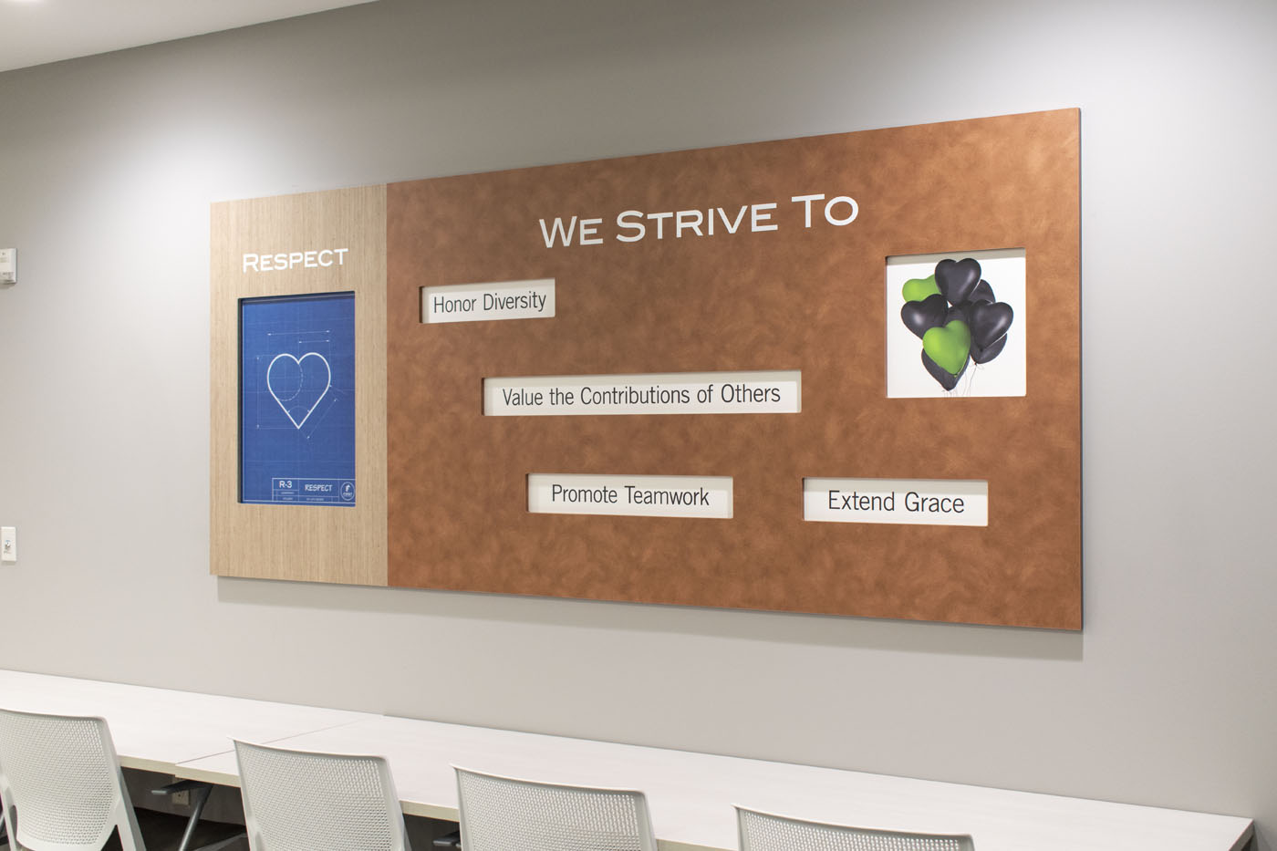
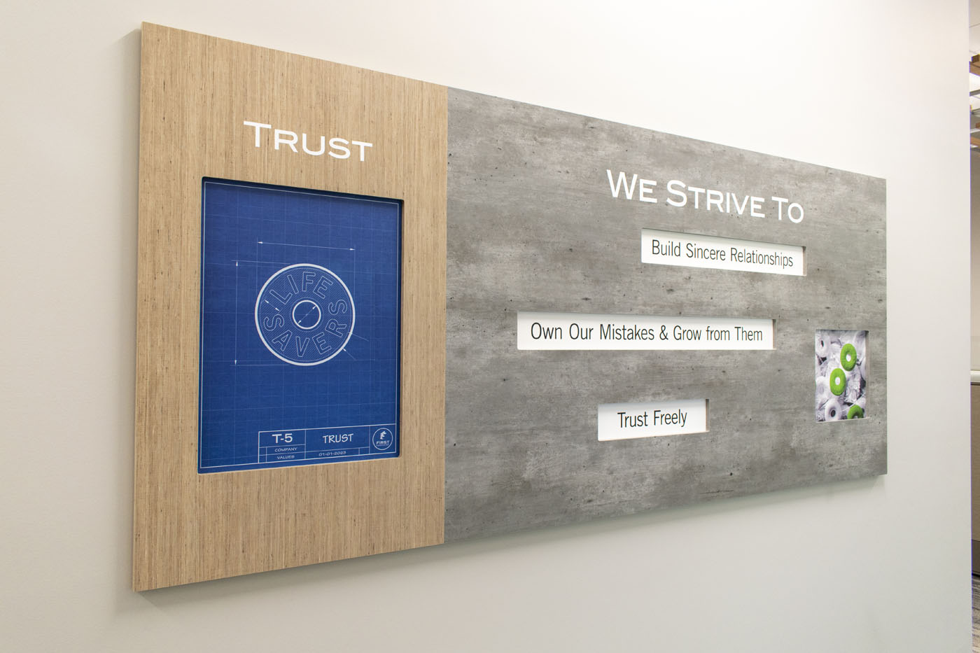
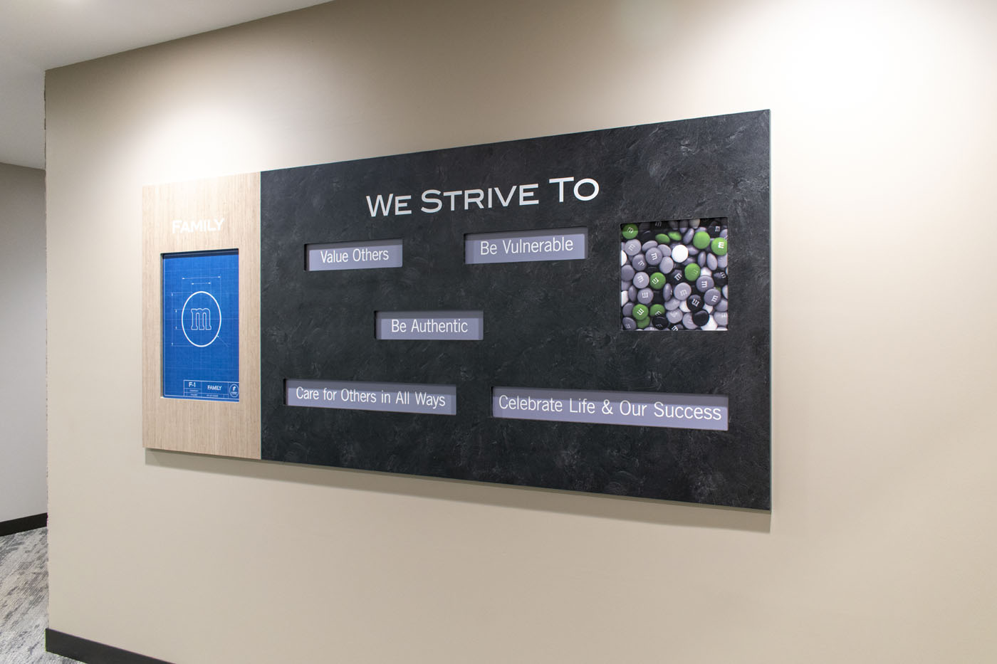
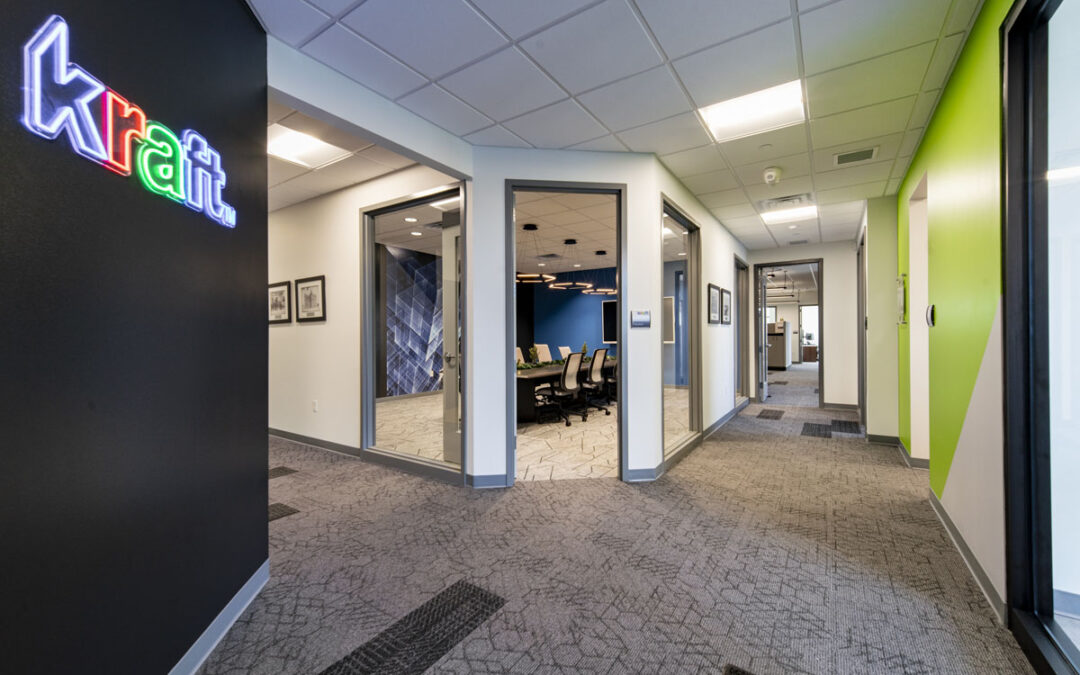
Early in the interior design consultancy, we noticed and complimented Kraft Business Systems (KBS) on their logo. Not only is it good-looking, but it has been developed based on business values and images that support those values.
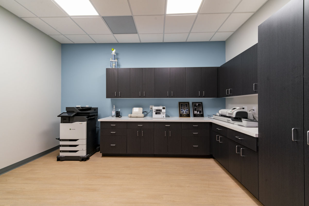
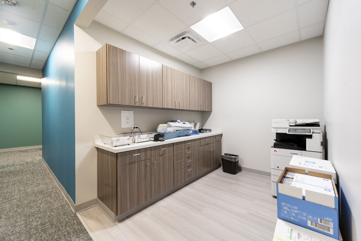
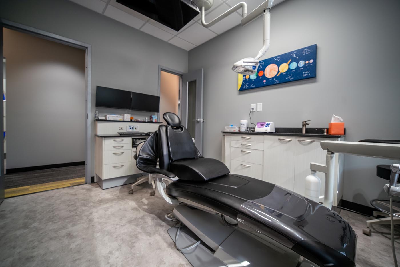
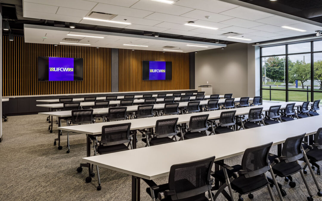
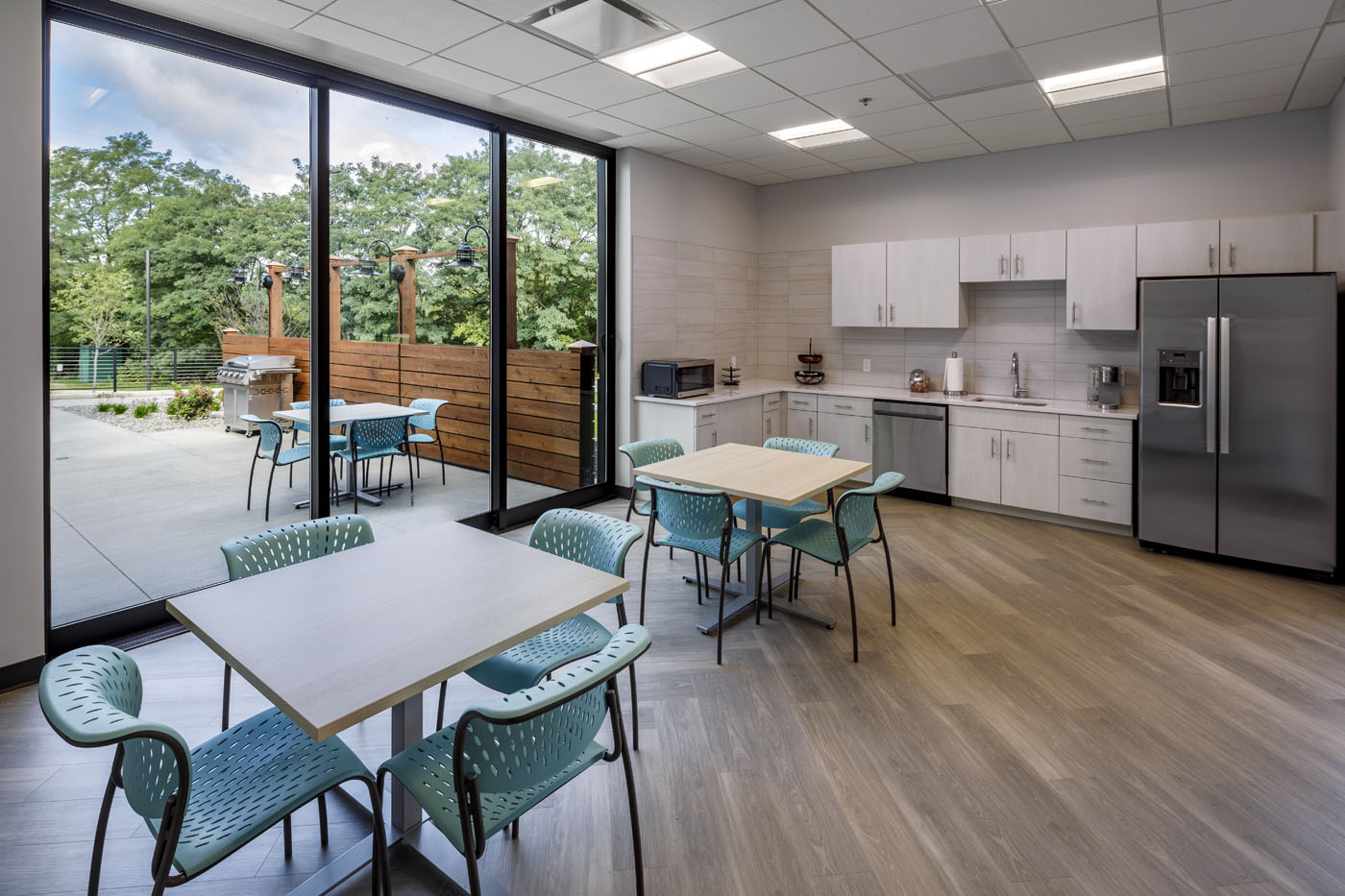
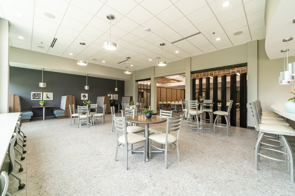
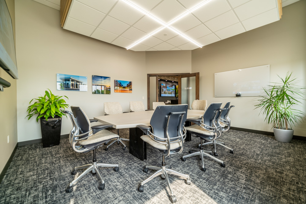
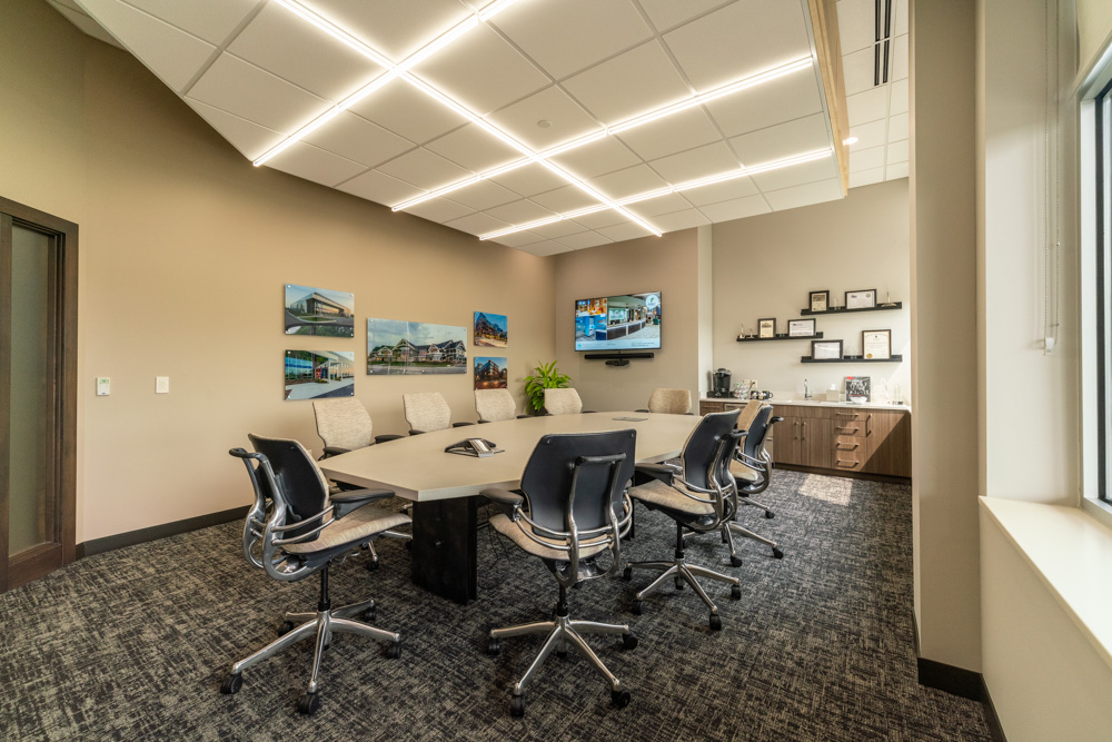
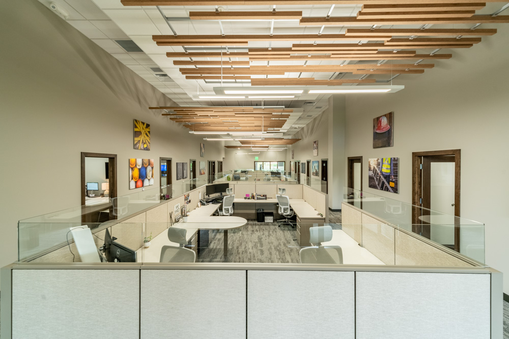
KBS sells printers, but more importantly, printing solutions and technical innovations. The business is built on solving problems for their customers, and r.o.i. Design took that approach as they made interior design decisions.
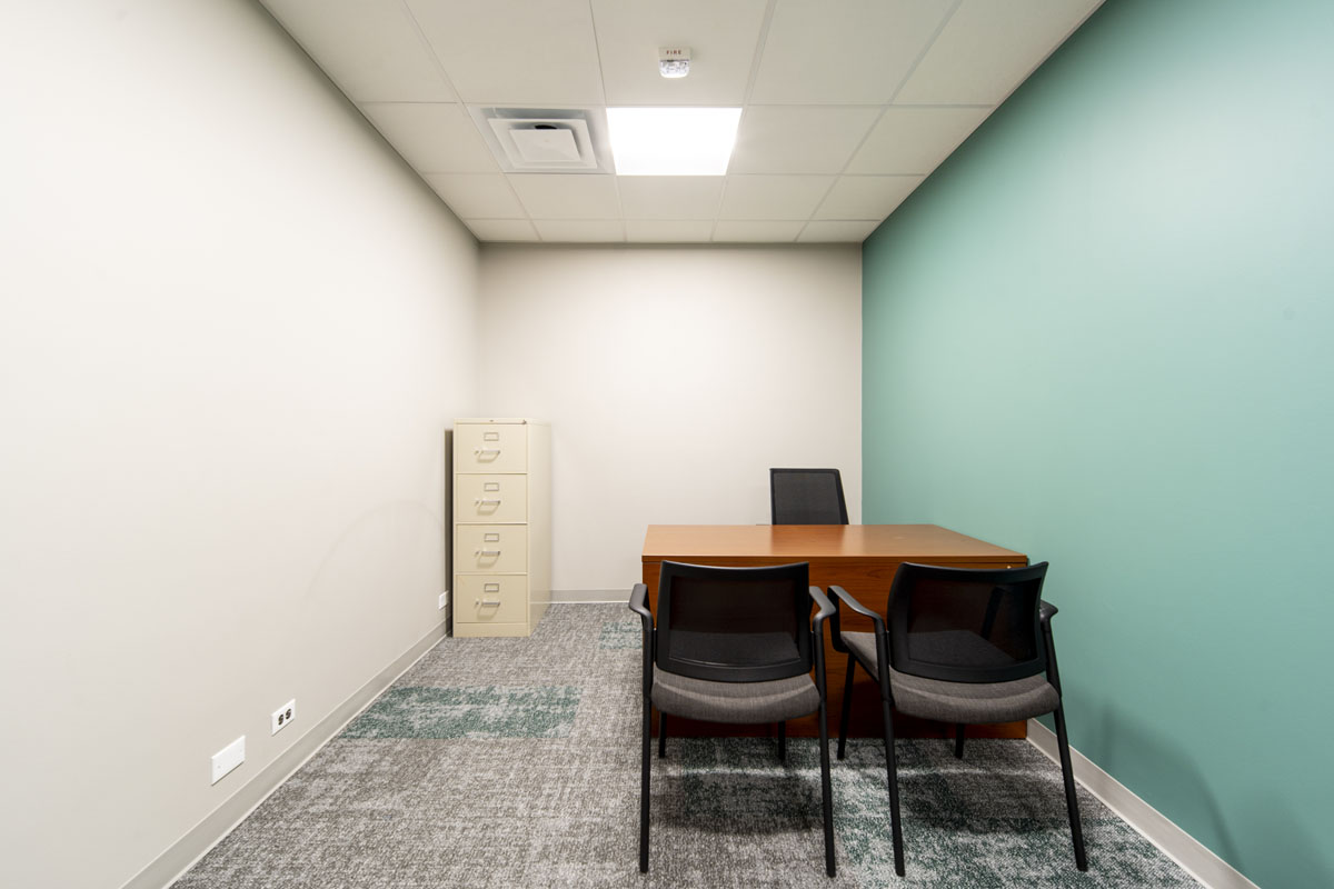
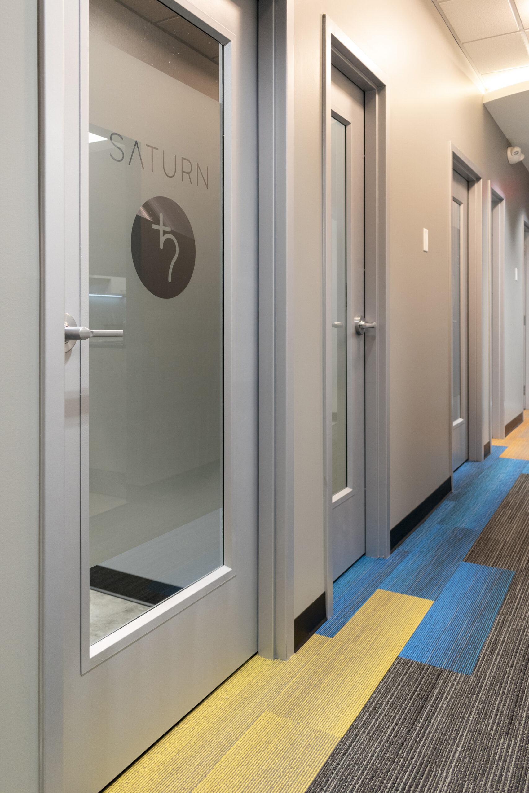
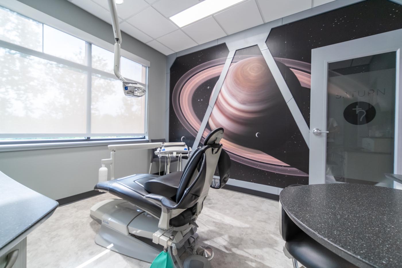
Each of the four key values were featured in their own areas:
-
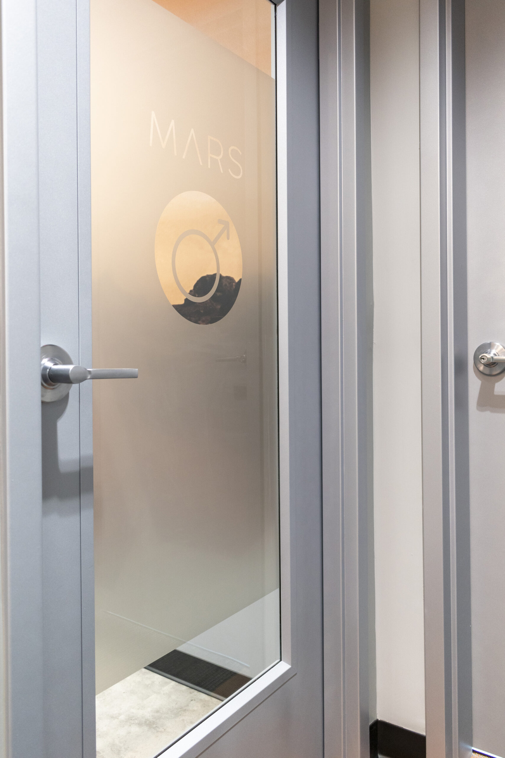
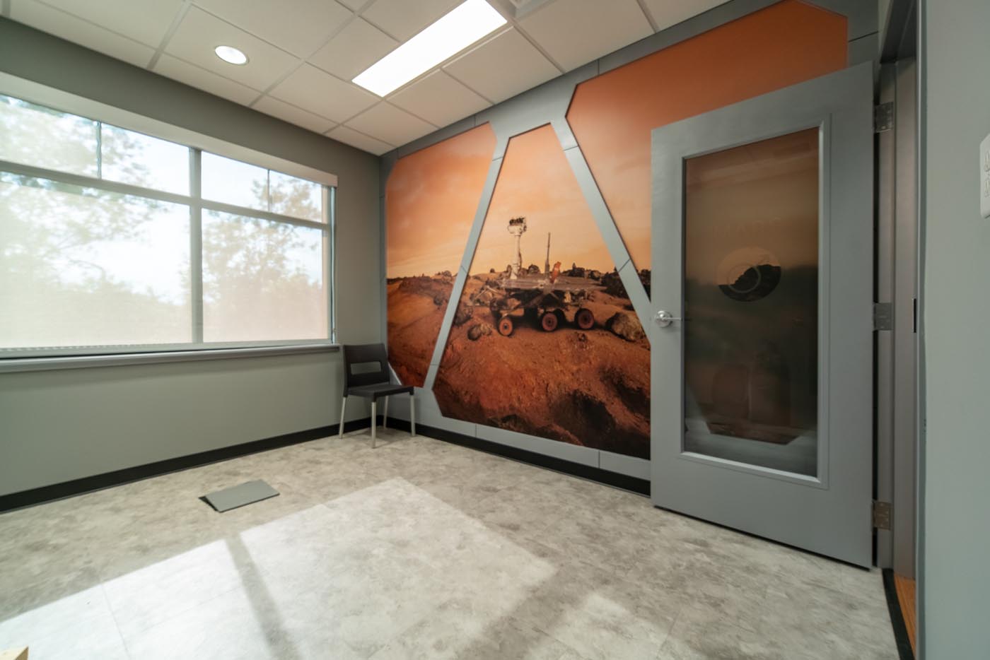
“Honor our company heritage in the print and printer industry.” (Orange)
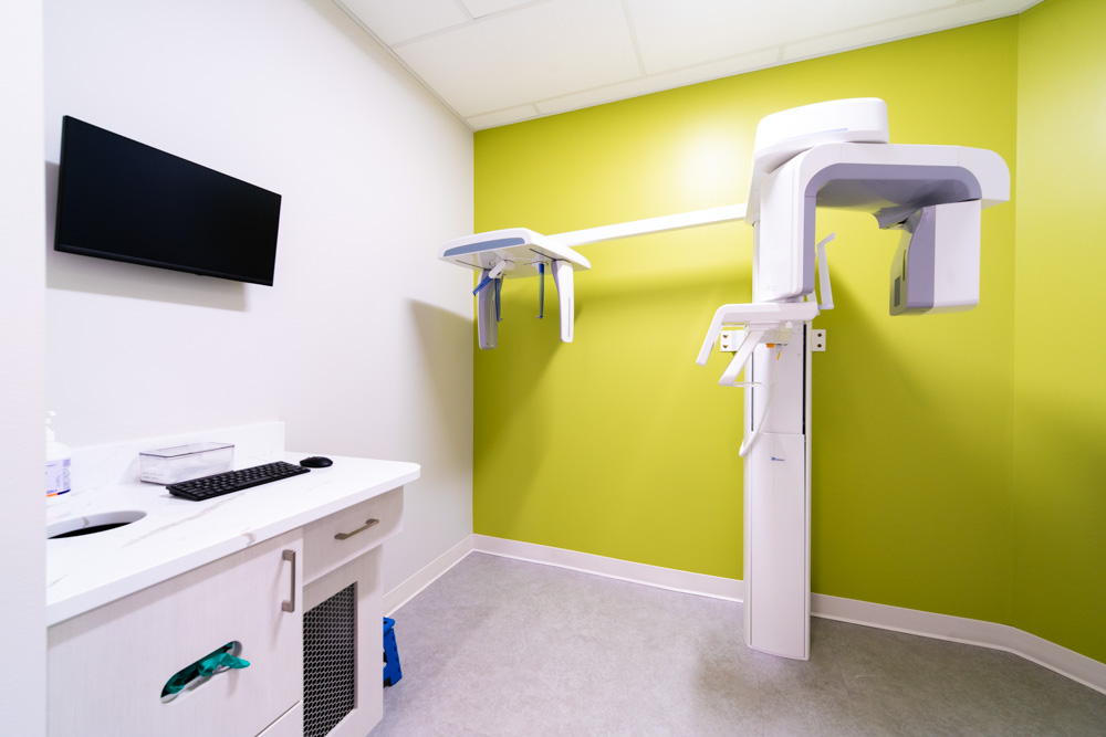
- “Committed to continued innovation and I.T. for the paperless office.” (Green)
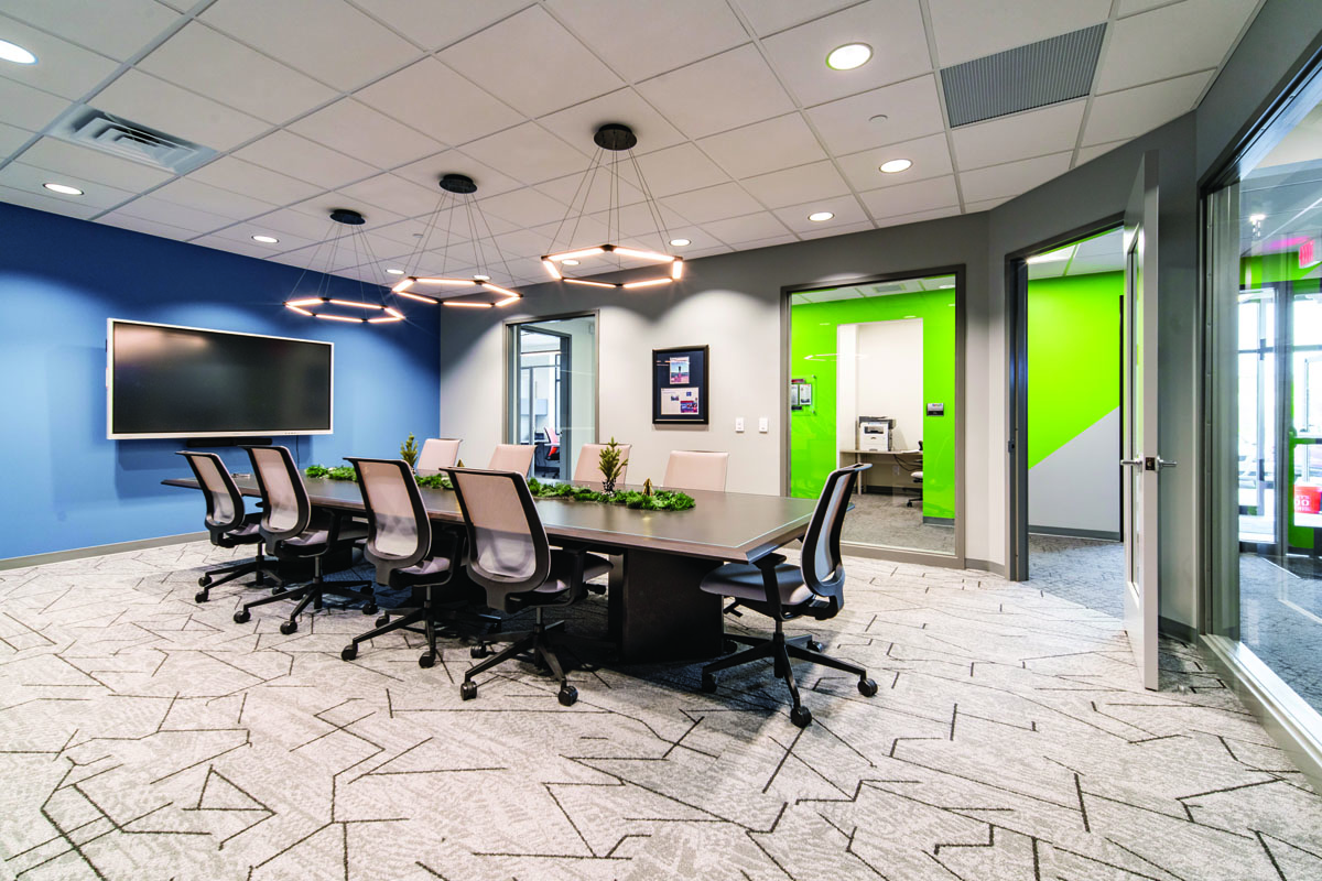
- “Focused on our clients and committed to interpersonal communication.” (Light Blue)
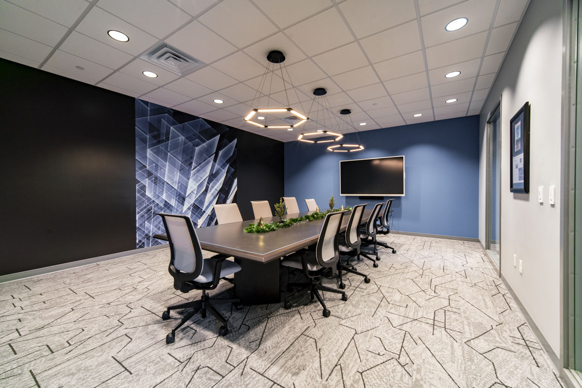
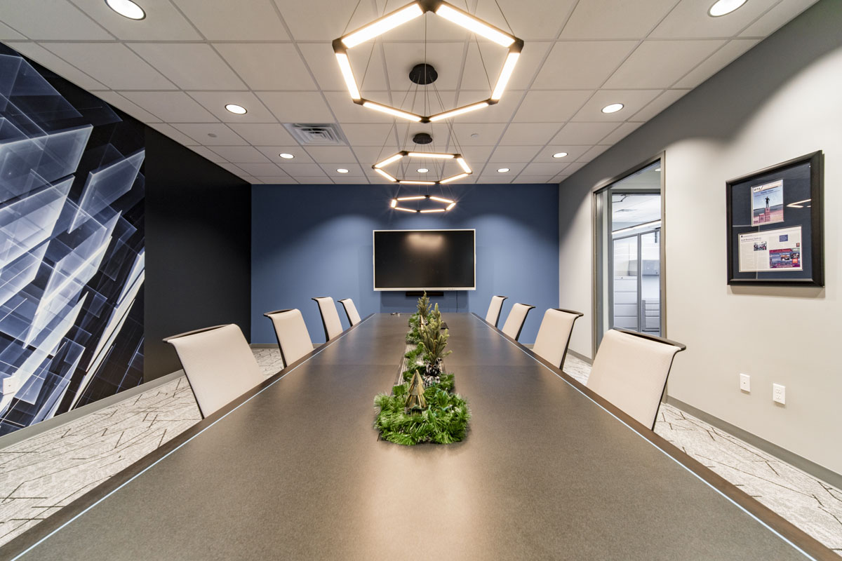
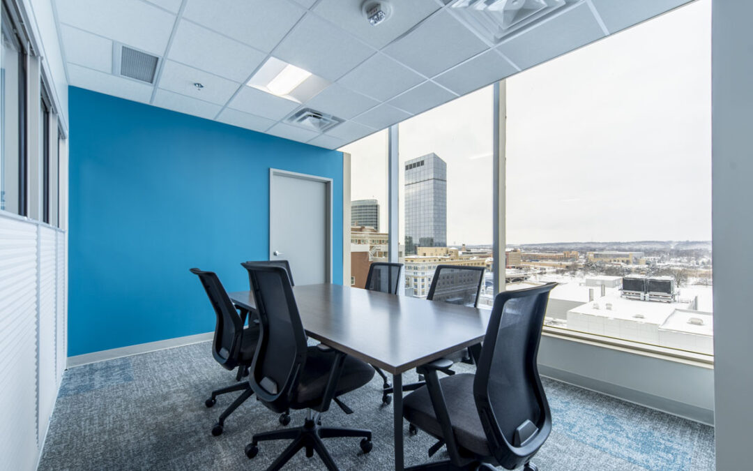
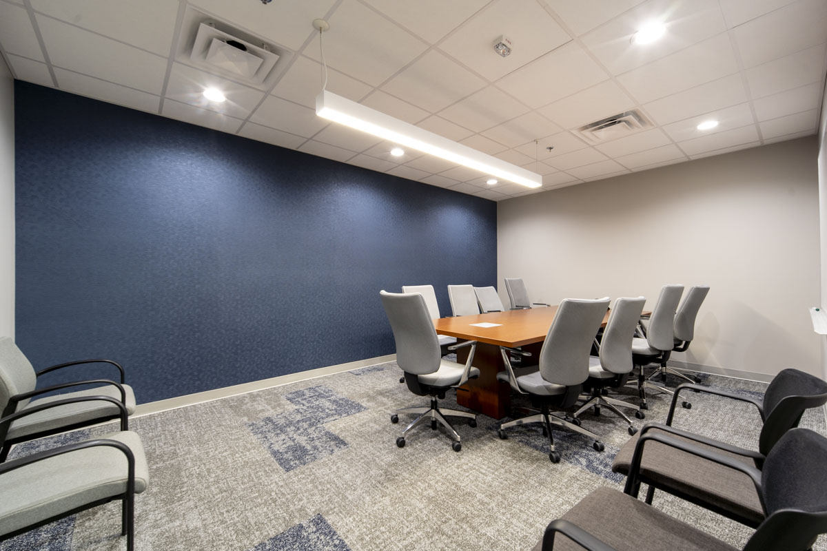
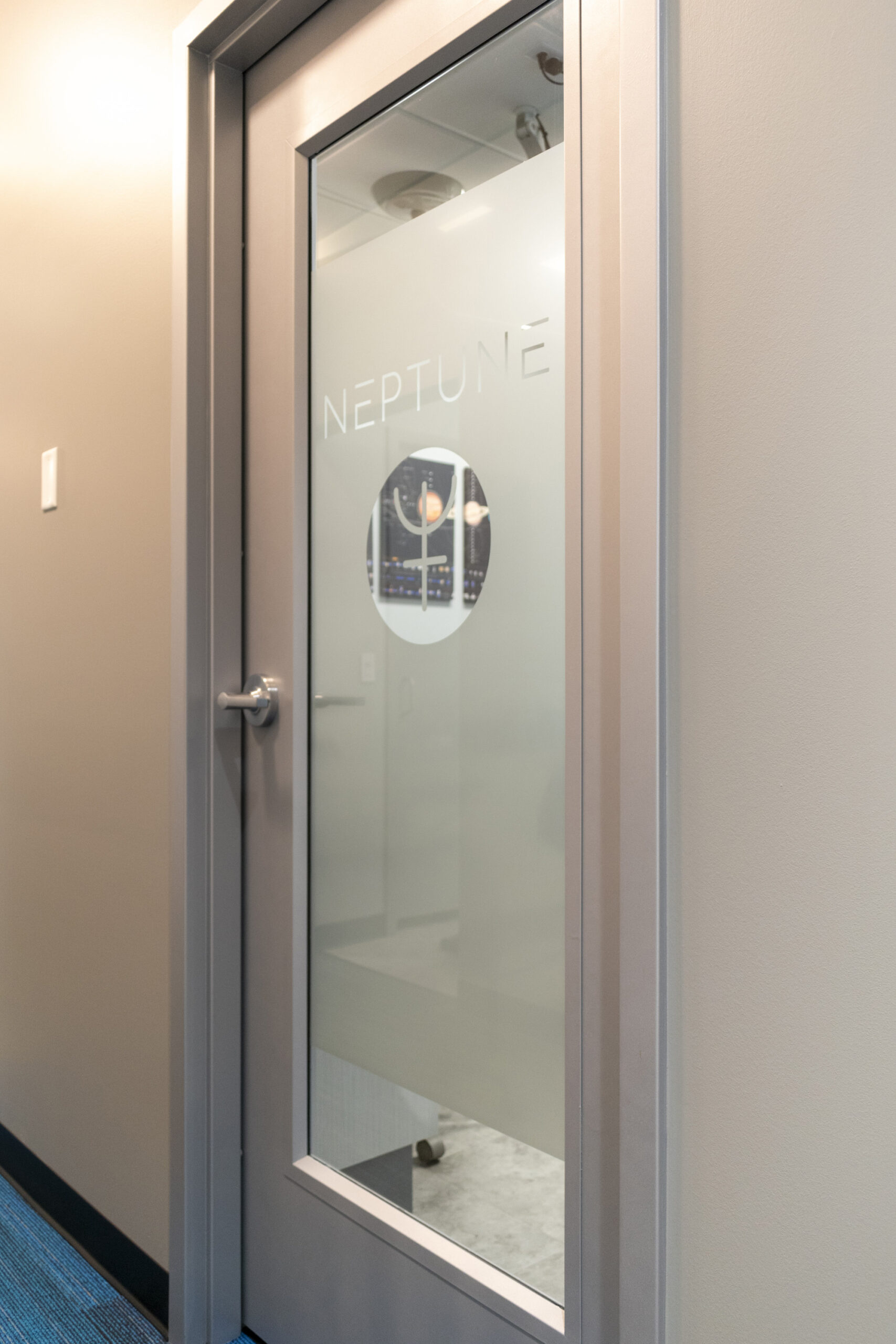
- “Look to the future with continued aspirations for creativity and growth.” (Dark Blue)
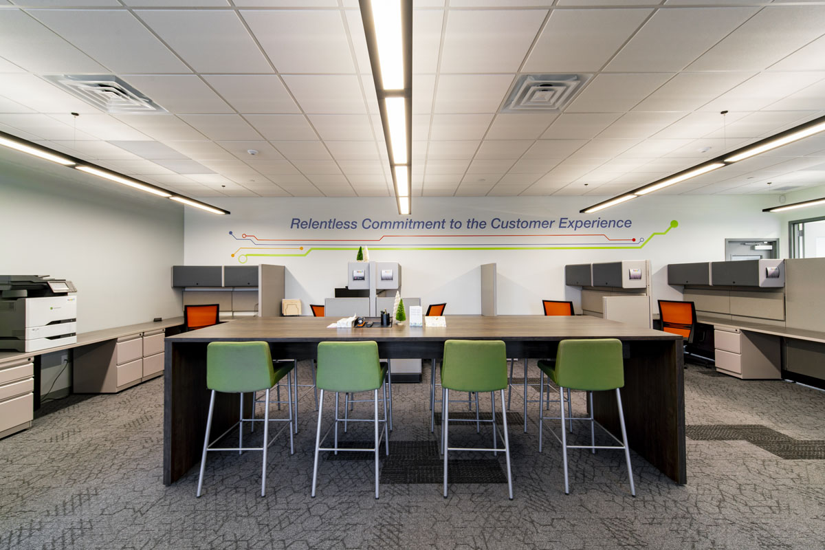
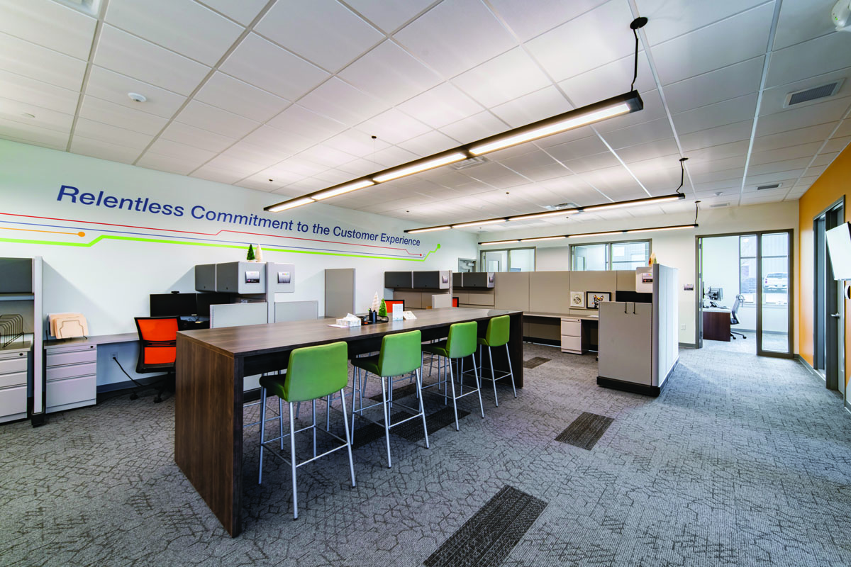
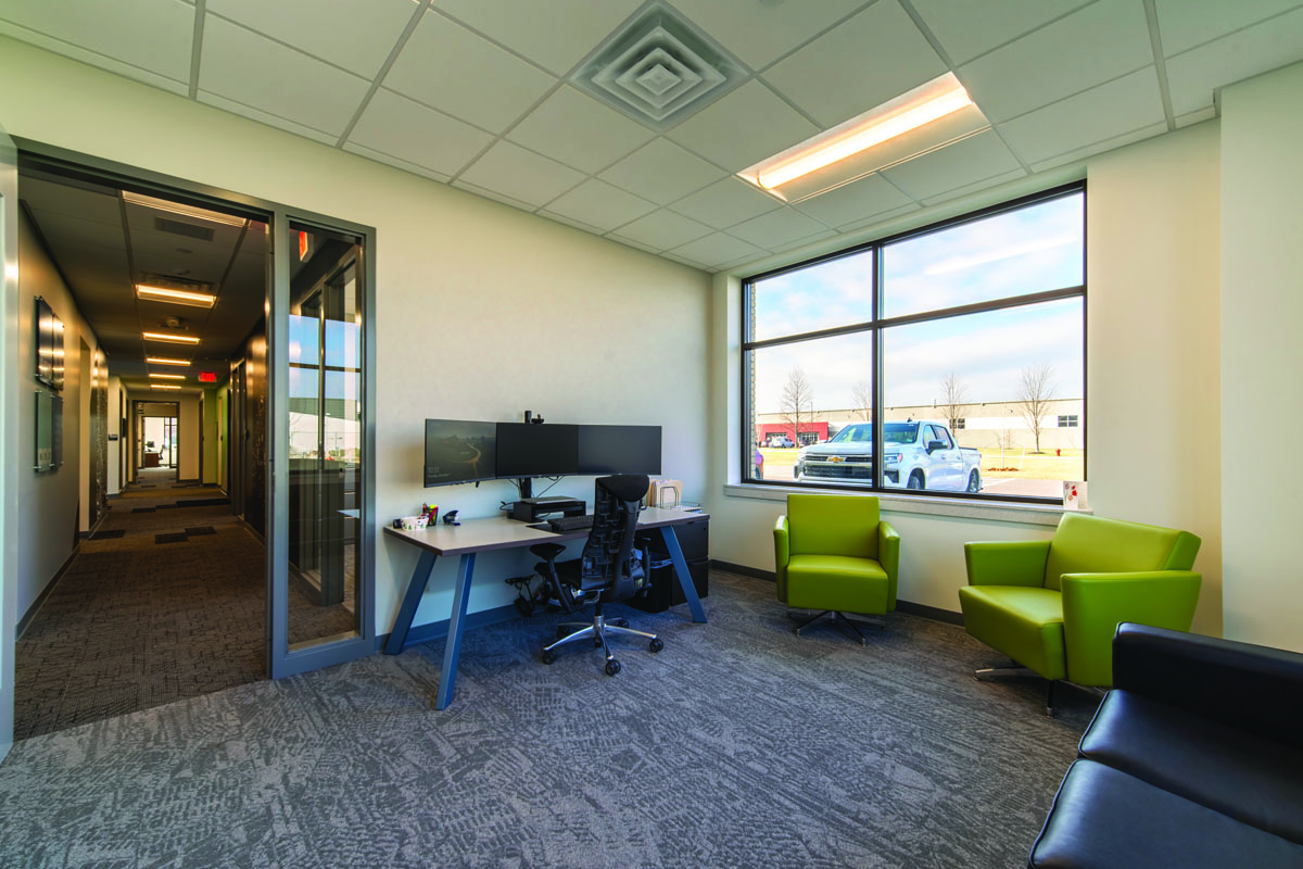
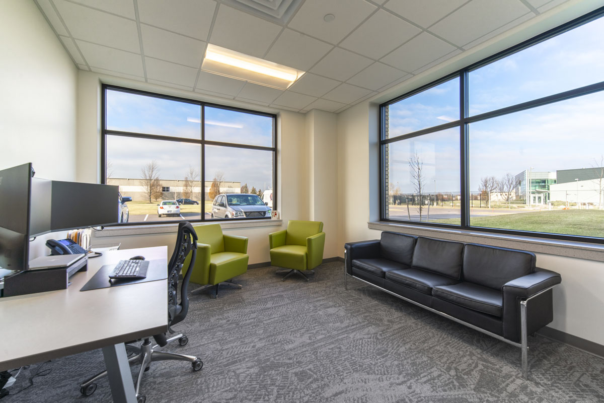
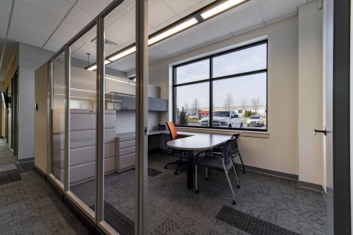
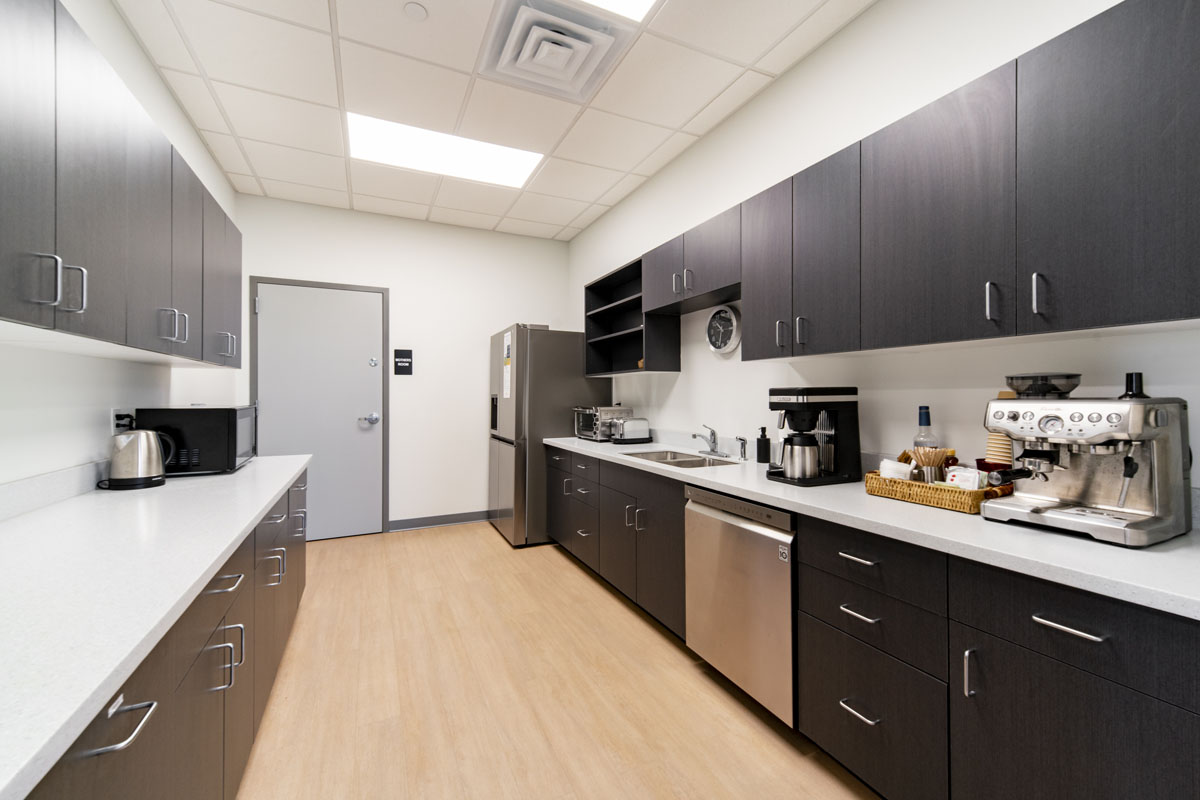
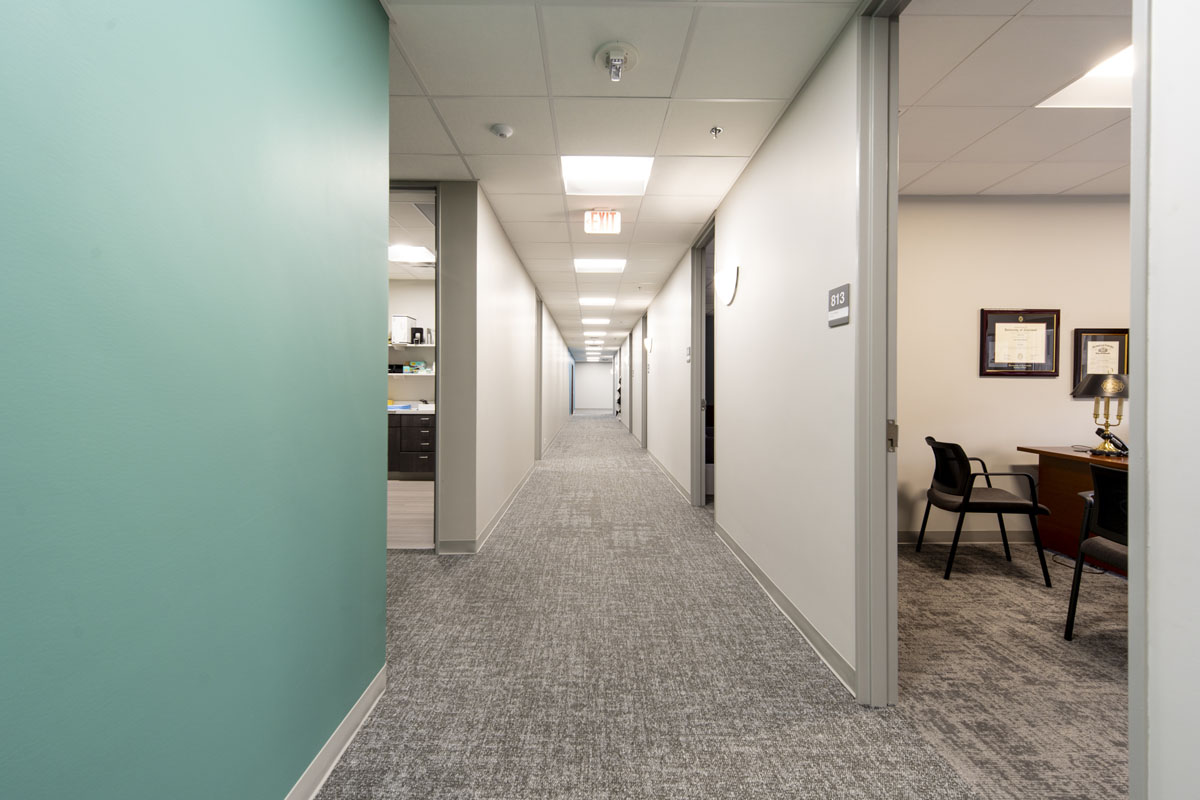
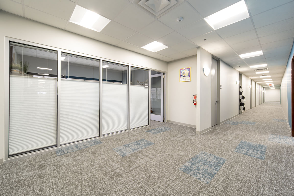
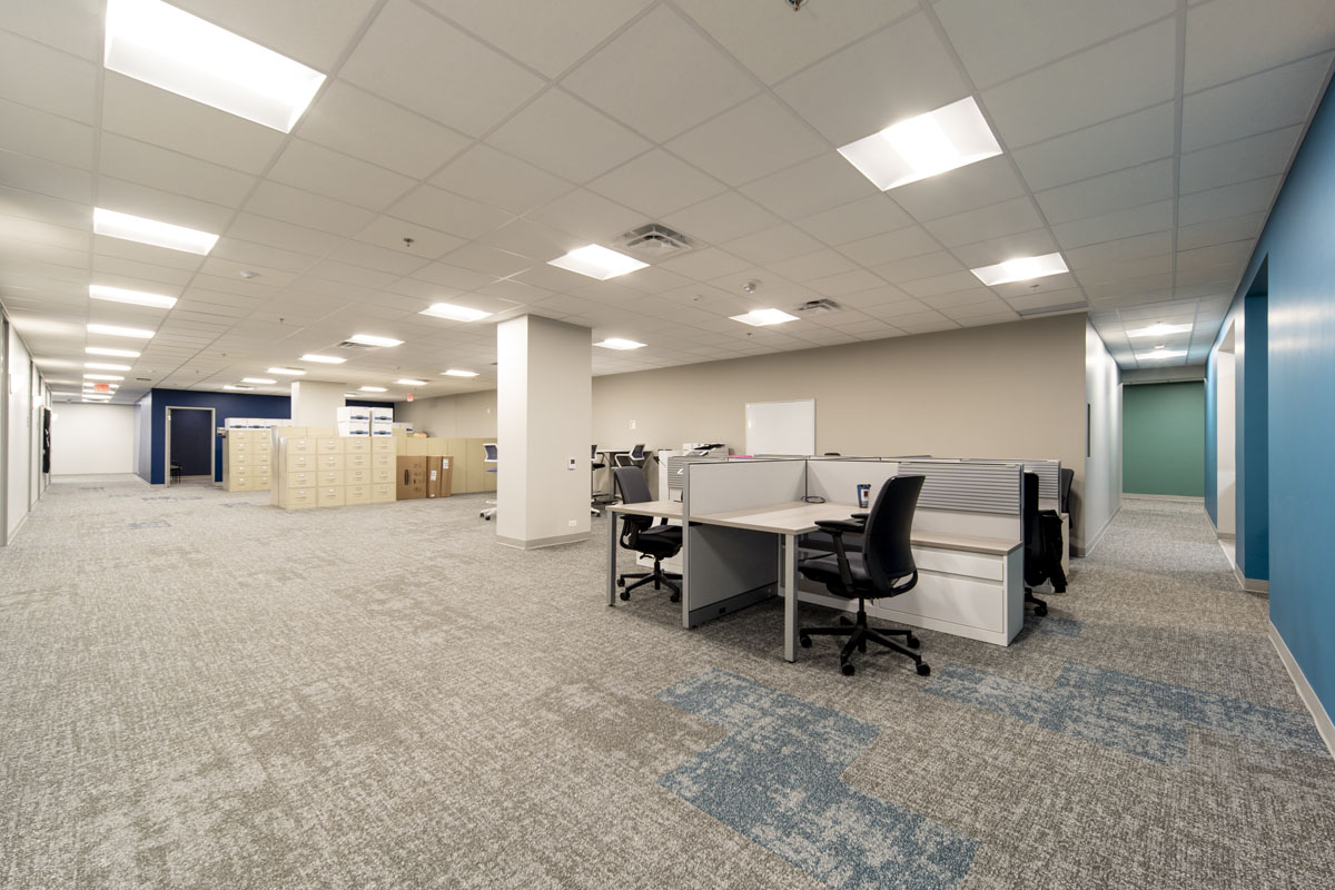
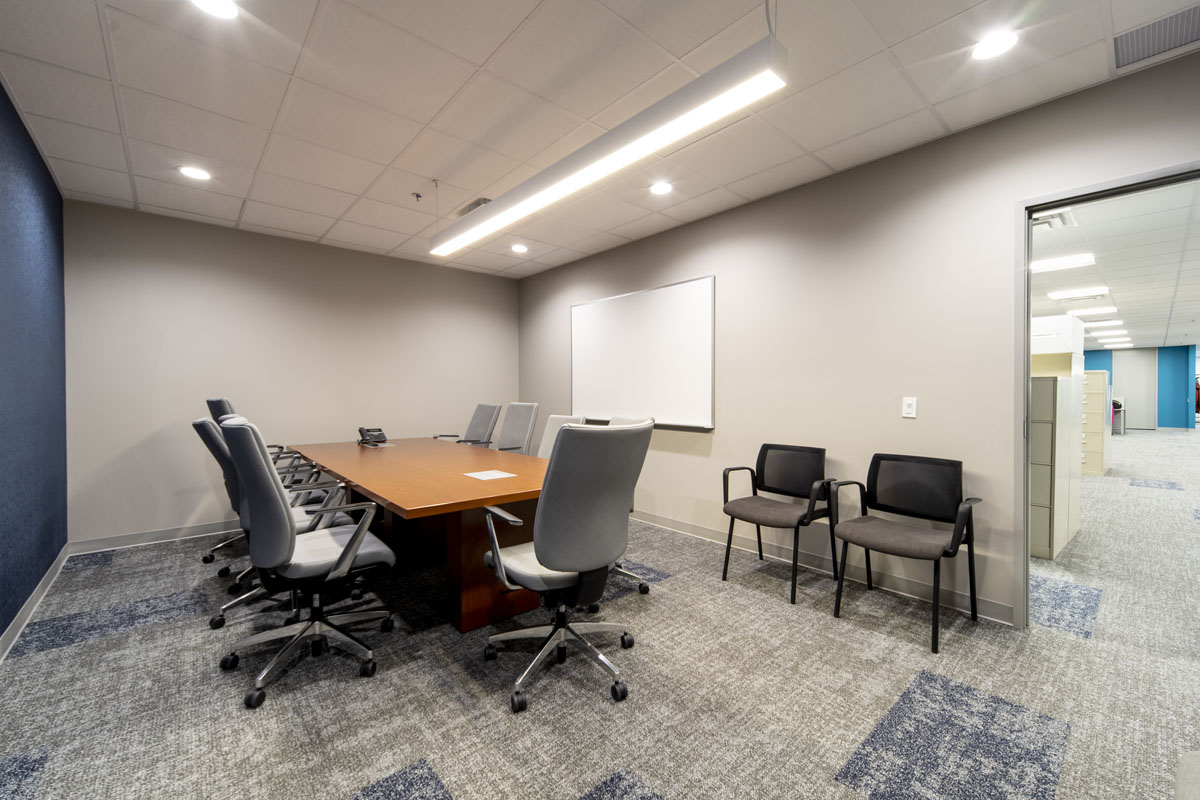
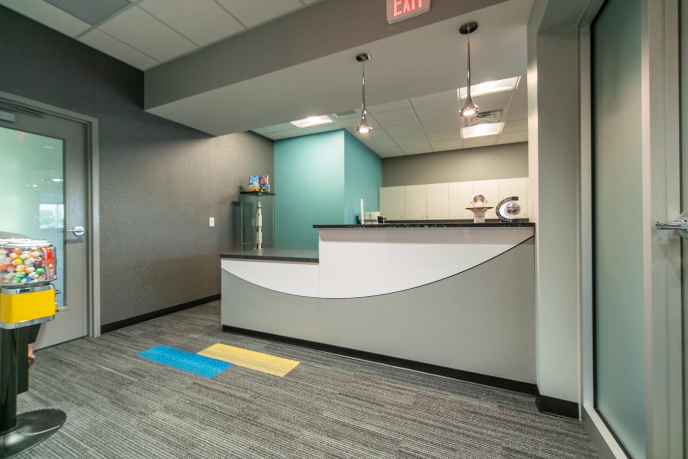
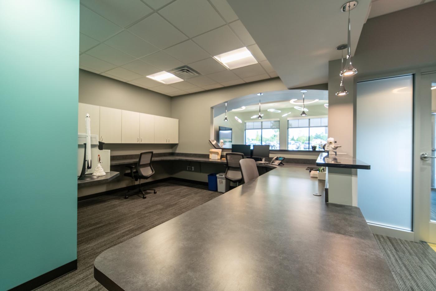
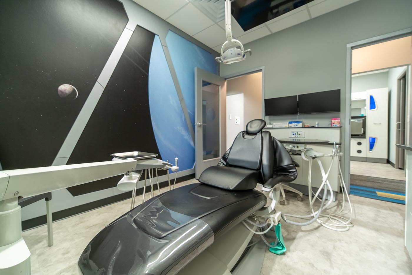
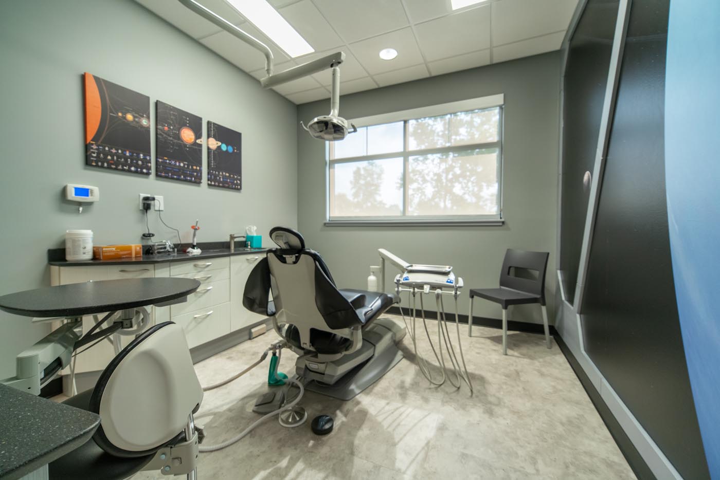
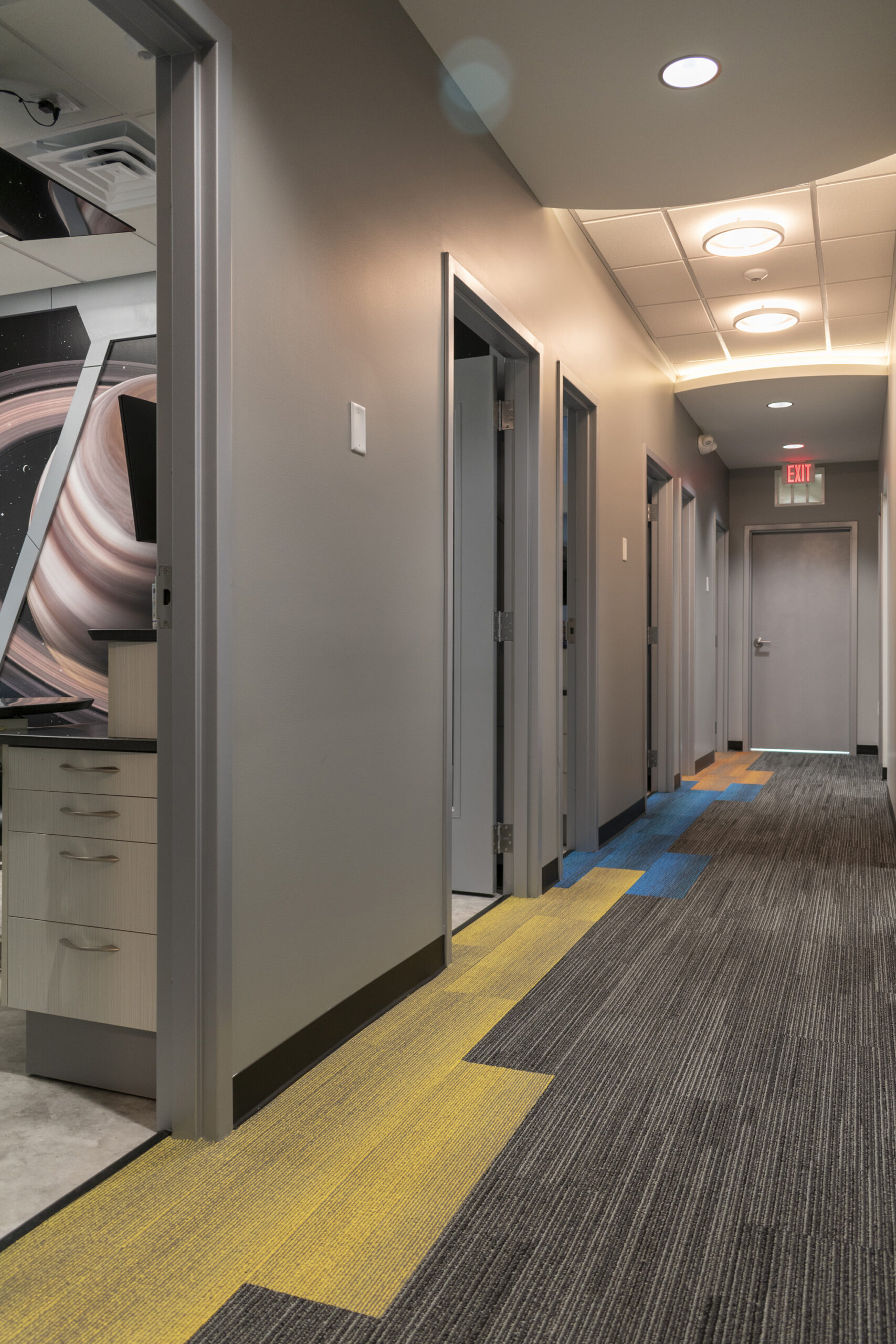
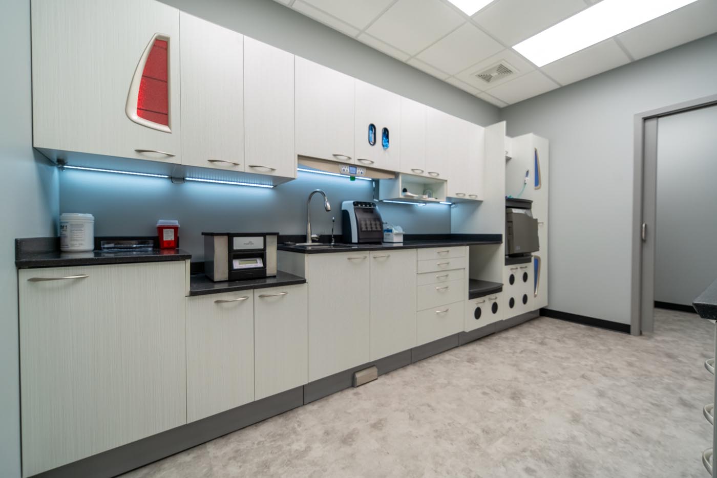
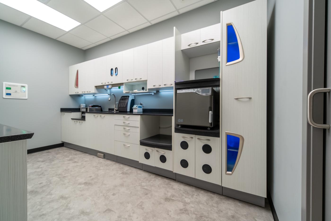
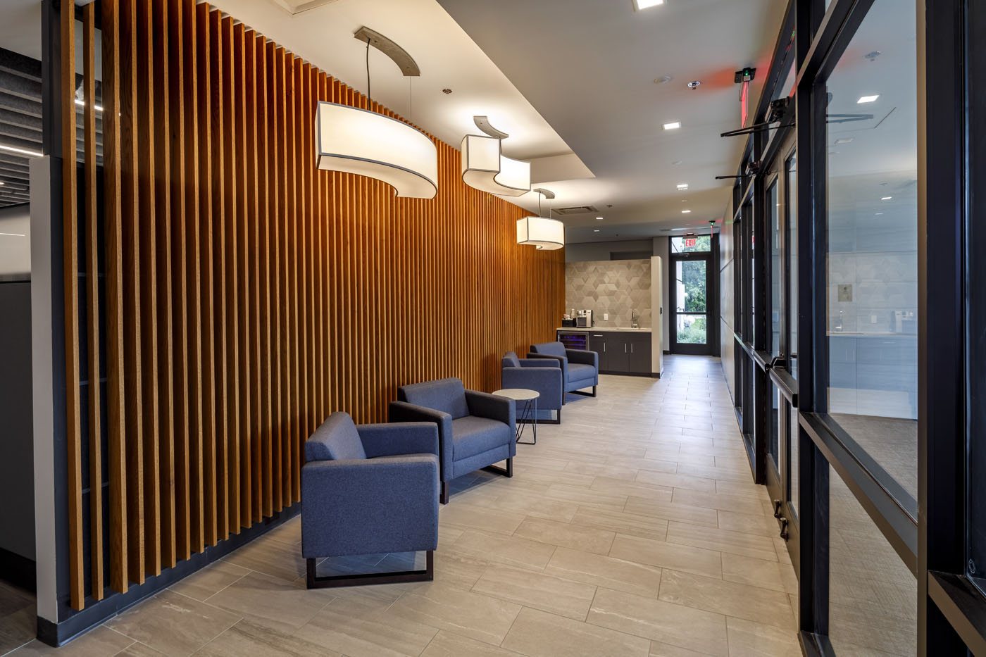
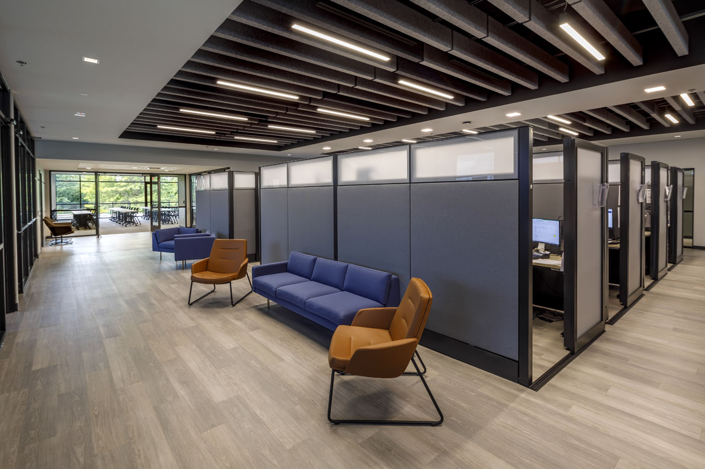
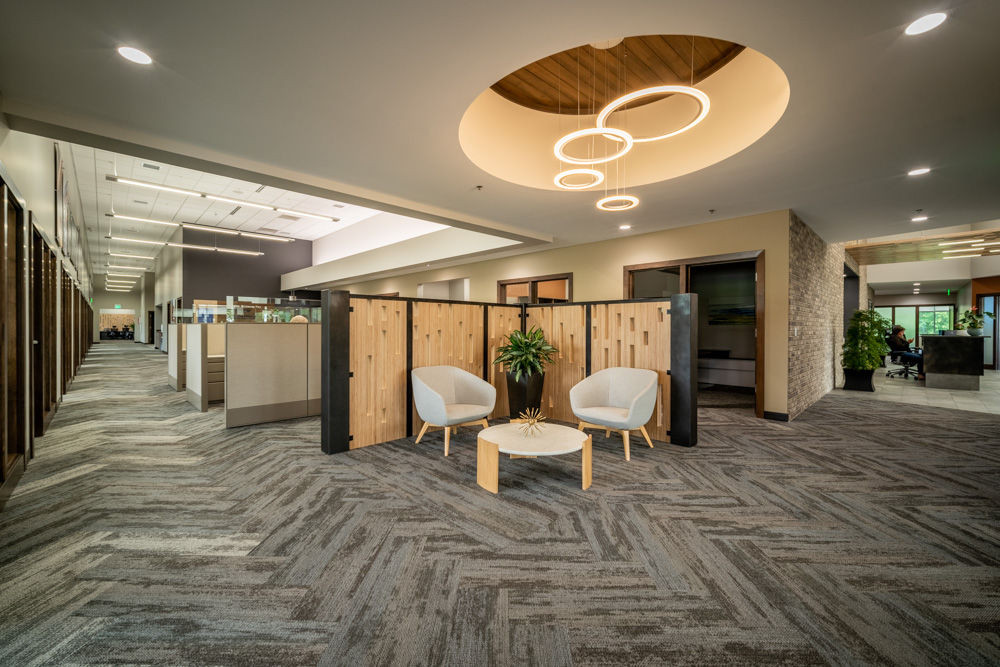
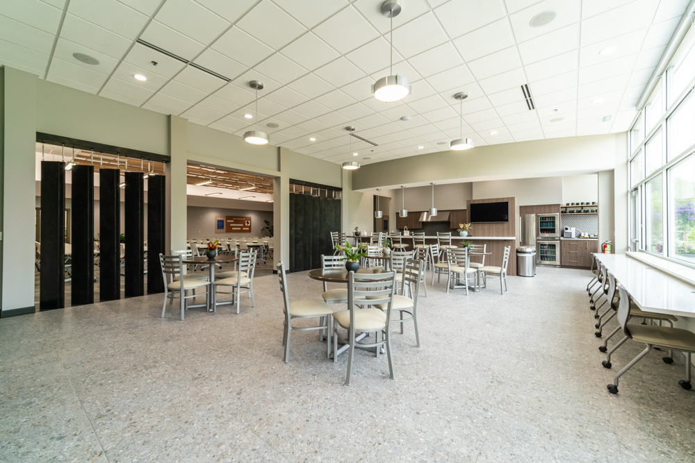
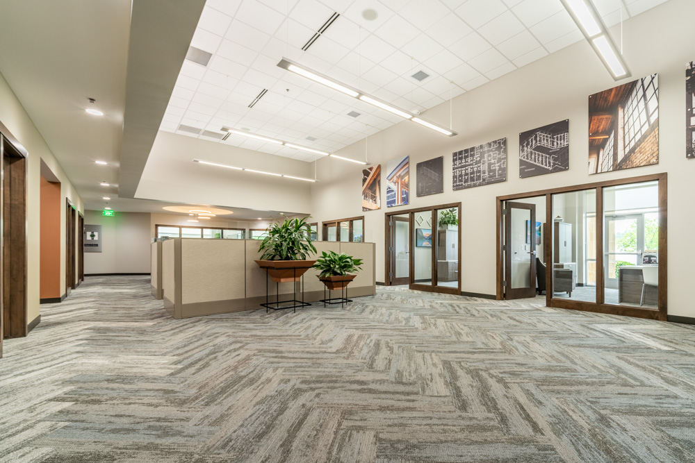
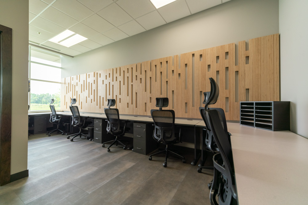
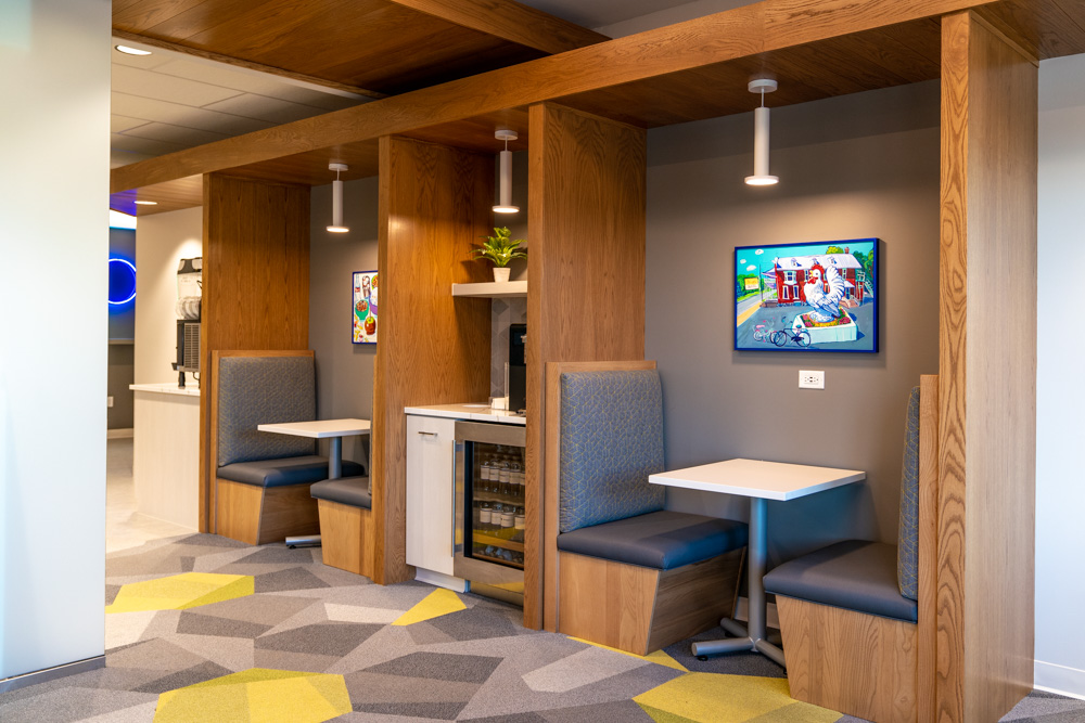
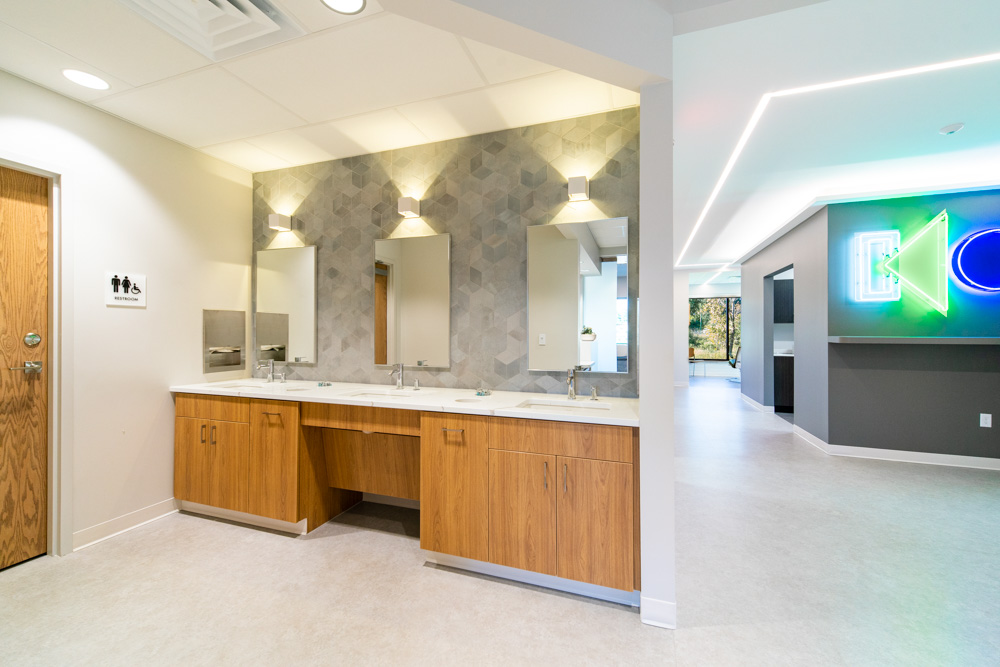
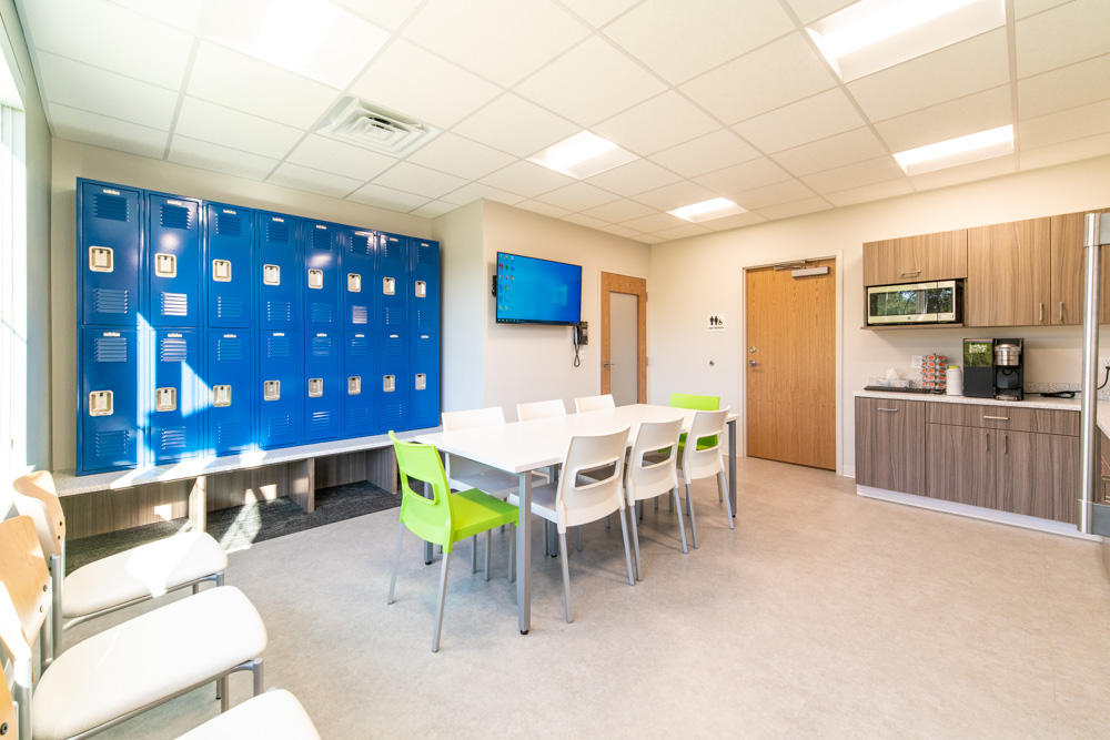
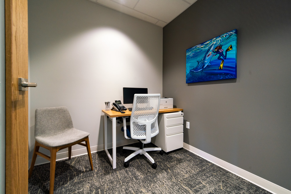
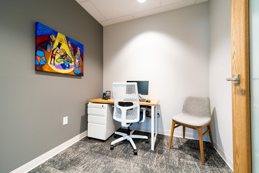
The colors of the five values are very bold, but the overall palette is white, grey, and black, creating a neutral background for the reds, oranges, yellows, blues, and greens. Not only did r.o.i. Design color block some of the walls in logo colors, we also created custom graphics for large-scale wall covering whose imagery is very “techy”.
As the design was coming to the finish line, Jeff commented, “This is cool, and I didn’t think I liked black, but I do!” The design was so well received that KBS borrowed finishes and accents for their other Michigan offices. That’s the best kind of compliment!