by Ryan | Sep 26, 2018 | Branding, Design News, Graphic Design, Interior Design, Medical Design, Procurement and Purchasing

© Image Courtesy of First Companies
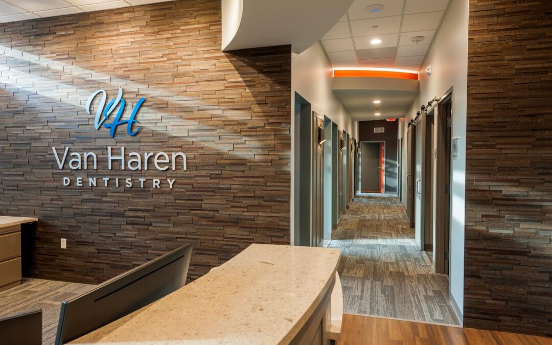
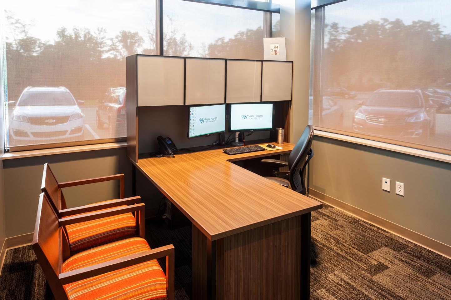
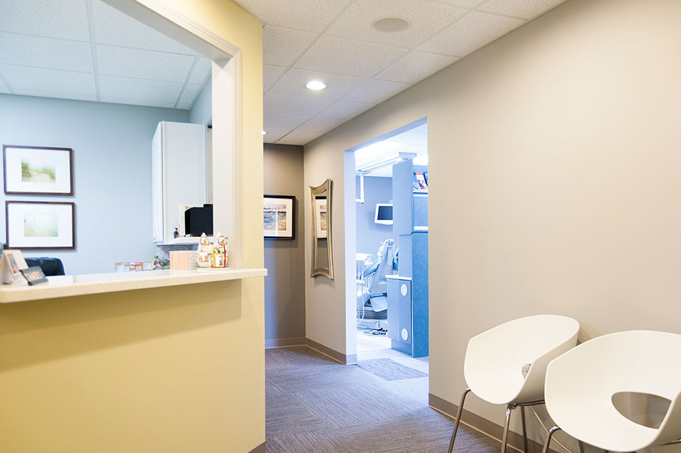
Van Haren Dentistry needed a new home, outgrowing their office after 10 years of dental practice, and reached out to First Companies’ Craig Baker for help. First Companies put together the team of r.o.i. Design and r2Design Group, architect Jon Blair to create a space to meet Ryan Van Haren’s needs.
r.o.i. Design was eager to provide a warm and friendly space for this team who uses the word “kind” to describe their practice. We found Dr. Van Haren to be a very caring professional with a love of family and desire to serve his patients and wanted him to feel at home in his new space.

© Image Courtesy of First Companies
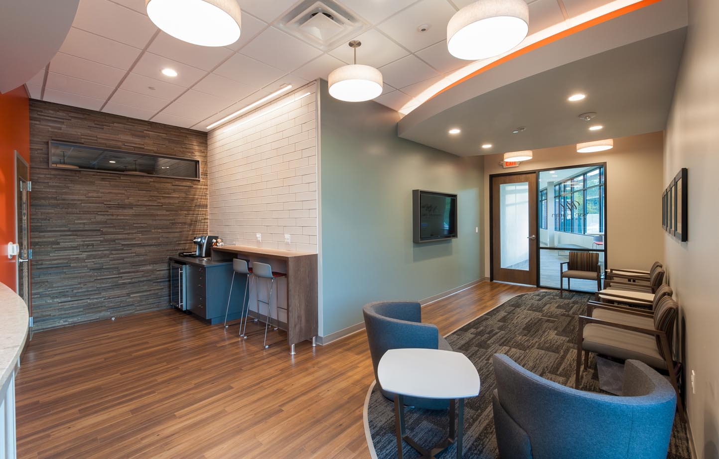
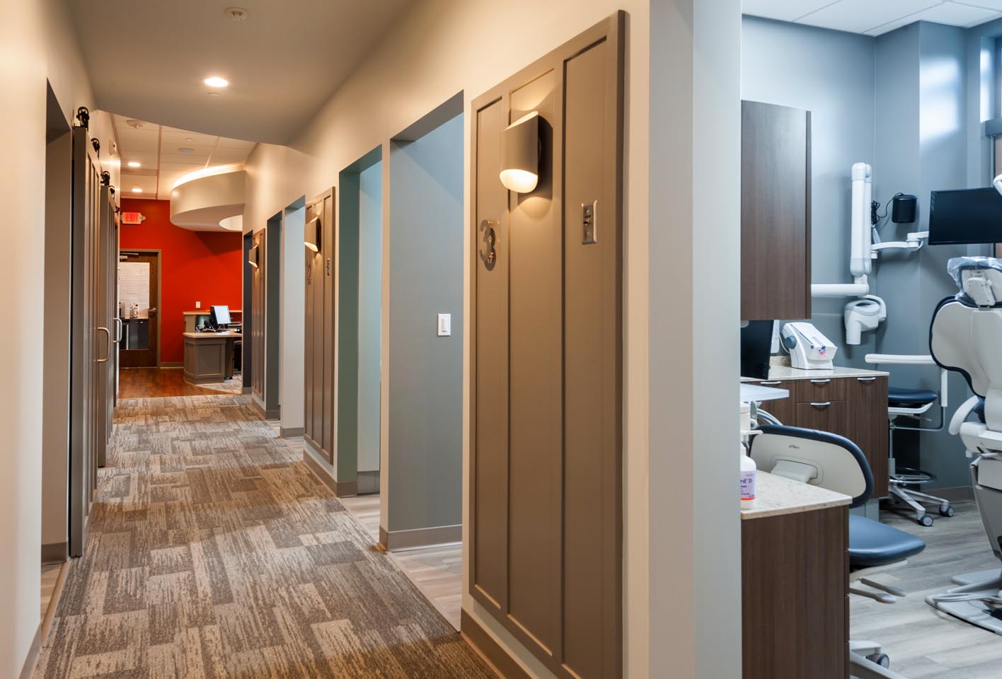
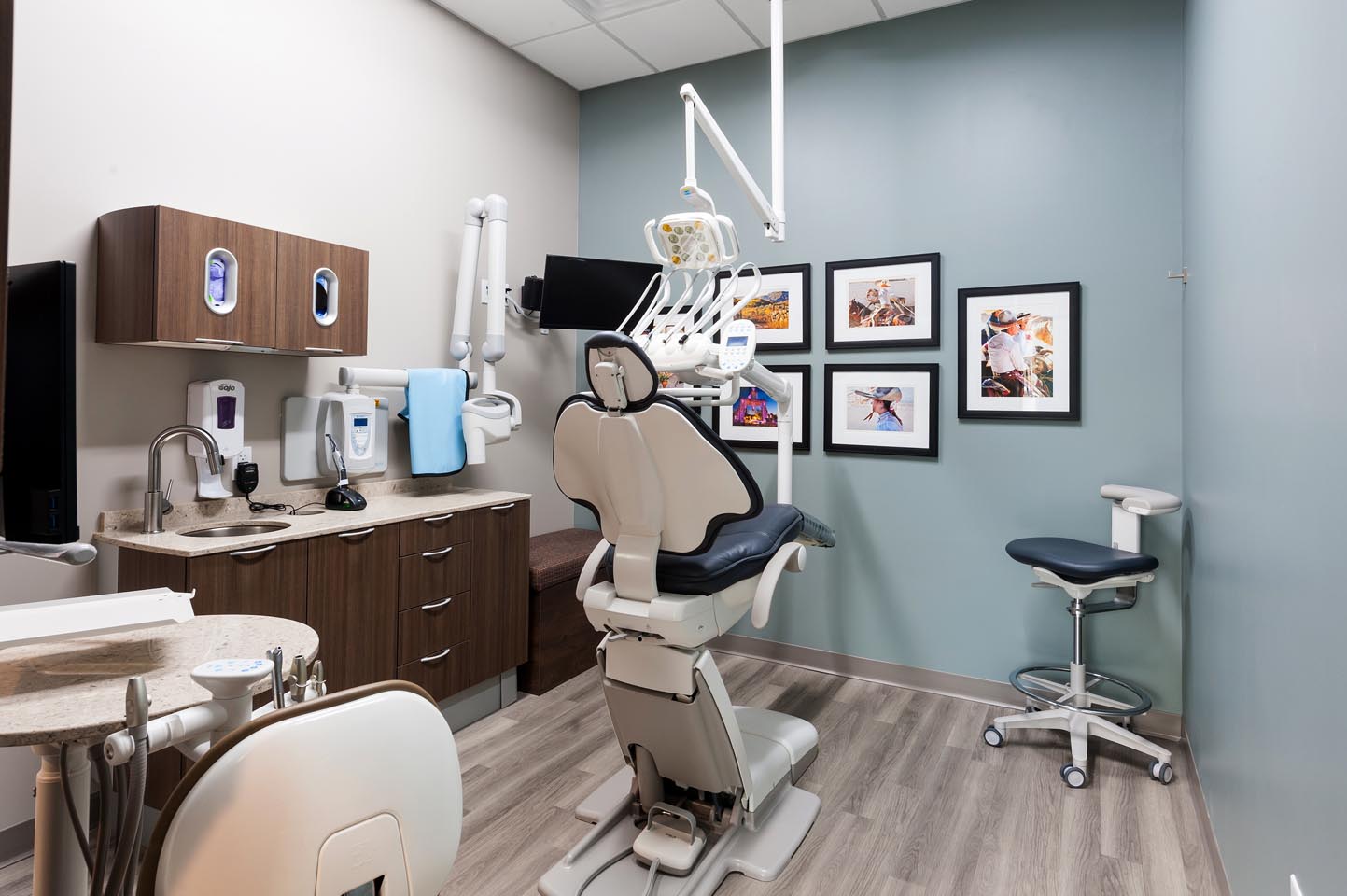
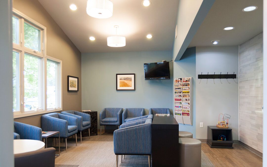
The new office has improved patient spaces, including waiting, consult, and hygiene/operatory. It also has more efficient space for staff, including reception, lab, sterilization, and break room.
One element from the old office was brought along: photos of Grand Rapids’ sister cities are displayed in the lobby, consult room and hygiene/operatory rooms. These colorful photos of people from around the world are a bright and refreshing accent throughout the space.

© Image Courtesy of First Companies
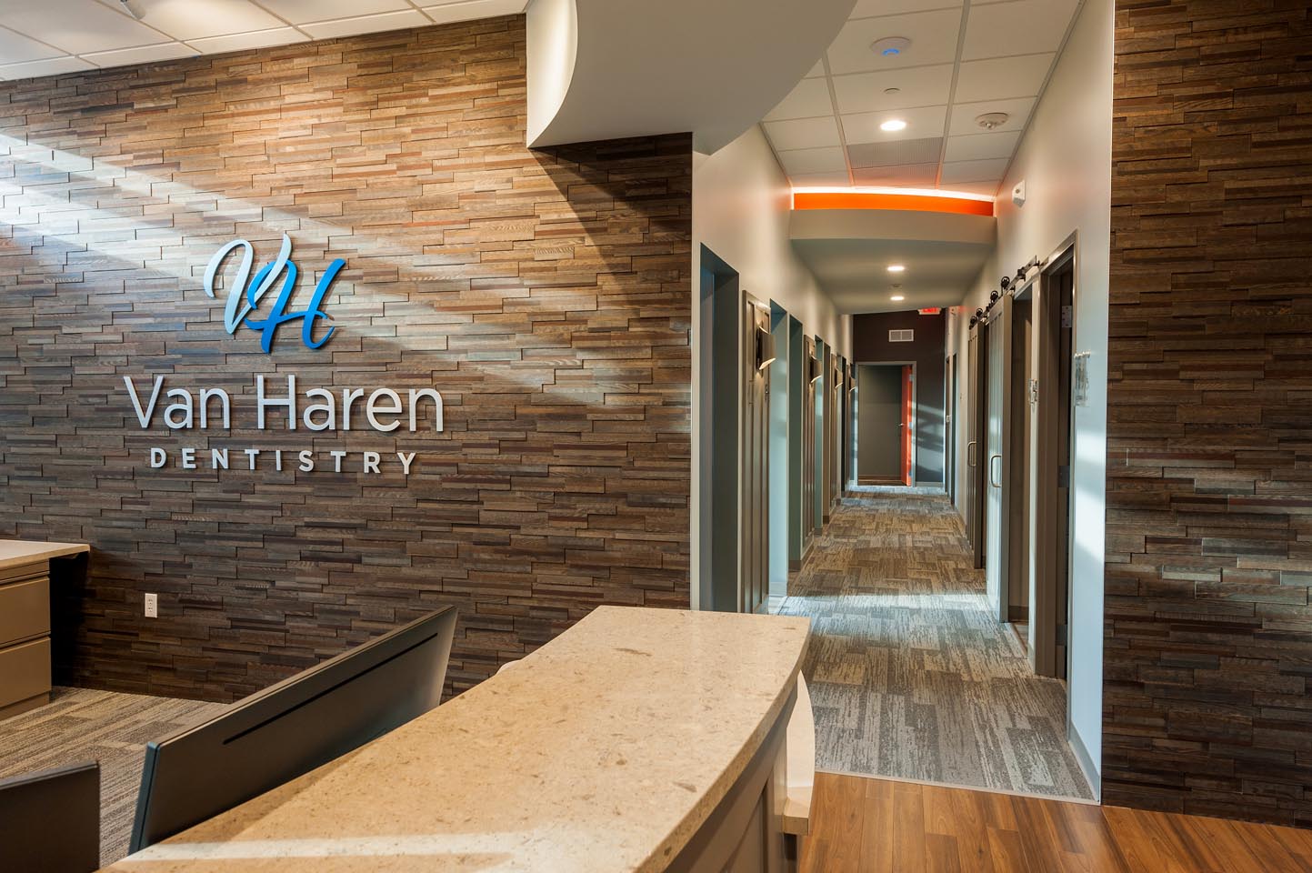
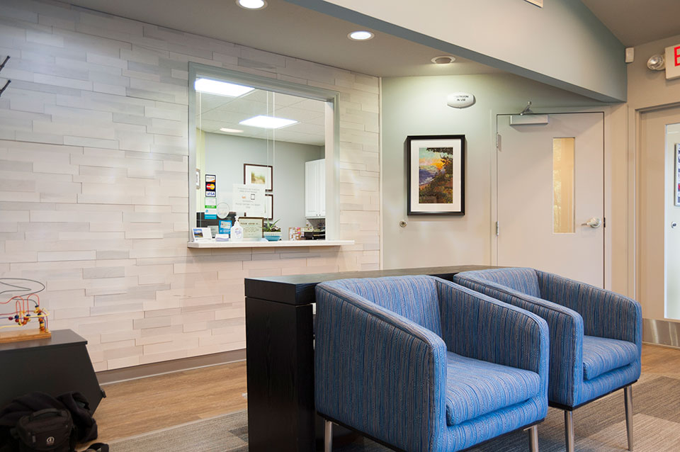
Our favorite features in this design include the pop of the color orange, use of a panelized wood tile, lobby and corridor ceiling details with edge lighting, as well as a friendly hospitality area with full height tile walls.

© Image Courtesy of First Companies
Not only did r.o.i. Design provide complete interior design services, we designed their new logo and designed the signage for the outside of the building. Again, a friendly and welcoming use of the “V H” hopes to reflect the nature of the practice. We also supported their process of procuring furniture, working with Custer Office.

© Image Courtesy of First Companies
First Companies delivered the space by the 4th of July. Congratulations to Josh Reynolds and the whole team from First Companies.
For more information about Van Haren Dentistry go to vanharendentistry.com.

by Ryan | Nov 15, 2017 | Design News, Interior Design, Medical Design
Dr. Drew Scholtz contacted r.o.i. Design looking for finish ideas to update his office. The challenge for any business is to understand what to invest in. What changes will have the largest impact on customer and employee satisfaction?

For Scholtz Dental, upgrading the lighting, updating the floor and wall finishes and replacing the lobby furnishings was the answer. Equipment and casegoods were able to remain until the next remodel. The lobby upgrade was the most noticeable improvement. We created a feature wall at the reception, added decorative lighting, installed an interesting carpet and added new stylish furnishings.

r.o.i. Design has a select group of manufacturers whose furniture we can distribute at competitive prices. Thank you Dr. Scholtz for selecting r.o.i. Design not only to provide you with interior finish ideas, but to supply you with new furnishings. It looks great!

by Ryan | Apr 24, 2017 | Branding, Design News, Designing for Kids, Medical Design
So much more than runny noses, vaccinations, bumps and scrapes, a pediatric practice is a sophisticated business that manages the physical, behavioral and mental health issues for newborns through teenagers. There are lots of challenges, so the office design needs to create an environment that offers some efficiency and some fun.
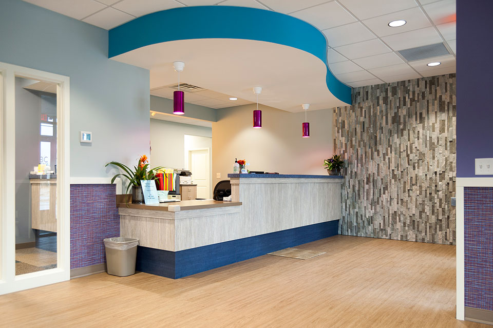
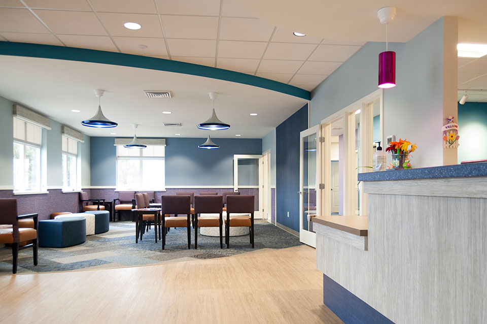
r.o.i. Design learned so much working with ABC Pediatrics as we helped them with the interior design of their new offices in Wyoming, MI. We learned how they wanted to engage families with their interiors, but not be just “kid-like”. They wanted their space to look professional and simple, but very welcoming and comfortable. They needed it to be user friendly for staff and family which meant maintainable surfaces and easily identifiable areas. And there was a budget.

ABC Pediatrics Lobby
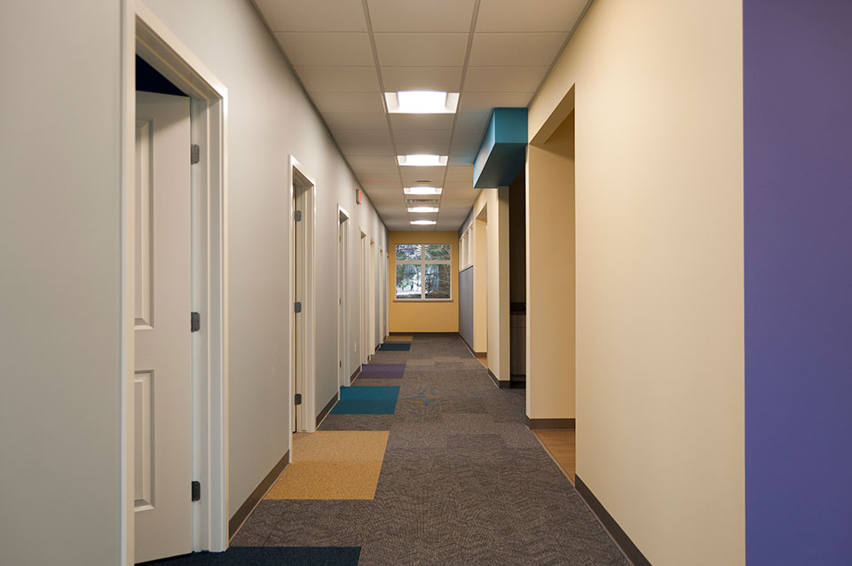
Starting with a color scheme that they currently use in their Walker location, r.o.i. Design “upped the ante” by intensifying some of the colors, adding pattern and interest, in thoughtful ways. Some of our favorite elements are the carpet accents, the color accents, the decorative lighting and the lobby furniture. Wall art will soon be added to the interior and we like those selections as well.

Interior corridor at ABC Pediatrics.
ABC Pediatrics also asked us to create a new logo for their practice. They wanted a logo that was as updated as their offices were, but more importantly, a representation of their brand. Interviewing them about how they viewed their distinctive difference, we came away with “Caring”, “Diverse” (ages and specialties), and “Child Centered”. They were very pleased with their new business logo designed by Ryan Bright, Creative Executive at r.o.i. Design.

ABC Pediatrics’ new logo.
More about designing for kids
r.o.i. Design has designed for younger audiences before so we had some clues on how this audience reacts to spaces. We know they see color differently than adults and appreciate any tactile detail. For more on our recent work for younger people please visit our page on Black River Schools and Northern Michigan Pediatric Dentistry.
More about ABC Pediatrics
Having outgrown their offices in Grandville, ABC decided to build a building that would be large enough to accommodate their expected growth of families from the south west side of Grand Rapids. Architect-at-Large created the footprint, and Pinnacle Construction was engaged to build the building, and when ABC inquired about interior design, Pinnacle recommended us for the assignment.
Learn more about ABC Pediatrics:
