by Ryan | Nov 14, 2017 | Church Design, Design News, Interior Design, Project Management
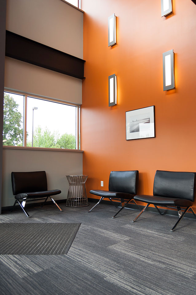
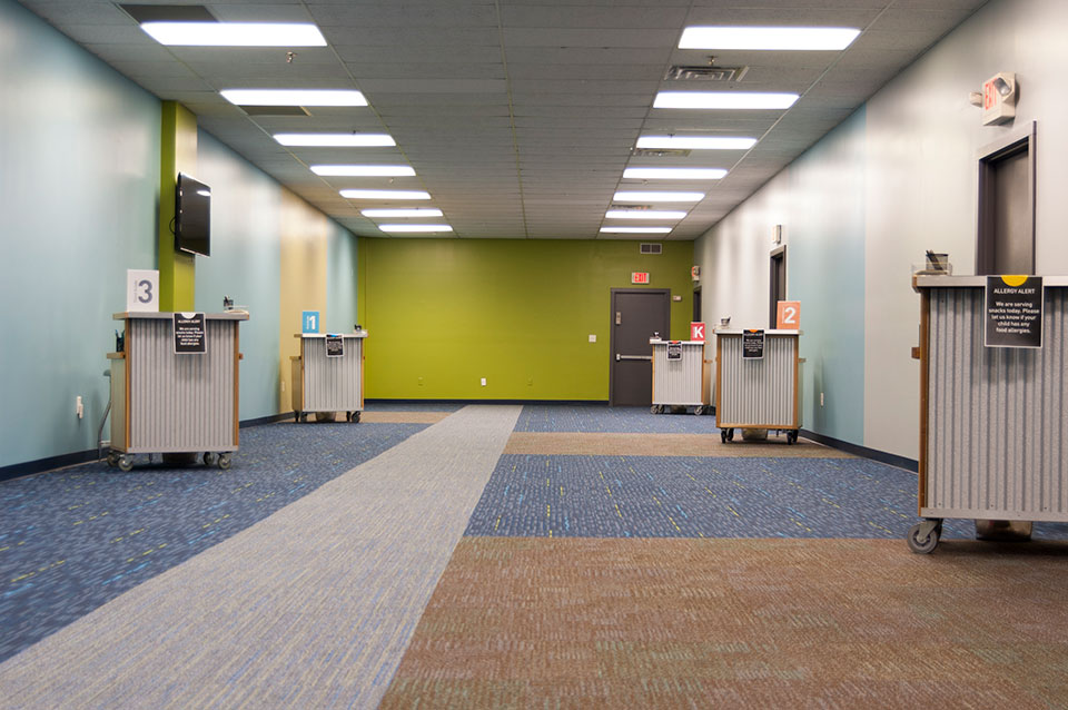
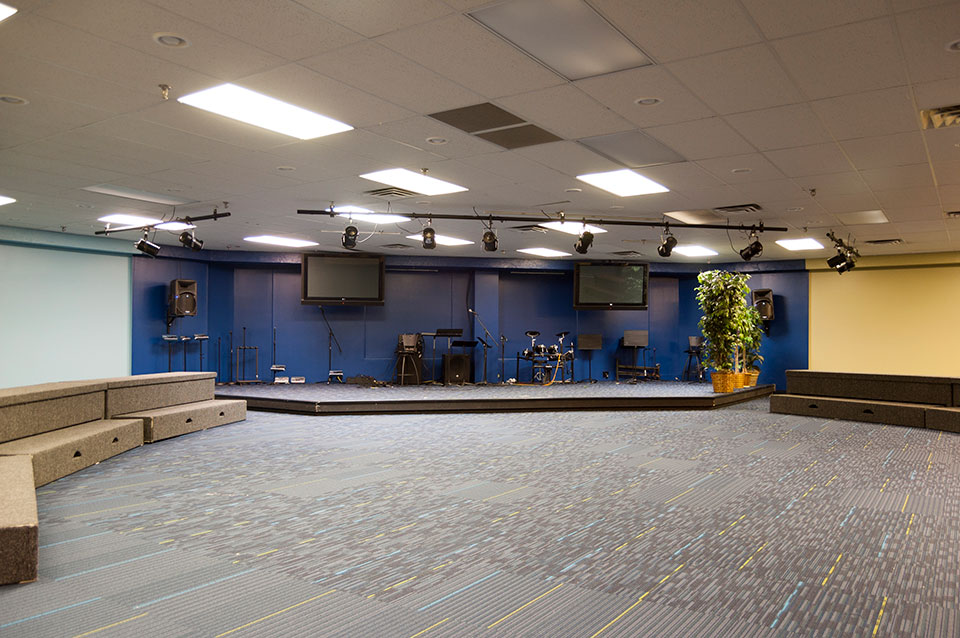
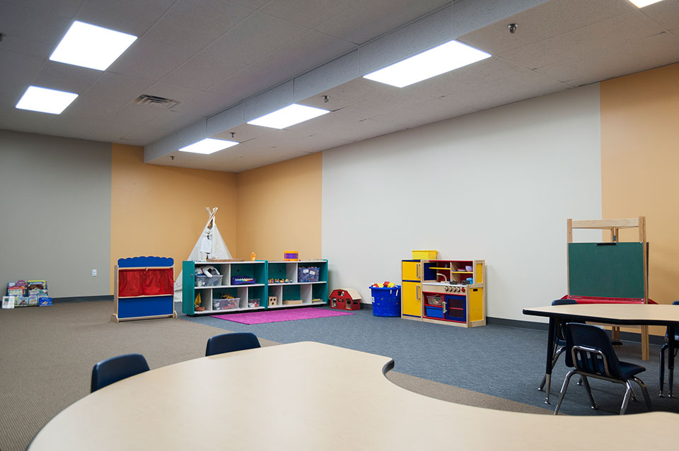
New leadership, new energy and new direction at Mars Hill created a desire to update their facility’s 38,000 square feet children’s ministry. More than 500 children from infants through 10-year-olds attend the ministry each Sunday. Their nursery, preschool and elementary school spaces were in need of refreshing. This meant new flooring, new paint, updated lighting and new cabinetry, as well as any needed repairs.
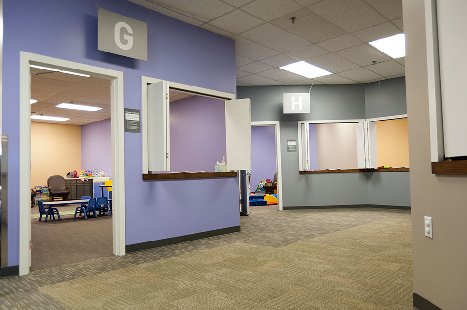
The redesign was intended to simplify, warm and organize the spaces to help member families entrust their children to Mars Hill. r.o.i. Design saw the journey, discovery and comfort of the spaces as key to the success of the redesign. Mars Hill will also be adding their own graphic and signage design as well as decorative elements to complete the look and feel.
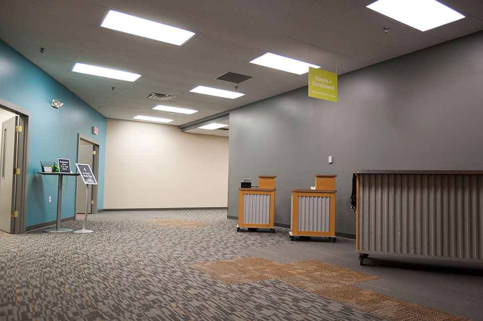
Mars Hill had a budget, based on generous donations and operational planning, but it wasn’t clear if they could make the needed changes within their budget or schedule. r.o.i Design worked with the leadership to solicit contractors who were members or affiliates of Mars Hill, as well as call in other sympathetic trades to make the remodel possible to meet the goals.
We acknowledge the efforts and donations of:
- Facilities and Administrative staff of Mars Hill
- Jacobsen Painting
- Kenowa Plumbing
- Meekhof Electric
- Floor Covering Engineers and Shaw Carpets
- Pinnacle Construction
Over 10 years ago, r.o.i. Design worked with Mars Hill to create interiors in their new space, a vacant shopping mall in Grandville, Michigan. We are grateful for the opportunity to help them again, not only with interior design, but project management of the remodel as well.
For more information about Mars Hill, visit their website, MarsHill.org
by Ryan | Sep 27, 2017 | Design News, Interior Design, Workplace Design
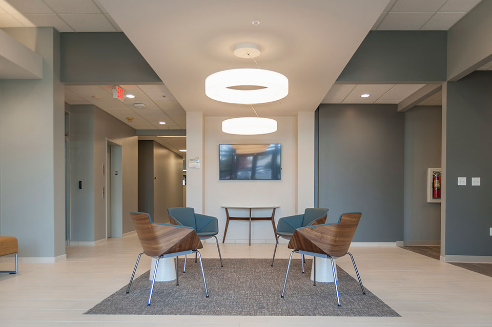
This perfectly located, generously sized and well-appointed office building is going through a face lift.
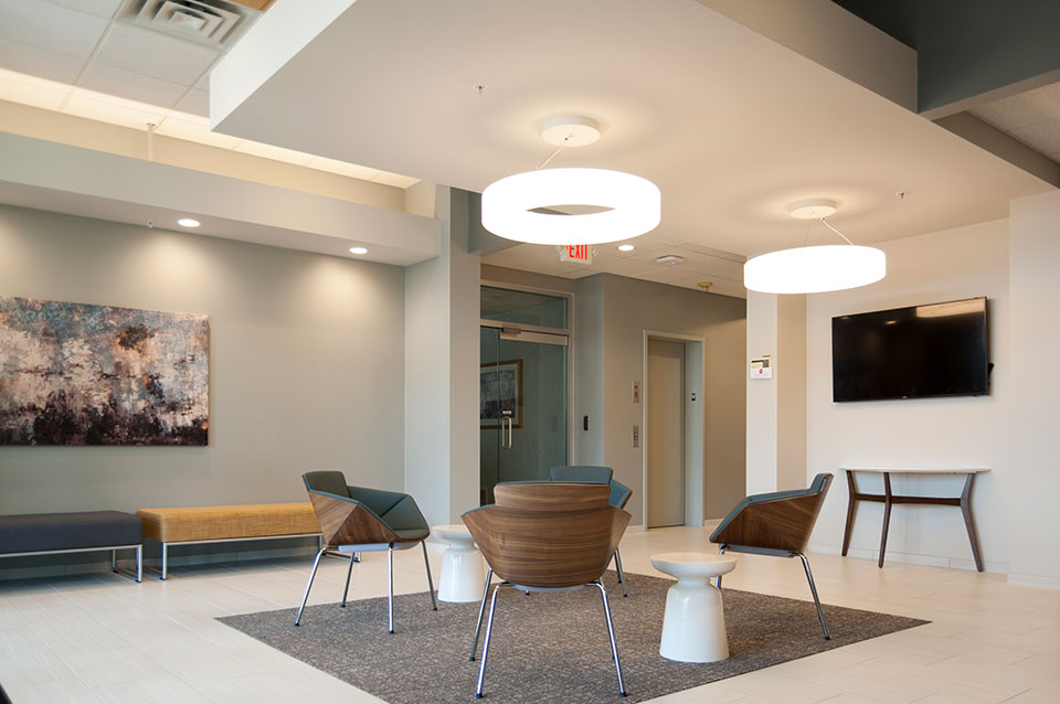
Hillary Taatjes-Woznick and Doug Taatjes of NAI Wisinski contacted us, asking us to compete to win the opportunity to provide a design for the lobby of Park East Court, off of East Paris in Grand Rapids, Michigan. This “first impressions” area was key in providing future tenants a glimpse into the aesthetics and financial commitment of ownership.
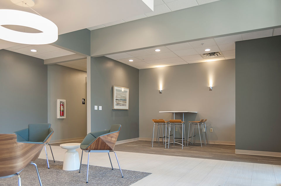
Our design included expanding the lobby into a hallway and a copy/storage room and floating a drywall lid in the center of the space. We replaced a reception desk with seating, and added focal points to the space. The popular gray color scheme of today was used, but with an accent of yellow on the ceiling and blue in the furnishings. The dated mahogany trim was painted. Decorative lighting was strategically placed to create a contemporary appeal.
We partnered with longtime friends and collaborators, Pinnacle Construction, to create budgets that directed the final design scope. Pinnacle Construction completed the lobby remodel in spring of 2017.
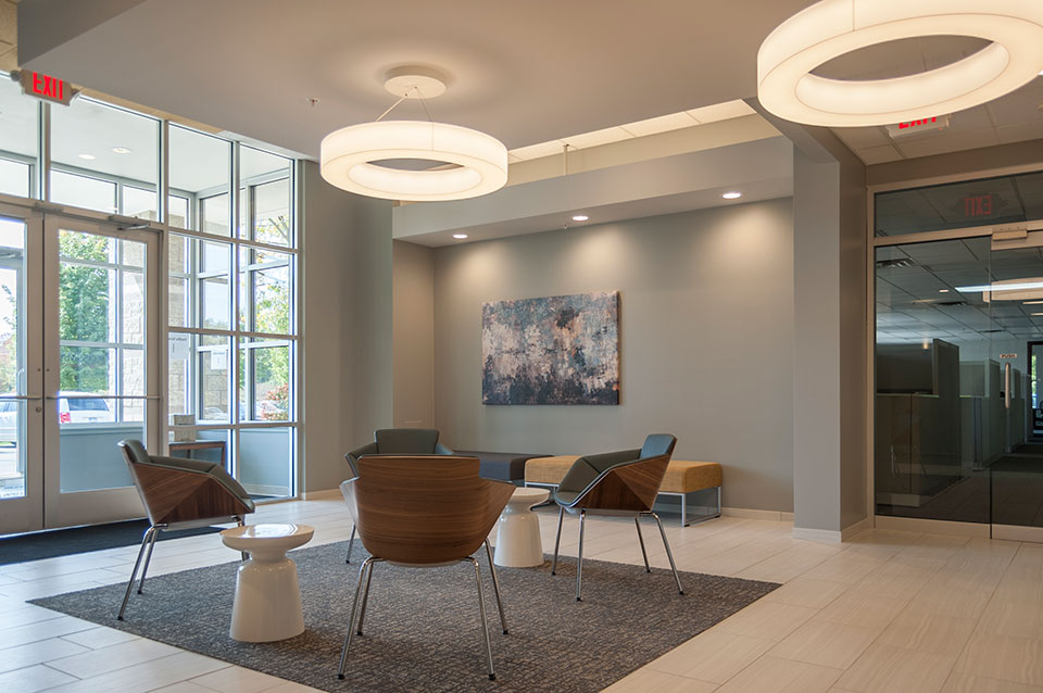
While we pride ourselves on our values of Budget (first), Brand and Beauty, we were told we won the opportunity to provide the design because they liked our design, which they thought best captured the owner’s preferences and gave them a look that they thought would best appeal to their tenants. Our idea wasn’t the least expensive but they thought offered the best ROI.
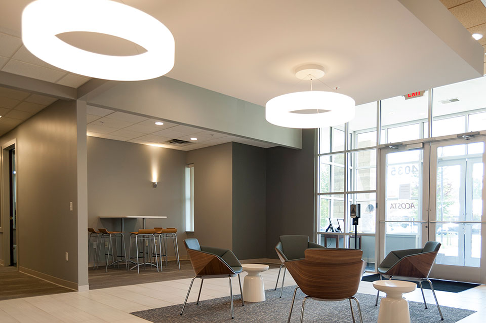
For more information about Park East Court, visit naiwwm.com and search for 4035 Park East Court
by Ryan | Apr 26, 2017 | Branding, Design News, Interior Design
We pride ourselves on being a commercial interior design group that has experience in a variety of environments. In the last few years our work has created office environments (from manufacturers to a variety of service providers), retail environments (from stores to neighborhood dental/orthodontic practices), schools (charter schools and higher education spaces), hospitality and multi-family spaces (hotels and apartments), and religious spaces (worship and educational related).
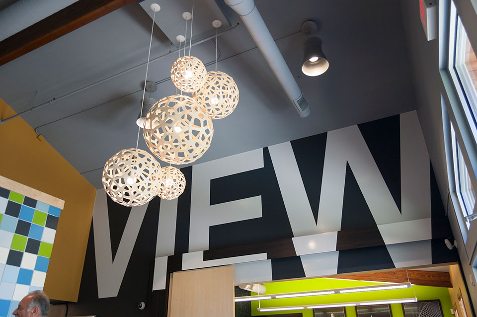
Campus View Apartments, Clubhouse – Allendale, MI
While there is variety in the types of spaces, our customers have some key attributes in common:
- They have a budget
- They have a company story, a brand. Sometimes it is more developed than others.
- They want their space to appeal and attract customers as well as please current and future employees.
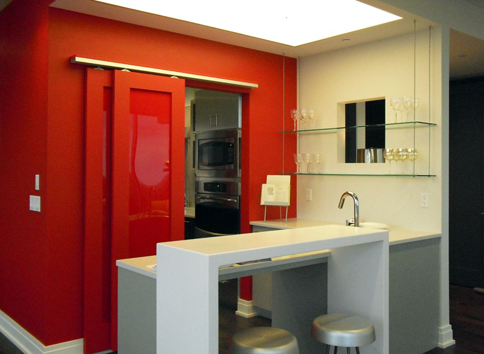
River House Condo – Grand Rapids, MI
Our design process, early in concept design, includes budget development. Our experience working with contractors and owners has given us perspective and knowledge that can identify budget issues early on, before all the design fees are spent.
Concept and developed design needs to reflect who the company is. We interview our clients, we listen as well as we can, and then summarize back to our customers what we heard.
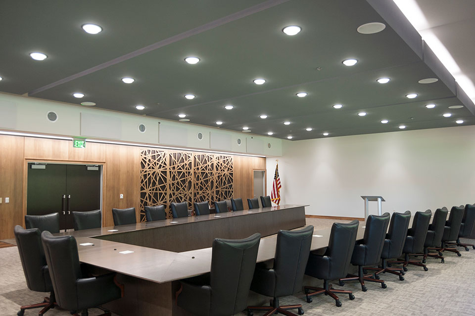
Wolverine Power Cooperative, Conference Room – Cadillac, MI
Everyone wants their space to be beautiful. But even more importantly, it needs to attract the target customer and maintain and inspire the ideal customer. This is a focused aesthetic, delivered with restraint.
For more information, see our current company brochure:

![2017 Color Trends]()
by Ryan | Oct 26, 2016 | Design News, Interior Design
The 2017 color forecasts are coming out, and r.o.i. Design is seeing a large variety of palettes and opinions. While there are many experts, we tend to look at our favorite paint companies, as well as Pantone.
There seems to be a trend toward “muted, dusty or grayed” colors, but there isn’t one color that is being called out as “the color”. There is interest in blues, purples, green, taupe and grays, but they don’t leave out any part of the spectrum in their predictions. r.o.i. Design knows that these predictions are the most influential for future manufactured products. The predictions of this year, will trickle into products we see hit the market in the next few years.
So whether we like a color or not, some of the colors predicted in these reports are going to show up in laminates, fabrics, tile and other architectural products we will have as options for interiors in the near future.
Here are three reports we found interesting. Find your favorite!

Benjamin Moore’s Color of the Year, Shadow 2117-30, is allusive and enigmatic — a master of ambiance.
“Emotional connections with this color evoke nostalgic memories of light on space and color.”
–CARL MINCHEW, VICE PRESIDENT OF COLOR AND DESIGN
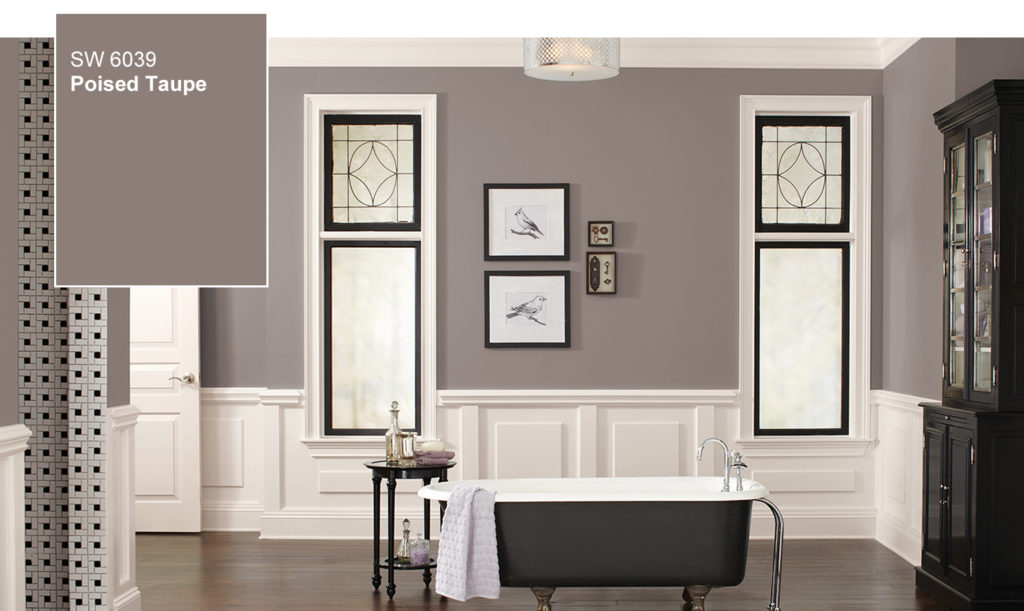
Sherwin-Williams doesn’t usually like to play color favorites, but in this case we can’t resist. The color we anticipate defining 2017 is Poised Taupe. Here’s why: This timeless neutral is modern, classic and a beautiful balance of warm and cool.
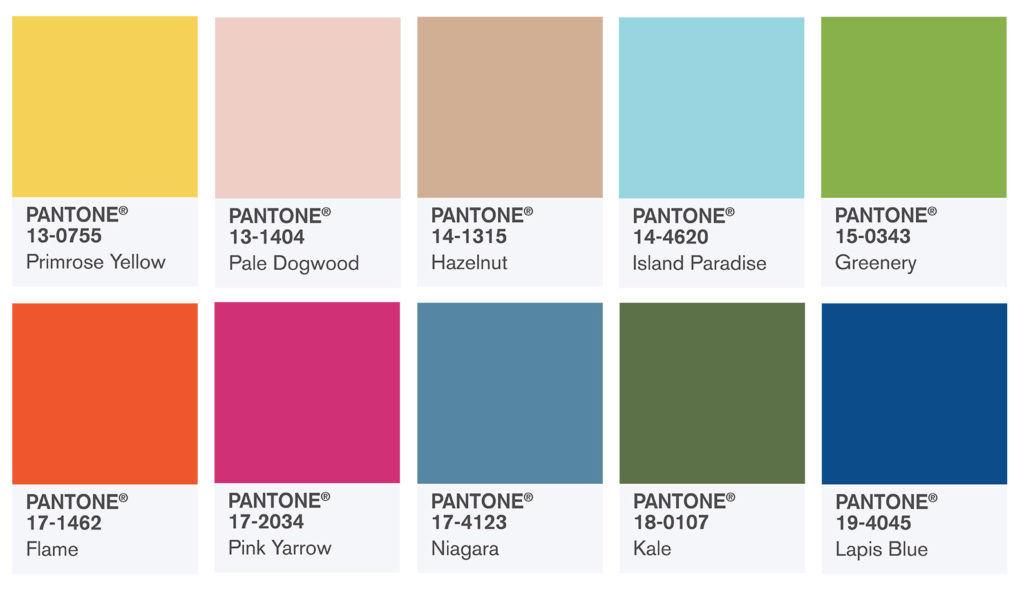
PANTONE 18-0107 Kale
Evocative of the great outdoors and a healthy lifestyle, Kale is another foliage-based green that conjures up our desire to connect to nature, similar to the more vivacious Greenery. And, just as we see in nature, this lush and fertile natural green shade provides the perfect complementary background to the more vibrant tones in the palette.
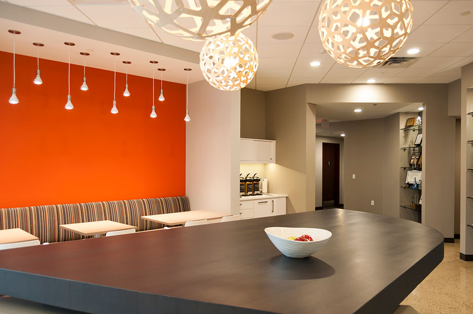
by Ryan | Oct 26, 2016 | Construction, Design News, Interior Design, Workplace Design
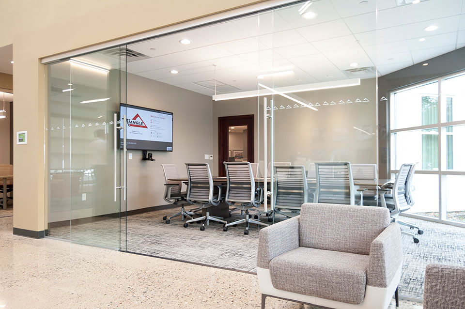
Triangle Associates has been keeping up operationally with its rapid growth over the last few years. And most recently that meant updating their corporate office interiors.
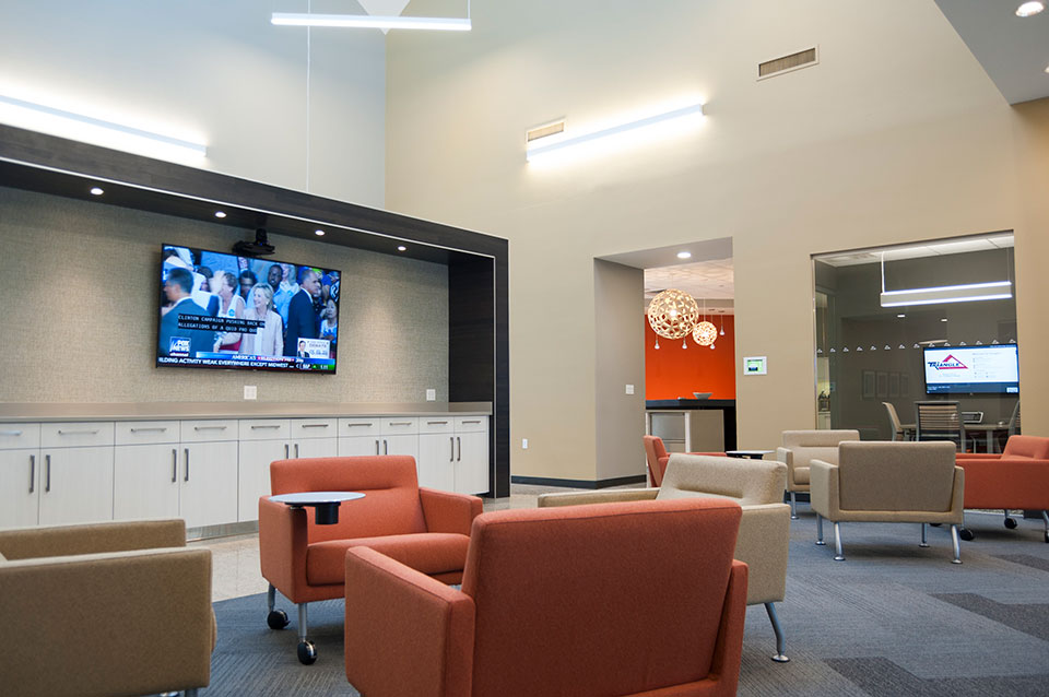
“Who we are as a company, our values, and our attitudes need to be represented in our workplace. It was time to make our office a more transparent and collaborative space to match our culture,” explains Mitch Watt, President of Triangle Associates.
Triangle has long offered design-build services for their customers and have in-house design, led by architect Aaron Jenks, but wanted interiors help. They called longtime friends and collaborators r.o.i. Design to work with them on interior concepts and finishes.
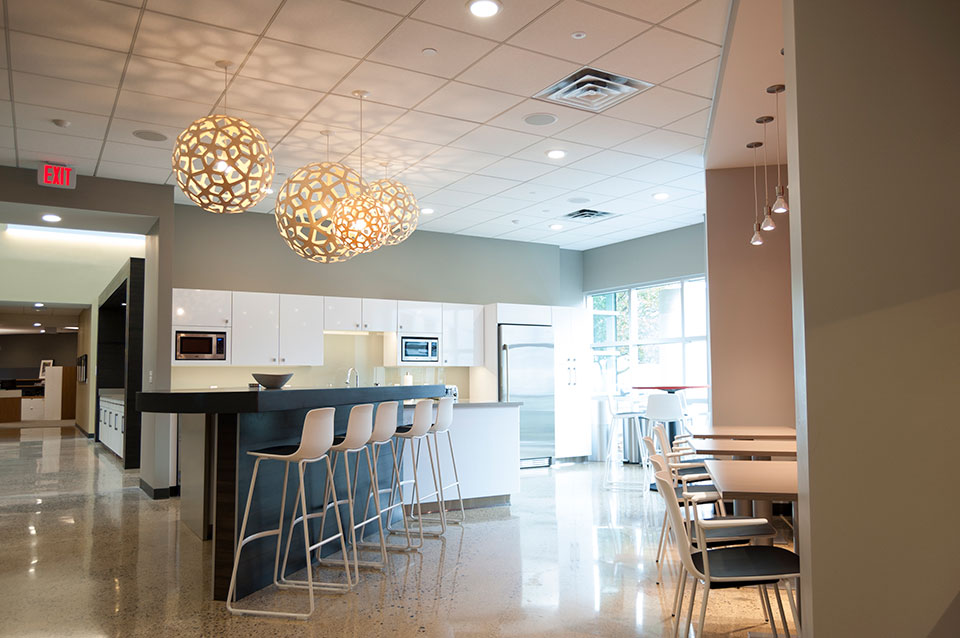
r.o.i. Design also provided recommendations for material selection that delivered design but offered opportunities for budget savings. Triangle Associates also consults with r.o.i. Design on procurement for their customer projects.
“We were very pleased to work on this team,” says Mary Witte, r.o.i. Design. “Triangle has always been a company with a strong foundation in design. Craig Datema and Mitch Watt are both architects and their leadership has made design one of their core values.”
 Other things to know about Triangle Associates:
- Triangle Associates is a client-centered construction company that provides construction management, general contracting, design-build, development, and sustainable building/LEED consulting services across a wide variety of market segments.
- While they have been hiring and training to fill positions that have been created to manage the growth, they managed to already be recognized as a leader. Last December they were named one of the Best and Brightest Companies to Work For® in the country for 2015 by the National Association for Business Resources (NABR). For 12 consecutive years, they have been named one of West Michigan’s 101 Best & Brightest Companies to Work For by the Michigan Business and Professional Association.
- Triangle’s newly constructed Richard DeVos Graduate School of Management was recently awarded at the AIA 2016 Honors Awards. Triangle thanked both the AIA Grand Rapids and their partner TowerPinkster for the keen eye towards quality workmanship on their Facebook page October 18, 2016
- Triangle received a 2016 Excellence In Construction Award for Hudsonville Public High School Project from the Associated Builders & Contractors West Michigan
- Triangle received a 2016 Excellence In Construction Award for Standard Lifters from the Associated Builders & Contractors West Michigan: New Construction $1 – $5 Million
by Ryan | Sep 20, 2016 | Design News, Interior Design, Meeting and Conference, Workplace Design
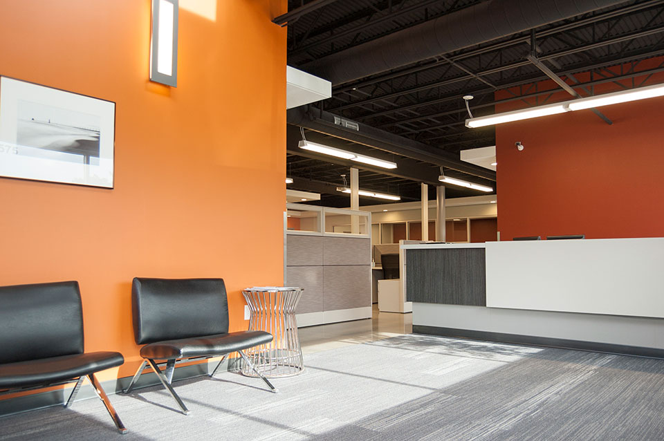
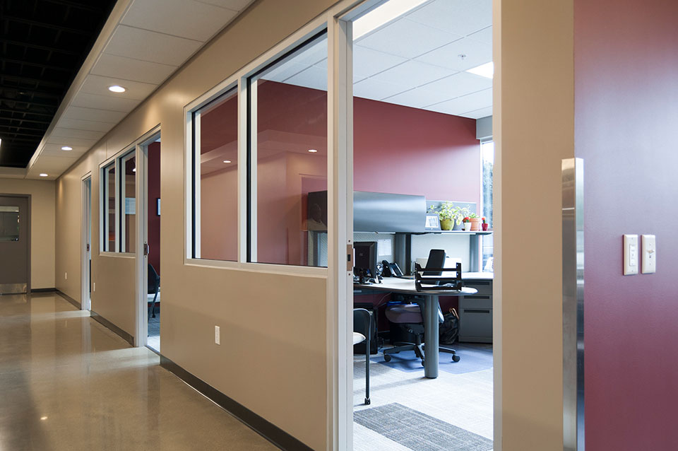 Advantage Label says they “label with a purpose”. They work with their customers to create labels and packaging that present a quality product and promote sales. r.o.i. Design’s experience of Advantage Label was just that, they perform with purpose and wanted their office to show them as a place of quality, efficiency and pride.
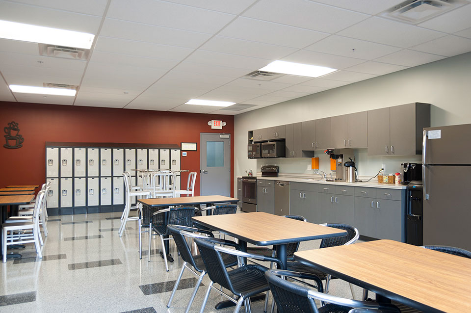 Wolverine Building Group contacted r.o.i. Design to support their design process and we were asked to review lighting plans, select finishes and lighting, and help make the break room more of a restaurant than a cafeteria.
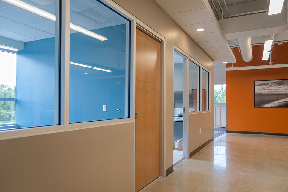 Using the red of their logo colors (which was also an accent color on the exterior of the building), r.o.i. Design added charcoals, blue gray and orange to the overall scheme to create depth and variety. The use of planked modular carpet tiles allowed accent colors to be introduced within a consistent field of carpet, without added costs.

For more about Advantage Label, CLICK HERE


 Other things to know about Triangle Associates:
 Advantage Label says they “label with a purpose”. They work with their customers to create labels and packaging that present a quality product and promote sales. r.o.i. Design’s experience of Advantage Label was just that, they perform with purpose and wanted their office to show them as a place of quality, efficiency and pride.
 Wolverine Building Group contacted r.o.i. Design to support their design process and we were asked to review lighting plans, select finishes and lighting, and help make the break room more of a restaurant than a cafeteria.
 Using the red of their logo colors (which was also an accent color on the exterior of the building), r.o.i. Design added charcoals, blue gray and orange to the overall scheme to create depth and variety. The use of planked modular carpet tiles allowed accent colors to be introduced within a consistent field of carpet, without added costs.