by Ryan | Nov 28, 2018 | Design News, Designing for Kids, Designing Public Areas, Interior Design

r.o.i. Design has a heart for the community, education, and kids. Every year we dedicate some of our time to non-profits whose goals match our own vision as we strive to make a difference in the lives of those we touch.
We have been investing in Living Stones Academy since 2016, when our friend Aaron Winkle, Head of School, reached out for support. Aaron’s request was coupled by the endorsement of Marlin Feyen, founding partner of Feyen Zylstra Electric. He showed us their vision to be radically inclusive and absolutely accessible, which struck a chord with us.
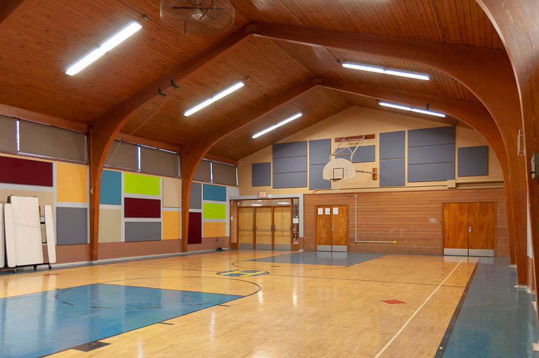
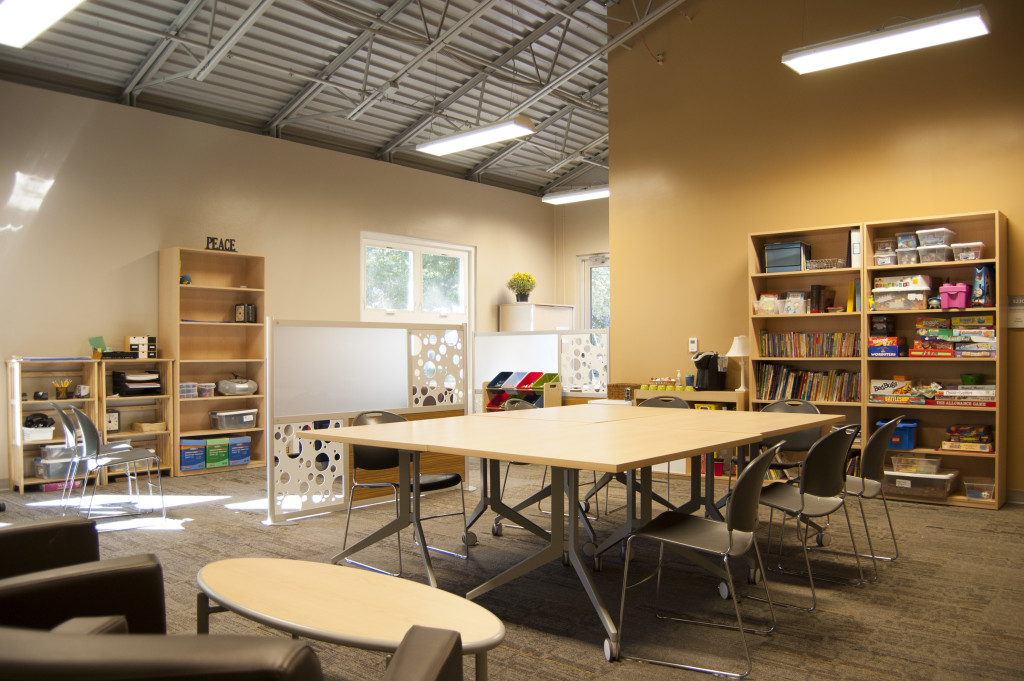
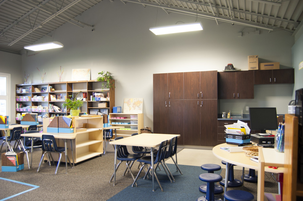
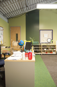
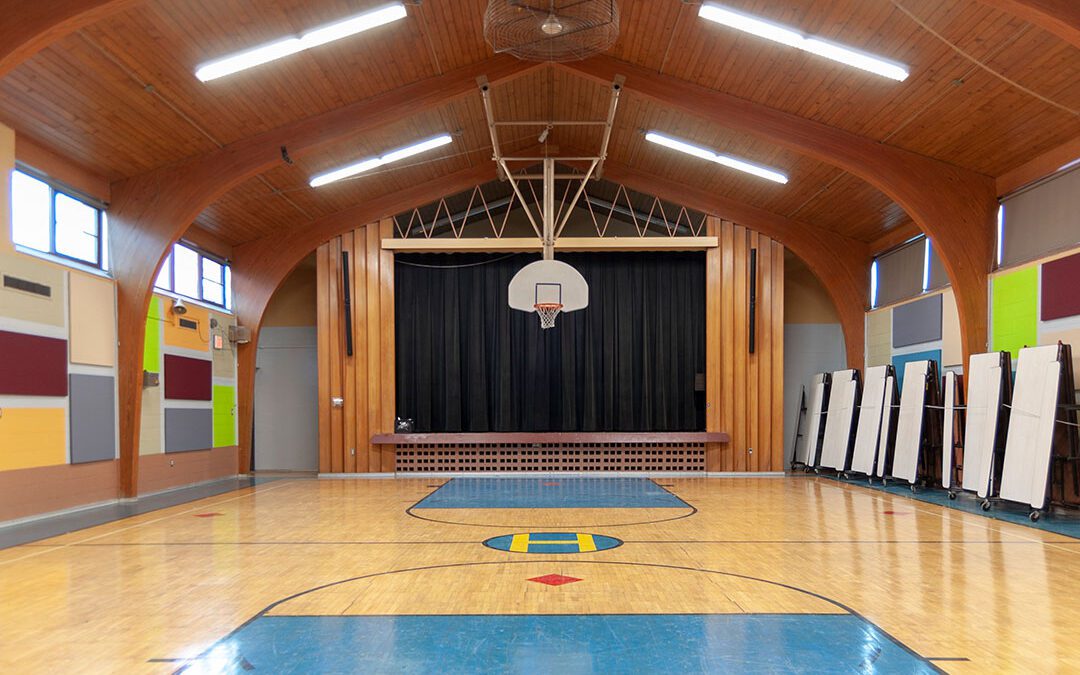
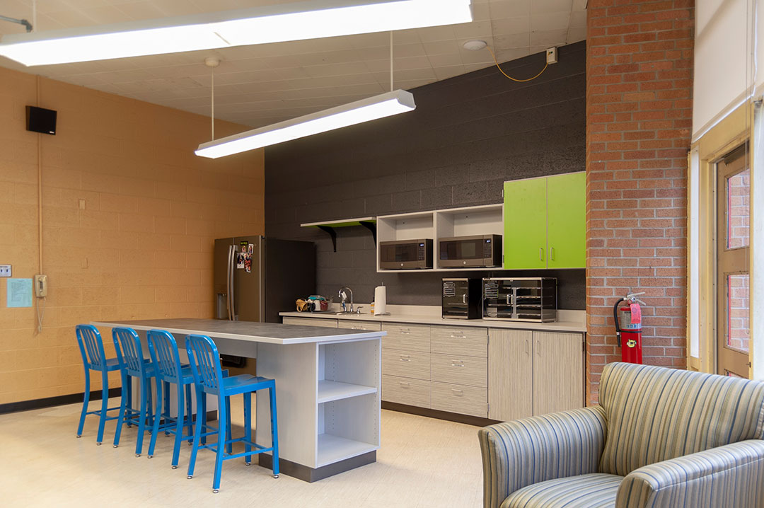
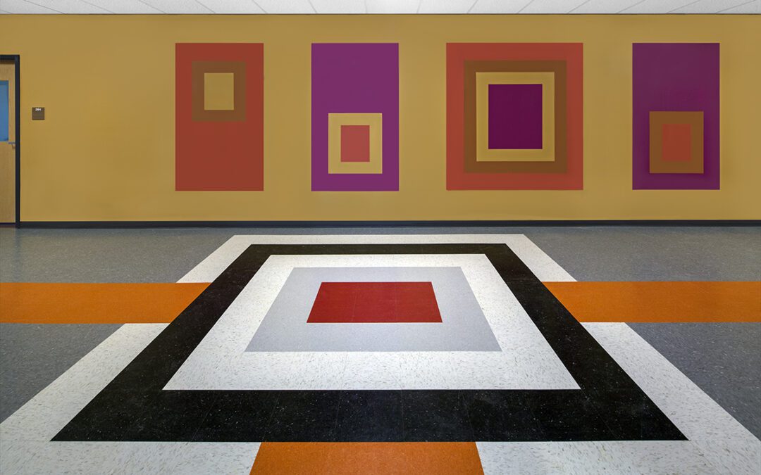
Since our involvement, we have provided design and direction for finishes in their new lunch program kitchen and related corridor, their gymnasium, and the teachers’ lounge. In each case, we took into consideration the 70’s style of the architecture that boasted a modern style and blocks of colors.
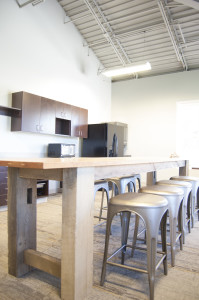
The largest of those projects was the gym. We created a design that included acoustic panels so it could be more effective as a presentation space, allowing the audience to hear more clearly. Perhaps the most rewarding was the redesign of the teacher’s lounge. Old fixtures were retired and a new friendly space was delivered that the teachers can use as a retreat from their classrooms.

We look forward to Living Stones continued success as they serve their families, of which 56% receive tuition assistance, 52% are minorities, and 15% are English language learners.
For more information about Living Stones Academy, go to livingstonesgr.org.
by Ryan | Sep 7, 2016 | Design News, Designing for Kids, Designing Public Areas, Interior Design
It is never too late to go back to school. r.o.i. Design has been working with Robert Doornbos at RMD Architects, creating interiors for some of the charter schools he has designed in the last year.
Our experience with Charter Schools teaches us that they appear to have highly passionate teams, with high academic goals for a focused community population. They care deeply about how their school environment looks and feels, and based on available budget, really want to make their spaces “A+”
Black River Charter School, Holland, MI
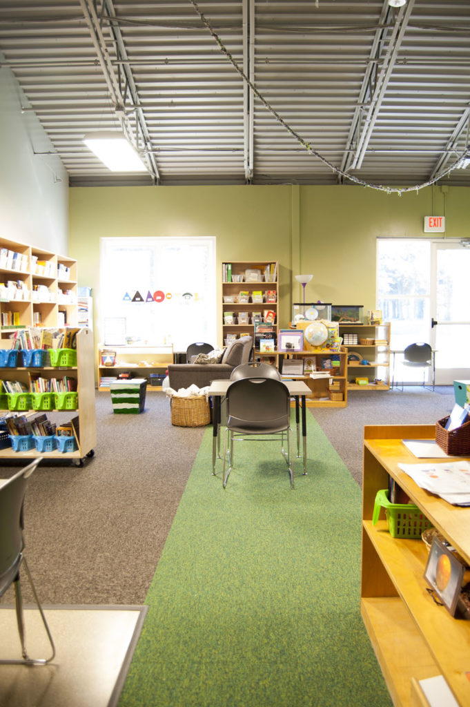 This is where we met RMD Architects. The board engaged us to work alongside him and the board, to assist in the selection and coordination of finishes. This is also a Montessori school which had a criteria that all the finishes be calm, orderly and like home. Our favorite detail in this project was the accenting of the carpet in the classrooms to aid in organizing space for “lining up”, or just calling out areas. There were three color schemes, one for kindergarten, one for lower elementary and one for upper elementary.
Macon Charter School, Macon, GA
© Triangle Associates
© Triangle Associates
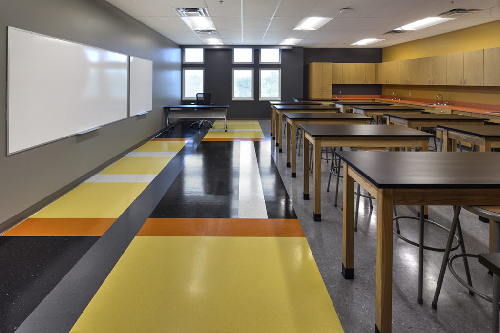
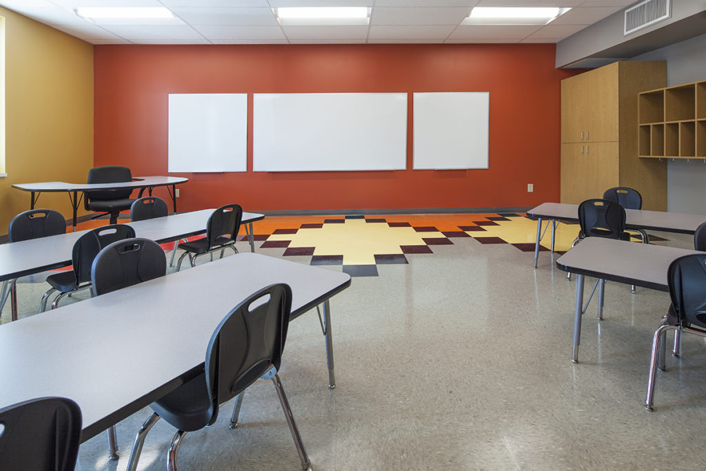
Culturally, this school wanted to embrace a global diversity and to make sure the interior could appeal to wide variety of students and families. Our favorite details here was the use of colors that we described as global cuisine, colors that naturally resonated with people as rich and flavorful: Eggplant, Saffron, Palm and Tomato. Then we used those colors in classic patterns in flooring and walls. Those patterns could be traced back to civilization 2000 years ago and could be seen just as decoration, or teaching tools. Through the course of the design we were informed that James Brown went to school in Macon, GA so we wanted to make sure everyone would “feel good”!
This project was a design-build project lead by Triangle Inc. in Grand Rapids, MI.
Northeast Academy, Minneapolis, MN
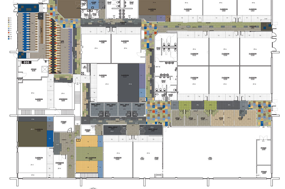 This community was growing quickly and expanding its program. They were moving into a larger school that needed to be refreshed, remodeled and delivered in less than five months. They moved in August 20, 2016! Our efforts focused on carpet and paint. Northeast wanted all the corridors to be carpeted and because there was little opportunity for other areas of interest, we created three to four modular carpet patterns that we repeated in different color ways. We also created tile patterns for entries and cafeteria. They will be remodeling another floor in the coming year, and hopefully, we will be able to go back and execute some wall accents and graphics as well.
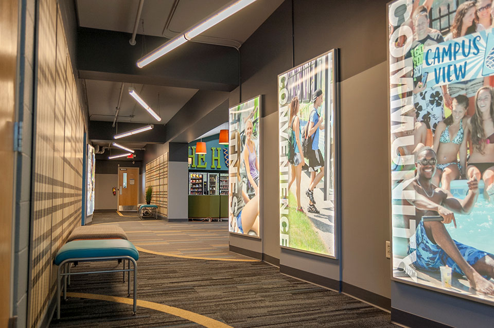
by Ryan | Aug 31, 2016 | Branding, Design News, Designing Public Areas, Graphic Design, Interior Design, Workplace Design
Campus View has been growing alongside Grand Valley State University for the last 50 years with a large inventory of apartments and town homes, and thousands of happy tenants. But as Grand Valley grows so do options for leasing and Campus View wanted to make their initial experience with potential new tenants reflect who they were more completely.
 r.o.i. Design was engaged to redesign the “customer experience” in their lobby and entry. Campus View has made continual investment in amenities but those investments aren’t always visible to customers on their first visit, so the lobby had to become a welcome center and a “billboard”.
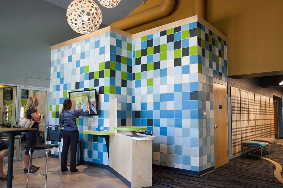 Removing the wall and counter that separated leasing staff from the inquiring customers was crucial. Opening up the space meant finding a way to lock down the office after hours, so r.o.i. Design created large sliding doors, that when closed, created a warm backdrop for the lobby.
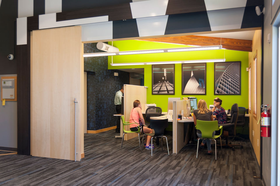 The use of maple plywood to create office dividers, sliding doors, sales desk and the decorative panels in the hallway eliminated the coldness of the painted concrete block without having to drywall the entire space. The smaller block wall in the lobby was custom painted giving the block an intentional “artsy” look.
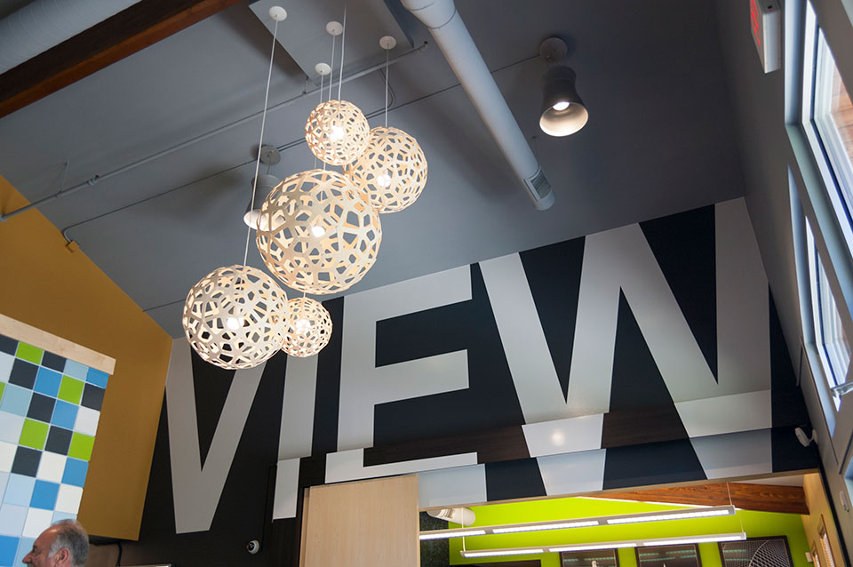 Campus View was so happy with the outcome that they sent us a personal thank-you that read, “We’re overjoyed with our updated facility and impressed with every aspect of working with your team. Thanks and we’d be thrilled to be a reference anytime. Cheers!”
For more about Campus View Apartments and Townhouses, click here.
by Ryan | Aug 31, 2016 | Branding, Design News, Designing Public Areas, Exhibit Design, Graphic Design
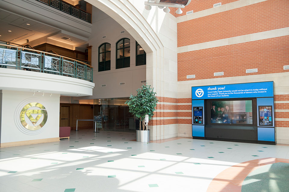
The Grand Valley University Foundation (GVUF) is the umbrella organization and recognition society for all who give to the University through annual giving, capital campaigns, special giving or planned giving. And while the steady growth of the University is apparent, the Shaping Our Future Campaign was a landmark.
At the annual Enrichment Dinner in 2011, the foundation announced that not only did it meet the stretch goal of $75 million for the Shaping Our Future campaign, it exceeded it. Thanks to more than 17,000 donors, the foundation raised $96.4 million.*
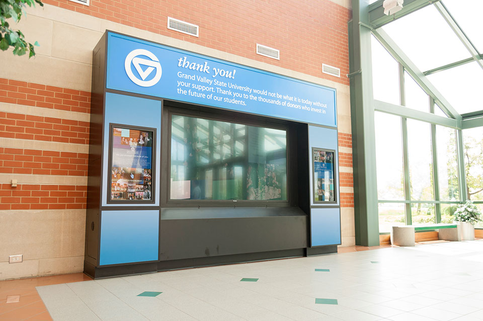 The challenge of creating a “donor wall” with 17,000 names to acknowledge all the givers developed into an opportunity. The goal was to acknowledge the donors but also inspire students and alumni in the story of philanthropy of Grand Valley State University.
The GVUF committee wanted to create an interactive display using touch screen technology and video to invite technologically-inclined students to engage with the exhibit. r.o.i Design, who also designed the L. William Seidman exhibit at the L. William Seidman School of Business, was asked to design and manage the execution of the donor exhibit.
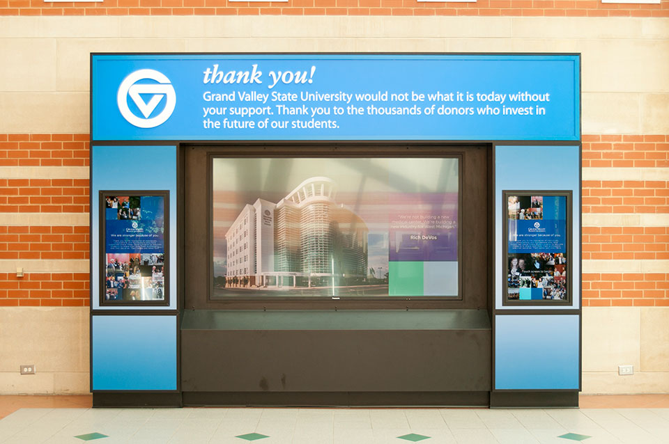 The foundation developed all lists, all copy and compiled photos, giving r.o.i. Design the assignment to design and develop the graphics, the exhibit and hire the team who could complete the work. Along the way, it was determined that in addition to the Shaping Our Future donors, all donors in recent history should also have a way to be acknowledged in the touch screen experience.
The exhibit was installed at the Student Services Center in Allendale in July 2016. We acknowledge the efforts and contributions of CK Productions for compiling the video, Underbite Games for the touch screen app, Superior Wood Products for the exhibit casework and Custer Tech for the AV equipment.
For more about the GVUF click here.
* The results of the Shaping Our Future campaign, Mary Idema Pew Library Learning and Information Commons and the L. William Seidman Center, were both dedicated with much celebration by the Grand Valley community and the foundation in the Fall of 2013.
by Ryan | Aug 31, 2016 | Design News, Designing Public Areas, Interior Design, Restaurant Design, Retail Design
GVSU’s original “cafeteria” was built more than 40 years ago and is still the largest food service facility on campus. It feeds a lot of people but needed to respond to the changing campus and its customers. More seating capacity at Fresh Food Co. and upgraded finishes meant planning for a 2016 summer remodel.
r.o.i. Design, who also designed the GVSU Laker Store in 2014 and its adjacent food court, was engaged by the University through Preferred Construction to create the design.
Einstein Bros. Bagels was moved out to a different location giving the Commons a fourth dining room.
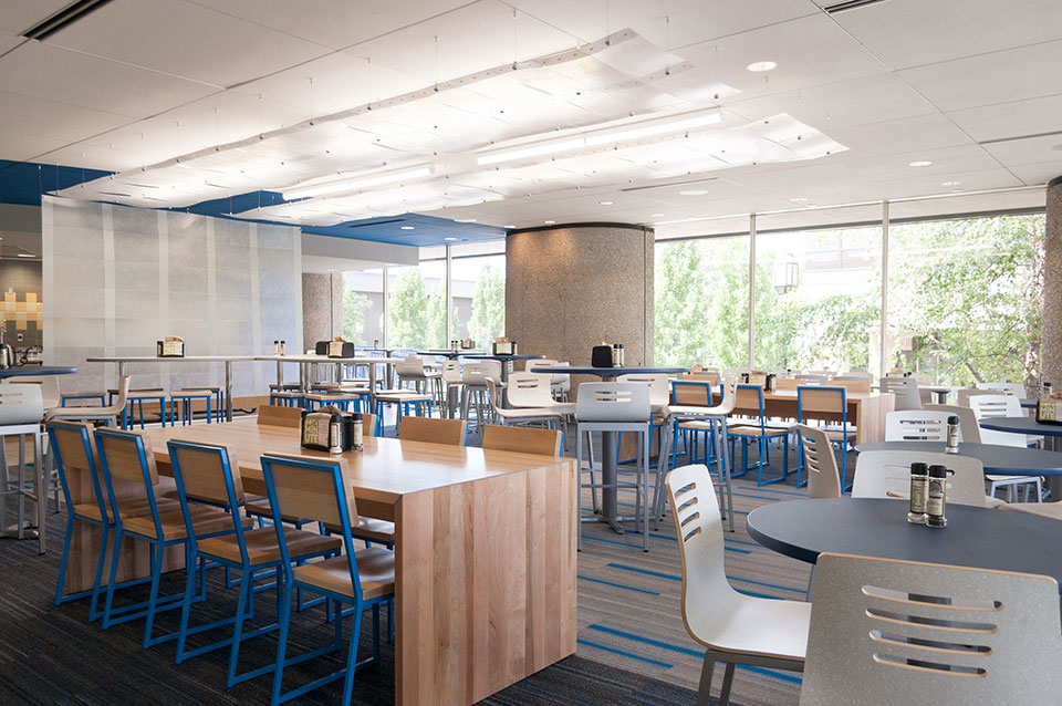 The design team, which included Campus Dining, GVSU Facilities, Preferred Construction and r.o.i. Design, looked at the trends in college dining and the recent building projects on campus along with their customer’s preferences to create a design criteria that could be executed within the budget and timeline.
“GVSU has more than 25,000 students and commensurate staff, so a lot of food service customers who have a variety of preferences. In order to create options in dining, it was agreed that the four rooms would each have a unique feeling so guests could have different experiences within the same facility. We agreed to organize the room designs around four ideas, one per room: water, earth, fire and wind,” says Mary Witte, President of r.o.i. Design. “The dining rooms already had some features that lent themselves to these notions, so we were able to build on what was already there and create something intentional and fun.”
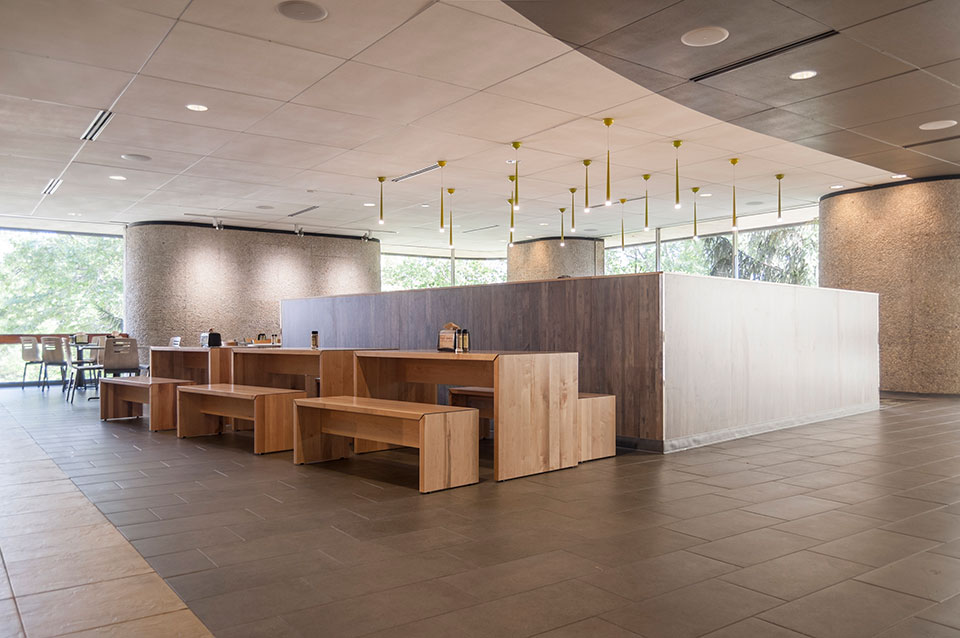
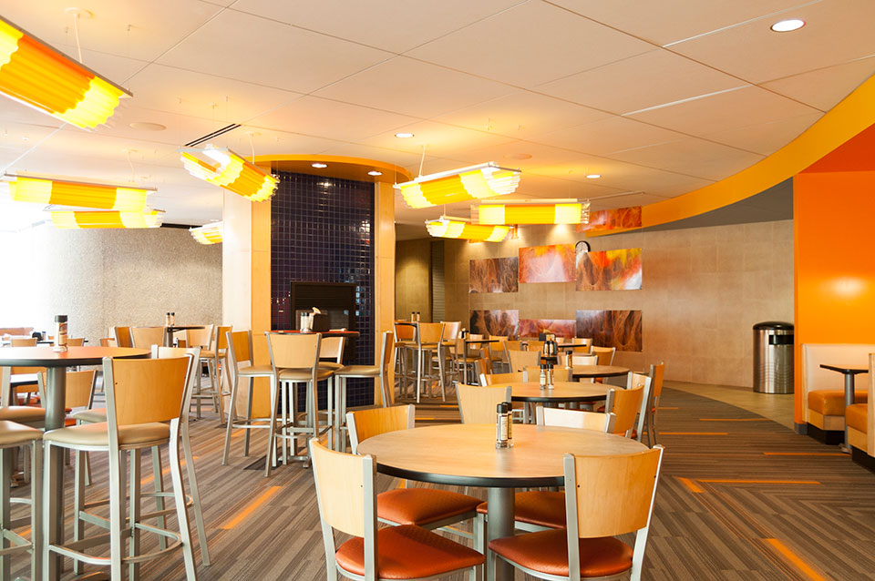 Each room received new flooring, new lighting, new millwork features, new paint accents and new furnishings that aligned with the “theme” of the room.
“Community Tables” were added to allow for larger groups to gather. Custom lighting enhanced the distinct look of each room.
The food line was enhanced with new equipment to allow Campus Dining the option to offer more variety in their menu.
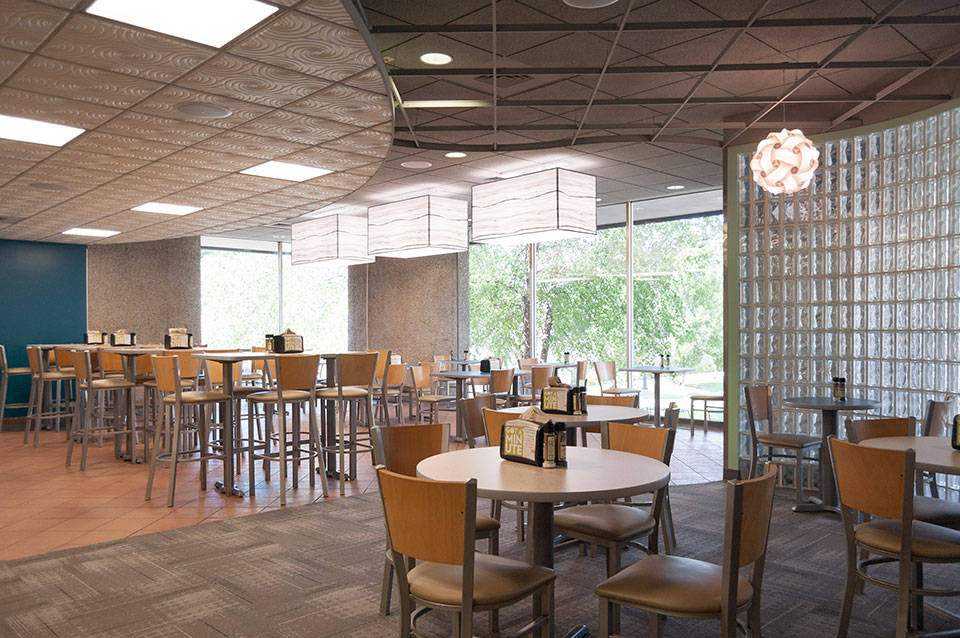 r.o.i. Design’s initial observations of customer’s response to the remodel has been very satisfying and we are proud that our design contributions met the goals of the Fresh Food Co. at The Commons at GVSU.

by Mary | Oct 7, 2015 | Design News, Designing for Kids, Designing Public Areas, Interior Design

Barb Ellis at a chilly ground breaking ceremony.
What does a school board president do when they want to make sure their school is the best design it can be? Call r.o.i. Design!
Barb Ellis did just that.
Black River Elementary School is part of the Black River Public Schools, a public charter school. Until last April, their elementary school was meeting in portable classrooms on their campus. They moved the students to a temporary location and broke ground for their new school. Four months later, the students came back to their new beautiful school.

Special Education Offices and Classrooms
Barb and Black River were in the capable hands of Robert Doornbos, (RMD Architects), and Bob McFarlane, (Lakewood Construction), but the list of decisions to make and the broad spectrum of opinions threatened to slow the process down. We joined the team late in 2014 and ran alongside their process to aid in the imagining of the exterior and the interior design of the classrooms and auxiliary spaces.

Teachers Break Room
We met with teachers early in the process and shared some ideas for iconic furnishings that would make their Montessori classrooms even more of an experience for their students.
Color schemes and the organization of color within the school was a collaborative process and the result has received “all A’s”.

Grades 1 -2 Classrooms : Blue Accents with Dark Wood Casegoods

Grades 3-4: Green Accents and Light Casegoods
Barb and Mike Ellis have been friends and customers of r.o.i. Design for a long time and we appreciate them giving us this opportunity. (Spin Dance in Holland, MI and Grand Rapids, MI).
For more about Black River Schools and the building of the elementary school:
Black River Public Schools
Holland Sentinel Article about Black River Elementary


 This is where we met RMD Architects. The board engaged us to work alongside him and the board, to assist in the selection and coordination of finishes. This is also a Montessori school which had a criteria that all the finishes be calm, orderly and like home. Our favorite detail in this project was the accenting of the carpet in the classrooms to aid in organizing space for “lining up”, or just calling out areas. There were three color schemes, one for kindergarten, one for lower elementary and one for upper elementary.

 This community was growing quickly and expanding its program. They were moving into a larger school that needed to be refreshed, remodeled and delivered in less than five months. They moved in August 20, 2016! Our efforts focused on carpet and paint. Northeast wanted all the corridors to be carpeted and because there was little opportunity for other areas of interest, we created three to four modular carpet patterns that we repeated in different color ways. We also created tile patterns for entries and cafeteria. They will be remodeling another floor in the coming year, and hopefully, we will be able to go back and execute some wall accents and graphics as well.
 r.o.i. Design was engaged to redesign the “customer experience” in their lobby and entry. Campus View has made continual investment in amenities but those investments aren’t always visible to customers on their first visit, so the lobby had to become a welcome center and a “billboard”.
 Removing the wall and counter that separated leasing staff from the inquiring customers was crucial. Opening up the space meant finding a way to lock down the office after hours, so r.o.i. Design created large sliding doors, that when closed, created a warm backdrop for the lobby.
 The use of maple plywood to create office dividers, sliding doors, sales desk and the decorative panels in the hallway eliminated the coldness of the painted concrete block without having to drywall the entire space. The smaller block wall in the lobby was custom painted giving the block an intentional “artsy” look.
 Campus View was so happy with the outcome that they sent us a personal thank-you that read, “We’re overjoyed with our updated facility and impressed with every aspect of working with your team. Thanks and we’d be thrilled to be a reference anytime. Cheers!”
 The challenge of creating a “donor wall” with 17,000 names to acknowledge all the givers developed into an opportunity. The goal was to acknowledge the donors but also inspire students and alumni in the story of philanthropy of Grand Valley State University.
 The foundation developed all lists, all copy and compiled photos, giving r.o.i. Design the assignment to design and develop the graphics, the exhibit and hire the team who could complete the work. Along the way, it was determined that in addition to the Shaping Our Future donors, all donors in recent history should also have a way to be acknowledged in the touch screen experience.
 The design team, which included Campus Dining, GVSU Facilities, Preferred Construction and r.o.i. Design, looked at the trends in college dining and the recent building projects on campus along with their customer’s preferences to create a design criteria that could be executed within the budget and timeline.
 Each room received new flooring, new lighting, new millwork features, new paint accents and new furnishings that aligned with the “theme” of the room.
 r.o.i. Design’s initial observations of customer’s response to the remodel has been very satisfying and we are proud that our design contributions met the goals of the Fresh Food Co. at The Commons at GVSU.
