(616) 459-3539
NeoCon Returns in 2021. Some of the Trends We Saw
NeoCon Returns in 2021. Some of the Trends We Saw

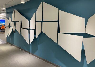
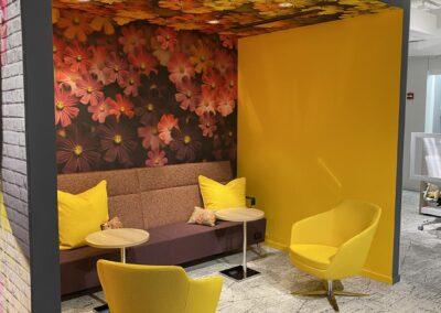
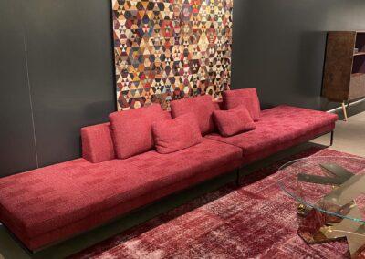
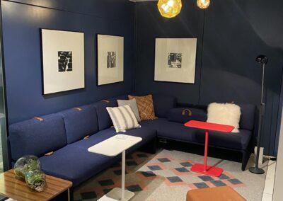
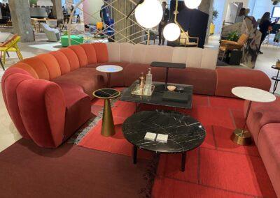
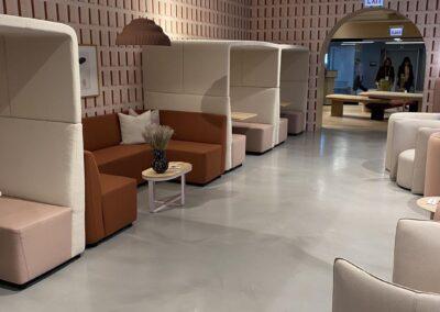
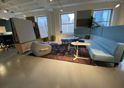
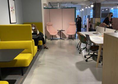
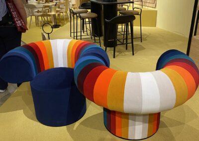
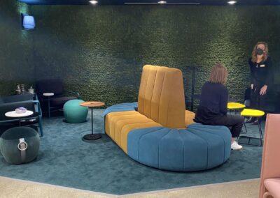
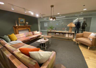
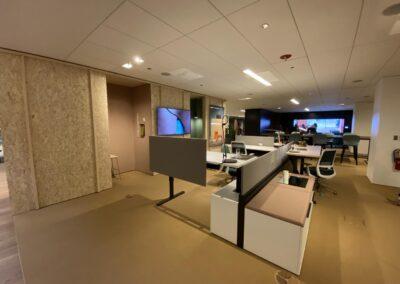
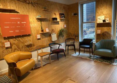
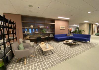
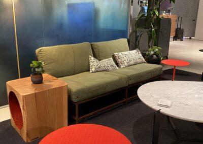
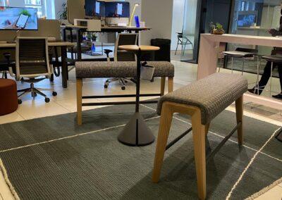
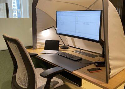
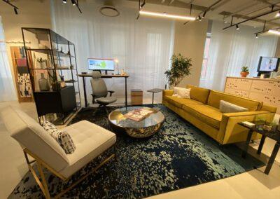
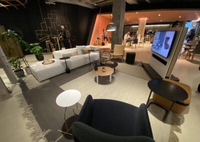
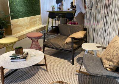
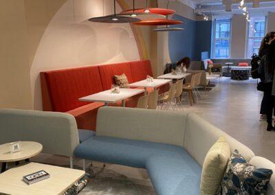
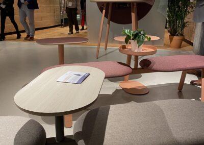
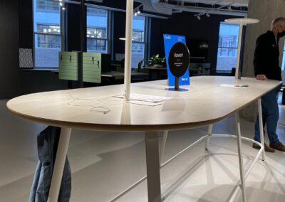
Scroll down to see photos from our visit. 

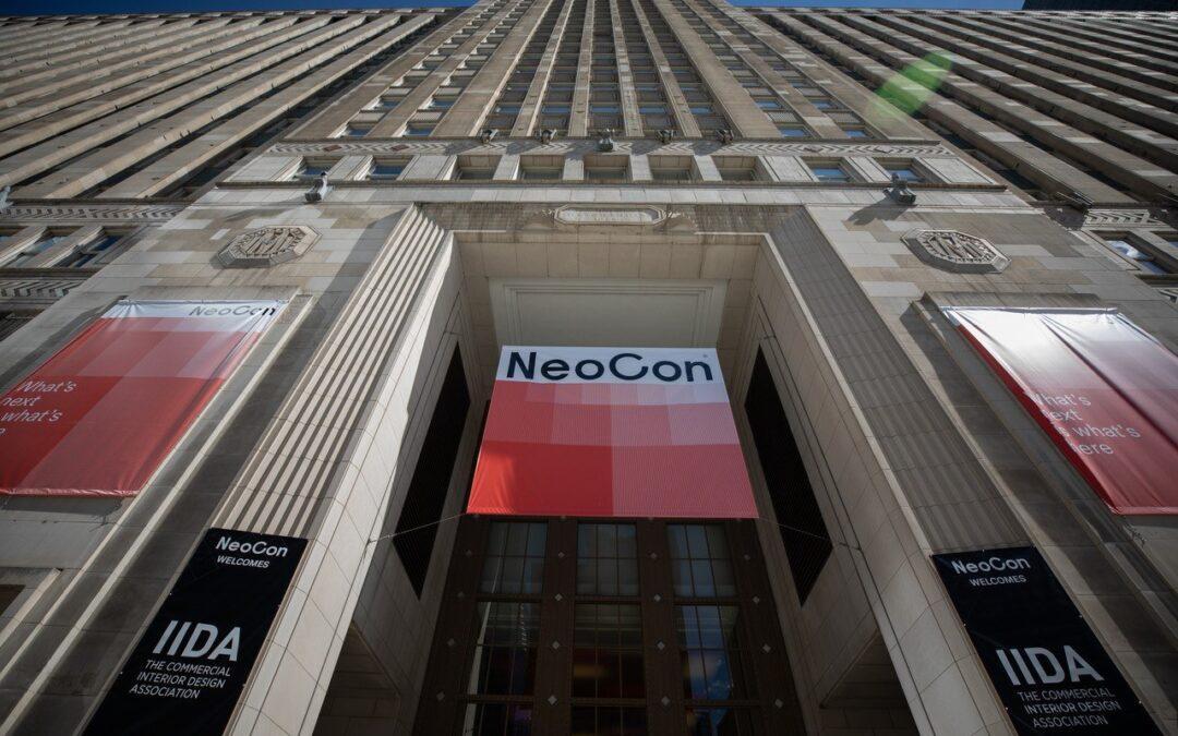
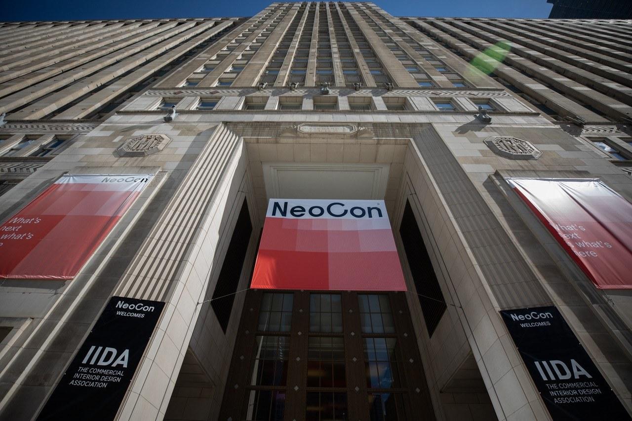
NeoCon was held this year at the Merchandise Mart in Chicago on October 4th – 6th. Normally the event is held during the second week of June but was postponed because of the pandemic. The 2020 NeoCon event was canceled altogether, but a virtual event was held online. This year, attendees needed to show proof of vaccination (or a negative COVID test), and masks needed to be worn in all indoor areas.

Attendance numbers were low and many of the showrooms were either closed or open only by reservation. This was due both to the pandemic and “off-season” of this year’s event. Hopefully, by next June, the show will return to normal.

While there were fewer attendees at the Mart, there was still plenty to see of the newest products from the commercial design industry. It’s always exciting to see the newest designs, innovations, and trends on display.

Some of the Trends We Saw

The future of the office wants to be “happy”, flexible and accommodating; there was a definite reference to the ’60s and ’70s in colors and textures and a sense of the eclectic was a welcome surprise.

Colors:

  • Much warmer colors and lots of soft colors. Pinks, corals, teals, yellows, and blues.
  • Sherwin Williams introduced their color of the year projecting we were going to love Evergreen Fog.
  • Benjamin Moore also introduces their Color of the Year 2022, October Mist.

Textures and Finishes

  • Lighter woods, including the casual use of OSB and plywood.
  • Felt was everywhere!
  • Lots of interesting wall dividers, screens, and room dividers using all kinds of materials.
  • Fabric folks were exploring retro patterns with lots of colors.

Products

  • Many mobile products were there as they try to accommodate changing work styles; carts, desks, even rooms.
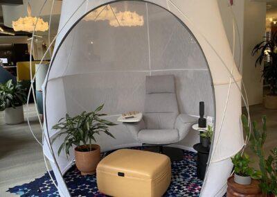
  • Many exhibitors have introduced small rooms that you can purchase, like a piece of furniture, to create spaces for employees to take private calls or have ZOOM meetings without bothering co-workers.
  • To deal with the spread of sound in an open office environment, there were acoustical wall panels and dividers, acoustical pendant lights, acoustical décor, and more.
  • Carpet manufacturers have gone all out to be “clean” and “green” with recycled products. They are also exploring patterns and colors giving us the hope of more than 10 shades of gray.
  • The return of woven rattan (vinyl) in commercial seating is making a comeback.
  • Technology and lighting impacted many designs. You can buy your conference table with built-in table lamps and ports for your phone and computer.

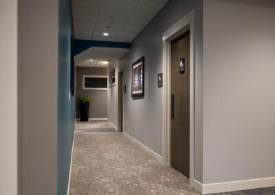
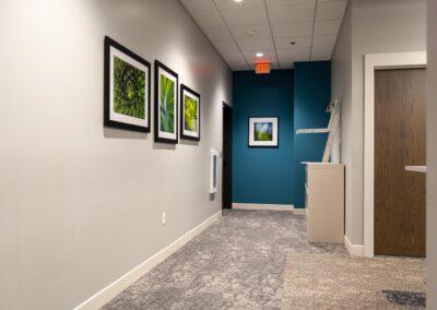
The Merchandise Mart had taken the time during the pandemic to update corridor finishes with new carpet, lighting, and wall accents. Most floors had their own particular look but in general, the lighting was greatly improved. This may have been in part because of the new exhibit space, Fulton Market, that is now competing for exhibitors and visitors. Herman Miller/Knoll has relocated their showroom to Fulton Market, a trendy location with an energetic urban vibe.

The world of design is alive at NeoCon and we were grateful to be a part of it.

Click on the thumbnails below to enlarge photos from our visit. 

Merl’s Towing Gets an Updated Façade

Merl’s Towing Gets an Updated Façade

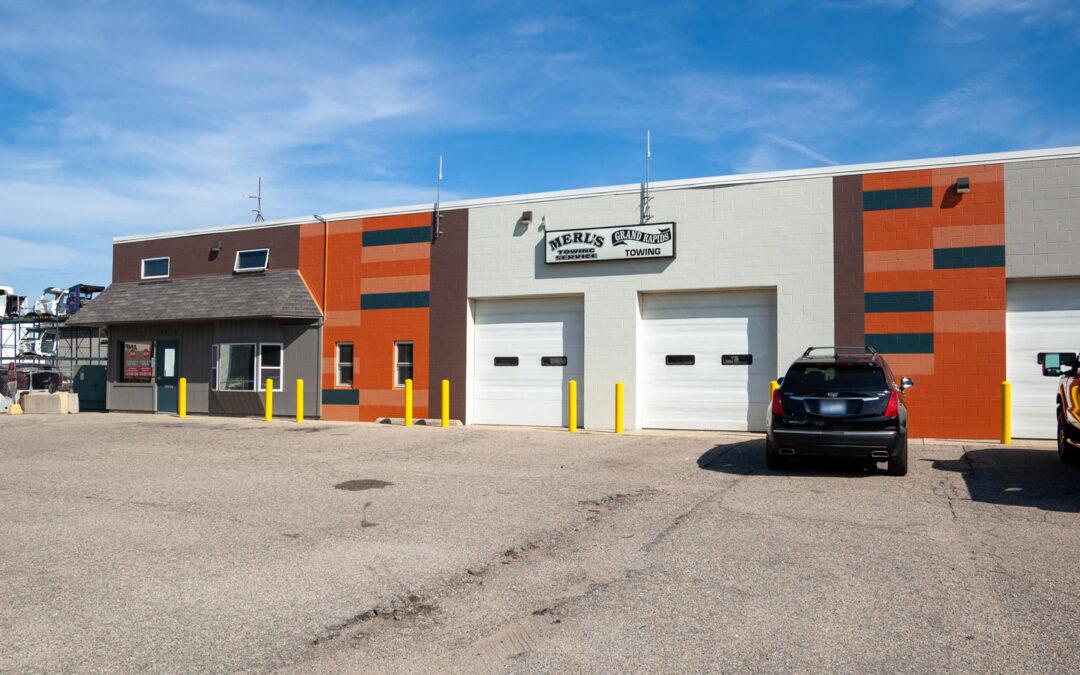
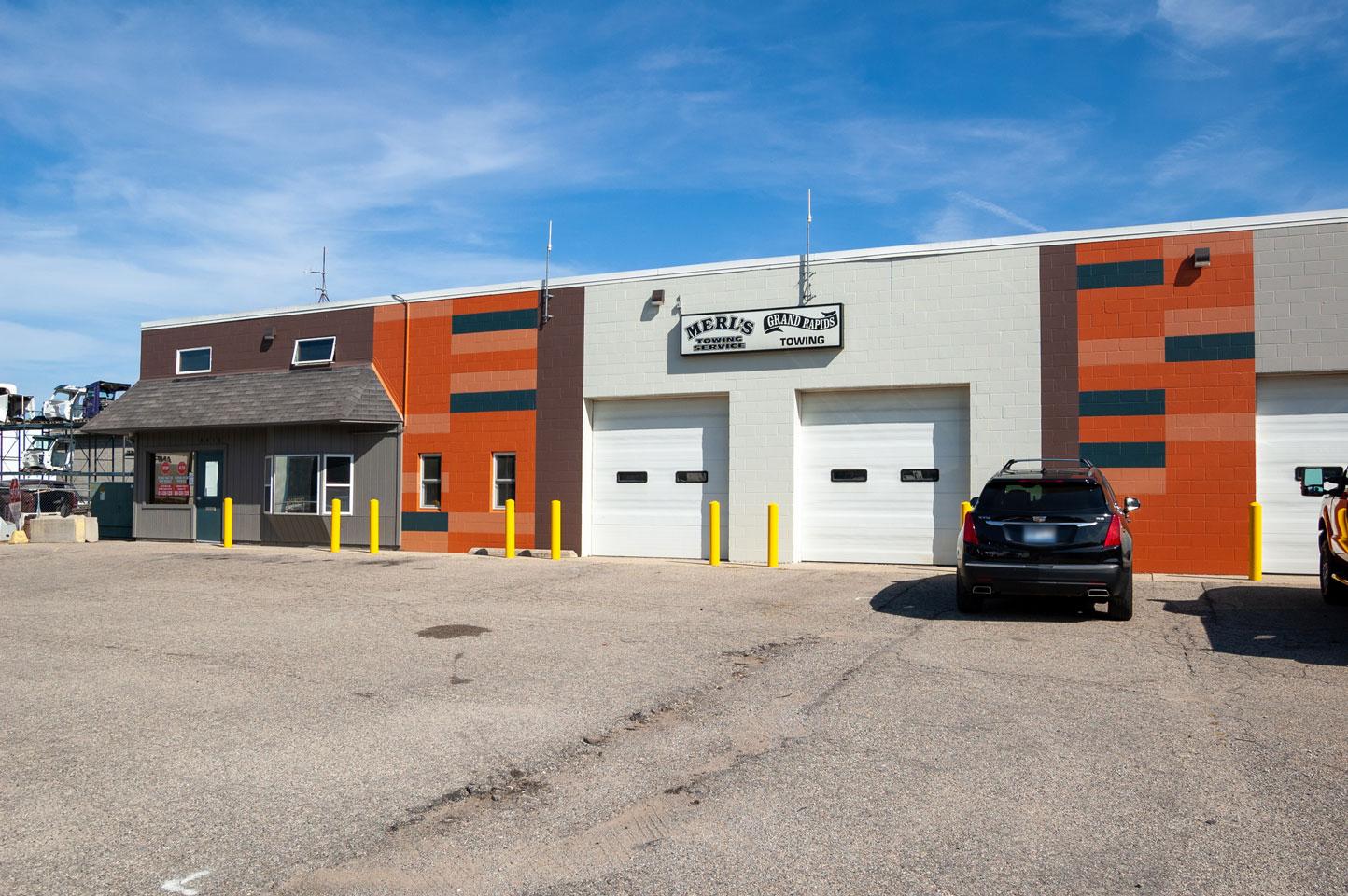
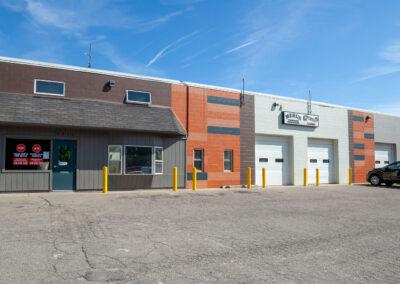
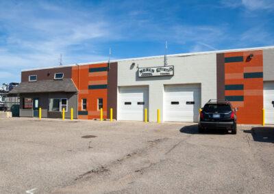
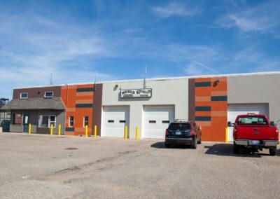
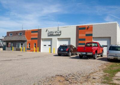
The owner of Merl’s Towing and Grand Rapids Towing, Dick Caster, is a long-time friend of r.o.i. Design. His late wife, Mary Jane Caster, was one of the founding members of r.o.i. Design. So, when he came to us needing help to dress up his business’s exterior, we were happy to help.

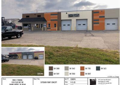
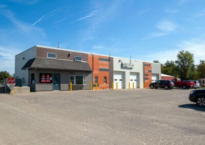
He did not want to spend too much money on the renovation, so the scope was limited to mostly repainting. We wanted to make the façade of the building look up-to-date and modern, but also have an element of fun. We produced a paint scheme that included vertical stripes with bold colors. Within the two orange stripes on the front, we also added some horizontal accents to break the pattern up.

We made a rendering in Photoshop so Dick could see what it would look like, and his painter could use it as a guide. The result was a success, and the building looks great!

Click on the thumbnails below to enlarge photos. 

r.o.i. Design’s Remodeled Offices

r.o.i. Design’s Remodeled Offices

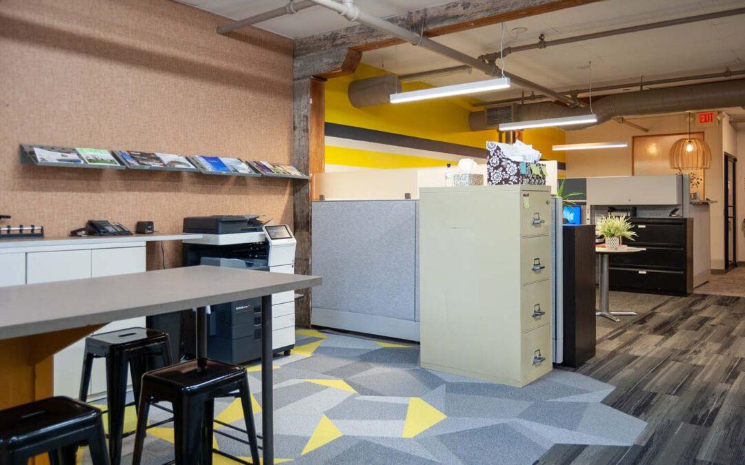
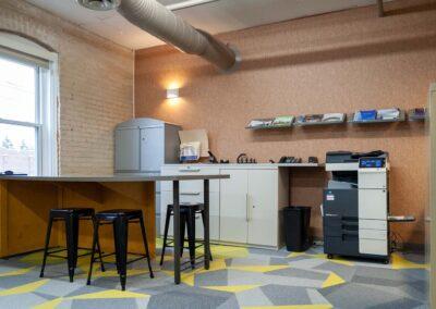
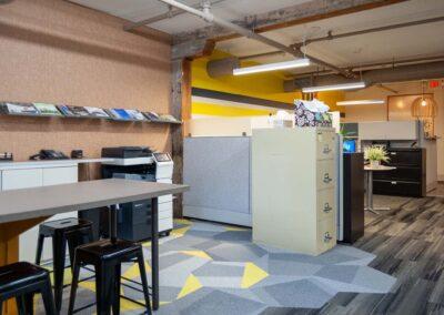
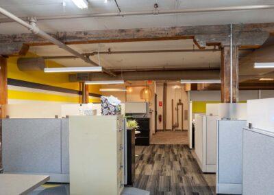
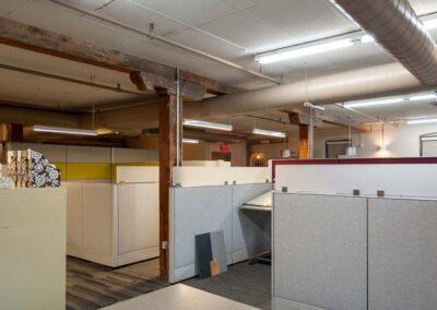
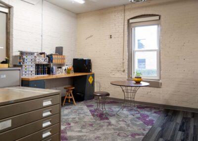
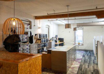
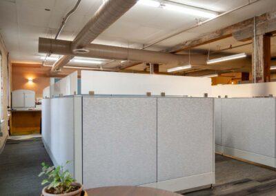
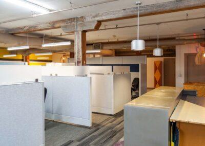
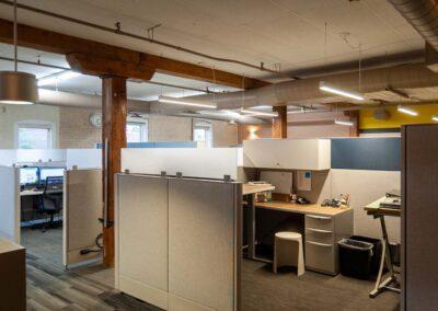
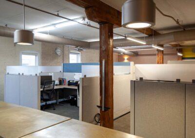
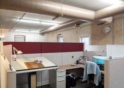
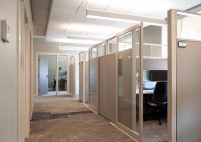
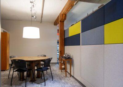
r.o.i. Design moved to Front Ave NW twenty years ago into a building that needed a lot of repairs, but it had a lot of historical charm and a great location on the fringe of downtown. Over the years, we were continually surprised at how much our visitors liked our space, and while we saw the worn carpet and furniture, they loved the charm. So, keeping the charm, this year we started a refresh. 

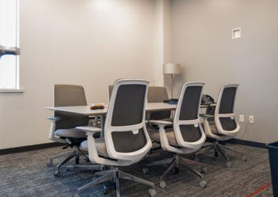
Our goals included overall cleaning, repairs, updating finishes, responding to COVID space planning, improving lighting, technology, and air quality. So now our seven-person firm has 3,500 square feet of office space (some just for meetings), 3,500 square feet of warehouse space for furnishings and a small workshop, and 2,000 square feet of library space for samples and materials.  

The remodel/refresh started with a design plan in 2019. That plan included replacing flooring, some new wall paints and wall coverings, additional lighting, and some new furnishings. Plus, the building needed lots and lots of cleaning. Like many plans in 2019, COVID asked us to slow down, so we moved some projects forward in 2019 and 2020, but in April 2021, we decided it was time to “get it done”.  

We moved out of our offices for 10 business days and organized the remodeling trades during those two weeks. We realized that it takes a lot of people, patience, and planning to make it a success, and because of the expert help and focus of a lot of people, we didn’t miss a day’s work! 

We would like to recognize our interior designers Megan Hoekzema and Marianne Martz for their selections, carpet layouts, and furniture layouts. 

We thank our procurement manager Ronda Geyer, for the constant reminders before the remodel to purge, organize, and get ready.  

And we couldn’t have done this without Rachel Barszcz our studio manager who kept us on task. 

And in alphabetical order, a SPECIAL THANK YOU to: 

  • Action Plumbing for replacing the 20-year-old toilet. Just in time so we could get new flooring in the common space restroom. 
  • Don Hampshire for rebuilding our steps to the garage, so they could be carpeted. 
  • Excel Electric for upgrades in 2020 and timely responses to our power needs at the last minute in 2021. 
  • Floorcovering Engineers LLC, John Quillan and team, for the expert installation of a complicated floor pattern in record time! 
  • For the great support of our carpet reps, Ryan Morton from Patcraft, and Patrick Coulsen from Shaw. The carpets look amazing and it is a showroom of different applications and styles. 
  • Huyser Asphalt for surfacing the parking lot. (Thanks for prioritizing us in a crazy COVID year!) 
  • i3 Business Solutions, for moving our computers (twice!), lending us cable, keeping us all “online”, and overall moral support. And thanks too for upgrading our phone systems at the same time, retiring our dated desk phones and introducing us to VOIP. 
  • Northwest Kent Mechanical for the updating of our four systems with air filtration and ion cleansing systems that protect us against so much stuff. 
  • Office Furniture Details LLC, Joe and Team, who moved our furniture at least twice, installed new furniture systems and retired a lot more. 
  • West Michigan Office Interiors, Jenna Henderson for fine-tuning our layouts, and Dean Clement for helping us keep on budget and on time. 

Like all projects, ours is not quite done, and the budget is under review.   

We celebrate our progress and the results so far, it is amazing! Let us know if you would like a tour!

Click on the thumbnails below to enlarge images.

Grand River Bank Branch Opens in Ada

Grand River Bank Branch Opens in Ada

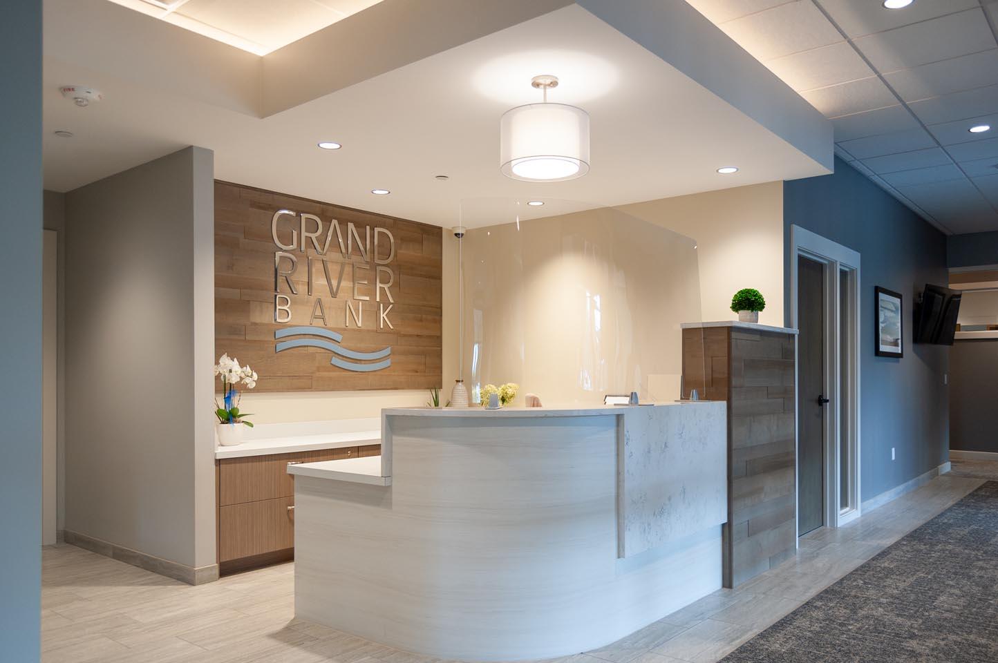
This exciting project started with Dixon Architecture introducing us to Pat Gill, President, and Liz Bracken, Vice President, of Grand River Bank who had a branch in Grandville in 2019. That team was working on a plan to create a second branch in Ada, and they were looking for design support.  

This more than two-year process resulted in a great space that both Grand River Bank and r.o.i. Design are proud of. We are even more grateful for our relationship and the friends we made there.  

During the design process for Ada, we helped Grand River Bank decorate a leased office in Cascade that temporarily housed lenders. We also assisted their Grandville offices with COVID screen designs and resources.  

Design elements in the new facility we celebrate include:  

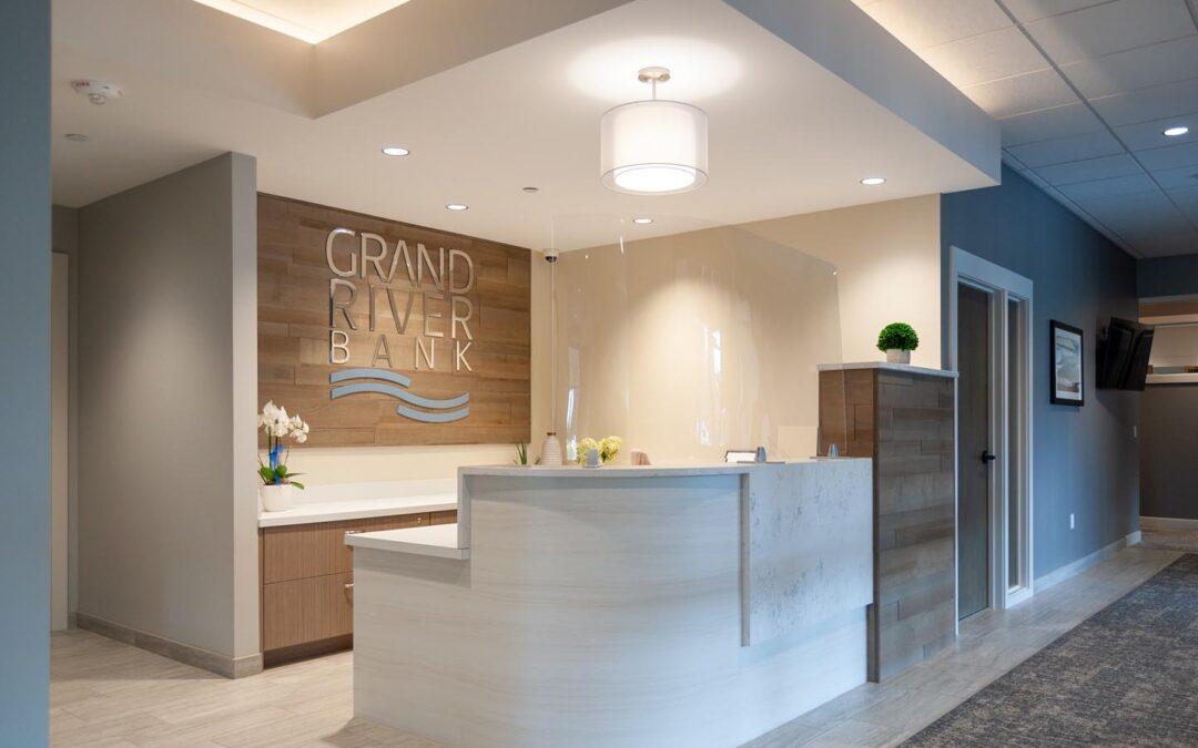
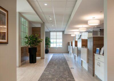
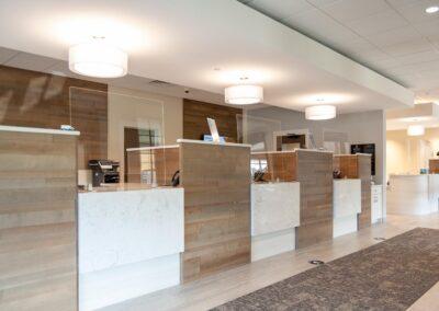
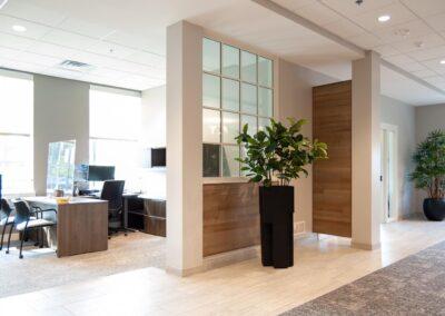
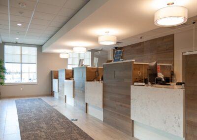
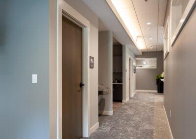
  • Ceiling clouds and lighting in the retail and corridors space – capturing light and creating comfort.  
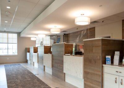
  • The reception desk and teller casework design, with its warm wood and white marble textures – very residential in feel.  
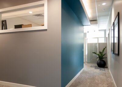
  • Warm and engaging finishes and wall art. 

We started the process with a consultative approach, engaging the Grand River Bank team with a series of meetings to understand the company’s goals, team preferences, and methods. The Grand River Bank leadership team moved the project forward cautiously considering COVID, knowing that they had a sound customer base in Ada. They partnered with BDR Custom Homes of Ada who was the general contractor, a partner, and a potential co-tenant of the building at 50 Crahen. Page Woodworking, a customer of Grand River Bank, created all the custom casework and countertops. 

Grand River Bank brands its bank as a more personal, hands-on bank, offering daily delivery and pick-up services and welcomes face-to-face engagements. They pride themselves on creative solutions to funding and financing. That combination created a design challenge for the new offices, one-part friendly retail, and one-part corporate lending, but both needing staff to have facilities that offered efficient spaces and accommodations to create the best in service. 

 Click on the thumbnails below to enlarge photos.

Monroe Community Church Starts a New Chapter

Monroe Community Church Starts a New Chapter

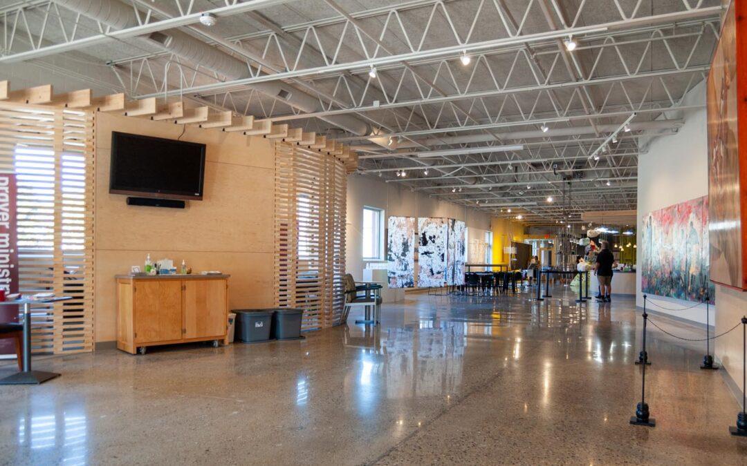
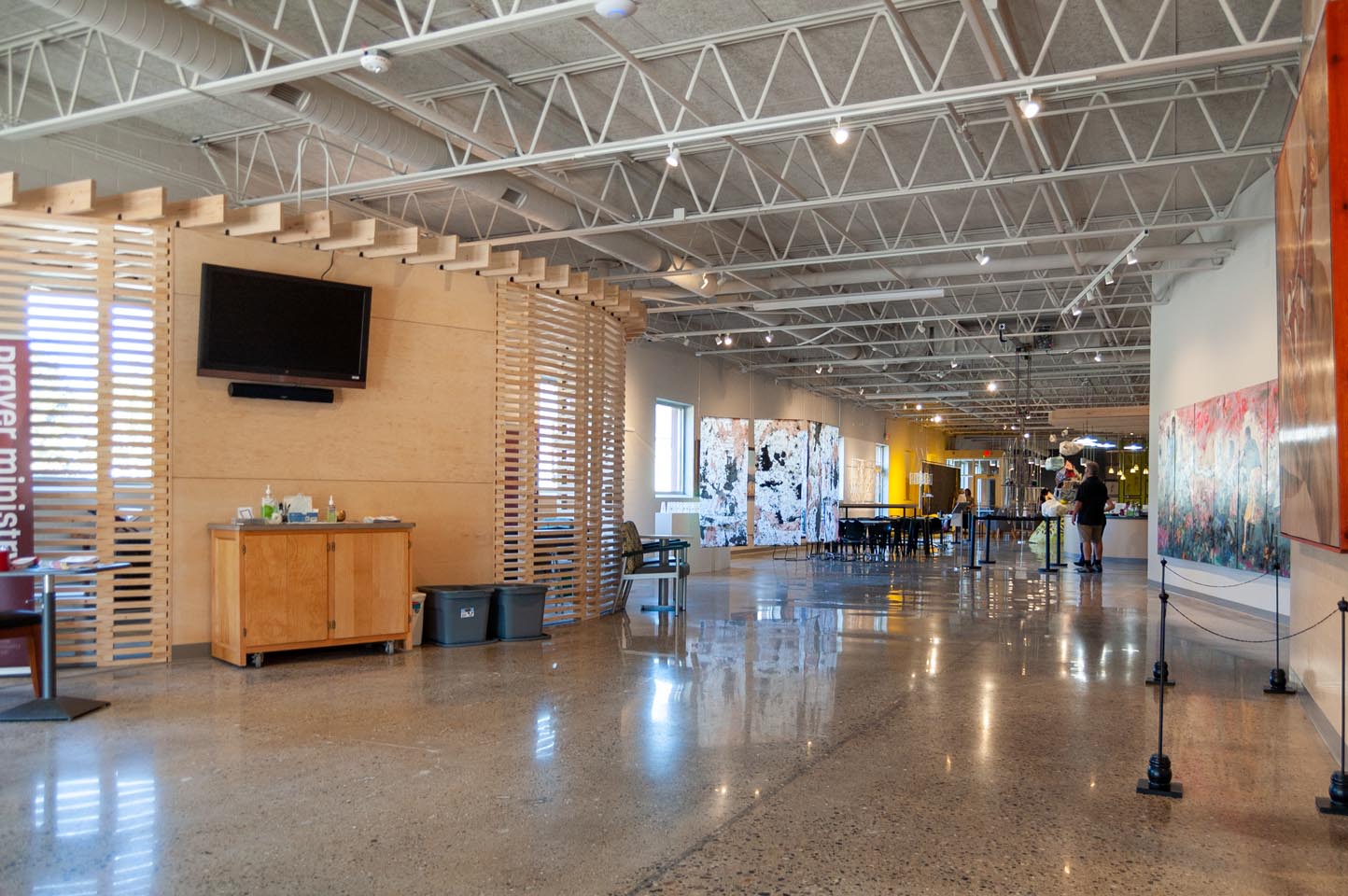
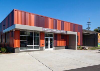
When architect and church leader Steve Fridsma of Elevate Studio asked r.o.i. Design to collaborate on the interior design of their new church space, we knew from the start it was going to look more like an art gallery than a church. 

The project converted a former manufacturing warehouse space into a place of worship, learning, and love. Engaging a variety of people, Monroe Community Church had planning and design committees composed of church members, Elevate Studio, GDK Construction, and r.o.i. Design for the interiors. 

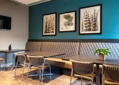
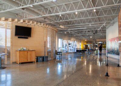
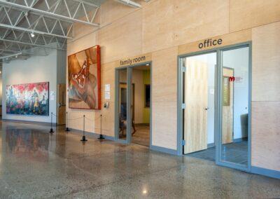
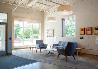
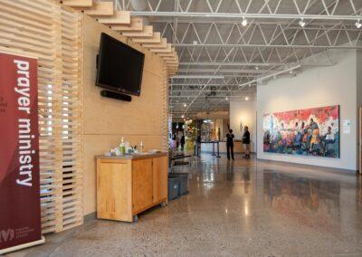
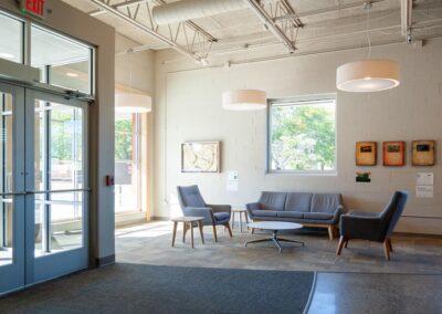
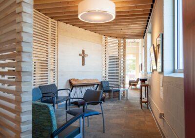
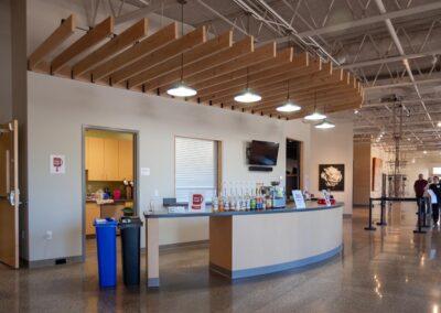
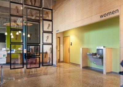
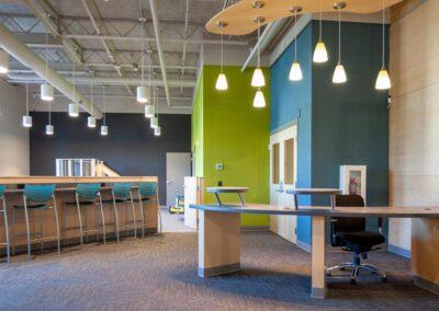
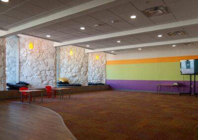
The entrance of the building opens into the Gallery, which is the largest space of the facility. It holds a prayer shelter, a café, lounge seating, and a play area just outside of the kid’s ministry rooms. It has maple plywood walls, open ceilings, concrete floors, and lots of light walls and windows.  

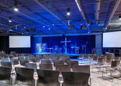
The Worship Space is open to the Gallery but in contrast to that room, is focused on a darker wall with theatrical lighting used during services and presentations. It has a calming presence. 

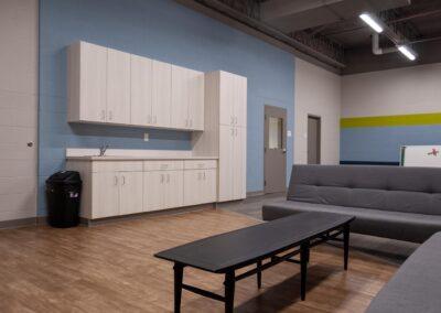
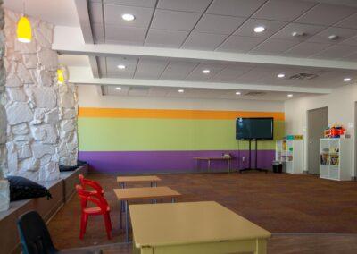
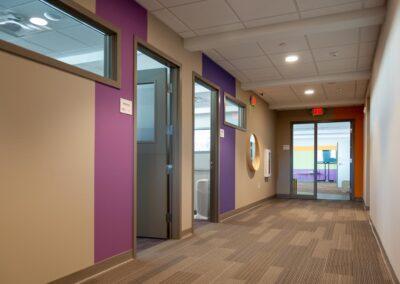
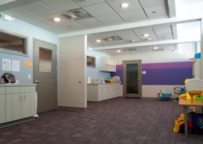
Kids areas use more color and the committee agreed to use graphic stripes in subtle ways to create interest and indicate different age groups. 

The project’s budget was challenging and while compromises were made, the outcome was not compromised. 

Monroe Community Church has a tradition of loving art and the urban community they serve. Their ministry is celebrated in part by their engagement with the city of Grand Rapids as being a venue for ArtPrize. In the fall of 2021, they opened their new facility, welcomed members and guests to their new space the same week that ArtPrize opened. The church, filled with art, met its design and community goals.

Hundreds of people will visit Monroe Community Church and get a glimpse of how they Love God, Love People, Love the City, and Love Art.  

Click on the thumbnails below to view larger images.

German Auto Service Moves Operations to a New Building

German Auto Service Moves Operations to a New Building

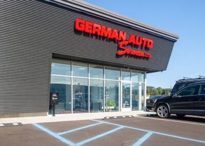
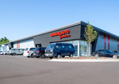
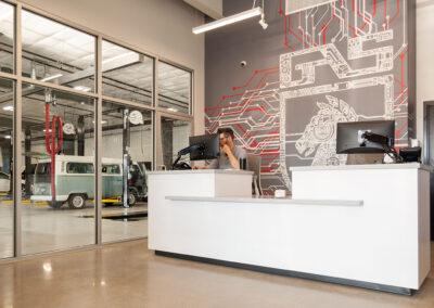
German Auto Service was located just down the street from r.o.i. Design for as long as we’ve been on Front Avenue. With the growth their business has seen in recent years, owners Ben and Joe Zeeuw decided it was time to expand. Rather than adding on to the limited space of their existing lot, they decided to build new. 

German Auto reached out to Pinnacle Construction, which is also located on Front Avenue, to be the general contractor on this project. Then they contacted r.o.i. Design to design the interiors. Marianne Martz from our office oversaw the design. 

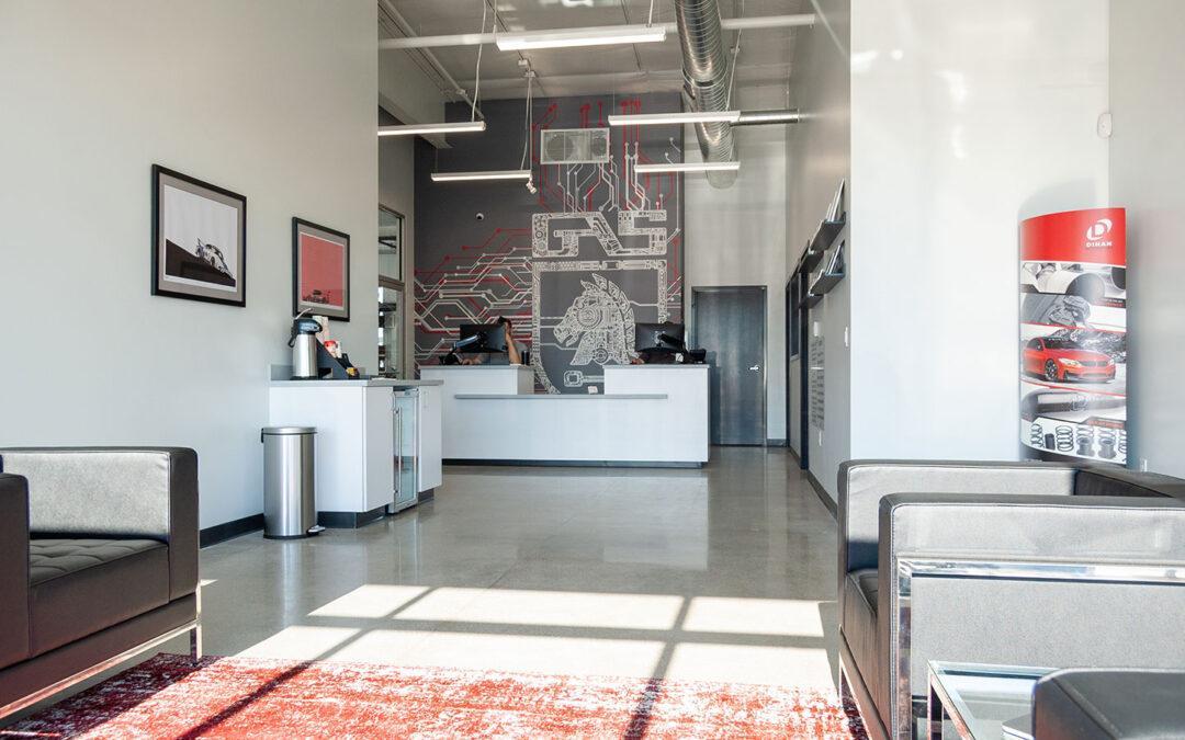
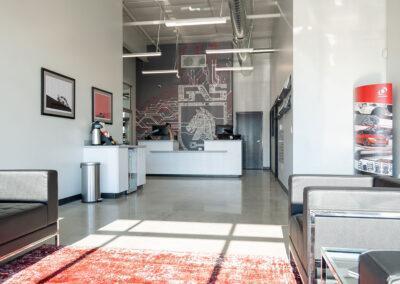
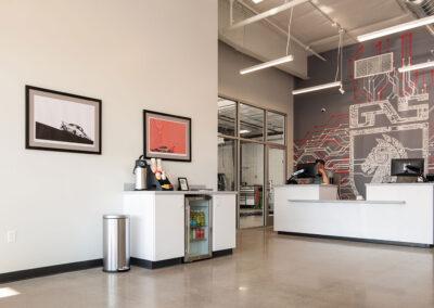
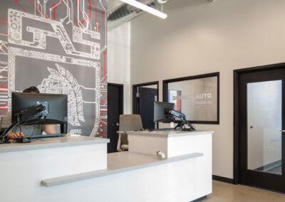
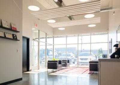
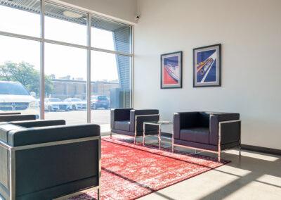
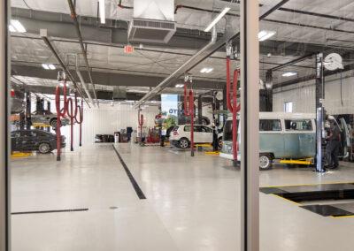
The new building is located near the intersection of Alpine Avenue and Ann Street on Avastar Parkway. The team at German Auto wanted to create a space that embraces the muscular architecture of a fully equipped service garage. The intent was not to hide the shop “out back”. From the lobby, customers have a front-row seat to see the service team at work. The customer service area offers a large open floor plan with a large-scale visually striking graphic. Thanks to the design concept, the new facility feels engaging and bright.

r.o.i Design thanks Ben and Joe for choosing our team to work alongside them. Congratulations to Pinnacle Construction on a great-looking building. 

Click on the thumbnails below to view larger images.