by Ryan | Nov 15, 2017 | Design News, Interior Design, Medical Design
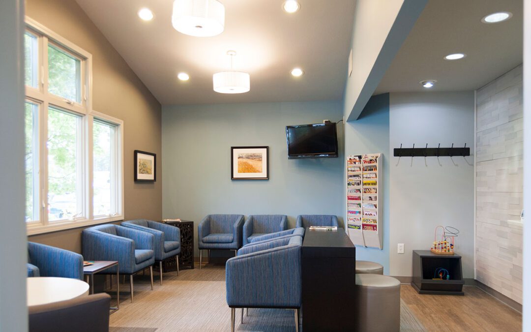
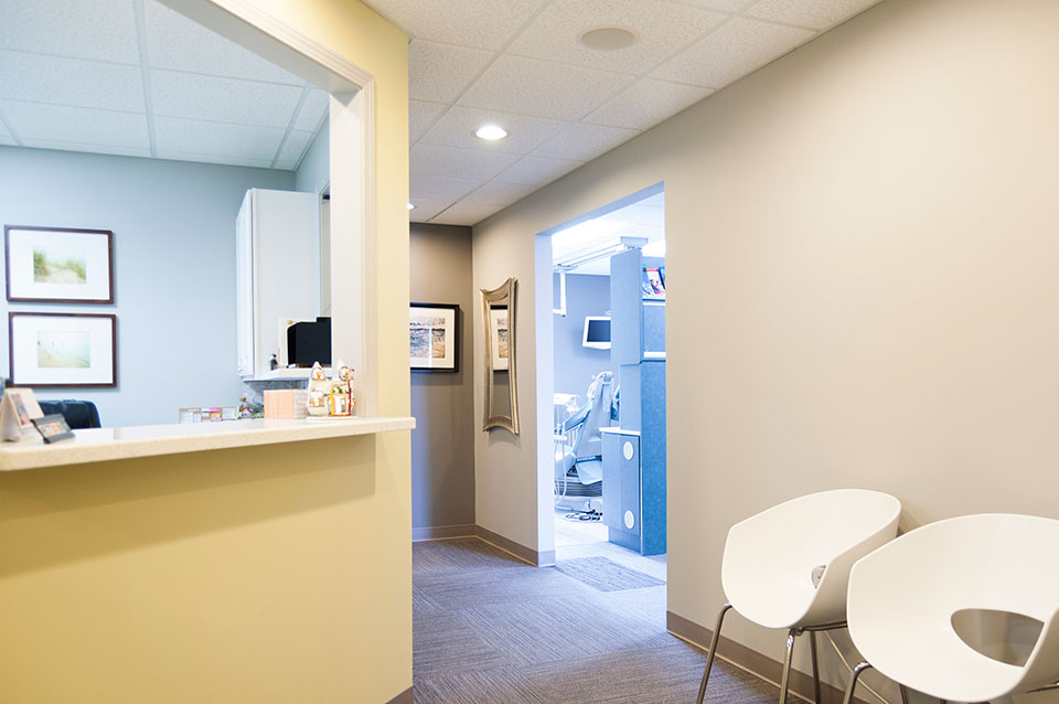
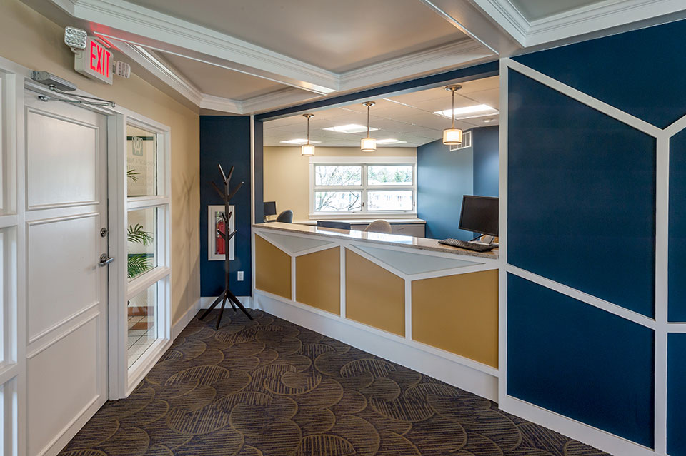
Dr. Drew Scholtz contacted r.o.i. Design looking for finish ideas to update his office. The challenge for any business is to understand what to invest in. What changes will have the largest impact on customer and employee satisfaction?

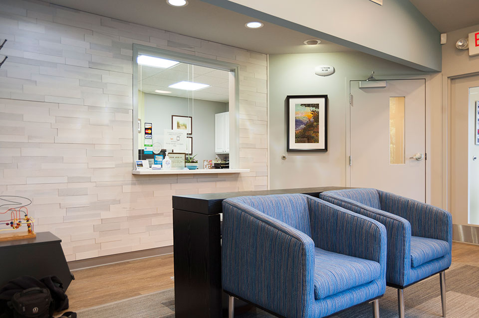
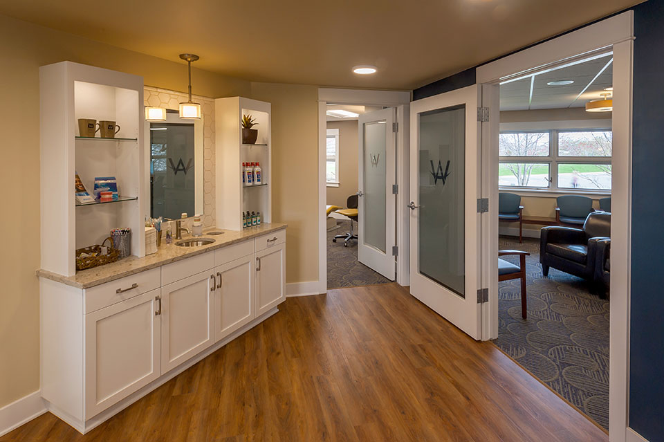
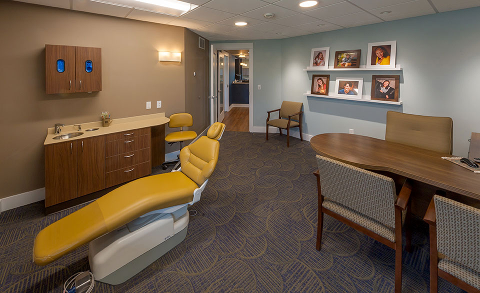
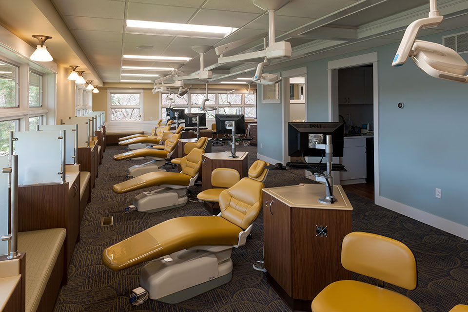
For Scholtz Dental, upgrading the lighting, updating the floor and wall finishes and replacing the lobby furnishings was the answer. Equipment and casegoods were able to remain until the next remodel. The lobby upgrade was the most noticeable improvement. We created a feature wall at the reception, added decorative lighting, installed an interesting carpet and added new stylish furnishings.

r.o.i. Design has a select group of manufacturers whose furniture we can distribute at competitive prices. Thank you Dr. Scholtz for selecting r.o.i. Design not only to provide you with interior finish ideas, but to supply you with new furnishings. It looks great!

by Ryan | Nov 15, 2017 | Design News
Armbrecht & Wierenga Orthodontics (A&W Ortho) is investing in their practice as the next generation of doctors joins the business. They are continuing their promise to create healthy, confident smiles.

Part of the investment meant remodeling their Kentwood offices. They chose First Companies as their construction manager, who in turn engaged Dixon Architecture and r.o.i. Design to create the design and construction documentation.

An important criteria in the design and selection of finishes was A&W Ortho’s desire to create a complete and well-appointed look. They wanted their space to be as welcoming, friendly and remain current in appeal as long as possible. They were eager to retire the pink/mauve color palette that the space had before.

r.o.i. Design’s favorite details included the new reception lobby elevation, the personalized brushing stations, and the embellished trim and new wall art. We were happy to provide and install the wall art as well as custom benches in this great remodel.


by Ryan | Nov 14, 2017 | Church Design, Design News, Interior Design, Project Management
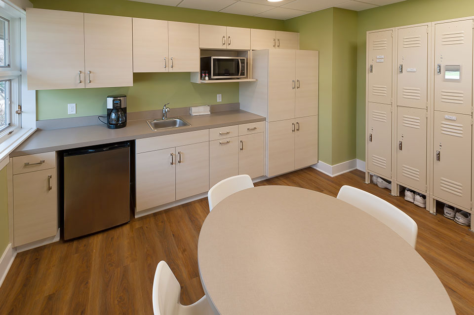
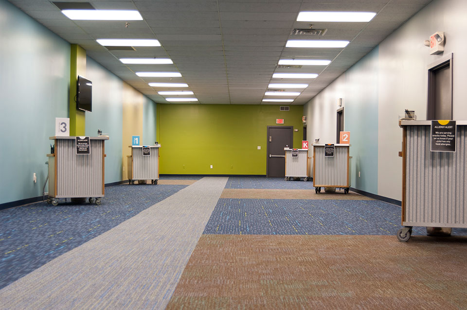
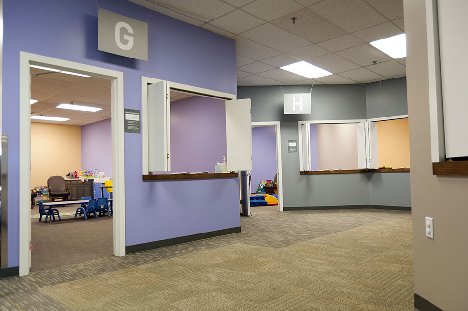
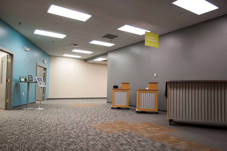
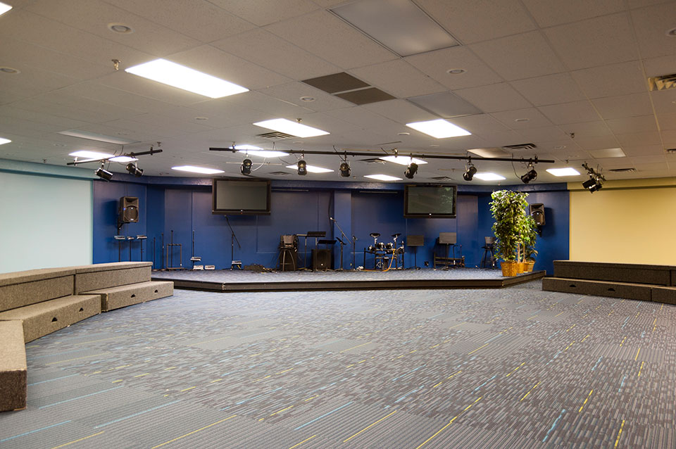
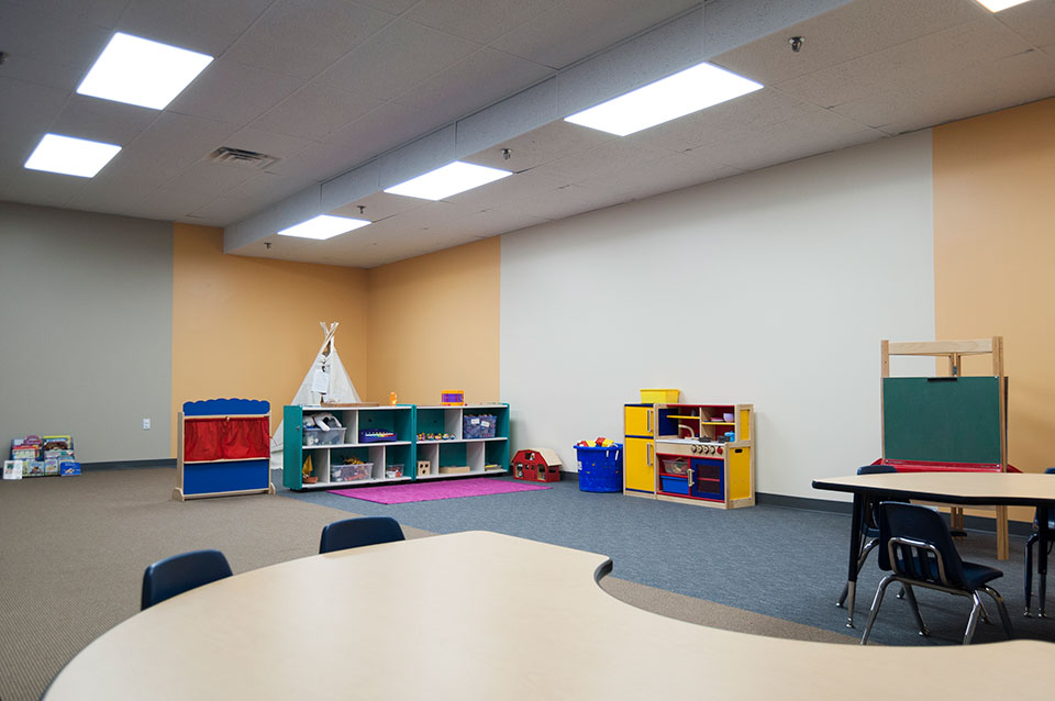
New leadership, new energy and new direction at Mars Hill created a desire to update their facility’s 38,000 square feet children’s ministry. More than 500 children from infants through 10-year-olds attend the ministry each Sunday. Their nursery, preschool and elementary school spaces were in need of refreshing. This meant new flooring, new paint, updated lighting and new cabinetry, as well as any needed repairs.

The redesign was intended to simplify, warm and organize the spaces to help member families entrust their children to Mars Hill. r.o.i. Design saw the journey, discovery and comfort of the spaces as key to the success of the redesign. Mars Hill will also be adding their own graphic and signage design as well as decorative elements to complete the look and feel.

Mars Hill had a budget, based on generous donations and operational planning, but it wasn’t clear if they could make the needed changes within their budget or schedule. r.o.i Design worked with the leadership to solicit contractors who were members or affiliates of Mars Hill, as well as call in other sympathetic trades to make the remodel possible to meet the goals.

We acknowledge the efforts and donations of:
- Facilities and Administrative staff of Mars Hill
- Jacobsen Painting
- Kenowa Plumbing
- Meekhof Electric
- Floor Covering Engineers and Shaw Carpets
- Pinnacle Construction

Over 10 years ago, r.o.i. Design worked with Mars Hill to create interiors in their new space, a vacant shopping mall in Grandville, Michigan. We are grateful for the opportunity to help them again, not only with interior design, but project management of the remodel as well.
For more information about Mars Hill, visit their website, MarsHill.org

by Ryan | Sep 27, 2017 | Design News
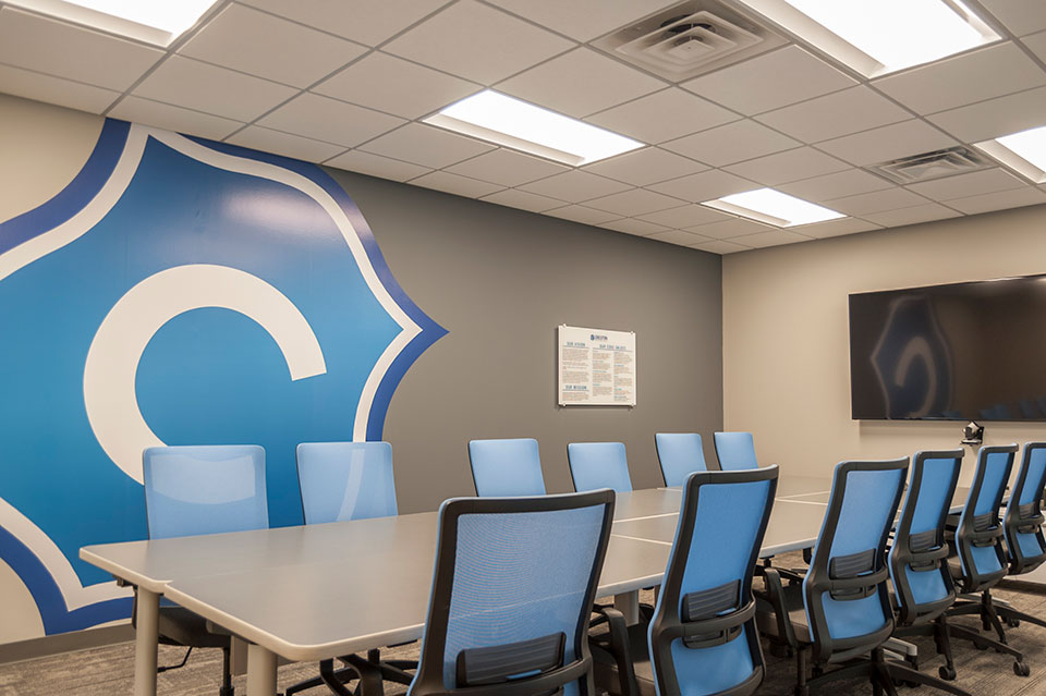
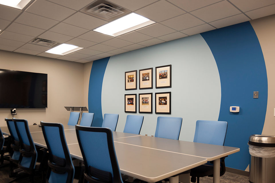
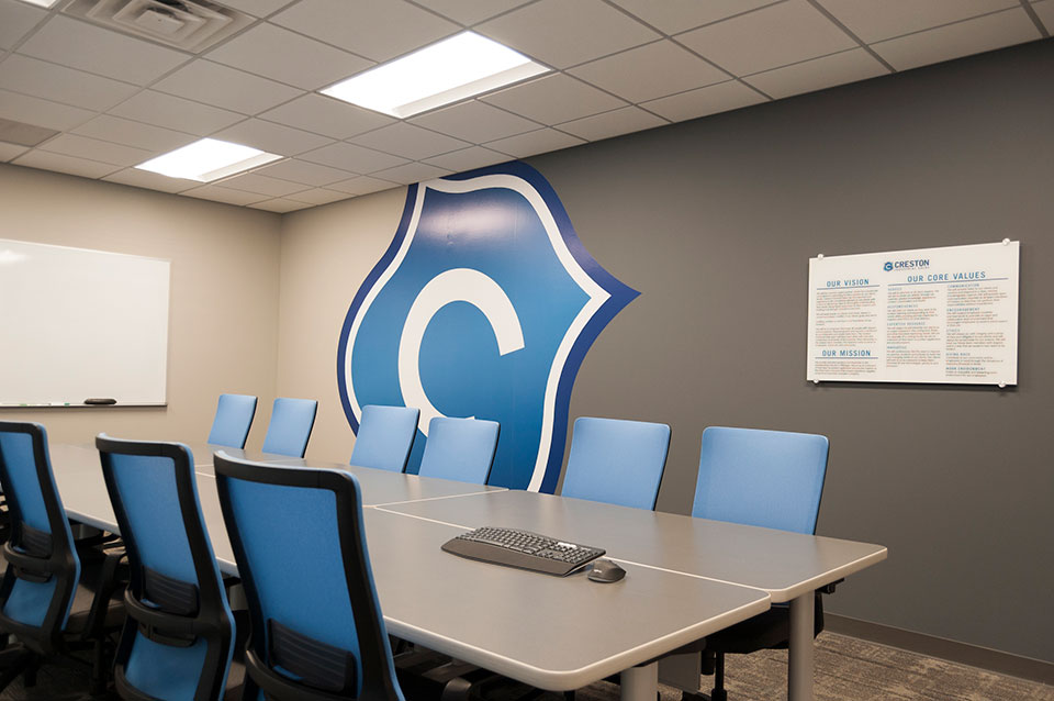
r.o.i. Design has been watching the trend in interiors where graphics have taken on a role in the final finish of a space. Brand is everything, and a business’s physical office wants to illustrate that brand. Brands include logos, people, values and key products.

Mary Jane Caster, our executive designer, worked with Creston Industrial Sales (CIS) in the past to create their showroom, helping them create an engaging customer space. Now as they are renovating their offices, as budget and time allows, they called us back to help them with their conference room. We appreciate their trust.
While a tiny project, it is interesting because it simply illustrates our key offerings: interior design, graphic design and project management. CIS trusted us to design the space and graphics, select the furnishings, work with vendors to get the furnishings in the space, hire the trades to replace flooring, paint walls, add graphics and update lighting.

CIS provides industrial products and expertise to the metalworking industry, including inventory management and real time purchasing solutions. They are small enough to know you, large enough to serve you. To learn more about CIS visit: crestonindustrial.com
We believe we fulfilled our own brand of Budget, Brand and Beauty for CIS.

by Ryan | Sep 27, 2017 | Design News, Interior Design, Workplace Design
This perfectly located, generously sized and well-appointed office building is going through a face lift.

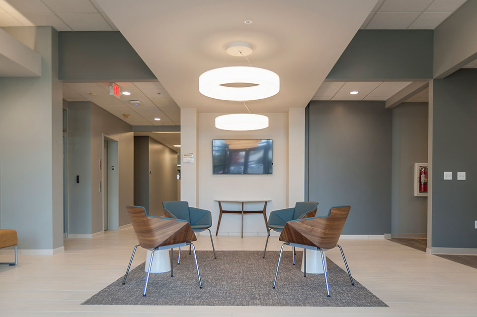
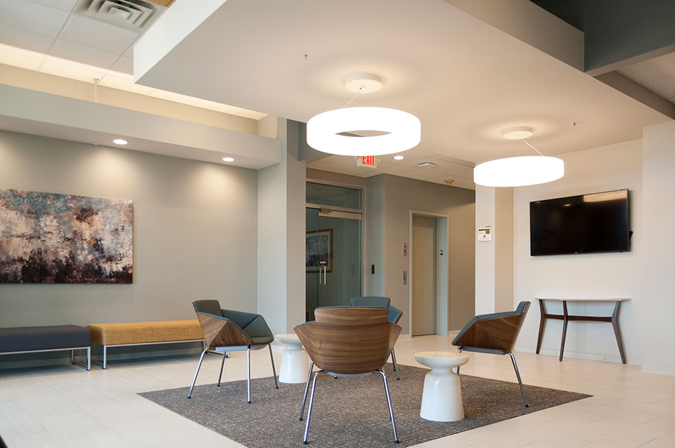
Hillary Taatjes-Woznick and Doug Taatjes of NAI Wisinski contacted us, asking us to compete to win the opportunity to provide a design for the lobby of Park East Court, off of East Paris in Grand Rapids, Michigan. This “first impressions” area was key in providing future tenants a glimpse into the aesthetics and financial commitment of ownership.

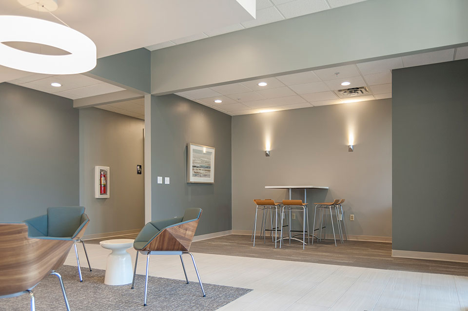
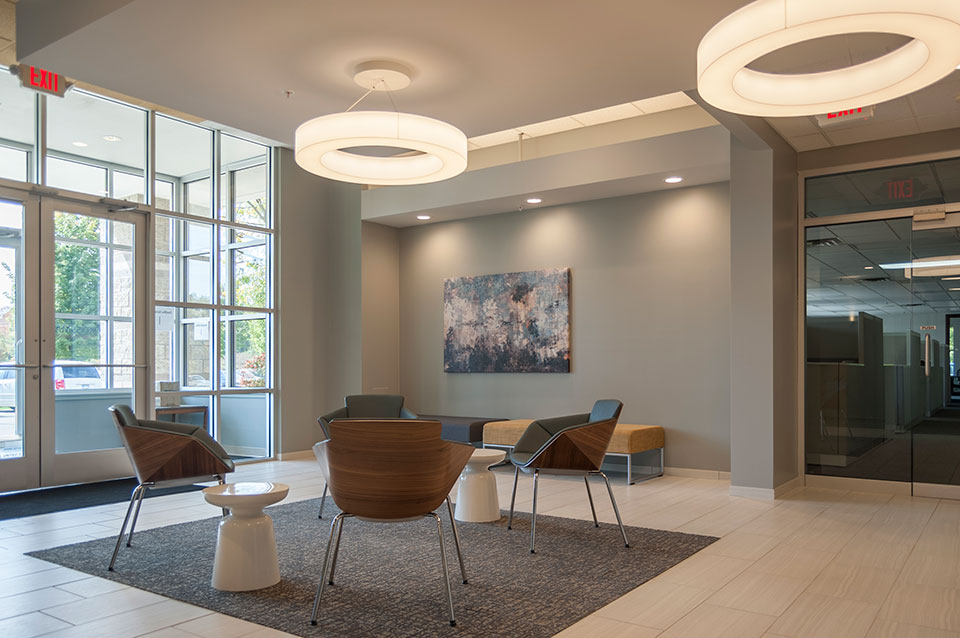
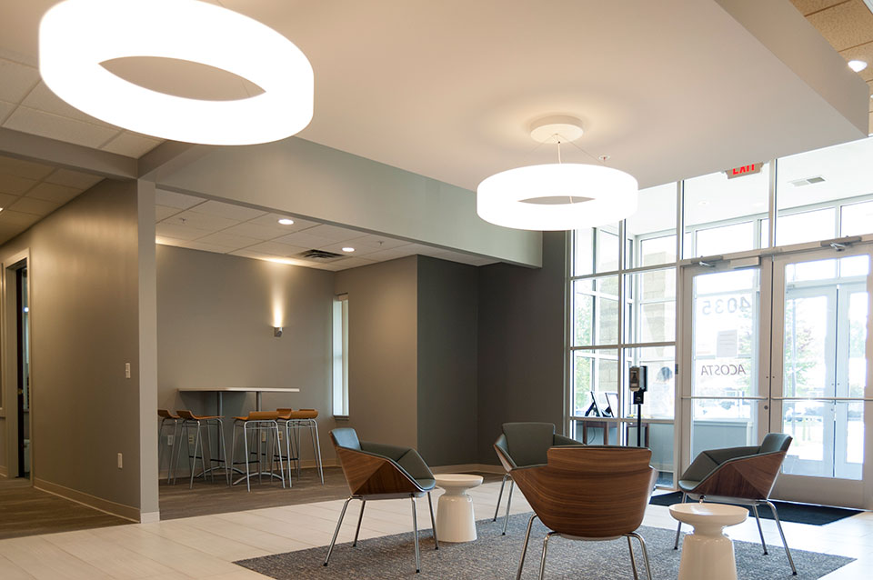
Our design included expanding the lobby into a hallway and a copy/storage room and floating a drywall lid in the center of the space. We replaced a reception desk with seating, and added focal points to the space. The popular gray color scheme of today was used, but with an accent of yellow on the ceiling and blue in the furnishings. The dated mahogany trim was painted. Decorative lighting was strategically placed to create a contemporary appeal.
We partnered with longtime friends and collaborators, Pinnacle Construction, to create budgets that directed the final design scope. Pinnacle Construction completed the lobby remodel in spring of 2017.

While we pride ourselves on our values of Budget (first), Brand and Beauty, we were told we won the opportunity to provide the design because they liked our design, which they thought best captured the owner’s preferences and gave them a look that they thought would best appeal to their tenants. Our idea wasn’t the least expensive but they thought offered the best ROI.

For more information about Park East Court, visit naiwwm.com and search for 4035 Park East Court

by Ryan | Sep 27, 2017 | Design News
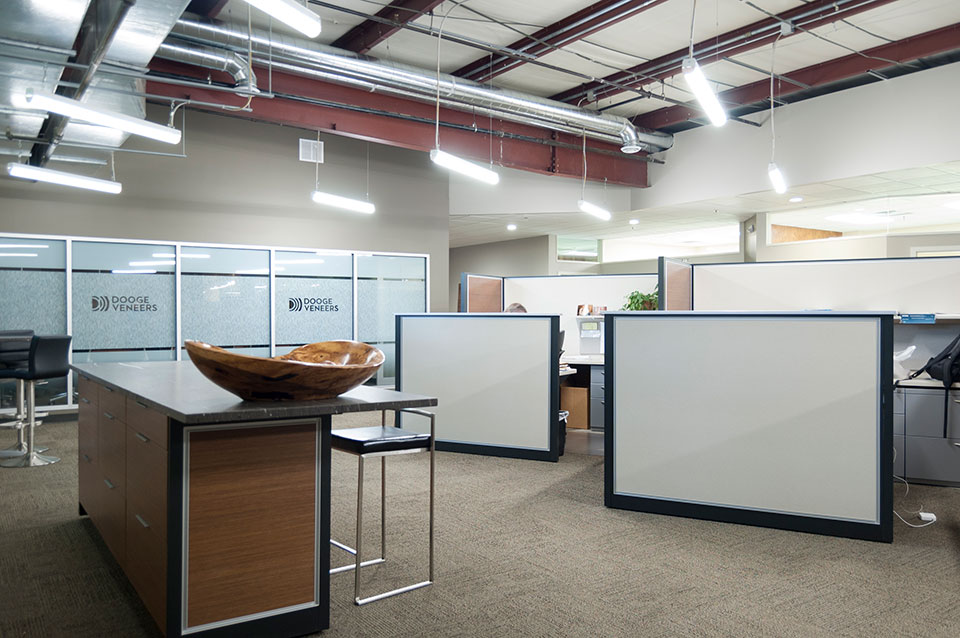
Business growth demanded Dooge Veneers to plan for hiring over the next five years. Already their recent growth had new staff using conference rooms for offices and doubling up in offices.
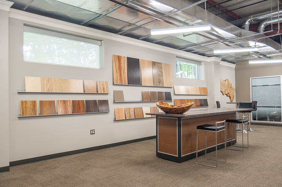
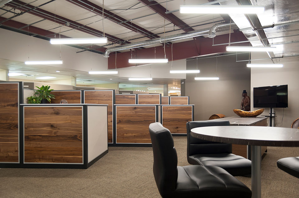
They had a large warehouse area that they used to inspect veneers as well as serve as a veneer sample library for their sales staff and their customers. Their goal was to convert that space to open office with a larger conference room.

Like their current offices, they wanted to use some of their veneers as architectural finishes. They were also hoping they could avoid putting a ceiling into the “warehouse” space, but rather find a way to create a more urban loft appearance exposing the ceiling structure and mechanical.
“Dooge Veneers is a wonderful customer because they are very design sensitive and aware of trends because they provide veneers for interiors and work with architects and designers all the time,” says Mary Witte, owner, r.o.i. Design. “Not only do they understand design, they challenge us and collaborate with us, so whenever we work with them the result is world-class”.

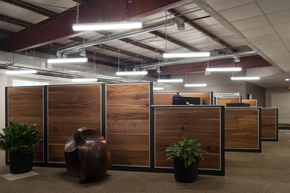
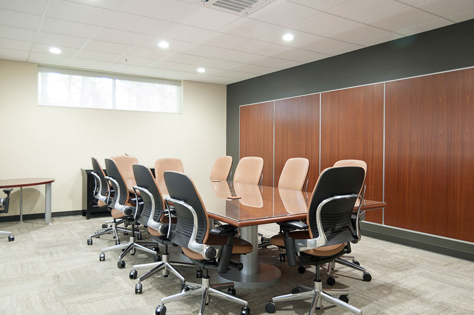
In 2009, the office was remodeled and many of the finishes still looked fresh, so r.o.i. Design identified the criteria for the new expanded open office based on elements that existed as well as taking advantage of today’s design style. Key to the design was the creation of custom “office cubicles”. Previously, Dooge had free standing desks with full height wood panel dividers that lined a wall in a much smaller open office. In order to maximize the space, r.o.i. Design opened up the warehouse to the existing offices, added spots for six people and the expanded sales space. While this meant offices had to be a little smaller, the new “cubicles”, using matched “rustic random” walnut veneer, recut walnut veneer and stainless steel trim, were more than enough for staff to accomplish their work. Their ability to work more collaboratively in the open office has proved to be very efficient and promotes the sharing of information. The new conference room allows for larger meetings while also creating a beautiful back drop to the open office with their new logo on a glass wall. Inside the conference room, r.o.i. designed inset panels in the drywall with FC Sapele wood and stainless steel trim.

This project, like so many recently, we also assist in the actual execution of the remodel, offering select project management services.
Dooge Veneers, whose offices are located in southeast Grand Rapids, has been in business for over 50 years. r.o.i. Design has had the extreme honor of helping this group design and remodel their corporate office and showroom three times over 20 years.
