by Ryan | Jul 12, 2018 | Design News
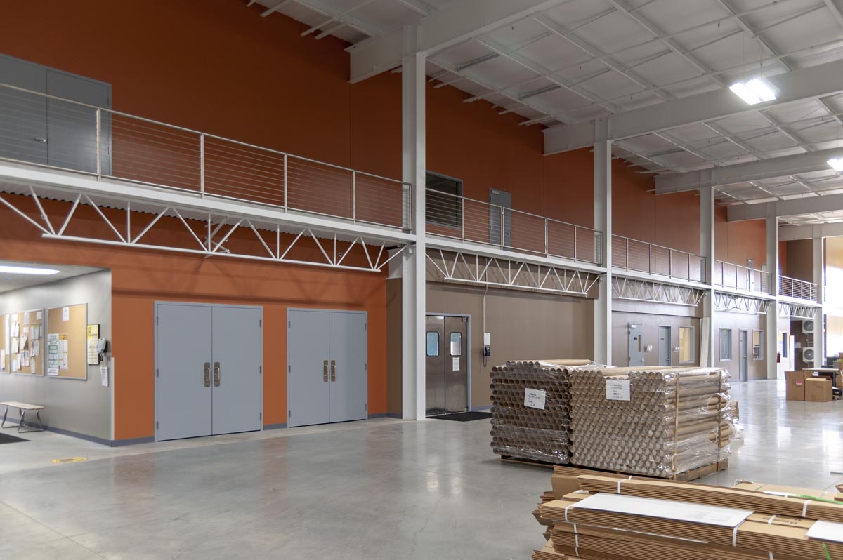
The Baum family has made Hastings Fiberglass a success for more than 50 years. That success is based on their innovation, customer care and their commitment to their community. But their ability to grow was limited based on their physical plant, so in 2016 they started to plan for a new headquarters and a state-of-the-art plant.

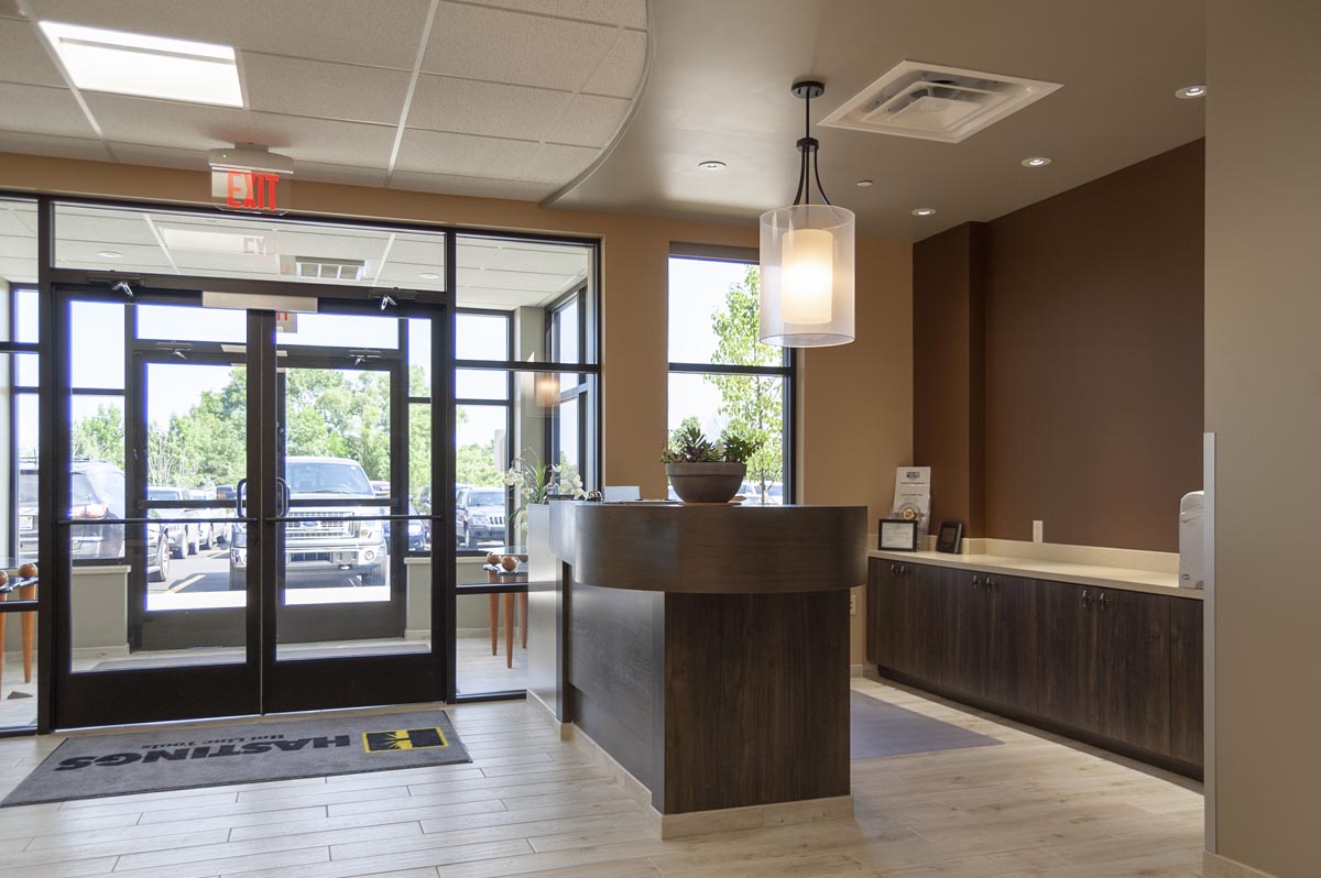
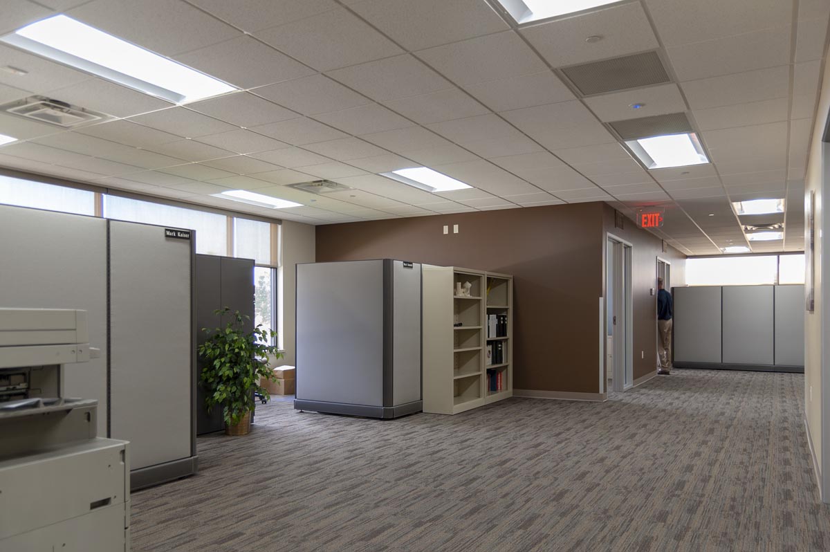
Wolverine Building Groups’ Brandon Hartel called r.o.i. Design to help with the interior design of this 100,000 SF, 8M project. He said that they needed “the r.o.i. Design touch”. Working with Wolverine and Hastings Fiberglass’ President Dave Baum and Earlene Baum, we worked through the decisions for the finishes of their offices as well as the plant.

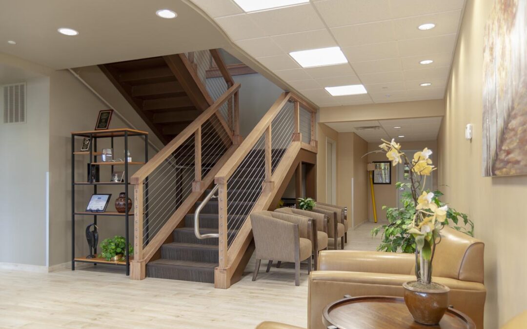
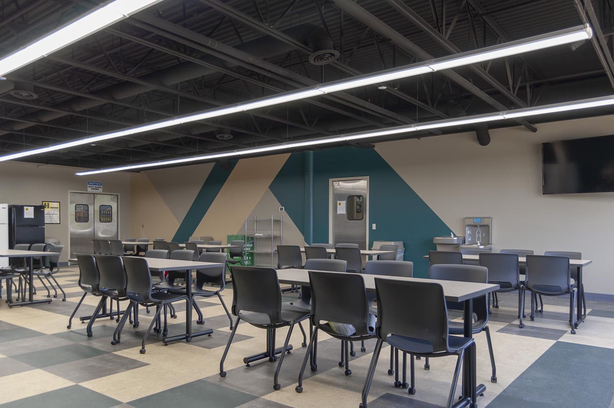
Some of our favorite results include the open staircase from the lobby to the second-floor offices, the break room/lunch room and the colors in the manufacturing space. Baum admitted he thought we were “a little nutty” putting all those colors in the plant, but he is so glad we did.

Congratulations to the Baum Family, Hastings Fiberglass and Wolverine Building Group for a job well done!
Excerpts From The Hastings Banner, 5/24/2018
Hastings Fiberglass begins Celebration with Ribbon Cutting
Hastings Mayor Dave Tossava spoke on behalf of the city, saying the achievement of Hastings Fiberglass is something for which the community should be proud. He thanked the Baum family for keeping their promise to stay committed to the community and keeping their world headquarters in Hastings.
“I knew Earl McMillan and Earl McMillan Jr. and I know they would be very proud of what stands here today,” Tossava of the founders.
Travis Alden, president of the Barry County Chamber of Commerce and Economic Development Alliance, congratulated the company for its growth and accomplishments.
“I want to thank the Baum family for their investment and commitment and for the tremendous opportunities to come from this project. We at the chamber will do whatever we can to make sure this company will continue to thrive,” said Alden.
Employees Joe Hendricks and Dennis James both agreed the larger workspace has helped things to run much smoother, and the flow of work has increased dramatically.
“I also feel a great sense of pride when I drive up to this building, and to point it out, and telling people this is where I work,” said Hendricks.
Dave Baum said moving the company the past two months was a difficult process. Computers and many other equipment needed to be updated or replaced, and during the move, he said, he wanted to make certain the operation continued.
“I am just amazed,” said Earlene Baum. “The building is so beautiful. My dad would not have believed what he started would have turned into this.”
Hastings Fiberglass has always maintained a close relationship with the community, and the community has always been supportive. The relationship is symbiotic and, fortunately for both bodies, the bond will continue far into the future.”
To learn more about Hastings Fiberglass go to hfgp.com


by Ryan | Jul 12, 2018 | Design News
In 2015, Pinnacle Construction introduced us to ABC Pediatrics for the interior design of their new building in Wyoming. The project was already in construction and we worked with the team of doctors to come up with a family-friendly interior.

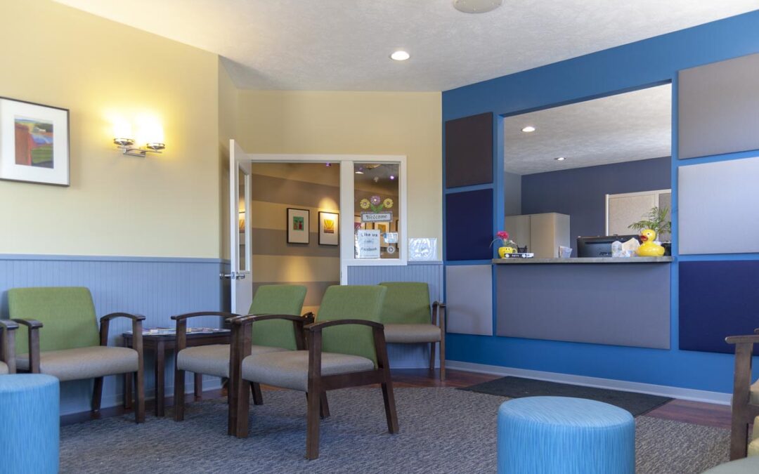
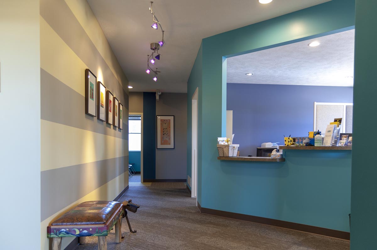
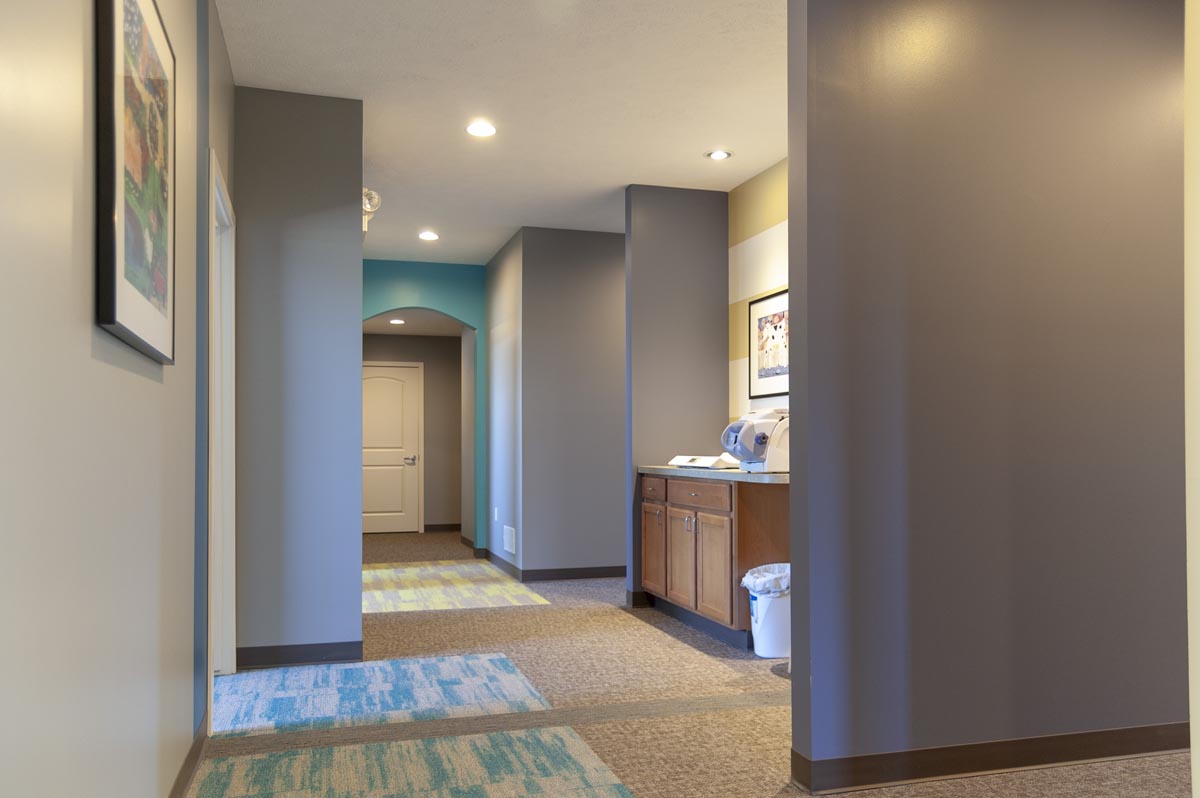
Their second location in Walker grew jealous of the new facility’s fresh look. So this year they decided to make some cosmetic changes to their 3 Mile Road offices. They asked r.o.i. Design to work with them to create a look for this space. They were looking for something that was different than Wyoming but still fun, residential, warm and welcoming.

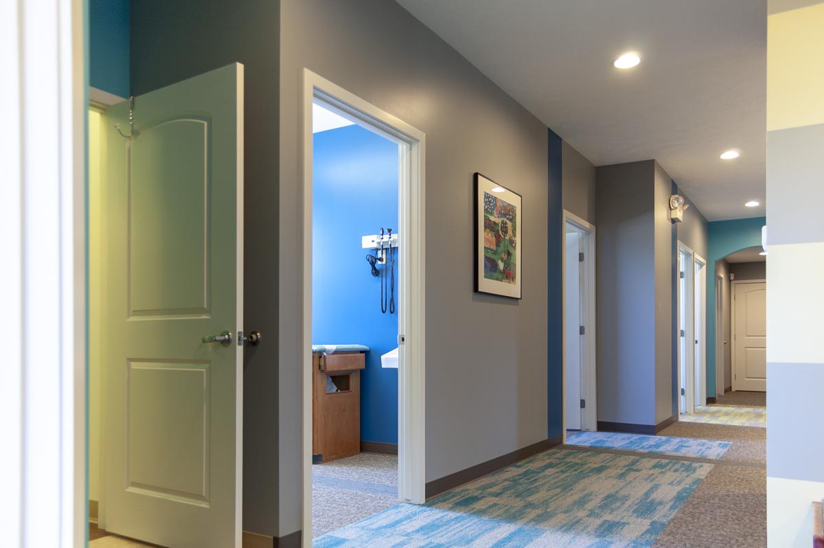
No walls were moved and no doors or windows were replaced. But every surface was refreshed with new paint, carpet or laminate. For this location, r.o.i. Design took a soft graphics approach to the interior, adding stripes and squares to the walls. Perhaps our favorite detail was the carpet patterns. We highlighted each exam room entrance with a bold color. Plus, we created diagonal “paved” pattern sections to the floor.

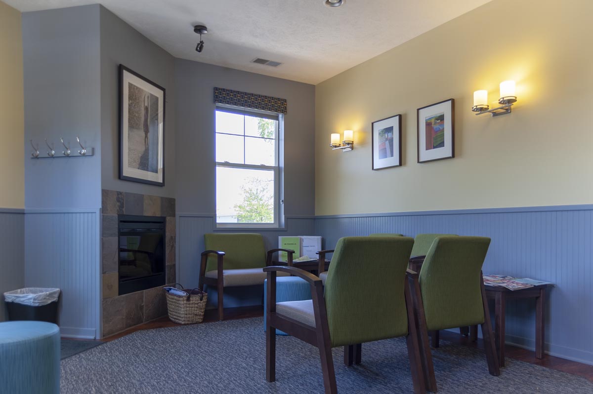
And, like their Wyoming location, we added some large ottomans to the lobby for fun seating.
A shout-out to Dr. Jennifer Perry for managing all the trades and getting the project completed on time and on budget!

We are so impressed with this group’s care for their patients and staff and now we are all proud of how their offices look!
Congratulations ABC Pediatrics!
For more about ABC Pediatrics go to abcpedspc.com

by Ryan | Jul 12, 2018 | Design News, Exhibit Design, Interior Design, Lighting Design, Workplace Design
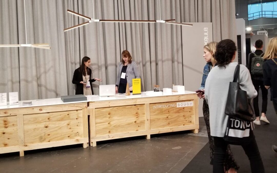
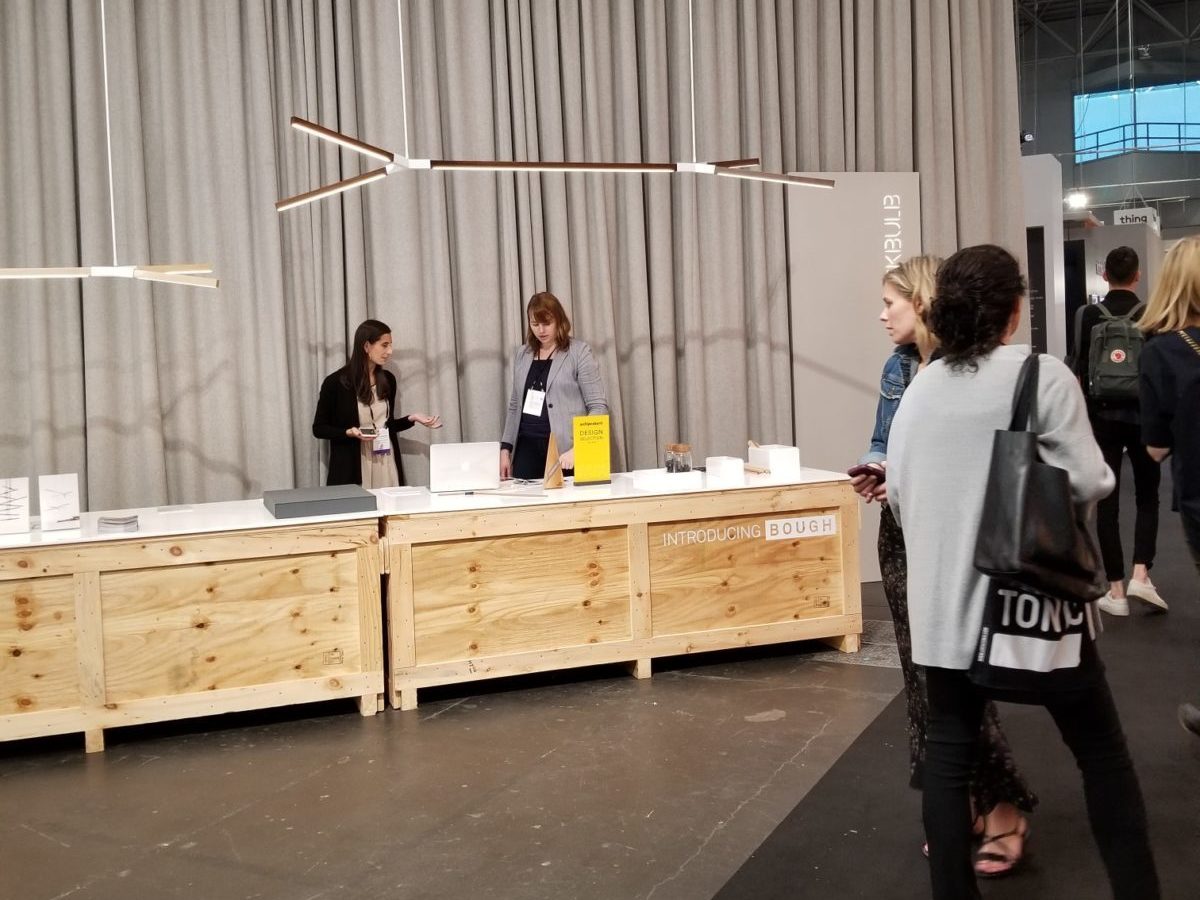
At r.o.i. Design, we like to stay on top of new products and current trends in the design world. One important way that we do this is by attending design shows to see these new products and trends firsthand. This spring, we attended two major design shows, International Contemporary Furniture Fair (ICFF) in New York City and NeoCon in Chicago. Read on to learn more about we saw and discovered.
ICFF, New York City
Thirty years ago this show started as an international furniture show, introducing new ideas and new materials for furniture. But today it is not limited to furniture. They describe themselves as North American’s platform for global design, showcasing the newest frontier of what’s best and what’s next. ICFF NYC hosts more than 800 exhibitors from more than 40 countries in 11 categories from furniture to materials to kitchen and bath to fabricators.

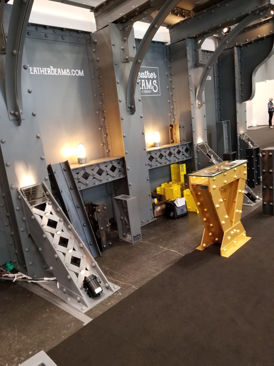
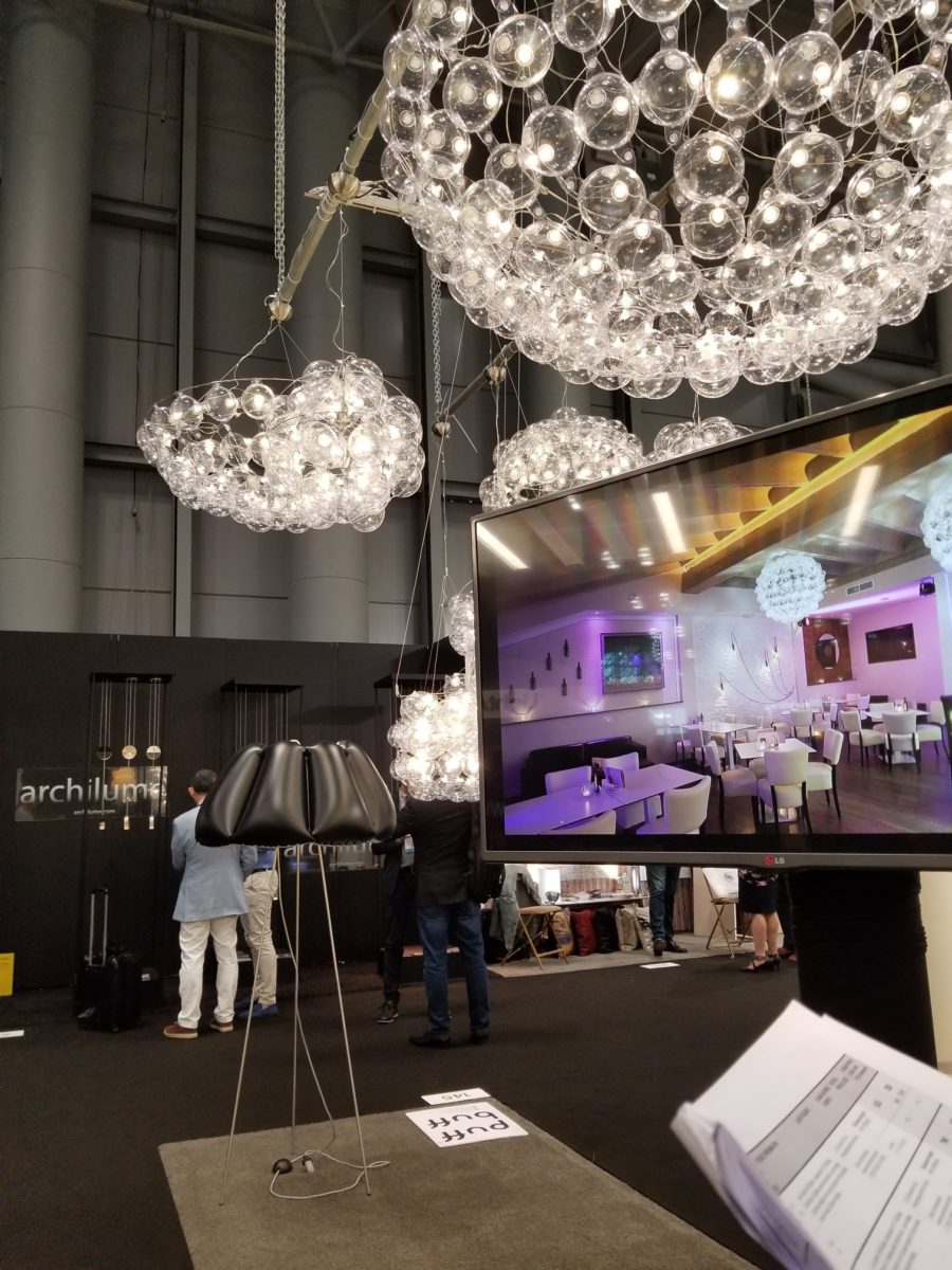
r.o.i. Design spent a day at the show and came away with a couple of observations. LED lighting promotes creativity in all product design, but the decorative lighting designs were breathtaking. A couple of memorable showcases were Featherbeams decorative faux trusses and metalwork, Puff Buff Design, LED lights in vinyl bubbles that are shipped unassembled from Poland, and Knuckles and Other Good Joints, beautiful metal joinery that promotes custom table designs.


ICFF is part of Design Week in NYC and the Cooper Hewitt Design Museum was part of the Design Week agenda. They were featuring two major exhibits, “Access+Ability” and “Saturated: The Allure and Science of Color”.
“Access+Ability” is an exposition of product designs that enable humans to freely engage with their environment. There has been a surge of design with and by people with a wide range of physical, cognitive, and sensory abilities. Fueled by advances in research, technology, and fabrication, this proliferation of functional, life-enhancing products is creating unprecedented access in homes, schools, workplaces, and the world at large. “Access+Ability” features over 70 innovative designs developed in the last decade.

The second exhibit, “Saturated: The Allure and Science of Color” explores the elusive, complex phenomenon of color perception and how it has captivated artists, designers, scientists, and sages. Featuring over 190 objects spanning antiquity to the present from the extraordinary collections of Smithsonian Libraries and Cooper Hewitt, the exhibition reveals how designers apply the theories of the world’s greatest color thinkers to bring order and excitement to the visual world.
NeoCon 2018, Chicago
We took a day trip to Chicago again this year to attend NeoCon. This year marked the 50th annual Neocon! While the six-plus hours on the road (round-trip) made for a long, hurried day, we still enjoyed the opportunity to see what is new in the world of commercial furnishings.
As usual, NeoCon was crowded with industry professionals on six floors of the Merchandise Mart. Some floors are occupied by the permanent showrooms of larger established manufacturers of furniture, textiles, carpet, and wallcovering. Other floors are full of booths represented by smaller groups and some newcomers. Large or small, many of these exhibitors have something unique, exciting, or just plain beautiful to introduce each year. This year was no exception, as we saw many items to whet our designer appetite.

Here are some of the trends and cool stuff we saw at NeoCon this year.
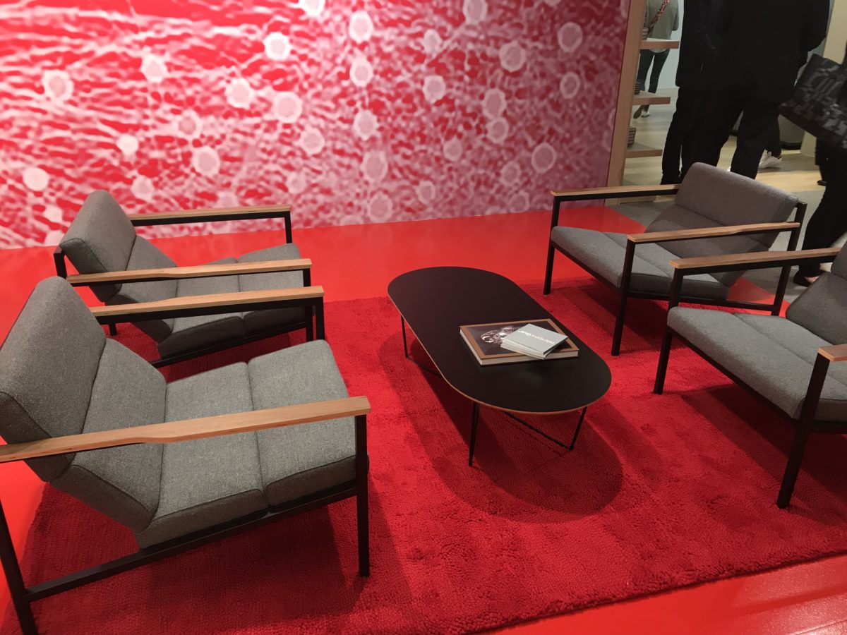
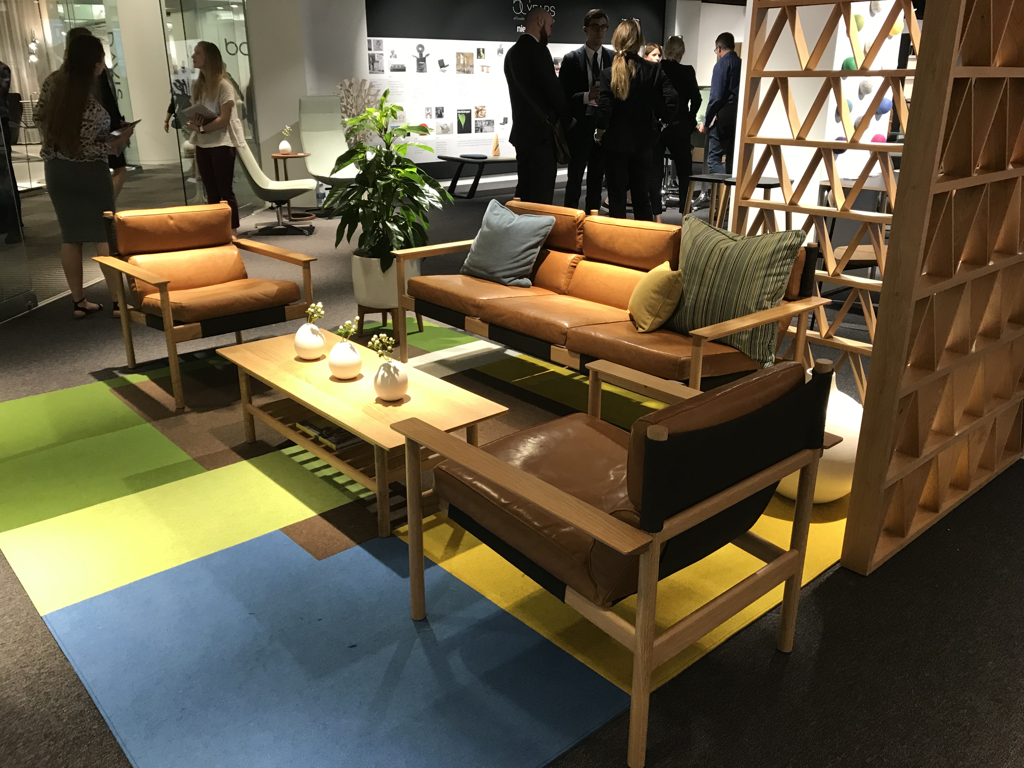
The styles and colors of the late-midcentury modern style are coming back in retro full-force. This style is super-chic right now in the commercial office industry. Of course, these styles are updated to today’s standards of technology, sustainability, and environmental quality.

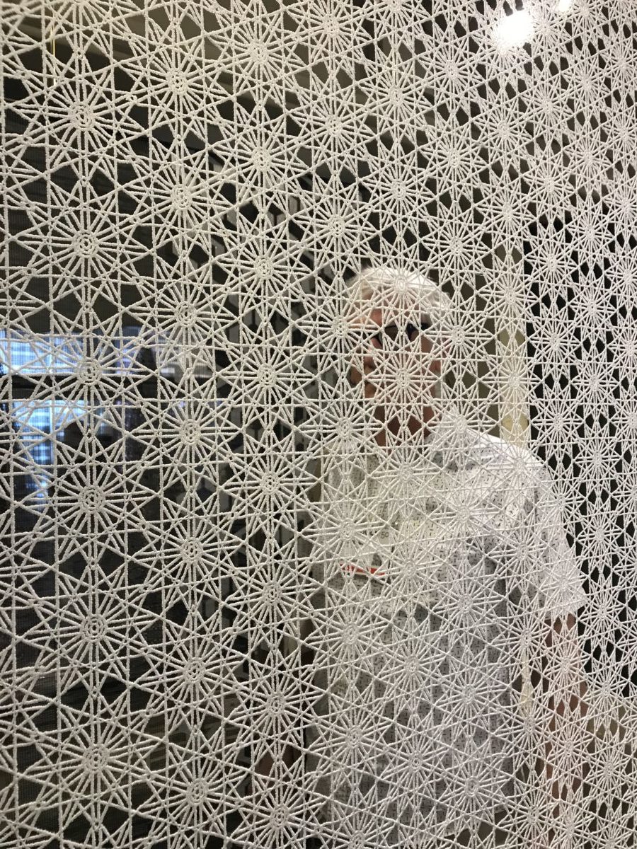
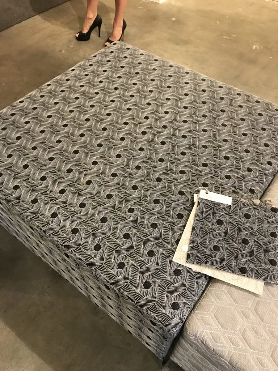
Intricate and complex geometric patterns are trending. We saw a lot of these tessellations in fabrics, wall panels, and even light fixtures at this year’s NeoCon.


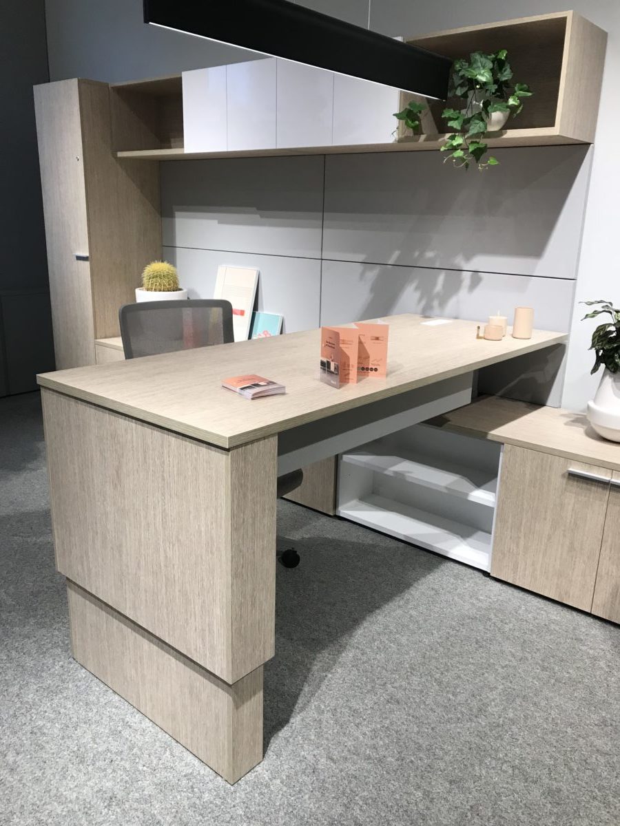
Adjustable Desks – This trend actually took off a few years ago, but it was interesting to see how almost everyone has adjustable height workstations now. There are some great designs out there. Heck, even r.o.i. Design created custom adjustable desks recently for one of our clients!

We noticed a lot of furniture now features natural wood paired up with powder-coated metals. When past trends in furniture were all wood or no wood at all, these new designs seem to strike a balance between the two.

by Ryan | Jul 12, 2018 | Design News, Restaurant Design, Retail Design
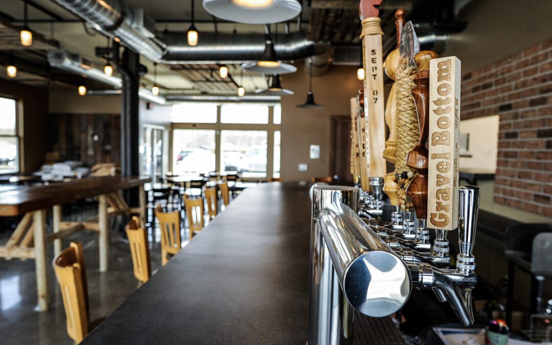
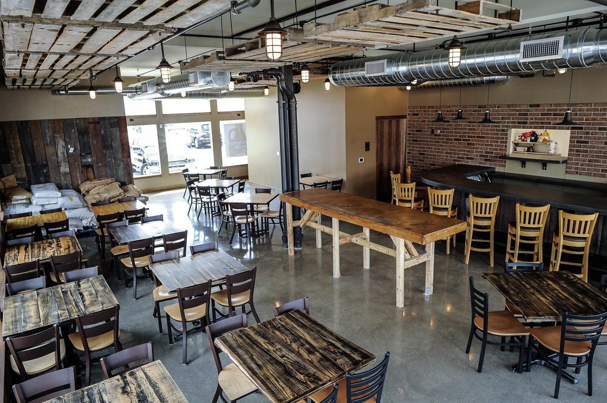
Breweries and their eateries often want their space to feel like their guests are joining them in the warehouse while they are brewing beer. But Gravel Bottom Brewery Ada, MI had to move to a brand-new storefront to allow for the downtown Ada development project to put in a street.

All Photos: Courtesy of Gravel Bottom Brewery
First Companies’ Craig Schroeder called r.o.i. Design looking for design help to make the new space feel more like a brewery warehouse.
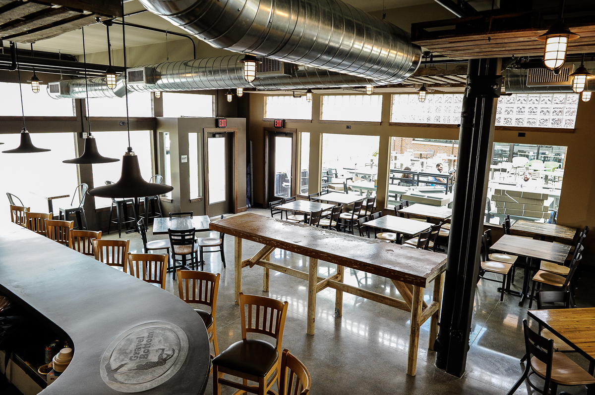
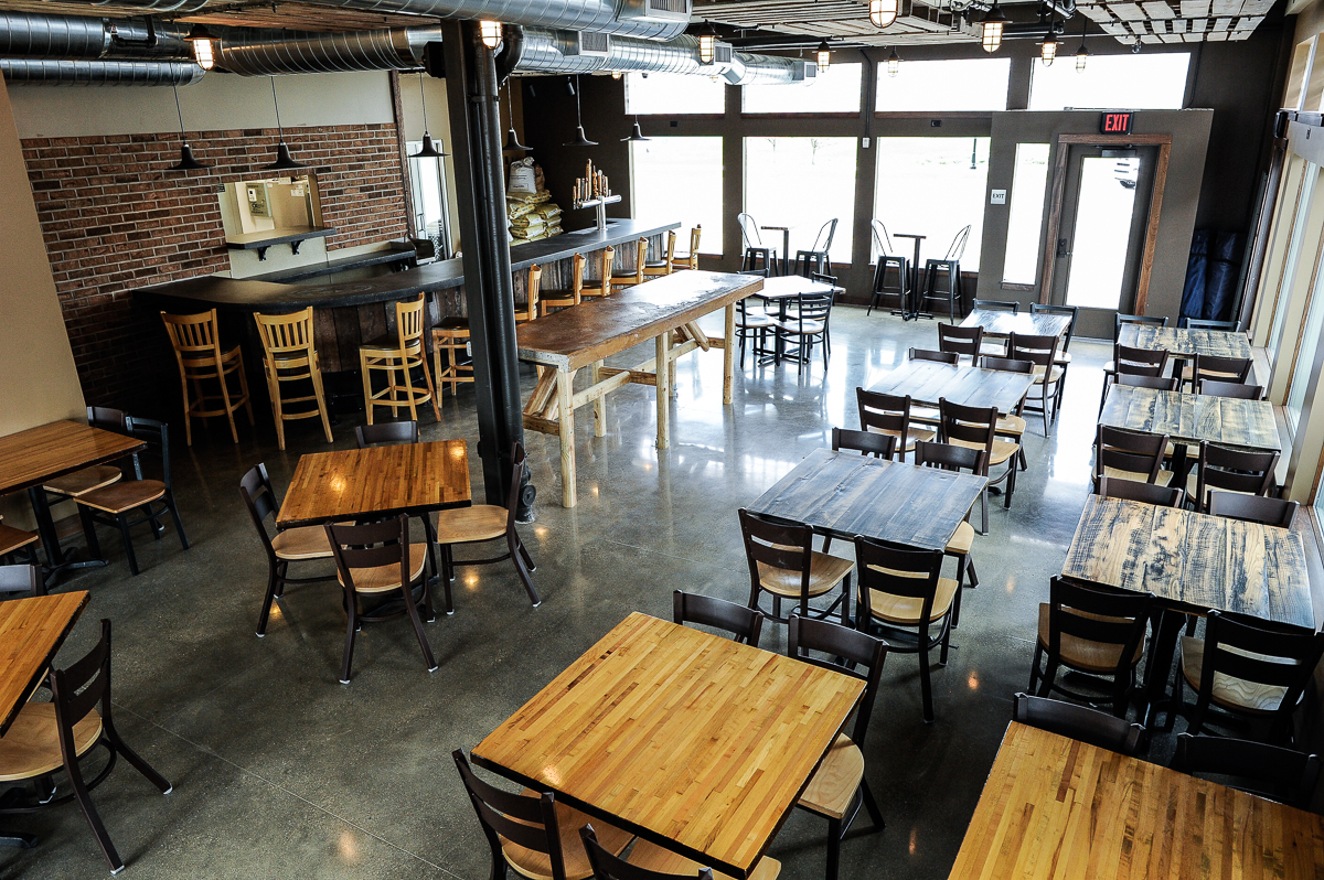
Owner Matt Michiels really liked his existing space and was hoping to re-create the look and feel. To r.o.i. Design that meant a warm paint scheme, industrial warehouse lights, reclaimed wood and vintage looking brick. We asked them to hang used wood pallets from the ceiling to add texture and hide some acoustic treatment.

All Photos: Courtesy of Gravel Bottom Brewery
Matt added an amazing concrete bar top to his new bar, as well as some incredible beer.
Congratulations to Gravel Bottom Craft Brewery and First Companies for making a place that looks like it has been in Ada for decades!
From 13 “On Your Side”, May 11, 2018 edition.
Gravel Bottom Craft Brewery in Ada is reopening after moving to a new location.
The brewery moved into a larger space as a part of the Ada Village redevelopment project. But, the company says that the new location still offers a familiar, cozy feel that it has become known for as the neighborhood brewery.
“We’ve put a lot of time and effort into making this feel similar to what the other Gravel Bottom was: welcoming and comfortable,” said owner Matt Michiels…
For more about Gravel Bottom Craft Brewery visit: gravelbottom.com

All Photos: Courtesy of Gravel Bottom Brewery

by Ryan | Apr 18, 2018 | Design News
Eat Good, Drink Good, Live Good.
This is the motto at Wok & Mortar, the newest dining establishment in East Grand Rapids’ Gaslight Village. They feature fresh Asian dishes inspired by the street food of the markets in Chiang Mai, Thailand.

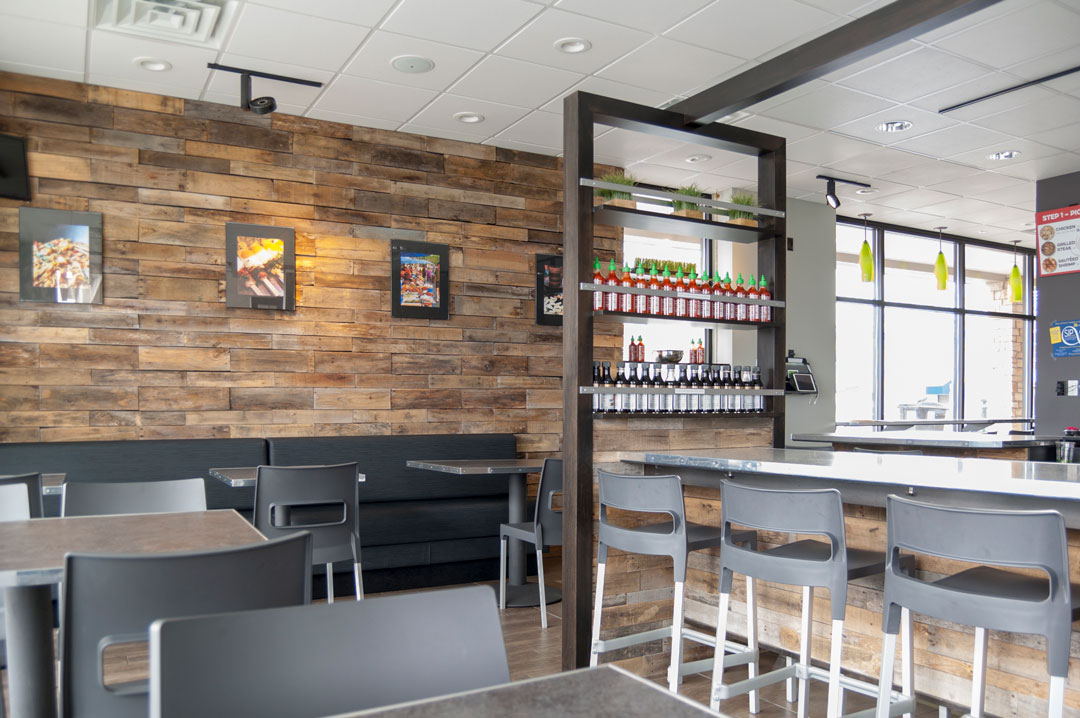
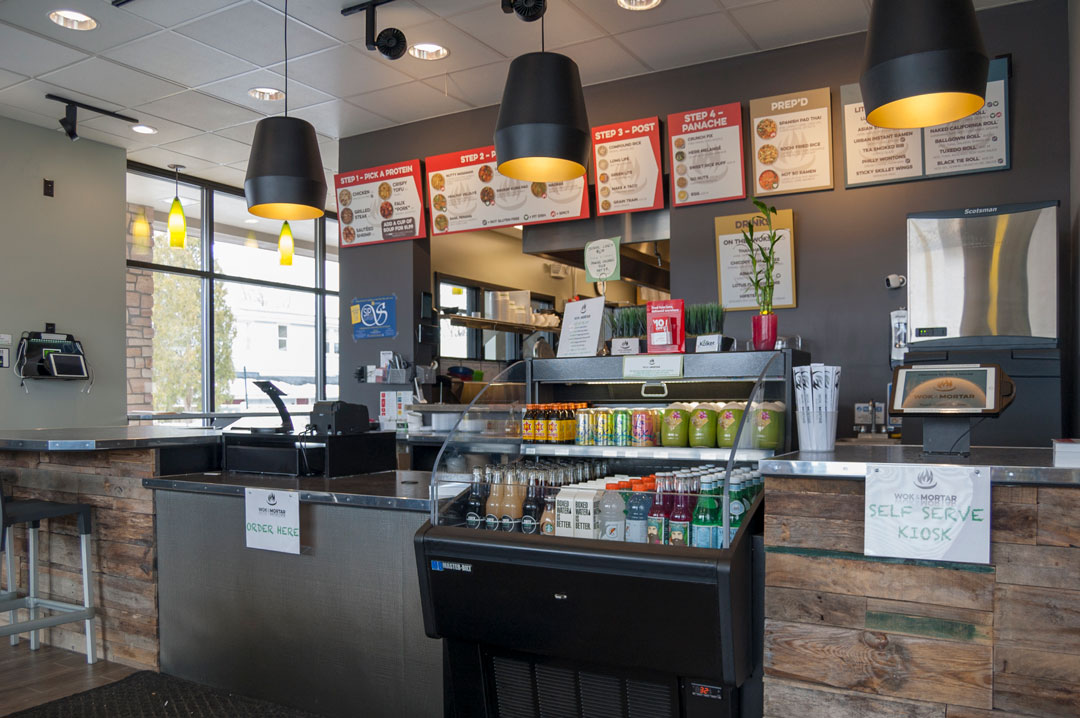
Large South and East facing windows provide the space with plenty of natural light, bringing out the natural tones of the wood.
r.o.i. Design met VaChong and Bobbiesee Ku, owners of Wok & Mortar, when we helped with the design of their Asian Fusion restaurant in Frankfort, MI. When they decided that they wanted to open a new restaurant in Grand Rapids, they called for our help again.
A Transformation
The space was previously occupied by a Biggby Coffee Shop. We set out to transform the space into a modern Asian restaurant with an updated urban vibe. The previous space was not a restaurant with a full-service commercial kitchen. So, it was a bit of a challenge to make the changeover. We brought in the help of Pinnacle Construction to manage the remodel. Great Lakes West Foodservice Equipment Service provided the kitchen equipment. In addition to interior design, we took on the role of “owner’s advocate”. We oversaw the entire remodeling project, from leasing the space to upgrading utilities, and finally to promote the grand opening.

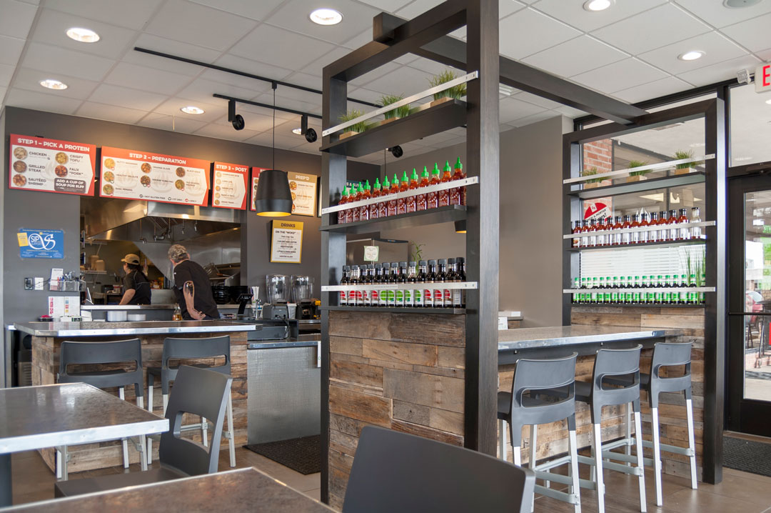
Communal Table and Order Counter. Customers can watch their meal being prepared in the large pass-through opening to the kitchen.
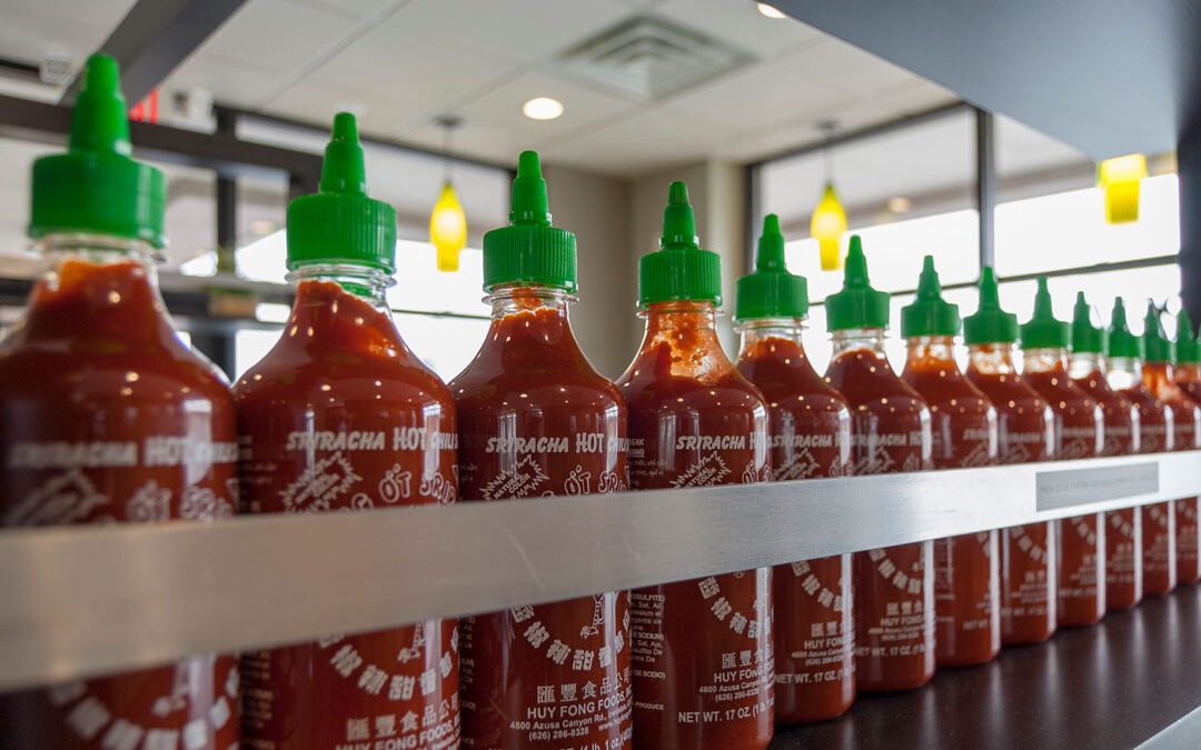
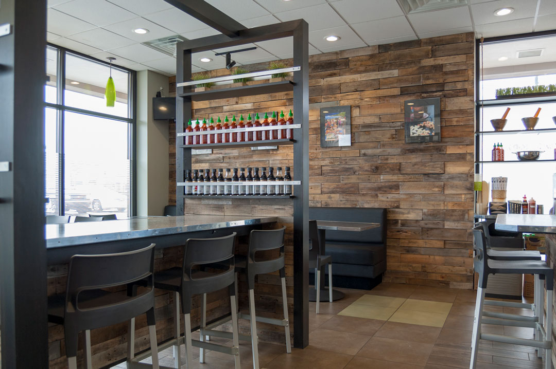
The interior features a wood wall made of reclaimed wood from shipping pallets. We also designed and had fabricated a custom communal table for the center of the space. It also features the reclaimed pallet wood, along with shelves to display the various sauces they offer for sale. The color palette consisted of mostly subdued grays. This allowed the wood features and graphic signage to stand out.

Reclaimed Pallet Wood Wall and Communal Table
Logo and Menu Design
r.o.i. Design was also asked by Wok & Mortar to design their logo. We went back and forth with a few concepts but finally landed on a design that incorporated the “W” and “M” from Wok & Mortar into flames over a wok. After that, we also designed the exterior sign, along with their menu boards and take-out menu.

Colorful menu boards allow customers to build their own dish. Orders can be placed using a self-serve kiosk or with the Wok & Mortar smartphone app.

The “W” and “M” from Wok & Mortar are incorporated into the flames in the wok for the restaurant’s logo.

by Ryan | Apr 18, 2018 | Design News
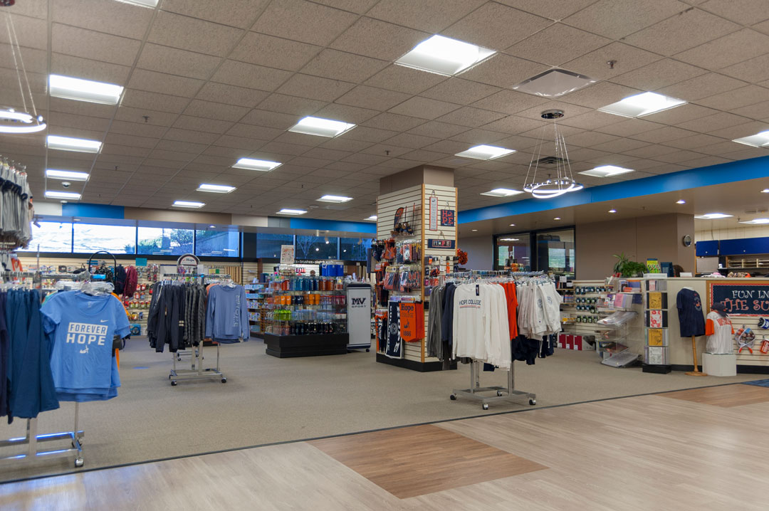
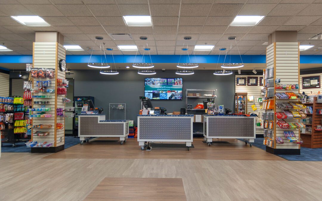
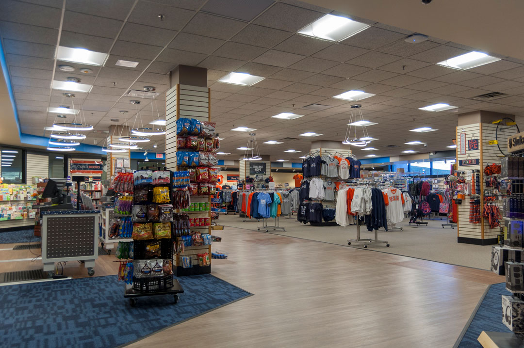
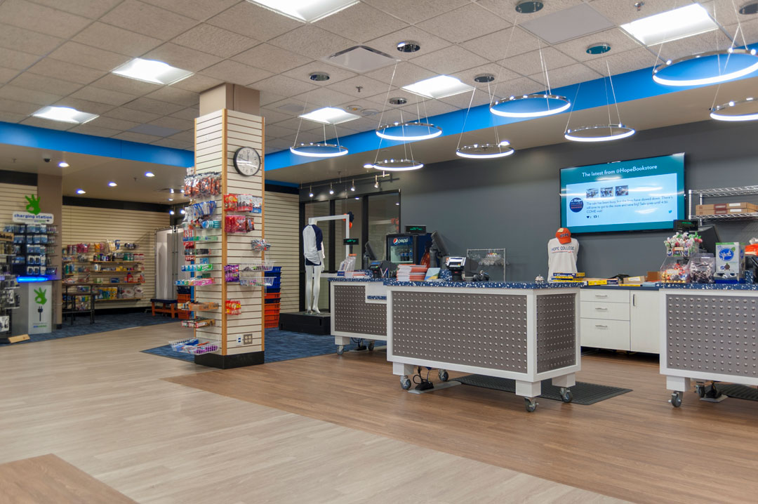
Hope College is committed to building community through retail. Their newly renovated bookstore is conveniently located next to the new Bultman Student Center on campus inside the DeWitt Cultural Center. When they learned that they were going to have a new neighbor three years ago, and their visibility to campus was going to be enhanced, they engaged r.o.i. Design to assist them in upgrading their appearance and “retail game”.

r.o.i. Design helped them rethink their store fixture plan and flow, designing a new cash out experience, and added color and texture to the space. The new Bultman Student Center construction took away 20% of the store floor space to allow for new connecting hallways between buildings, but through the wizardry of design, Hope College 2017-2018 returning customers thought the store got bigger!

The bookstore and their online store are the “go-to” spot for all things Hope College, from books to logowear. Learn more about the Hope College Bookstore website.
