(616) 459-3539
Notions Marketing is Working Smart
Notions Marketing is Working Smart

Notions Marketing is the World’s Largest Creative Arts Distributor.

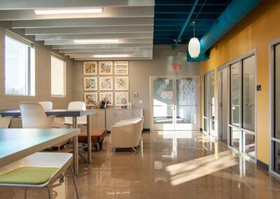
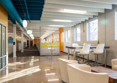
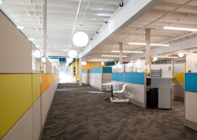
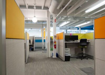
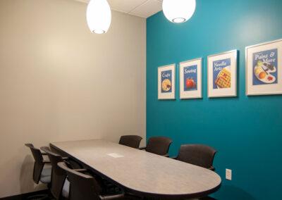
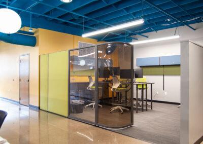
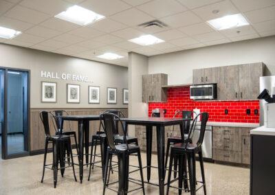
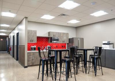
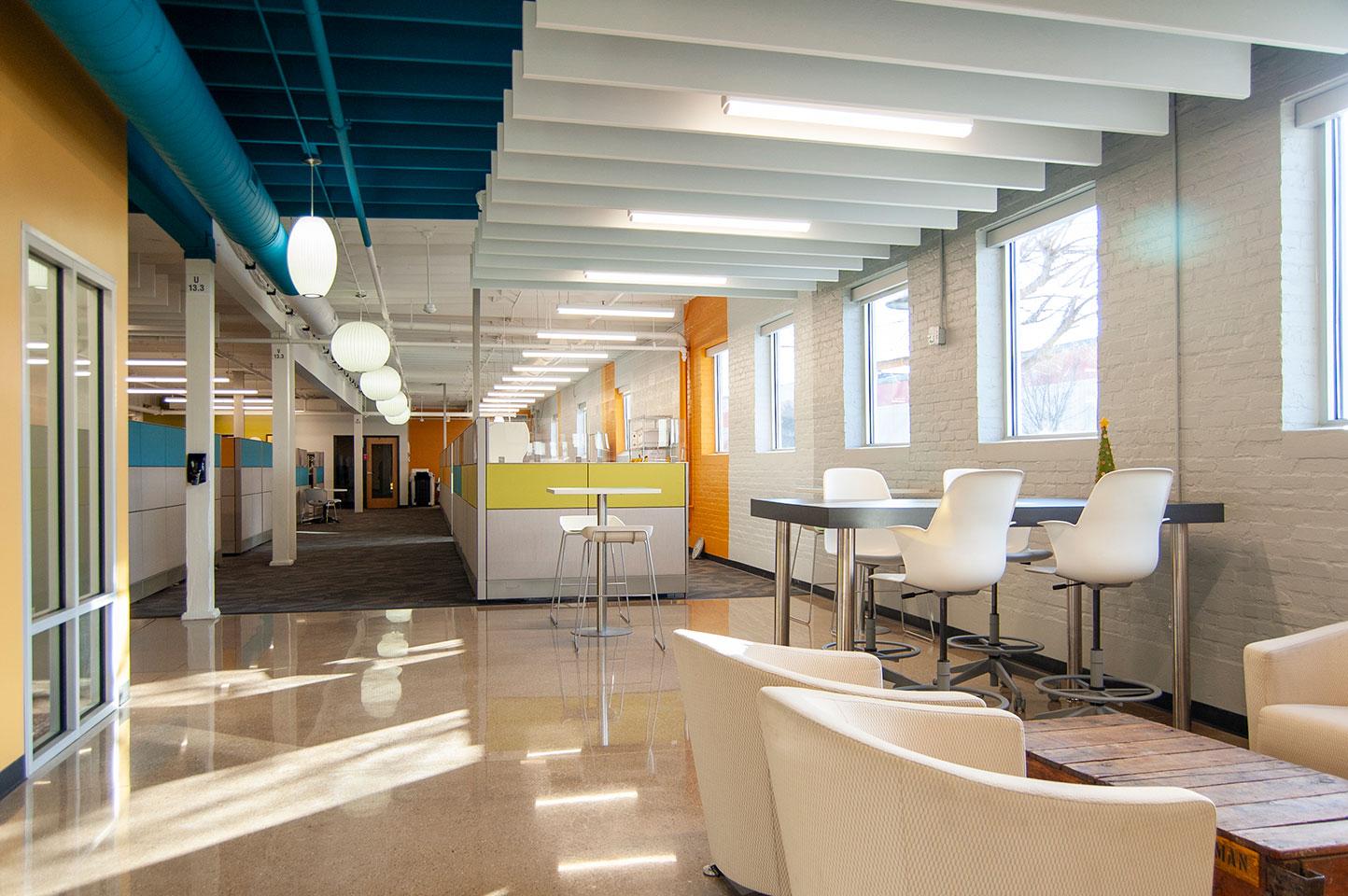
Creative customers understand innovation, and Notions Marketing inspired r.o.i. Design. We worked with them to create new administration offices within an existing distribution center. When the Notions Administration team began working from home in April 2020, Notions leaders saw an opportunity to achieve a long-term goal to bring all employees together to a single campus. The relocation of the Admin team also opened new opportunities for the broadening of cross-functional team collaboration and value creation.

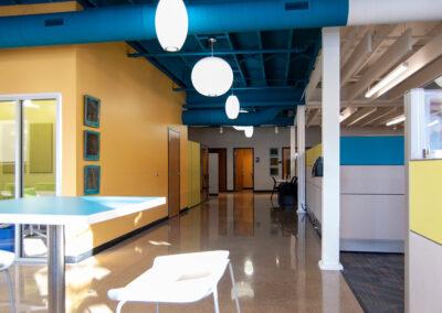
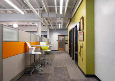
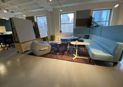
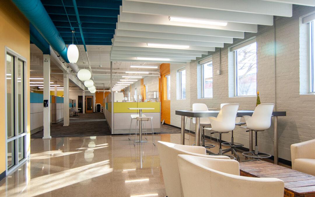
The vintage warehouse selected for the new office area had wood ceilings and joists, concrete floors as well as all exposed sprinkling, plumbing pipes, and electrical conduit. Working with Architectural Concepts, the space was planned for closed and open offices, as well as an area to receive vendors and customers.

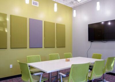
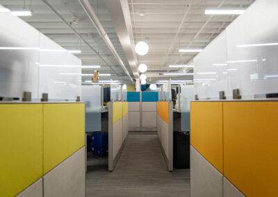
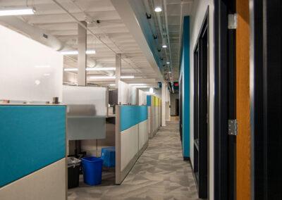
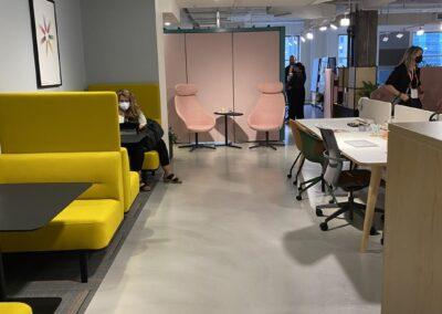
Working with their CEO and Dustin Brown, Director of Facilities & Risk Management, r.o.i. Design knew that the character and brand of this vibrant company had to be incorporated into the space. Elements that assisted with that look include Herman Miller mid-century pendant lights that were reclaimed from the former building, painting the existing wood ceiling, using linear lighting within the wood joists, adding white wood baffles under an accented blue ceiling, accenting walls with bold colors from their brand, and the reuse of some classic occasional furniture from their former offices. To help manage acoustics and to add to the overall interest, carpet tile patterns were added along with the use of reclaimed concrete floors.

“r.o.i. was an excellent partner for Notions through this process. Projects involving old buildings are never easy and r.o.i. continued to impress as they turned limitations to spot-on solutions. We are so excited to welcome our team back to this high-energy environment. As the how and where of work continues to evolve, we know we have a space and a partner in r.o.i. that will continue to adapt to what the business needs”, said Bobbie Medema, Notions’ CEO.

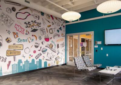
Notions owns a variety of art, collected over the years, that will also be used in this new space as a reminder of their foundation and love of the creative process. Notions also enlisted the help of talented internal creative team members to create a 22-foot-wide mural for the lobby that celebrates their neighborhood, their products, and their legacy.

Longtime friend and furniture vendor West Michigan Office Interiors worked with Notions to create furniture solutions for sales, finance, HR, merchandising, and creative team members. The new open office furnishings use several of their brand’s colors as accents in the systems.

With the oversite of Vander Kodde Construction, the project was completed in the Fall of 2021. We are pleased to have been on this notable team for this innovative customer.

Wilkast Moves into Its New Building

Wilkast Moves into Its New Building

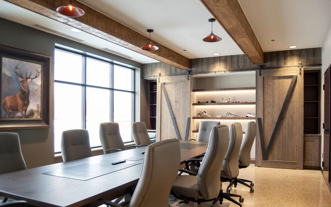
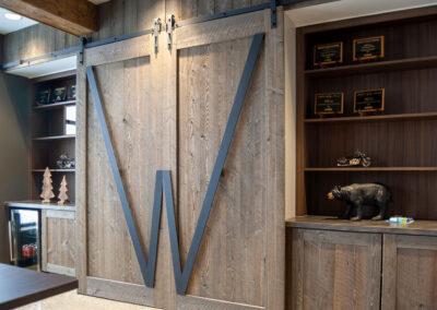
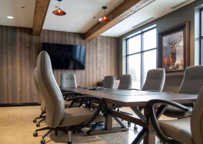
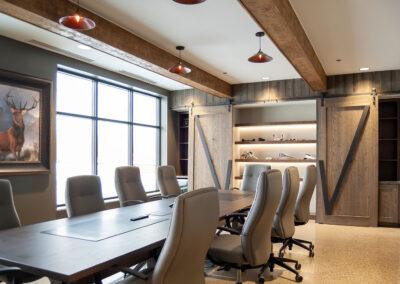
This world-class die casting company has created parts for the automotive and motorcycle industries since 1979. Tom and Kurt Wilkerson are the second generation of Wilkast owners and they saw the need for facility and tooling expansion to meet the growing demand for their services. 

First Companies introduced r.o.i. Design to the Wilkersons, and along with Dixon Architecture we were engaged to design a new building that would house the corporate office and expanded plant. 

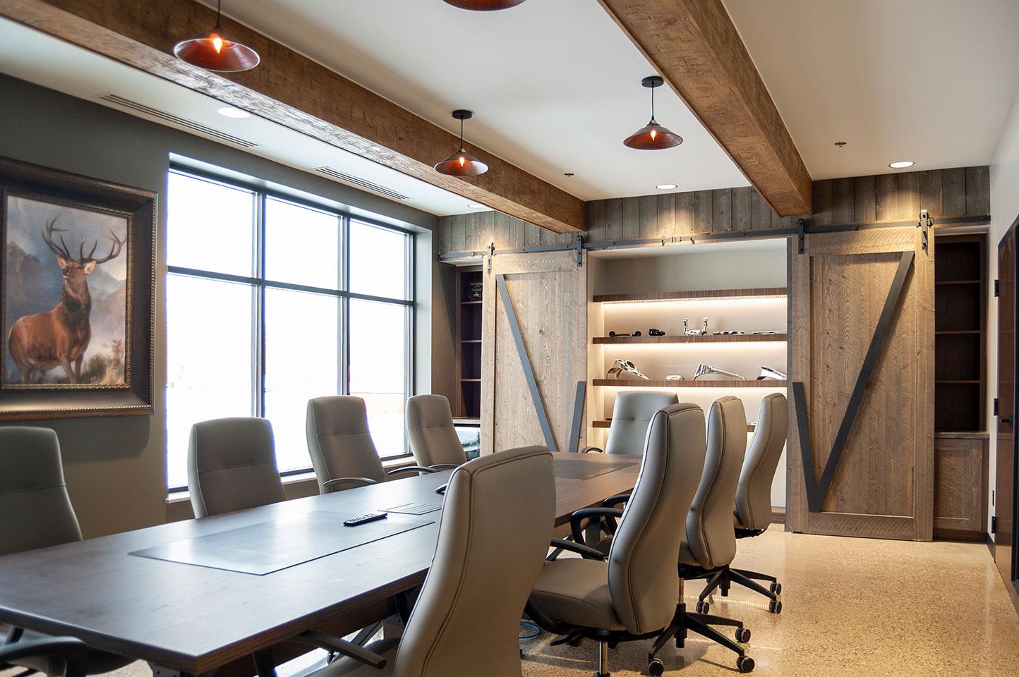
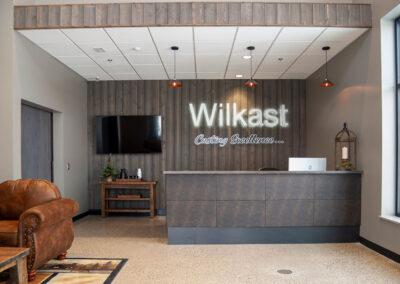
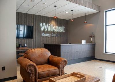
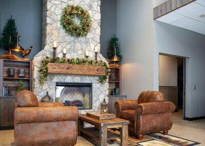
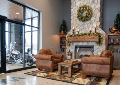
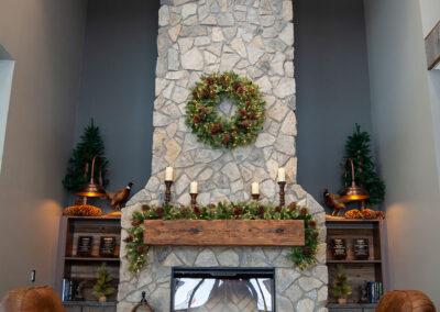
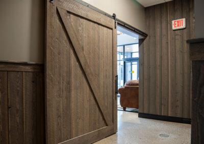
Like most manufacturers, their processes create dust and debris, so the offices had to be planned using materials that were durable and cleanable. To aid in the effort, the Wilkersons decided to borrow from a ranch-lodge style using rustic woods and natural stone throughout. The floors are all concrete and the corridors and conference rooms have wood panels. An elkhorn chandelier greets you in the lobby. The overall feel is very welcoming, and the shiny Harley Davidson in the vestibule is a nice touch. 

Click on the thumbnails below to view larger images.

© All Photos Courtesy of First Companies, Inc.

A New Home for the Midwest Miniatures Museum

A New Home for the Midwest Miniatures Museum

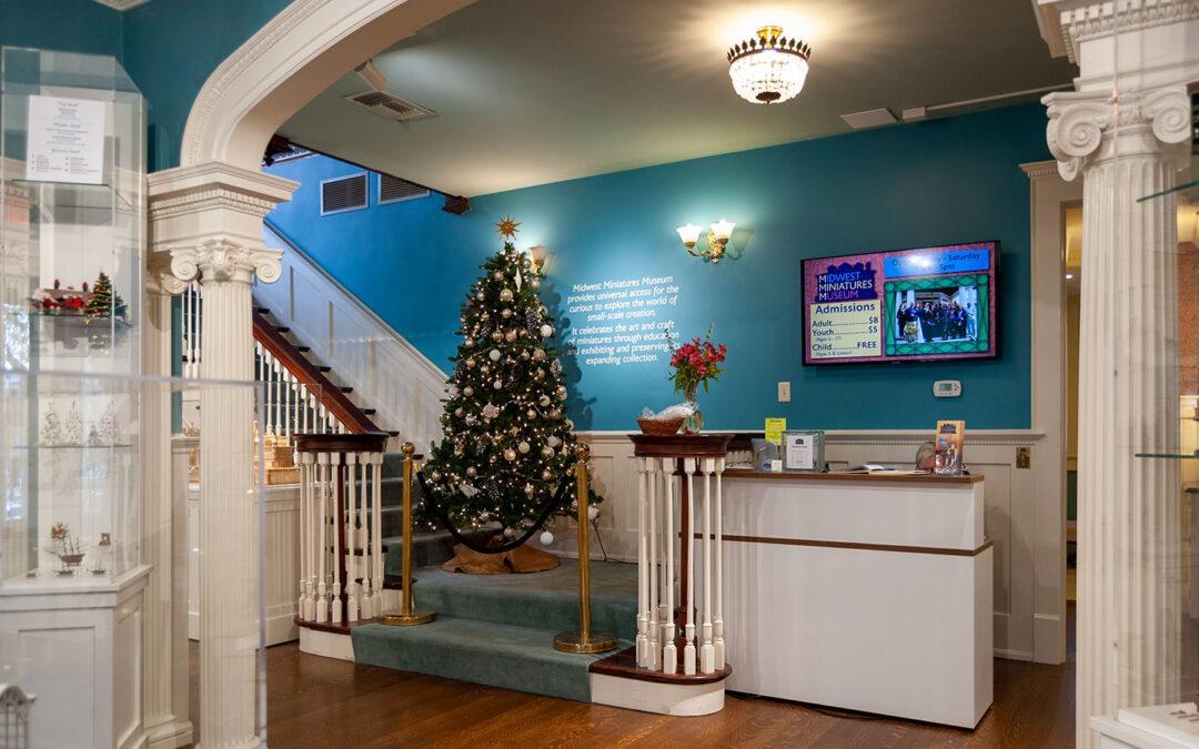
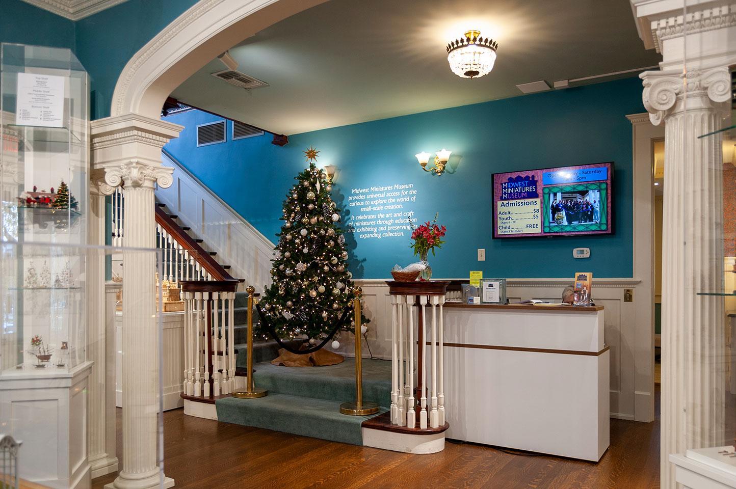
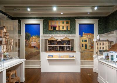
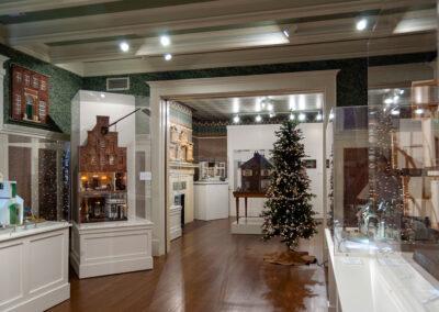
The Midwest Miniatures Museum held its Grand Re-Opening on Nov. 6th, 2021, in Grand Haven, Michigan.

Formerly located at Hickory Corners on the grounds of the Gilmore Car Museum, the Museum had been looking for a new location that was much more accessible and fitting in aesthetic to display their miniatures collections. After an extensive search, they were finally able to acquire the historic Nathaniel and Esther Robbins House in downtown Grand Haven.

r.o.i. Design was referred to the museum by independent museum consultant, Timothy J. Chester, and we were engaged in 2019 by the Museum’s director, Ina Whitney, to assist in the design of the first-floor exhibit. We visited the Hickory Corner location along with Ina and the Museum’s administrator, Hanna Steinman. We selected the items to be displayed and began the process of designing the exhibit.

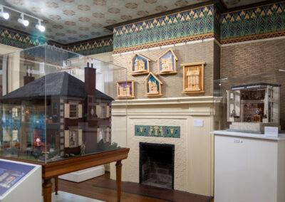
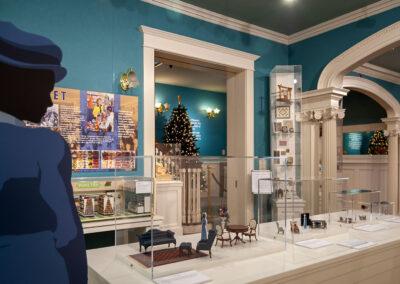
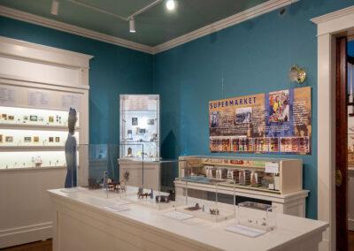
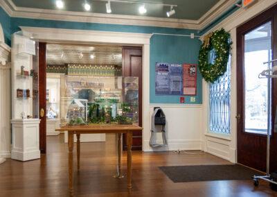
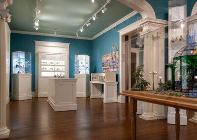
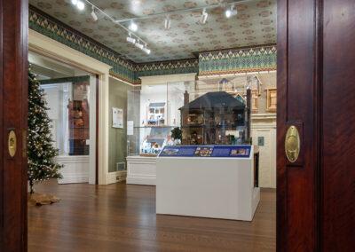
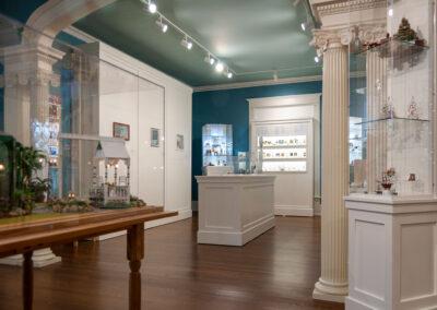
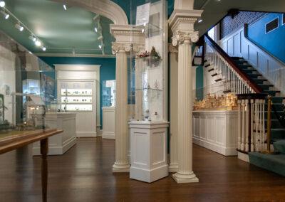
We designed new display cases and fixtures for the exhibits in a style imitating the interior trim of the home. In addition to supporting the curation of the exhibit, we also managed the execution. We engaged Bluewater Studio to create the exhibit fixtures, and their attention to detail and care for the artifacts made the project a success. We also added new gallery lighting to the historic home and worked with contractors on interior upgrades as needed.

The initial display shows some of the best of their collection from miniature rooms, complete miniature structures, a silver collection, miniature art, textiles, as well as displays of miniature toys, tableware, and so much more.

The museum is now planning for future phases and is engaged in fundraising to add an elevator and create more exhibits on the home’s 2nd and 3rd floors.

If you are in the Grand Haven area, you should plan a visit to the Midwest Miniatures Museum to see this unique collection.

Click on the thumbnails below to view larger images.

NeoCon Returns in 2021. Some of the Trends We Saw

NeoCon Returns in 2021. Some of the Trends We Saw

Scroll down to see photos from our visit. 

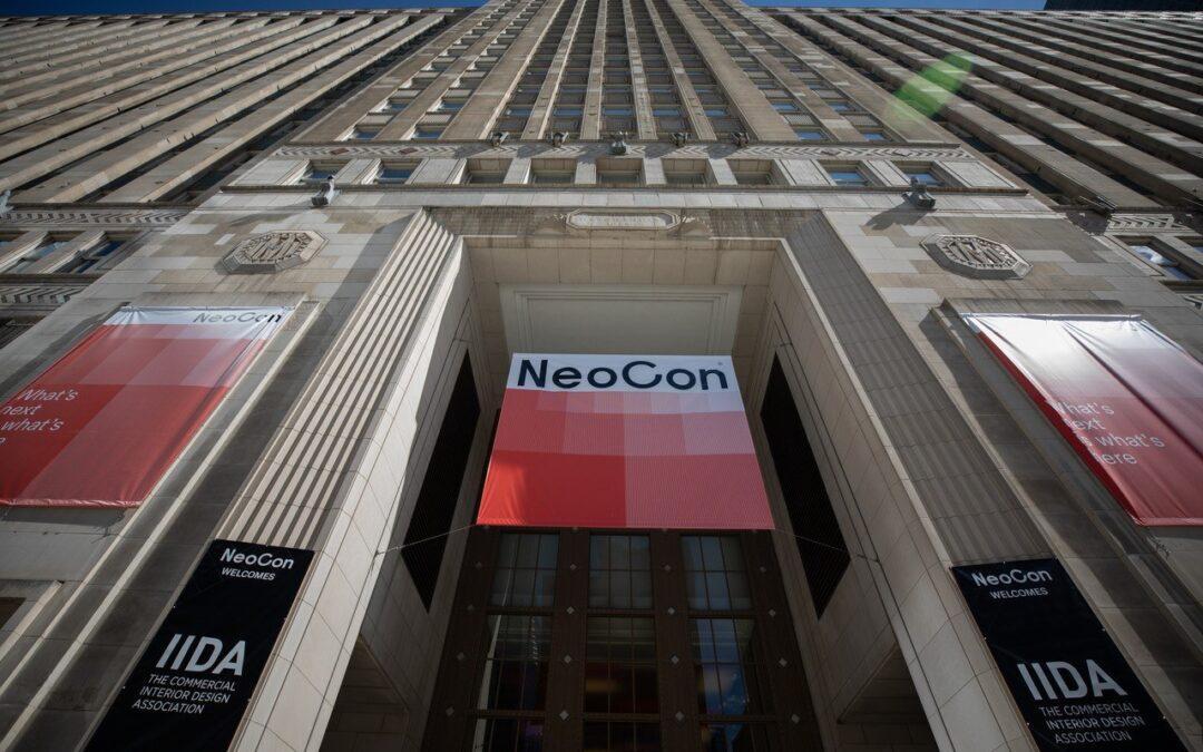
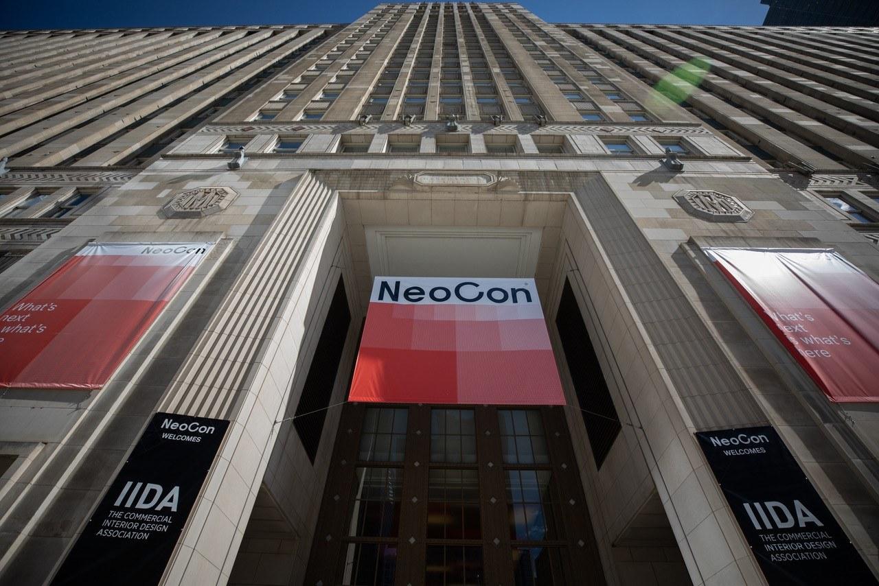
NeoCon was held this year at the Merchandise Mart in Chicago on October 4th – 6th. Normally the event is held during the second week of June but was postponed because of the pandemic. The 2020 NeoCon event was canceled altogether, but a virtual event was held online. This year, attendees needed to show proof of vaccination (or a negative COVID test), and masks needed to be worn in all indoor areas.

Attendance numbers were low and many of the showrooms were either closed or open only by reservation. This was due both to the pandemic and “off-season” of this year’s event. Hopefully, by next June, the show will return to normal.

While there were fewer attendees at the Mart, there was still plenty to see of the newest products from the commercial design industry. It’s always exciting to see the newest designs, innovations, and trends on display.

Some of the Trends We Saw

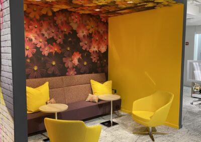
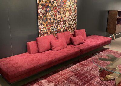
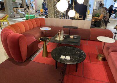
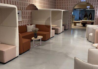
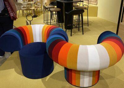
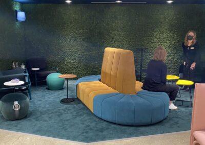
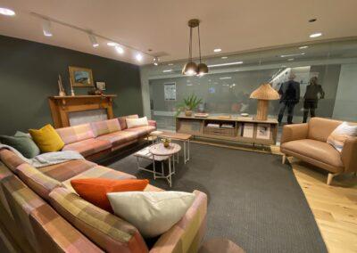
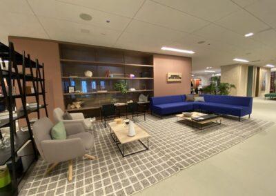
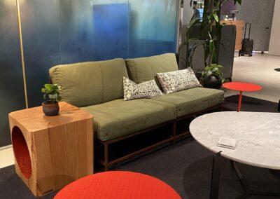
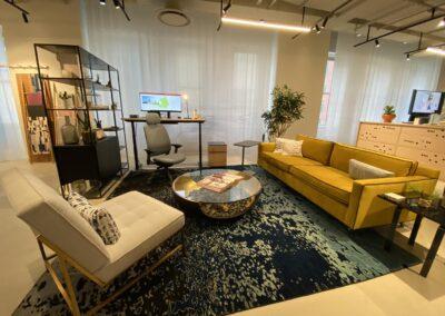
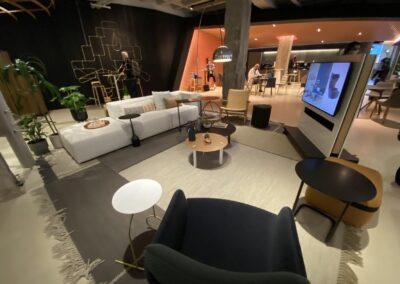
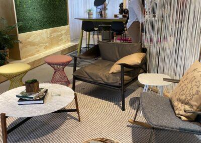
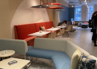
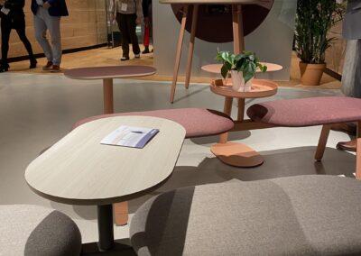
The future of the office wants to be “happy”, flexible and accommodating; there was a definite reference to the ’60s and ’70s in colors and textures and a sense of the eclectic was a welcome surprise.

Colors:

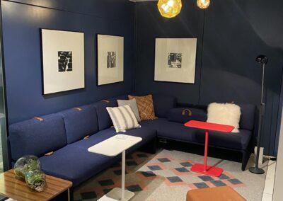
  • Much warmer colors and lots of soft colors. Pinks, corals, teals, yellows, and blues.
  • Sherwin Williams introduced their color of the year projecting we were going to love Evergreen Fog.
  • Benjamin Moore also introduces their Color of the Year 2022, October Mist.

Textures and Finishes

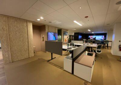
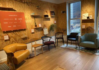
  • Lighter woods, including the casual use of OSB and plywood.
  • Felt was everywhere!
  • Lots of interesting wall dividers, screens, and room dividers using all kinds of materials.
  • Fabric folks were exploring retro patterns with lots of colors.

Products

  • Many mobile products were there as they try to accommodate changing work styles; carts, desks, even rooms.
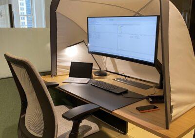
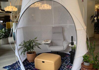
  • Many exhibitors have introduced small rooms that you can purchase, like a piece of furniture, to create spaces for employees to take private calls or have ZOOM meetings without bothering co-workers.
  • To deal with the spread of sound in an open office environment, there were acoustical wall panels and dividers, acoustical pendant lights, acoustical décor, and more.
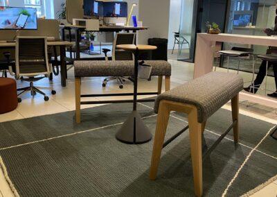
  • Carpet manufacturers have gone all out to be “clean” and “green” with recycled products. They are also exploring patterns and colors giving us the hope of more than 10 shades of gray.
  • The return of woven rattan (vinyl) in commercial seating is making a comeback.
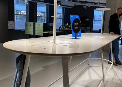
  • Technology and lighting impacted many designs. You can buy your conference table with built-in table lamps and ports for your phone and computer.
The Merchandise Mart had taken the time during the pandemic to update corridor finishes with new carpet, lighting, and wall accents. Most floors had their own particular look but in general, the lighting was greatly improved. This may have been in part because of the new exhibit space, Fulton Market, that is now competing for exhibitors and visitors. Herman Miller/Knoll has relocated their showroom to Fulton Market, a trendy location with an energetic urban vibe.
The world of design is alive at NeoCon and we were grateful to be a part of it.

Click on the thumbnails below to enlarge photos from our visit. 

Merl’s Towing Gets an Updated Façade

Merl’s Towing Gets an Updated Façade

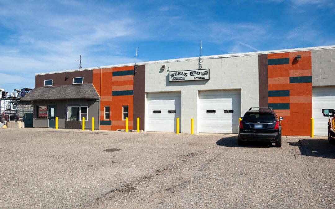
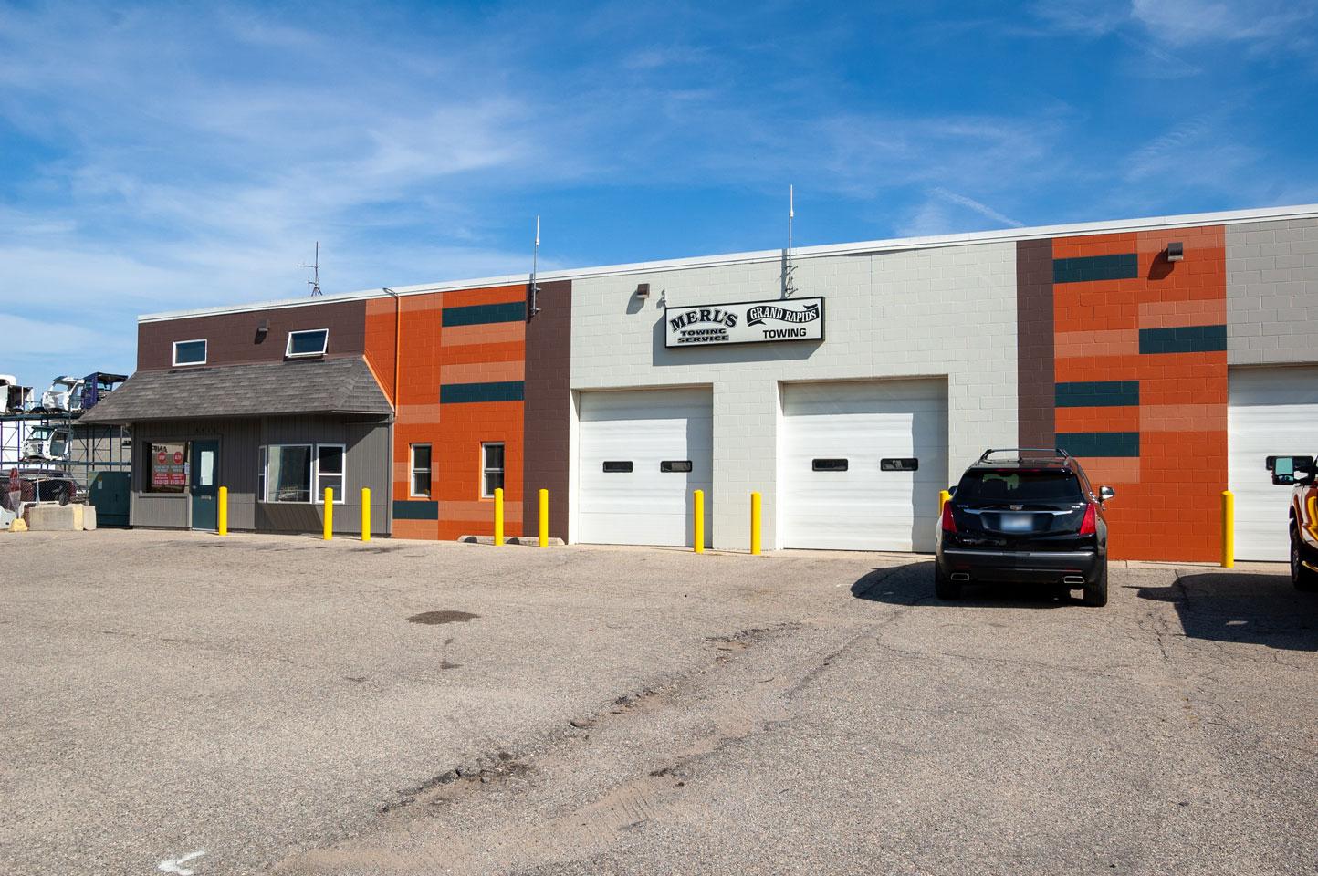
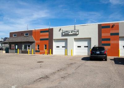
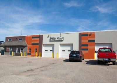
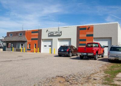
The owner of Merl’s Towing and Grand Rapids Towing, Dick Caster, is a long-time friend of r.o.i. Design. His late wife, Mary Jane Caster, was one of the founding members of r.o.i. Design. So, when he came to us needing help to dress up his business’s exterior, we were happy to help.

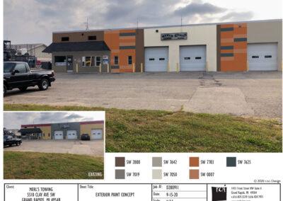
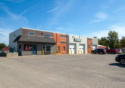
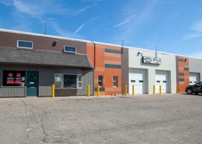
He did not want to spend too much money on the renovation, so the scope was limited to mostly repainting. We wanted to make the façade of the building look up-to-date and modern, but also have an element of fun. We produced a paint scheme that included vertical stripes with bold colors. Within the two orange stripes on the front, we also added some horizontal accents to break the pattern up.

We made a rendering in Photoshop so Dick could see what it would look like, and his painter could use it as a guide. The result was a success, and the building looks great!

Click on the thumbnails below to enlarge photos.