by Ryan | Aug 31, 2016 | Branding, Design News, Graphic Design, Interior Design, Retail Design
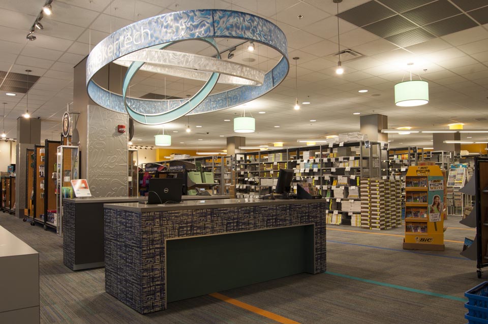
r.o.i. Design has been designing for retail for more than 20 years, but now that schools and universities have discovered their customers expect the same kinds of retail experiences on campus as they do in their communities, more than ever we find ourselves working for these institutions. On-campus stores are faced with new business challenges, and they have to be profitable in a time of change.
Products:
 Unlike what the doomsayers predicted five years ago, books are still being sold in campus bookstores. But online competitors and used book providers continue to eat away at that business. Incoming freshman graduated from high schools where there were textbooks, and professors are still writing and using textbooks, so until those two trends change, there will be books in campus stores.
So the savvy campus stores are looking at other products and services that will eventually eclipse book sales. Leading categories today appear to be technology & communication (equipment and their repair), fashion & apparel, campus services (printing, product rentals, grocery, HBA, etc.) and entertainment (food service, movies and more).
Layout & Aesthetics:
 Whether it is a gift shop, a concession stand, a book store, a copy center or a hotel, all these on-campus environments are being compared to their off-campus competitors. Very few students or staff are confined to campus for discretionary shopping.
While convenient, most outdated retail experiences on campus are seeing reduced sales.
Key retail design elements include lighting, store layout and merchandising, wayfinding and signage, and intuitive, easy check-out experiences. Store displays have to be clear and fresh.
Service:
Perhaps more difficult to change than product mix or store layout is the store culture and service attitude provided by staff. An institution that has previously considered all customer interface as administrative is now looking at how to change employee mind-sets. The new overall need for staff to be more flexible is paramount; to be open to work different hours, to work different jobs and to continue to be open to change. HR attitudes has further challenged some on-campus stores profitability.
The more on-campus stores can employ students and work to develop structures that hire and train students, the more successful their retailing will be.
This type of service situation (not just found in campus retail but in all retailers) motivated r.o.i. Design to start a consulting arm of their business where they work with teams to support these kinds of changes. See Accelerate ROI.
Marketing and Promotion:
Successful stores have independent marketing agendas and strategies, separate from the institution and marketing to the institution. Sometimes this means changes in staffing so there are resources internally available to support this effort.
Students need reminders of retail locations and what is being sold at those locations, continually. Social media and crowd-sourcing for marketing is undeniably the best tool to use on college campuses.
by Ryan | Aug 31, 2016 | Design News, Designing Public Areas, Interior Design, Restaurant Design, Retail Design
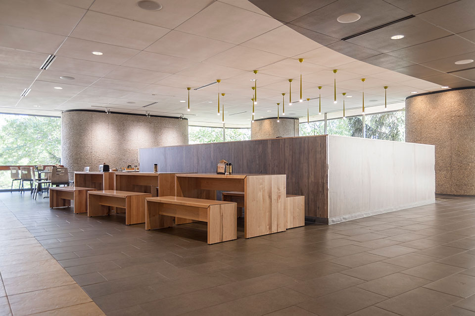
GVSU’s original “cafeteria” was built more than 40 years ago and is still the largest food service facility on campus. It feeds a lot of people but needed to respond to the changing campus and its customers. More seating capacity at Fresh Food Co. and upgraded finishes meant planning for a 2016 summer remodel.
r.o.i. Design, who also designed the GVSU Laker Store in 2014 and its adjacent food court, was engaged by the University through Preferred Construction to create the design.
Einstein Bros. Bagels was moved out to a different location giving the Commons a fourth dining room.
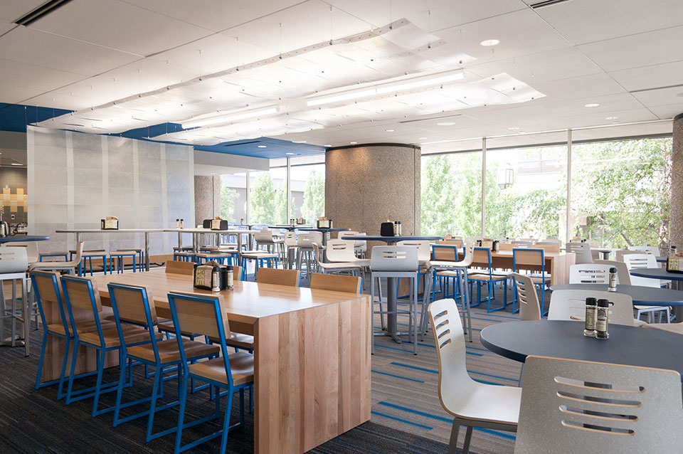 The design team, which included Campus Dining, GVSU Facilities, Preferred Construction and r.o.i. Design, looked at the trends in college dining and the recent building projects on campus along with their customer’s preferences to create a design criteria that could be executed within the budget and timeline.
“GVSU has more than 25,000 students and commensurate staff, so a lot of food service customers who have a variety of preferences. In order to create options in dining, it was agreed that the four rooms would each have a unique feeling so guests could have different experiences within the same facility. We agreed to organize the room designs around four ideas, one per room: water, earth, fire and wind,” says Mary Witte, President of r.o.i. Design. “The dining rooms already had some features that lent themselves to these notions, so we were able to build on what was already there and create something intentional and fun.”
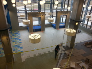
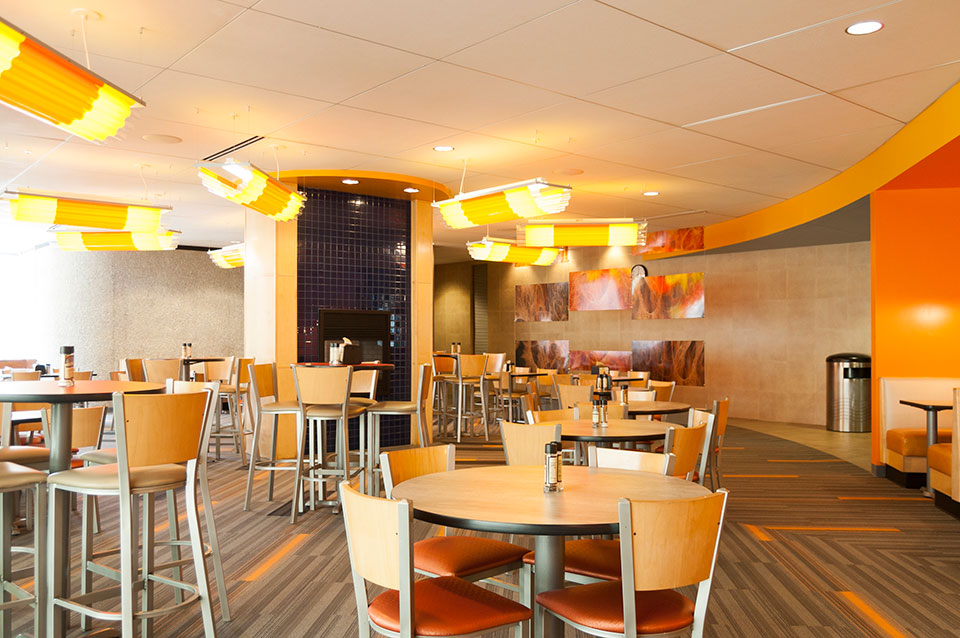 Each room received new flooring, new lighting, new millwork features, new paint accents and new furnishings that aligned with the “theme” of the room.
“Community Tables” were added to allow for larger groups to gather. Custom lighting enhanced the distinct look of each room.
The food line was enhanced with new equipment to allow Campus Dining the option to offer more variety in their menu.
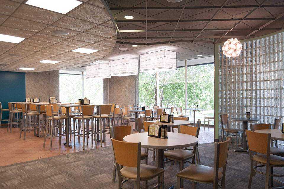 r.o.i. Design’s initial observations of customer’s response to the remodel has been very satisfying and we are proud that our design contributions met the goals of the Fresh Food Co. at The Commons at GVSU.

by Mary | Sep 6, 2015 | Construction, Hospitality Design, Interior Design, Restaurant Design, Retail Design

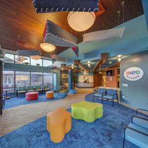
Northern Michigan Pediatric Dentistry. A design build team- r.o.i. Design was the interior designer.
Who is the design team?
The building architect, interior designer, site engineer, landscape architect, structural engineer, civil engineer, casegood designer, furniture designer, and art consultant all make up the design team.
Construction managers are dealing with a variety of team types:
One Stop Shopping
Large architect and engineering firms who offer “one stop shopping”, everything in one company, linear accountability. Convenient but not always transparent. When a design team has a bundle of work with a contractor, it is easier for the GM to negotiate changes since they are funneling a quantity of work to a firm.

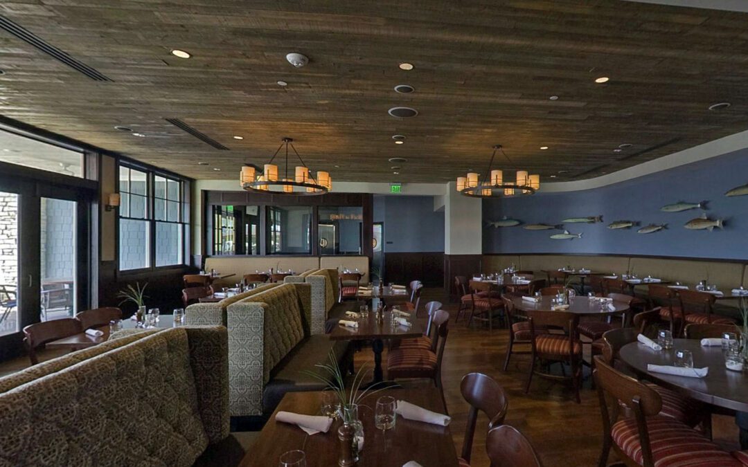
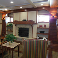
The Inn at Harbor Shores, r.o.i. Design was recommended by contractor as an industry specialist.
Industry Specialist
A key player (designer or architect) who offers unique experience in a construction type: charter schools, national retail chains, senior care, mid-scale hotels, higher education, specialty medical, etc. , who recommends a group of independents they or the contractor manages to fill out the roster of all the professional design requirements.

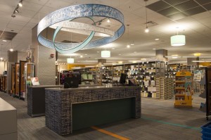
GVSU Laker Store, a customer directed design team. r.o.i. Design worked as planners and interior designers.
Customer Team
When there are pre-existing relationships that have to be managed and the contractor works with the customer to fill out the professional needs of the project with a variety of firms.
Design-Build
The “design-build” team is assembled by the contractor and the customer directs all design criteria to the contractor who then works with their choice of professionals to support planning, produce design, architecture, engineering and all it’s documentation.
So what is the ideal “design team”? It’s the one that works best for the project.
Experienced construction professionals understand that they can’t have just one process that will deliver the design on all their projects (unless the contractor only works with one building type). Experienced construction professionals know they have to have a variety of firms in their contact list and stay informed of changes in those firms, understanding their emerging strengths and successes on new projects.
##
r.o.i. Design works on several teams and team types. We understand the “R’s”: rates, relationships and relevance. We see successful design companies prosper when they can collaborate and adjust to changing criteria. We also see the importance of the construction manager who realizes the need for customers to be connected to the design process and their designers, and still be sure their budget and timeline are prioritized.

by Mary | Sep 6, 2015 | Construction, Design News, Designing Public Areas, Hospitality Design, Retail Design
Recently, r.o.i. Design was at a bid opening and after hearing the bids for Division 09, it was clear to all that something was “up”. We all are seeing a steady increase in the percentage of costs spent in finishes in projects.
r.o.i. Design has been able to balance budgets by applying specialty finishes with discretion in key areas and working with contractors on the design as a whole, before a project goes to bid. Managing customer expectations at the design phase is key in order to deliver the interior the customer requires.
Some of the areas to watch for creeping costs include:
Hard surface flooring

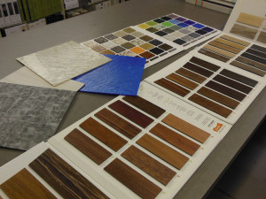
LVT is available in a wide selection of colors and patterns, including those that mimic wood and stone.
The old stand by – vinyl composite tile (VCT) – which is affordable at install, but adds cost
every year in maintenance, is loosing ground to other composites that don’t have that ongoing expense. There are VET (vinyl enhanced tiles) and LVT (luxury vinyl tiles) whose retail square foot costs are a minimum of $1 more than VCT.
A larger portion of the flooring in projects are receiving hard surfaces verses carpet.
The love for finished concrete isn’t necessarily a budget saver and it’s popularity has demanded more skilled trades in adapting concrete in order to be considered a finished floor.
Wall panels and specialty wall treatments

Molded cork wall coverings by Murrato
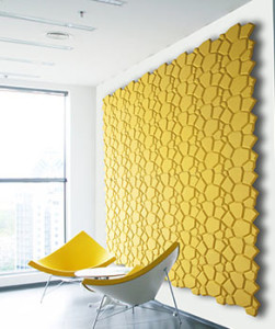
Wall covering manufacturers have been busy coming up with new materials and designs that are gaining interest. r.o.i. Design doesn’t believe we will ever see projects where 100% of the walls are covered with wall covering as was prevalent in the 90’s, but do see a percentage of the walls being given “special” treatment.
Custom wall covering and panel products are becoming more affordable allowing customers to create “branded” and proprietary looks to their interiors. Part of that customization means the finish category is fulfilling more of the signage requirements of a building.
Ceilings
 Changes in technology have advanced product design and improved product performance. But the first wave of those innovations come at a higher price. The cycle of new product introduction is more robust, and increased competition will start to impact costs on trendy finishes in a positive direction.

by Ryan | Apr 2, 2015 | Branding, Design News, Designing Public Areas, Graphic Design, Retail Design
 Grand Valley State University
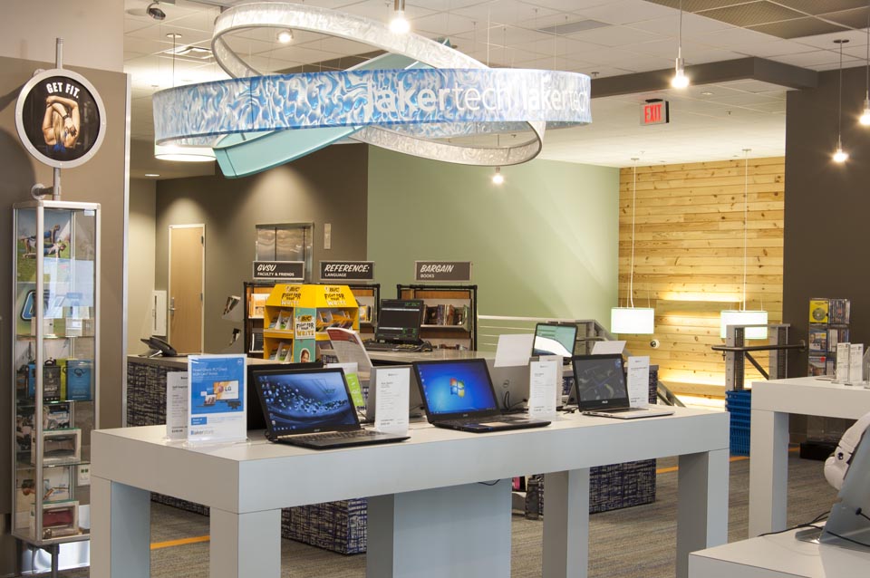
The new 40,000 SF marketplace retail facility at the Allendale campus of Grand Valley State University will be open to students this month.
The planning of the store started in 2012 when the University Book Store team researched other university stores to see the trends in campus retail. We weren’t surprised to learn:
 Books are no longer the big seller. If students haven’t converted to electronic books, they probably are shopping online for the best price for used books. The name of the store is now officially GVSU Laker Store, no more “book” store.
- Food and technology are part of the experience. At GVSU Laker Store there will be a department where students can purchase hardware and software for most of their technology needs. Adjacent to the store, outside the door, Starbucks and Which Wich are ready to capture the shoppers on their arrival and exits.
- They are competing with off campus retail experiences for fashion and active wear. For GVSU Laker Store that means competing with product mix, service and store design. That’s where r.o.i. Design comes in.
 As part of the Fishbeck Thompson Carr & Huber (FTC&H) design team, we worked with the store staff, GVSU facility managers and FTC&H to come up with a competitive experience. The criteria for design was to create a space that resonates with the student experience of “making unique choices”. We want the student to recognize themselves in some elements or parts of the store through the variety of finishes and graphics. We wanted them to take ownership and be proud of their school store. “Lakers for Life”.
Some of our favorite parts of the design:
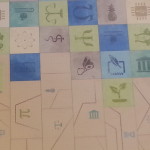
 Custom tile: using the universal symbols for academic departments, we created a mosaic of color to indicate all choices of study and types of students were welcome here.
- Media Display: In the taller part of the store, 9 screens create a large display that can either show one large image or up to 9 individual images. The plan is to show real time GVSU athletic games and musical performances while students and their family shop.
- Custom graphics: using the letters G, V, S and U, we created a “cloud” type graphic using different fonts and colors again to represent that the GVSU experience is as diverse as its community and highly connected through technology.
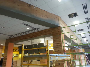
- The Laker Wave: the two story volume holds over 250 translucent blades of cloth that together attempt to create the image of moving water. The gesture of the blades texture the interior but also impact the look of the exterior as they are seen through the wall of curtain glass.
 Reclaimed wood: throughout the interior and exterior there is reclaimed wood siding. The internal staircase in the store is a friendly combination of wood, color and light.
- Color: (Photo) challenging the campus standards of GVSU blue and white, GVSU Laker Store is vibrant as it reflects the many colors of the fashion shown in the store.

by Mary | Nov 19, 2014 | Design News, Graphic Design, Interior Design, Project Management, Retail Design
 We often get the question, “r.o.i. Design, what is that about?”
We explain that we believe the execution and build out of the design will bring a return on their investment. Said another way, the fees paid to us come back to our customer through their company’s improved efficiency, improved team performance, improved recognition, etc.
Probably one of the best of testimonials we got was from Lori Terpstra, owner of Rylee’s ACE, after the opening of her store on the corner of Michigan and Fuller in Grand Rapids, MI. She sent us a card that read, “From picking colors, laying out departments and designing our graphics, we certainly felt the ROI of r.o.i. Design.”
Some might say that we build an ROI by creating an interior design that reflects our customers brand while being sensitive to budgets. Some might say we build an ROI by adding services and expertise to our firm in addition to interior design where our customers are looking for solutions.
 We have been including graphic design as one of our services for more than 10 years. It became clear, especially for our developer customers, that one-stop-shopping to create a brand, an interior, a logo, and a message was key to their success in conceptual development of their projects. When we are working with our customers on projects, we develop a relationship with them and if we do our job right, we understand their needs and have the opportunity to serve them in many ways, including graphic design and signage design. Ryan Bright, our Creative Executive, graduate of Kendall College of Art and Design and senior member of our team, has been serving our interior design customer graphic design needs since we added the service to our list.
Sharon Fisher, owner of Apothecary Gift Shop in Holland MI
We designed the store interior when it was Model Drug Store and Apothecary Gift Shop. Ryan developed the logos for both identities and worked with the sign companies to create the signage in the store. Recently Sharon sold the “Drug Store” part of her business and needed to redesign the exterior of the store to read just “Apothecary Gift Shop”. We were happy to work with her to create new awnings and signage for the exterior and interior. The store still looks great and is one of our favorite spots to shop for gifts.
Jor dan Hoyer of The Law Office of Jordan C. Hoyer
We did the interiors of Jordan’s office in the Trust Building in downtown Grand Rapids. We also created her logo, developed her website and created a half page ad that she ran in the Grand Rapids Business Journal, ArtPrize edition. Jordan claims that so many law firms have horrible websites and branding and she feels that with Ryan’s and r.o.i. Design’s help, she is getting a lasting return on investment.
 We focus on selling our time. But a long time ago, we saw the difficulty some of our customers were having staying within budgets with product procurement. Either they didn’t have the staffing time or expertise,and when they did, they were often paying for too many layers of distribution. We have offered a return on investment to several customers by finding the right manufacturers for the right job and tracking the purchasing and receiving process.
 Meadow Brook Medical Care Facility in Bellaire, MI
This group is just finishing the 4th phase of a complete remodel and expansion of their facility. They knew on the onset that they didn’t have the time or experience to set budgets, solicit bids and negotiate prices to stay in budgets. We became their purchasing department for two years. Like most jobs of six figures or more, up to ten percent of product can be a disappointment, either by quality or service. David Schultz, the point person of the facility, had the ability to focus on the positive and help us help them work through the glitches.
The Inn at Harbor Shores in St. Joseph, MI
Edgewater Resources, a fairly new development group with several marina developments on their boards realized half way through construction that they wouldn’t be able to manage procurement without adding staff. The construction group, Lamar Construction, recommended us to help them be their staff with the selection, bidding and purchasing of FFE. Again, no huge purchasing project is without flaws, but this group worked with us as we had some items reworked, rehung and corrected. Thanks Michael Woods for your support!

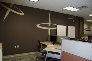
Spin Dance Offices with Tops
To create unique spaces, sometimes that means custom decorations. We have never been afraid to offer to get the custom decor made and installed in order to keep the design intact. Sometimes we can actually make it in our little shop and sometimes we can manage all the parts and pieces and assemble it.
 Van Wingen and Mandeville in Traverse City, MI
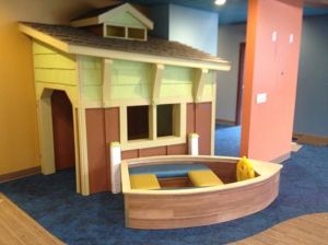
Rockford Construction engaged us to design this pediatric dental office where they see 40 children an hour! Their lobby had to accommodate and engage kids from ages two and up. We had a vision to create an office that had three themes; water, land and sky. We wanted to “float” felt boats in the lobby to help with acoustics and everyone looked at us puzzled. “We will make ’em,” we said. And that led to us making a boat house and boat for the lobby.
The Millenia Companies in Cleveland, OH
One of their properties in Clinton Township had just been remodeled and they were looking for a group to come in and add wall art, occasional furniture and floor plants. They wanted the final step of decor to feel local. We said, “We can do that!” We researched images of the Detroit area and their local environs and came up with a package that they said “fit the bill”.
So how we provide a return on investment is based on our holistic approach to getting a design interior to be the best that it can be. And if we can do more than interiors, we are all in.
r.o.i. Design provides a return on your design investment and creates lasting customer experiences.
We are a creative team who leads the process of collaborative planning and design
Our methods and problem solving skills produce outcomes that are based on budget, brand and beauty.


 Unlike what the doomsayers predicted five years ago, books are still being sold in campus bookstores. But online competitors and used book providers continue to eat away at that business. Incoming freshman graduated from high schools where there were textbooks, and professors are still writing and using textbooks, so until those two trends change, there will be books in campus stores.
 Whether it is a gift shop, a concession stand, a book store, a copy center or a hotel, all these on-campus environments are being compared to their off-campus competitors. Very few students or staff are confined to campus for discretionary shopping.

 The design team, which included Campus Dining, GVSU Facilities, Preferred Construction and r.o.i. Design, looked at the trends in college dining and the recent building projects on campus along with their customer’s preferences to create a design criteria that could be executed within the budget and timeline.
 Each room received new flooring, new lighting, new millwork features, new paint accents and new furnishings that aligned with the “theme” of the room.
 r.o.i. Design’s initial observations of customer’s response to the remodel has been very satisfying and we are proud that our design contributions met the goals of the Fresh Food Co. at The Commons at GVSU.