by Mary | Apr 30, 2014 | Design News, Interior Design
 10 FREE Design Tips:
- The least expensive changes you can make that still gives you a “bang for the buck”: paint and lighting.
- The reclaimed wood look will peak this year, but still be specified for the next five to six years.
- To look your best, freshen the lobby (entry)
- Exterior finishes are going darker.
- Interior finishes are going lighter.
- Quartz is the new granite.
- The use of graphics in interiors is growing.
- Favorite wood finishes are still dark but watch out, the light tones will come back soon.
- Metal and stainless finishes are not going anywhere.
Today, information and inspiration is a “click” away. We can “Google ” perfect paint scheme and be given ga-zillions of options for paint perfection. You want affordable office furniture? The internet will direct you to so many sites that you start to not value any of them. ( A couple of pages we follow include: designophy.com, designmilk.com, designntrend.com )
But what is the best advice r.o.i. Design can give you?
- Understand your goals for a design and make sure the changes you make in your business, school or home are going to help you meet those goals.
Asking the right questions and helping focus our customers on what’s important is equally valuable as picking the right color. So when you hire a designer, please expect more than aesthetics. You get what you pay for.

by Mary | Apr 25, 2014 | Church Design, Design News, Interior Design, Project Management

Completed Renovation
 The Burpo family experienced a miracle that resulted in the book and now the movie, “Heaven is for Real”.
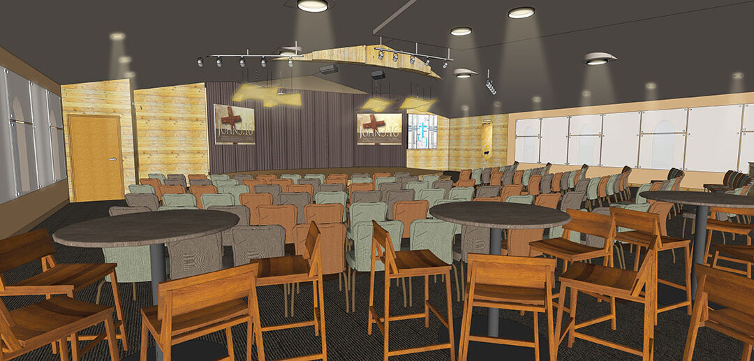
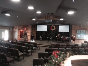
That miracle is bringing a lot of attention to the Crossroads Wesleyan Church in Imperial, Nebraska. (heavenisforreal.net) Anticipating a new wave of attention, Pastor Todd Burpo and Executive Pastor Phil Harris, knew this opportunity meant updating their sanctuary to make sure it was a very welcoming place. A few years ago, they had expanded the church’s footprint with a large multiple purpose room, additional offices and classrooms because their ministry required those spaces. But now the vintage pews and dated lighting had to go; their story and their ministry was far more dynamic than their worship space.
Design became real. (more…)

by Mary | Sep 30, 2013 | Design News, Exhibit Design, Interior Design, Project Management
In 2012, a friend of r.o.i. Design, Tim Chester, introduced us to the Grand Valley State University’s development office project- the Bill Seidman Timeline.

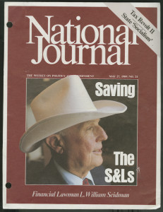
Bill Seidman on the Cover of the “National Journal” 1990
GVSU has had a busy year, with the opening the new library (Mary Idema Pew Learning Commons) on the Allendale campus, and the L. William Seidman Center (School of Business) in downtown Grand Rapids.
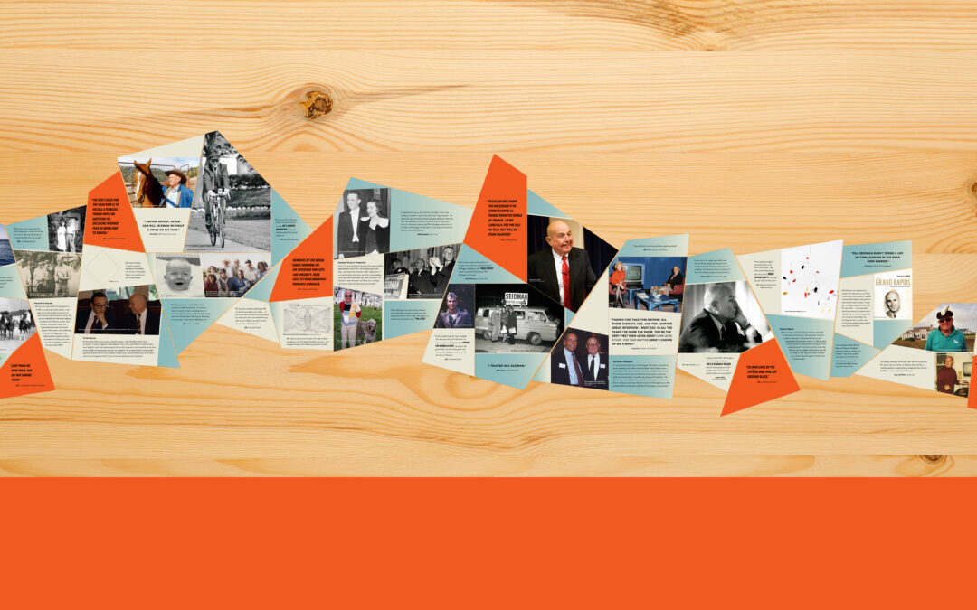
As part of the L. William Seidman Center’s presentation, a prominent 20 feet section of wall space in the lounge was dedicated to honor the life and achievements of Bill Seidman. While GVSU has thousands of curated works of art, a complete in-house marketing department, expert public relations and communication experts, their experience in creating a museum quality exhibit was more limited than they were comfortable with for this important assignment.

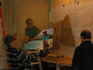
Larry Hutchinson, center, Mary Witte, left, September 23, 2013
r.o.i. Design, Mary Witte, was hired to manage the process of hiring the designer, managing scope, budget and timeline. Through this process r.o.i. was very pleased to meet Larry Hutchinson, Hutchinson Studio, who designed the exhibit, (casework and graphics) and (along with r.o.i.) researched the content.
To support the process, r.o.i.’s Ryan Bright provided graphic design for the media presentation that Springthrough (local media and marketing company) compiled to create a multimedia touchscreen experience.
Visitors can learn more about the exhibit, scroll through a timeline of Bill’s life, and watch vide0s of Bill speaking.
Pioneer Construction, who built the L. William Seidman Center building, built the casegoods that house the exhibit.
(more…)

by Mary | Aug 7, 2013 | Design News, Interior Design

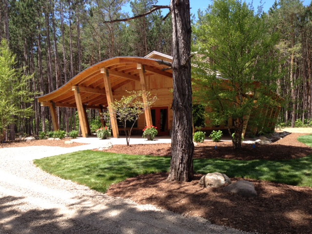
In 2011, we received a call from Gaylord, MI. Scott and Janice Lampert had purchased property in their hometown and wanted to create a landmark spot on the site.
“We have been so blessed by the land, we wanted to give back to the land” , reported Lampert. “This site is so amazing in its intimate northern Michigan way that we wanted to make it available to today’s recreational and educational user.”
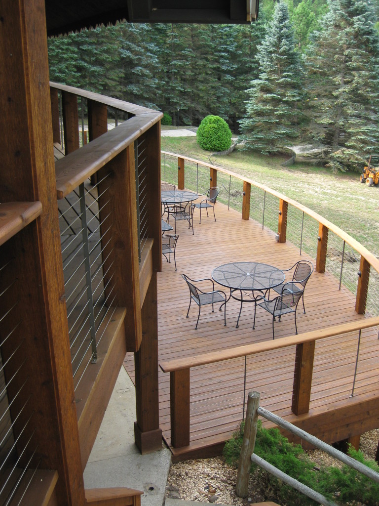
Very influenced by retreat centers, spas and boutique resorts they have visited, the goal was to create a resort that would compete on the highest level for aesthetics and experience. “There is definitely a spiritual side to this place,” Janice Lampert explained. “Partly because of its history and the hundreds of visitors who came to this spot since the 1950’s, but by far, it is the soul of the land and nature that lives here that gives it it’s spirit”. (more…)

 10 FREE Design Tips:
