by Mary | Sep 6, 2015 | Construction, Design News, Designing Public Areas, Hospitality Design, Retail Design
Recently, r.o.i. Design was at a bid opening and after hearing the bids for Division 09, it was clear to all that something was “up”. We all are seeing a steady increase in the percentage of costs spent in finishes in projects.
r.o.i. Design has been able to balance budgets by applying specialty finishes with discretion in key areas and working with contractors on the design as a whole, before a project goes to bid. Managing customer expectations at the design phase is key in order to deliver the interior the customer requires.
Some of the areas to watch for creeping costs include:
Hard surface flooring
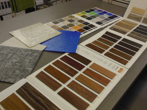
LVT is available in a wide selection of colors and patterns, including those that mimic wood and stone.
The old stand by – vinyl composite tile (VCT) – which is affordable at install, but adds cost
every year in maintenance, is loosing ground to other composites that don’t have that ongoing expense. There are VET (vinyl enhanced tiles) and LVT (luxury vinyl tiles) whose retail square foot costs are a minimum of $1 more than VCT.
A larger portion of the flooring in projects are receiving hard surfaces verses carpet.
The love for finished concrete isn’t necessarily a budget saver and it’s popularity has demanded more skilled trades in adapting concrete in order to be considered a finished floor.
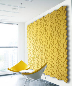
Wall panels and specialty wall treatments

Molded cork wall coverings by Murrato
Wall covering manufacturers have been busy coming up with new materials and designs that are gaining interest. r.o.i. Design doesn’t believe we will ever see projects where 100% of the walls are covered with wall covering as was prevalent in the 90’s, but do see a percentage of the walls being given “special” treatment.
Custom wall covering and panel products are becoming more affordable allowing customers to create “branded” and proprietary looks to their interiors. Part of that customization means the finish category is fulfilling more of the signage requirements of a building.
Ceilings
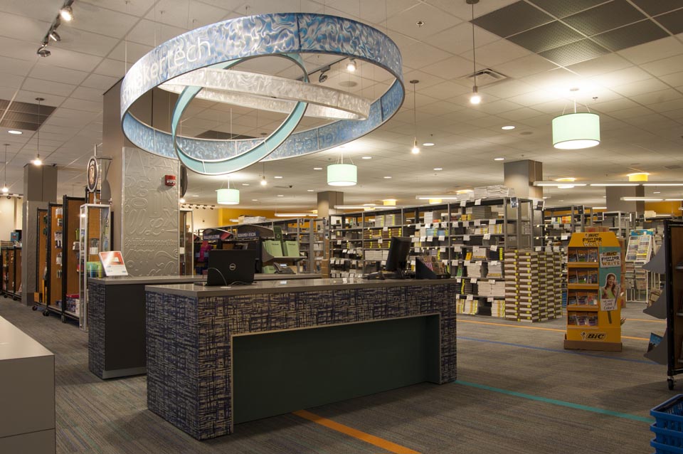
 Changes in technology have advanced product design and improved product performance. But the first wave of those innovations come at a higher price. The cycle of new product introduction is more robust, and increased competition will start to impact costs on trendy finishes in a positive direction.

by Ryan | Apr 2, 2015 | Branding, Design News, Designing Public Areas, Graphic Design, Retail Design
 Grand Valley State University
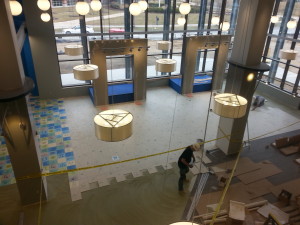
The new 40,000 SF marketplace retail facility at the Allendale campus of Grand Valley State University will be open to students this month.
The planning of the store started in 2012 when the University Book Store team researched other university stores to see the trends in campus retail. We weren’t surprised to learn:
 Books are no longer the big seller. If students haven’t converted to electronic books, they probably are shopping online for the best price for used books. The name of the store is now officially GVSU Laker Store, no more “book” store.
- Food and technology are part of the experience. At GVSU Laker Store there will be a department where students can purchase hardware and software for most of their technology needs. Adjacent to the store, outside the door, Starbucks and Which Wich are ready to capture the shoppers on their arrival and exits.
- They are competing with off campus retail experiences for fashion and active wear. For GVSU Laker Store that means competing with product mix, service and store design. That’s where r.o.i. Design comes in.
 As part of the Fishbeck Thompson Carr & Huber (FTC&H) design team, we worked with the store staff, GVSU facility managers and FTC&H to come up with a competitive experience. The criteria for design was to create a space that resonates with the student experience of “making unique choices”. We want the student to recognize themselves in some elements or parts of the store through the variety of finishes and graphics. We wanted them to take ownership and be proud of their school store. “Lakers for Life”.
Some of our favorite parts of the design:
 Custom tile: using the universal symbols for academic departments, we created a mosaic of color to indicate all choices of study and types of students were welcome here.
- Media Display: In the taller part of the store, 9 screens create a large display that can either show one large image or up to 9 individual images. The plan is to show real time GVSU athletic games and musical performances while students and their family shop.
- Custom graphics: using the letters G, V, S and U, we created a “cloud” type graphic using different fonts and colors again to represent that the GVSU experience is as diverse as its community and highly connected through technology.
- The Laker Wave: the two story volume holds over 250 translucent blades of cloth that together attempt to create the image of moving water. The gesture of the blades texture the interior but also impact the look of the exterior as they are seen through the wall of curtain glass.
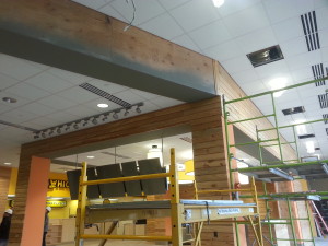
 Reclaimed wood: throughout the interior and exterior there is reclaimed wood siding. The internal staircase in the store is a friendly combination of wood, color and light.
- Color: (Photo) challenging the campus standards of GVSU blue and white, GVSU Laker Store is vibrant as it reflects the many colors of the fashion shown in the store.

by Ryan | Dec 8, 2014 | Church Design, Designing Public Areas, Interior Design, Project Management
Schools, churches, foundations and other non-profit organizations need design as much as ‘for profit’ companies. But there is a difference:
- Non-profits are making legacy decisions; what they do in their organization has an impact beyond current staff tenure.
- They typically have to raise funds for a project alongside designing the project.
- The process in design and project management is slighting more “hands on”.
- And it always involves processing information with a larger group of people, i.e. a committee and volunteers.

We worked with non profit Colossian Forum to design their new offices.
r.o.i. Design has experienced some methods and processes that are very helpful when working with non-profit organizations.
1. Helping the customer “see” designs
Most of the time the representatives of an organization are not experienced in developing designs, planning buildings or remodeling. Their only frame of reference might be their own home improvements. That means it is important to use as many visual tools as possible to describe designs and process; tours of other facilities, photos of other facilities and renderings of concepts prior to hard lining a design.
2. Managing expectations
All jobs start with the budget, but in these cases it is even more critical. Design professionals have to understand the resources available before designing begins.
The organization needs to understand the included steps to design. Laying out an overall schedule is helpful as well as establishing a habit of creating meeting minutes.
Technology is making sharing files much easier so information can be updated in real time.

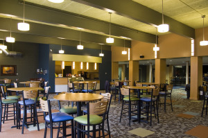
Cafe at Life Stream Church in Allendale, MI
3. Advocacy
It is not uncommon for design professionals to act as facilitators and advocates for their clients as the design is priced and bids start coming in. Being able to maintain design intent and still meet budgets is crucial. A group of people from the organization was charged with executing work and have shared their excitement and ideas with the broader group. Being able to help them “deliver” on that promise is part of the job.
4. Philanthropy
Building trust between the organization and the design team is a necessary element to working with non-profits. That may require some above and beyond involvement or participation in their activities.
Demonstrating an understanding of giving and how it furthers the mission of the organization establishes a common ground. A building or remodeling project is an opportunity to get people involved and teach others the lessons of philanthropy.
r.o.i. Design has had several non-profits as customers, including Grand Valley State University, Meadow Brook Medical Care Facility, Grand Rapids Child Discovery Center, Spring Hill Camp, Colossian Forum, Grandvue Medical Care Facility, Theological Book Network and Wesleyan Conference West Michigan.
We have been pleased to work for several churches, including Life Stream (Allendale, MI), Crossroads Wesleyan (Imperial, Nebraska), Kentwood Community (Wyoming, MI), Hope Reformed (Holland, MI) and Sonrise (Ft. Wayne, IN).

by Mary | Oct 1, 2014 | Design News, Designing Public Areas, Home Design, Interior Design

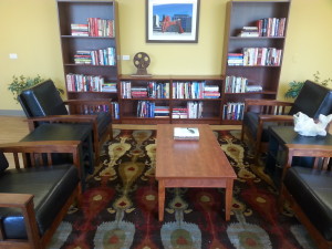
Stuyvesant Apartments Library Lounge
Our friends Hooker DeJong Architects and Engineers have referred us for a variety of projects in hospitality in the past, including Double JJ Ranch and Resort and Meadow Brook Medical Care Facility. So when their apartment developer clients asked them if they knew anyone who could work with them to finish the design and decor in their common areas, we were pleased that they thought of us. Projects of this caliber all have a requirement to offer a computer room, a community room, a laundry room, an exercise or activity room and a library. We have been very impressed with the facilities that we have been working with and are seeing these types of facilities being more and more interested in creating a community within their building.
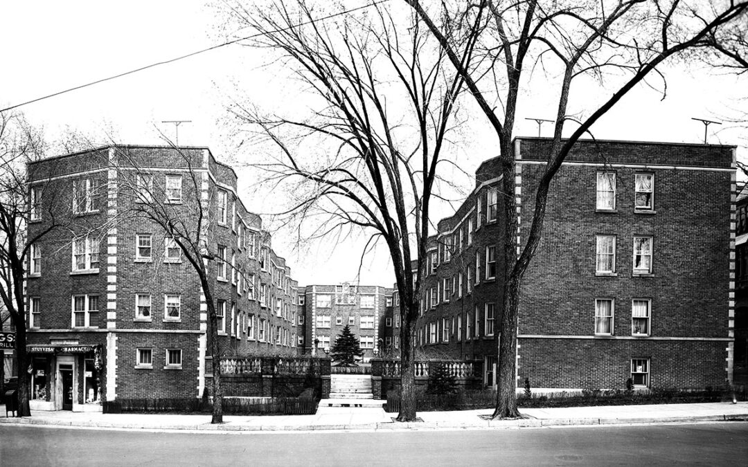
Stuyvesant Apartments in Grand Rapids MI
Hooker DeJong and Wolverine Building Group.
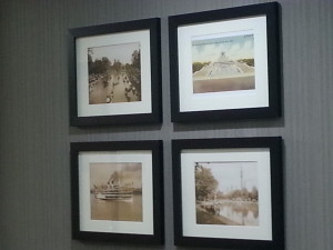
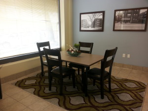
Because of the historical nature of this project, it had the additional criteria of having historically-inspired decor. We were asked to use vintage photographs, which we researched through the collections at the Grand Rapids Public Library. Other decor consisted of a West Michigan theme, ranging from manufacturing to recreation.

Elevator Lobby Art of Belle Isle at St. George Tower
St. George Towers in Clinton Township, MI
Hooker DeJong and The Millennia Companies
This complete renovation is a wow! As we worked through selecting art and accessories, we sensed the pride the residents and the management had in this project. We enjoyed hearing comments from the residents who followed us around as we hung art and staged areas who looked over our shoulders and said, “I remember that place!” “That’s the Tech Center on Mound Rd? Sure looks different today!”

Lobby of Stuyvesant Apartments with Historic Photos of Site

by Mary | Oct 1, 2014 | Design News, Designing for Kids, Designing Public Areas
Drs. Jamie VanWingen and Matt Mandeville of Northern Michigan Pediatric Dentistry typically will see up to 20 patients per hour and most of them are under the age of five.

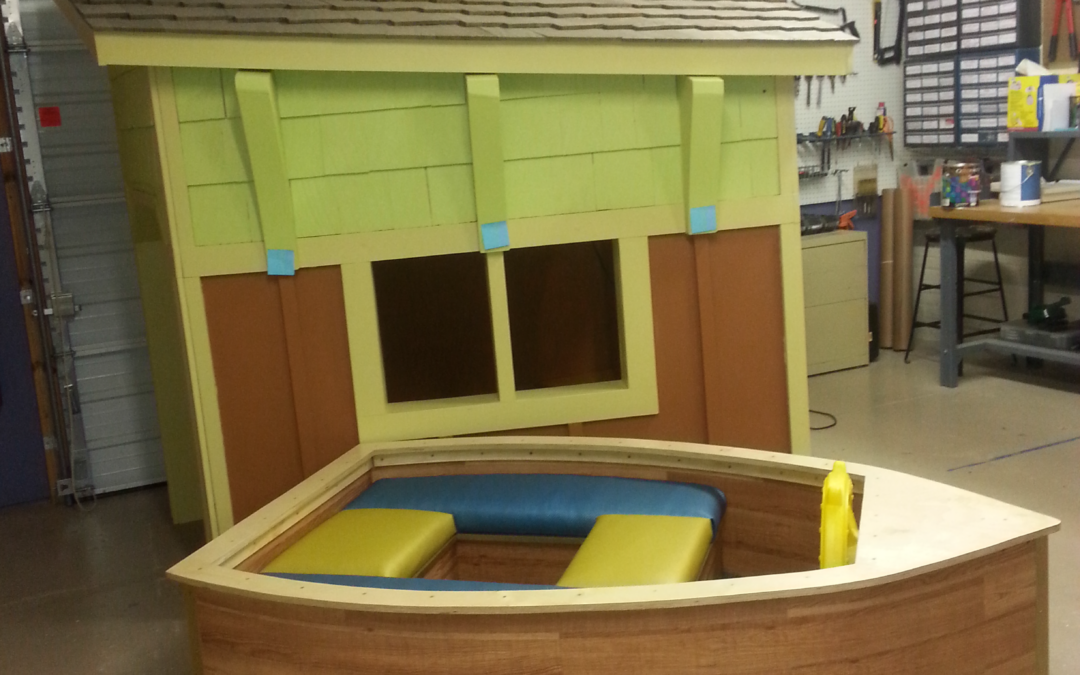
The lobby playhouse and boat, “USS Tooth Ferry”
They’ve been planning for growth, and to meet their changing needs, engaged Rockford Construction to work with them to remodel a building on 8th Street in Traverse City, MI. Bob Cornwell of Cornwell Architects was asked to work with them to create a space plan. Last spring we were contacted by Josh Reynolds of Rockford Construction to inquire if we had experience with designing for kids and if we would give him a bid for the interiors of this project. We showed them our work with children’s museums, day care centers, schools and theme parks and they invited us “to play”.
Mary and Mary Jane from r.o.i. Design worked with Drs. Jamie and Matt to come up with an interior that reflected their outgoing nature and love of adventure and travel.

The Lobby will have hanging felt boats, radiating beams, and a boat house.
Part of the design criteria given to us was to design interesting flooring patterns and interesting ceilings. The doctors also wanted to get away from the literal kid-mural type of interiors and instead work with blocks of color and graphics so the space would appeal to both kids and families.It was also important to ensure staff wasn’t exhausted by working in a space that was so visually busy.
The new office is designed around three areas; Water, Land and Sky. The interior finishes reflect those themes in a colorful way. The completion date is scheduled for November 2014. For more about what we did on this job see our blog story “There is a Boathouse in the Warehouse”.

The corridor through the “Land” theme.

Inset stone path in the vinyl flooring in the “Land” theme

Welcome to the “Sky”. Hanging clouds will be suspended over the dental chairs

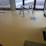
Inset star shapes in the “Sky” theme


 Changes in technology have advanced product design and improved product performance. But the first wave of those innovations come at a higher price. The cycle of new product introduction is more robust, and increased competition will start to impact costs on trendy finishes in a positive direction.
