by Ryan | May 26, 2015 | Design News
Branding comes in many forms, but its purpose is that of establishing identity, being noticed and then being recognized again. Your company may offer the exact same service or product as another, but what sets you apart from them is your unique identity as described by your brand.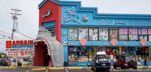
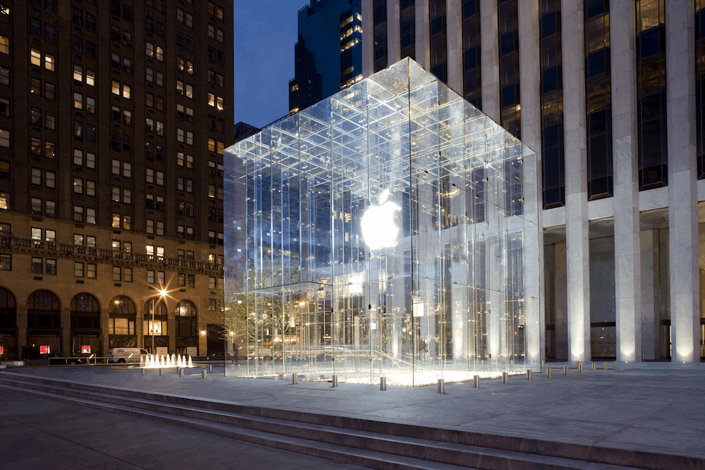
Branding a building’s exterior is critical for retail facilities.
- It has to set you apart from your competitors.
- It should make you easy to recognize.
- It reinforces your brand which creates credibility.
Recognition helps gets customers through your door, but a shopper’s decision to seek out a brand and purchase a product is very influenced by the visceral experience of the brand.
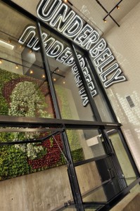 A few important things we consider when a client needs their retail store exterior branded:
- Do they have an identifiable store name that has a connection to the rest of the brand?
- Are there visual trademark-Secondary brand “marks” can be very stimulating and make you more memorable. This is in addition to or supportive of your logo.
- Does the curb appeal and store front reflect the brand-For an unmistakable store front there’s a lot of room to get creative, but the goal is to turn the heads that weren’t looking, to affirm your returning customers about your brand and to guide those that were looking.
- Are we using materials and finishes that relate to the brand in some way? If we are working with an organic food store, have we made selections that support “organic?”
The role of exterior branding is to compliment your marketing with the same consistency in message and brand promise that you offer your clients or customers in all other areas.
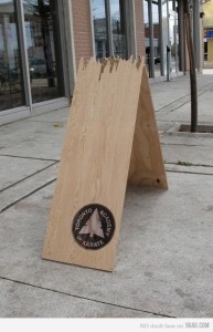 Consistency in all things visual suggests that your company will be consistent in quality and service. With the majority of human decision making based on emotion it stands to reason that a brand’s consistency is a major influence on customer trust. Trust means repeat customers.
At r.o.i. Design we can help you with exterior branding no matter how small or large the steps you want or need to take may be. We’ve been through it ourselves with our own identity and understand the importance of maintaining customer trust.
by Ryan | Apr 2, 2015 | Design News
And It’s Montessori!
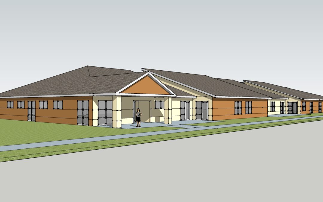
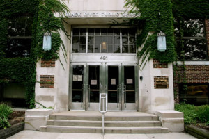 It’s an exciting time when a school knows they can retire the portable classrooms for a real school. Black River Elementary will have ground breaking this month on their new facility that will be on the campus with their middle school, high school and Lyceum building in Holland MI.
Returning customer, Barb Ellis (Spin Dance), is the current president of their board and suggested to their group that r.o.i. Design should be included in their design build team of Robert Doornbos, RMD Architects, and Lakewood Construction.
Our challenge was to provide value through creativity and leadership, without adding cost. Some of the ways we added value:
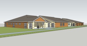 Providing counsel and visuals to help them understand classroom sizes and capacity so teachers and administrators could plan more confidently.
- Challenging their ideas for the exterior and saving dollars by eliminating the cost of a brick mold for the concrete building panels. Instead, we created interest by using two concrete stain colors and V grooves.
- Creating color coded classrooms by grade, allowing there to be a variety of finishes within the school but not every classroom being different.
- Providing an accent stripe in the classroom carpets to create a clear line for students to “line up”.
- Providing bands of wall color in the corridor to create a background for Montessori teaching method quotes.
 Designing a community table for the teachers’ break room that is being donated by a parent.
- Offering some ideas for “iconic” furniture for the classrooms; items that are unique and promote using a part of the classroom differently, creating “other” spaces.
by Ryan | Apr 2, 2015 | Design News
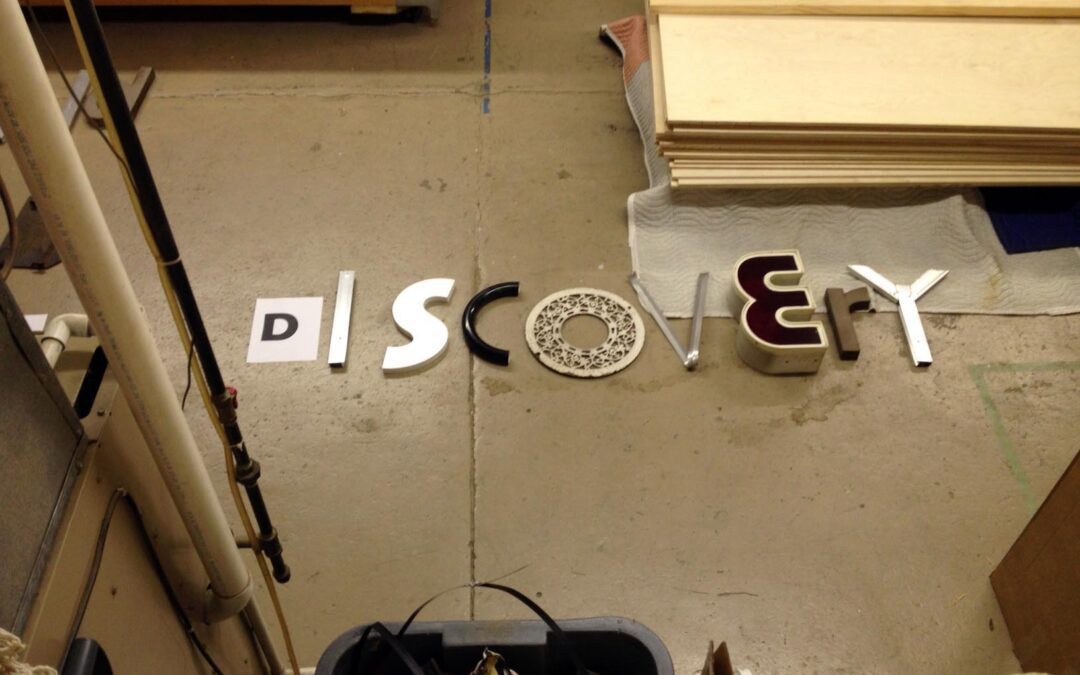
 The Grand Rapids Child Discovery Center has been r.o.i. Design’s not-for-profit partner for 3 years. We support their marketing and communication needs by offering graphic design and marketing support for their projects. Currently we are trying to collect individual letters to create a temporary sign to identity the school. Since they moved into their new site at 409 Lafayette SE, a sign has not been a budget priority, but to properly promote the school, they need a sign!
We have collected a lot of letters, but there is still an opportunity to donate if you have a D, C, S or G!

The Grand Rapids Child Discover Center (GRCDC) is a diverse, urban, K-5 school in the heart of Grand Rapids, MI. The school believes education is based on relationships; relationships to others, to ideas, to the environment and the larger community. This approach is based on the Reggio Emilia method which encourages curiosity, discovery and connectedness. This shared experience in passionate discovery engages all members of our school community in co-constructing a unique and effective education. For more information visit grcdc.org.
by Ryan | Apr 2, 2015 | Branding, Design News, Designing Public Areas, Graphic Design, Retail Design
 Grand Valley State University
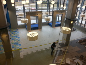
The new 40,000 SF marketplace retail facility at the Allendale campus of Grand Valley State University will be open to students this month.
The planning of the store started in 2012 when the University Book Store team researched other university stores to see the trends in campus retail. We weren’t surprised to learn:
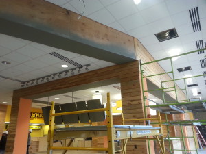 Books are no longer the big seller. If students haven’t converted to electronic books, they probably are shopping online for the best price for used books. The name of the store is now officially GVSU Laker Store, no more “book” store.
- Food and technology are part of the experience. At GVSU Laker Store there will be a department where students can purchase hardware and software for most of their technology needs. Adjacent to the store, outside the door, Starbucks and Which Wich are ready to capture the shoppers on their arrival and exits.
- They are competing with off campus retail experiences for fashion and active wear. For GVSU Laker Store that means competing with product mix, service and store design. That’s where r.o.i. Design comes in.
 As part of the Fishbeck Thompson Carr & Huber (FTC&H) design team, we worked with the store staff, GVSU facility managers and FTC&H to come up with a competitive experience. The criteria for design was to create a space that resonates with the student experience of “making unique choices”. We want the student to recognize themselves in some elements or parts of the store through the variety of finishes and graphics. We wanted them to take ownership and be proud of their school store. “Lakers for Life”.
Some of our favorite parts of the design:
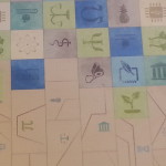 Custom tile: using the universal symbols for academic departments, we created a mosaic of color to indicate all choices of study and types of students were welcome here.
- Media Display: In the taller part of the store, 9 screens create a large display that can either show one large image or up to 9 individual images. The plan is to show real time GVSU athletic games and musical performances while students and their family shop.
- Custom graphics: using the letters G, V, S and U, we created a “cloud” type graphic using different fonts and colors again to represent that the GVSU experience is as diverse as its community and highly connected through technology.
- The Laker Wave: the two story volume holds over 250 translucent blades of cloth that together attempt to create the image of moving water. The gesture of the blades texture the interior but also impact the look of the exterior as they are seen through the wall of curtain glass.
 Reclaimed wood: throughout the interior and exterior there is reclaimed wood siding. The internal staircase in the store is a friendly combination of wood, color and light.
- Color: (Photo) challenging the campus standards of GVSU blue and white, GVSU Laker Store is vibrant as it reflects the many colors of the fashion shown in the store.
![The R.O.I. in Restaurant Remodels]()
by Ryan | Apr 1, 2015 | Branding, Design News, Interior Design, Restaurant Design
 Consistently serving great food is the best way for a restaurant owner to keep customers coming back for more. However, lighting, cleanliness, wall décor and even the ambience are all things that your customer will notice. To offer the ultimate dining experience you need to appeal to every sense of your target customer. Remodeling your restaurant is part of an overall plan to increase business. The improvement plan puts good food at the top of the list. Second is the overall cleanliness and service. We recommend a regular maintenance program for cleaning and an appropriate staff training method be well established before making any changes to the décor.
If your food is great, your staff is friendly and you hold a high standard of cleanliness then you are ready to think about changes to the interior.
 Undergo this process with three things in mind:
- The Menu—The atmosphere you intend to create should be indicative of the food you serve. It should complement the menu. Your brand is the basis for the entire experience.
- Budget and Scope—An interesting surrounding does not need to cost a fortune. Unique and creative solutions are always available and can set you apart from the rest. It is important to do enough so customers see your investment but maintain restraint so costs can be covered within a reasonable period of time. That’s good business planning.
- Your Customer—Establish who they are and what appeals to them. A family of four and a 25 year old single male will have a very different set of ideals and it’s important for a restaurant owner to be conscientious of that.
Remodeling for a restaurant means at least one of the following:
- Changes in seating layouts and new furniture to fulfill the layout—The current trend consists of more bench seating, less traditional booths and more open café seating versus heavy dining arrangements.
- Changes in finishes, flooring, walls and ceilings—Restaurants are showing lighting brighter interiors with a wide variety of finishes within rooms.
- Changes in lighting—With the arrival of LED, clean and well lit rooms are a welcome “upgrade” for the customer.
- Changes in wall décor—Technology has made it possible to have a variety of custom décor options that are restaurant or site specific. Avoid residential décor solutions. Build the brand.
A return customer is a return on investment. Happy dining.
by Ryan | Mar 23, 2015 | Design News
There’s a lot of ground to cover in the world of flooring. Vinyl has been a popular choice for its durability and wide range of styles for many years. With the introduction of luxury vinyl tile (LVT), understanding how it compares to the traditional vinyl composite tile (VCT) is a popular topic. Vinyl itself was discovered by accident in the 1920’s in an attempt to create an adhesive. It was immediately recognized for its durability and used in a number of applications including floor covering. VCT consists of about 8-12% vinyl with limestone and clay making up the difference giving it a porous composition which requires regular maintenance to keep it sealed.
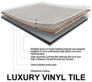 LVT on the other hand is composed of 100% vinyl which eliminates the need to seal and gives it superior strength.
LVT has been around for a few decades and its application is widely used commercially and residentially. It is easy to install, easy to maintain and even comes in very realistic looking wood grain. It is less noisy than VCT and hardwoods and also less permanent, making a design change less of a hassle. It may come as no surprise that LVT is the preferred flooring option for healthcare facilities where, along with heavy traffic, there are many chemicals in use that could easily make their way to the floor.

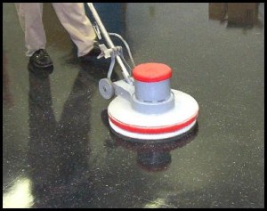
VCT’s material cost are low, but it requires routine maintenance to keep its finish.
VCT is less expensive than LVT (about $4 less per square foot) and, along with its competitive durability, remains one of the most common flooring solutions for places with heavy foot traffic. Regular maintenance can add up in cost however, and while LVT may be initially more expensive, it essentially pays for itself over time because it doesn’t necessitate being stripped and resealed. The average cost to maintain VCT for a duration of 22 years adds up to about $25 per square foot.
r.o.i. Design is working with an elementary school where initial budget and familiarity with the maintenance involved with VCT has made it the best choice for their science room. Vinyl flooring is the popular choice for durability and ease of maintenance…knowing whether LVT or VCT is best can be overwhelming, but r.o.i. Design has got you covered.

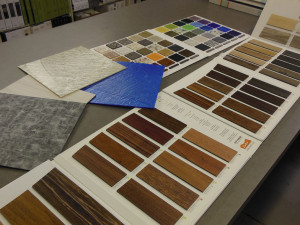
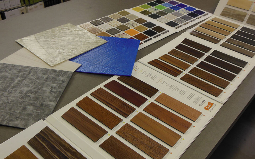
LVT is available in a wide selection of colors and patterns, including those that mimic wood and stone.


 A few important things we consider when a client needs their retail store exterior branded:
 Consistency in all things visual suggests that your company will be consistent in quality and service. With the majority of human decision making based on emotion it stands to reason that a brand’s consistency is a major influence on customer trust. Trust means repeat customers.


 Designing a community table for the teachers’ break room that is being donated by a parent.


 Undergo this process with three things in mind:
 LVT on the other hand is composed of 100% vinyl which eliminates the need to seal and gives it superior strength.