by Ryan | Sep 7, 2016 | Design News, Designing for Kids, Designing Public Areas, Interior Design
It is never too late to go back to school. r.o.i. Design has been working with Robert Doornbos at RMD Architects, creating interiors for some of the charter schools he has designed in the last year.
Our experience with Charter Schools teaches us that they appear to have highly passionate teams, with high academic goals for a focused community population. They care deeply about how their school environment looks and feels, and based on available budget, really want to make their spaces “A+”
Black River Charter School, Holland, MI
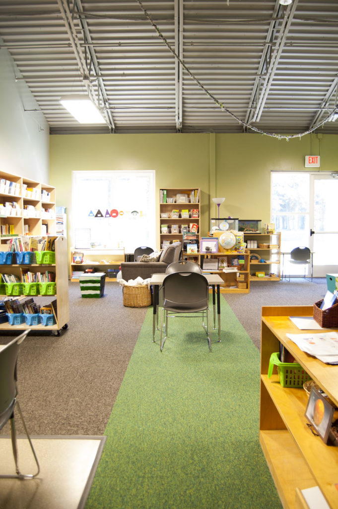 This is where we met RMD Architects. The board engaged us to work alongside him and the board, to assist in the selection and coordination of finishes. This is also a Montessori school which had a criteria that all the finishes be calm, orderly and like home. Our favorite detail in this project was the accenting of the carpet in the classrooms to aid in organizing space for “lining up”, or just calling out areas. There were three color schemes, one for kindergarten, one for lower elementary and one for upper elementary.
Macon Charter School, Macon, GA
© Triangle Associates
© Triangle Associates
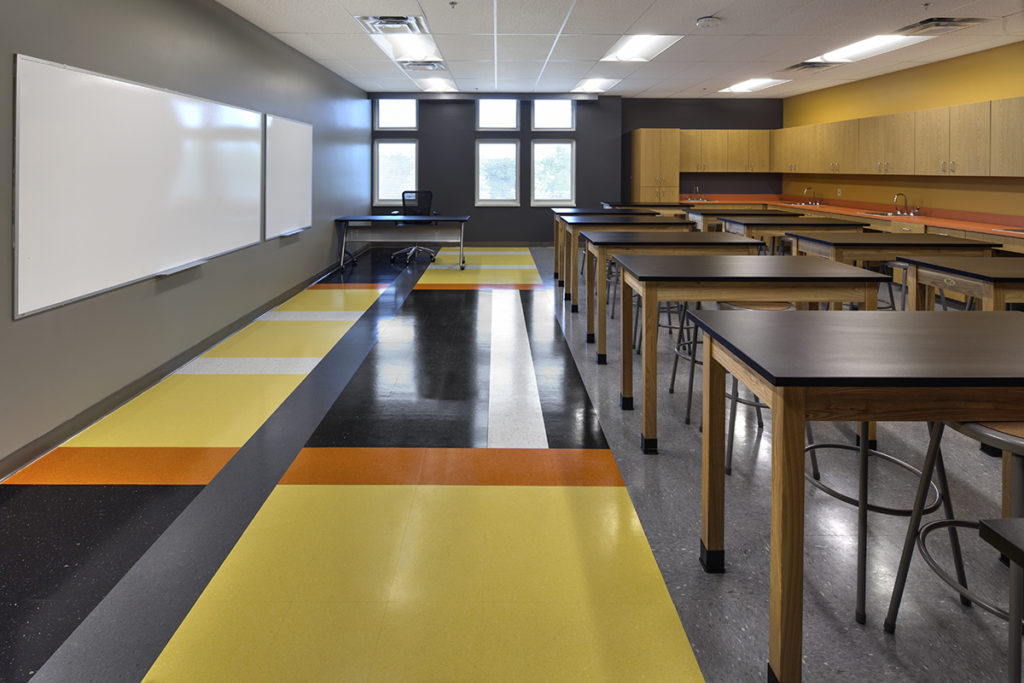
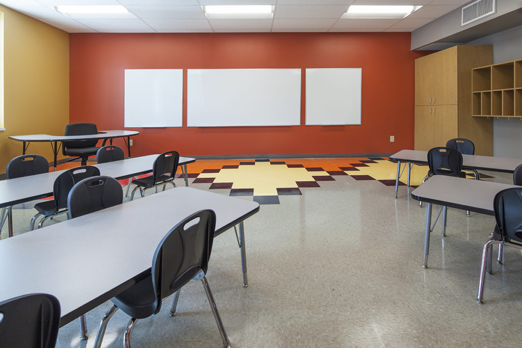
Culturally, this school wanted to embrace a global diversity and to make sure the interior could appeal to wide variety of students and families. Our favorite details here was the use of colors that we described as global cuisine, colors that naturally resonated with people as rich and flavorful: Eggplant, Saffron, Palm and Tomato. Then we used those colors in classic patterns in flooring and walls. Those patterns could be traced back to civilization 2000 years ago and could be seen just as decoration, or teaching tools. Through the course of the design we were informed that James Brown went to school in Macon, GA so we wanted to make sure everyone would “feel good”!
This project was a design-build project lead by Triangle Inc. in Grand Rapids, MI.
Northeast Academy, Minneapolis, MN
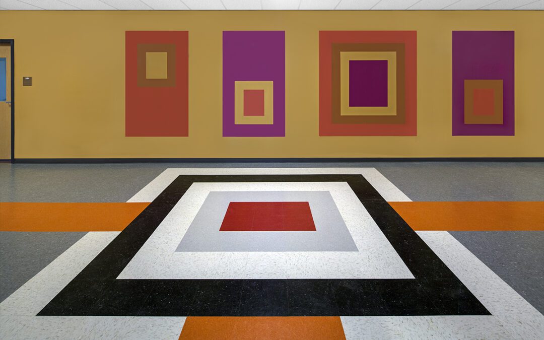
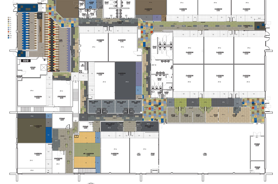 This community was growing quickly and expanding its program. They were moving into a larger school that needed to be refreshed, remodeled and delivered in less than five months. They moved in August 20, 2016! Our efforts focused on carpet and paint. Northeast wanted all the corridors to be carpeted and because there was little opportunity for other areas of interest, we created three to four modular carpet patterns that we repeated in different color ways. We also created tile patterns for entries and cafeteria. They will be remodeling another floor in the coming year, and hopefully, we will be able to go back and execute some wall accents and graphics as well.
by Ryan | Aug 31, 2016 | Design News, Designing for Kids, Interior Design, Workplace Design
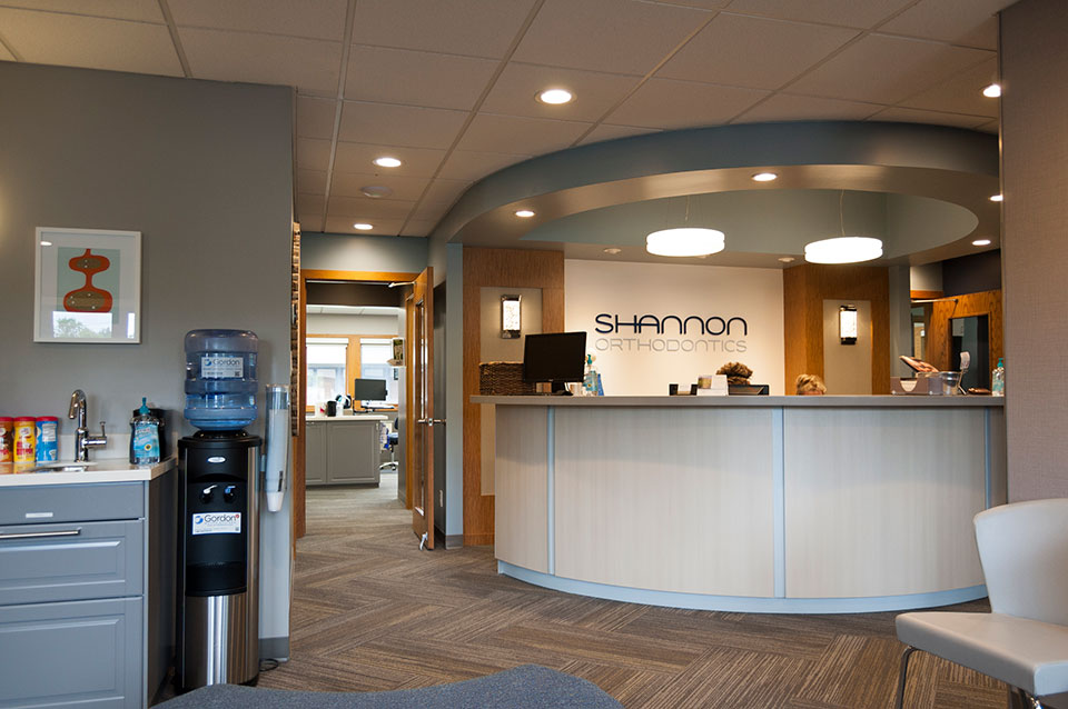
Shannon Orthodontics prides itself on its use of the latest research and technology and delivers an extremely friendly service. They want their customers to “achieve the smile they have always dreamed of”.
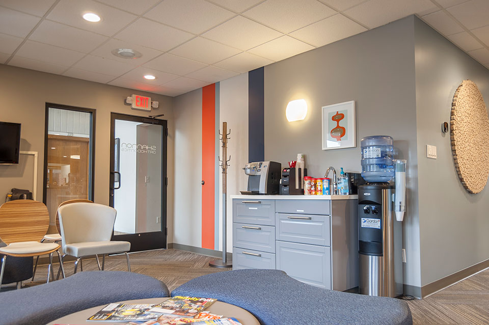 Shannon’s business practice far out-shown the interior of their offices. They wanted to deliver a complete experience, so Tom Shannon and wife Kate researched other offices in the area and found our work at JCL Periodontics. Tom and Kate liked the character and personality we brought to that space and after initial meetings decided to engage us in the redesign of their Grandville office.
Their newly designed offices were officially complete in July 2015 and the transformation is very satisfying to the Shannon team and to r.o.i. Design. Thank you to Rockford Trades for managing the remodel while they stayed open. It looks great!
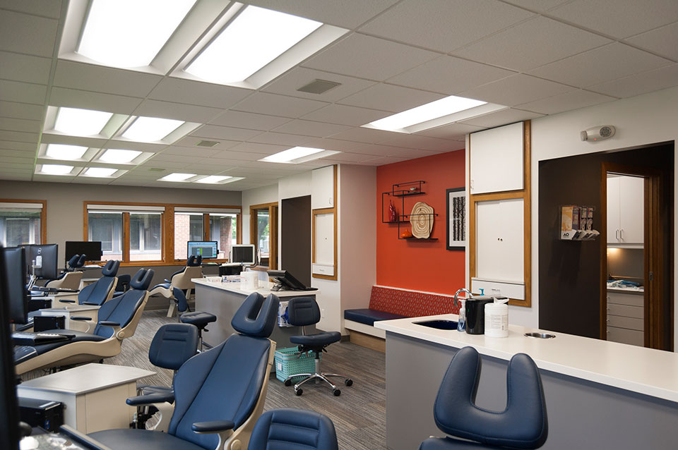 Highlights of the design include:
- Flexible lobby seating creating greater capacity through use of backless benches.
- New decorative and in-ceiling LED lighting for a crisper look and far more efficient energy use.
- All new finishes, including modular plank carpet laid in herringbone pattern, all freshly painted walls, and new cabinetry and countertops. The reception desk was reclad in place.
- New wall art and signage.
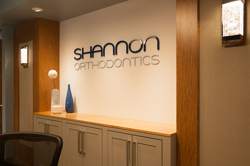 Shortly after the project was complete, the Shannon’s made a short video of the interior as an advertisement that they ran during the Summer Olympics this summer. You can see that video on their Facebook page.
Now their Grandville offices reflect their business. Everything is straight and bright!
We start on their Plainwell location this year.

by Ryan | Aug 31, 2016 | Design News, Exhibit Design, Hospitality Design, Interior Design, Meeting and Conference, Workplace Design
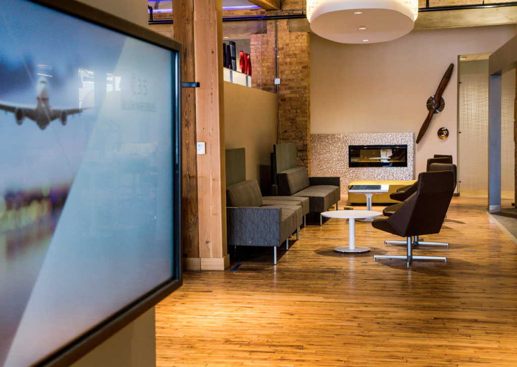
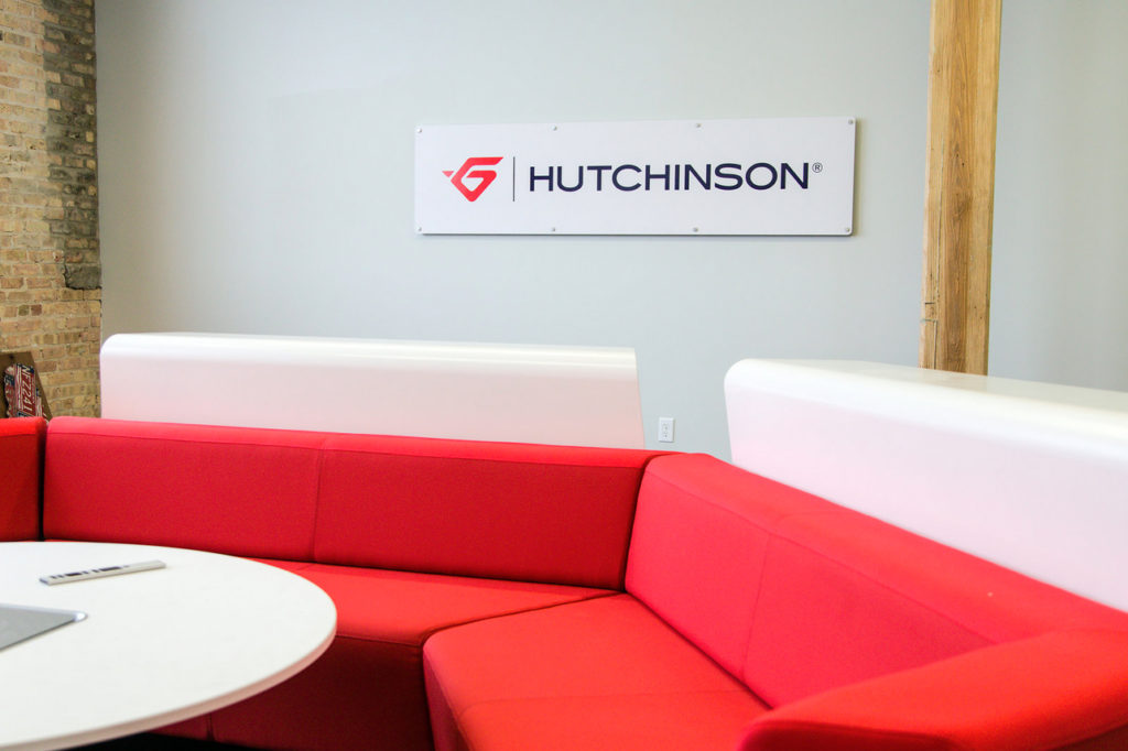
Manufacturing giant Hutchinson Worldwide has one of their anti-vibration plants in Grand Rapids, MI and that location was selected to be the location for their North American Innovation Center, 616 Fab House. The facility includes a 100 year old factory that originally began as Corduroy Rubber. The historical nature of this plant was in part the reason it was selected as an innovation center as it showcases the historical presence of Hutchinson in the US.
© Tiberius Images
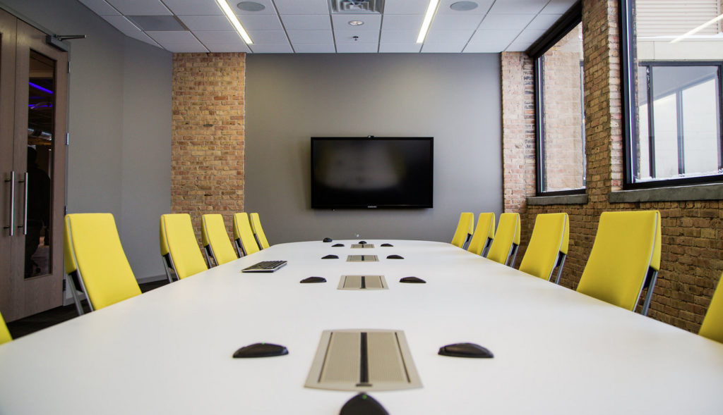
Through a competitive process, r.o.i. Design was selected as the design team to plan the innovation center and over a year the plans developed to include 13,400 square feet of a renovated third floor space. In that space there are video conference rooms, executive conference rooms, training rooms, lounge space, exhibit space and hospitality. In addition to the innovation center space, a new entry tower and approach to the 616 Fab House was designed. Working with Architectural Concepts, Ken Watkins, r.o.i. Design provided complete design and construction documents.
© Tiberius Images
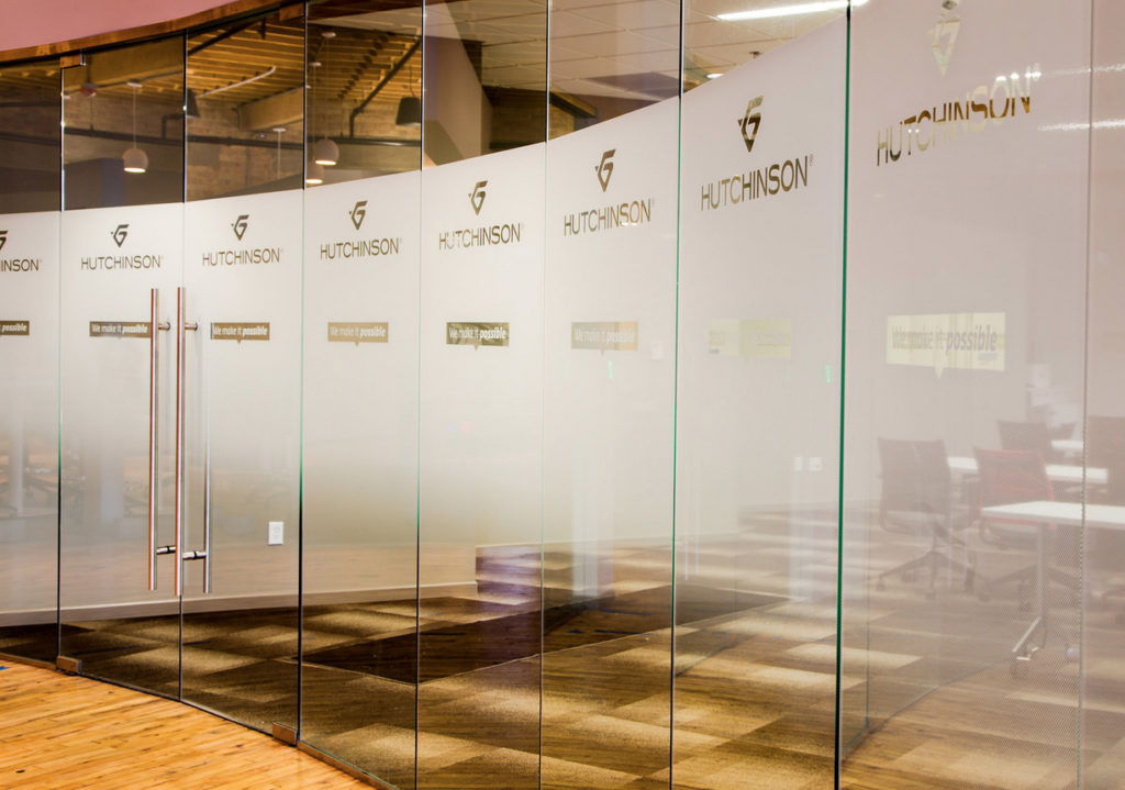
r.o.i. Design’s goal in the design was to celebrate the structure, including the vintage wood beams and columns, the original brick and wood floors, in contrast with the clean, new modern additions of glass, steel and technology. LED lighting was added using fixtures that blend with the historical envelope, providing light and drama without adding unneeded decoration.
Steelcase’s MediaScape products were installed in the space, allowing for multi-faceted video conferencing between Hutchinson offices and their global customers.
© Tiberius Images
The modern space was enhanced with reproductions of historic photos that tell the French and American story of Hutchinson and Corduroy Rubber.
r.o.i. Design is grateful for this opportunity and were very impressed with the focus and dedication of the Hutchinson team and look forward to their continued growth and contributions.
From January 20, 2016 mlive article: French auto and aerospace supplier opens North American innovation center… “The 616 Fab House, which formerly served as a storage area, was built in just under eight months with Pinnacle Construction serving as general contractor and R.O.I. Design handling architectural and design services. About 10,000 square feet of unused space on the third will allow for future expansion.”
© Tiberius Images
The 616 Fab House is Hutchinson’s second innovation center, with the other being the 507 Fab House, located in Montargis, France, near Hutchinson’s Paris world headquarters, according to a company news release. That facility was built by the legendary Gustave Eiffel.
The innovation center, 616 Fab House is part of Hutchinson’s 30-acre campus, is dedicated to research, development and innovative thinking for all of Hutchinson’s divisions.
“It is our intent to use the 616 Fab House as a place to connect using our state-of-the-art video and audio conferencing systems to bring customers together with Hutchinson’s global capabilities,” said Hutchinson North America President and CEO Cedric Duclos. “Additionally, we aim to use this space to foster innovative thinking and brainstorming. Using our touch screen technology and a variety of meeting spaces, we provide a setting that inspires creative, problem-solving thinking that drives Hutchinson’s business forward.”
by Ryan | Aug 31, 2016 | Branding, Design News, Graphic Design, Interior Design, Retail Design
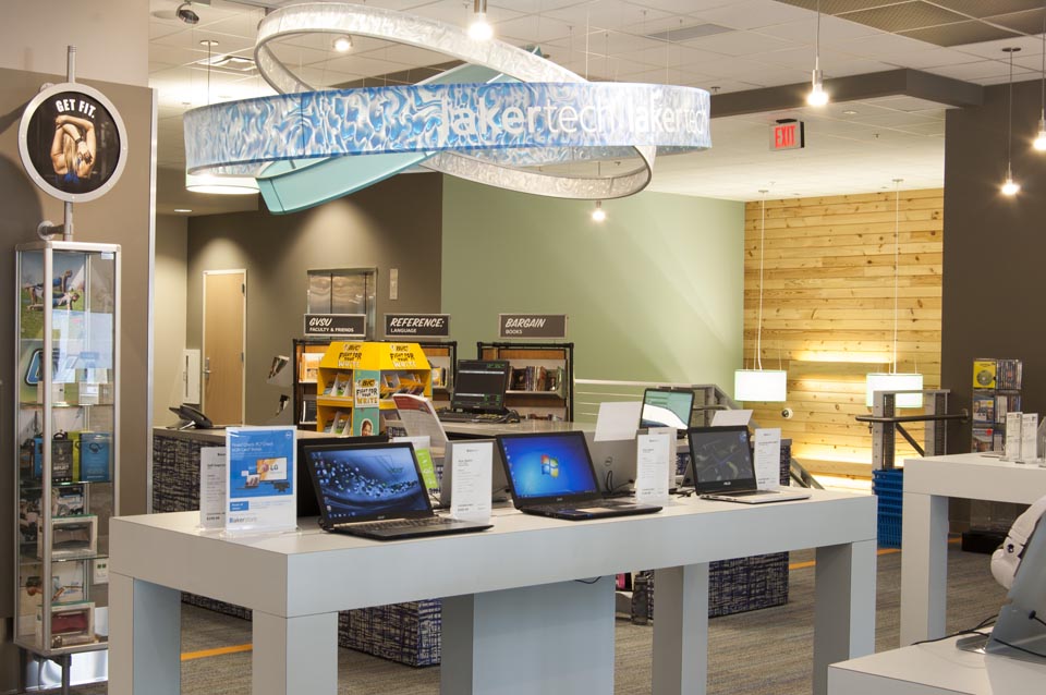
r.o.i. Design has been designing for retail for more than 20 years, but now that schools and universities have discovered their customers expect the same kinds of retail experiences on campus as they do in their communities, more than ever we find ourselves working for these institutions. On-campus stores are faced with new business challenges, and they have to be profitable in a time of change.
Products:
 Unlike what the doomsayers predicted five years ago, books are still being sold in campus bookstores. But online competitors and used book providers continue to eat away at that business. Incoming freshman graduated from high schools where there were textbooks, and professors are still writing and using textbooks, so until those two trends change, there will be books in campus stores.
So the savvy campus stores are looking at other products and services that will eventually eclipse book sales. Leading categories today appear to be technology & communication (equipment and their repair), fashion & apparel, campus services (printing, product rentals, grocery, HBA, etc.) and entertainment (food service, movies and more).
Layout & Aesthetics:
 Whether it is a gift shop, a concession stand, a book store, a copy center or a hotel, all these on-campus environments are being compared to their off-campus competitors. Very few students or staff are confined to campus for discretionary shopping.
While convenient, most outdated retail experiences on campus are seeing reduced sales.
Key retail design elements include lighting, store layout and merchandising, wayfinding and signage, and intuitive, easy check-out experiences. Store displays have to be clear and fresh.
Service:
Perhaps more difficult to change than product mix or store layout is the store culture and service attitude provided by staff. An institution that has previously considered all customer interface as administrative is now looking at how to change employee mind-sets. The new overall need for staff to be more flexible is paramount; to be open to work different hours, to work different jobs and to continue to be open to change. HR attitudes has further challenged some on-campus stores profitability.
The more on-campus stores can employ students and work to develop structures that hire and train students, the more successful their retailing will be.
This type of service situation (not just found in campus retail but in all retailers) motivated r.o.i. Design to start a consulting arm of their business where they work with teams to support these kinds of changes. See Accelerate ROI.
Marketing and Promotion:
Successful stores have independent marketing agendas and strategies, separate from the institution and marketing to the institution. Sometimes this means changes in staffing so there are resources internally available to support this effort.
Students need reminders of retail locations and what is being sold at those locations, continually. Social media and crowd-sourcing for marketing is undeniably the best tool to use on college campuses.
by Ryan | Aug 31, 2016 | Branding, Design News, Designing Public Areas, Graphic Design, Interior Design, Workplace Design
Campus View has been growing alongside Grand Valley State University for the last 50 years with a large inventory of apartments and town homes, and thousands of happy tenants. But as Grand Valley grows so do options for leasing and Campus View wanted to make their initial experience with potential new tenants reflect who they were more completely.
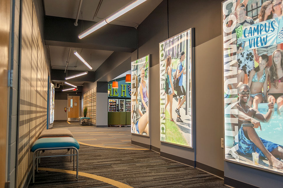
 r.o.i. Design was engaged to redesign the “customer experience” in their lobby and entry. Campus View has made continual investment in amenities but those investments aren’t always visible to customers on their first visit, so the lobby had to become a welcome center and a “billboard”.
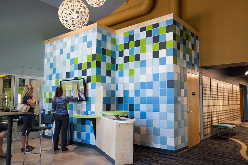 Removing the wall and counter that separated leasing staff from the inquiring customers was crucial. Opening up the space meant finding a way to lock down the office after hours, so r.o.i. Design created large sliding doors, that when closed, created a warm backdrop for the lobby.
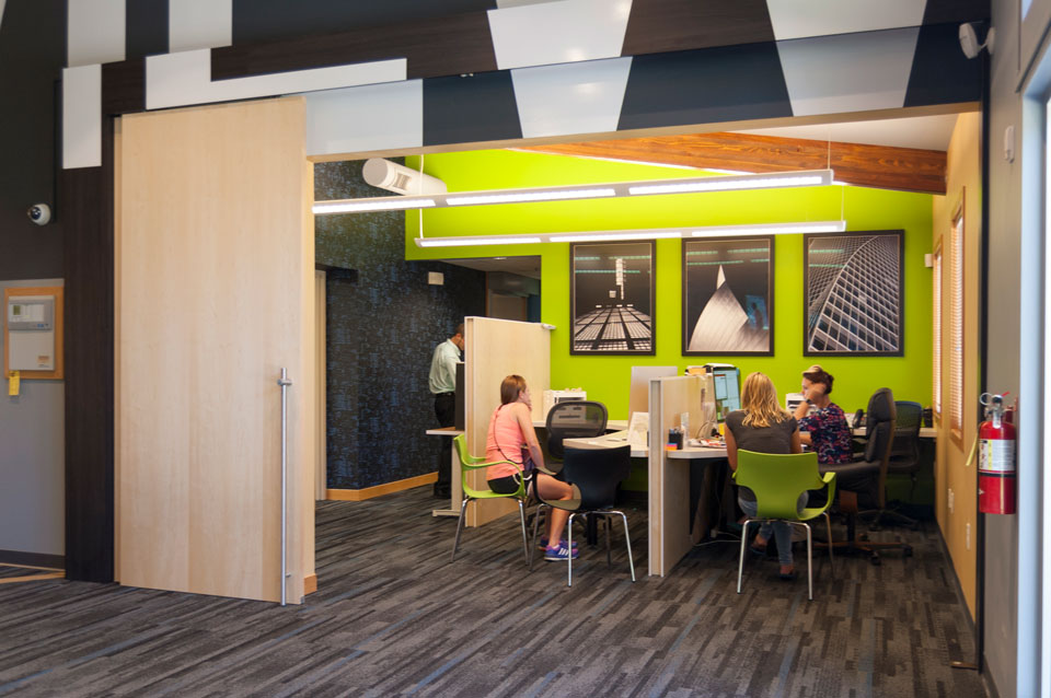 The use of maple plywood to create office dividers, sliding doors, sales desk and the decorative panels in the hallway eliminated the coldness of the painted concrete block without having to drywall the entire space. The smaller block wall in the lobby was custom painted giving the block an intentional “artsy” look.
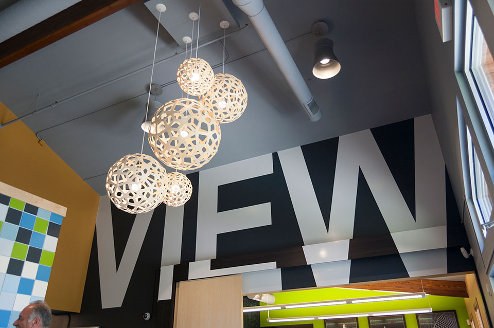 Campus View was so happy with the outcome that they sent us a personal thank-you that read, “We’re overjoyed with our updated facility and impressed with every aspect of working with your team. Thanks and we’d be thrilled to be a reference anytime. Cheers!”
For more about Campus View Apartments and Townhouses, click here.

 This is where we met RMD Architects. The board engaged us to work alongside him and the board, to assist in the selection and coordination of finishes. This is also a Montessori school which had a criteria that all the finishes be calm, orderly and like home. Our favorite detail in this project was the accenting of the carpet in the classrooms to aid in organizing space for “lining up”, or just calling out areas. There were three color schemes, one for kindergarten, one for lower elementary and one for upper elementary.

 This community was growing quickly and expanding its program. They were moving into a larger school that needed to be refreshed, remodeled and delivered in less than five months. They moved in August 20, 2016! Our efforts focused on carpet and paint. Northeast wanted all the corridors to be carpeted and because there was little opportunity for other areas of interest, we created three to four modular carpet patterns that we repeated in different color ways. We also created tile patterns for entries and cafeteria. They will be remodeling another floor in the coming year, and hopefully, we will be able to go back and execute some wall accents and graphics as well.

 Shannon’s business practice far out-shown the interior of their offices. They wanted to deliver a complete experience, so Tom Shannon and wife Kate researched other offices in the area and found our work at JCL Periodontics. Tom and Kate liked the character and personality we brought to that space and after initial meetings decided to engage us in the redesign of their Grandville office.
 Highlights of the design include:
 Shortly after the project was complete, the Shannon’s made a short video of the interior as an advertisement that they ran during the Summer Olympics this summer. You can see that video on their


 Unlike what the doomsayers predicted five years ago, books are still being sold in campus bookstores. But online competitors and used book providers continue to eat away at that business. Incoming freshman graduated from high schools where there were textbooks, and professors are still writing and using textbooks, so until those two trends change, there will be books in campus stores.
 Whether it is a gift shop, a concession stand, a book store, a copy center or a hotel, all these on-campus environments are being compared to their off-campus competitors. Very few students or staff are confined to campus for discretionary shopping.
 r.o.i. Design was engaged to redesign the “customer experience” in their lobby and entry. Campus View has made continual investment in amenities but those investments aren’t always visible to customers on their first visit, so the lobby had to become a welcome center and a “billboard”.
 Removing the wall and counter that separated leasing staff from the inquiring customers was crucial. Opening up the space meant finding a way to lock down the office after hours, so r.o.i. Design created large sliding doors, that when closed, created a warm backdrop for the lobby.
 The use of maple plywood to create office dividers, sliding doors, sales desk and the decorative panels in the hallway eliminated the coldness of the painted concrete block without having to drywall the entire space. The smaller block wall in the lobby was custom painted giving the block an intentional “artsy” look.
 Campus View was so happy with the outcome that they sent us a personal thank-you that read, “We’re overjoyed with our updated facility and impressed with every aspect of working with your team. Thanks and we’d be thrilled to be a reference anytime. Cheers!”