by Mary | Sep 26, 2014 | Home Design, Interior Design, Project Management
 “Awwh… do we have to talk about the budget?”
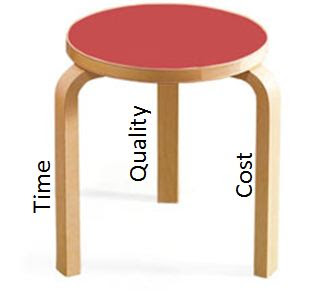
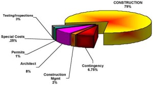
Probably the most difficult thing for a recently graduated design student entering the workforce is the perceived limitation that a budget has on their design. And it isn’t always just the young professional, sometimes the customer is deflated that initial planning has to start with a discussion on budgets. “We don’t want to limit your creativity” is the cry, “Can’t we just let you design and then price it all out?”
The answer is “of course”, but we caution that redesign also creates more design fees and in some cases an extended schedule. And always some disappointment.
So what is the r.o.i. Design solution to managing budget and creative expectations? We focus on the customer:
- Overall, we are open and flexible about product selections, knowing that the budget isn’t completely known on start and change will be needed.
- No design should be dependent on any one element; everything is replaceable.
- We also remind ourselves continually that the perception of quality is a standard the customer sets, not the designer.
- We are happy when our customer is happy.
Then we practice at least six budget disciplines when designing. They are: (more…)

by Mary | Jul 29, 2014 | Design News
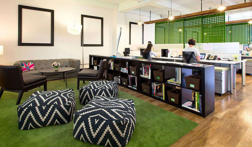
 There are trends in everything, and employees are looking for a broader variety of options of work spaces to pick from based on the work they are doing and their experience outside of work.
This trend sees a revolt against totally open offices or workplaces that don’t offer more than one way to work. The really cool places to work, i.e. Google, Zappos, Capital One, etc., are landmarks for today’s workforce who see how others work and want their employers to explore the options.
Ten to fifteen years ago, the economy was seeing less and less of a need for middle managers. There was a push toward group management, peer management, and self- directed work. That meant teams had to learn how to work with less supervision but with more transparency. In response, office design saw systems furniture walls get lower or disappear. The economy after 2005 was less than bullish, so owners and managers were shrinking the spaces they worked in even when they didn’t “downsize” the workforce.
Somewhere around 2008, we had small, open offices and a growing number of shared spaces. Collaboration and innovation were the buzz words that eclipsed teamwork and self-direction. We lived through the phase when supervision was reduced and we had to be more accountable, but our business cultures wanted us to do more, be more creative and work together too.
 Today’s business culture is asking employees to do more. Technology has made this possible and the workforce is adjusting to a different pace. Healthy environments understand how people work best and consider their needs to: be productive, meet goals, be visible, mentor, report, be accountable, collaborate and communicate.
At NeoCon 2014, Steelcase pronounced “Privacy: The Next Office Crisis”. They developed products that create acoustical and visual separation. Haworth and Herman Miller have been introducing open space private meeting areas that have the equivalent of wings or shields that have adaptable parts to help the users to feel more or less “open”. Haworth and Herman Miller were subtly promoting that if a team had a high level of trust, walls didn’t have to be built. They continue to invent environments that promote people working together and compromising autonomy for “cool”.
So what does the small business owner without a budget for one of the Big Three’s furniture solution do? r.o.i. Design is working with a variety of customers tackling this dilemma and have seen the following to be successful:
- Communicate with your group that you know it probably is time for a change in the office and that you are thinking about it. Be open to their ideas and casual discussions around the office. DON’T hold a town hall meeting, don’t set yourself up for a deadline and a transition you can’t promise.
- Identify other offices/workplaces that you like how they work and feel in your region. Talk to your team about them. DON’T compare yourself to Silicone Valley if you are in the suburbs of a Midwestern town. Understand what the other employers in your industry are doing in your area.
- Hire someone like r.o.i. Design to meet with you and help you start to imagine and understand what some of the options could be for:
- Adjacency – who is sitting next to who, who is supporting who, who are natural leaders and where is there cross-pollination.
- Clear roles of spaces-what is private, what is shared, what is collaborative, what is casual, what is formal etc.
- Reasonable and feasible budgets and timelines to create enough meaningful change.
- Once there is more of an understanding of what is needed, research how to get there. This is when you contact contract office suppliers and re-sellers. Remember the companies that sell furniture as their main business, may not be as open to a phased equipment purchase and may not see the value of making changes in the environment using existing furniture.
- Communicate with your team as to what you discovered and manage expectations for change. Include enough of the employees in the actual planning to facilitate “buy-in”.
- Treat the change as a management opportunity and pay attention to how your team responds. Reward them for helpful behaviors and attitude.
- Stay flexible, and execute 80% of your ideas. A new trend will start showing up in five to ten years and office remodeling will never be completely, “done”.
The reward of creating spaces that support the needs of employees is way beyond the investment in design fees and equipment if you can get through a planning process something like what is described above.
There is a balance between making enough office changes to indicate your commitment to support real performance change and only making token changes that don’t really solve some of the new issues arising in the workplace. Do something, do enough, but don’t break the bank.

by Mary | May 27, 2014 | Design News, Home Design
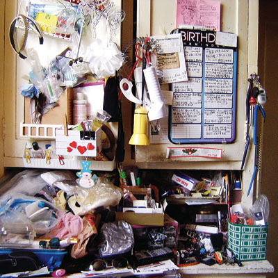
Clutter is a nuisance, but in preparing to teach a course on decluttering for OLLI (Osher Lifelong Learning Institute) at Aquinas College, Mary Witte quickly realized that clutter is more than just sorting things into pretty baskets.
Here is a link to the presentation. Clutter
What creates clutter? There are typically events that kick off our bad habits (downsizing, retirement, loss of a family member, remodeling, hobbies, inheritance…) but the inability to deal with clutter may be more personal. We may be blind to clutter, the longer it is there, the more natural it becomes. We may call clutter by a different name like our to-do pile, or future project, or we just describe clutter is how we organize.
No matter your excuse, it is time to de-clutter! Get on it!
More information about OLLI here.

by Mary | May 7, 2014 | Design News, Interior Design, Retail Design
Dentists of today are a sophisticated group of business people who are engaging their customer in new ways. Promoting preventative habits and healthy diet as well as educating their patients on how dental health impacts whole-health, are just some of the examples of how modern dentistry is gaining an important role in family health. But the most significant trend is the increased care and concern to provide comfort and a great experience while at the dentist. Some of that comfort is coming from the improvements in technology and consequently, faster and less invasive visits. While dentists still specialize, they are trying to make referrals easier and offer more services to minimize the need for patients to go to three different offices to finish a procedure.

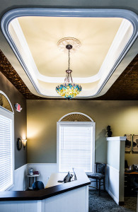
Reception Counter. Click for larger view.
r.o.i. Design, as retail specialists, were asked by Rockford Construction to assist them in the planning and interiors for their dental customers with the goal of making the experience as comfortable, professional and enjoyable as possible.

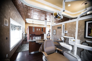
Treatment Room. Click for larger view.
Some of the things that we have seen be the most successful in our projects this year are:
- Spa-like feel and color palettes
- Extending the comfort of the lobby through to the exam, hygiene and procedure rooms, no more scary rooms!
- Integrating the greeting and reception experience with the entire service; no more sliding doors at the check-in desk!
- Promoting the office “brand” and expertise of that particular office through design.

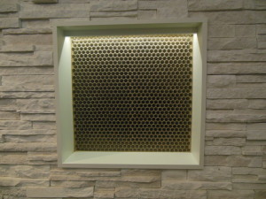
Stone Wall with Copper Tiles in Niche. Click for larger view.

by Mary | May 6, 2014 | Branding, Design News, Interior Design
There is a short walk between design and marketing. They are neighbors, and like good neighbors they share with one another.
No one wants a trendy design that will require a remodel before the bills are paid. No one wants a corny theme, but everyone wants a look that fits them and lasts the test of time. When branding a project, r.o.i. Design makes sure to include these steps in their process.
1. First understand the people who are going to use the space. What is their relationship to the brand? Is it their space, the place they work, their favorite retail store, their place of worship or the place to weigh-in for Weight Watchers?
2. Understand the message that the owner of the space wants to convey. We often hear words like professional, comfortable, efficient, welcoming, motivational, safe and casual. We want to provide those things and more. What attribute of the business or the owner can we share that is of interest and illustrates how this space is different from other places?
3. Be authentic. The details that extend a brand are meaningful and lasting. They can sometimes become iconic but don’t necessarily start that way. Quite often, our customer will relate these details as “fun” without being silly. They often are subtle or integrated in a way that is so natural that, “of course that detail would be there”. For CPA’s Baker | Holtz, who didn’t want to appear “shy” about their profession, we found little ways to make them smile and gave them landmarks in their space so they could give an interesting tour of their office.
4. Be addictive. When the recipe for a design works, the nuances of the “brand look” are happily continued by the users of the space. For a while, r.o.i. Design called themselves “Design Dogs”, happy to follow the customers lead. We saw ourselves so differently than the aloof cat-like designer stereotype that for a while we had dogs on the backs of our business cards. People started giving us dog sculptures and other dog-related stuff, on and on.
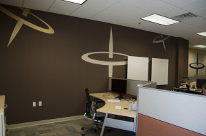
We worked with Spin Dance in their downtown Holland office space. We tried to understand the complex service this technology group offers to their customers and we tried to understand the name. We offered to them that perhaps they could illustrate data spinning, so quickly, so precisely and to the point, like a spinning top. It stuck. We want all spaces that are important to you to be significant and tell your story. You shouldn’t have to borrow a cup of sugar from “marketing” to make it that way.

 “Awwh… do we have to talk about the budget?”
