by Mary | Oct 7, 2015 | Design News, Designing for Kids, Designing Public Areas, Interior Design

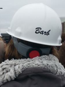
Barb Ellis at a chilly ground breaking ceremony.
What does a school board president do when they want to make sure their school is the best design it can be? Call r.o.i. Design!
Barb Ellis did just that.
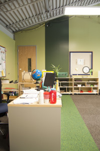
Black River Elementary School is part of the Black River Public Schools, a public charter school. Until last April, their elementary school was meeting in portable classrooms on their campus. They moved the students to a temporary location and broke ground for their new school. Four months later, the students came back to their new beautiful school.

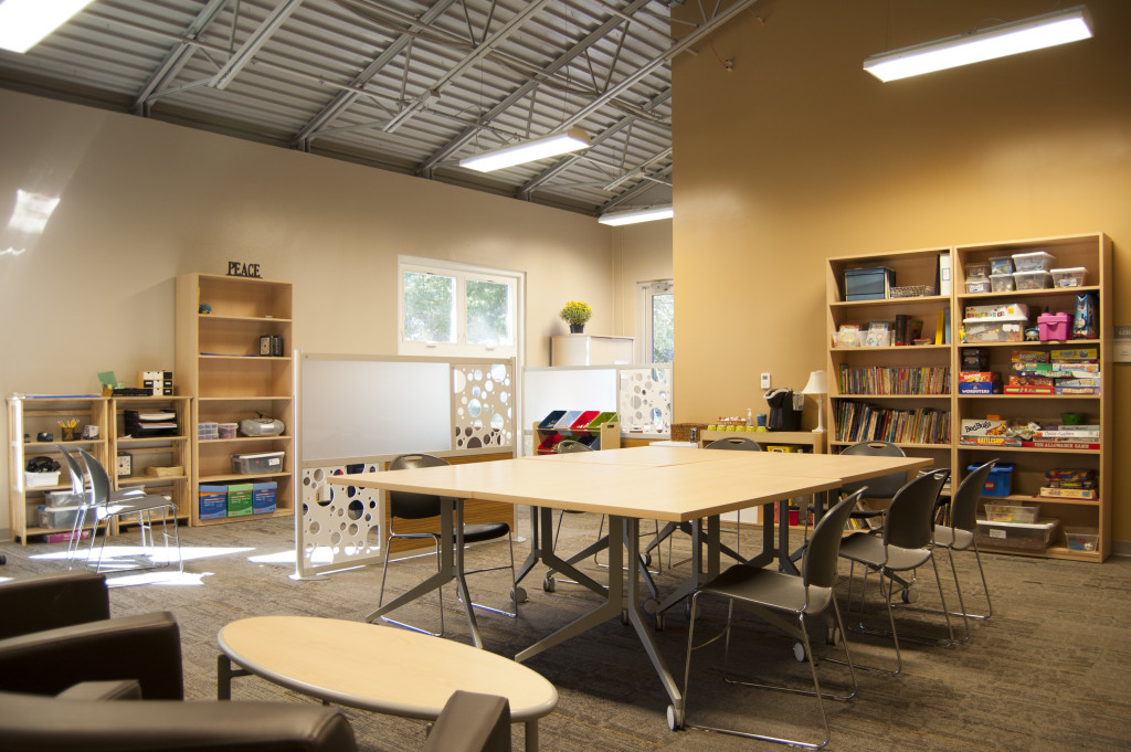
Special Education Offices and Classrooms
Barb and Black River were in the capable hands of Robert Doornbos, (RMD Architects), and Bob McFarlane, (Lakewood Construction), but the list of decisions to make and the broad spectrum of opinions threatened to slow the process down. We joined the team late in 2014 and ran alongside their process to aid in the imagining of the exterior and the interior design of the classrooms and auxiliary spaces.

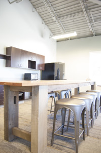
Teachers Break Room
We met with teachers early in the process and shared some ideas for iconic furnishings that would make their Montessori classrooms even more of an experience for their students.
Color schemes and the organization of color within the school was a collaborative process and the result has received “all A’s”.

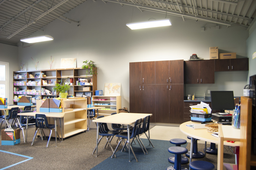
Grades 1 -2 Classrooms : Blue Accents with Dark Wood Casegoods

Grades 3-4: Green Accents and Light Casegoods
Barb and Mike Ellis have been friends and customers of r.o.i. Design for a long time and we appreciate them giving us this opportunity. (Spin Dance in Holland, MI and Grand Rapids, MI).
For more about Black River Schools and the building of the elementary school:
Black River Public Schools
Holland Sentinel Article about Black River Elementary

by Mary | May 6, 2014 | Branding, Design News, Interior Design
There is a short walk between design and marketing. They are neighbors, and like good neighbors they share with one another.
No one wants a trendy design that will require a remodel before the bills are paid. No one wants a corny theme, but everyone wants a look that fits them and lasts the test of time. When branding a project, r.o.i. Design makes sure to include these steps in their process.
1. First understand the people who are going to use the space. What is their relationship to the brand? Is it their space, the place they work, their favorite retail store, their place of worship or the place to weigh-in for Weight Watchers?
2. Understand the message that the owner of the space wants to convey. We often hear words like professional, comfortable, efficient, welcoming, motivational, safe and casual. We want to provide those things and more. What attribute of the business or the owner can we share that is of interest and illustrates how this space is different from other places?
3. Be authentic. The details that extend a brand are meaningful and lasting. They can sometimes become iconic but don’t necessarily start that way. Quite often, our customer will relate these details as “fun” without being silly. They often are subtle or integrated in a way that is so natural that, “of course that detail would be there”. For CPA’s Baker | Holtz, who didn’t want to appear “shy” about their profession, we found little ways to make them smile and gave them landmarks in their space so they could give an interesting tour of their office.
4. Be addictive. When the recipe for a design works, the nuances of the “brand look” are happily continued by the users of the space. For a while, r.o.i. Design called themselves “Design Dogs”, happy to follow the customers lead. We saw ourselves so differently than the aloof cat-like designer stereotype that for a while we had dogs on the backs of our business cards. People started giving us dog sculptures and other dog-related stuff, on and on.
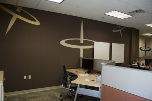
We worked with Spin Dance in their downtown Holland office space. We tried to understand the complex service this technology group offers to their customers and we tried to understand the name. We offered to them that perhaps they could illustrate data spinning, so quickly, so precisely and to the point, like a spinning top. It stuck. We want all spaces that are important to you to be significant and tell your story. You shouldn’t have to borrow a cup of sugar from “marketing” to make it that way.
