(616) 459-3539
Animal Emergency Hospital

Animal Emergency Hospital

Animal Emergency Hospital

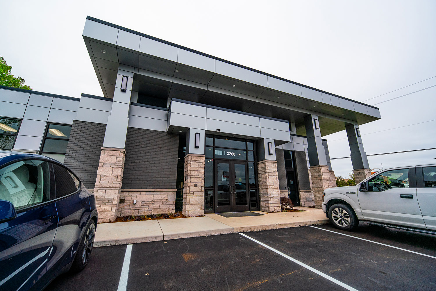
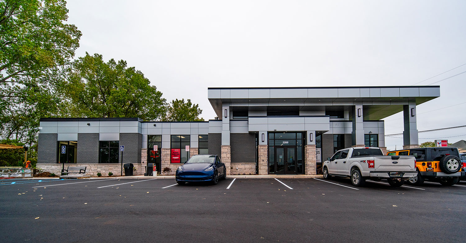
3260 Plainfield Ave NE
Grand Rapids, MI 49525

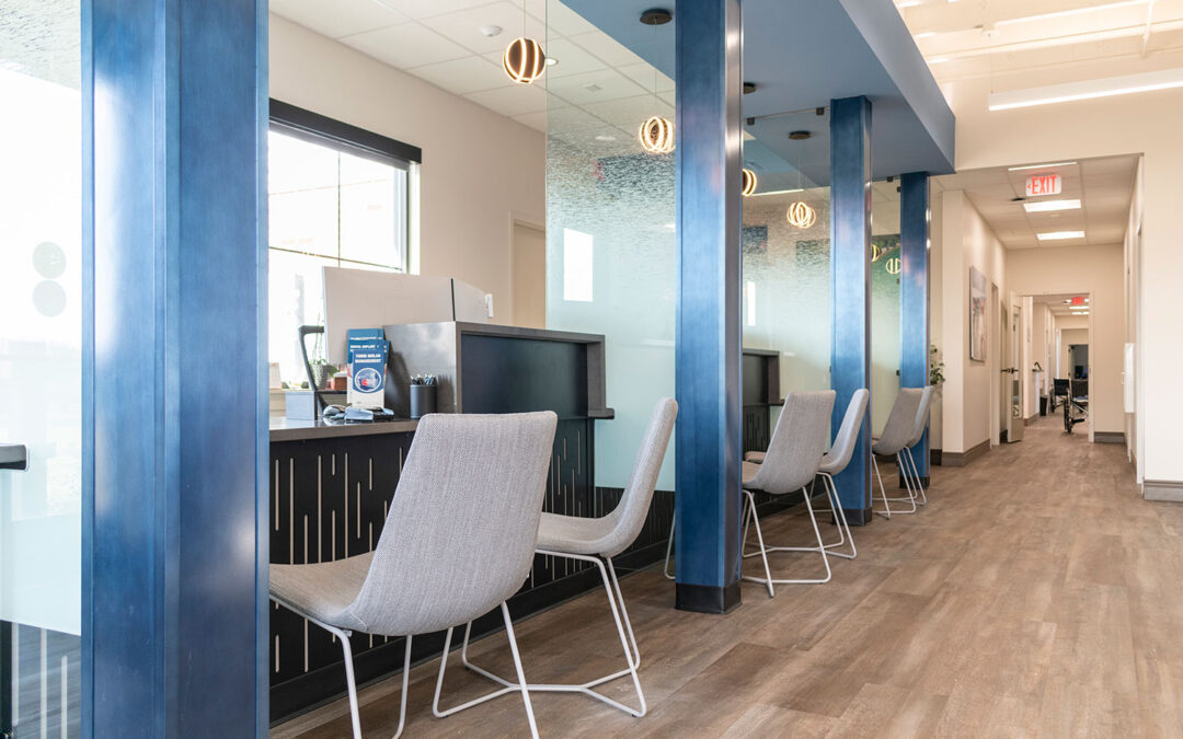
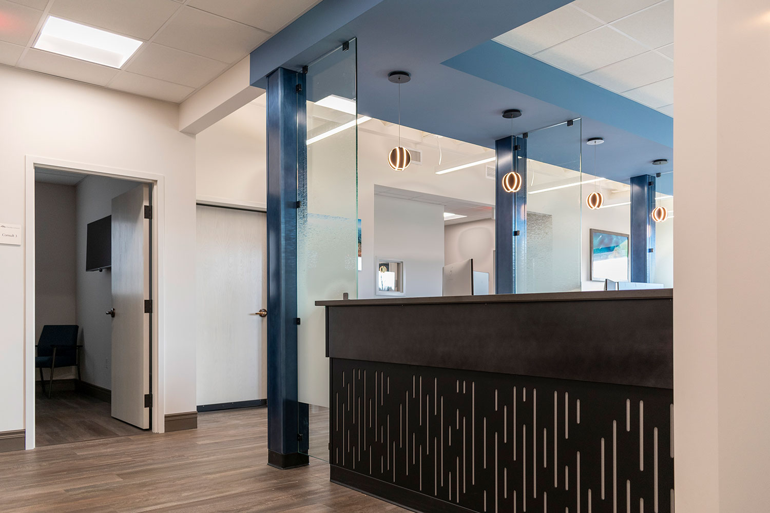
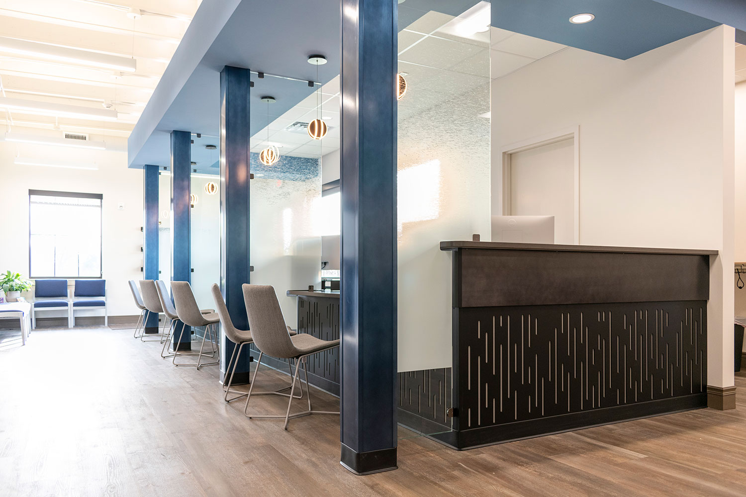
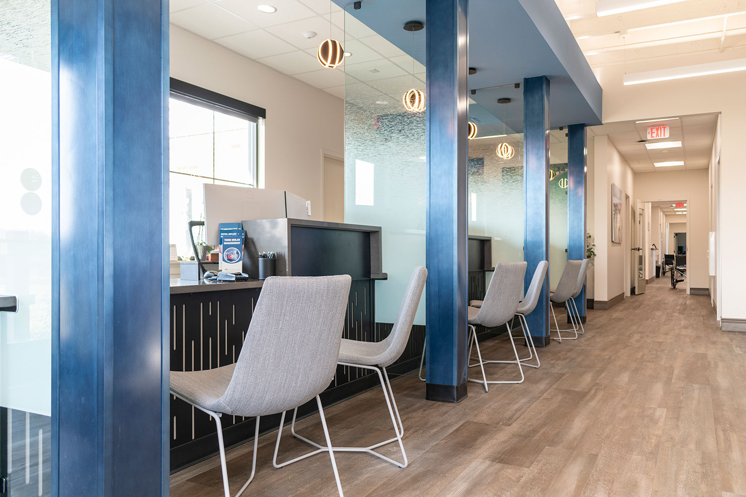
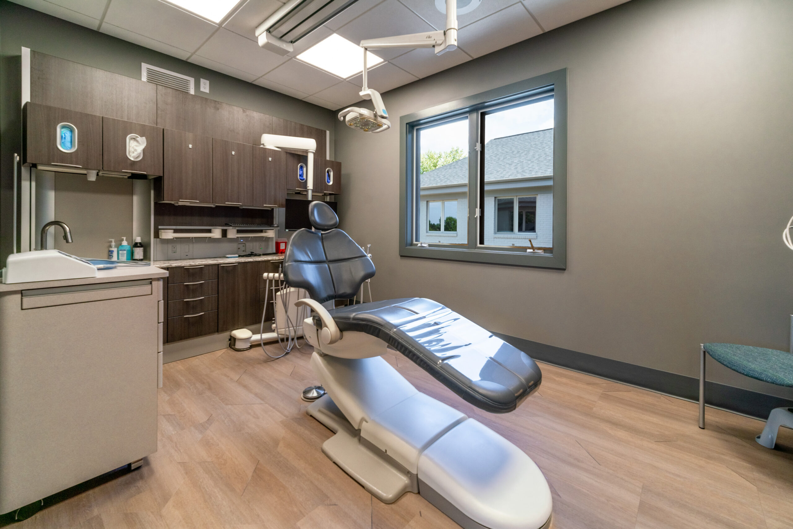
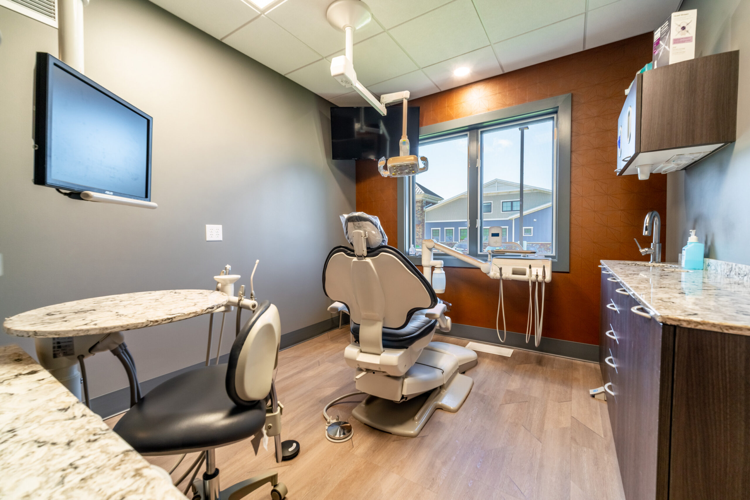
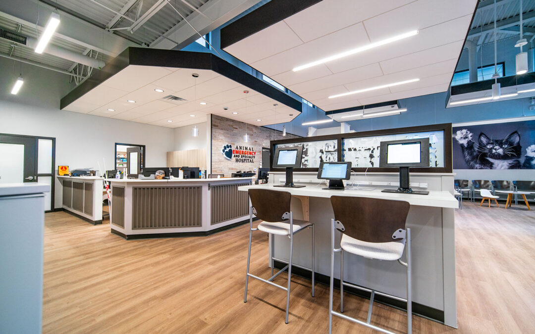
We were honored to be the interior designers for the first new Animal Emergency Hospital in Byron Center in 2022. They had an older location on Plainfield in Grand Rapids, but the space looked tired and couldn’t compare with the new facility. The plan was to build a new hospital next door to the Plainfield location, and that dream came true when they moved into the new facility in February, 2024. r.o.i. Design worked with First Companies and Dr. Marilyn Brink, as we did the first time for the Byron Center location.

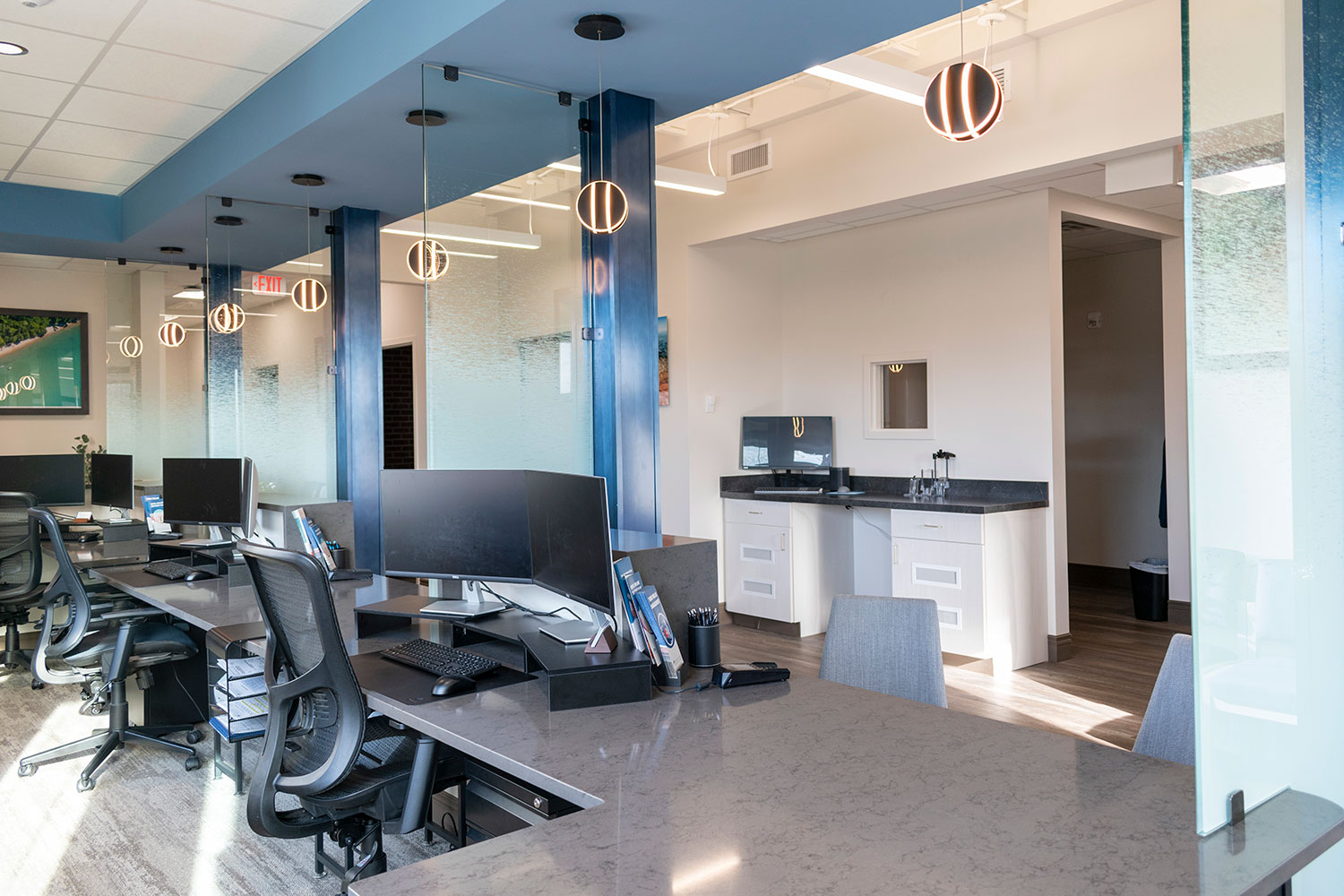
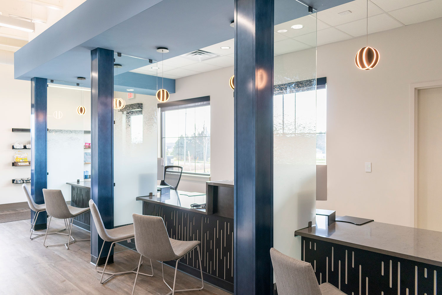
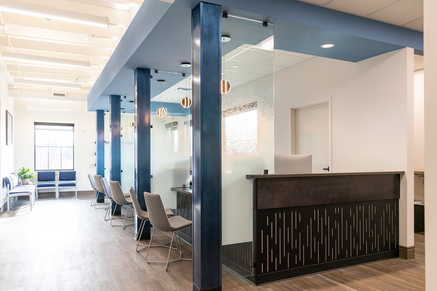
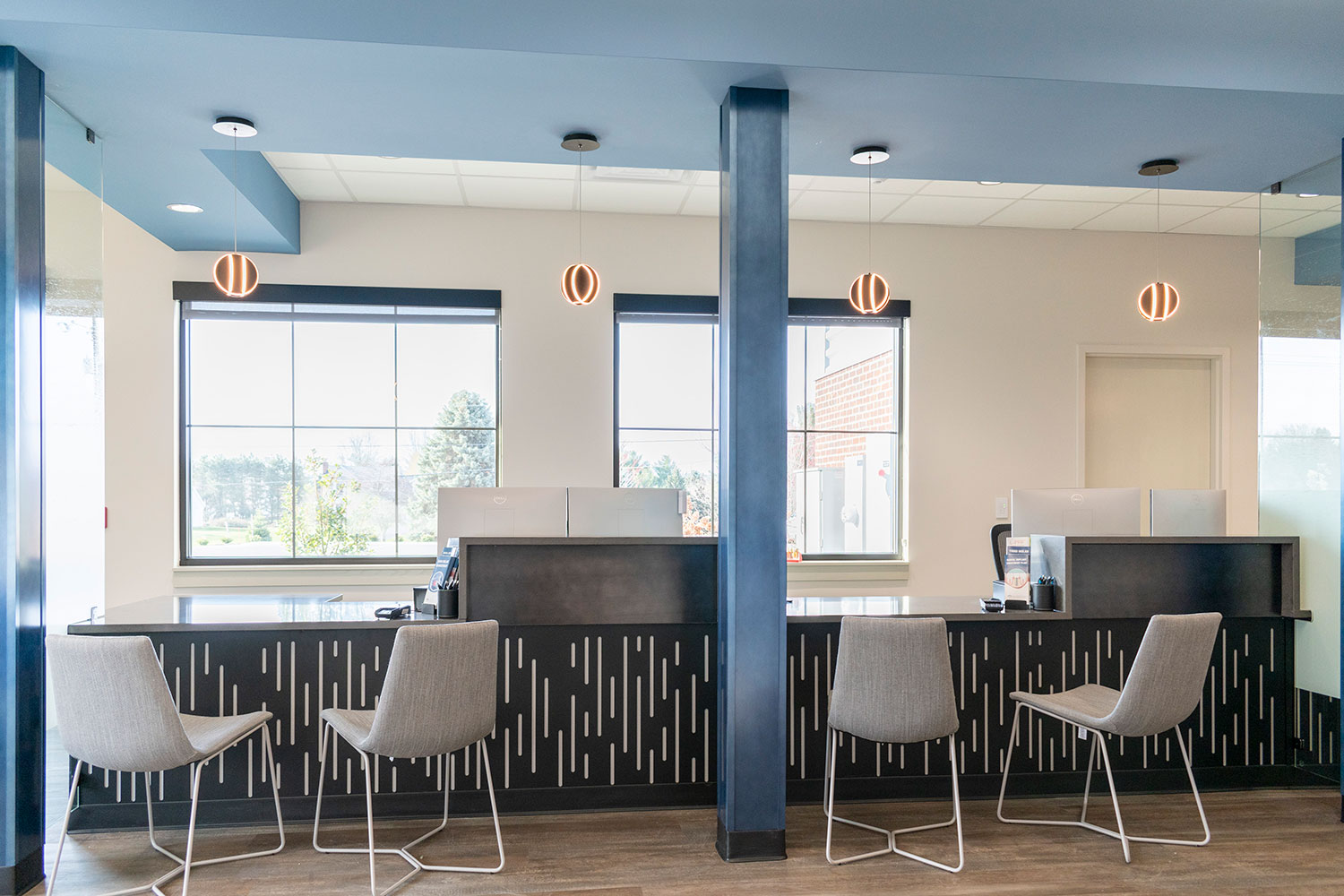
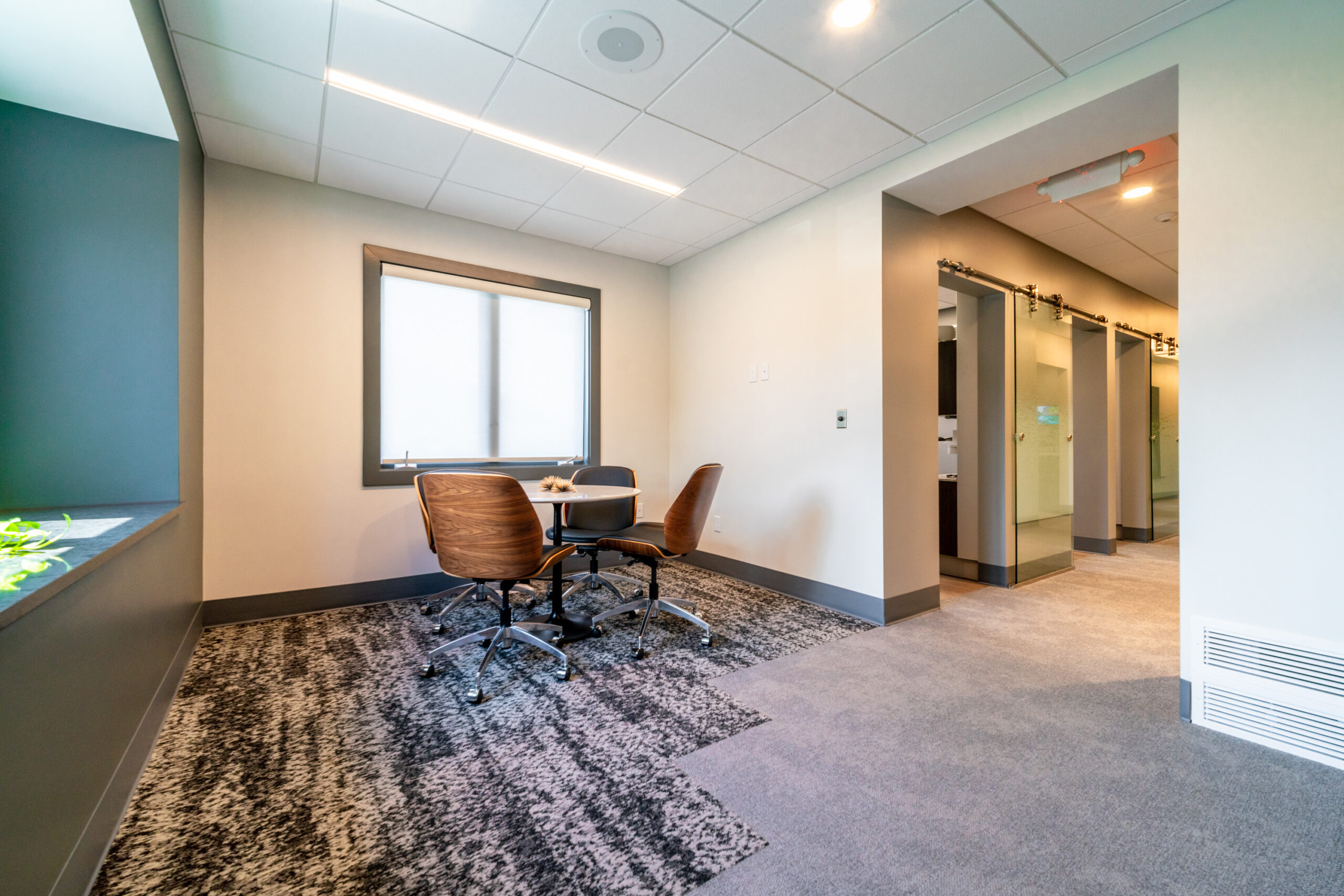
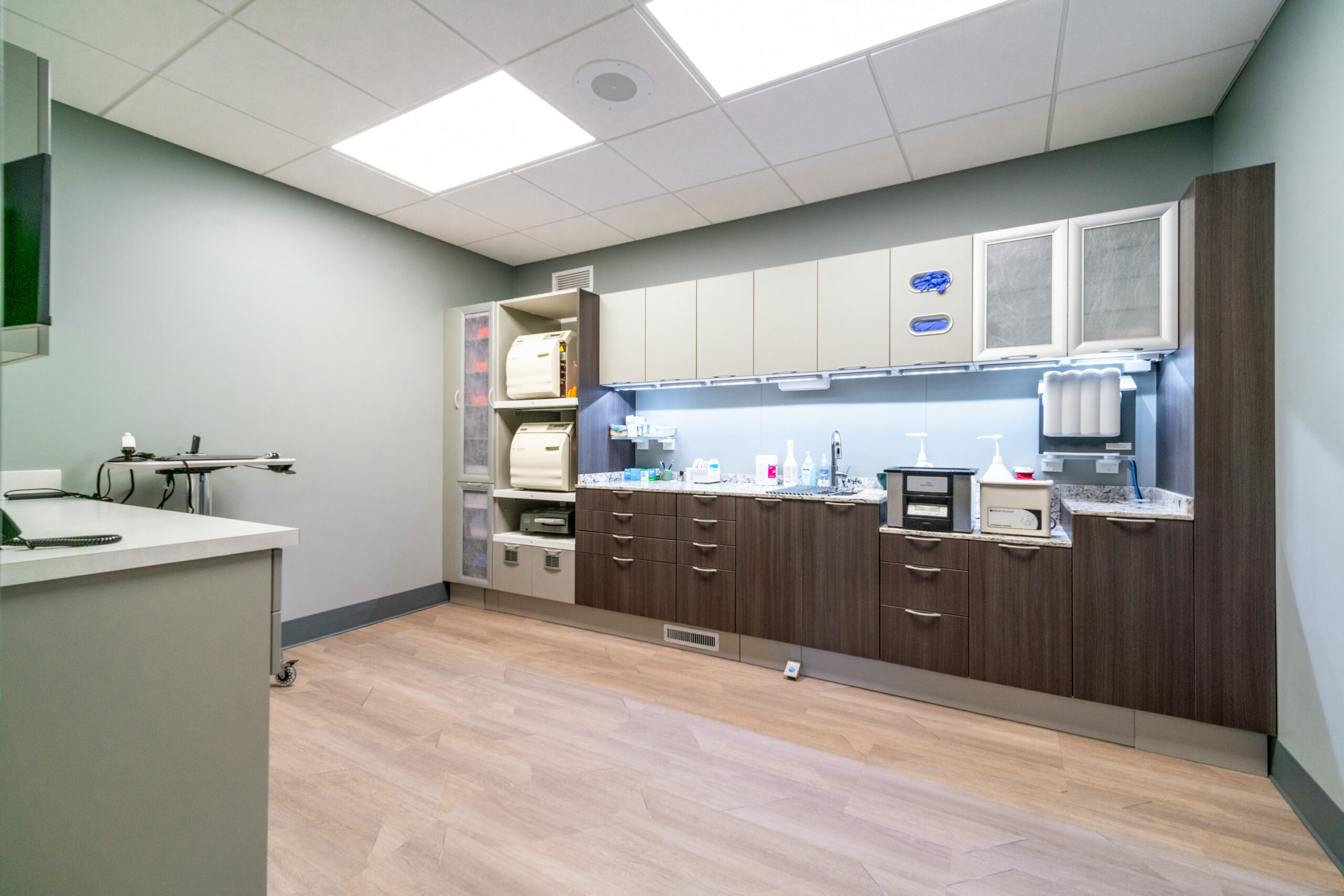
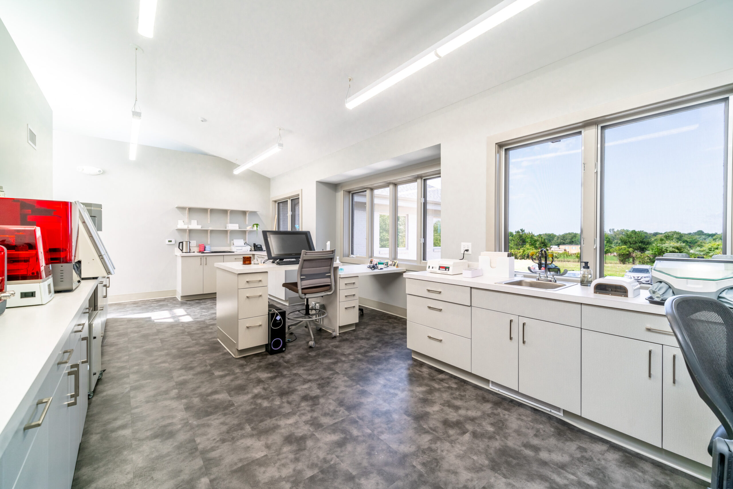
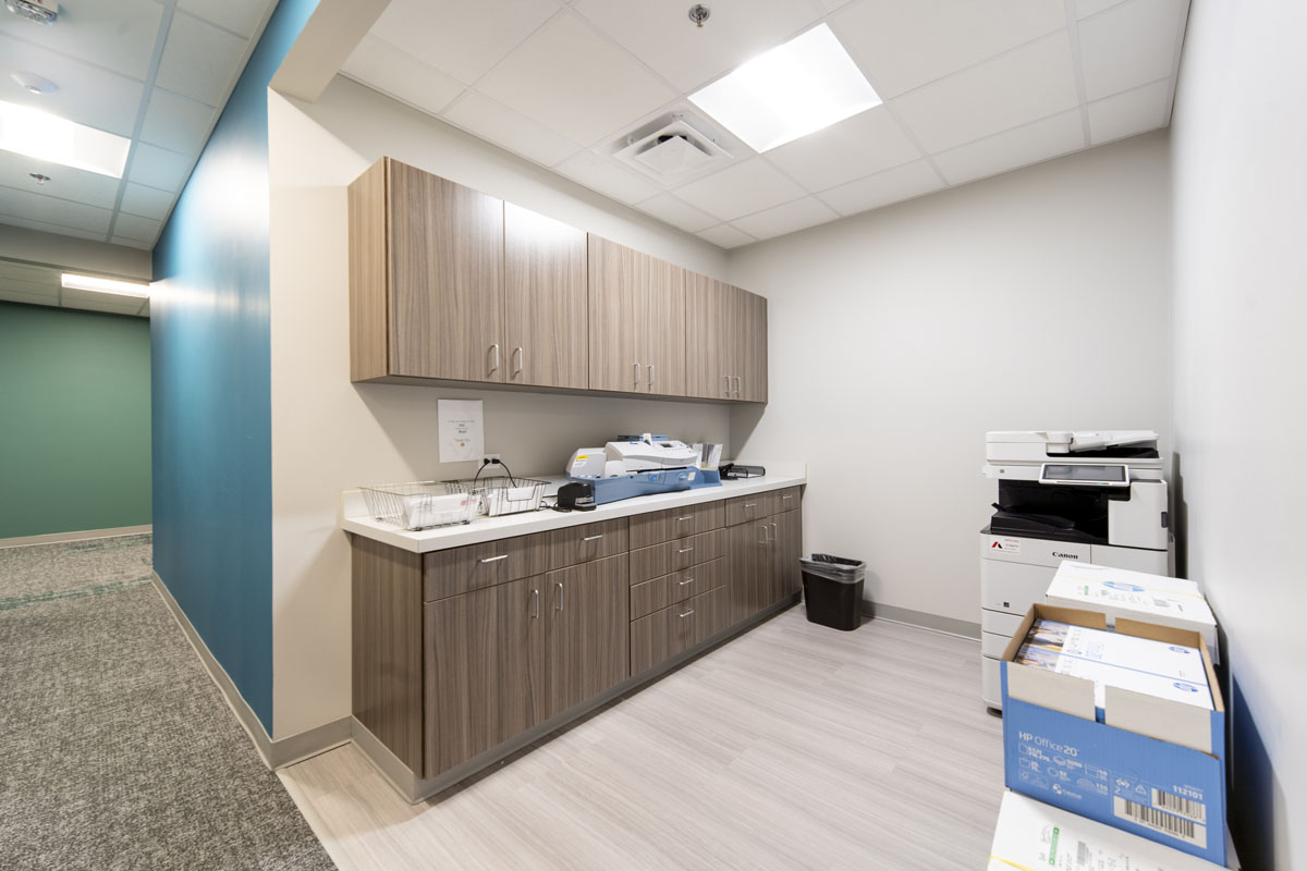
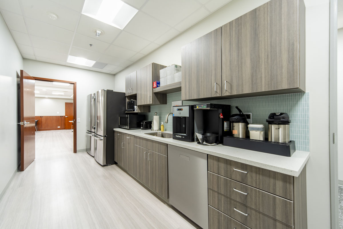
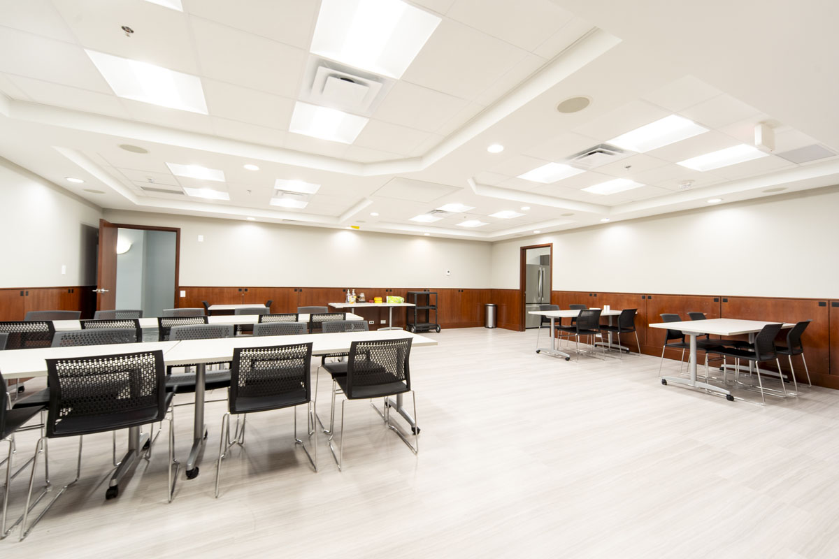
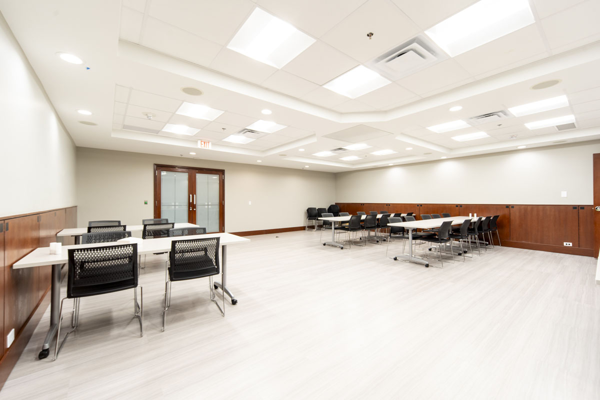
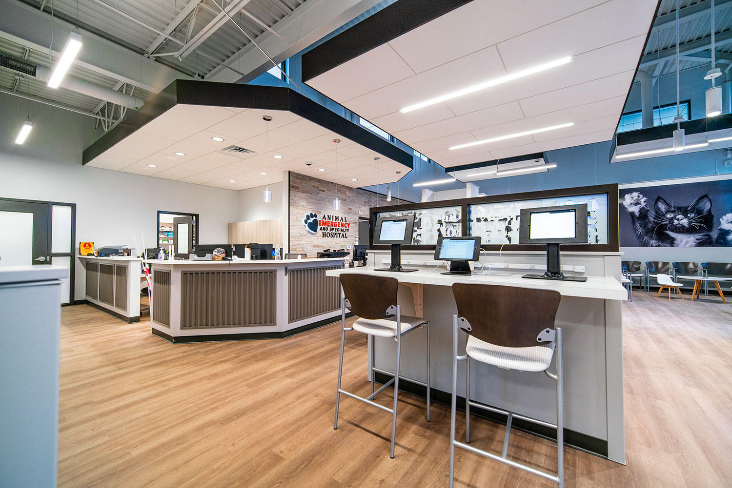
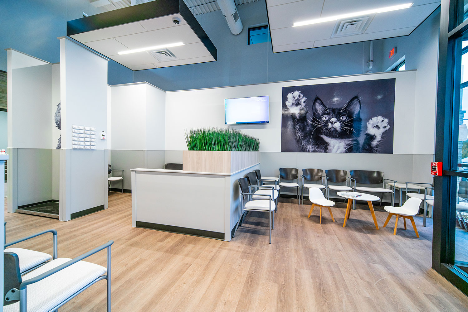
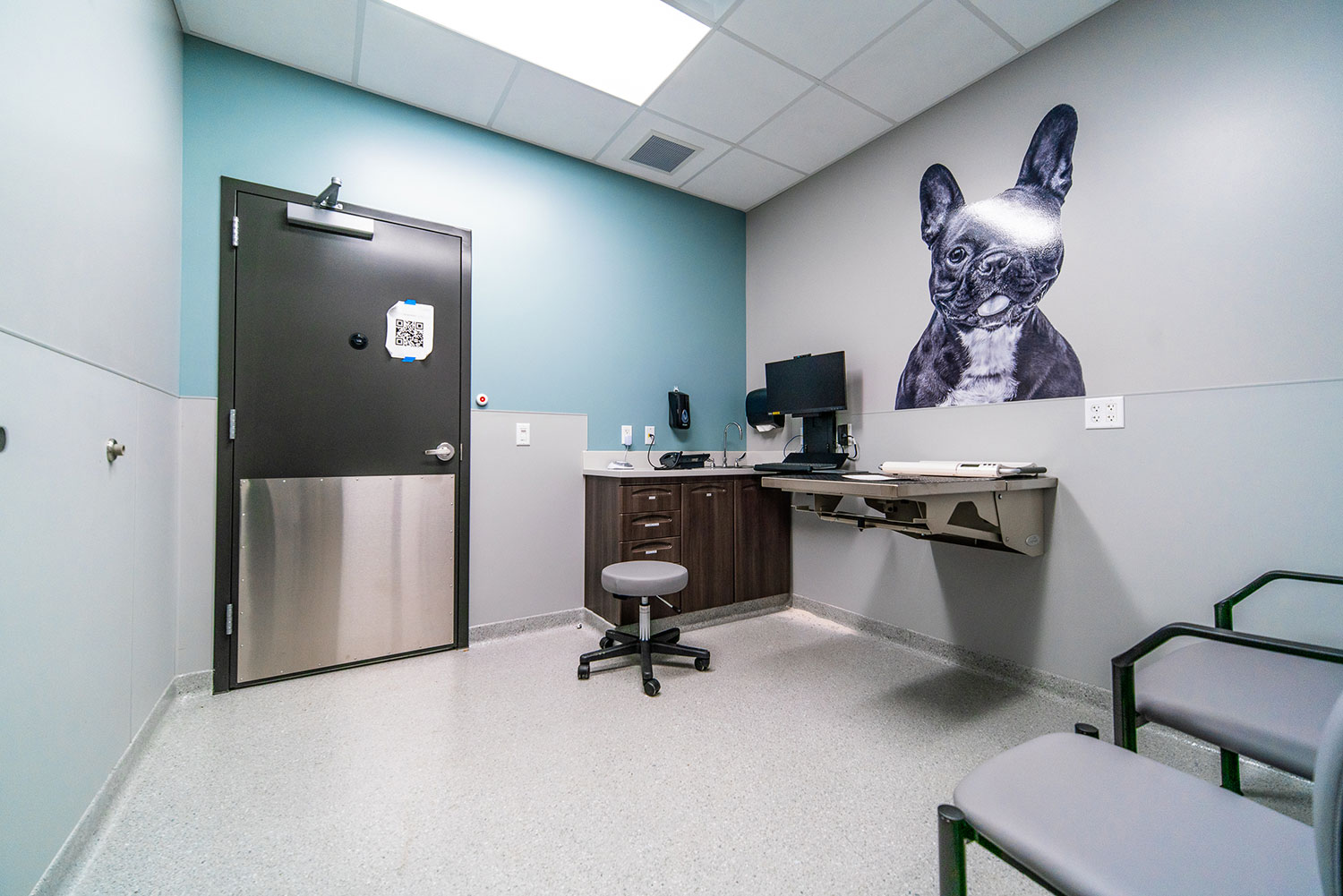
The plan for the Plainfield location was a flipped-flopped and mirrored version of the Byron Center location’s plan, due to site conditions, but it includes all these aspects that we so enjoy:

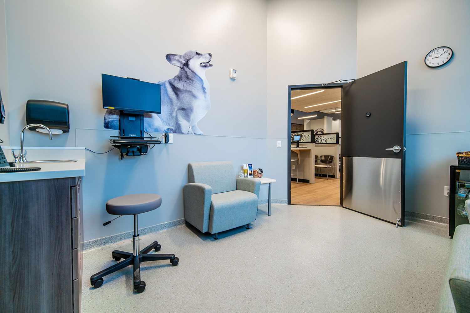
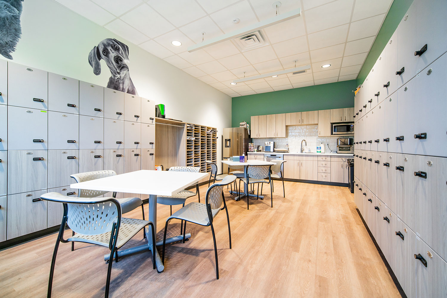
  • Large-scale black-and-white photos of dogs, cats, iguanas, birds, guinea pigs, and so much more.
  • Soaring tall ceiling in the lobby softened by “clouds” of acoustical materials and strip lighting.
  • Shiplap wood walls.
  • Metal-faced reception desk.
  • Half-walls in the waiting room with silhouettes of animals.

Click on the thumbnails below to enlarge.

© All photos courtesy of First Companies

Third Coast Oral & Maxillofacial Surgery

Third Coast Oral & Maxillofacial Surgery

Third Coast Oral & Maxillofacial Surgery

2119 64th St SW
Byron Center, MI 49315

A returning customer, Third Coast Oral and Maxillofacial Surgery, called us to help plan for an improved checkout experience for their patients. This meant planning and designing a small addition and reconfiguration of some rooms. Dr. Niquette, owner of Third Coast, has a very contemporary taste and r.o.i. Design tried to create a unique look with metal panel fronts and colorful metal posts. The check-in desk has some perforated metal and we wanted there to be a connection in materials.

The checkout desk is the place where transactions happen and appointments are made, so there needed to be more privacy than what they could offer at the reception check-in desk.

Click on the thumbnails below to enlarge.

Blueprint Dentistry

Blueprint Dentistry

Blueprint Dentistry

877 E 16th St
Holland, MI 49423

Dr. Kevin Kross of Blueprint Dentistry wanted his new dental office to reflect his technical and sophisticated approach to complete and premier dental care. His new logo includes architectural lines and symbols that clearly state the focus on precision dentistry. 

Blueprint Dentistry’s design elements reflect its brand. The lighting in the lobby is recessed linear LED that runs through the ceiling and continuously down the wall. The exam room corridor has a recessed cavity in the ceiling with unique box light fixtures that fit into the recess and create a special effect. 

The overall color scheme throughout is mostly black and white, which sparkles with accents of glass and specialty lighting. The reception desk is backlit with a frosted acrylic face with the logo and name etched into the material. In addition, the glass sliding doors with chrome barn door hardware in the exam rooms elevate a patient’s typical dental experience. 

The desk in Dr. Kross’s office is made from white concrete with flecks of silver and gold randomly embedded in the top. The private office is also set up to accommodate a second doctor. The lower-level break room also has a concrete table, which is 12 feet long, surrounded by Eames-inspired chairs. 

Click on the thumbnails below to enlarge.

© All photos courtesy of First Companies

Mailloux Dentistry

Mailloux Dentistry

Mailloux Dentistry

877 E 16th St Ste 50
Holland, MI 49423

What sets Mailloux Dentistry apart is their attention to the beauty and aesthetics of the smile. They are a family dentistry where adult and child patients receive the same attention.

The lobby of the space has many curves. The reception desk, bulkheads, ceiling accents, accent tiles, and many more elements all incorporate curvilinear shapes. The intention was to make their patients feel welcome and relaxed. Inside the reception bulkhead are wood baffles that enhance the coziness of the space.

The overall color scheme includes gold, warm white, pink, and gray. The elegance of the lobby chandeliers and the waiting room furniture are paired with a carpet that looks handmade. The vinyl flooring (LVT) in the exam rooms has accents of gold in a light parquet wood floor look.

On this project, we were honored to also design their new logo. We came up with numerous concepts and refined them down to the final product. We also provided and branding standards document so they could use their new logo to its full potential.

The lobby and reception furniture were also provided by r.o.i. Design. It is always wonderful to be able to finish a design we start down to these details.

Click on the thumbnails below to enlarge.

© All photos courtesy of First Companies

Kent County Office of the Defender

Kent County Office of the Defender

Kent County Office of the Defender

250 Monroe Ave NW # 800
Grand Rapids, MI 49503

Kent County Office of the Defender (KCOD) has been working with r.o.i. Design for over five years.  KCOD was funded and mandated by the State of Michigan to increase its capacity to serve more people.  Initially, we were trying to squeeze more people and efficiency into their small office. But the demand for space was growing, and it was clear a new and larger office was needed. The new office had to accommodate an increasing staff, be walkable to the courthouses downtown, and be connected to public transportation.  They also needed to maintain as much of the integrity of the space as possible (historical building, loyal realtors, and use type).

When KCOD leased the 8th floor at 850 Monroe, it had previously housed a law firm but was vacant for 10 years. The entry, lobby, reception, and training room needed minor updates and the office layouts were appropriate but too few. Generous corridors were narrowed so 12 offices and a conference room could be added. At their move-in in 2023, they had every office filled. To expand more, they would look to add space one floor down in the same building.

The suite’s previous design was quite dated and needed major finish updates to the lighting, paint, and flooring. r.o.i. Design added color-coordinated accents in quadrants: navy, green, and teal. The lunchroom, copy room, and client check-in received new case goods, and all received new laminates. It was decided to keep the original cherry paneling and marble floor in the Lobby.

The base paint color of the suite remained neutral, removing much of the wallcovering, and adding a lighter paint. All carpets were replaced with a mid-toned product which was better at hiding stains. Accent carpet tiles interrupt the pattern to enhance the color of the quadrant.

The lighting was inspected and converted to LED throughout. Very few decorative lights were added or needed. The restrooms had been updated just before the previous tenants left and worked very well for the group with just a few lighting tweaks.

Click on the thumbnails below to enlarge.