by Ryan | Jan 7, 2015 | Design News
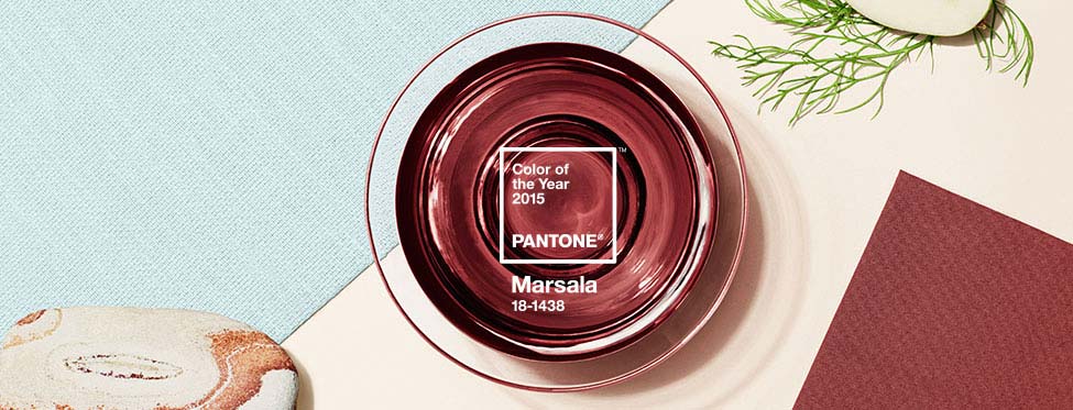
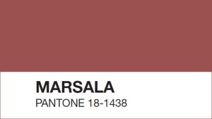 Pantone 18-1438 Marsala takes the spot this year as Pantone’s color of the year, following Radiant Orchid, and its subtlety is surprising. “Marsala enriches our mind, body and soul, exuding confidence and stability,” says Leatrice Eisman, Executive Director of the Pantone Color Institute. Marsala, the color, derives its name from a fortified wine made in Sicily that is often used in cooking. One may wonder whether or not Eisman’s description was meant for the color or the wine.
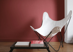 Pantone’s color of the year has been a persuasive part of the design, fashion and a number of related industries for over 50 years. We’ve been associating decades with colors since the 1950’s and Pantone is to thank…or blame. Marsala’s closest relative, Rust, comes from ‘The Earthy ‘70s,’ a significantly muted decade following ‘The Psychedelic ‘60s.’
How are these colors chosen, you may wonder, who decides? Well, secret meetings in European capitals twice a year, each with two days of presentations and debates given by representatives of color standards groups from many different nations is the process. Sounds pretty legit to me…But, what catchy title will this decade have?
Read more about Marsala and why it is Pantone’s Color of the Year HERE.

by Ryan | Dec 8, 2014 | Design News
Every industry has their own language. Words that aren’t often used in everyday conversations are used to describe conditions within the industry’s “lingo”. It is important we don’t confuse our customers, but sometimes we do when we use design jargon.
Here are some of the reasons why:
When describing the slant or a floor or ceiling surface, we use the word “cant”.
cant
/kant/
Noun: cant; plural noun: cants
A slope or tilt.
“The outward cant of the curving walls”
Synonyms: slope, slant, tilt, angle, inclination
Then the customer asks, “What can’t I do?”
When we are describing the brightness of a light source, we use the word “lumens”.
lu·men
/lo͞omən/
Noun: lumen; plural noun: lumens; symbol: lm
The SI unit of luminous flux, equal to the amount of light emitted per second in a unit solid angle of one steradian from a uniform source of one candela.
The customer says, “Well of course we are humans and I can see that it is not bright enough!”
We describe a built in seat as a “banquette”.
ban·quette
/baNGˈket/
noun
An upholstered bench along a wall, especially in a restaurant or bar.
The customer says, “We probably aren’t going to rent out the office for banquets.”
Describing a detail in a granite wall, we may say “kerf”.
kerf
/kərf/
Noun: kerf; plural noun: kerfs
A slit made by cutting, especially with a saw.
The customer says, “Sorry, I didn’t mean to be rude.”
When we are describing the durability of a flooring material, we say “P.S.I.”.
P.S.I.
An abbreviation for Pounds per Square Inch. It is a unit of pressure or of stress. It is the pressure resulting from a force of one pound-force applied to an area of one square inch.
The customer says, “I love that show, especially the LA version.”
r.o.i. Design is committed to providing the best possible customer experience and we vow not to intentionally confuse anyone with design jargon!

by Mary | Nov 19, 2014 | Design News, Graphic Design, Interior Design, Project Management, Retail Design
 We often get the question, “r.o.i. Design, what is that about?”
We explain that we believe the execution and build out of the design will bring a return on their investment. Said another way, the fees paid to us come back to our customer through their company’s improved efficiency, improved team performance, improved recognition, etc.
Probably one of the best of testimonials we got was from Lori Terpstra, owner of Rylee’s ACE, after the opening of her store on the corner of Michigan and Fuller in Grand Rapids, MI. She sent us a card that read, “From picking colors, laying out departments and designing our graphics, we certainly felt the ROI of r.o.i. Design.”
Some might say that we build an ROI by creating an interior design that reflects our customers brand while being sensitive to budgets. Some might say we build an ROI by adding services and expertise to our firm in addition to interior design where our customers are looking for solutions.
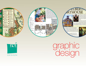 We have been including graphic design as one of our services for more than 10 years. It became clear, especially for our developer customers, that one-stop-shopping to create a brand, an interior, a logo, and a message was key to their success in conceptual development of their projects. When we are working with our customers on projects, we develop a relationship with them and if we do our job right, we understand their needs and have the opportunity to serve them in many ways, including graphic design and signage design. Ryan Bright, our Creative Executive, graduate of Kendall College of Art and Design and senior member of our team, has been serving our interior design customer graphic design needs since we added the service to our list.
Sharon Fisher, owner of Apothecary Gift Shop in Holland MI
We designed the store interior when it was Model Drug Store and Apothecary Gift Shop. Ryan developed the logos for both identities and worked with the sign companies to create the signage in the store. Recently Sharon sold the “Drug Store” part of her business and needed to redesign the exterior of the store to read just “Apothecary Gift Shop”. We were happy to work with her to create new awnings and signage for the exterior and interior. The store still looks great and is one of our favorite spots to shop for gifts.
Jor dan Hoyer of The Law Office of Jordan C. Hoyer
We did the interiors of Jordan’s office in the Trust Building in downtown Grand Rapids. We also created her logo, developed her website and created a half page ad that she ran in the Grand Rapids Business Journal, ArtPrize edition. Jordan claims that so many law firms have horrible websites and branding and she feels that with Ryan’s and r.o.i. Design’s help, she is getting a lasting return on investment.
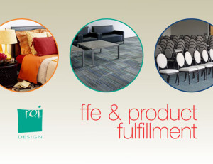 We focus on selling our time. But a long time ago, we saw the difficulty some of our customers were having staying within budgets with product procurement. Either they didn’t have the staffing time or expertise,and when they did, they were often paying for too many layers of distribution. We have offered a return on investment to several customers by finding the right manufacturers for the right job and tracking the purchasing and receiving process.
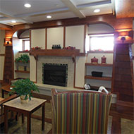 Meadow Brook Medical Care Facility in Bellaire, MI
This group is just finishing the 4th phase of a complete remodel and expansion of their facility. They knew on the onset that they didn’t have the time or experience to set budgets, solicit bids and negotiate prices to stay in budgets. We became their purchasing department for two years. Like most jobs of six figures or more, up to ten percent of product can be a disappointment, either by quality or service. David Schultz, the point person of the facility, had the ability to focus on the positive and help us help them work through the glitches.
The Inn at Harbor Shores in St. Joseph, MI
Edgewater Resources, a fairly new development group with several marina developments on their boards realized half way through construction that they wouldn’t be able to manage procurement without adding staff. The construction group, Lamar Construction, recommended us to help them be their staff with the selection, bidding and purchasing of FFE. Again, no huge purchasing project is without flaws, but this group worked with us as we had some items reworked, rehung and corrected. Thanks Michael Woods for your support!
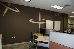
Spin Dance Offices with Tops
To create unique spaces, sometimes that means custom decorations. We have never been afraid to offer to get the custom decor made and installed in order to keep the design intact. Sometimes we can actually make it in our little shop and sometimes we can manage all the parts and pieces and assemble it.
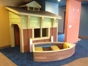 Van Wingen and Mandeville in Traverse City, MI
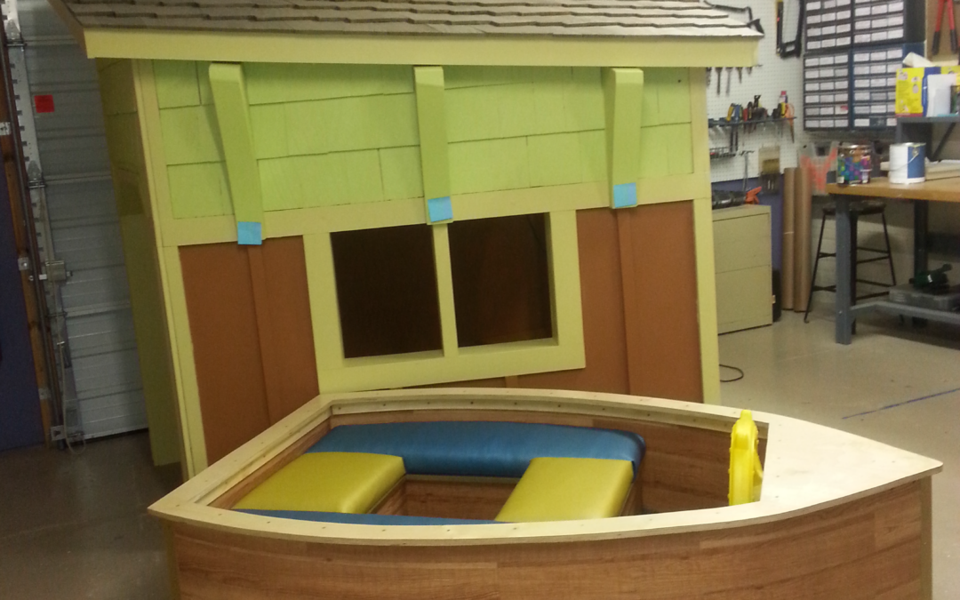
Rockford Construction engaged us to design this pediatric dental office where they see 40 children an hour! Their lobby had to accommodate and engage kids from ages two and up. We had a vision to create an office that had three themes; water, land and sky. We wanted to “float” felt boats in the lobby to help with acoustics and everyone looked at us puzzled. “We will make ’em,” we said. And that led to us making a boat house and boat for the lobby.
The Millenia Companies in Cleveland, OH
One of their properties in Clinton Township had just been remodeled and they were looking for a group to come in and add wall art, occasional furniture and floor plants. They wanted the final step of decor to feel local. We said, “We can do that!” We researched images of the Detroit area and their local environs and came up with a package that they said “fit the bill”.
So how we provide a return on investment is based on our holistic approach to getting a design interior to be the best that it can be. And if we can do more than interiors, we are all in.
r.o.i. Design provides a return on your design investment and creates lasting customer experiences.
We are a creative team who leads the process of collaborative planning and design
Our methods and problem solving skills produce outcomes that are based on budget, brand and beauty.

by Mary | Nov 12, 2014 | Design News, Interior Design
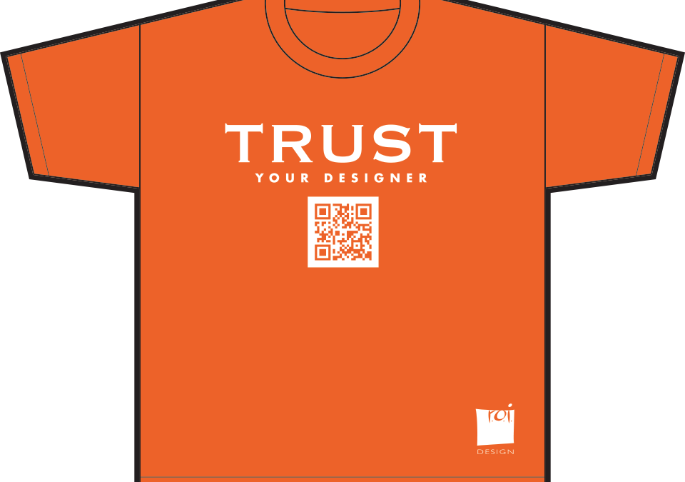
 A few years ago, when r.o.i. Design was in the midst of a large project, the construction project manager joked with us saying, “You should create t-shirts that say Trust Your Designer and maybe folks would relax and not try to second guess recommendations”. We all had a good chuckle, but we actually did print those t-shirts. We proudly wear our shirts, not to say we have all the answers, but that we might have some really good ones and ask to be heard.
Here are some comments from our 2014 customers that support the “Trust Your Designer” philosophy:
Customer #1
“I would have never thought to use so many colors in the office. I thought it would look kiddish or unprofessional, but it looks great and our customers love it.”
Customer #2
“We thought you guys were nuts when you asked us not to replace the carpet but seal the concrete instead. We didn’t want a cold environment or to look like we didn’t have enough money to carpet the place. Well, we had to take back our words when we saw the final product. It looks like amazing.”
 Customer #3
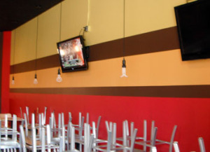
“Stripes, not just stripes but yellow stripes! You had to convince us to let the painter paint one to show us. We were ready to kibosh the whole scheme and were second-guessing the rest of the paint colors after that. We hate to admit it, but it looks amazing! We almost had a heart attack in the process, but we have gotten so many compliments and our staff loves working in a youthful energetic place.”
Customer #4
“We really wanted a first class office and were ready to pay for it. We couldn’t believe you were telling us to spend less money. When you came to us with a budget that was 75% of what we wanted to spend, saying that it would be great, we had our doubts. We thought for sure that the actual costs were going to end up being closer to our original number and were getting annoyed at the delay of the start of the design process. Well, we did spend more than 75% of our first budget, but not by much and the style and look of our offices actually looks like we spent more than we did. We won’t say that we will never doubt you again, but the next time, we will be more willing to listen to your pre-design ideas than we were last time.”
 Customer #5
“When we hired you, we told you we just wanted consulting on finishes and that the plan was set. We didn’t want to engage in any conversation about layout since we had been through several months of space planning. We believed we had the best possible plan. I remember when you came to a meeting with some tracing paper and a Sharpie pen. You said, “We have to show you something on the plan that we believe is a mistake”. Do you remember how upset we were? But you went on to demonstrate that we had eaten up space with hallways that weren’t needed and we ended up with a 2nd conference room and a facilities office that we sorely needed. We probably have told a dozen people about our experience with r.o.i. Design. We didn’t realize all your experience in so many areas of design and how you could offer us a return on investment if we let you.”
Providing a return on investment is our goal for all our customers. We want the fees that are paid us to be returned back to them with improved performance and customer satisfaction. r.o.i. Design has been in the business of helping our customers create environments that “work” for more than 20 years. It is our passion to partner with them in creating positive change.

by Mary | Oct 1, 2014 | Design News, Designing Public Areas, Home Design, Interior Design

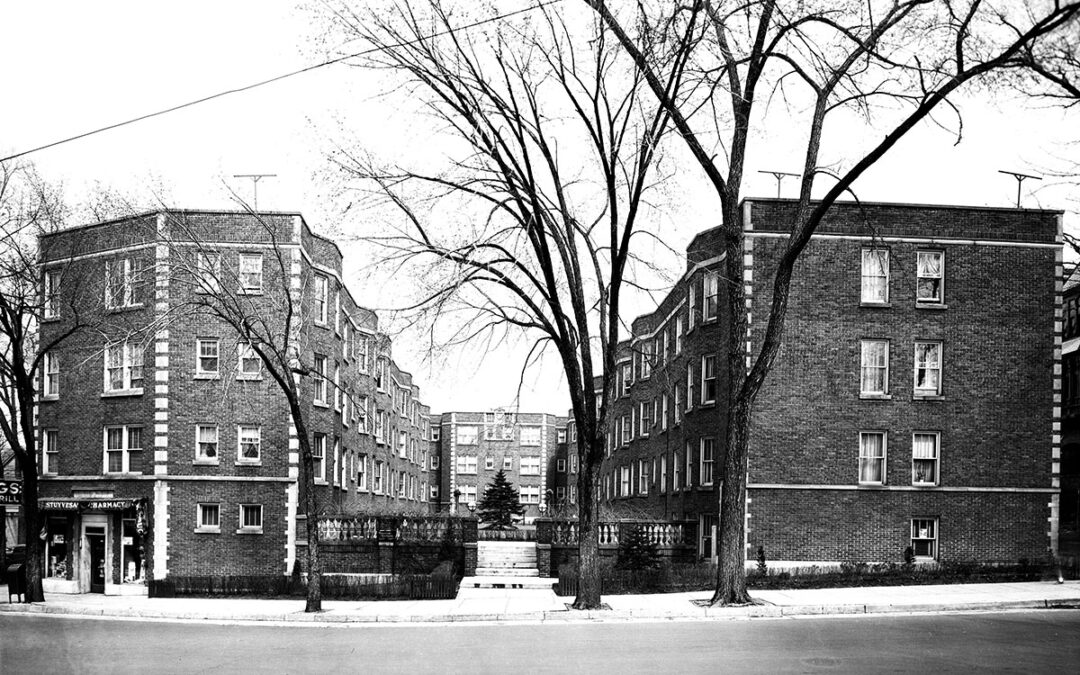
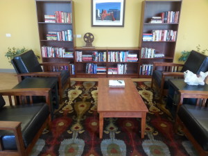
Stuyvesant Apartments Library Lounge
Our friends Hooker DeJong Architects and Engineers have referred us for a variety of projects in hospitality in the past, including Double JJ Ranch and Resort and Meadow Brook Medical Care Facility. So when their apartment developer clients asked them if they knew anyone who could work with them to finish the design and decor in their common areas, we were pleased that they thought of us. Projects of this caliber all have a requirement to offer a computer room, a community room, a laundry room, an exercise or activity room and a library. We have been very impressed with the facilities that we have been working with and are seeing these types of facilities being more and more interested in creating a community within their building.
Stuyvesant Apartments in Grand Rapids MI
Hooker DeJong and Wolverine Building Group.
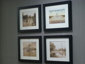
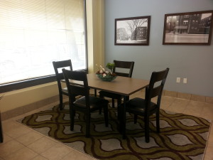
Because of the historical nature of this project, it had the additional criteria of having historically-inspired decor. We were asked to use vintage photographs, which we researched through the collections at the Grand Rapids Public Library. Other decor consisted of a West Michigan theme, ranging from manufacturing to recreation.

Elevator Lobby Art of Belle Isle at St. George Tower
St. George Towers in Clinton Township, MI
Hooker DeJong and The Millennia Companies
This complete renovation is a wow! As we worked through selecting art and accessories, we sensed the pride the residents and the management had in this project. We enjoyed hearing comments from the residents who followed us around as we hung art and staged areas who looked over our shoulders and said, “I remember that place!” “That’s the Tech Center on Mound Rd? Sure looks different today!”

Lobby of Stuyvesant Apartments with Historic Photos of Site

by Mary | Oct 1, 2014 | Design News, Designing for Kids, Designing Public Areas
Drs. Jamie VanWingen and Matt Mandeville of Northern Michigan Pediatric Dentistry typically will see up to 20 patients per hour and most of them are under the age of five.

The lobby playhouse and boat, “USS Tooth Ferry”
They’ve been planning for growth, and to meet their changing needs, engaged Rockford Construction to work with them to remodel a building on 8th Street in Traverse City, MI. Bob Cornwell of Cornwell Architects was asked to work with them to create a space plan. Last spring we were contacted by Josh Reynolds of Rockford Construction to inquire if we had experience with designing for kids and if we would give him a bid for the interiors of this project. We showed them our work with children’s museums, day care centers, schools and theme parks and they invited us “to play”.
Mary and Mary Jane from r.o.i. Design worked with Drs. Jamie and Matt to come up with an interior that reflected their outgoing nature and love of adventure and travel.

The Lobby will have hanging felt boats, radiating beams, and a boat house.
Part of the design criteria given to us was to design interesting flooring patterns and interesting ceilings. The doctors also wanted to get away from the literal kid-mural type of interiors and instead work with blocks of color and graphics so the space would appeal to both kids and families.It was also important to ensure staff wasn’t exhausted by working in a space that was so visually busy.
The new office is designed around three areas; Water, Land and Sky. The interior finishes reflect those themes in a colorful way. The completion date is scheduled for November 2014. For more about what we did on this job see our blog story “There is a Boathouse in the Warehouse”.

The corridor through the “Land” theme.

Inset stone path in the vinyl flooring in the “Land” theme

Welcome to the “Sky”. Hanging clouds will be suspended over the dental chairs

Inset star shapes in the “Sky” theme

 Pantone 18-1438 Marsala takes the spot this year as Pantone’s color of the year, following Radiant Orchid, and its subtlety is surprising. “Marsala enriches our mind, body and soul, exuding confidence and stability,” says Leatrice Eisman, Executive Director of the Pantone Color Institute. Marsala, the color, derives its name from a fortified wine made in Sicily that is often used in cooking. One may wonder whether or not Eisman’s description was meant for the color or the wine.
 Pantone’s color of the year has been a persuasive part of the design, fashion and a number of related industries for over 50 years. We’ve been associating decades with colors since the 1950’s and Pantone is to thank…or blame. Marsala’s closest relative, Rust, comes from ‘The Earthy ‘70s,’ a significantly muted decade following ‘The Psychedelic ‘60s.’


 Customer #3
 Customer #5