by Ryan | Aug 31, 2016 | Branding, Design News, Designing Public Areas, Exhibit Design, Graphic Design
The Grand Valley University Foundation (GVUF) is the umbrella organization and recognition society for all who give to the University through annual giving, capital campaigns, special giving or planned giving. And while the steady growth of the University is apparent, the Shaping Our Future Campaign was a landmark.
At the annual Enrichment Dinner in 2011, the foundation announced that not only did it meet the stretch goal of $75 million for the Shaping Our Future campaign, it exceeded it. Thanks to more than 17,000 donors, the foundation raised $96.4 million.*
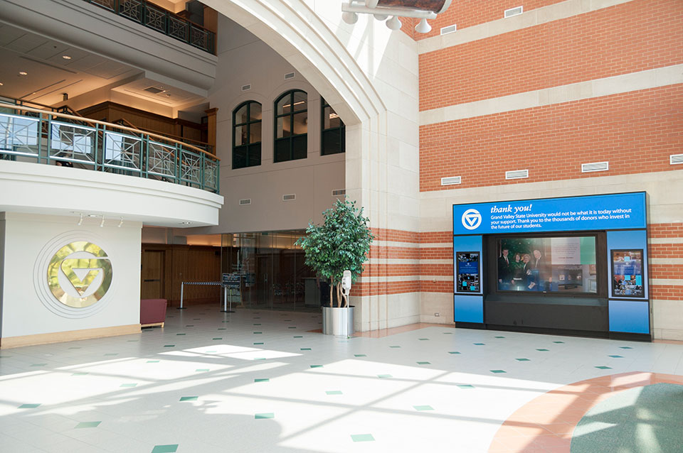
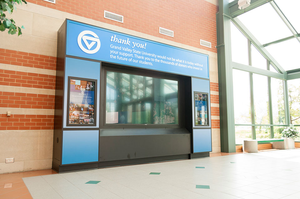 The challenge of creating a “donor wall” with 17,000 names to acknowledge all the givers developed into an opportunity. The goal was to acknowledge the donors but also inspire students and alumni in the story of philanthropy of Grand Valley State University.
The GVUF committee wanted to create an interactive display using touch screen technology and video to invite technologically-inclined students to engage with the exhibit. r.o.i Design, who also designed the L. William Seidman exhibit at the L. William Seidman School of Business, was asked to design and manage the execution of the donor exhibit.
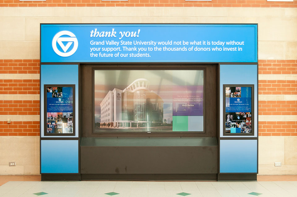 The foundation developed all lists, all copy and compiled photos, giving r.o.i. Design the assignment to design and develop the graphics, the exhibit and hire the team who could complete the work. Along the way, it was determined that in addition to the Shaping Our Future donors, all donors in recent history should also have a way to be acknowledged in the touch screen experience.
The exhibit was installed at the Student Services Center in Allendale in July 2016. We acknowledge the efforts and contributions of CK Productions for compiling the video, Underbite Games for the touch screen app, Superior Wood Products for the exhibit casework and Custer Tech for the AV equipment.
For more about the GVUF click here.
* The results of the Shaping Our Future campaign, Mary Idema Pew Library Learning and Information Commons and the L. William Seidman Center, were both dedicated with much celebration by the Grand Valley community and the foundation in the Fall of 2013.
by Ryan | Apr 2, 2015 | Branding, Design News, Designing Public Areas, Graphic Design, Retail Design
 Grand Valley State University
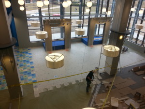
The new 40,000 SF marketplace retail facility at the Allendale campus of Grand Valley State University will be open to students this month.
The planning of the store started in 2012 when the University Book Store team researched other university stores to see the trends in campus retail. We weren’t surprised to learn:
 Books are no longer the big seller. If students haven’t converted to electronic books, they probably are shopping online for the best price for used books. The name of the store is now officially GVSU Laker Store, no more “book” store.
- Food and technology are part of the experience. At GVSU Laker Store there will be a department where students can purchase hardware and software for most of their technology needs. Adjacent to the store, outside the door, Starbucks and Which Wich are ready to capture the shoppers on their arrival and exits.
- They are competing with off campus retail experiences for fashion and active wear. For GVSU Laker Store that means competing with product mix, service and store design. That’s where r.o.i. Design comes in.
 As part of the Fishbeck Thompson Carr & Huber (FTC&H) design team, we worked with the store staff, GVSU facility managers and FTC&H to come up with a competitive experience. The criteria for design was to create a space that resonates with the student experience of “making unique choices”. We want the student to recognize themselves in some elements or parts of the store through the variety of finishes and graphics. We wanted them to take ownership and be proud of their school store. “Lakers for Life”.
Some of our favorite parts of the design:
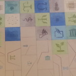 Custom tile: using the universal symbols for academic departments, we created a mosaic of color to indicate all choices of study and types of students were welcome here.
- Media Display: In the taller part of the store, 9 screens create a large display that can either show one large image or up to 9 individual images. The plan is to show real time GVSU athletic games and musical performances while students and their family shop.
- Custom graphics: using the letters G, V, S and U, we created a “cloud” type graphic using different fonts and colors again to represent that the GVSU experience is as diverse as its community and highly connected through technology.
- The Laker Wave: the two story volume holds over 250 translucent blades of cloth that together attempt to create the image of moving water. The gesture of the blades texture the interior but also impact the look of the exterior as they are seen through the wall of curtain glass.
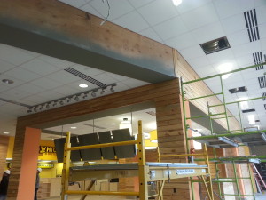
 Reclaimed wood: throughout the interior and exterior there is reclaimed wood siding. The internal staircase in the store is a friendly combination of wood, color and light.
- Color: (Photo) challenging the campus standards of GVSU blue and white, GVSU Laker Store is vibrant as it reflects the many colors of the fashion shown in the store.
![The R.O.I. in Restaurant Remodels]()
by Ryan | Apr 1, 2015 | Branding, Design News, Interior Design, Restaurant Design
 Consistently serving great food is the best way for a restaurant owner to keep customers coming back for more. However, lighting, cleanliness, wall décor and even the ambience are all things that your customer will notice. To offer the ultimate dining experience you need to appeal to every sense of your target customer. Remodeling your restaurant is part of an overall plan to increase business. The improvement plan puts good food at the top of the list. Second is the overall cleanliness and service. We recommend a regular maintenance program for cleaning and an appropriate staff training method be well established before making any changes to the décor.
If your food is great, your staff is friendly and you hold a high standard of cleanliness then you are ready to think about changes to the interior.
 Undergo this process with three things in mind:
- The Menu—The atmosphere you intend to create should be indicative of the food you serve. It should complement the menu. Your brand is the basis for the entire experience.
- Budget and Scope—An interesting surrounding does not need to cost a fortune. Unique and creative solutions are always available and can set you apart from the rest. It is important to do enough so customers see your investment but maintain restraint so costs can be covered within a reasonable period of time. That’s good business planning.
- Your Customer—Establish who they are and what appeals to them. A family of four and a 25 year old single male will have a very different set of ideals and it’s important for a restaurant owner to be conscientious of that.
Remodeling for a restaurant means at least one of the following:
- Changes in seating layouts and new furniture to fulfill the layout—The current trend consists of more bench seating, less traditional booths and more open café seating versus heavy dining arrangements.
- Changes in finishes, flooring, walls and ceilings—Restaurants are showing lighting brighter interiors with a wide variety of finishes within rooms.
- Changes in lighting—With the arrival of LED, clean and well lit rooms are a welcome “upgrade” for the customer.
- Changes in wall décor—Technology has made it possible to have a variety of custom décor options that are restaurant or site specific. Avoid residential décor solutions. Build the brand.
A return customer is a return on investment. Happy dining.

by Mary | May 6, 2014 | Branding, Design News, Interior Design
There is a short walk between design and marketing. They are neighbors, and like good neighbors they share with one another.
No one wants a trendy design that will require a remodel before the bills are paid. No one wants a corny theme, but everyone wants a look that fits them and lasts the test of time. When branding a project, r.o.i. Design makes sure to include these steps in their process.
1. First understand the people who are going to use the space. What is their relationship to the brand? Is it their space, the place they work, their favorite retail store, their place of worship or the place to weigh-in for Weight Watchers?
2. Understand the message that the owner of the space wants to convey. We often hear words like professional, comfortable, efficient, welcoming, motivational, safe and casual. We want to provide those things and more. What attribute of the business or the owner can we share that is of interest and illustrates how this space is different from other places?
3. Be authentic. The details that extend a brand are meaningful and lasting. They can sometimes become iconic but don’t necessarily start that way. Quite often, our customer will relate these details as “fun” without being silly. They often are subtle or integrated in a way that is so natural that, “of course that detail would be there”. For CPA’s Baker | Holtz, who didn’t want to appear “shy” about their profession, we found little ways to make them smile and gave them landmarks in their space so they could give an interesting tour of their office.
4. Be addictive. When the recipe for a design works, the nuances of the “brand look” are happily continued by the users of the space. For a while, r.o.i. Design called themselves “Design Dogs”, happy to follow the customers lead. We saw ourselves so differently than the aloof cat-like designer stereotype that for a while we had dogs on the backs of our business cards. People started giving us dog sculptures and other dog-related stuff, on and on.
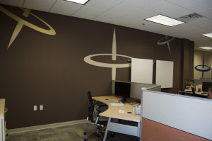
We worked with Spin Dance in their downtown Holland office space. We tried to understand the complex service this technology group offers to their customers and we tried to understand the name. We offered to them that perhaps they could illustrate data spinning, so quickly, so precisely and to the point, like a spinning top. It stuck. We want all spaces that are important to you to be significant and tell your story. You shouldn’t have to borrow a cup of sugar from “marketing” to make it that way.

 The challenge of creating a “donor wall” with 17,000 names to acknowledge all the givers developed into an opportunity. The goal was to acknowledge the donors but also inspire students and alumni in the story of philanthropy of Grand Valley State University.
 The foundation developed all lists, all copy and compiled photos, giving r.o.i. Design the assignment to design and develop the graphics, the exhibit and hire the team who could complete the work. Along the way, it was determined that in addition to the Shaping Our Future donors, all donors in recent history should also have a way to be acknowledged in the touch screen experience.


 Undergo this process with three things in mind: