by Ryan | Jan 7, 2015 | Design News
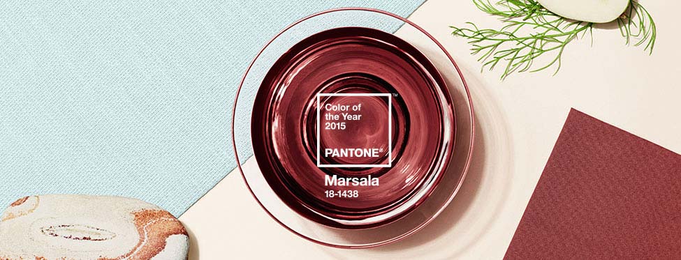
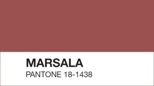 Pantone 18-1438 Marsala takes the spot this year as Pantone’s color of the year, following Radiant Orchid, and its subtlety is surprising. “Marsala enriches our mind, body and soul, exuding confidence and stability,” says Leatrice Eisman, Executive Director of the Pantone Color Institute. Marsala, the color, derives its name from a fortified wine made in Sicily that is often used in cooking. One may wonder whether or not Eisman’s description was meant for the color or the wine.
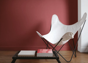 Pantone’s color of the year has been a persuasive part of the design, fashion and a number of related industries for over 50 years. We’ve been associating decades with colors since the 1950’s and Pantone is to thank…or blame. Marsala’s closest relative, Rust, comes from ‘The Earthy ‘70s,’ a significantly muted decade following ‘The Psychedelic ‘60s.’
How are these colors chosen, you may wonder, who decides? Well, secret meetings in European capitals twice a year, each with two days of presentations and debates given by representatives of color standards groups from many different nations is the process. Sounds pretty legit to me…But, what catchy title will this decade have?
Read more about Marsala and why it is Pantone’s Color of the Year HERE.

by Ryan | Dec 8, 2014 | Design News
Every industry has their own language. Words that aren’t often used in everyday conversations are used to describe conditions within the industry’s “lingo”. It is important we don’t confuse our customers, but sometimes we do when we use design jargon.
Here are some of the reasons why:
When describing the slant or a floor or ceiling surface, we use the word “cant”.
cant
/kant/
Noun: cant; plural noun: cants
A slope or tilt.
“The outward cant of the curving walls”
Synonyms: slope, slant, tilt, angle, inclination
Then the customer asks, “What can’t I do?”
When we are describing the brightness of a light source, we use the word “lumens”.
lu·men
/lo͞omən/
Noun: lumen; plural noun: lumens; symbol: lm
The SI unit of luminous flux, equal to the amount of light emitted per second in a unit solid angle of one steradian from a uniform source of one candela.
The customer says, “Well of course we are humans and I can see that it is not bright enough!”
We describe a built in seat as a “banquette”.
ban·quette
/baNGˈket/
noun
An upholstered bench along a wall, especially in a restaurant or bar.
The customer says, “We probably aren’t going to rent out the office for banquets.”
Describing a detail in a granite wall, we may say “kerf”.
kerf
/kərf/
Noun: kerf; plural noun: kerfs
A slit made by cutting, especially with a saw.
The customer says, “Sorry, I didn’t mean to be rude.”
When we are describing the durability of a flooring material, we say “P.S.I.”.
P.S.I.
An abbreviation for Pounds per Square Inch. It is a unit of pressure or of stress. It is the pressure resulting from a force of one pound-force applied to an area of one square inch.
The customer says, “I love that show, especially the LA version.”
r.o.i. Design is committed to providing the best possible customer experience and we vow not to intentionally confuse anyone with design jargon!

by Ryan | Dec 8, 2014 | Church Design, Designing Public Areas, Interior Design, Project Management
Schools, churches, foundations and other non-profit organizations need design as much as ‘for profit’ companies. But there is a difference:
- Non-profits are making legacy decisions; what they do in their organization has an impact beyond current staff tenure.
- They typically have to raise funds for a project alongside designing the project.
- The process in design and project management is slighting more “hands on”.
- And it always involves processing information with a larger group of people, i.e. a committee and volunteers.

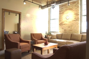
We worked with non profit Colossian Forum to design their new offices.
r.o.i. Design has experienced some methods and processes that are very helpful when working with non-profit organizations.
1. Helping the customer “see” designs
Most of the time the representatives of an organization are not experienced in developing designs, planning buildings or remodeling. Their only frame of reference might be their own home improvements. That means it is important to use as many visual tools as possible to describe designs and process; tours of other facilities, photos of other facilities and renderings of concepts prior to hard lining a design.
2. Managing expectations
All jobs start with the budget, but in these cases it is even more critical. Design professionals have to understand the resources available before designing begins.
The organization needs to understand the included steps to design. Laying out an overall schedule is helpful as well as establishing a habit of creating meeting minutes.
Technology is making sharing files much easier so information can be updated in real time.

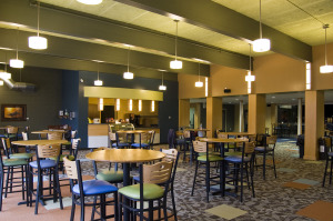
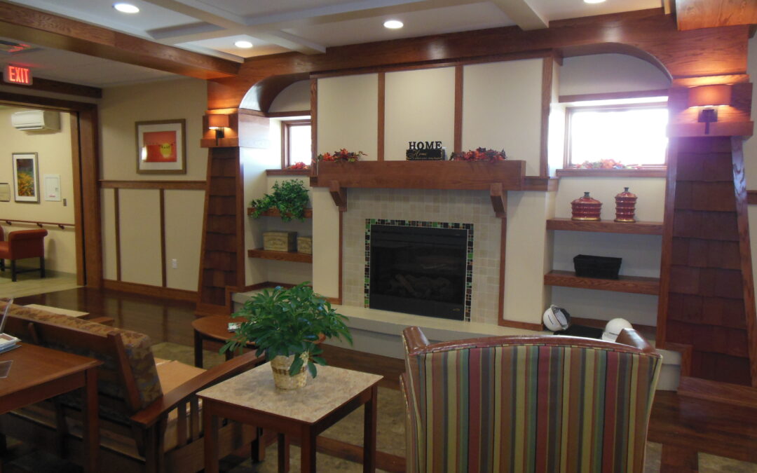
Cafe at Life Stream Church in Allendale, MI
3. Advocacy
It is not uncommon for design professionals to act as facilitators and advocates for their clients as the design is priced and bids start coming in. Being able to maintain design intent and still meet budgets is crucial. A group of people from the organization was charged with executing work and have shared their excitement and ideas with the broader group. Being able to help them “deliver” on that promise is part of the job.
4. Philanthropy
Building trust between the organization and the design team is a necessary element to working with non-profits. That may require some above and beyond involvement or participation in their activities.
Demonstrating an understanding of giving and how it furthers the mission of the organization establishes a common ground. A building or remodeling project is an opportunity to get people involved and teach others the lessons of philanthropy.
r.o.i. Design has had several non-profits as customers, including Grand Valley State University, Meadow Brook Medical Care Facility, Grand Rapids Child Discovery Center, Spring Hill Camp, Colossian Forum, Grandvue Medical Care Facility, Theological Book Network and Wesleyan Conference West Michigan.
We have been pleased to work for several churches, including Life Stream (Allendale, MI), Crossroads Wesleyan (Imperial, Nebraska), Kentwood Community (Wyoming, MI), Hope Reformed (Holland, MI) and Sonrise (Ft. Wayne, IN).

by Ryan | Sep 26, 2014 | Design News

Last year’s ArtPrize installation, Benjamin Moore paint sample mosaic.
Well, it is that time of the year again. Leaves are changing colors, the air is getting crisp, and for the city of Grand Rapids, time for ArtPrize! The international art competition kicked off this week and the excitement in the community is evident. As everyone seems to be getting into the spirit of the arts, our team at r.o.i. Design is no exception.
Last year we got our creative juices flowing and created an installation in our lobby, creating a mosaic image out of 2” x 2” Benjamin Moore paint samples. This year we are doing another installation in the lobby of our building at 1451 Front Ave. NW.

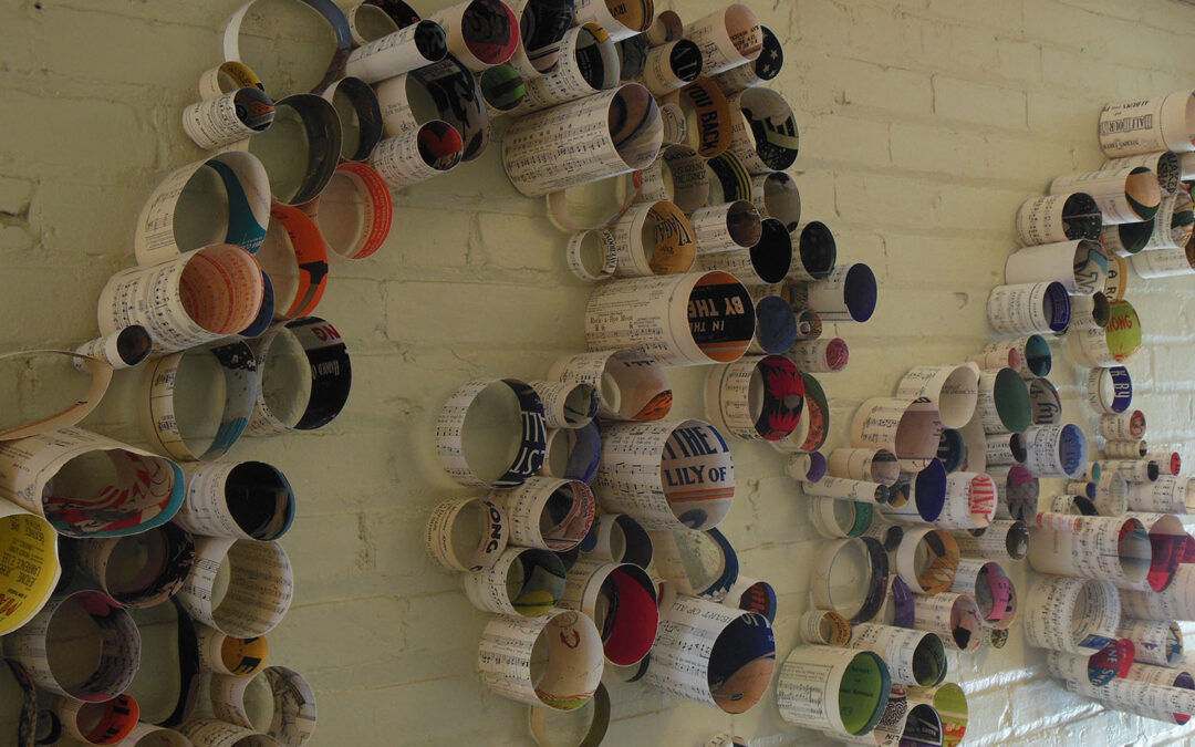
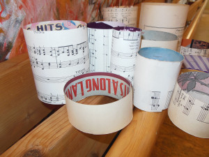
Old sheet music, rolled into rings and fastened together.
Our new design assistant, Ian McRae, has been diligently cutting, rolling and taping together pieces of old sheet music to create a unique art installation he calls “Solo”. Ian is a graduate of Kendall College of Art and Design, with a major in Sculpture and Functional Art. The sheet music comes from the personal collection of r.o.i. Design owner Mary Witte, and pieces date back to the early 1900’s.

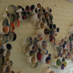
Detail of installation. Click for larger view.
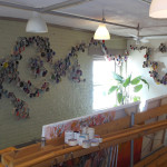
With over 500 individual paper rings, taped together and carefully arranged together along the walls in our building’s entry, the installation makes quite an impact. While the piece is not an official ArtPrize entry (we are located just North of the event’s boundaries) we feel it is a fitting attempt to participate in this celebration of the arts.

ArtPrize 2014 installation in our building’s entry at 1451 Front Ave. NW. Click for larger view.
If you are in the area, stop by during normal business hours and check it out. We would love to see you and hear what you think about the installation.

by Ryan | Jul 29, 2014 | Church Design, Design News, Home Design, Project Management, Retail Design
r.o.i. Design has a very friendly relationship with and sincere respect for architectural design, although we are not architects. Some of us have had training in interior architecture, but mostly we are known for our creativity, our process and our desire to deliver a “return on investment”. We do help our customers procure the architectural services they need for their projects and can manage the process of delivering the design when it is appropriate.
CLICK HERE to see our services and all that we do.
We have designed commercial buildings, store facades, homes, and a variety of office and store remodels for contractors and business owners. In these cases, we hire architects to review our drawings, add code language and seal our drawings. Two small architectural firms with whom we have a long history of working together are Architectural Concepts (Ken Watkins) and TJA Architecture (Tim Allspach).
Most recently we assisted Gerrit’s Appliance with the planning of their Kentwood showroom, planned by fall of 2014 and Williams Kitchen and Bath with the planning of their new Plumbing Showroom. We also are working with developers of mixed used spaces helping them design (or redesign) their new spaces from buildings that were formerly commercial or industrial, turning them into retail and office spaces.

Modern home remodel we designed with Bruce Heys Builders
We also have designed homes under 3800 square feet working with builders. We are very proud of the home we designed for Bruce Heys Builders that converted a 70’s ranch to a modern home suitable for years to come.
If we were approached with a larger project, we would contact our friends at HDJ Architects (David Layman and Eric Maring). We have partnered with HDJ on the Double JJ Ranch and Golf Resort in Rothbury MI, a variety of Michigan credit unions and most recently Meadow Brook Medical Care Facility in Bellaire MI.

Meadow Brook Medical Care Facility, designed with HDJ Architects
When churches call us, we prefer to partner with Elevate Studio (Steve Fridsma & Jim VanderMolen). Steve reminded us that when he was a student he attended an event that toured our company, Designers Workshop, and we had our first professional project with him when he was with Progressive Architecture.

Welcome Center at Sojourn Lakeside Resort in Gaylord
There have been situations where a client comes to us to create a concept. They prefer to take the concept from us to a local architect in their region to create construction documents. This was the case for the Welcome Center at Sojourn Lakeside Resort in Gaylord for the Lambert Family.
Never before has architecture and interior design been as integrated as it is today in our society and industry. Our customers realize the value of bringing us in at the architectural conceptual stage as we identify, from the beginning, how people might interact with the space. Interior design and architecture impacts behavior and as spaces are imagined, we assist the design team in keeping the customer experience in mind.

 Pantone 18-1438 Marsala takes the spot this year as Pantone’s color of the year, following Radiant Orchid, and its subtlety is surprising. “Marsala enriches our mind, body and soul, exuding confidence and stability,” says Leatrice Eisman, Executive Director of the Pantone Color Institute. Marsala, the color, derives its name from a fortified wine made in Sicily that is often used in cooking. One may wonder whether or not Eisman’s description was meant for the color or the wine.
 Pantone’s color of the year has been a persuasive part of the design, fashion and a number of related industries for over 50 years. We’ve been associating decades with colors since the 1950’s and Pantone is to thank…or blame. Marsala’s closest relative, Rust, comes from ‘The Earthy ‘70s,’ a significantly muted decade following ‘The Psychedelic ‘60s.’


