by Ryan | Dec 18, 2018 | Uncategorized

There are so many causes and needs in our community. This year, our hearts went to pets and sheltered animals. Several of our team members lost pets this year, or face losing them, or are searching for that new pet. It is a daily topic of discussion in our office. We realize how much pets mean to us, and how they are such healers. So, during this holiday season, we decided to campaign to raise funds for one of our favorite animal causes, Mackenzie’s Animal Sanctuary.
We met Mackenzie’s through our clients Sue and Hank Gignac. Sue has been an avid volunteer for years, and Sue and Hank have rescued many of their animals. Sue’s love for the people and animals of Mackenzie’s put us on a path to set up a fundraiser and to volunteer as a company to support their work.
Our holiday card sentiment sums it up pretty well:
“A pet to cuddle and love brings great joy. We wish you all the love and joy this season can bring.”
You can DONATE to our campaign raising funds for them HERE.
You can learn more about Mackenzie’s Animal Sanctuary HERE.

by Ryan | Dec 18, 2018 | Design News, Interior Design, Medical Design

Photos © First Companies
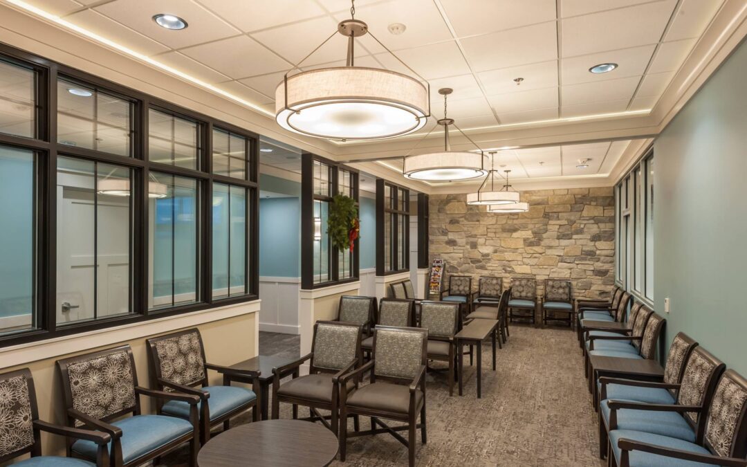
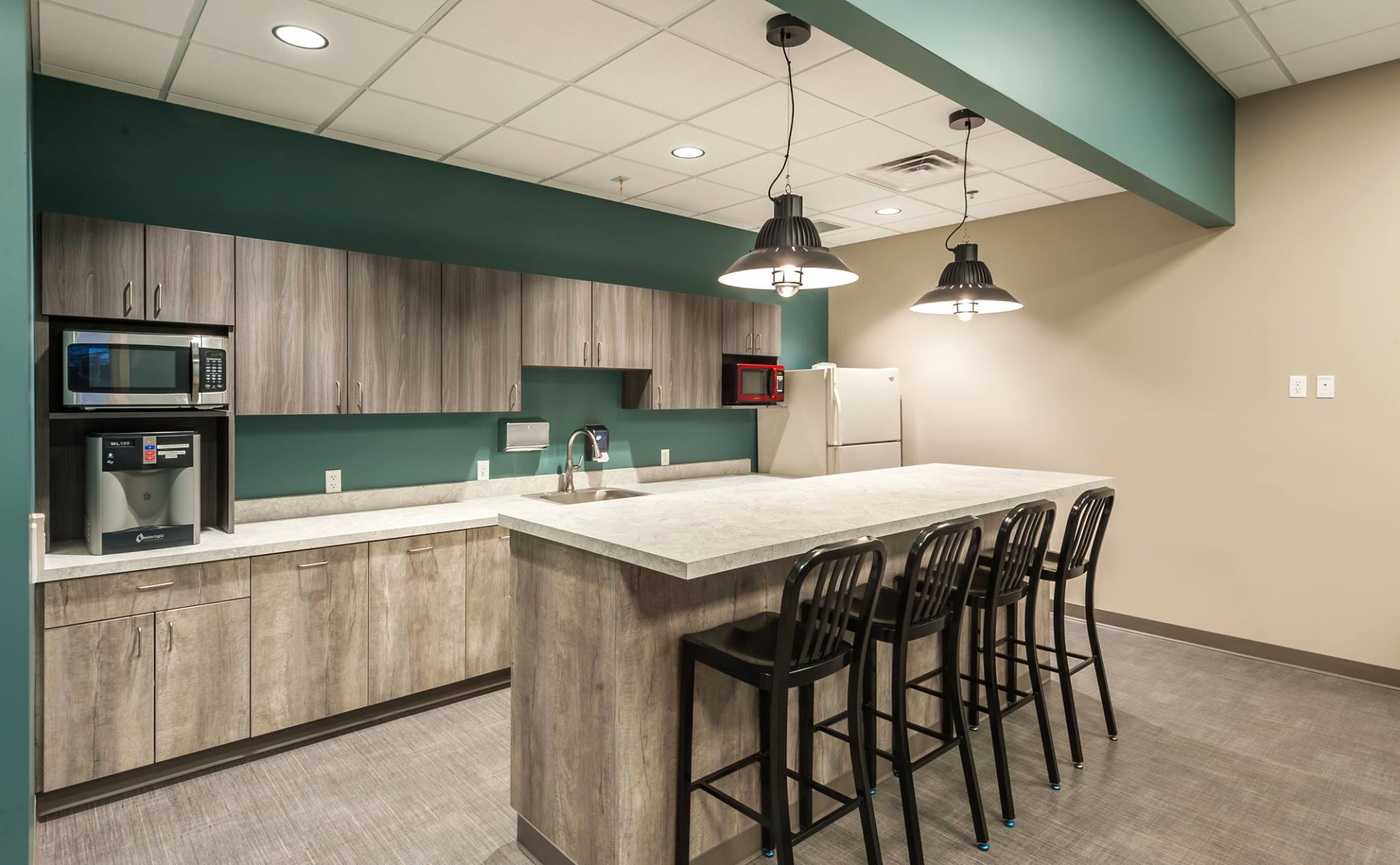
“Your Home for Compassionate Service and Exceptional Care” is the phrase used by the team at West Michigan Dermatology to describe their practice. It is with that in mind that First Companies set out to fulfill their needs for two new locations. Craig Baker from First Companies reached out to r.o.i. Design for interiors and to r2Design for architecture to create the designs for their new Holland and Grandville locations.
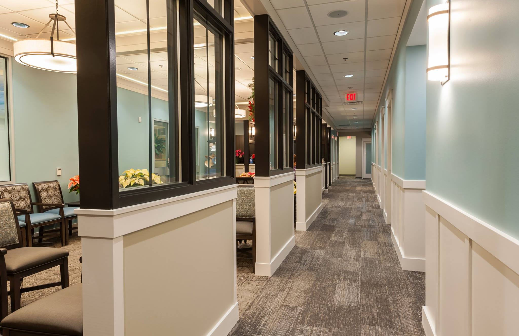
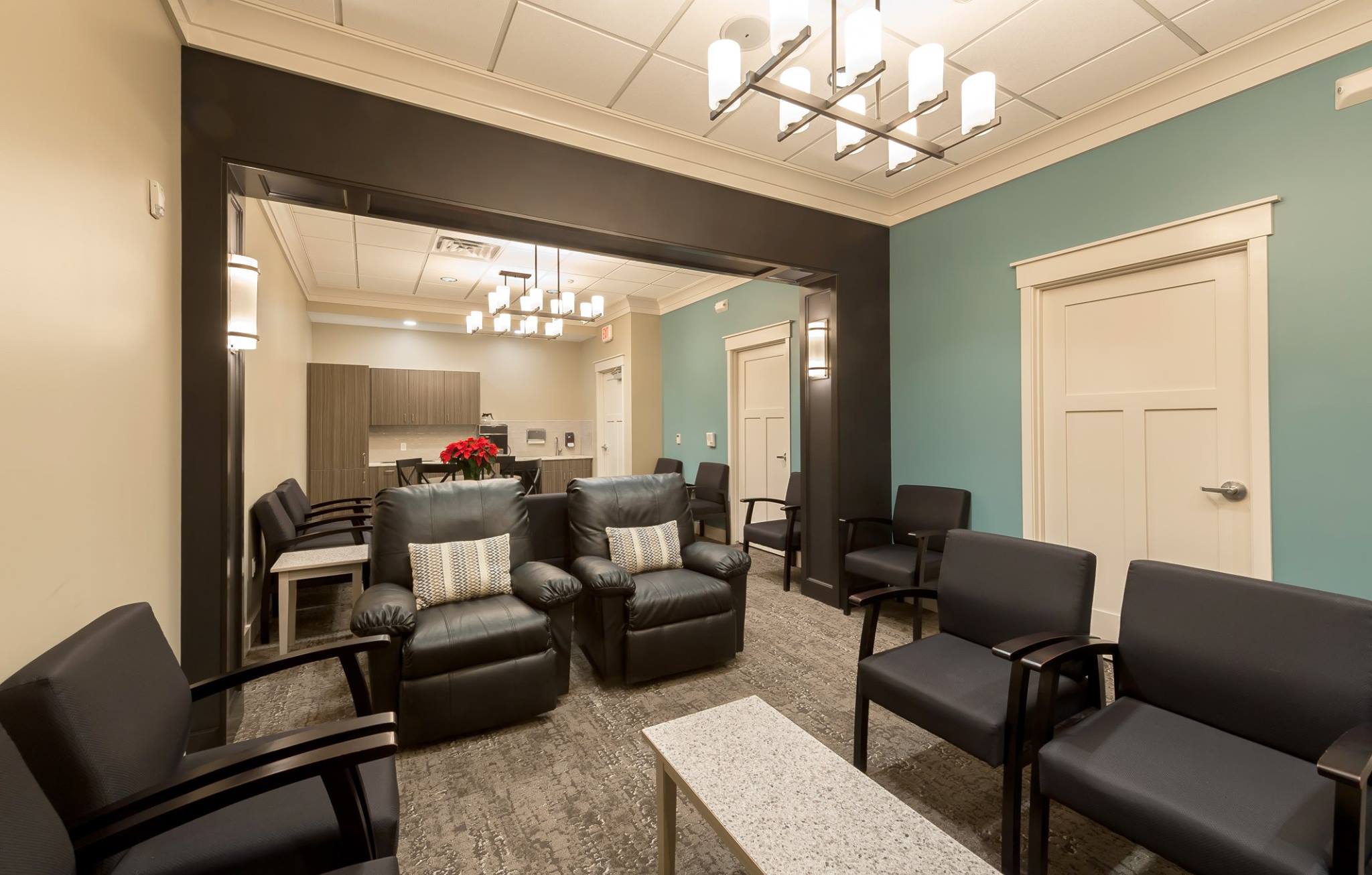
The new Holland location was just a move “across the street”, but the new space feels much refreshed. The desire for a residential “cottage feel” resulted in an interior that includes painted millwork, decorative light fixtures, as well as a feature stone veneer wall. Furnishings also reflected a feeling of hospitality. All clinic and exam areas were designed for comfort and medical excellence.
The layout gave West Michigan Dermatology the convenience of exam rooms with two doors. One allows patients to enter from the lobby side, and the other for staff to enter from the clinical side. With a variety of procedures from skin care to surgery, this layout fosters privacy and a professional separation for the maximum comfort of patients.
While r.o.i. Design was fond of many aspects of the interior, the color scheme of black, white, grey, and blue was one of the most satisfying elements.
Kudos to First Companies project manager, Jason Beekes, and to architect, Jon Blair, for their expertise and focus. We wish West Michigan Dermatology in Holland great success in their new home.

Photos © First Companies

Photos © First Companies

Photos © First Companies

by Ryan | Dec 18, 2018 | Design News, Graphic Design, Interior Design

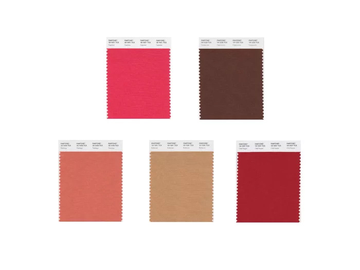
Pantone Cravings Palette
Gone are the days of one ruling color. Forecasters and color experts alike are suggesting we are going to see a range of colors rising to popularity this year.
r.o.i. Design sees the significance to this year’s forecast to be a further departure from grays and moving more towards browns. And while commercial interiors lag the residential interior trends, they always do follow. We have already seen a broad acceptance by our office clients of warmer grays that could be taupe, and much more willing to see shades of brown as accents. We also resonate with the projected trend of more complex blues for interiors.
But what do the experts say?
Pantone has been a ranking authority, but r.o.i. Design also pays attention to our favorite paint companies opinions, Sherwin Williams and Benjamin Moore.
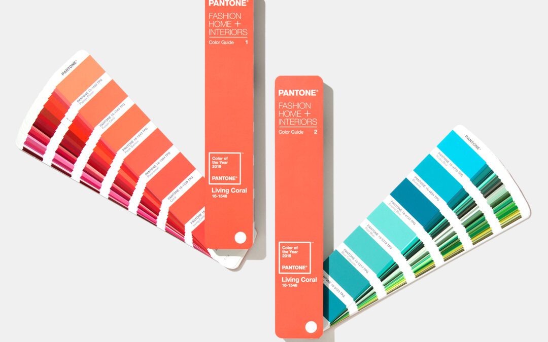
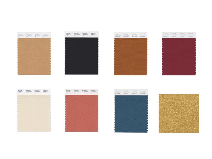
While Pantone has announced Living Coral as their “Color of the Year”, they are also suggesting two general palettes that are going to be widely used. One is called the Cravings Pallete and the other the Classico collection.
From Coastal Living’s article, “Trend Alert! These Will Be the Hottest Colors for Homes in 2019”:
The “Cravings” palette, according to Pantone, includes allusions to “fetish foods”—from rich Butterum and Cappuccino to spicy Chili Pepper and Cayenne. The hues will “draw upon memorable sensory experiences to inspire new ones that will be just as pleasing.”

Pantone Classico Palette
There’s also a Classico collection of 8 hues that includes Rich Gold, Mallard Blue, and Apricot Brandy. According to Pantone, “the colors are “fundamental, basic, and everlasting, while at the same time, elegant and forever fashionable.” With hues that pay a subtle homage to sunsets, sand, and sea, that’s certainly true on the coast.
For your personal research, here are a few articles to get you started:
Benjamin Moore 2019 Color Trends
Sherwin Williams’ 2019 Color Forecast
Designing with Pantone’s 2019 Color of the Year
Coastal Living, “Trend Alert! These Will Be the Hottest Colors for Homes in 2019”

by Ryan | Dec 18, 2018 | Uncategorized

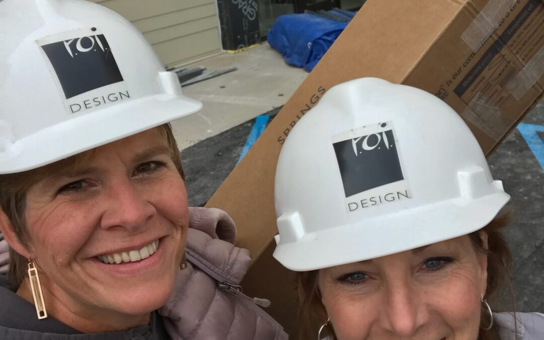
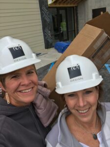
Stacey Udell (L) & Ronda Geyer (R)
This month we finished the installation of more than 100 window shades for Wolverine Buildings Group’s building at Midtown CityZen. This is a multi-use development by Third Coast Development in downtown Grand Rapids. It’s worth mentioning that on this installation, there was no working elevator. Our team got their exercise walking the shades up and down four floors. The product looks great, and we’re a little more fit!
We want to thank Wolverine Building Group’s project manager, Landon Jones for the opportunity to work on this project.
The main focus at r.o.i. Design is interior design, but over the years we have added other related services. We became a distributor of commercial window coverings in 2016 and have seen this solution become more and more important to our customers. We focus on solar shades, a simple solution to cut glare and heat without adding a bulky window treatment.
A January 2018 article by MLive describes the project in more detail.

by Ryan | Nov 28, 2018 | Branding, Design News, Graphic Design

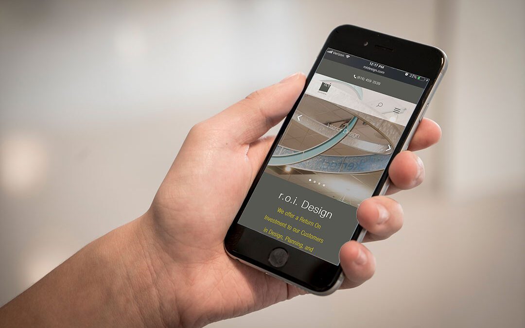
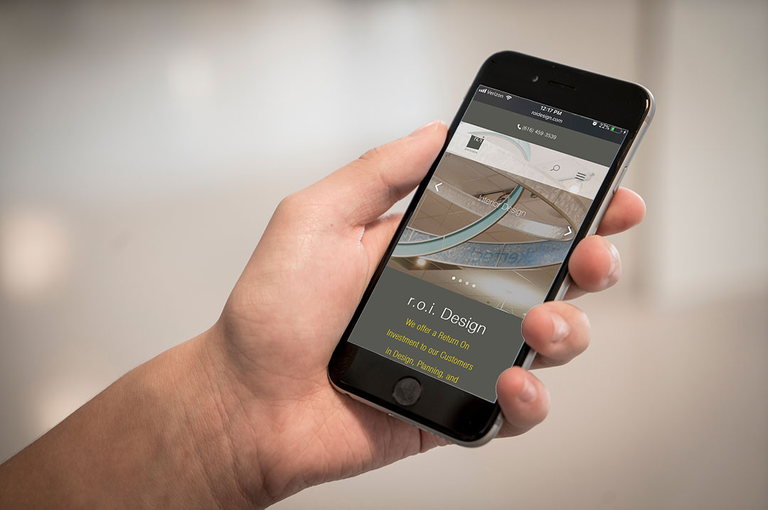
We are thrilled to reveal our new website that provides an updated look and easy viewing on handheld devices.
Our new look streamlines our story and hopefully makes our site easier to navigate. While there are many important features of the site, our portfolio and our blogs are a huge resource in our marketing efforts.
A huge shout-out to Ryan Bright, our Creative Executive, who managed the project along with the help of contracted media expert Nahshon Cook.
For questions regarding our website or offerings, contact ryanbright@roidesign.com


