(616) 459-3539
Shannon Orthodontics

Shannon Orthodontics

Shannon Orthodontics 
Grandville and Plainwell, MI

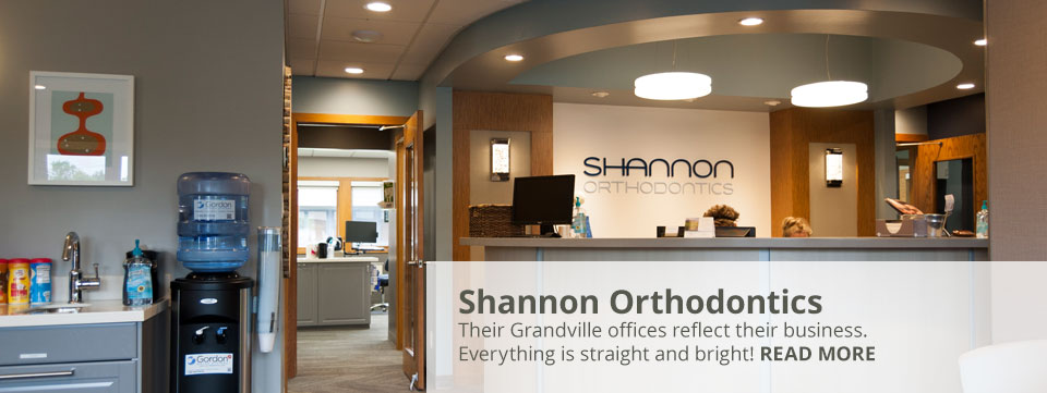
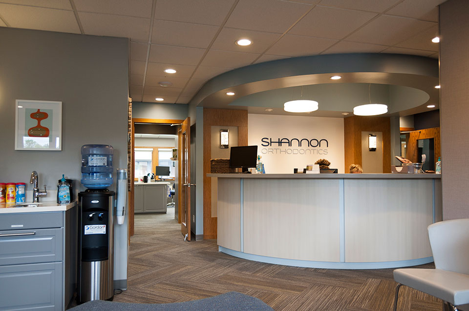
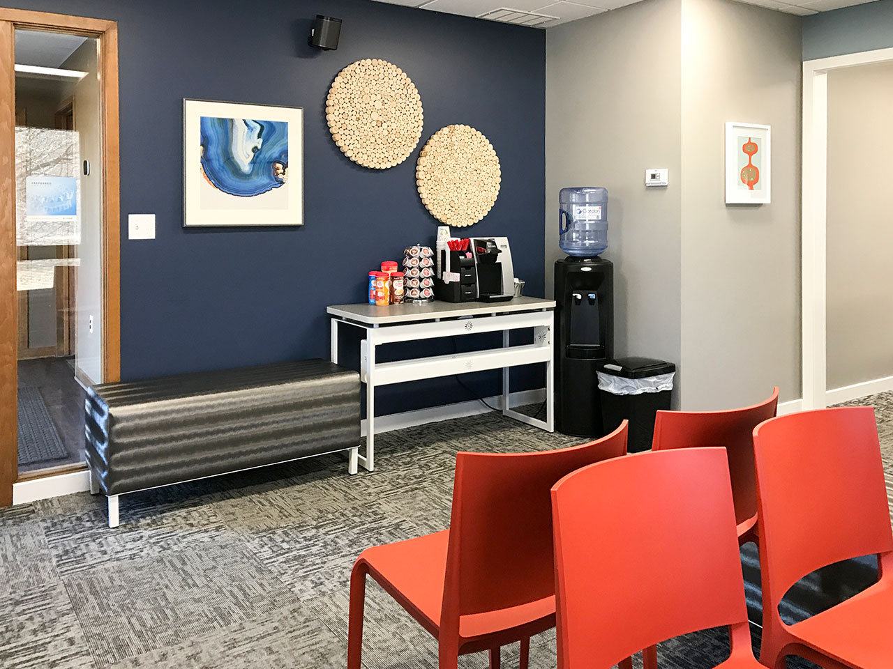
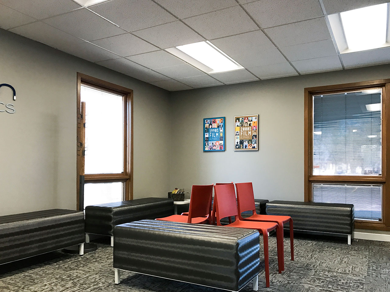
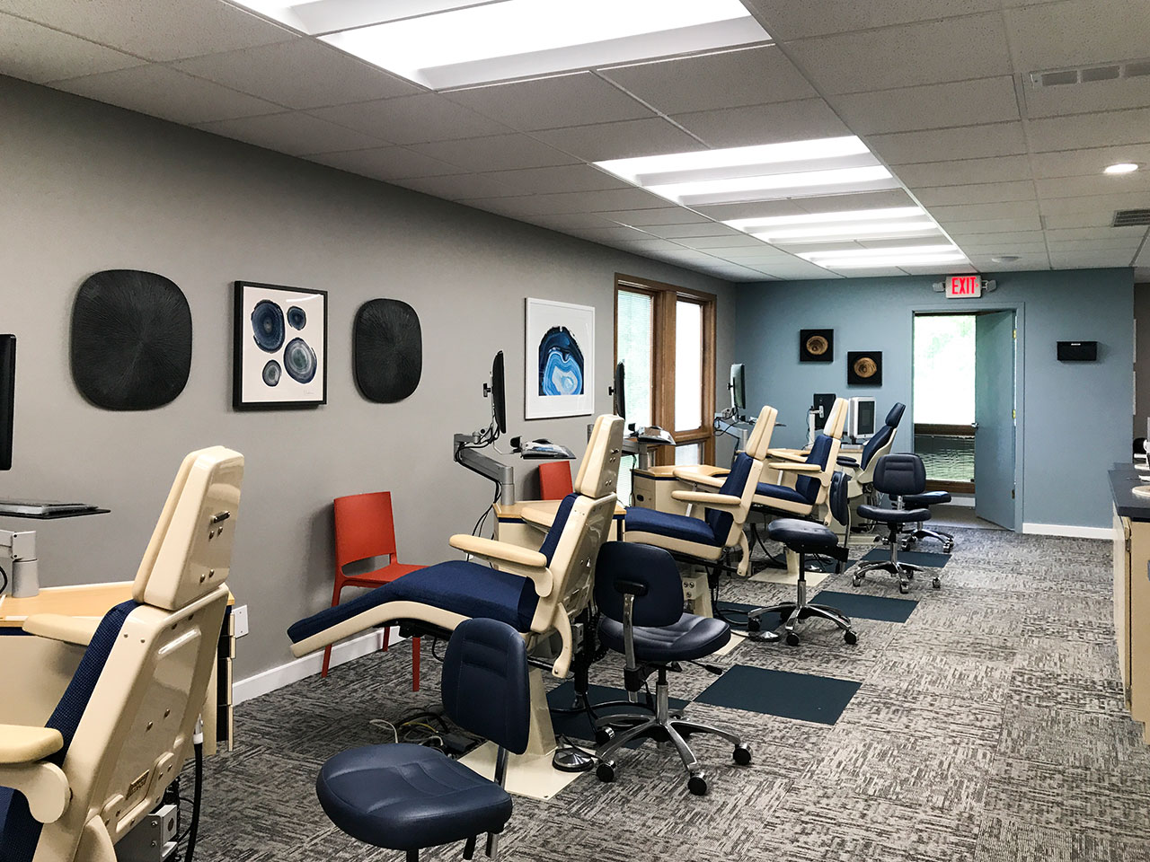
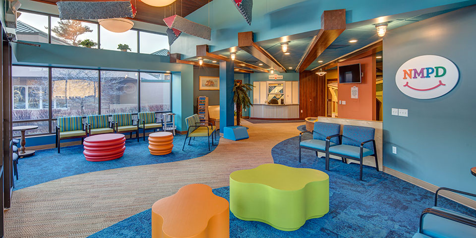
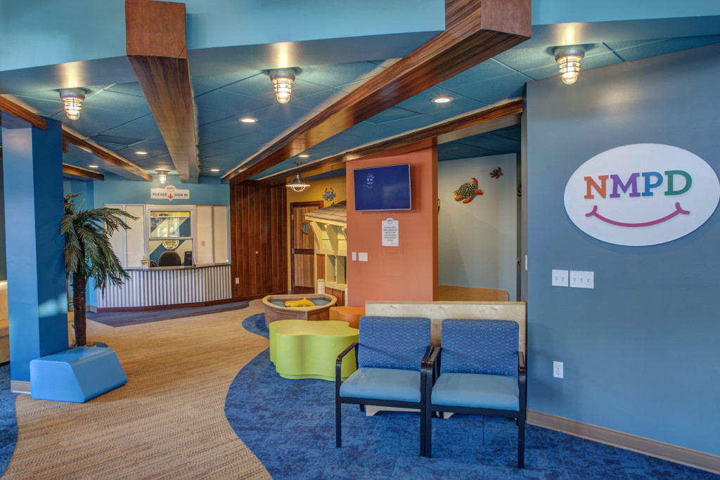
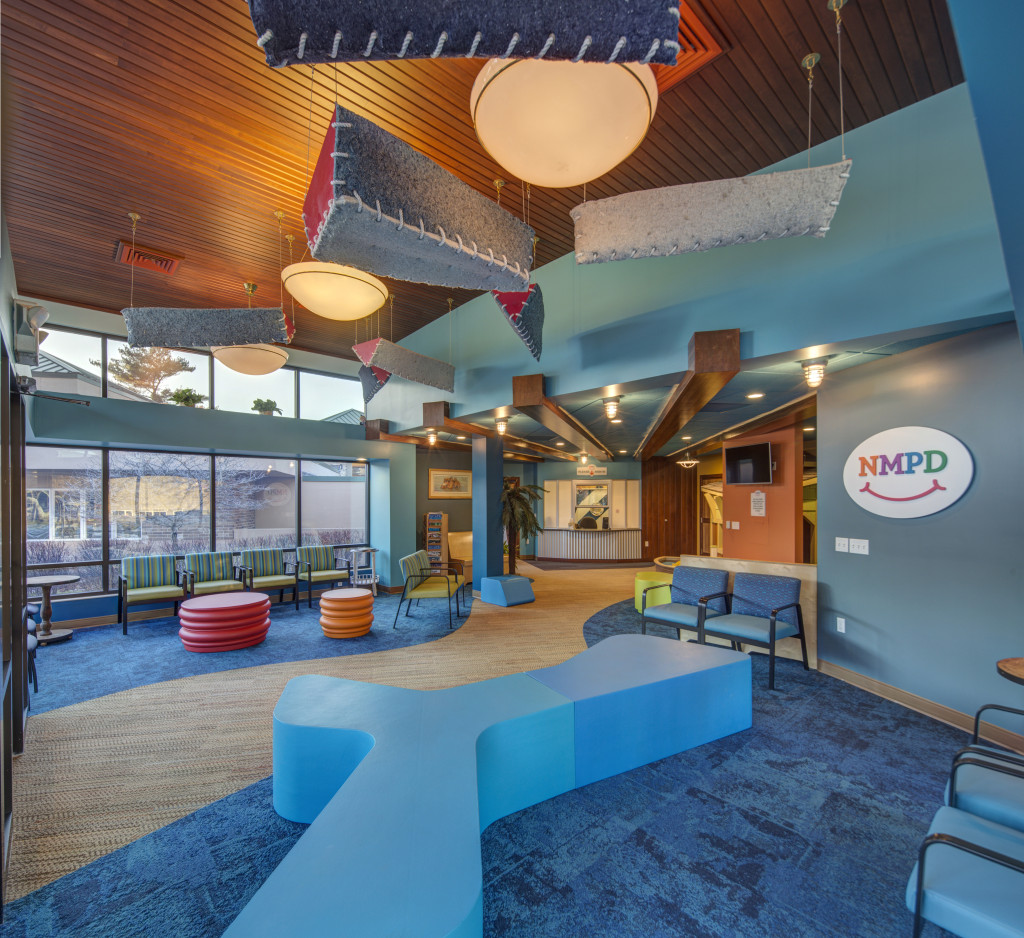
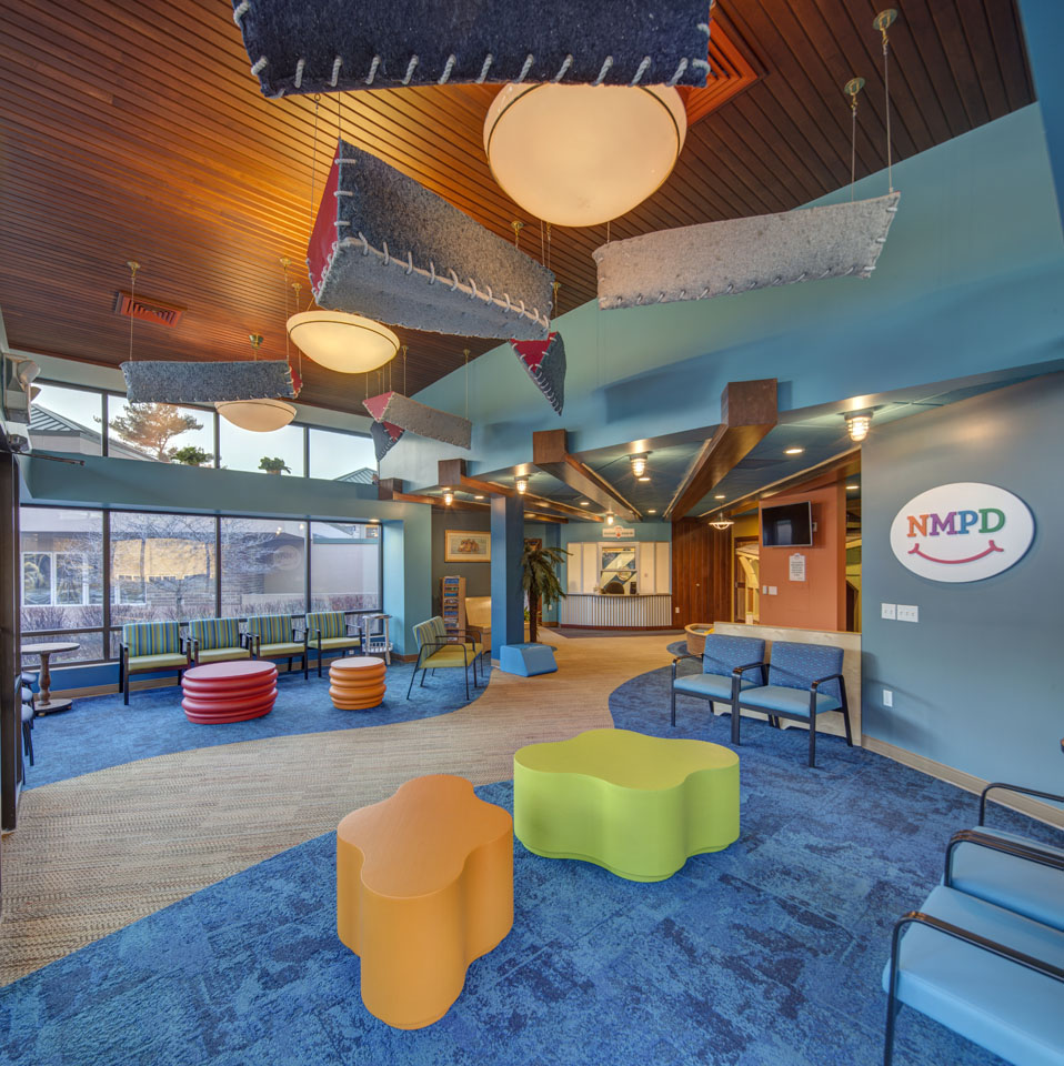
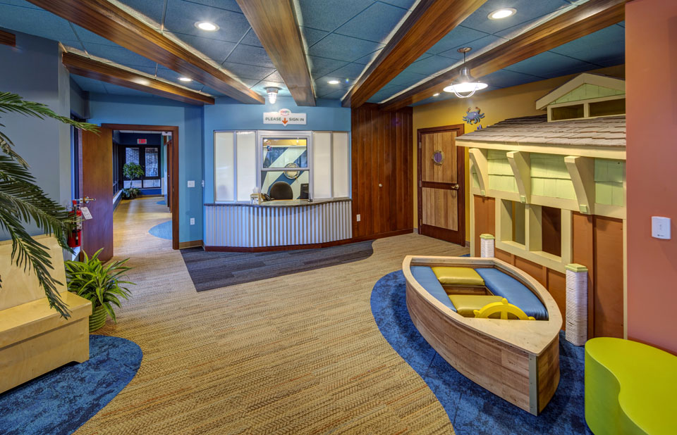
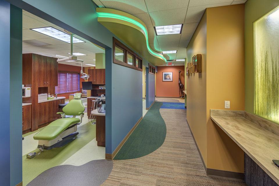
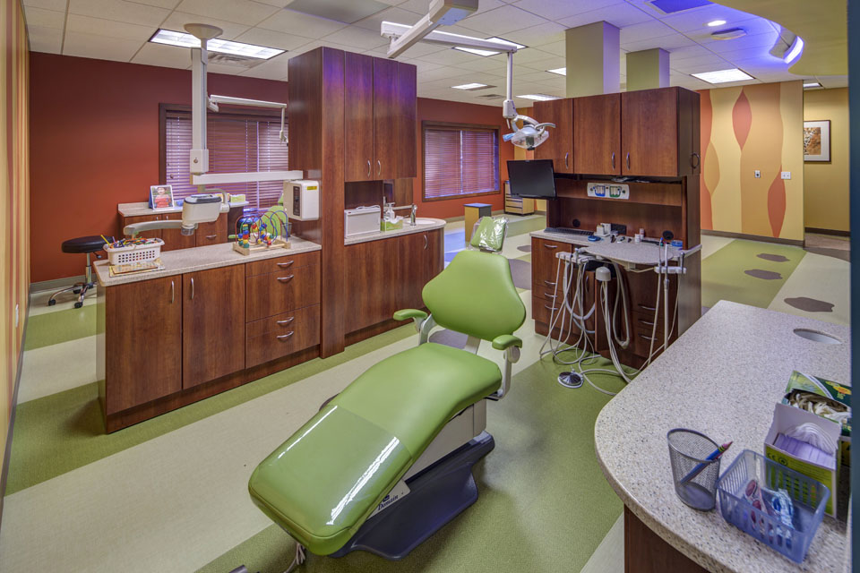
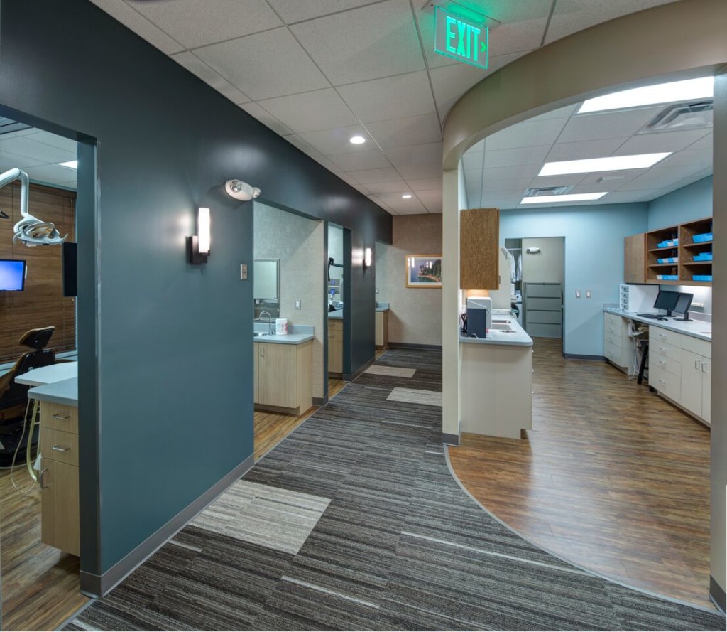
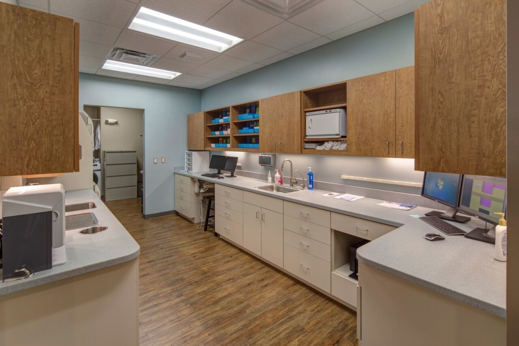
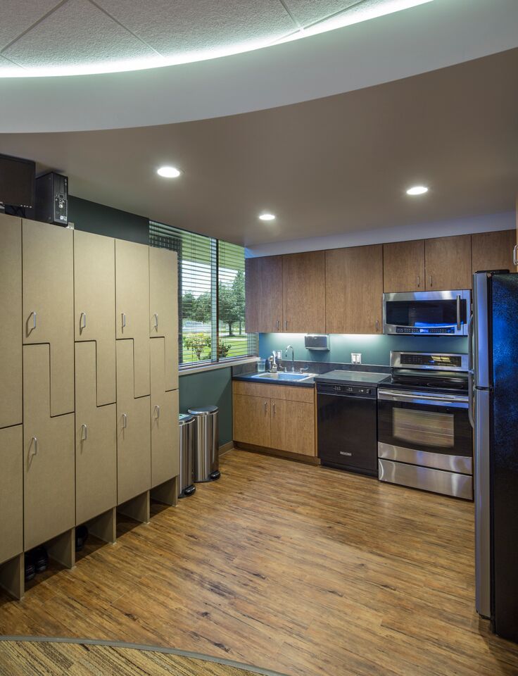
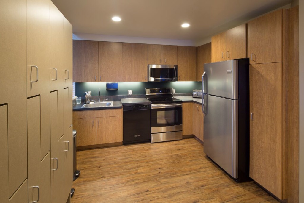
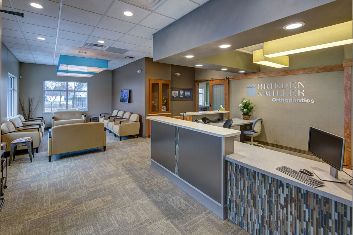
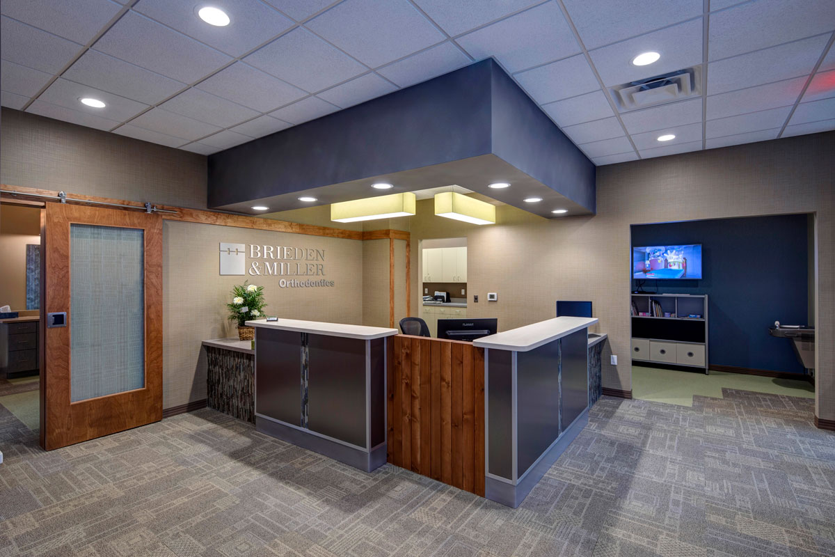
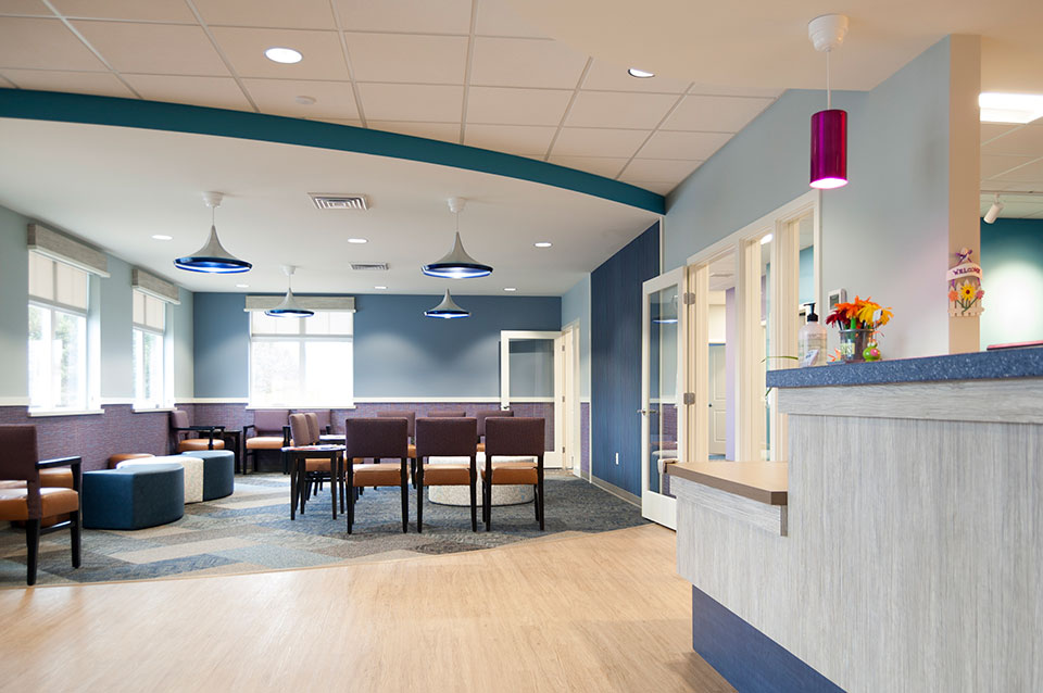
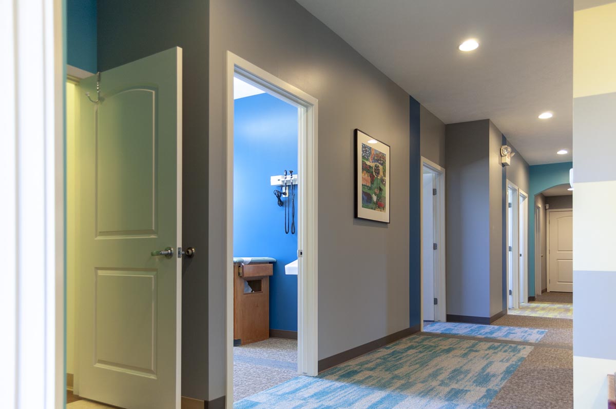
Grandville: Shannon Orthodontics prides itself on its use of the latest research and technology and delivers an extremely friendly service. They want their customers to “achieve the smile they have always dreamed of”.
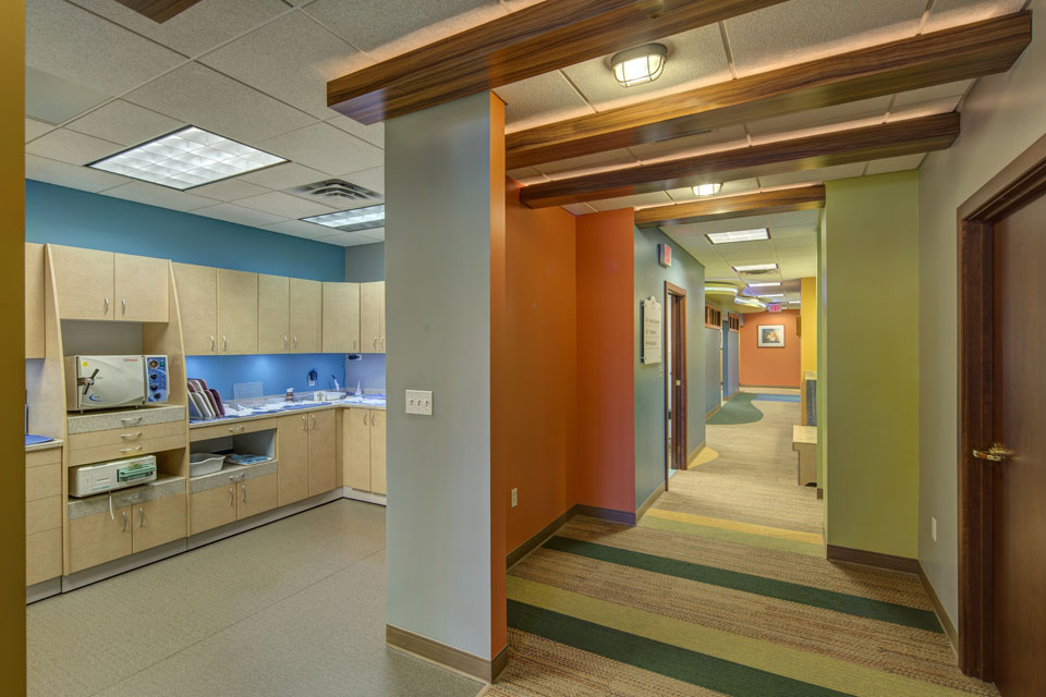
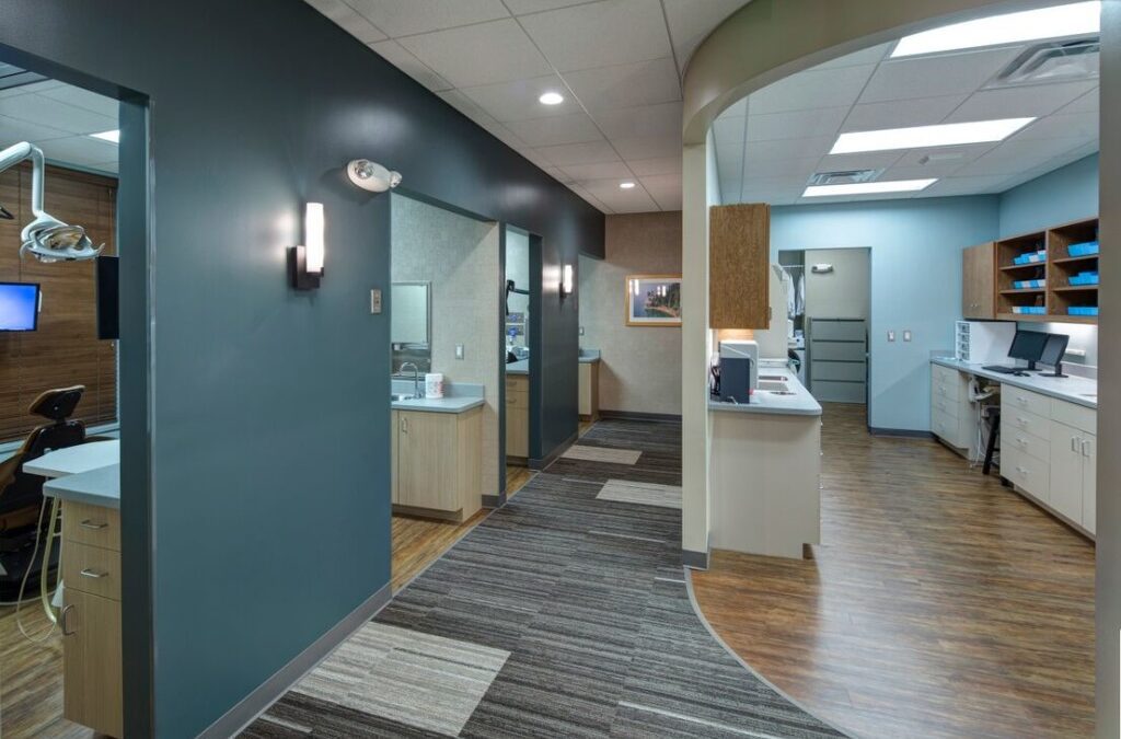
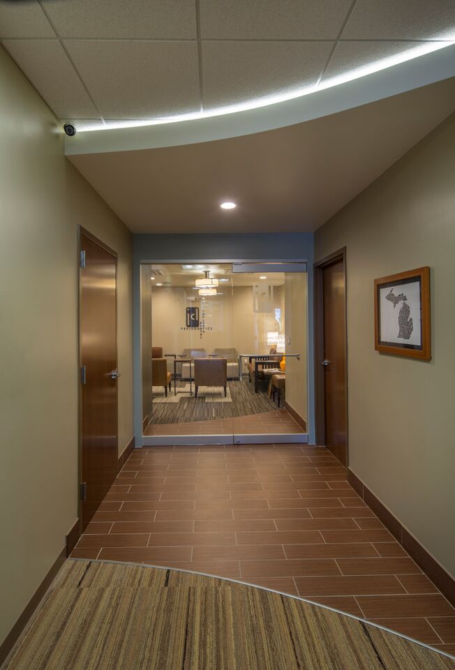
Tom Shannon and wife Kate researched other offices in the area and found our work at JCL Periodontics. Tom and Kate liked the character and personality we brought to that space and after initial meetings decided to engage us in the redesign of their Grandville office where we helped they with layout, interior finishes, lighting, signage, wall décor and furnishings.

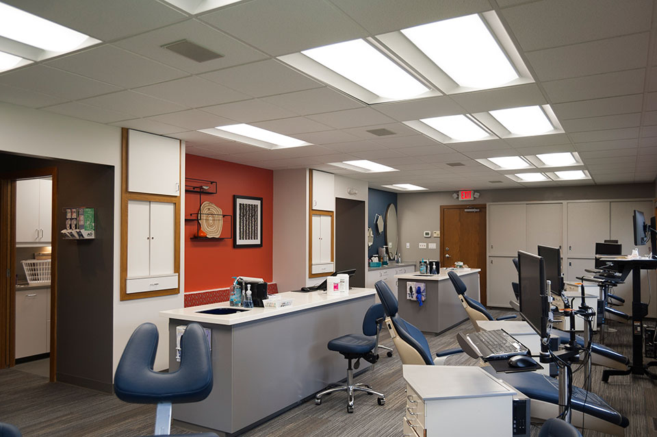
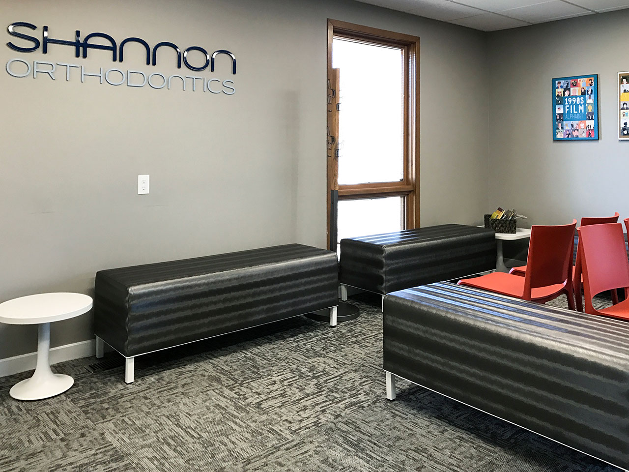
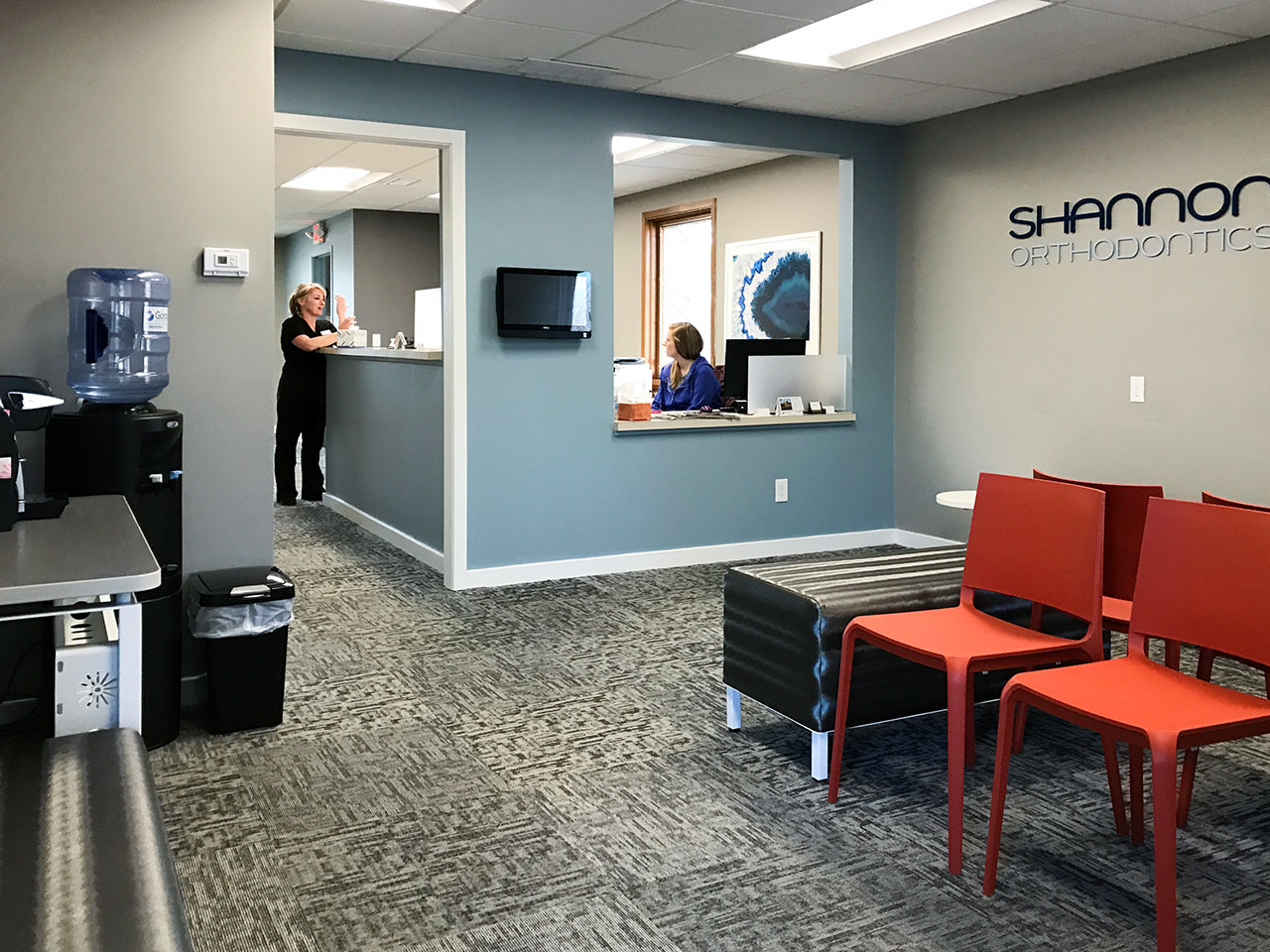
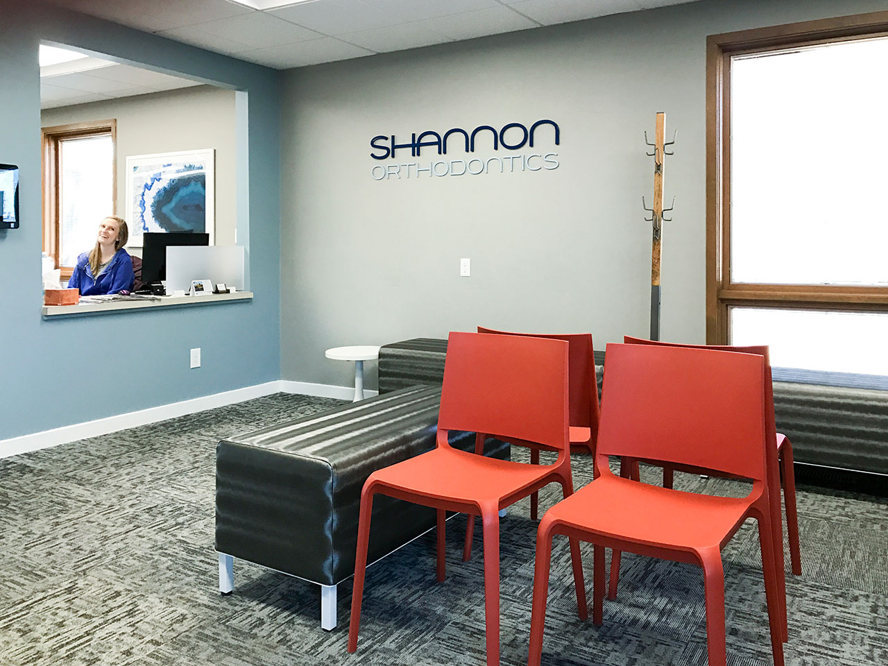
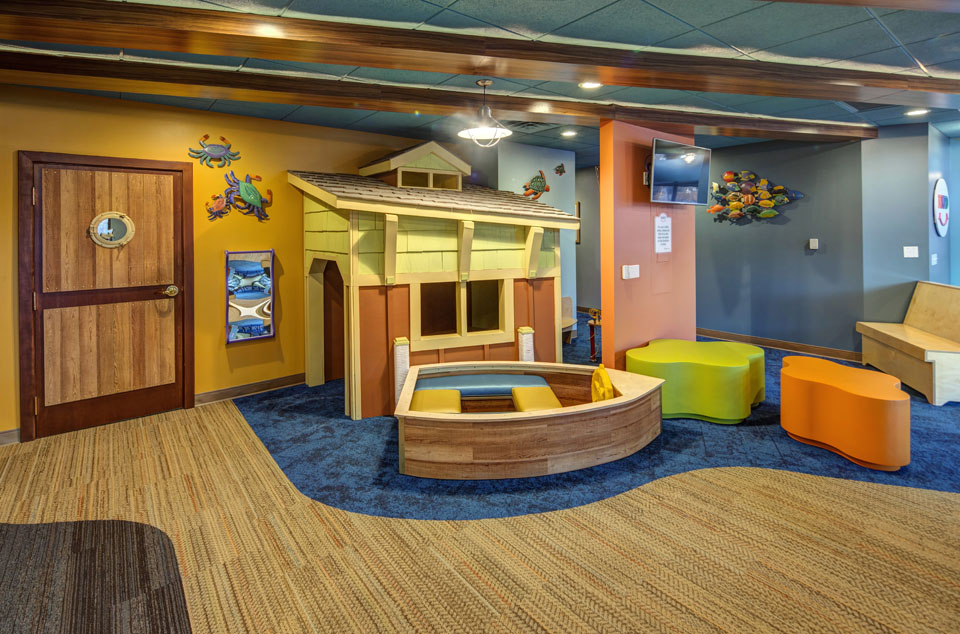
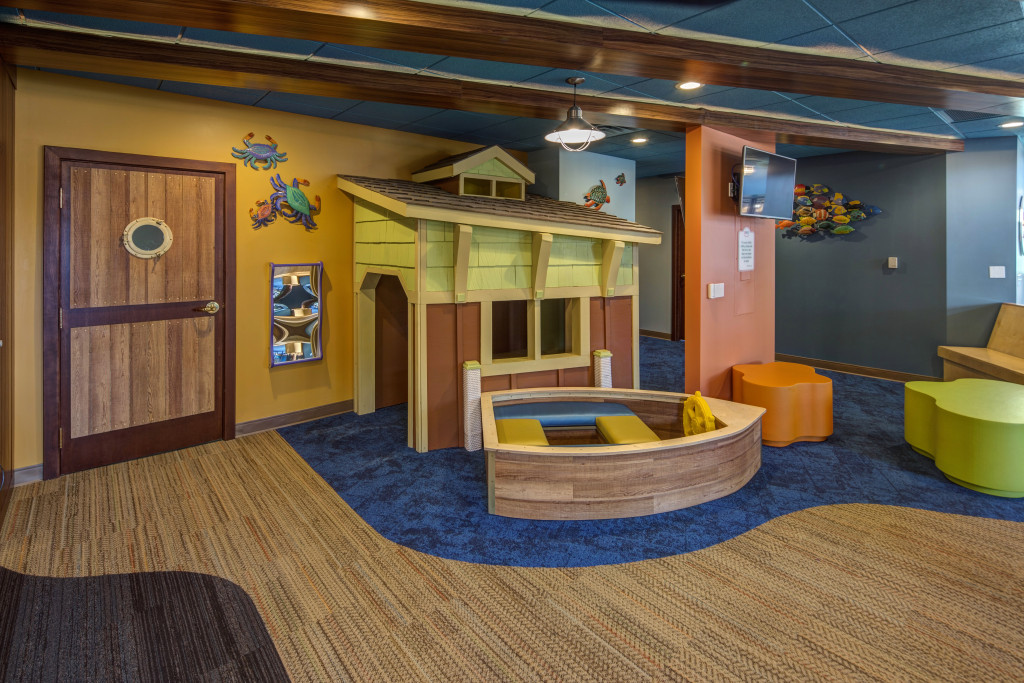
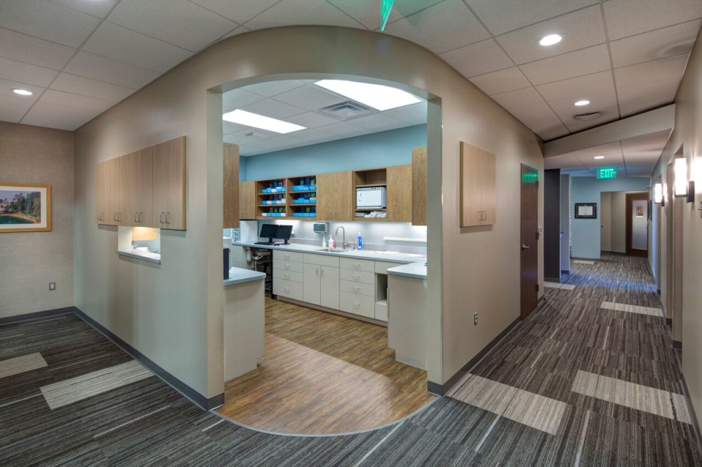
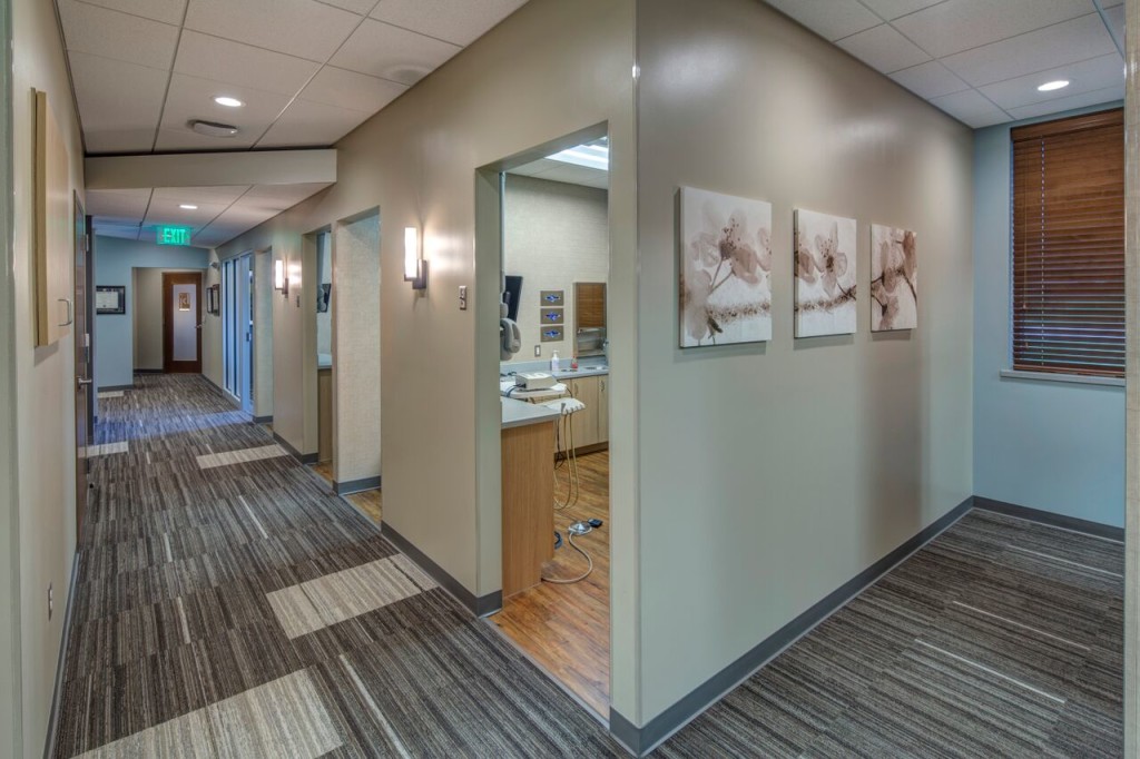
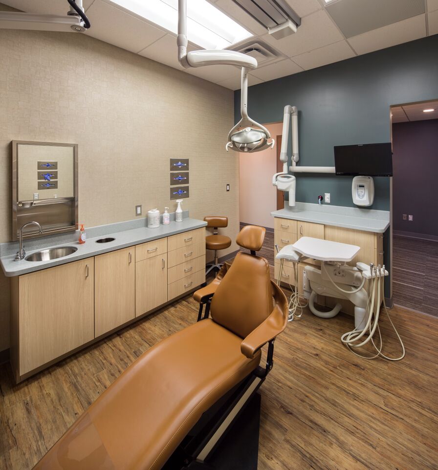
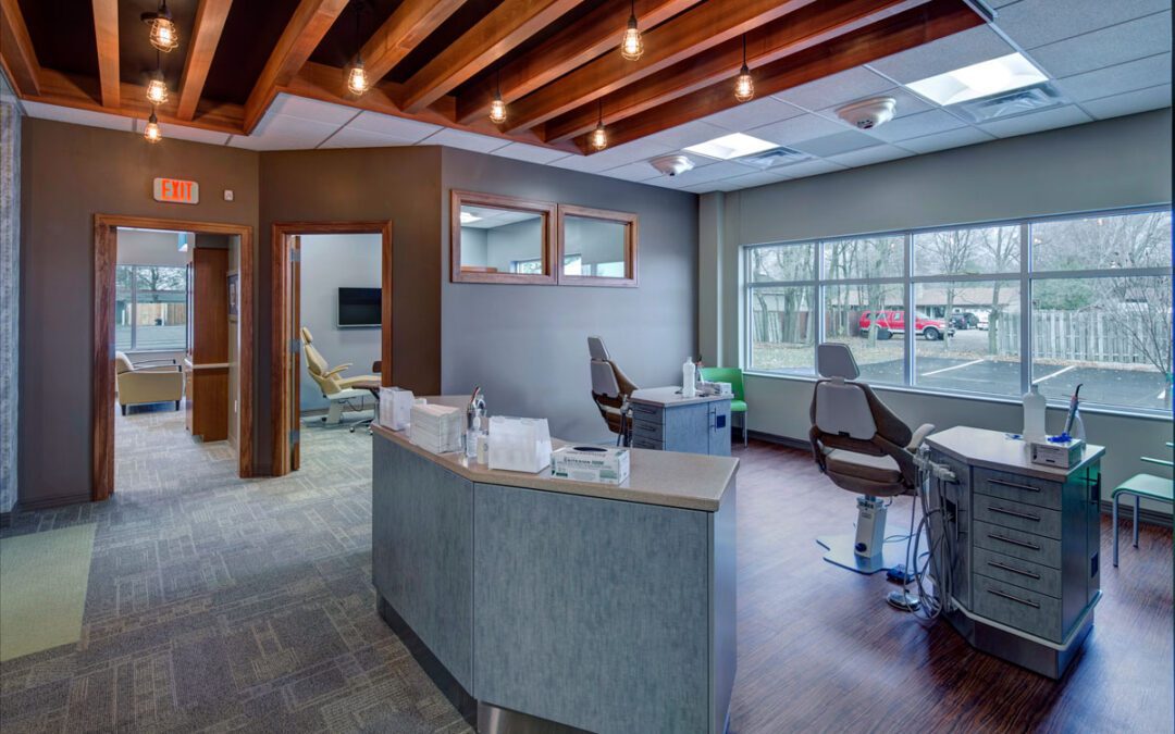
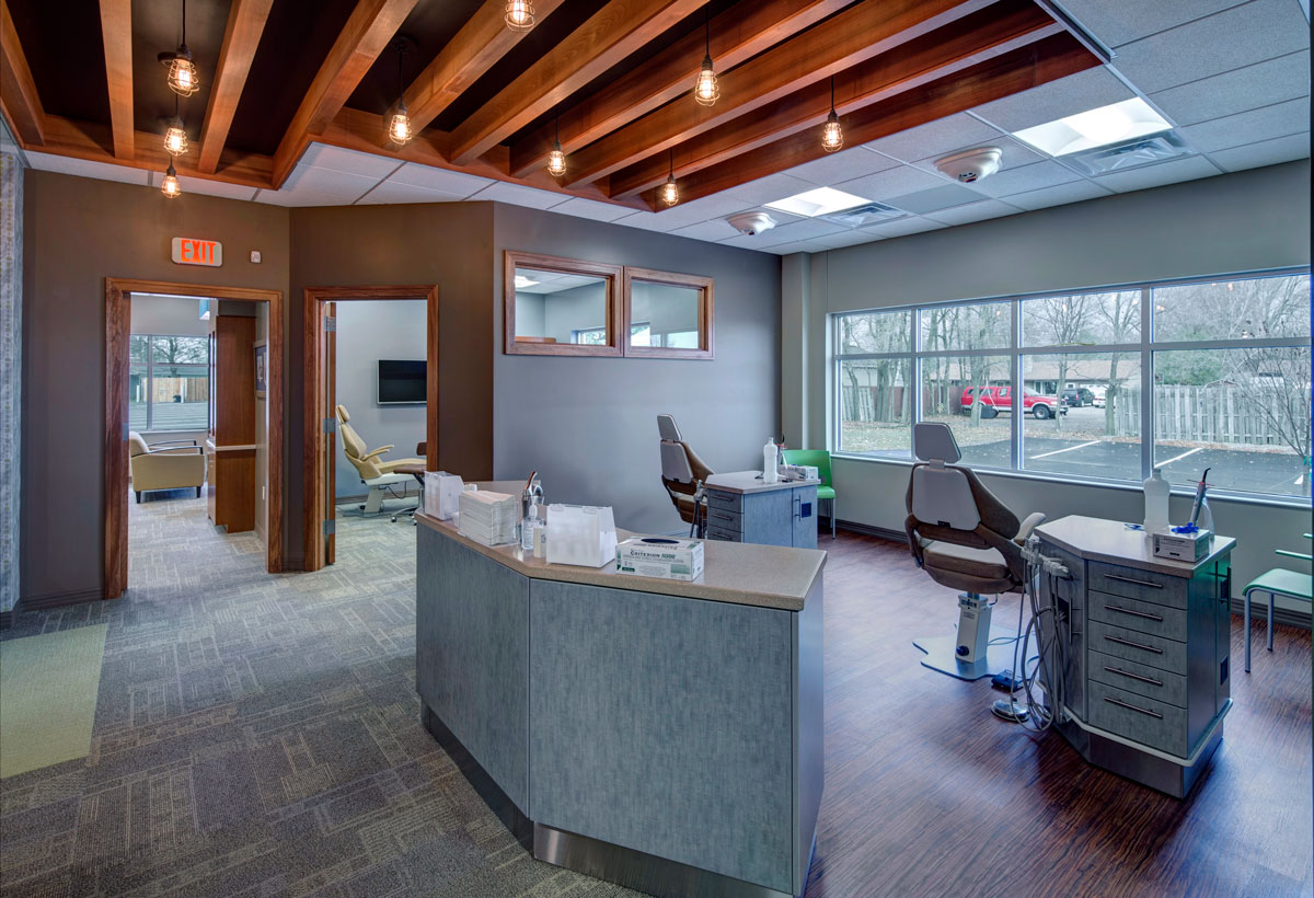
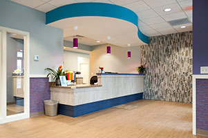
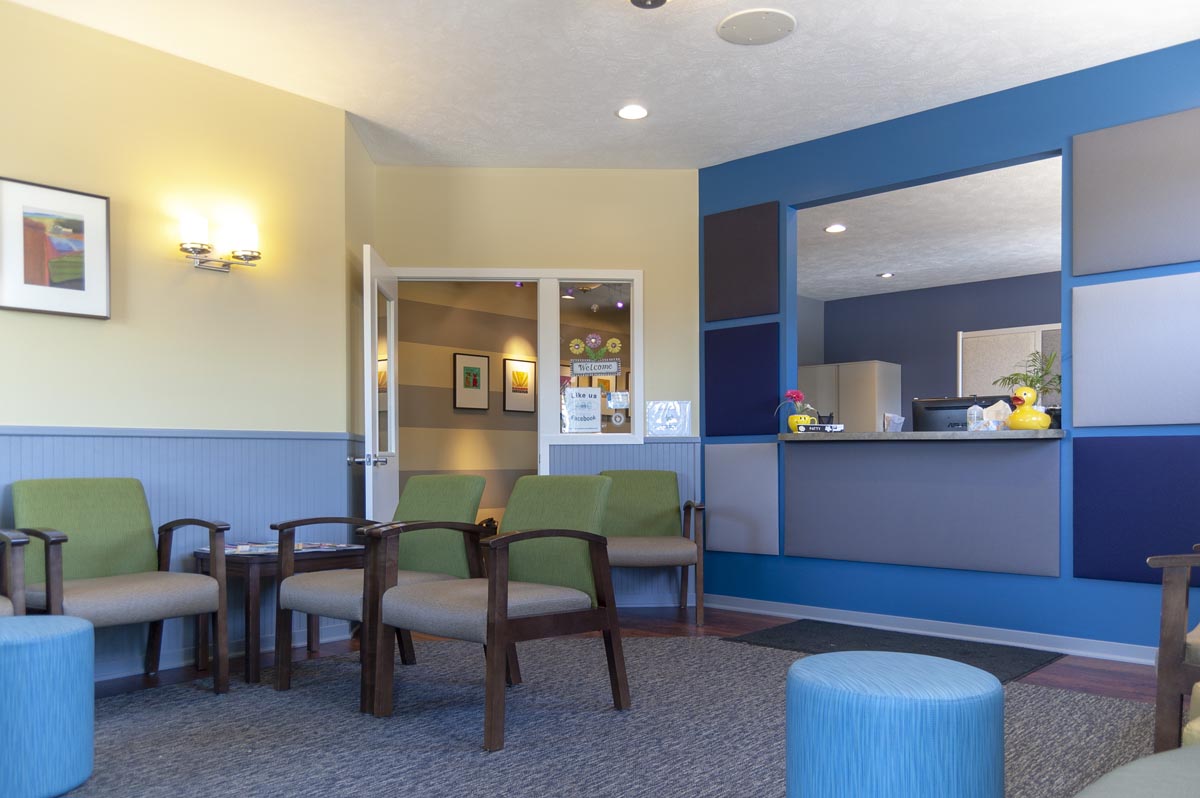
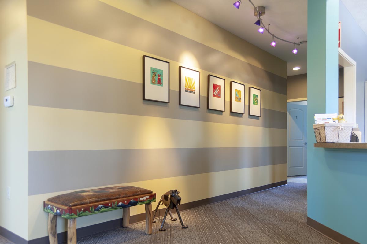
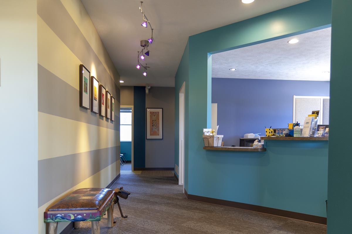
Plainwell: Shannon understands the importance of brand and marketing.
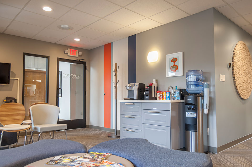
They want all their offices to provide a uniform feel, so they could use their interiors in their advertising. They used their new spaces to create a video to promote their business.
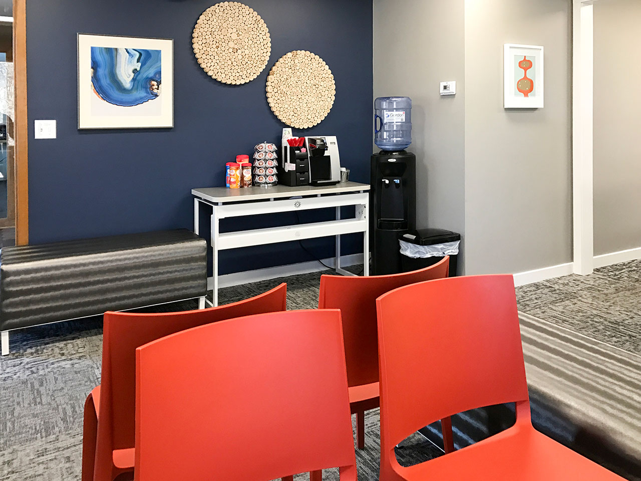
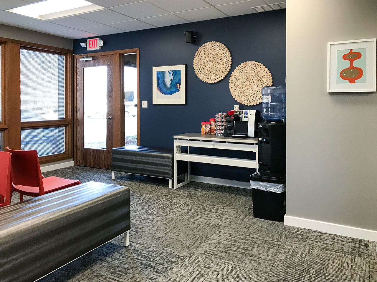
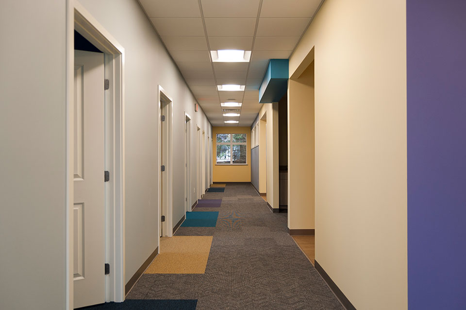
Some of the interior elements that help carry the brand include the color scheme, the use of logo and signage, iconic furniture and wall art pieces.
We recognize that Shannon Ortho customers have many choices when it comes to orthodontics, and we want our customer to look as great as they make their patients feel!

Northern Michigan Pediatric Dentistry

Northern Michigan Pediatric Dentistry

Northern Michigan Pediatric Dentistry
Traverse City, MI

Northern Michigan Pediatric Dentistry (NMPD) is an adventure for the patients, for the dentists and for r.o.i. Design. This extremely busy practice specializes in the surgical and preventative care of the youngest of children.

r.o.i. Design recommended that the offices be divided into three themed areas organized around water, land and sky.

Design solutions included:

Water:
Small boat hulls were hung in the 14-foot ceiling area to help with acoustic reverberation and to give the waiting patients below that they were “under the water”. The carpet in the lobby undulated in pattern like waves, and the furnishings were abstract shapes that were meant to resemble bottom of the ocean creatures.
Between water and land there was a boat house play house with a steerable boat and a dock side port office.

Land:
Stepping through the door to the operatory the visitor experienced custom floor patterns that resembled stepping stones leading them to the examination chairs. A back lit acrylic panel filled with natural grasses lead the patients past a space that has a color changing cloud.

Sky:
Starting with a dark corridor with inserted LED spots and track lights, the visitors step from deep space into a tall bright area filled with stars, clouds and sunshine.
Featured in the Summer 2015 issue of Incisal Edge, this pediatric office was recognized for its creativity.

JCL Periodontics

JCL Periodontics

JCL Periodontics
Grand Rapids, MI

When does a visit to the periodontist not feel like a visit to the periodontist? That’s what our client Dr. Jake Lueder asked us. “I want our patients to know we care about them and want them to be as comfortable as possible. For me that means that they get a sense of who we are by the character of our offices. And that helps them relax, trusting we are here to help.” Lueder described to r.o.i. Design.

Dr. Jake Lueder appreciates the textures and elements of nature. He is a woodworking hobbyist, a wilderness lover, a generous host and employer, as well as a methodical practitioner. His customers have a wide variety of backgrounds, but he wanted to make sure that a retired plumbing executive would be just at ease as a mom with two small children in his space.
Some of our favorite design elements that spoke to his criteria were to include reclaimed wood, stone tile, interesting ceiling details, wall art depicting Michigan nature, soothing colors and comfortable seating in the space.

Brieden & Miller Orthodontics

Brieden & Miller Orthodontics

Brieden & Miller Orthodontics.
Sparta, MI

Successful orthodontists Dr. Lathe Miller and Dr. Mark Breiden were planning their second office and wanted their new office to reflect their customer who lived in and around Sparta, MI area.
Working with Dixon Architecture, r.o.i. Design recommended ceiling details, tile details, carpet details and finishes to give the space an upscale industrial feel. Custom elements included faux ceiling joists, a sliding barn door and apple tiles. (Sparta is known for its apple farms.)

ABC Pediatrics

ABC Pediatrics

ABC Pediatrics 
Wyoming and Walker, MI

Wyoming: r.o.i. Design learned so much working with ABC Pediatrics as we helped them with the interior design of their new offices in Wyoming, MI. We learned how they wanted to engage families with their interiors, but not be just “kid-like”. They wanted their space to look professional and simple, but very welcoming and comfortable. They needed it to be user friendly for staff and family which meant maintainable surfaces and easily identifiable areas. And there was a budget.

Starting with a color scheme that they currently use in their original Walker location, r.o.i. Design “upped the ante” by intensifying some of the colors, adding pattern and interest, in thoughtful ways. Some of our favorite elements are the carpet accents, the color accents, the decorative lighting and the lobby furniture. Wall art will soon be added to the interior and we like those selections as well.

ABC Pediatrics also asked us to create a new logo for their practice. They wanted a logo that was as updated as their offices were, but more importantly, a representation of their brand. Interviewing them about how they viewed their distinctive difference, we came away with “Caring”, “Diverse” (ages and specialties), and “Child Centered”. They were very pleased with their new business logo designed by Ryan Bright, Creative Executive at r.o.i. Design.

Walker: Their second location in Walker grew jealous of the new facility’s fresh look. So, this year they decided to make some cosmetic changes to their 3 Mile Road offices. They asked r.o.i. Design to work with them to create a look for this space. They were looking for something that was different than Wyoming but still fun, residential, warm and welcoming.

No walls were moved, and no doors or windows were replaced. But every surface was refreshed with new paint, carpet or laminate. For this location, r.o.i. Design took a soft graphics approach to the interior, adding stripes and squares to the walls. Perhaps our favorite detail was the carpet patterns. We highlighted each exam room entrance with a bold color. Plus, we created diagonal “paved” pattern sections to the floor.

And, like their Wyoming location, we added some large ottomans to the lobby for fun seating.