by Ryan | Dec 7, 2016 | Design News
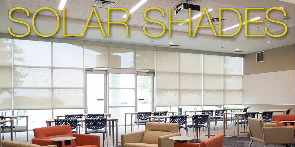
r.o.i. Design Now Offers and Installs SWF Contract Window Coverings!
Give us a call for a free estimate on SWF Contract Solar Shades. We would be pleased to show you product samples and discuss your window covering needs. r.o.i. Design will visit you, take measurements and provide installation.
Solar Shades Are Our Most Popular Window Covering!
- Great alternative to mini-blinds
- Manages light and privacy with minimal decoration
- Easy to clean woven vinyl panels in a variety of colors and transparencies
- Manual or electronic operation with superior clutch systems
Call Us: 616.459.3539 x105
or email Ronda Geyer: rondageyer@roidesign.com

by Ryan | Dec 7, 2016 | Design News
While r.o.i. Design helps design projects that are “ground up” new construction, we are often engaged to assist in the refreshing of existing properties and interiors. More than maintenance and less than easy, property owners review upgrades annually and typically have budgets every three to five years for improvements.
While sometimes these projects may be considered “tiny”, we think of them as “mighty”. Two of those projects for us recently included the upgrading of a public space corridor for a multi-tenant office building on 44th Street in Grand Rapids, MI, owned in part by Mike Stoddard of Basic Online and the atrium of Beechwood Church in Holland MI.
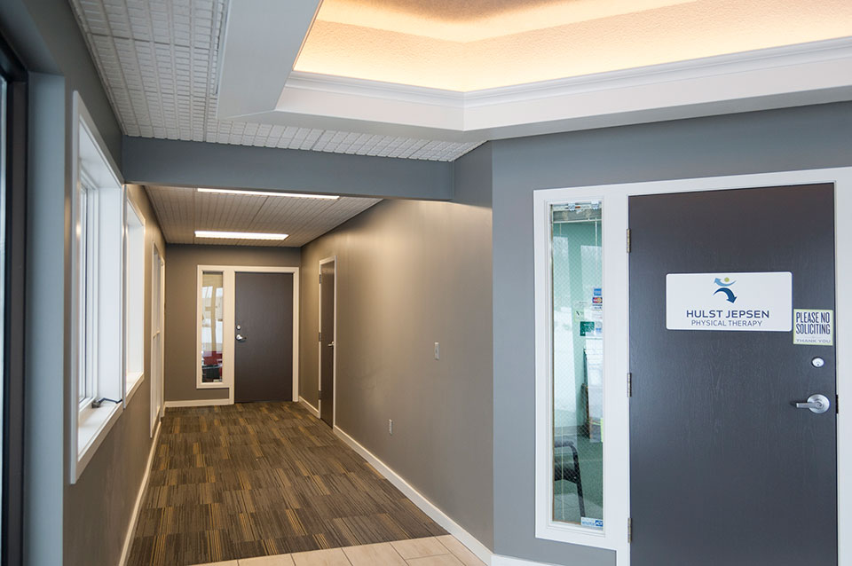
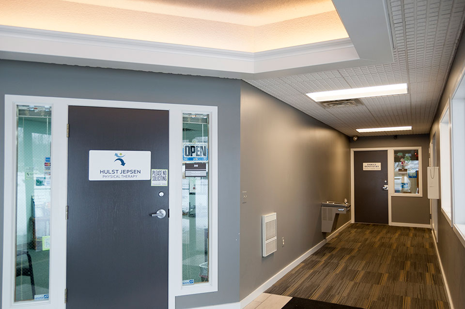
1535 44th Street Office Corridor

New corridor finishes in the Office Suites at 1535 44th St. Wyoming, MI.
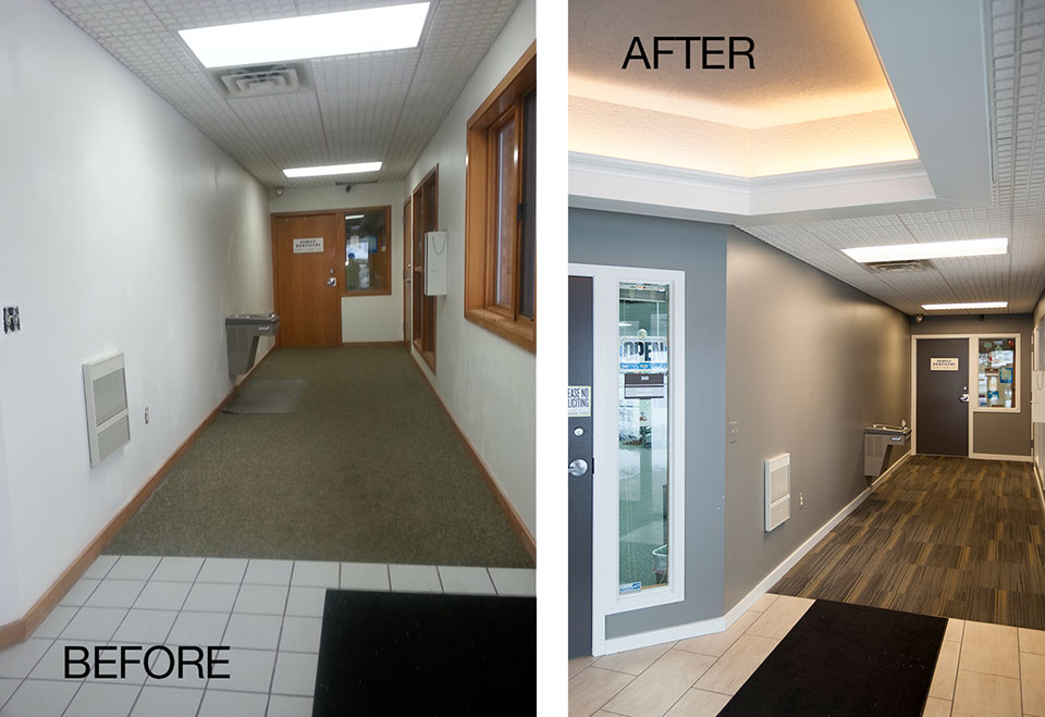
Mike Stoddard recognized the caliber of his tenants and wanted to make sure their customers enjoyed their experience of the building. His realtor, Hillary Taatjes Woznick of NAI Wisinski of West Michigan referred us to Mike and we made paint, flooring and lighting selections that brought his space to today’s standards. We were also happy to solicit bids and provide the project management of the remodeling. Plus, we topped if off with new suite signage!

Photos showing the “before” and “after” results at 1535 44th Street corridors.
Beechwood Church

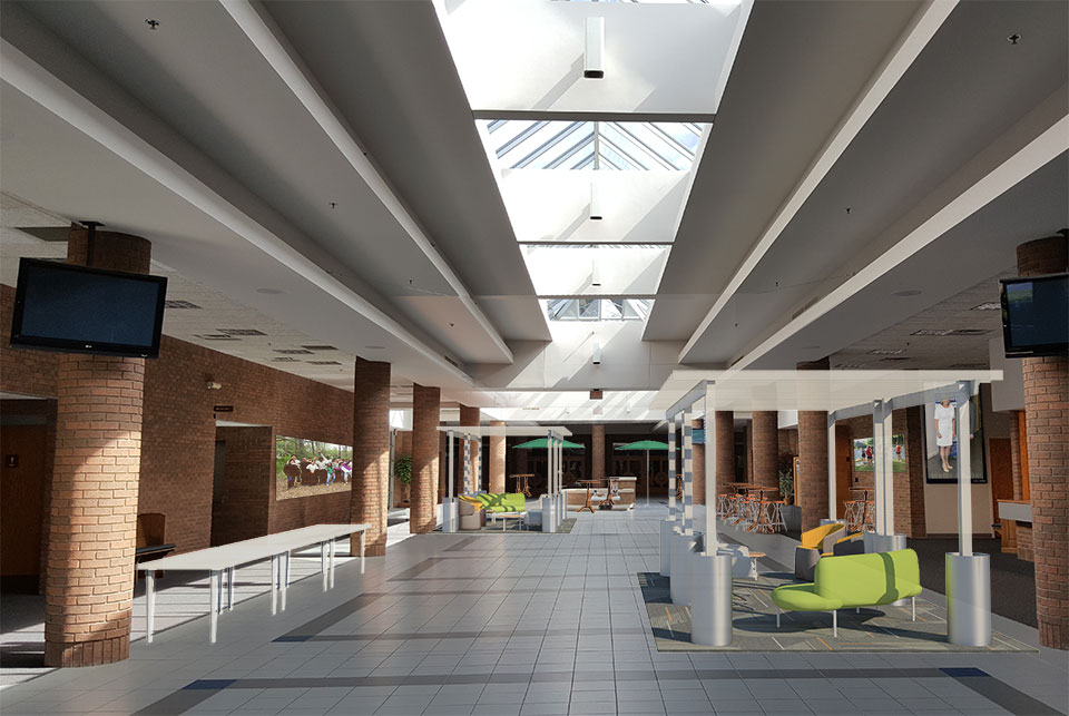
r.o.i. Design’s rendering for the atrium at Beechwood Church, Holland, MI.
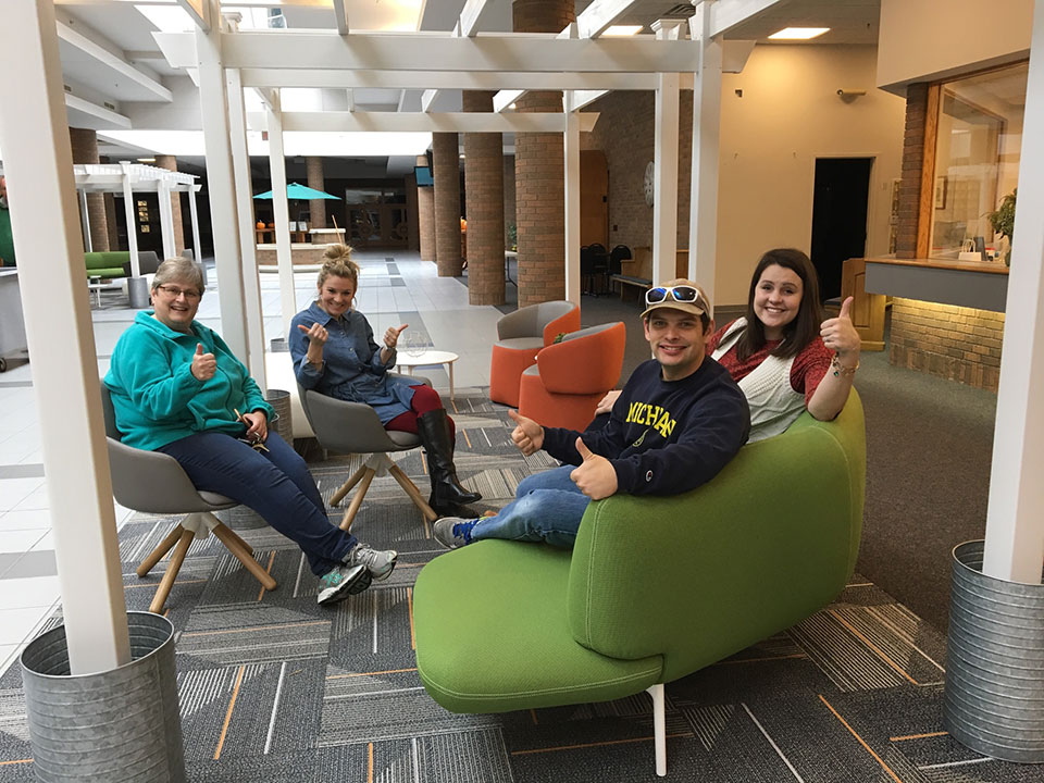
r.o.i. Design engages in church design on a regular basis, but when Barb Ellis (Black River Schools, Spin Dance, and Infinite Key) contacted us for help on her church, the assignment was focused. With the arrival of a new pastor, and a commitment to “start new”, the design committee was looking for ideas to make an impact on the large atrium that connected the worship, education and office space of the church operation. Taking on the perspective that the atrium was the outdoor “mall”, we suggested adding some pergolas with seating, and relocating welcome desks and hospitality areas to be more prominent within the space. With the help of products from Home Depot, IKEA and CB2, a conversion was possible. There was also a generous gift made by Haworth to provide furniture for the pergola areas. Great job, Beechwood! It’s always tough to take a risk in design.

Happy customers at Beechwood Church. Left to right: Jean Lemmenes, Co-director of Music, Emily Bodkins, Children’s Ministry, Leah Vondracek, Administration.

by Ryan | Dec 6, 2016 | Design News
There is glory in planning a great project and being able to guide the design criteria. There is great satisfaction in selecting architectural finishes that meet the budget and still provide a stunning look. While r.o.i. Design continually has those opportunities, we also appreciate the projects when we are asked to put on the “finishing touches”.
Finishing touches could include wall art, accessory furnishings or signage.
Recently we have had this opportunity with Rylee’s Ace Hardware and Wolverine Power Cooperative.

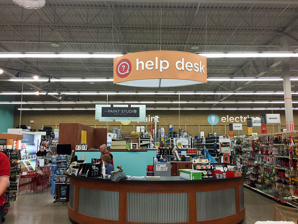
Signage installation at Rylee’s Ace Hardware, Grand Rapids, MI.
Lori Terpstra, owner and CEO of Rylee’s Ace Hardware in Grand Rapids, MI contacted us this fall reminding us that it has been seven years since we designed their store and wanted the colors and signage to be updated. Taking into consideration the Ace Hardware national brand direction, but more importantly Lori’s store and customer, we created a bold solution. When we first designed the space, colors were more muted and neutral, today color is brighter-more celebrated and we brought that to the store. In 2009 retail department signage typically was based on lifestyle images and text; today it’s all about symbols. We took today’s graphic preferences and brought them to the design. www.ryleesace.com

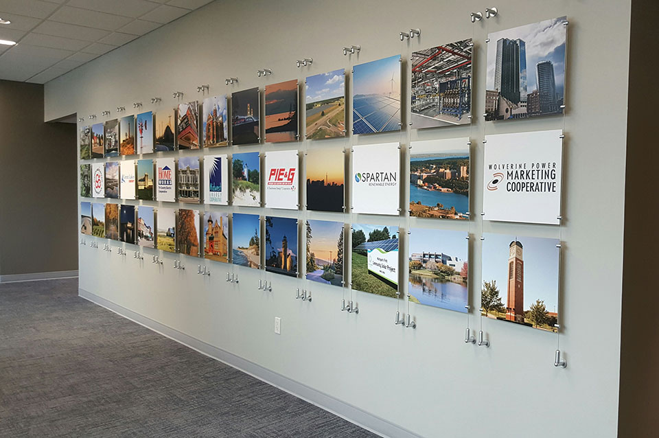
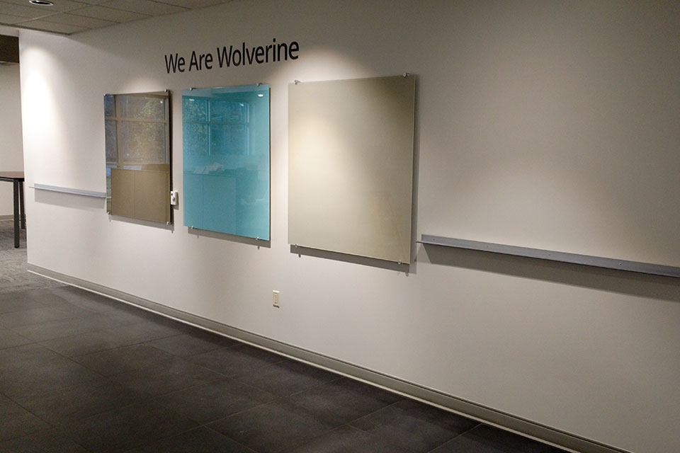
Community Wall at Wolverine Power Cooperative, Cadillac, MI.
Wolverine Power Cooperative, Cadillac, MI, moved into their new corporate offices less than a year ago. Our work as designers on the project gave us some insights into their brand and messaging. Dawn Coon, Executive Director of Administration, appreciated our perspective and engaged us to create custom wall décor for several of their walls in this large facility.
Making the wall décor personal and relevant to our customer’s business assists in creating the ROI we have built our business on.
In addition to corporate inspired art, Wolverine has purchased art produced by Michigan artists and will continue to support locally created art. www.wolverinepowercooperative.com

42 image panels installation at Wolverine Power Cooperative, Cadillac, MI.

Custom Service Map Wood Print, Wolverine Power Cooperative, Cadillac, MI.

by Ryan | Dec 6, 2016 | Design News
Neighborhoods come in all shapes and sizes. And for many, the apartment complex is their neighborhood – complete with dining areas, gathering areas, workout areas, and shared quiet areas.

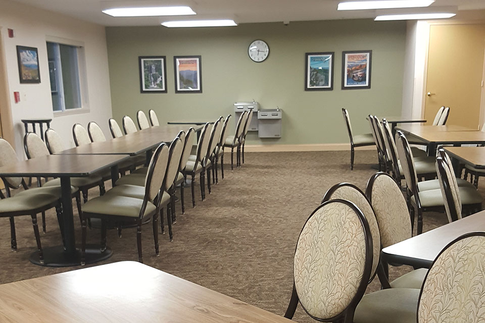
Forest Glen Community Room, Chantilly, VA.
Wolverine Building Group, Grand Rapids, MI, engaged r.o.i. Design this year to assist them in the final phase design and product fulfillment for the public spaces of their project, Forest Glen, in Chantilly, VA.
This project has two phases and at this writing Phase 1 is complete and Phase 2 is scheduled for a January 2017 finish.
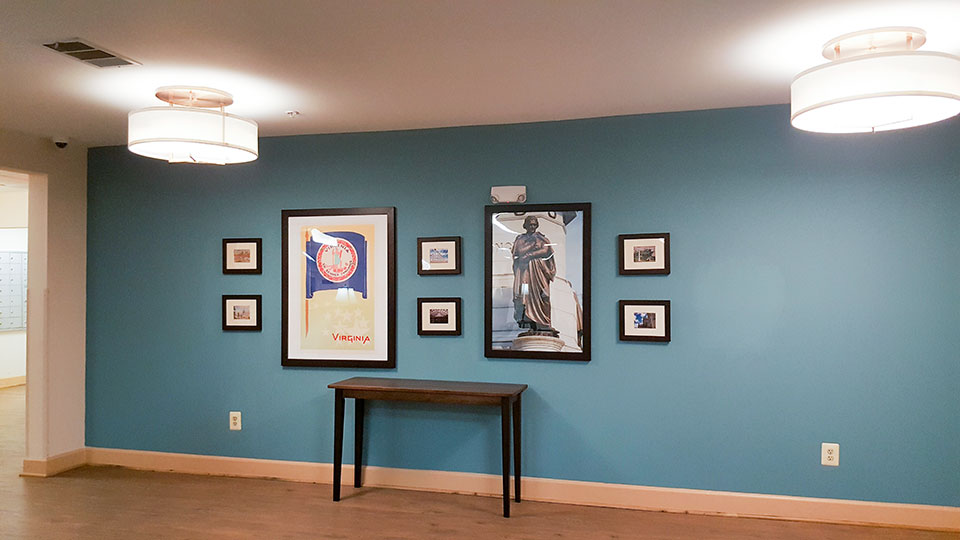
The developer, Eagle Point Companies of Portland MA, wants their residents to feel at home. For us that means acknowledging the locale in the design. r.o.i. Design provided wall art and décor that fits the location of the project. In this case, Chantilly VA is one of the suburban communities of Washington, D.C. Featuring our nation’s capital landmarks was appropriate.

Wall decor in Forest Glen Lobby, Chantill, VA.
We acknowledge the team at Wolverine Building Group, Brian Steinberg and site superintendent, Bruce Soloway whose team work has made this possible. For more information about Wolverine Building Group, go to www.wolvgroup.com
And a shout out to Neil at Eagle Point for his attentive responses and careful consideration of selections and product details.

![2017 Color Trends]()
by Ryan | Oct 26, 2016 | Design News, Interior Design
The 2017 color forecasts are coming out, and r.o.i. Design is seeing a large variety of palettes and opinions. While there are many experts, we tend to look at our favorite paint companies, as well as Pantone.
There seems to be a trend toward “muted, dusty or grayed” colors, but there isn’t one color that is being called out as “the color”. There is interest in blues, purples, green, taupe and grays, but they don’t leave out any part of the spectrum in their predictions. r.o.i. Design knows that these predictions are the most influential for future manufactured products. The predictions of this year, will trickle into products we see hit the market in the next few years.
So whether we like a color or not, some of the colors predicted in these reports are going to show up in laminates, fabrics, tile and other architectural products we will have as options for interiors in the near future.
Here are three reports we found interesting. Find your favorite!

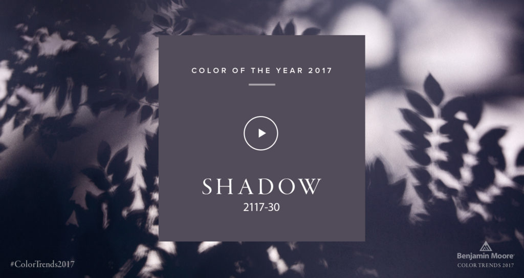
Benjamin Moore’s Color of the Year, Shadow 2117-30, is allusive and enigmatic — a master of ambiance.
“Emotional connections with this color evoke nostalgic memories of light on space and color.”
–CARL MINCHEW, VICE PRESIDENT OF COLOR AND DESIGN

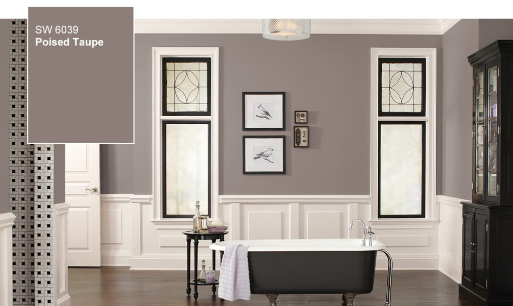
Sherwin-Williams doesn’t usually like to play color favorites, but in this case we can’t resist. The color we anticipate defining 2017 is Poised Taupe. Here’s why: This timeless neutral is modern, classic and a beautiful balance of warm and cool.

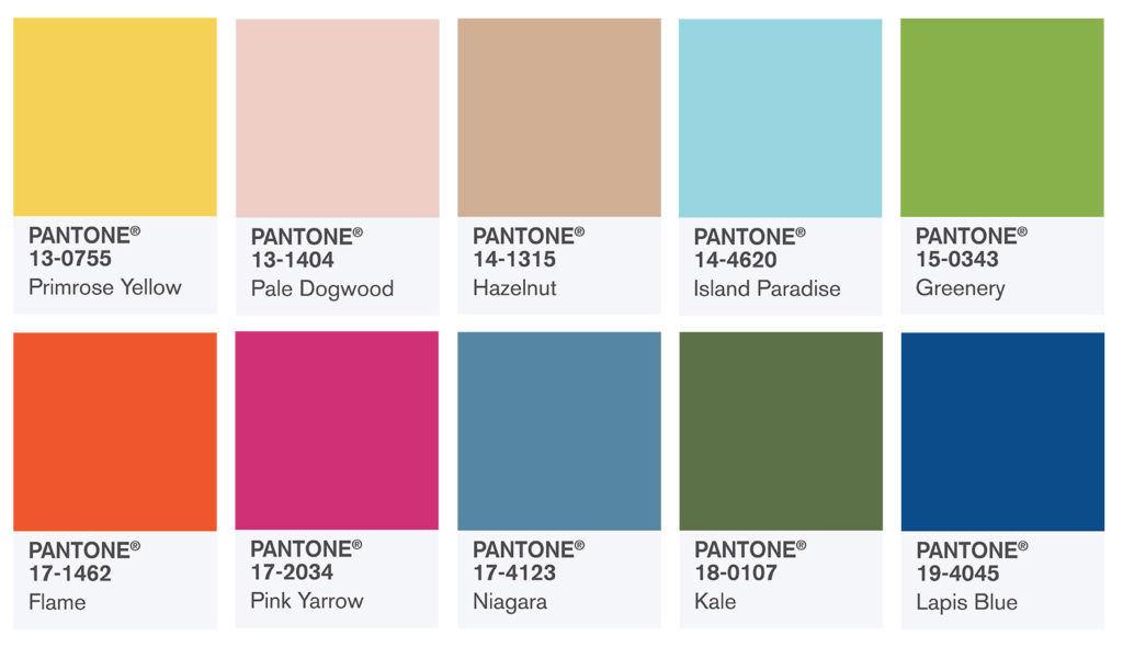
PANTONE 18-0107 Kale
Evocative of the great outdoors and a healthy lifestyle, Kale is another foliage-based green that conjures up our desire to connect to nature, similar to the more vivacious Greenery. And, just as we see in nature, this lush and fertile natural green shade provides the perfect complementary background to the more vibrant tones in the palette.
