There is a short walk between design and marketing. They are neighbors, and like good neighbors they share with one another.

Double JJ Gold Rush Water Park Wild West Store Front
No one wants a trendy design that will require a remodel before the bills are paid. No one wants a corny theme, but everyone wants a look that fits them and lasts the test of time. When branding a project, r.o.i. Design makes sure to include these steps in their process.

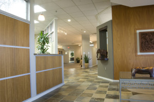
Dooge Veneer Showroom with Natural Elements
1. First understand the people who are going to use the space. What is their relationship to the brand? Is it their space, the place they work, their favorite retail store, their place of worship or the place to weigh-in for Weight Watchers?
2. Understand the message that the owner of the space wants to convey. We often hear words like professional, comfortable, efficient, welcoming, motivational, safe and casual. We want to provide those things and more. What attribute of the business or the owner can we share that is of interest and illustrates how this space is different from other places?

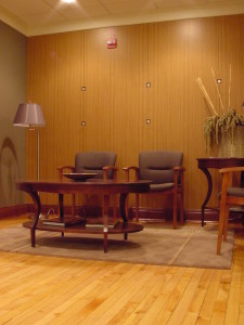
Baker | Holtz Lobby with Silver Dollars in Veneer Panels
3. Be authentic. The details that extend a brand are meaningful and lasting. They can sometimes become iconic but don’t necessarily start that way. Quite often, our customer will relate these details as “fun” without being silly. They often are subtle or integrated in a way that is so natural that, “of course that detail would be there”. For CPA’s Baker | Holtz, who didn’t want to appear “shy” about their profession, we found little ways to make them smile and gave them landmarks in their space so they could give an interesting tour of their office.
4. Be addictive. When the recipe for a design works, the nuances of the “brand look” are happily continued by the users of the space. For a while, r.o.i. Design called themselves “Design Dogs”, happy to follow the customers lead. We saw ourselves so differently than the aloof cat-like designer stereotype that for a while we had dogs on the backs of our business cards. People started giving us dog sculptures and other dog-related stuff, on and on.

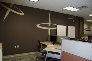
Spin Dance Offices with Tops
We worked with Spin Dance in their downtown Holland office space. We tried to understand the complex service this technology group offers to their customers and we tried to understand the name. We offered to them that perhaps they could illustrate data spinning, so quickly, so precisely and to the point, like a spinning top. It stuck. We want all spaces that are important to you to be significant and tell your story. You shouldn’t have to borrow a cup of sugar from “marketing” to make it that way.
