ABC Pediatrics
Wyoming and Walker, MI
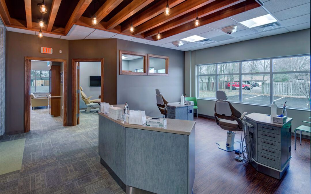
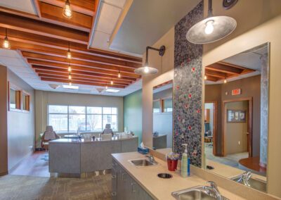
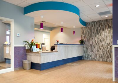
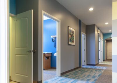
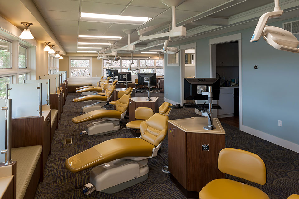
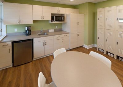
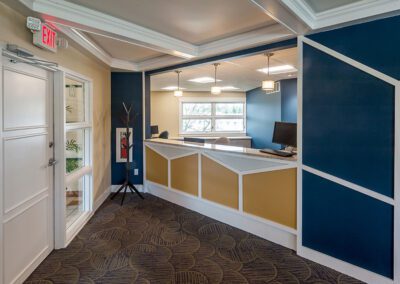
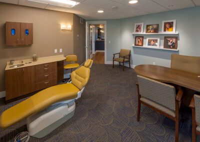
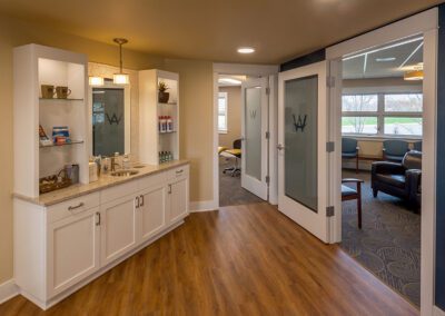
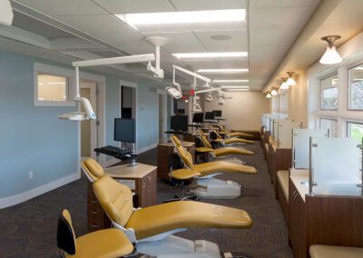
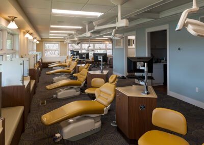
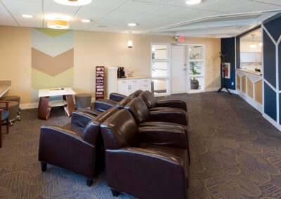
Wyoming: r.o.i. Design learned so much working with ABC Pediatrics as we helped them with the interior design of their new offices in Wyoming, MI. We learned how they wanted to engage families with their interiors, but not be just “kid-like”. They wanted their space to look professional and simple, but very welcoming and comfortable. They needed it to be user friendly for staff and family which meant maintainable surfaces and easily identifiable areas. And there was a budget.
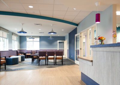
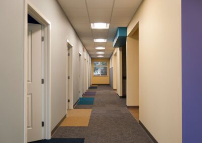
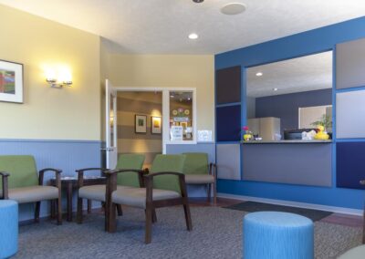
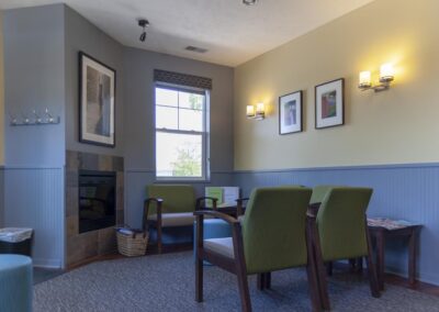
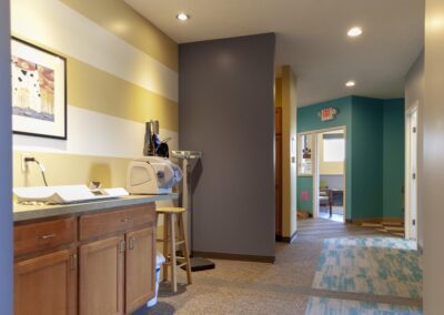
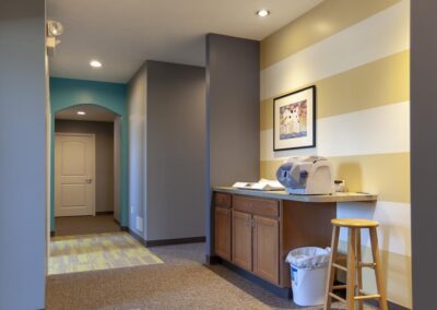
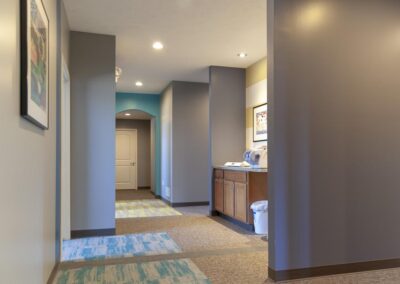
Starting with a color scheme that they currently use in their original Walker location, r.o.i. Design “upped the ante” by intensifying some of the colors, adding pattern and interest, in thoughtful ways. Some of our favorite elements are the carpet accents, the color accents, the decorative lighting and the lobby furniture. Wall art will soon be added to the interior and we like those selections as well.
ABC Pediatrics also asked us to create a new logo for their practice. They wanted a logo that was as updated as their offices were, but more importantly, a representation of their brand. Interviewing them about how they viewed their distinctive difference, we came away with “Caring”, “Diverse” (ages and specialties), and “Child Centered”. They were very pleased with their new business logo designed by Ryan Bright, Creative Executive at r.o.i. Design.
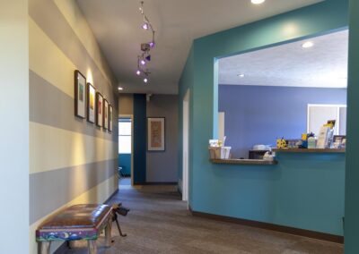
Walker: Their second location in Walker grew jealous of the new facility’s fresh look. So, this year they decided to make some cosmetic changes to their 3 Mile Road offices. They asked r.o.i. Design to work with them to create a look for this space. They were looking for something that was different than Wyoming but still fun, residential, warm and welcoming.
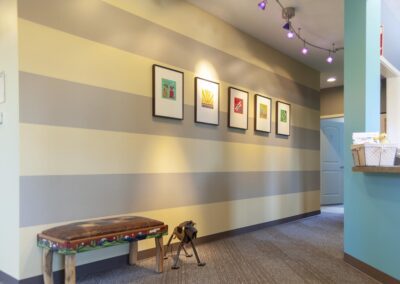
No walls were moved, and no doors or windows were replaced. But every surface was refreshed with new paint, carpet or laminate. For this location, r.o.i. Design took a soft graphics approach to the interior, adding stripes and squares to the walls. Perhaps our favorite detail was the carpet patterns. We highlighted each exam room entrance with a bold color. Plus, we created diagonal “paved” pattern sections to the floor.
And, like their Wyoming location, we added some large ottomans to the lobby for fun seating.
