Mailloux Dentistry
877 E 16th St Ste 50
Holland, MI 49423
What sets Mailloux Dentistry apart is their attention to the beauty and aesthetics of the smile. They are a family dentistry where adult and child patients receive the same attention.
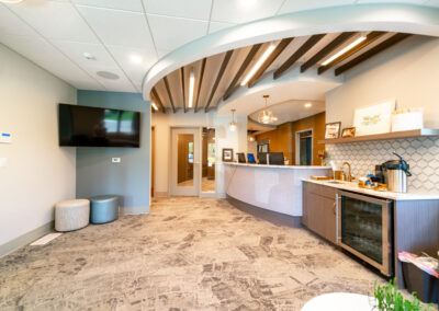
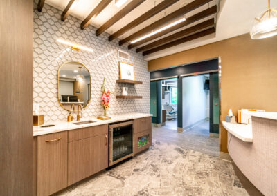
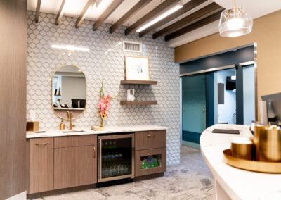
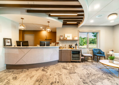
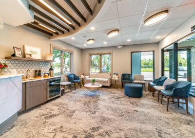
The lobby of the space has many curves. The reception desk, bulkheads, ceiling accents, accent tiles, and many more elements all incorporate curvilinear shapes. The intention was to make their patients feel welcome and relaxed. Inside the reception bulkhead are wood baffles that enhance the coziness of the space.
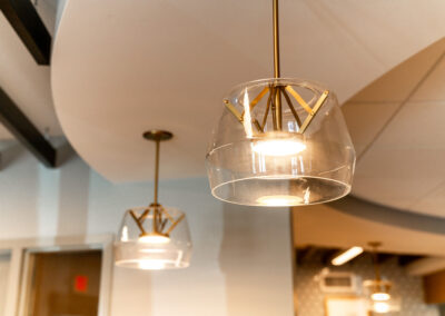
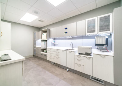
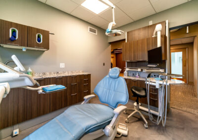
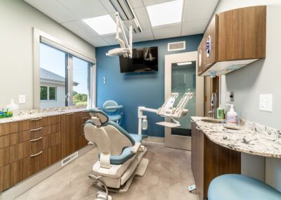
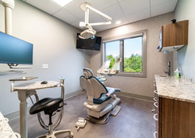
The overall color scheme includes gold, warm white, pink, and gray. The elegance of the lobby chandeliers and the waiting room furniture are paired with a carpet that looks handmade. The vinyl flooring (LVT) in the exam rooms has accents of gold in a light parquet wood floor look.
On this project, we were honored to also design their new logo. We came up with numerous concepts and refined them down to the final product. We also provided and branding standards document so they could use their new logo to its full potential.
The lobby and reception furniture were also provided by r.o.i. Design. It is always wonderful to be able to finish a design we start down to these details.
Click on the thumbnails below to enlarge.
© All photos courtesy of First Companies

