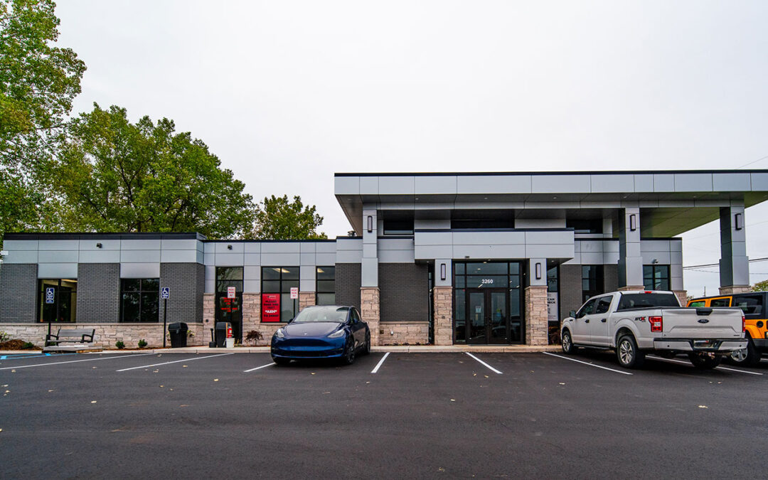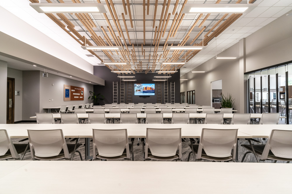
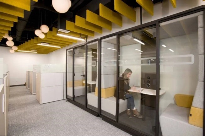
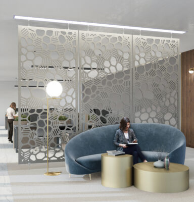
Open Offices Bring Acoustic Issues
With the onset of the open office and shared spaces comes great efficiency and improved collaboration, but also brings acoustic issues.
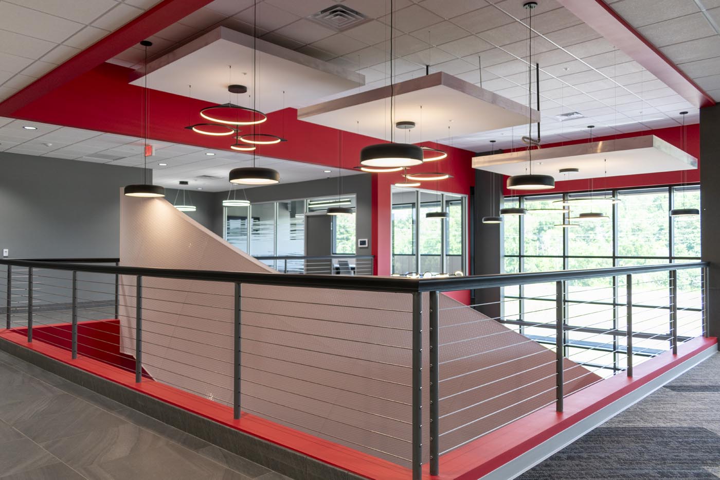
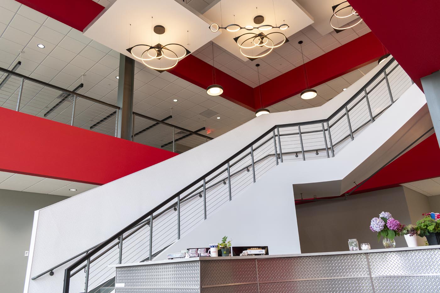
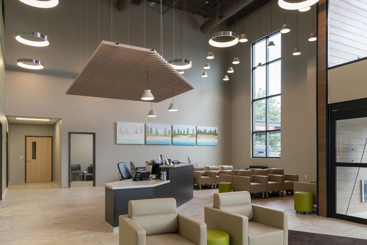
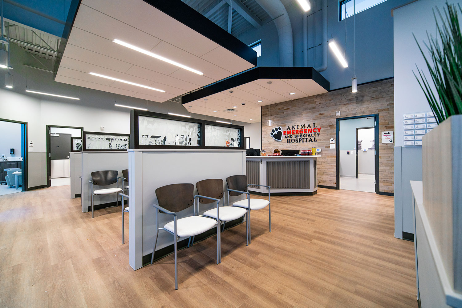
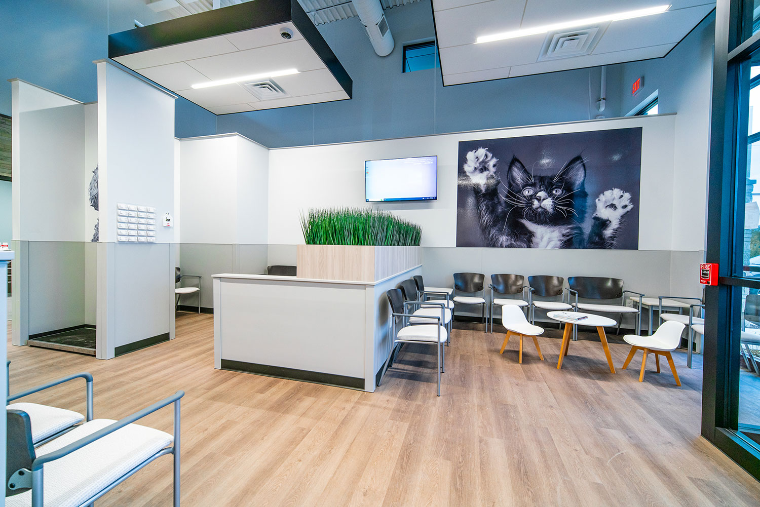
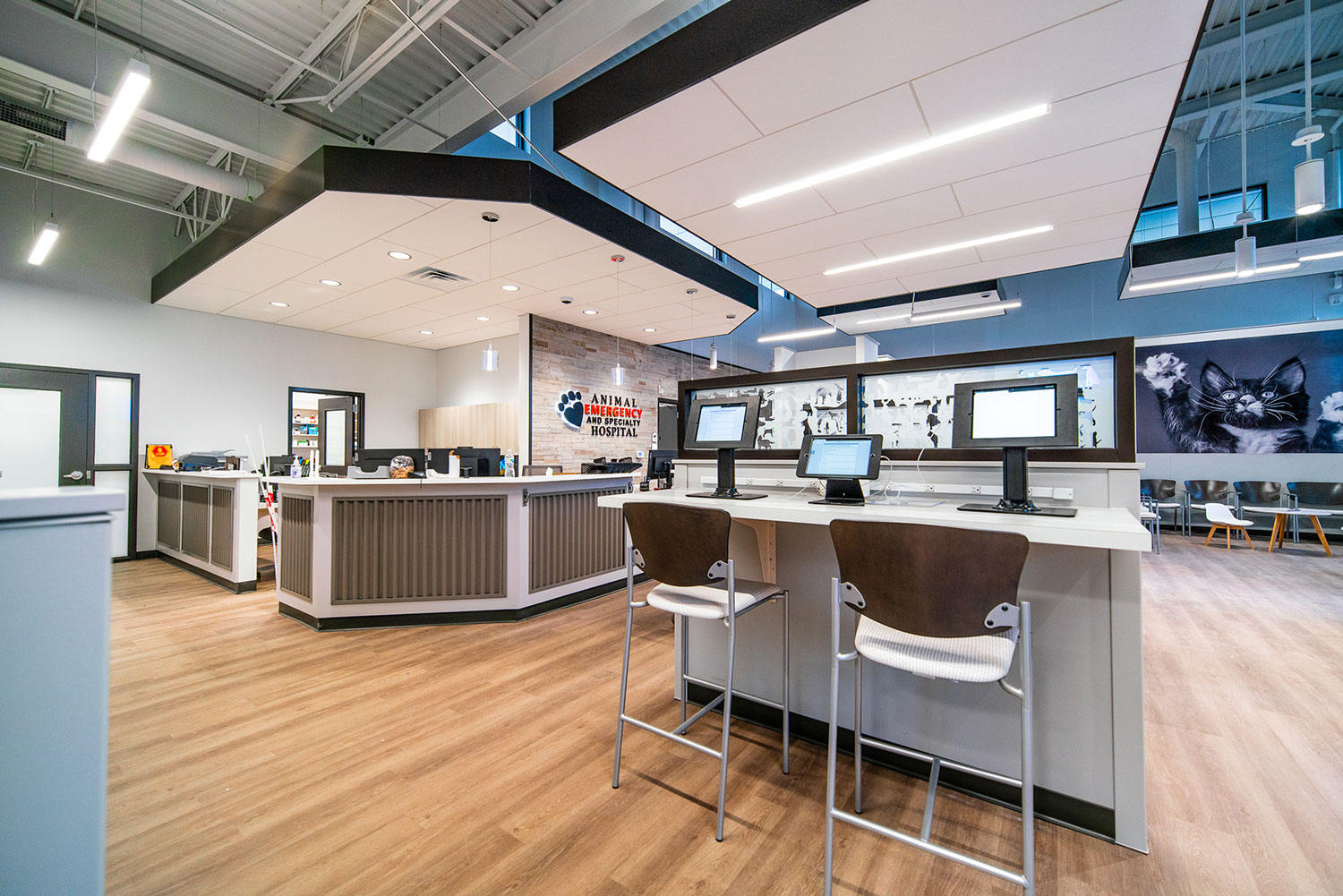
Acoustics are the science of sound control, addressing the reflection of noise between and around spaces. Very rudimentary sound waves act like a ping pong ball in a space, rebounding off hard surfaces. Ideal reverberation time, referred to as T60, signifies the time it takes for sound to fade by 60dB (decibels) within an enclosed space. The faster the fade, the better it is. r.o.i. Design approaches the issues of acoustics in most jobs where we consider absorbing, blocking, covering or diffusing sound.
Absorb
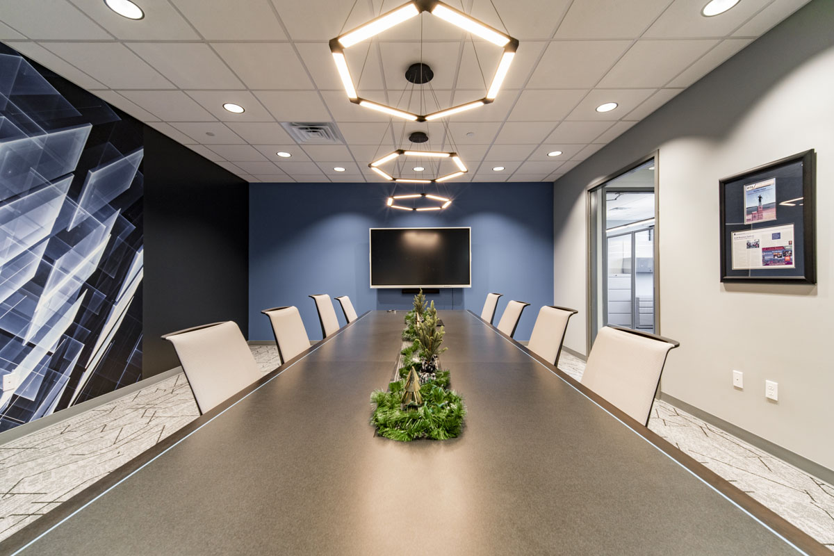
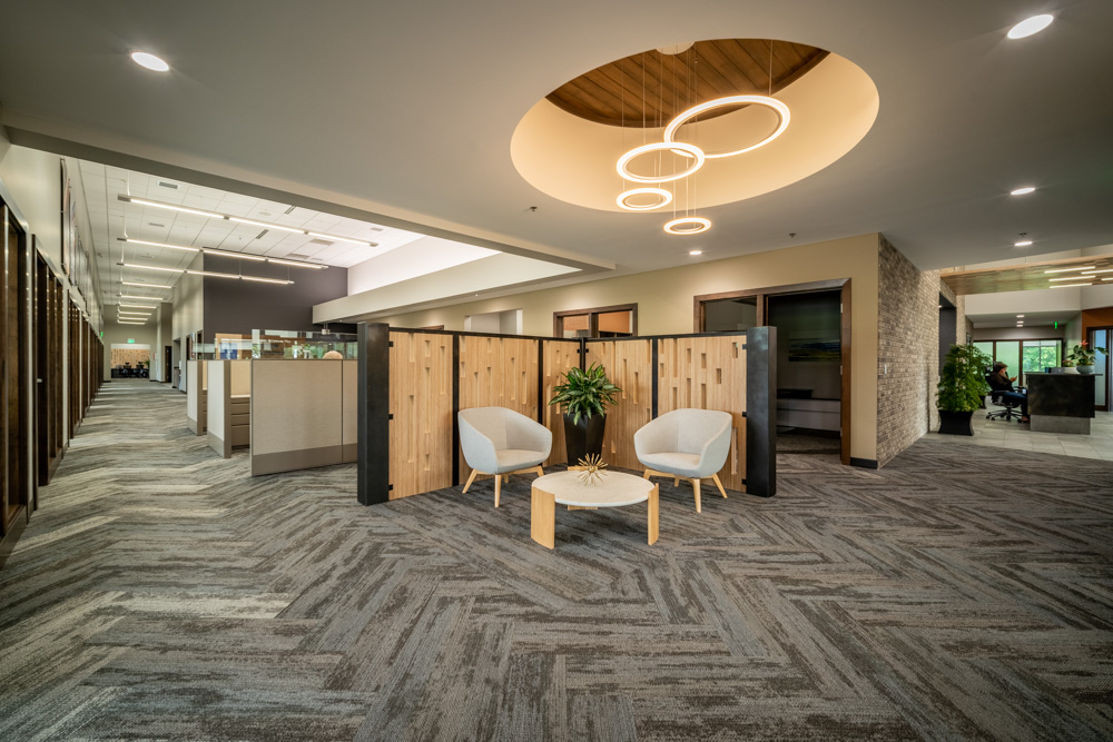
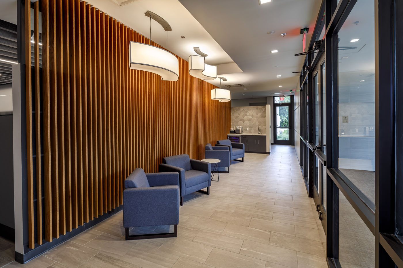
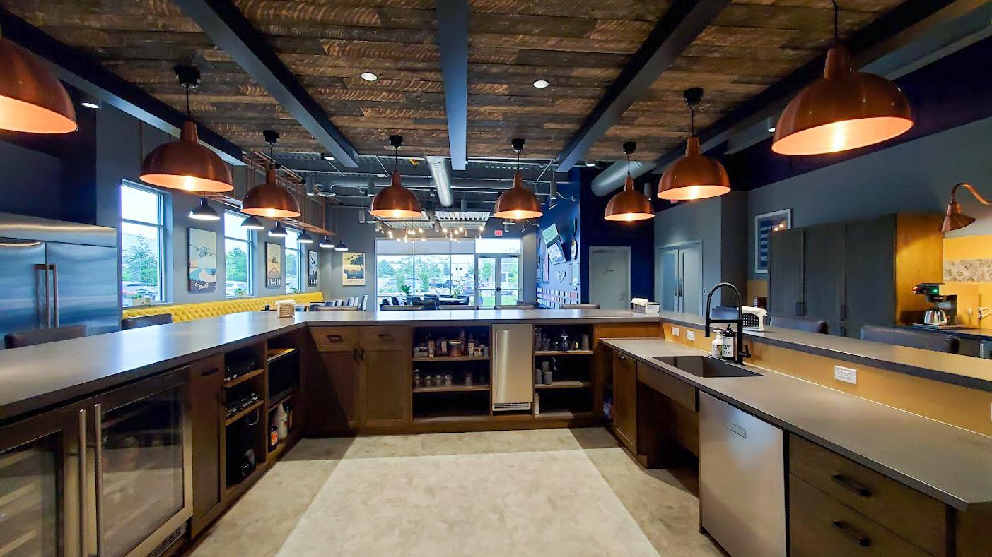
The absorption coefficient of materials controls how much sound reverberates when they hit those materials—a higher coefficient means they absorb more sound. Therefore, absorptive objects reduce ambient noise. A favorite solution is one that also adds design are decorative baffles made from felt, wood, or fabric.
Block
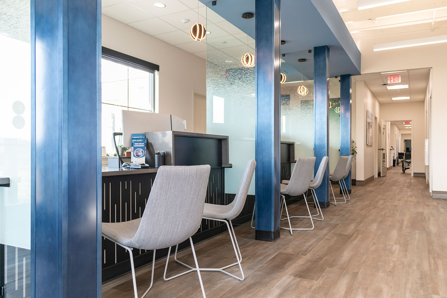
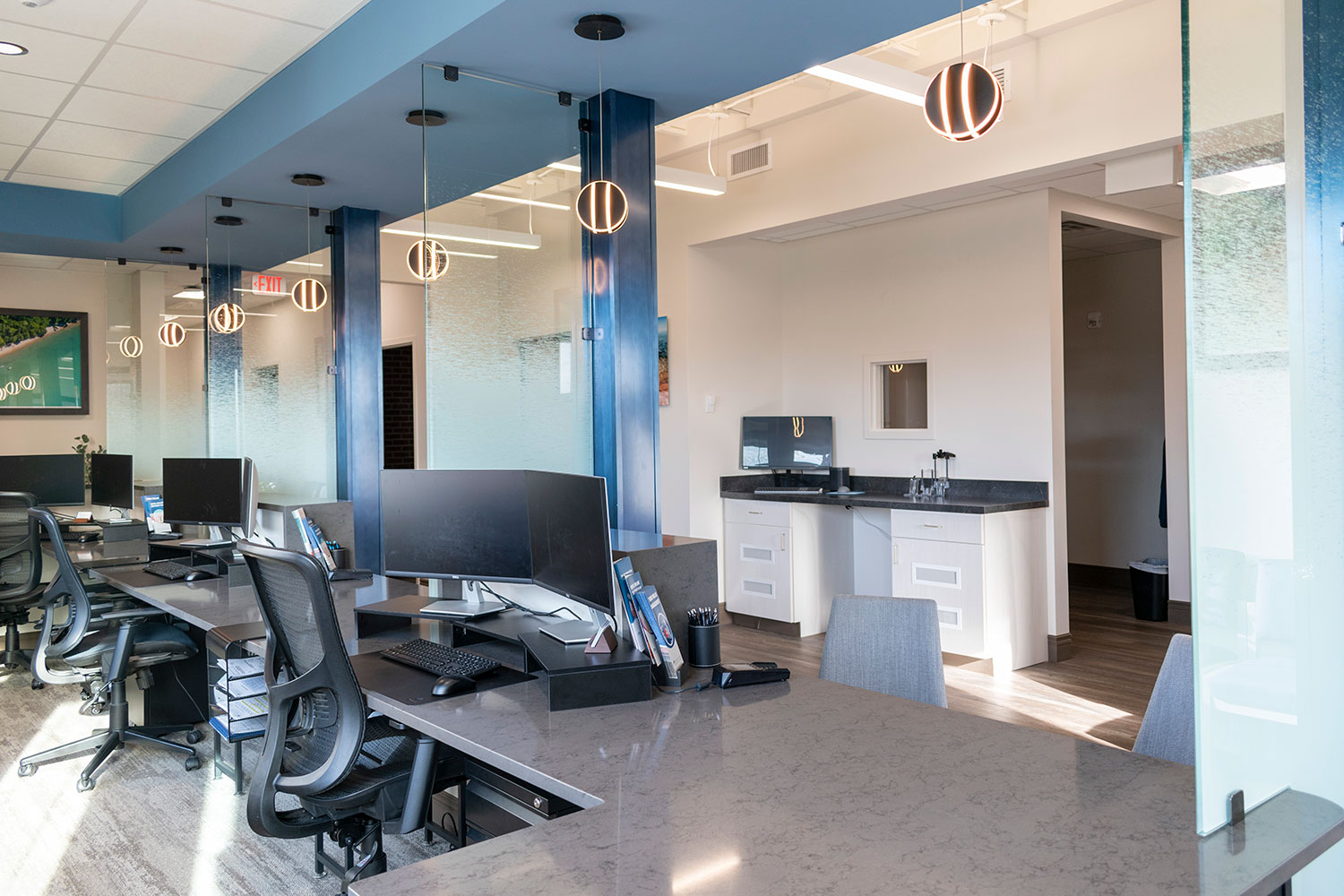
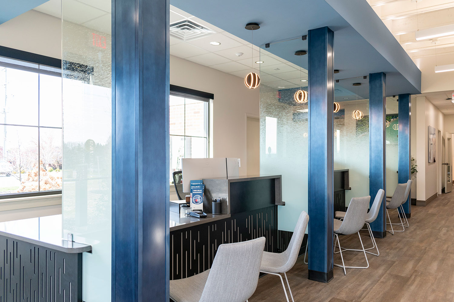
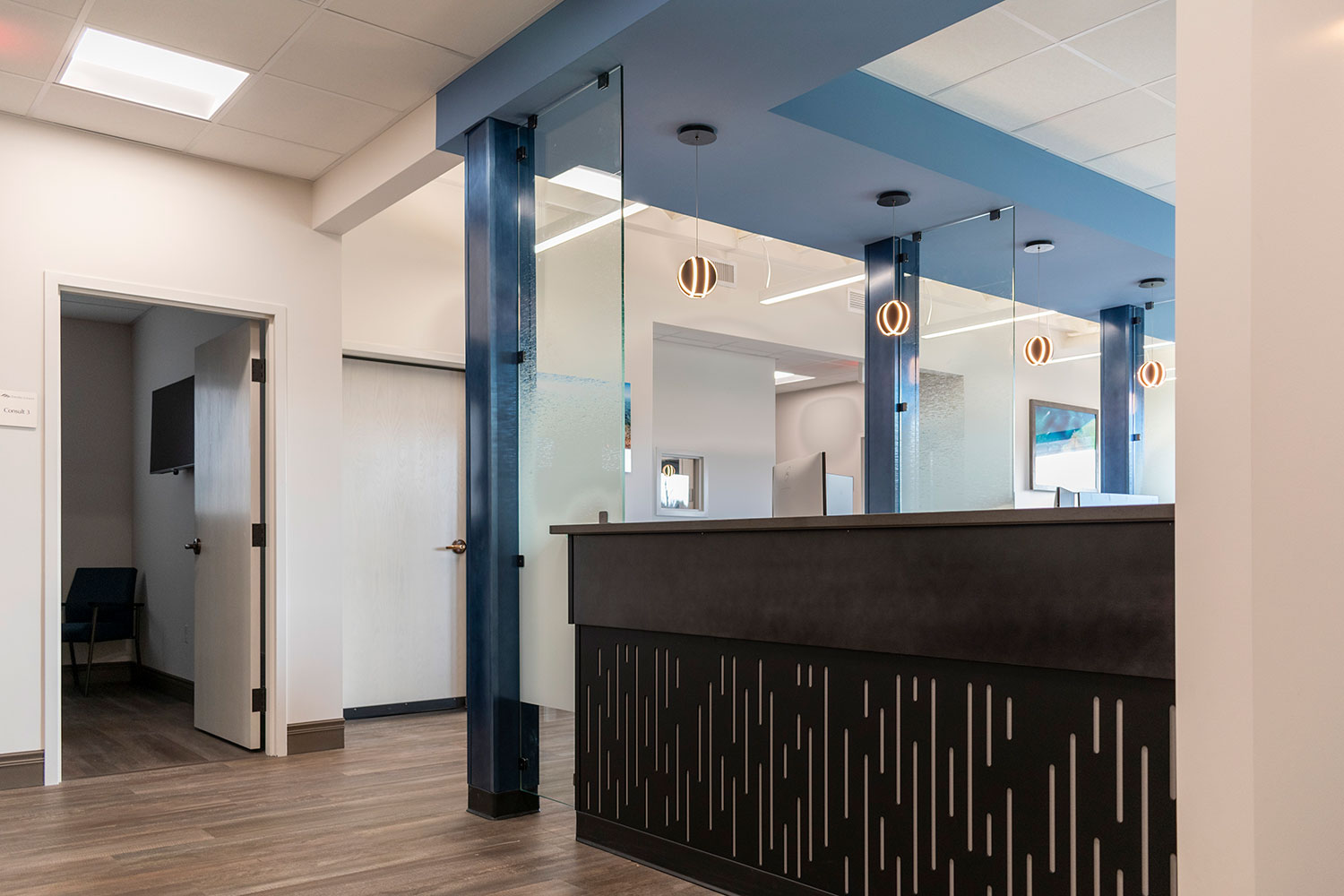
The amount of sound blocked by a wall or other obstacle is called sound transmission loss—or attenuation. For example, screens, panels, and doors also help block sound from traveling between spaces. r.o.i. Design often adds partitions and window coverings to block sound.
Cover
If you can’t absorb or block sound, you might have to cover it. Carpets and acoustical ceilings, as well as efficient HVAC systems, can conceal sound and lower background noise levels. A popular solution is sound masking technology, much like a sound system that is designed to create a consistent pitch to cover other sounds.
Diffuse
In some environments, proper acoustics involve scattering sound uniformly throughout the space, in other words, diffusion. Too much absorption makes it difficult to transmit noise properly— for example, people may need to hear others talking over a long distance. Back to the ping pong ball, imagine it trying to bound off a textured wood wall; the bound is diffused.
While r.o.i. Design is not acousticians, we are very capable of specifying products that absorb, cover, block, and diffuse. For projects that we added acoustic solutions, click on the links below: