
The 2017 color forecasts are coming out, and r.o.i. Design is seeing a large variety of palettes and opinions. While there are many experts, we tend to look at our favorite paint companies, as well as Pantone.
There seems to be a trend toward “muted, dusty or grayed” colors, but there isn’t one color that is being called out as “the color”. There is interest in blues, purples, green, taupe and grays, but they don’t leave out any part of the spectrum in their predictions. r.o.i. Design knows that these predictions are the most influential for future manufactured products. The predictions of this year, will trickle into products we see hit the market in the next few years.
So whether we like a color or not, some of the colors predicted in these reports are going to show up in laminates, fabrics, tile and other architectural products we will have as options for interiors in the near future.
Here are three reports we found interesting. Find your favorite!
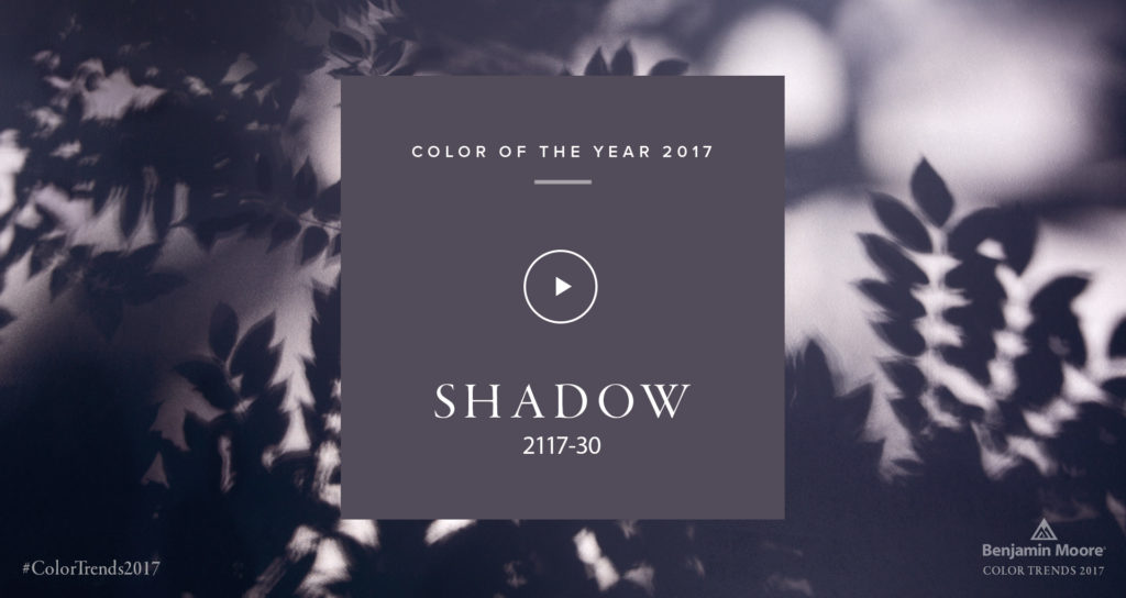
Benjamin Moore’s Color of the Year, Shadow 2117-30, is allusive and enigmatic — a master of ambiance.
“Emotional connections with this color evoke nostalgic memories of light on space and color.”
–CARL MINCHEW, VICE PRESIDENT OF COLOR AND DESIGN
READ ENTIRE ARTICLE
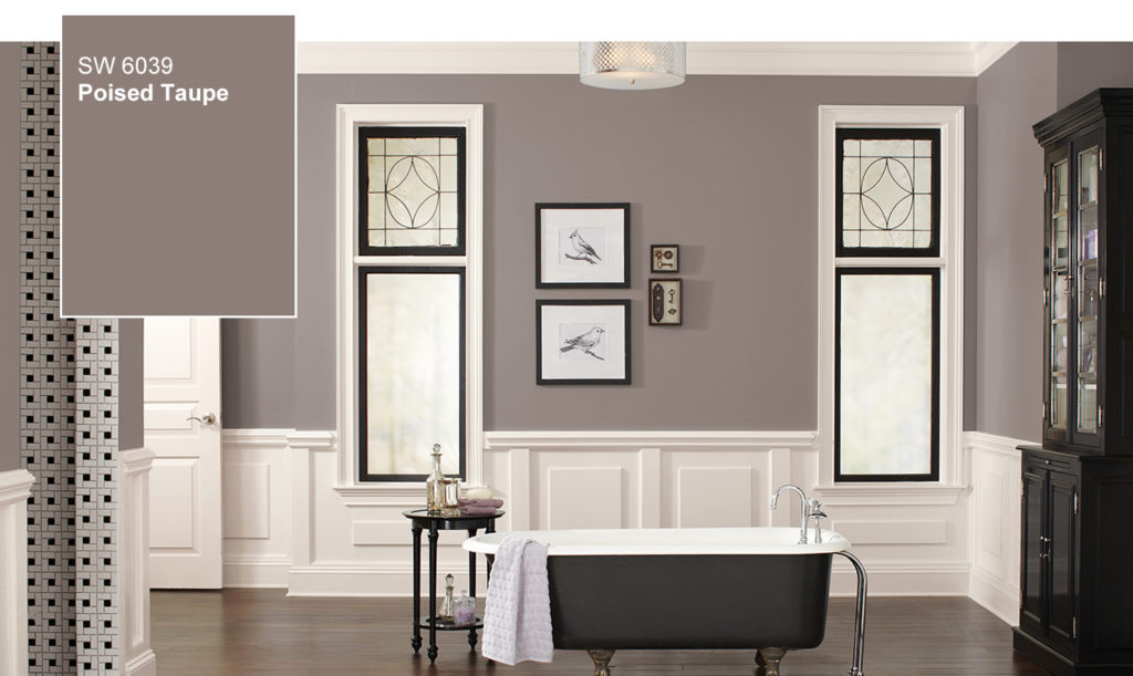
Sherwin-Williams doesn’t usually like to play color favorites, but in this case we can’t resist. The color we anticipate defining 2017 is Poised Taupe. Here’s why: This timeless neutral is modern, classic and a beautiful balance of warm and cool.
READ ENTIRE ARTICLE
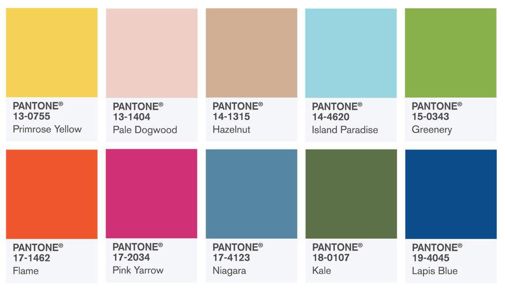
PANTONE 18-0107 Kale
Evocative of the great outdoors and a healthy lifestyle, Kale is another foliage-based green that conjures up our desire to connect to nature, similar to the more vivacious Greenery. And, just as we see in nature, this lush and fertile natural green shade provides the perfect complementary background to the more vibrant tones in the palette.